

76% of SaaS companies have AI in their products. Most users avoid those features entirely. The issue isn't model quality — it's the design of the trust experience that precedes adoption. Here's how to fix it.
Most AI features get shipped and then quietly ignored. The problem isn't the AI — it's the UX.

AI UX design is one of the most searched and least understood disciplines in product right now. It sits at the intersection of interface design, behavioral psychology, and AI product strategy, and it determines whether the AI features companies spend months building actually get used. This guide covers what AI UX design means in practice for SaaS product teams, why AI features fail even in well-funded products, and what design decisions actually drive adoption. If you are shipping AI and not seeing engagement, this is for you.
76% of SaaS companies have shipped AI features into their customer-facing products, according to SaaS Capital's 2025 report. Another number tells the real story: across most products, fewer than 30% of users ever meaningfully engage with those AI features, a consistent finding across Amplitude and Mixpanel feature adoption analyses.
The gap between "we shipped AI" and "users are using AI" is not a model quality problem. It's a design problem.
TL;DR
AI features fail because of design failures in the first 90 seconds, not because of poor model quality
The three root causes are: no capability boundary, no consequence communication, and no recovery path
The Groto AI Trust Sequence is a 5-moment framework for designing first-session AI trust
AI onboarding must use real user data, not demos
Visible user control is the most undervalued driver of long-term AI adoption — a principle central to AI SaaS UX integration at every stage from onboarding through retention
If your AI feature has single-digit engagement, the fix is in the UX layer, not the model
What Is AI UX Design?
AI UX design is the practice of designing product interfaces that enable users to understand, trust, and effectively work with AI systems — and if UI UX design basics are still being established on your team, that foundation matters before layering AI-specific interaction patterns on top. It covers how AI features are introduced, how outputs are presented, how confidence is communicated, how errors are surfaced, and how recovery is made effortless.
It differs from conventional UX design in one critical way — and AI vs traditional UX breaks down exactly where those differences show up in SaaS product decisions. Deterministic products behave predictably: press a button, get an expected result. AI products don't. An AI recommendation may differ tomorrow from today. An AI-generated output may be high-confidence in one context and low-confidence in another. Users have no inherited mental model for this, because nothing in their prior product experience has prepared them for it.
This is why AI UX design is its own discipline. It requires designing for uncertainty, for probabilistic behaviour, and for the specific challenge of building trust between a user and a system they cannot fully predict or control.
The failure mode unique to AI products is what we call the "feature invisibility loop": a user encounters an AI feature for the first time, gets one output they don't understand or trust, disengages, and never returns. The feature registers near-zero retention in your analytics, and the team assumes the AI needs to be better. In most cases, the AI is adequate. The first-session design wasn't.
Is Your AI UX Design Already Broken? Check These Signs
Before diving into what good AI UX design looks like, it helps to know what broken looks like. Most SaaS teams don't realise their AI UX has a problem until adoption numbers arrive, — grounding this diagnosis in a SaaS UX design guide gives teams the full product context before narrowing to AI-specific failures. and by then users have already formed a permanent opinion.
Your AI UX design likely has a problem if:
Users activate the AI feature once and never return to it
Support tickets reference confusion about what the AI feature is actually for
Users manually replicate tasks the AI was built to automate
AI-generated outputs get ignored or deleted without being acted on
Users describe the AI as "unreliable" despite the model performing well in testing
There is no visible way to edit, retry, or override an AI output from the primary interface
Your AI onboarding is a tooltip, a modal, or a demo video rather than a live interaction on the user's own data
If two or more of these are true, the problem is not your model. It's your design layer, and it's fixable without touching a single parameter.
Why Users Avoid AI Features — It's Not the Model
The most common assumption product teams make after shipping an AI feature with low adoption is that the AI needs to be better. This sends teams down months of model improvement work while the real problem sits unfixed in the interface.
Research from Amplitude's 2025 Product Report found that the primary driver of AI feature disengagement isn't model accuracy. It's confusion about what the feature is for, and distrust of outputs that users don't know how to evaluate.
Three specific design failures drive this at scale:
No capability boundary. Users don't understand what the AI can and can't do. When they try something outside its designed scope and get a poor output, they conclude the entire feature is broken and don't return.
No consequence communication. Users don't know what happens when they engage the AI feature, what it changes, what it creates, what it saves or sends. That absence of information creates hesitation that compounds into avoidance.
No recovery path. When an AI output is wrong, unclear, or unhelpful, there is no visible way to improve it, retry it, or understand what happened. The dead-end gets read as failure, and users permanently route around the feature.
All three failures live in the design, not the model. And all three are fixable without retraining anything — AI UX design mistakes maps these patterns across real products so teams can diagnose which failure is costing them adoption before running the full audit.
What We've Seen Across Real AI Products
Before the framework, the proof. We've worked on AI UX design across SaaS products in hiring, edtech, health, PR, insurance, and dubbing. The pattern is consistent across all of them.
Camb.ai is an AI dubbing platform operating in real-time across 140+ languages. When we came in, the product had strong underlying AI but users weren't engaging with the core dubbing workflow at the depth the team expected. We redesigned the first-session experience to surface AI-driven outputs from users' existing audio files immediately on login, rather than asking them to generate a demo. The product demonstrated value within the user's real context before they had to do anything. First-session AI engagement increased substantially.
See how we redesigned AI onboarding for real-world activation.
Pathways is a B2B AI hiring platform. The AI assessed candidates through personality-based evaluations, but hiring managers weren't acting on the AI-generated scores. The issue was output comprehension: the scores appeared without explanation, confidence signal, or suggested next action. We redesigned the output layer to include reasoning context and a clear recommended action for each candidate. Decision-making speed improved and the AI scores moved from being ignored to being the primary hiring input.
See how we redesigned AI outputs to improve hiring decisions.
Barista is a PR AI tool. PR teams were using the platform for content creation but bypassing the AI collaboration features entirely, doing manually what the AI was built to do. The problem was no capability framing: users didn't know which tasks the AI was specifically designed for within their workflow. After redesigning the in-flow capability communication, teams began using the AI features as a primary part of their content process rather than an optional add-on.
See how we increased AI feature adoption inside real PR workflows.
LearnSphere is an edtech platform with AI features for admins, teachers, and students. Each user type had a different primary objection to the AI. Admins worried about accuracy, teachers worried about losing control of content, students weren't sure they were using it correctly. We addressed each objection through interface design rather than marketing language, building different onboarding paths and confidence signals for each role.
See how we designed AI trust differently for every user role.
The throughline across all of these: the AI was not the problem. The design decisions around how the AI was introduced, explained, and recovered from were.
The Groto AI Trust Sequence — 5 Moments That Determine Adoption
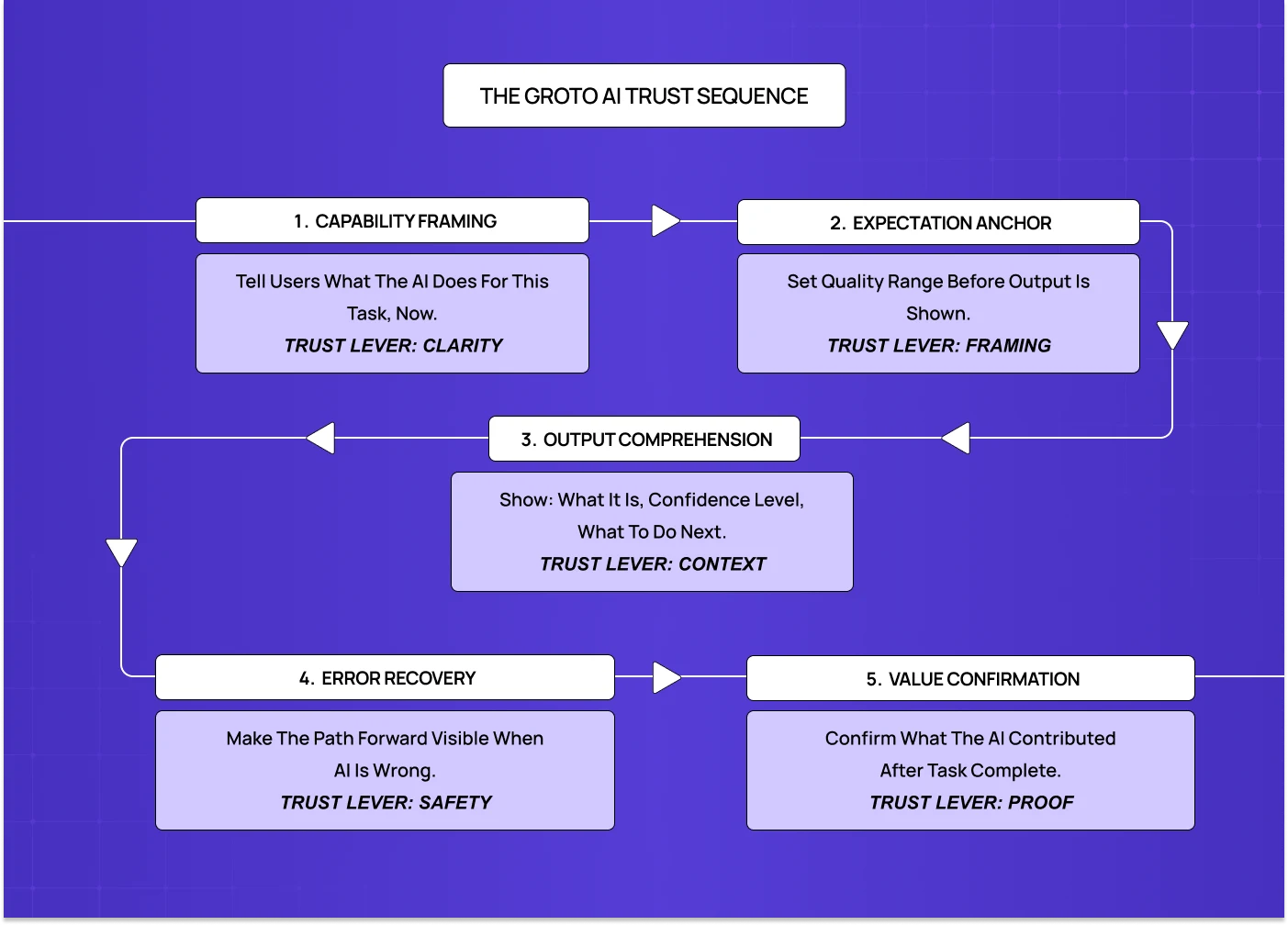
The AI Trust Sequence is our framework for designing the first-session AI experience in SaaS products. It identifies five moments, all occurring within the first 90 seconds of AI interaction, that determine whether a user becomes an adopter or an avoider.
Most product teams design none of these moments intentionally. They ship the feature, add a tooltip, and wait for adoption metrics that never arrive.
Moment 1: Capability Framing In one line: Show users exactly what the AI does for their current task, before they take any action.
The capability statement must appear within the task flow, in plain language, before the user does anything with the AI. "AI-powered insights available" tells users nothing. "This AI analyses your last 30 days of session data and surfaces the 3 flows where users are dropping off" tells them exactly what to expect and sets the right evaluation criteria before any output appears.
Moment 2: Expectation Anchor In one line: Frame the quality range before the output appears, not after the user has already judged it.
One sentence of expectation context before the AI output is revealed. Not a legal disclaimer. A framing that positions the user to evaluate the output correctly — the same principle behind AI confidence signal design on dashboards, where users need framing before they read a number, not after. "Here's a first draft based on your brief, edit it to match your voice" changes the evaluation frame from "is this publishable?" to "is this a useful starting point?" The second question the AI almost always answers correctly.
Moment 3: Output Comprehension In one line: Every AI output needs a confidence signal, a next-action prompt, and a brief reason behind the result.
Every AI output must have a confidence signal (visual or textual), a next-action prompt, and for complex or consequential outputs, a brief explanation of the reasoning — decisions that fit inside UX design process steps as part of the output design and validation phase. "Based on your Q1 cohort data" or "Derived from your top 5 performing campaigns" is sufficient. It gives users what they need to decide whether to trust the output.
Moment 4: Error Recovery In one line: Make it effortless to improve, retry, or understand a bad output, or users will never return.
Every AI output state must have a visible, accessible recovery path. "Try a different prompt," "Edit this output," "Rate this response," "What went wrong?" are all acceptable. Any one of them prevents the dead-end that turns one bad interaction into permanent disengagement — a principle that scales into multi-step agent intervention design, where a missing recovery point doesn't just end one interaction but breaks trust across an entire autonomous task sequence.
Moment 5: Value Confirmation In one line: After every AI-assisted task, show users what the AI specifically contributed.
A lightweight confirmation at the end of the AI-assisted task. "This analysis saved you approximately 20 minutes of manual review." "Your last 3 AI-assisted campaigns performed 34% above your average." Specific, connected to outcome, brief — the same outcome-visibility principle that drives SaaS dashboard UX when surfacing AI-generated metrics. Users who complete an AI-assisted task with no awareness of what the AI contributed will continue using the product, but the AI feature stays invisible in their mental model.
AI UX Design in Practice: Where This Is Already Being Applied
AI UX design is not a future discipline. It's being applied right now across SaaS product categories, each with its own design challenges.
AI copilot design — writing assistants, code assistants, research tools — faces a primary challenge of expectation anchoring. Users evaluate first drafts against a finished-copy standard. The fix is framing the output as a starting point before it appears, not after.
Recommendation engines (product recommendations, content feeds, lead scoring): the primary challenge is output comprehension. Users don't act on recommendations they can't evaluate. The fix is a confidence signal and a one-line reason attached to every recommendation.
Automated workflow tools (scheduling, routing, data processing) share the same root problem explored in copilot UX failures: visible control. Users disengage from automations they can't override easily. The fix is a persistent pause or override mechanism in the primary dashboard, not buried in settings.
AI onboarding assistants (personalised setup flows, interactive product tours) require a different approach than AI chatbot UX: the primary challenge is using real user data, not a demo. Generic demos produce a single impression. An AI that has already processed the user's real context produces immediate relevance and a reason to continue.
AI search and knowledge retrieval (enterprise search, documentation AI): the primary challenge is error recovery. When the AI returns an irrelevant or wrong result, there needs to be an effortless path to refine or redirect the query without starting over.
Popular AI UX Design Tools Worth Knowing
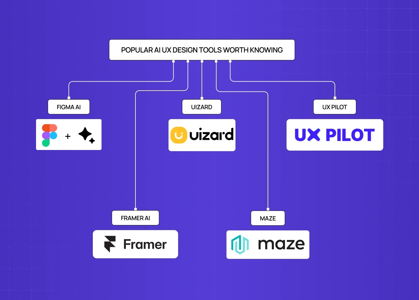
These tools sit across the AI UX design workflow, from ideation to implementation. None replaces a design team, but each removes a specific type of friction in the process.
Among the leading AI design tools,
Figma AI is the most integrated option for teams already working in Figma. It generates UI components, renames layers, and helps explore layouts during ideation. It works best for early-stage concept work and design system maintenance. Output quality requires significant manual refinement before it's production-ready.
Uizard converts rough sketches and wireframes into editable UI screens. Useful for rapid concept validation and communicating design ideas to non-designers before investing in high-fidelity work.
UX Pilot is purpose-built for AI UI generation. It produces more usable first-generation screens than general tools because its model is trained specifically for UX output. Strong for teams that need to move from prompt to iterable interface quickly.
Framer AI generates responsive layouts and can take a product from design to live deployment in one platform. Best suited for website-facing product UI rather than complex application flows.
Maze sits on the research and testing side — one of the AI tools UX designers use specifically for AI-assisted usability testing, pattern detection across user sessions, and automated insight surfacing. Useful for validating AI UX design decisions before shipping rather than after.
For teams building AI-first SaaS products, the tool question matters less than the design decisions being made with them. A well-reasoned AI UX design built in Figma will outperform a poorly structured one built with the most advanced generation tool available.
The AI UX Design Audit: What to Look at First
If you're a product team that has already shipped AI features and isn't seeing adoption, this is the order in which to diagnose and fix the problem.
Audit the capability framing. Find every place in your product where an AI feature is introduced. Ask: does this tell the user specifically what the AI will do for them, in the context of the task they are currently doing? If the answer is no, that is your first fix.
Audit the expectation layer. For every AI output in your product, check whether there is any framing before the output appears. If users are seeing raw AI output with no context about what to expect or how to evaluate it, trust is being destroyed at first contact.
Audit the confidence signals. Every AI output should communicate how certain the AI is, visually or in plain language. If outputs appear with no indication of confidence level, users are left to evaluate them blindly.
Audit the recovery paths. For every AI output state, including correct outputs, wrong outputs, and low-confidence outputs, check whether there is a visible and effortless way to improve, retry, or override. A missing recovery path is a permanent trust-breaker.
Audit the value confirmation. Check whether users receive any indication of what the AI contributed after completing an AI-assisted task. If they don't, habitual adoption will not form regardless of how good the AI is.
Audit the control visibility. Check whether override, edit, and dismiss options are visible in the primary AI interaction surface, not in settings, not after three clicks. If control is buried, users will disengage rather than engage with an AI they feel they cannot manage.
Run this audit before assuming the AI needs to improve. In most cases, at least three of these six will surface fixable issues — and quantifying their impact using UX design ROI methods gives teams the business case to act on findings immediately rather than deferring them to the next sprint.
Where AI UX Design Is Heading in 2026
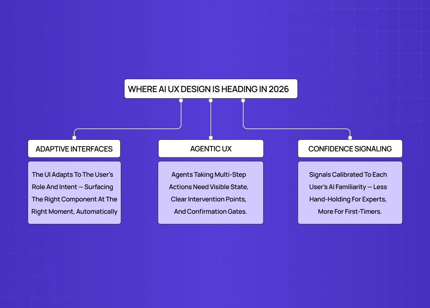
The discipline is moving fast. Three directions are already visible and will define AI UX design for SaaS over the next 12 to 18 months.
Adaptive interfaces represent the clearest direction covered in AI driven UX practices for 2026. The next generation of AI products won't just have AI features sitting inside a conventional interface. The interface itself will adapt based on what the AI knows about the user's behaviour, role, and current task. Instead of navigating menus to find features, users will be served the right interface component for their current intent. The UX design challenge shifts from "how do we design the feature" to "how do we design the rules that govern what the AI surfaces and when."
Agentic AI product design is moving from experimental to production. AI agents that take multi-step actions on behalf of users bring a design challenge fundamentally different from single-output AI features. The design challenge here is fundamentally different from single-output AI features: users need to understand what the agent is doing, why, and how to intervene at any point. Trust architecture for agentic AI requires persistent visibility of agent state, clear intervention points, and explicit confirmation gates before consequential actions are taken — the exact problem space autonomous agent trust design as a discipline exists to map and solve systematically.
Personalised confidence signaling. Right now, confidence signals in AI products are static: the same visual indicator for every user. The next wave will be adaptive, with confidence signals calibrated to the individual user's demonstrated level of AI familiarity. A power user who has acted on AI recommendations 200 times needs less hand-holding than a first-session user. The design system will need to account for this spectrum rather than treating every user identically — a capability that itself maps to where a product team sits on an AI product maturity benchmark, since adaptive confidence signaling is a later-stage capability most teams aren't yet equipped to build.
SaaS teams that design for these directions now rather than retrofitting later will have a meaningful head start on both adoption and retention as the market matures.
Conclusion
AI adoption in SaaS products is not determined by model quality. It's determined by design quality in the critical first session and the ongoing interaction patterns that follow.
Most AI features fail not because the AI is bad, but because users never trusted it enough to rely on it, and that trust is earned or lost in the first 90 seconds
The signs of broken AI UX are visible before adoption data arrives: one-time activations, manual workarounds, ignored outputs, missing recovery paths
The Groto AI Trust Sequence gives product teams five concrete design moments to address, each one a specific lever for converting trial into reliance
Real-world client work across Camb.ai, Pathways, Barista, LearnSphere, and PolicyBazaar confirms the same pattern: the model was not the problem, the design layer was
AI tools like Figma AI, Uizard, and UX Pilot accelerate the process — part of how AI transforming UX development is reshaping workflows — but they don't replace the design decisions that determine whether users trust what gets built.
The direction of the discipline, adaptive interfaces, agentic UX, personalised confidence signaling, means the gap between good and poor AI UX design will widen significantly over the next 18 months
The fix is available now, and it's in the design layer, not the model
At Groto, we design AI product experiences for SaaS teams building for the 5-200 person company. We work across the full AI product design cycle — spanning the complete UX discipline overview from first-session trust architecture and capability framing through to feedback loop design, error state systems, and agentic UX. We have helped SaaS teams who shipped AI features and saw single-digit engagement rates turn those features into primary drivers of retention, without changing the underlying model.


