Segmented Control UI: A Visibility-First Component and How to Stop Misusing It

A practical guide to segmented control UI — what it is, when to use it, and the four misuse patterns that break SaaS dashboards.

Segmented Control UI: A Visibility-First Component and How to Stop Misusing It

A practical guide to segmented control UI — what it is, when to use it, and the four misuse patterns that break SaaS dashboards.

Segmented controls look simple but get misused constantly. This guide breaks down the visibility-first principle behind the component, a three-variable decision framework for when to use it, and the four patterns that cause it to fail in SaaS dashboards.

The segmented control UI component, explained — and why most teams misuse it.
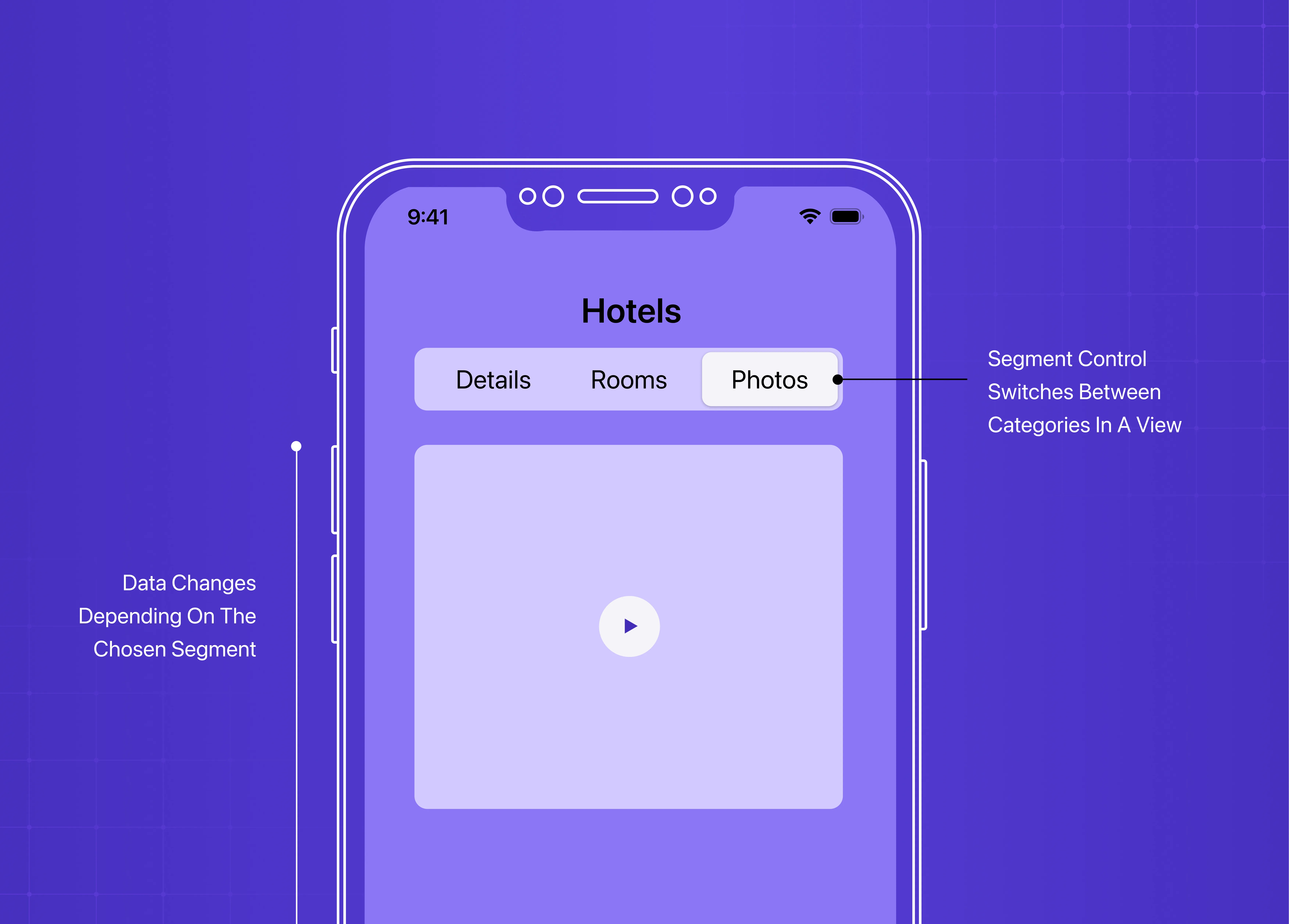
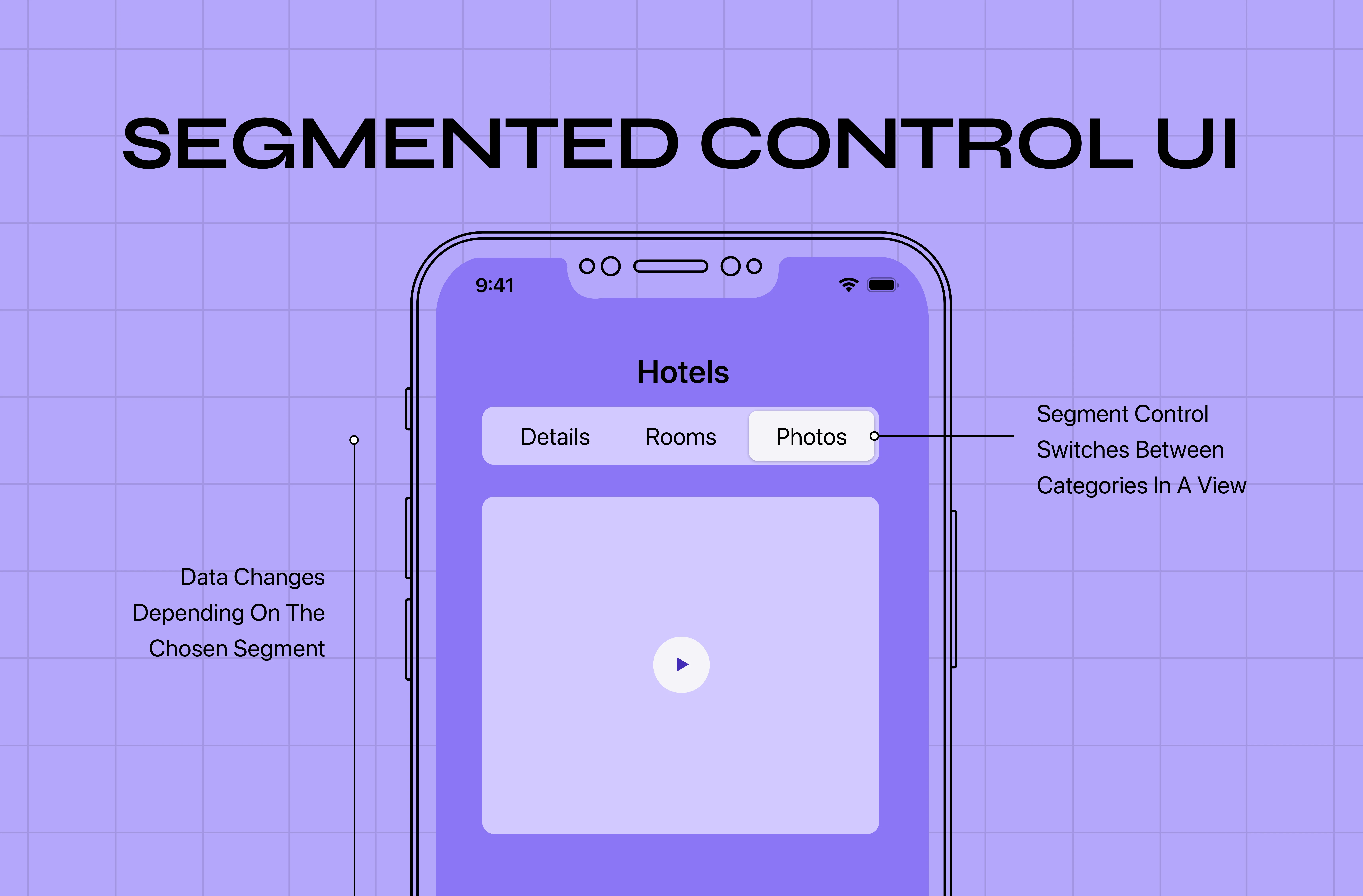
Mobile app interface example showing a segmented control component with tabs for hotel details, rooms, and photos, demonstrating category switching within a single view.

It is also one of the most consistently misused components in product UI design.

The misuse follows a predictable pattern: a designer needs to present a set of options, sees that a segmented control looks clean and compact in a Figma mock-up, and places it in the interface. The component typically enters the design at the high-fidelity wireframe stage — precisely when the visual appeal of a compact solution is strongest and the resistance to reconsidering component choice is lowest. The problem surfaces later — in usability tests, in support tickets, in the analytics — when users can’t find the view they’re looking for, don’t realise they’ve filtered their data, or mistake a local view switch for a navigational element.

The underlying issue is not bad taste in component choice. It’s that most teams implement segmented controls without a clear understanding of why the component works when it works — which means they can’t recognise when a different component would work better.

The core principles of digital product design provide the evaluative framework that makes these component decisions consistent rather than case-by-case. 

A segmented control is a visibility-first component. Its entire value proposition is that the user can see all available options simultaneously without opening a menu, clicking a dropdown, or scrolling through a list. Every design decision about when to use a segmented control — and when to use something else — flows from this single principle. When you use the component in a way that undermines its visibility advantage, you’ve kept the visual overhead without delivering the value.

TL;DR

  • A segmented control shows 2–5 mutually exclusive options in a horizontal row, all visible at once

  • Its core value is visibility — if you undermine that, the component stops working

  • Use it for view switches (same data, different display), not for navigation or data filters

  • 3 decision variables: option count, view vs. content change, local vs. persistent scope

  • The 4 most common misuses: navigation disguised as view switching, 6+ options, page-level mode switches, and replacing a toggle for binary choices

What Is Segmented Control UI?

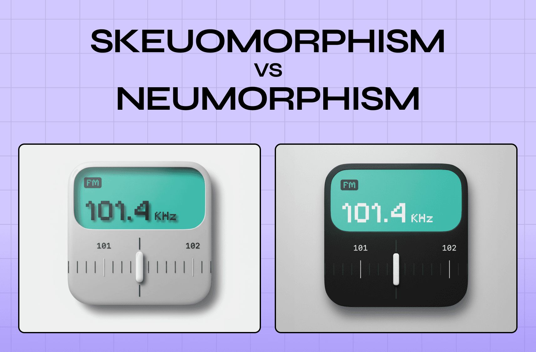
A segmented control UI is a compact, horizontal component that presents a small set of mutually exclusive options — all visible at once — and switches between them instantly on selection. It is one of the most recognisable micro UX design patterns in product interfaces — compact, locally scoped, and instantly interactive — which is also what makes it so easy to misplace without noticing. You’ve seen it in calendar apps switching between Day, Week, and Month; in SaaS dashboards toggling between Table and Card views; in settings panels switching between Personal and Team modes. Unlike a dropdown that hides its options behind a click, or tabs that imply full-page navigation, a segmented control keeps every choice in plain sight. Its visual treatment — and specifically how it communicates selected vs. unselected state — is one of the components most affected by design style movements; the skeuomorphism vs. neumorphism debate plays out most visibly in exactly these kinds of selection-state decisions. 

The UX/UI checklist top SaaS teams actually use

15 essential checks covering onboarding, conversions, and retention. Spot quick wins and fix friction before it costs you signups.

No Spam. Free Lifetime

The UX/UI checklist top SaaS teams actually use

15 essential checks covering onboarding, conversions, and retention. Spot quick wins and fix friction before it costs you signups.

No Spam. Free Lifetime

The Switch Component Selection Map: Choosing Between Segmented Control, Tabs, Toggle, and Radio Buttons
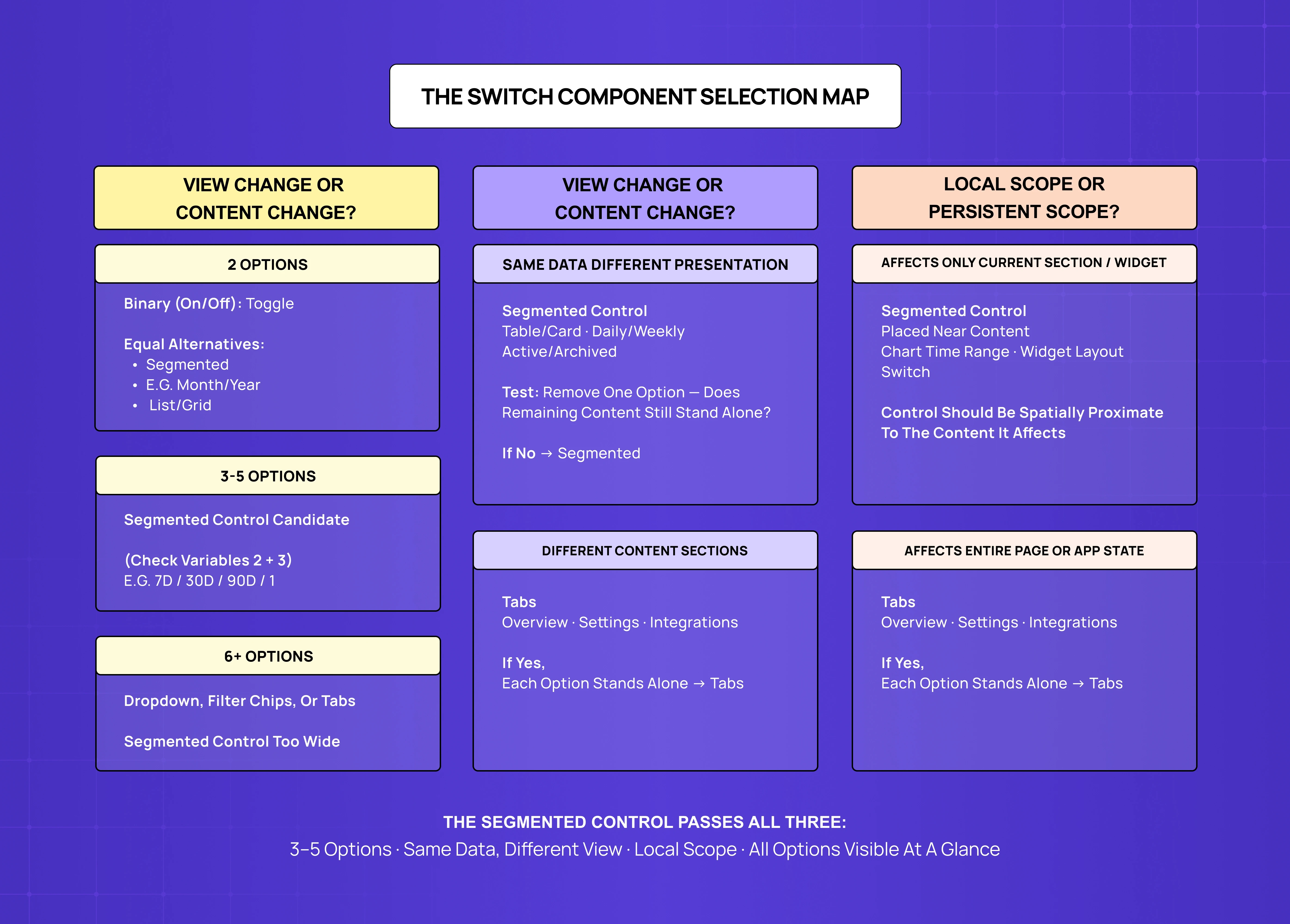
Segmented control selection map explaining when to use toggles, segmented controls, tabs, dropdowns, or filter chips based on content changes, scope, and option count.

Most design teams choose between switching components based on aesthetics or convention. The more reliable basis is three variables: how many options exist, whether the user is changing the content or changing the view, and whether the selection persists across the product or applies only to the current context.

These three questions, answered in sequence, point to the right component in almost every SaaS UI situation.

Variable 1: How Many Options?

  • 2 options: Use a toggle for binary on/off choices. Use a segmented control for two opposing but equal alternatives (“Month / Year,” “List / Grid”) where neither option is the default.

  • 3–5 options: Segmented control is the primary candidate — all options are scannable at a glance, which is where the component’s visibility value is strongest.

  • 6+ options: Wrong component. The row gets too wide, scanning becomes sequential, and the visibility advantage disappears. Use a dropdown, filter chips, or tabs instead.

The distinction between a 2-option toggle and a 2-option segmented control is subtle but important: a toggle implies a binary state with an active and inactive position; a segmented control implies two equal alternatives with no default hierarchy between them.

Variable 2: Content Change or View Change?

  • View change (same data, different presentation — “Table / Card,” “Daily / Weekly / Monthly”): Use a segmented control. The instant, no-navigation switch is exactly right here.

  • Content change (different information, not a different lens on the same data): Use tabs. Tabs signal navigation; segmented controls signal view switching. Mixing them up is a leading cause of user confusion in SaaS dashboards.

  • Quick test: Remove one option — does the remaining content still stand on its own? If yes → tabs. If no → segmented control.

Variable 3: Persistent or Local Scope?

  • Local scope (affects one section or widget only): Use a segmented control. Place it directly adjacent to the content it controls, not at the top of the page.

  • Persistent scope (affects entire page or application state): Use tabs, primary navigation, or a settings-level toggle. A segmented control’s visual weight communicates “small local preference” — not “page-wide mode change.”

What Makes a Segmented Control Work: Design Requirements

When a segmented control is the right component by the Selection Map, the design requirements that determine whether it works are straightforward. They fall into four categories — option count, visual state, sizing, and placement — each of which has accessibility implications that accessibility-first UX practice addresses specifically for interactive selection components like this one. 

Option Count and Label Length

  • Keep labels short: the full control should not be wider than the content it controls

  • Use uniform label treatment — all text or all icons, never mixed

  • Two to five options maximum; beyond that, switch to a different component

Mixed label types create unequal visual weight between segments and suggest that the options have different character or importance, even when they don’t. If labels require more than two or three words, a different presentation — radio buttons with descriptions, a dropdown with subtitles — will communicate better. The label copy in a segmented control is a microcopy decision with direct usability consequences — the UX writing guide for improving microcopy covers the principles that determine whether short-form labels like these communicate immediately or create friction. 

Visual State Clarity

  • Selected state must be distinguishable by value contrast, not colour alone

  • Hover state must look visually different from the selected state — using the same fill for both creates momentary confusion

  • Never rely on colour as the sole indicator of selection

The most reliable pattern is a filled background on the selected segment with sufficient contrast against both the unselected segments and the control’s container background. This keeps the component accessible for users with colour vision deficiencies. The contrast and hierarchy decisions here are a direct application of visual design principles — specifically the relationship between figure-ground contrast and the communication of state change. 

Sizing and Density Matching

  • Match the visual density of the surrounding UI, not a default mobile library spec

  • Height should align with adjacent interactive elements (search fields, buttons)

  • Avoid “large” mobile sizing in data-dense desktop SaaS interfaces

Component sizing should be calibrated to the specific UI context. In data-dense SaaS dashboards, a segmented control at the default “large” size from a mobile component library will feel visually heavy and compete with data-presenting elements for visual weight. The correct specification lives in the design system for SaaS products — where segmented control variants are defined relative to the density of the specific UI contexts they appear in, not imported from a generic mobile spec. 

Placement Relative to Controlled Content

  • The segmented control must be the spatially closest interactive element to the content it controls

  • Widget-level controls belong inside or directly above the widget’s container

  • Page-level controls (e.g., list layout toggle) go directly above the list, not above the fold

If the control appears at the top of a page and affects a chart halfway down, the spatial relationship is broken — the user has to remember that a control they interacted with above the fold is still affecting what they’re seeing below it. This is a direct violation of the proximity principle; the 13 principles of design cover how proximity, contrast, and unity govern component placement decisions like this one. 

The Four Misuse Patterns in SaaS Dashboards
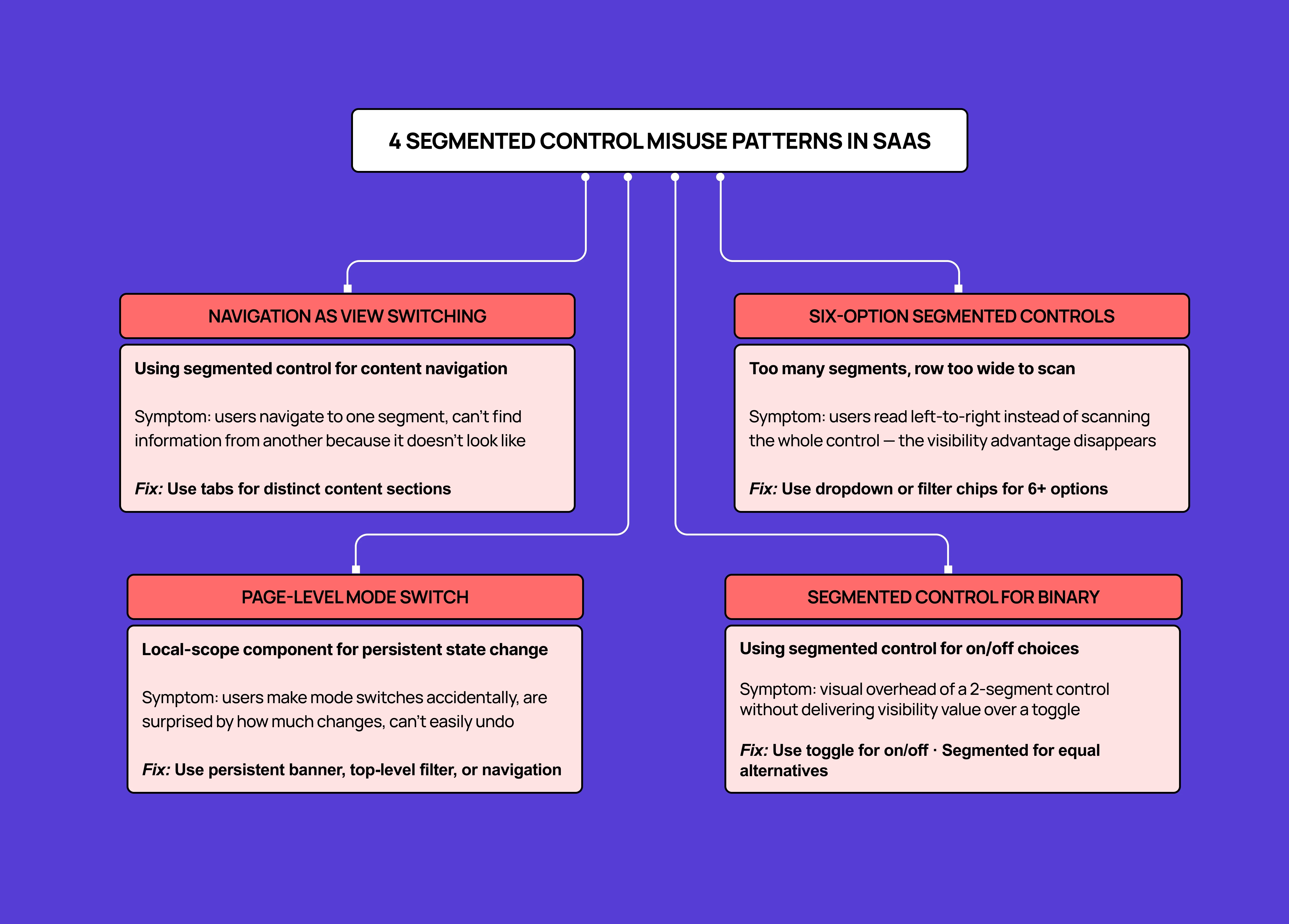
UX anti-patterns diagram showing four common segmented control misuse cases in SaaS products, including navigation misuse, too many options, binary misuse, and page-level mode switching.

SaaS products generate the most instructive segmented control misuse examples because their information density and complexity create pressure to compact switching behaviour into small components. The four patterns below appear consistently in usability studies of SaaS dashboards — and in the broader set of UI/UX mistakes that hurt conversions, where component misselection is one of the most frequently documented failure modes. 

Misuse 1: Navigation Masquerading as View Switching

Using a segmented control to load different content sections, not different views of the same content.

This is the most common and most damaging misuse: a segmented control used to navigate between different sections of a product, where each option loads different information rather than a different view of the same information.

The symptom in user testing: users who have navigated to one “segment” cannot find their way back to information they saw in a previous “segment” because the component’s visual language communicated “this is a view preference” rather than “this is navigation.” They don’t backtrack through the segmented control because it doesn’t look like navigation.

The fix: Use tabs for navigation between distinct content sections, and reserve segmented controls for view switches within a section.

Misuse 2: Six-Option Segmented Controls

More than five options collapses the visibility advantage and signals a deeper architecture problem.

Six or more segments in a horizontal row produce a component that is too wide for most viewport widths and too dense for comfortable scanning. The visibility advantage — being able to see all options simultaneously — is preserved in theory but lost in practice because the options require slow left-to-right scanning rather than a single glance. This problem is most acute on mobile — mobile-first responsive design best practices address how to evaluate horizontal controls against the narrowest expected viewport before finalising option count, which is the check that prevents six-option segmented controls from making it into shipped interfaces. 

More significantly, six-option segmented controls usually indicate that the options being presented are not equal in frequency of use. If two options account for 80% of selections and four options account for 20%, the component is doing the wrong job. A filter architecture with defaults would serve users better.

The fix: For 6+ options, use a dropdown, filter chips, or tabs. If the use case genuinely requires all six options to be simultaneously visible, evaluate whether the entire information architecture around this control needs rethinking.

Misuse 3: Segmented Control as Page-Level Mode Switch

Applying a local-scope component to a choice that changes the entire page state.

When a segmented control switches the entire page between fundamentally different modes — a “Setup / Live” switch that changes the entire product state, or a “Personal / Team” switch that loads an entirely different data context — the component’s local-scope visual language fails to communicate the impact of the choice.

Users in this situation frequently make mode switches accidentally, are surprised by how dramatically the interface changes, and are unsure how to revert. The component communicated “small preference” and delivered “major state change.”

The fix: For page-level mode switches with significant impact, use a more prominent component — a top-level filter, a persistent banner showing the active mode, or explicit navigation. The visual weight of the switching mechanism should match the impact of the switch.

Misuse 4: Segmented Control Replacing a Toggle for Binary Choices

Using a segmented control for binary on/off states where a toggle would communicate the relationship more clearly.

Using a segmented control with two options like “On / Off,” “Yes / No,” or “Enabled / Disabled” adds visual weight without delivering the visibility benefit. A toggle switch communicates binary state more efficiently and with less horizontal space.

The exception is two options that are opposing but not binary — “Month / Year,” “Light / Dark,” “Grid / List” — where a segmented control is correct because the options don’t have an active/inactive relationship.

The fix: If one option could be described as “the default” and the other as “the alternate setting,” use a toggle. If both options are equally valid first-choice options with no implied hierarchy, a segmented control is right.

Segmented Controls in SaaS Dashboard Design
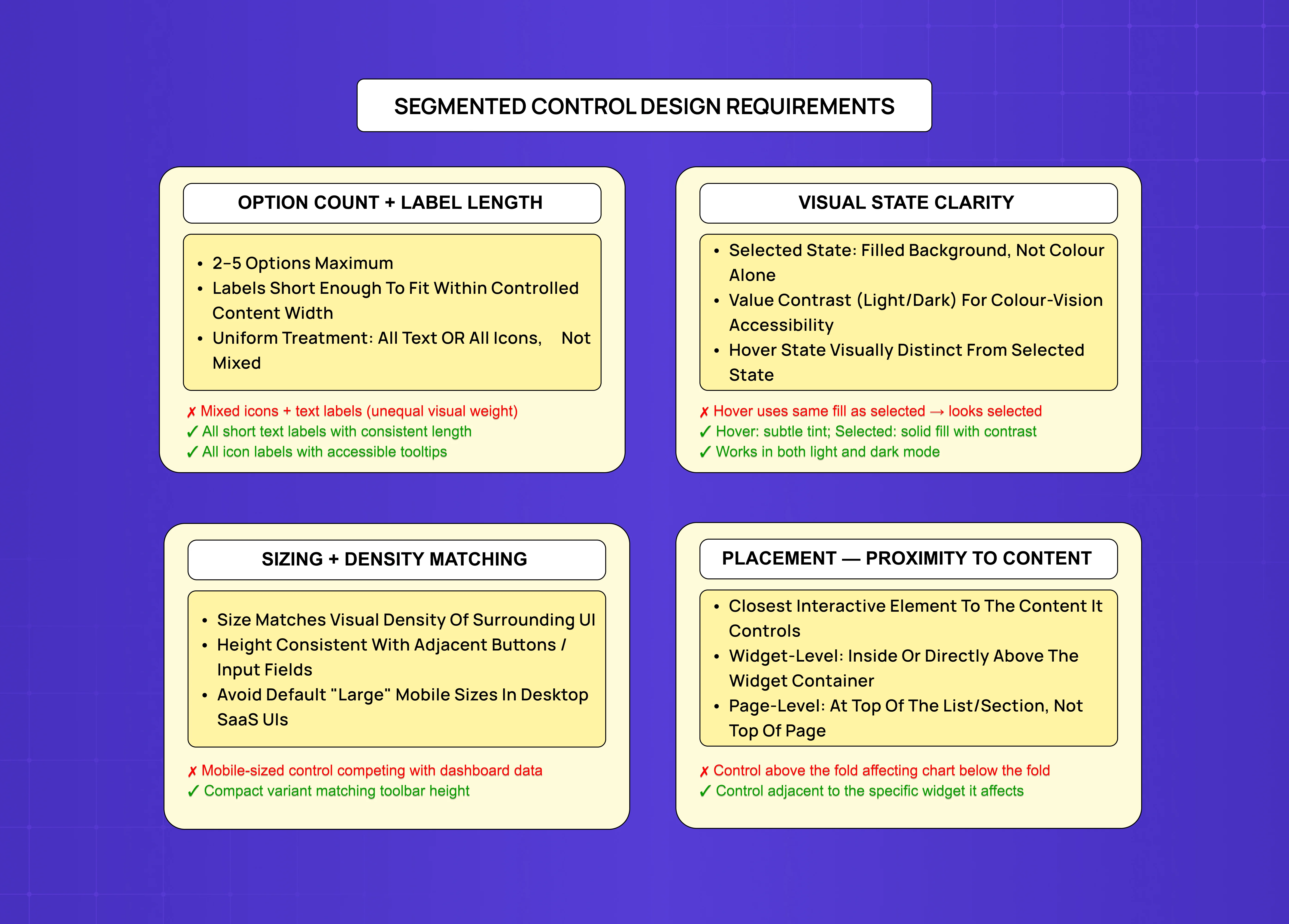
Segmented control design requirements board covering option count, label length, visual state clarity, sizing, density matching, and placement proximity to controlled content.

For SaaS products, the highest-value applications of segmented controls are in data visualisation contexts: time range selectors attached to charts (“7D / 30D / 90D / 1Y”), view type selectors for list data (“All / Active / Archived”), and layout switchers for content grids (“List / Grid / Board”). How these patterns fit into a well-structured SaaS dashboard is covered in the guide to designing SaaS dashboards users actually understand — the segmented control decisions described here are one component of a broader dashboard design architecture. 

These applications work because they satisfy all three variables of the Selection Map: option count is small (3–4), the switch is a view change not a content change, and the scope is local to the specific chart or list it’s attached to.

Where segmented controls work well in SaaS dashboards:

  • Time range selectors on charts (“7D / 30D / 90D / 1Y”)

  • View type selectors (“All / Active / Archived”)

  • Layout switchers (“List / Grid / Board”)

Where they consistently cause problems:

  •  Acting as data filters without an explicit “filter active” state

  • Controlling an entire page’s information context

  • Replacing primary navigation between distinct product sections

The applications that cause problems are the ones that use segmented controls to reduce cognitive overhead in complex filtering — trying to put all the most-used filters into a segmented control to avoid a “Show filters” drawer or a full filter bar. This trades the complexity of an explicit filter interface for the ambiguity of a component that doesn’t communicate that it’s filtering.

When a segmented control acts as a filter, users often don’t realise they’re looking at filtered data. The absence of an explicit “filter active” state — which a filter chip or filter bar would provide — means users may be reading filtered metrics without knowing the filter is applied. In a financial dashboard, this could mean a user comparing numbers across views without realising the “Active” segment in one chart is filtering out churned customers that the “All” state of another chart includes.

The design principle for SaaS dashboards: segmented controls are view presentation controls, not data filters. The distinction determines whether users understand what they’re looking at. Segmented controls remain one of the most consistently used interactive patterns across mobile and web; mobile app UI/UX design trends for 2026 show the component evolving toward more contextual, data-aware implementations — which makes the view vs. filter distinction more critical as the pattern expands into more complex product interfaces. 

Key Takeaways

  • A segmented control is a visibility-first component. Its value is letting users see all options simultaneously. Any misuse that undermines this visibility advantage — too many options, too wide a viewport, wrong placement — removes the value while keeping the visual overhead.

  • The Switch Component Selection Map uses three variables to choose the right component: option count (2 = toggle or segmented, 3–5 = segmented, 6+ = dropdown/tabs), view change vs. content change (view = segmented, content = tabs), and scope (local = segmented, persistent = tabs/navigation).

  • The four SaaS misuse patterns are: navigation masquerading as view switching, six-option segmented controls, page-level mode switches using local-scope components, and segmented controls replacing toggles for binary choices.

  • In SaaS dashboards, segmented controls work best as view presentation controls attached to specific data widgets — not as data filters, not as primary navigation, and not as page-level mode switches.

  • Component sizing and placement relative to controlled content are the most commonly under-specified design requirements in segmented control implementations. The control should match the density of its surrounding UI and be spatially proximate to the content it affects.

Segmented controls look simple but get misused constantly. This guide breaks down the visibility-first principle behind the component, a three-variable decision framework for when to use it, and the four patterns that cause it to fail in SaaS dashboards.

The segmented control UI component, explained — and why most teams misuse it.

Mobile app interface example showing a segmented control component with tabs for hotel details, rooms, and photos, demonstrating category switching within a single view.

It is also one of the most consistently misused components in product UI design.

The misuse follows a predictable pattern: a designer needs to present a set of options, sees that a segmented control looks clean and compact in a Figma mock-up, and places it in the interface. The component typically enters the design at the high-fidelity wireframe stage — precisely when the visual appeal of a compact solution is strongest and the resistance to reconsidering component choice is lowest. The problem surfaces later — in usability tests, in support tickets, in the analytics — when users can’t find the view they’re looking for, don’t realise they’ve filtered their data, or mistake a local view switch for a navigational element.

The underlying issue is not bad taste in component choice. It’s that most teams implement segmented controls without a clear understanding of why the component works when it works — which means they can’t recognise when a different component would work better.

The core principles of digital product design provide the evaluative framework that makes these component decisions consistent rather than case-by-case. 

A segmented control is a visibility-first component. Its entire value proposition is that the user can see all available options simultaneously without opening a menu, clicking a dropdown, or scrolling through a list. Every design decision about when to use a segmented control — and when to use something else — flows from this single principle. When you use the component in a way that undermines its visibility advantage, you’ve kept the visual overhead without delivering the value.

TL;DR

  • A segmented control shows 2–5 mutually exclusive options in a horizontal row, all visible at once

  • Its core value is visibility — if you undermine that, the component stops working

  • Use it for view switches (same data, different display), not for navigation or data filters

  • 3 decision variables: option count, view vs. content change, local vs. persistent scope

  • The 4 most common misuses: navigation disguised as view switching, 6+ options, page-level mode switches, and replacing a toggle for binary choices

What Is Segmented Control UI?

A segmented control UI is a compact, horizontal component that presents a small set of mutually exclusive options — all visible at once — and switches between them instantly on selection. It is one of the most recognisable micro UX design patterns in product interfaces — compact, locally scoped, and instantly interactive — which is also what makes it so easy to misplace without noticing. You’ve seen it in calendar apps switching between Day, Week, and Month; in SaaS dashboards toggling between Table and Card views; in settings panels switching between Personal and Team modes. Unlike a dropdown that hides its options behind a click, or tabs that imply full-page navigation, a segmented control keeps every choice in plain sight. Its visual treatment — and specifically how it communicates selected vs. unselected state — is one of the components most affected by design style movements; the skeuomorphism vs. neumorphism debate plays out most visibly in exactly these kinds of selection-state decisions. 

The UX/UI checklist top SaaS teams actually use

15 essential checks covering onboarding, conversions, and retention. Spot quick wins and fix friction before it costs you signups.

No Spam. Free Lifetime

The Switch Component Selection Map: Choosing Between Segmented Control, Tabs, Toggle, and Radio Buttons

Segmented control selection map explaining when to use toggles, segmented controls, tabs, dropdowns, or filter chips based on content changes, scope, and option count.

Most design teams choose between switching components based on aesthetics or convention. The more reliable basis is three variables: how many options exist, whether the user is changing the content or changing the view, and whether the selection persists across the product or applies only to the current context.

These three questions, answered in sequence, point to the right component in almost every SaaS UI situation.

Variable 1: How Many Options?

  • 2 options: Use a toggle for binary on/off choices. Use a segmented control for two opposing but equal alternatives (“Month / Year,” “List / Grid”) where neither option is the default.

  • 3–5 options: Segmented control is the primary candidate — all options are scannable at a glance, which is where the component’s visibility value is strongest.

  • 6+ options: Wrong component. The row gets too wide, scanning becomes sequential, and the visibility advantage disappears. Use a dropdown, filter chips, or tabs instead.

The distinction between a 2-option toggle and a 2-option segmented control is subtle but important: a toggle implies a binary state with an active and inactive position; a segmented control implies two equal alternatives with no default hierarchy between them.

Variable 2: Content Change or View Change?

  • View change (same data, different presentation — “Table / Card,” “Daily / Weekly / Monthly”): Use a segmented control. The instant, no-navigation switch is exactly right here.

  • Content change (different information, not a different lens on the same data): Use tabs. Tabs signal navigation; segmented controls signal view switching. Mixing them up is a leading cause of user confusion in SaaS dashboards.

  • Quick test: Remove one option — does the remaining content still stand on its own? If yes → tabs. If no → segmented control.

Variable 3: Persistent or Local Scope?

  • Local scope (affects one section or widget only): Use a segmented control. Place it directly adjacent to the content it controls, not at the top of the page.

  • Persistent scope (affects entire page or application state): Use tabs, primary navigation, or a settings-level toggle. A segmented control’s visual weight communicates “small local preference” — not “page-wide mode change.”

What Makes a Segmented Control Work: Design Requirements

When a segmented control is the right component by the Selection Map, the design requirements that determine whether it works are straightforward. They fall into four categories — option count, visual state, sizing, and placement — each of which has accessibility implications that accessibility-first UX practice addresses specifically for interactive selection components like this one. 

Option Count and Label Length

  • Keep labels short: the full control should not be wider than the content it controls

  • Use uniform label treatment — all text or all icons, never mixed

  • Two to five options maximum; beyond that, switch to a different component

Mixed label types create unequal visual weight between segments and suggest that the options have different character or importance, even when they don’t. If labels require more than two or three words, a different presentation — radio buttons with descriptions, a dropdown with subtitles — will communicate better. The label copy in a segmented control is a microcopy decision with direct usability consequences — the UX writing guide for improving microcopy covers the principles that determine whether short-form labels like these communicate immediately or create friction. 

Visual State Clarity

  • Selected state must be distinguishable by value contrast, not colour alone

  • Hover state must look visually different from the selected state — using the same fill for both creates momentary confusion

  • Never rely on colour as the sole indicator of selection

The most reliable pattern is a filled background on the selected segment with sufficient contrast against both the unselected segments and the control’s container background. This keeps the component accessible for users with colour vision deficiencies. The contrast and hierarchy decisions here are a direct application of visual design principles — specifically the relationship between figure-ground contrast and the communication of state change. 

Sizing and Density Matching

  • Match the visual density of the surrounding UI, not a default mobile library spec

  • Height should align with adjacent interactive elements (search fields, buttons)

  • Avoid “large” mobile sizing in data-dense desktop SaaS interfaces

Component sizing should be calibrated to the specific UI context. In data-dense SaaS dashboards, a segmented control at the default “large” size from a mobile component library will feel visually heavy and compete with data-presenting elements for visual weight. The correct specification lives in the design system for SaaS products — where segmented control variants are defined relative to the density of the specific UI contexts they appear in, not imported from a generic mobile spec. 

Placement Relative to Controlled Content

  • The segmented control must be the spatially closest interactive element to the content it controls

  • Widget-level controls belong inside or directly above the widget’s container

  • Page-level controls (e.g., list layout toggle) go directly above the list, not above the fold

If the control appears at the top of a page and affects a chart halfway down, the spatial relationship is broken — the user has to remember that a control they interacted with above the fold is still affecting what they’re seeing below it. This is a direct violation of the proximity principle; the 13 principles of design cover how proximity, contrast, and unity govern component placement decisions like this one. 

The Four Misuse Patterns in SaaS Dashboards

UX anti-patterns diagram showing four common segmented control misuse cases in SaaS products, including navigation misuse, too many options, binary misuse, and page-level mode switching.

SaaS products generate the most instructive segmented control misuse examples because their information density and complexity create pressure to compact switching behaviour into small components. The four patterns below appear consistently in usability studies of SaaS dashboards — and in the broader set of UI/UX mistakes that hurt conversions, where component misselection is one of the most frequently documented failure modes. 

Misuse 1: Navigation Masquerading as View Switching

Using a segmented control to load different content sections, not different views of the same content.

This is the most common and most damaging misuse: a segmented control used to navigate between different sections of a product, where each option loads different information rather than a different view of the same information.

The symptom in user testing: users who have navigated to one “segment” cannot find their way back to information they saw in a previous “segment” because the component’s visual language communicated “this is a view preference” rather than “this is navigation.” They don’t backtrack through the segmented control because it doesn’t look like navigation.

The fix: Use tabs for navigation between distinct content sections, and reserve segmented controls for view switches within a section.

Misuse 2: Six-Option Segmented Controls

More than five options collapses the visibility advantage and signals a deeper architecture problem.

Six or more segments in a horizontal row produce a component that is too wide for most viewport widths and too dense for comfortable scanning. The visibility advantage — being able to see all options simultaneously — is preserved in theory but lost in practice because the options require slow left-to-right scanning rather than a single glance. This problem is most acute on mobile — mobile-first responsive design best practices address how to evaluate horizontal controls against the narrowest expected viewport before finalising option count, which is the check that prevents six-option segmented controls from making it into shipped interfaces. 

More significantly, six-option segmented controls usually indicate that the options being presented are not equal in frequency of use. If two options account for 80% of selections and four options account for 20%, the component is doing the wrong job. A filter architecture with defaults would serve users better.

The fix: For 6+ options, use a dropdown, filter chips, or tabs. If the use case genuinely requires all six options to be simultaneously visible, evaluate whether the entire information architecture around this control needs rethinking.

Misuse 3: Segmented Control as Page-Level Mode Switch

Applying a local-scope component to a choice that changes the entire page state.

When a segmented control switches the entire page between fundamentally different modes — a “Setup / Live” switch that changes the entire product state, or a “Personal / Team” switch that loads an entirely different data context — the component’s local-scope visual language fails to communicate the impact of the choice.

Users in this situation frequently make mode switches accidentally, are surprised by how dramatically the interface changes, and are unsure how to revert. The component communicated “small preference” and delivered “major state change.”

The fix: For page-level mode switches with significant impact, use a more prominent component — a top-level filter, a persistent banner showing the active mode, or explicit navigation. The visual weight of the switching mechanism should match the impact of the switch.

Misuse 4: Segmented Control Replacing a Toggle for Binary Choices

Using a segmented control for binary on/off states where a toggle would communicate the relationship more clearly.

Using a segmented control with two options like “On / Off,” “Yes / No,” or “Enabled / Disabled” adds visual weight without delivering the visibility benefit. A toggle switch communicates binary state more efficiently and with less horizontal space.

The exception is two options that are opposing but not binary — “Month / Year,” “Light / Dark,” “Grid / List” — where a segmented control is correct because the options don’t have an active/inactive relationship.

The fix: If one option could be described as “the default” and the other as “the alternate setting,” use a toggle. If both options are equally valid first-choice options with no implied hierarchy, a segmented control is right.

Segmented Controls in SaaS Dashboard Design

Segmented control design requirements board covering option count, label length, visual state clarity, sizing, density matching, and placement proximity to controlled content.

For SaaS products, the highest-value applications of segmented controls are in data visualisation contexts: time range selectors attached to charts (“7D / 30D / 90D / 1Y”), view type selectors for list data (“All / Active / Archived”), and layout switchers for content grids (“List / Grid / Board”). How these patterns fit into a well-structured SaaS dashboard is covered in the guide to designing SaaS dashboards users actually understand — the segmented control decisions described here are one component of a broader dashboard design architecture. 

These applications work because they satisfy all three variables of the Selection Map: option count is small (3–4), the switch is a view change not a content change, and the scope is local to the specific chart or list it’s attached to.

Where segmented controls work well in SaaS dashboards:

  • Time range selectors on charts (“7D / 30D / 90D / 1Y”)

  • View type selectors (“All / Active / Archived”)

  • Layout switchers (“List / Grid / Board”)

Where they consistently cause problems:

  •  Acting as data filters without an explicit “filter active” state

  • Controlling an entire page’s information context

  • Replacing primary navigation between distinct product sections

The applications that cause problems are the ones that use segmented controls to reduce cognitive overhead in complex filtering — trying to put all the most-used filters into a segmented control to avoid a “Show filters” drawer or a full filter bar. This trades the complexity of an explicit filter interface for the ambiguity of a component that doesn’t communicate that it’s filtering.

When a segmented control acts as a filter, users often don’t realise they’re looking at filtered data. The absence of an explicit “filter active” state — which a filter chip or filter bar would provide — means users may be reading filtered metrics without knowing the filter is applied. In a financial dashboard, this could mean a user comparing numbers across views without realising the “Active” segment in one chart is filtering out churned customers that the “All” state of another chart includes.

The design principle for SaaS dashboards: segmented controls are view presentation controls, not data filters. The distinction determines whether users understand what they’re looking at. Segmented controls remain one of the most consistently used interactive patterns across mobile and web; mobile app UI/UX design trends for 2026 show the component evolving toward more contextual, data-aware implementations — which makes the view vs. filter distinction more critical as the pattern expands into more complex product interfaces. 

Key Takeaways

  • A segmented control is a visibility-first component. Its value is letting users see all options simultaneously. Any misuse that undermines this visibility advantage — too many options, too wide a viewport, wrong placement — removes the value while keeping the visual overhead.

  • The Switch Component Selection Map uses three variables to choose the right component: option count (2 = toggle or segmented, 3–5 = segmented, 6+ = dropdown/tabs), view change vs. content change (view = segmented, content = tabs), and scope (local = segmented, persistent = tabs/navigation).

  • The four SaaS misuse patterns are: navigation masquerading as view switching, six-option segmented controls, page-level mode switches using local-scope components, and segmented controls replacing toggles for binary choices.

  • In SaaS dashboards, segmented controls work best as view presentation controls attached to specific data widgets — not as data filters, not as primary navigation, and not as page-level mode switches.

  • Component sizing and placement relative to controlled content are the most commonly under-specified design requirements in segmented control implementations. The control should match the density of its surrounding UI and be spatially proximate to the content it affects.

Have a project in mind?

Let’s talk through your idea and see what makes sense.

Harpreet Singh

Founder at Groto

Have a project in mind?

Let’s talk through your idea and see what makes sense.

Harpreet Singh

Founder at Groto

FAQ

Everything you were going to ask (and a few things you didn’t know to)

How should segmented controls be sized in a SaaS dashboard?

Segmented control sizing should match the visual density of the surrounding interface. In data-dense SaaS dashboards, use the smallest size variant that remains readable and easily clickable — typically matching the height of adjacent buttons or input fields. Controls attached to specific widgets (a time range selector on a chart) should be sized relative to the widget, not relative to the page. Controls in a top-level toolbar should match the height and visual weight of other toolbar elements. Avoid using default "large" sizing from mobile component libraries in desktop SaaS interfaces — the result is a component that visually dominates the data it's meant to control.

What is the difference between segmented control and segmented button?

The names refer to the same component type — the difference is purely platform convention. Apple’s Human Interface Guidelines call it a segmented control; Google’s Material Design calls it a segmented button. Functionally, both are horizontal rows of mutually exclusive options that switch instantly on selection. If you’re designing for iOS or following Apple conventions, the term is segmented control. If you’re working within Material Design or Android, segmented button is the correct label. The design principles and misuse patterns covered in this post apply equally to both.

What is the difference between tabs and segmented controls?

Use a segmented control when the user is switching between different views or presentations of the same underlying content — the data doesn’t change, the display format does. Use tabs when the user is navigating between different content sections — each option loads substantively different information. The practical test: remove one option from the set. Does the remaining content still stand on its own as independently meaningful? If yes, use tabs. If no — because the options are just different lenses on the same data — use a segmented control. Mixing up these two components is one of the most common sources of user confusion in SaaS dashboards, because they look visually similar but imply very different interaction models.


Can segmented controls be used vertically?

Vertical segmented controls exist in some design systems but are uncommon and generally less effective than their horizontal counterparts. The simultaneous visibility advantage works best in horizontal orientation for left-to-right reading cultures, where the eye naturally scans across a row. Vertical segmented controls are more easily confused with radio buttons in visual hierarchy. If the use case requires vertical presentation due to horizontal space constraints, radio buttons are usually the cleaner, more convention-respecting choice.
What are the accessibility requirements for segmented controls?

Segmented controls require several accessibility considerations. Selected vs unselected states must be distinguishable by more than colour alone — value contrast (light/dark difference) is needed for users with colour vision deficiencies. Keyboard navigation should support moving between segments using arrow keys, with the selected state updated on focus or via Enter/Space. Screen reader implementation should use the role="radiogroup" pattern with each segment using role="radio" and aria-checked to communicate state. Tab order should reach the segmented control as a group, with internal navigation handled by arrow keys rather than Tab stops for each individual segment.

What are the different types of buttons in UI?

Answer: UI buttons broadly fall into several types — primary buttons (high emphasis, main call-to-action), secondary buttons (medium emphasis, alternative actions), ghost or outlined buttons (low emphasis, tertiary actions), icon buttons (action through visual symbol alone), toggle buttons (switching between two states), and segmented controls (mutually exclusive selection across 2–5 options shown simultaneously). The distinction between a toggle button and a segmented control is often misunderstood — a toggle button communicates binary on/off state, while a segmented control presents equal-weight alternatives with no implied default hierarchy between them.

How should segmented controls be sized in a SaaS dashboard?

Segmented control sizing should match the visual density of the surrounding interface. In data-dense SaaS dashboards, use the smallest size variant that remains readable and easily clickable — typically matching the height of adjacent buttons or input fields. Controls attached to specific widgets (a time range selector on a chart) should be sized relative to the widget, not relative to the page. Controls in a top-level toolbar should match the height and visual weight of other toolbar elements. Avoid using default "large" sizing from mobile component libraries in desktop SaaS interfaces — the result is a component that visually dominates the data it's meant to control.

What is the difference between segmented control and segmented button?

The names refer to the same component type — the difference is purely platform convention. Apple’s Human Interface Guidelines call it a segmented control; Google’s Material Design calls it a segmented button. Functionally, both are horizontal rows of mutually exclusive options that switch instantly on selection. If you’re designing for iOS or following Apple conventions, the term is segmented control. If you’re working within Material Design or Android, segmented button is the correct label. The design principles and misuse patterns covered in this post apply equally to both.

What is the difference between tabs and segmented controls?

Use a segmented control when the user is switching between different views or presentations of the same underlying content — the data doesn’t change, the display format does. Use tabs when the user is navigating between different content sections — each option loads substantively different information. The practical test: remove one option from the set. Does the remaining content still stand on its own as independently meaningful? If yes, use tabs. If no — because the options are just different lenses on the same data — use a segmented control. Mixing up these two components is one of the most common sources of user confusion in SaaS dashboards, because they look visually similar but imply very different interaction models.

Can segmented controls be used vertically?

Vertical segmented controls exist in some design systems but are uncommon and generally less effective than their horizontal counterparts. The simultaneous visibility advantage works best in horizontal orientation for left-to-right reading cultures, where the eye naturally scans across a row. Vertical segmented controls are more easily confused with radio buttons in visual hierarchy. If the use case requires vertical presentation due to horizontal space constraints, radio buttons are usually the cleaner, more convention-respecting choice.

What are the accessibility requirements for segmented controls?

Segmented controls require several accessibility considerations. Selected vs unselected states must be distinguishable by more than colour alone — value contrast (light/dark difference) is needed for users with colour vision deficiencies. Keyboard navigation should support moving between segments using arrow keys, with the selected state updated on focus or via Enter/Space. Screen reader implementation should use the role="radiogroup" pattern with each segment using role="radio" and aria-checked to communicate state. Tab order should reach the segmented control as a group, with internal navigation handled by arrow keys rather than Tab stops for each individual segment.

What are the different types of buttons in UI?

Answer: UI buttons broadly fall into several types — primary buttons (high emphasis, main call-to-action), secondary buttons (medium emphasis, alternative actions), ghost or outlined buttons (low emphasis, tertiary actions), icon buttons (action through visual symbol alone), toggle buttons (switching between two states), and segmented controls (mutually exclusive selection across 2–5 options shown simultaneously). The distinction between a toggle button and a segmented control is often misunderstood — a toggle button communicates binary on/off state, while a segmented control presents equal-weight alternatives with no implied default hierarchy between them.

More Articles

Extreme close-up black and white photograph of a human eye

Let’s bring your vision to life

Tell us what's on your mind? We'll hit you back in 24 hours. No fluff, no delays - just a solid vision to bring your idea to life.

Profile portrait of a man in a white shirt against a light background

Harpreet Singh

Founder and Creative Director

Get in Touch

Extreme close-up black and white photograph of a human eye

Let’s bring your vision to life

Tell us what's on your mind? We'll hit you back in 24 hours. No fluff, no delays - just a solid vision to bring your idea to life.

Profile portrait of a man in a white shirt against a light background

Harpreet Singh

Founder and Creative Director

Get in Touch

Extreme close-up black and white photograph of a human eye

Let’s bring your vision to life

Tell us what's on your mind? We'll hit you back in 24 hours. No fluff, no delays - just a solid vision to bring your idea to life.

Profile portrait of a man in a white shirt against a light background

Harpreet Singh

Founder and Creative Director

Get in Touch