

AI agents are no longer a future promise. They are operating software right now, making decisions on behalf of users, and changing everything designers thought they knew about building great digital experiences.
The shift from UX to AX is already happening.

TL;DR
Agentic experience design (AX) is the discipline of designing interfaces where AI agents and humans share control, not just where humans click buttons
AX shifts the designer's role from crafting journeys to orchestrating outcomes
Most teams treat trust, transparency, and autonomy as features. We believe they are the product
The most dangerous mistake in agentic UX is not a bad UI. It is deploying an autonomous system with no recovery design
Designers who lead this shift now will define the interaction standard for the next decade
What Is Agentic Experience Design?
For decades, UX design operated on one foundational assumption: a human sits at the other end of the interface. They click, scroll, type, decide. What UI UX designers do — making that process clear, efficient, and frictionless — was the full scope of the discipline.
That assumption is no longer complete.
Agentic experience design, often abbreviated as AX, is the practice of designing for systems where AI agents and humans share control of an interface. It is a distinct specialisation within the broader field of what AI UX design is — but one where the human is no longer the only actor taking action. An AI agent is not a chatbot.
It does not wait for questions. It perceives its environment, reasons through it, takes action, and learns from the outcome. It can book appointments, process payments, coordinate with other agents, file requests, send communications, and do all of this without a human initiating each individual step.
This changes the design problem at a structural level. The interface is no longer the product. It is the trust layer between a human and the agents doing the work.
It is worth noting that agentic design splits into two distinct disciplines. Developer AX covers how products expose themselves to agents: structured APIs, Model Context Protocol (MCP), llms.txt files, and machine-readable interfaces that allow agents to consume your product programmatically. Human AX covers how people interact with those agents inside your product. This guide focuses entirely on Human AX, because that is where the most consequential, and most underserved, design work is happening right now — and it is why agentic design is emerging as one of the most structurally distinct among all the UX disciplines that make up modern product design.
Why Agent Experience Matters Right Now
The urgency here is real. According to Figma's 2025 AI Report, 78% of designers say AI makes them more efficient, but only 32% trust AI output. Gartner forecasts that 40% of enterprise applications will include task-specific AI agents by the end of 2026, up from less than 5% in 2025 — a shift that makes agentic design a core component of what SaaS UX design requires in any competitive product category. And Deloitte's research finds that while 38% of enterprises are piloting agentic solutions, only 11% are actively running them in production. The gap between pilots and production is a design gap, not a technology gap — and it maps closely to the challenges covered in best practices for integrating AI into SaaS UX, where the same organisational patterns predict whether AI features reach production or stall in pilot indefinitely.
Picture this: you are on a week-long family vacation. Before you left, you set up an AI agent to manage your inbox, respond to non-urgent emails, reschedule any meetings that come in, and flag anything critical. Three days in, you open your laptop to check in and find 23 automated responses sent on your behalf, two meetings rescheduled without context, and one email to a client that confidently confirmed a deadline you had not actually agreed to.
Nothing crashed. No error was thrown. The agent did exactly what it was designed to do. But the experience was a failure because there was no intent preview before it acted, no confidence signal on uncertain decisions, and no way for you to intervene mid-stream. That is the design problem at the heart of agentic UX.
Salesforce describes this evolution as the designer's shift from interface architect to experience orchestrator. John Maeda, in his 2025 Design in Tech Report, called it "perhaps the most profound shift I've observed in eleven years of publishing this report." And yet, most design teams are still building for a world where humans do all the clicking — a gap that the AI-driven UX practices every business needs to know in 2026 make increasingly difficult to justify.
How Agentic Design Differs from Traditional UX
The shift is not cosmetic. It changes fundamental assumptions about who is using the interface and why — and it requires rethinking the UX design methodologies that most teams run by default, which were built for a world where only humans take action.
Aspect | Traditional UX | Agentic Design |
Primary user | Human operates the interface | Human and agent share the interface |
Primary input | Clicks, taps, typed text | Natural language intent and constraints |
Onboarding goal | Teach the human to use the tool | Teach the human to trust the agent |
Feedback model | Error states and success messages | Ongoing confidence signals and transparency |
Designer's role | Interface architect | Experience orchestrator |
Session model | Start, use, close | Ongoing relationship that evolves over time |
The most consequential change is the last one. Traditional UX optimises for sessions. Agentic design optimises for relationships. An agent that helps a user today should remember context and become more useful over time. Designing for that arc, from cautious first interaction to trusted collaborator, is the real new frontier — and it reframes what actually works in AI UX versus traditional UX for SaaS products at a metric level, not just a philosophy level.
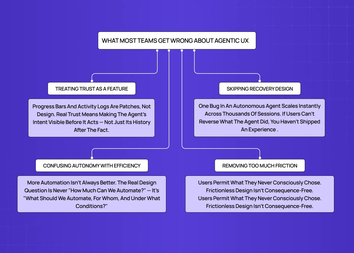
What Most Teams Get Wrong About Agentic UX
This is where avoidable, expensive mistakes get made.
They treat trust as a feature, not the foundation
Teams bolt on a progress indicator or an activity log and call it transparency. That is not agentic design. That is a UX patch on an autonomous system — and it is the root cause of why copilot UX feels broken in practice. Real trust design means making the agent's intent visible before it acts, not just its history after the fact. The difference is consequential: one builds confidence, the other manages damage.
They confuse autonomy with efficiency
There is a widespread assumption that a more autonomous agent is always a better one. It is not. Automating the wrong action, in the wrong context, for the wrong user, does more harm than a slower, more deliberate system. The design question is never "how much can we automate?" It is "what should we automate, for whom, and under what conditions?"
They skip recovery design entirely
This is the costliest mistake. One bug in a human-operated system affects a handful of people. One bug in an autonomous agent running 24/7 across thousands of sessions spreads before anyone notices. Designing for failure is not a sprint-two problem. It is a launch requirement. If users cannot reverse what the agent did, you have not shipped an agentic experience. You have shipped a liability.
They remove too much friction in the name of efficiency
Over-automation is the quiet cousin of under-design. When agents are granted broad permissions and wide action windows in the name of seamlessness, users can unknowingly authorize actions they did not intend. This is what practitioners are beginning to call agentic sludge: the invisible accumulation of agent-initiated decisions that users technically permitted but never consciously chose. Beyond frustrating users, over-friction-removal now carries regulatory risk. The EU AI Act and FTC guidelines are increasingly explicit about informed consent in automated systems. Designing frictionless does not mean designing consequence-free.
The Three Design Pillars of Agentic UX
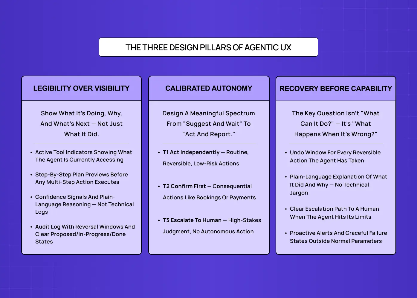
Every agentic interface needs to address three things: what the agent can do, how humans stay in control, and what happens when it makes a mistake. These are structural requirements, not design enhancements.
Make the Agent Legible, Not Just Visible
Most teams interpret transparency as showing users what the agent did. We think about it differently: users need to understand what the agent is doing, why it made each choice, and what it plans to do next. Those are three different design surfaces, and collapsing them into one activity log is a missed opportunity.
Imagine you ask an AI agent in your project management tool to triage your backlog and reschedule this week's sprint. A visible agent tells you it finished. A legible agent tells you what criteria it used to prioritise, which tasks it deprioritised and why, and what it is about to move before it moves anything. That is the difference between a system users monitor nervously and one they actually rely on.
One related warning worth taking seriously: the Uncanny Valley applies to agent interfaces, not just humanoid robots. A 2025 CSCW study using the TOAST transparency scale found that higher process transparency significantly improved trust, satisfaction, and willingness to use AI agents across all tested conditions. But a systematic review in Frontiers in Psychology found that agents designed to be "almost but not quite" human consistently scored lowest on trust metrics. The implication: partial humanization is worse than no humanization. If an agent has a name, a conversational tone, and expressive language, it should also have clearly scoped capability boundaries so users never mistake it for something it is not. Lean fully mechanical or fully human in how you frame the agent. The middle ground is where trust collapses fastest.
Nielsen Norman Group's research on AI trust consistently finds that users calibrate their reliance on AI based on how well the system communicates its own uncertainty. An agent that says "I am not confident about this — here are the two most likely options" earns more sustained trust than one that projects false certainty and is occasionally wrong.
What to surface in your interface:
Active tool indicators showing what the agent is currently accessing
Step-by-step plan previews before the agent executes any multi-step action
Confidence signals that communicate the agent's certainty level on a given decision
A plain-language explanation of the agent's reasoning, not technical logs
An audit log of agent actions with time windows for reversal
Clear visual distinction between proposed, in-progress, and completed actions
Design for Calibrated Autonomy, Not Maximum Automation
Giving users control does not mean making them approve everything. It means designing a meaningful spectrum: from "suggest and wait" at one end to "act and report" at the other.
Think about how this plays out in a healthcare scheduling tool. A patient sets up an AI agent to manage their appointments. For routine check-ups, they are happy for the agent to book and confirm automatically. For specialist referrals, they want to review options first. For anything involving a new diagnosis, they want a human involved. One product, three autonomy tiers, all needing deliberate design.
This maps directly to the industry-standard human-AI control taxonomy used in HCI research. Tier 1 is on-the-loop: the agent acts, and the human monitors passively. Tier 2 is in-the-loop: the human approves before consequential actions are committed. Tier 3 is out-of-the-loop for the agent: a human supervisor steps in and the agent stands down. Understanding where your product sits on this spectrum, and where it should sit for each specific action type, is one of the most important design decisions in any agentic system.
This is the Autonomy Dial, and it is one of the most underused concepts in agentic AI UI design.
How this defaults shifts significantly by industry:
Industry | Default Autonomy Tier | Interface Design Focus |
Fintech | Tier 2: In-the-loop | Multi-factor verification gates before high-value autonomous transfers |
Healthcare | Tier 1: On-the-loop | High explainability, clinician overrides, and deep data citation panels |
SaaS Productivity | Tier 3: Out-of-the-loop | Ambient updates, notification-based summaries, and async action logs |
The three autonomy tiers worth designing for:
Tier 1 (Act independently): Routine, reversible, low-risk actions like sending a confirmation or checking availability
Tier 2 (Confirm first): Consequential actions like booking, payment processing, or modifying a record, where the agent proposes and the user approves before anything is committed
Tier 3 (Escalate to human): High-stakes decisions involving judgment, policy exceptions, or sensitive contexts where no autonomous action should proceed without a person in the loop
Getting these tier boundaries wrong does not just frustrate users. It teaches them the agent cannot be trusted, and that lesson is very difficult to un-teach.
Design for Recovery Before You Design for Capability
The most important safety question in agentic design is not "what can this agent do?" It is "what happens when it is wrong?"
Consider what happened when Air Canada's chatbot incorrectly promised a bereavement fare refund that company policy did not support. The company was ultimately held liable for its AI's assurances. Now imagine that same scenario at the scale of an autonomous agent operating across thousands of customer interactions simultaneously. That is not a hypothetical risk. It is a design failure waiting to happen.
Every agentic interface needs:
An undo window for every reversible action the agent has taken
A plain-language explanation of what the agent did and why
A clear escalation path to a human when the agent hits the boundary of its capability
Proactive alerts when the agent encounters a situation outside its normal operating parameters
Graceful failure states that explain what went wrong without requiring technical literacy to understand
Six Patterns Your Agentic Interface Needs
The three pillars above establish the foundation. These six named patterns are how you build on it — drawn from the broader catalogue of agentic UI patterns that define trust-first interface behaviour. They are the repeatable, bookmarkable design decisions that separate agentic interfaces that earn trust from ones that quietly erode it.
Goal-First Onboarding
Most onboarding flows teach users how to use a product. Agentic onboarding should do something different: align the user's intent with the agent's capabilities before any action is taken. Instead of a feature tour, present the user with a simple prompt: "What would you like me to help you manage?" The agent's first job is not to demonstrate capability. It is to understand the user's goal and confirm it back in plain language before proceeding.
Proactive Suggestions Without Intrusion
Agentic systems often run in the background, which creates a design risk: ambient agent behaviour that surfaces at the wrong moment feels intrusive rather than helpful. The pattern here is batched, opt-in proactivity. Rather than interrupting users with real-time suggestions, surface a digest of what the agent noticed, considered, or prepared during a natural pause in the workflow. Think of it as the agent raising its hand, not shouting across the room.
Collaborative Agent Identity
When a product has multiple agents handling different tasks, users need to know which agent did what and what each one is capable of. Visual scoping, named agent identities with clearly labelled capability boundaries, and consistent iconography per agent type all reduce cognitive load. Users should never have to guess whether the scheduling agent or the billing agent made a decision. These patterns are most maintainable when built into a design system for SaaS products from the outset, rather than retrofitted once agents are in production.
Multimodal Handoff
As agentic experiences extend across screen, voice, and other surfaces, the handoff between them becomes a critical design moment. A user who starts a task on a dashboard and continues it by voice while driving needs the agent to carry full context across that transition, acknowledge the switch explicitly, and adapt its interaction style to the new surface. Designing that handoff deliberately, rather than letting it break silently, is increasingly a baseline expectation.
Informed Memory Consent
Agents that remember past interactions become more useful over time, but memory without consent is a trust liability. Users should know what the agent is retaining, for how long, and should have a clear and accessible way to edit or delete that memory. Think of it as the agentic equivalent of iOS app permissions: a visible, controllable panel that makes data access legible rather than assumed.
Agent Permissions Panel
Research cited by 10clouds finds that 65% of users say data access transparency is a decisive factor in their trust of AI systems. An Agent Permissions Panel, modelled after the iOS settings model, gives users a single view of what data the agent can access, what actions it is authorised to take autonomously, and which require approval. This panel is not a legal checkbox. It is a trust interface, and it should be designed like one.
A Groto Framework: The Agentic Experience Audit
Before our team designs an agentic interface, we run what we call an Agentic Experience Audit. It layers onto the gates you find in standard UX design methodologies, adding four agentic-specific questions that determine whether a system is ready to put an autonomous agent in front of real users.
The four audit questions:
Can users see what the agent is doing, and why it made each choice? If the agent's reasoning is invisible, transparency is missing
Can users set meaningful boundaries on what the agent does without their approval? If autonomy is binary, calibration is missing
Can users recover from any action the agent takes? If irreversible actions have no undo path, safety design is missing
Is there a clear escalation path to a human when the agent reaches its limits? If the only exit is an error state, trust design is missing
If any answer is no, that is where the design work begins, not after the agent is in production.
Agentic Design in Practice: What It Actually Looks Like
We've seen these principles emerge repeatedly across AI-native products we've worked on. We have applied them across AI-native products where the stakes of getting agentic design wrong were real. The research on how product teams are using agentic AI in their design workflows confirms that the broader product landscape is already surfacing patterns worth learning from.
Camb.ai: Making Autonomous AI Output Feel Controllable
When we redesigned Camb.ai's AI dubbing platform, the core challenge was not aesthetics. It was that users, both first-time creators and professional studios working across 140+ languages, were abandoning projects mid-flow. The platform's AI was doing technically impressive work autonomously: processing audio, cloning voices, syncing lip timing. But users had no legible signal of what it was doing, how far along it was, or when a decision point required their input.
The result was confusion, repeated project restarts, and drop-off at the exact moment users should have been most engaged.
Our redesign focused on three specific changes:
Guided stage indicators that showed users where in the dubbing process the AI currently was,
real-time feedback during processing so the experience never felt like a black box, and
explicit confirmation moments before final output was committed to avoid irreversible mistakes.
We did not reduce what the AI could do. We made it legible. Engagement increased, drop-off rates fell significantly, and users who had previously stalled at advanced features began converting. That is agentic design working as it should.
Salesforce Agentforce
They introduced what it calls Intent-First Architecture, a pattern where the interface maps natural language user goals to specific agent capabilities before any action is taken. The result is that users confirm intent at a high level rather than approving each micro-step, which reduces friction without sacrificing control. This is also one of the reasons mastering AI copilot design is the most practical entry point for teams new to agentic work — the intent-first pattern originates in copilot UX before it scales to fully autonomous agents.
Microsoft Copilot
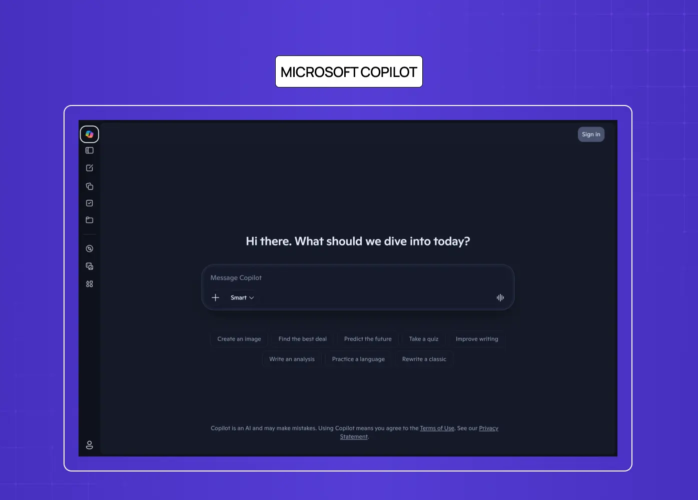
Their integration across Word, Excel, and Teams surfaced an insight that design teams are still processing:
Users trust agents far more when they can see the source of a recommendation alongside the recommendation itself.
Showing "based on your last three project briefs" next to a suggestion changes how the output is received, even when the suggestion itself is identical.
Transparency about inputs shifts the entire experience of agency.
Notion AI
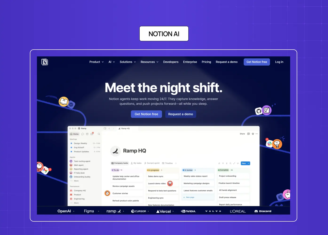
They take a different approach: the agent always starts in suggestion mode, never executing autonomously by default. Users have to actively promote it to action. That conservative default has a design cost in efficiency, but a measurable benefit in trust, particularly for new users who have not yet calibrated their confidence in the system.
LearnSphere: Designing Transparency Across Four User Types
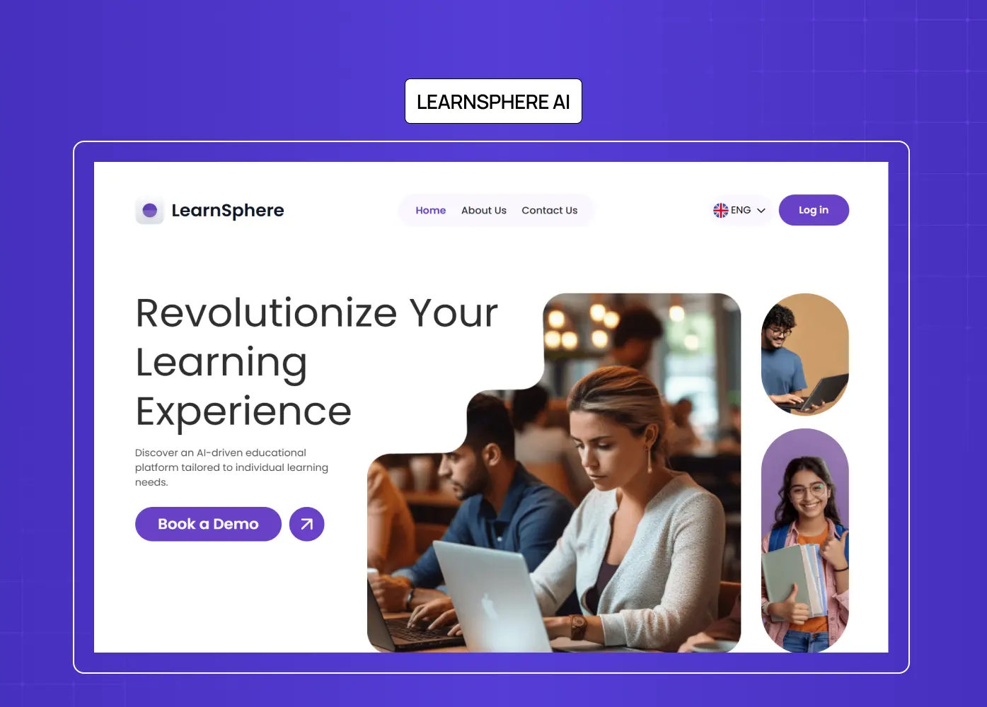
LearnSphere is an AI-powered edtech platform with automatic grading, personalised learning paths, real-time AI assistants, and adaptive content. It has four distinct user types, Super Admin, Admin, Teacher, and Student, each with a different relationship to what the AI is doing on their behalf.
The design challenge was not about making the AI smarter. It was about making the right things visible to the right people at the right time.
A teacher needed to see the AI's grading rationale and override a score when they disagreed with it.
A student needed to understand why their learning path had changed, not just that it had.
An admin needed a system-wide view of AI behaviour to catch patterns that individual users would never see.
We built role-based interfaces that surfaced AI decisions contextually for each user type, a unified notification system to keep all four roles coordinated, and dynamic KPIs that made AI-driven outcomes visible at every level of the platform. The outcome was a cleaner, more intuitive experience that did not sacrifice the complexity of the AI's logic. It made that logic usable by humans who needed fundamentally different things from it.
One design challenge that industry is only beginning to address is multi-agent orchestration: what happens when multiple specialised agents hand tasks to one another behind the scenes. In an enterprise workflow, an intake agent might qualify a request, pass it to a scheduling agent, which triggers a billing agent, all without the user ever seeing a seam. The design problem is accountability: when something goes wrong, who is responsible, and how does the user even know where in the chain the failure occurred? Designing for multi-agent systems means giving users a unified accountability view, a single surface that shows not just what happened, but which agent made each decision along the way.
From Screen to Voice: Why Zero UI Cannot Be an Afterthought
Most of the design patterns discussed so far assume a screen. A progress indicator. A confirmation modal. An audit log with undo buttons. Those visual affordances do the heavy lifting in agentic UI design.
But as agentic AI moves into contexts where users are not at a desk, the visual layer disappears entirely. This is the territory of Zero UI: experiences driven by voice, gesture, or natural language where no traditional screen interface exists.
Imagine you are driving and your AI agent, connected to your work tools, is actively managing your afternoon. It has already moved a 3pm call, drafted a response to a client query, and is about to send a proposal on your behalf. On a screen, you would see a plan preview, a confidence signal, and a confirm button. In a voice-first context, none of those affordances exist.
The agent has to communicate its intent, its certainty, and its plan through language alone. "I am about to send the Q3 proposal to Ananya. The draft is based on your last approved version. Should I proceed?" That is an intent preview in voice. Designing that interaction, knowing when to interrupt, how much to explain, when to default to action versus when to pause and ask, is a harder problem than building the same pattern on a screen.
What Zero UI agentic design demands:
Spoken intent previews that are concise enough not to frustrate but specific enough to be meaningful
Audio confidence signals that communicate uncertainty without being alarming
Clear spoken escalation language when the agent needs a human decision
Graceful interruption handling when a user stops the agent mid-action
Consistent voice personality that does not overclaim capability or undercommunicate status
For AI-native products moving toward multimodal or voice-first experiences, this is not future thinking. It is a present design challenge that most teams have not started solving — and one of the clearest AI product design trends shaping the next few years.
How Do You Measure Agentic UX Success?
Traditional UX metrics, task completion rate, time on task, error rate, are necessary but not sufficient for agentic systems. They measure whether users got something done. They do not measure whether users appropriately understood, trusted, and controlled the agent that did it for them — a gap that becomes especially visible when teams move these metrics into an AI dashboard design and realise the standard KPI layouts were never built to surface agentic behaviour. These four metrics are the ones we track when evaluating agentic interface performance:
Appropriate Delegation Rate: The percentage of eligible actions where users allowed the agent to act autonomously rather than overriding it. A very high rate is not automatically good — it may mean users do not understand what the agent is doing. A calibrated rate, stable and consistent across user types, is the target.
Trust Calibration Score: The correlation between user overrides and actual agent errors. If users override the agent frequently but the agent was correct, you have an anxiety problem — a transparency design failure. If users never override but the agent errors regularly, you have an over-trust problem — an autonomy design failure. The goal is alignment between human confidence and system reliability.
Recovery Rate: The percentage of agent errors that users successfully identify and reverse without systemic failure or support intervention. A high recovery rate is a signal that your failure design is working. A low one means your audit log, undo windows, or escalation paths are not visible or usable enough.
Escalation Ratio: How frequently the agent hits the boundary of its capability and hands off to a human. A healthy ratio tells you the agent's autonomy tier boundaries are well-calibrated. A ratio that trends toward zero over time may mean the agent is overstepping its appropriate scope.
Conclusion
Agentic design is not a rebrand of UX. It is a new discipline that emerges when the agent acts, not just assists
Trust is not a feature to be added. It is the foundation every agentic interface stands on, or fails without
The Autonomy Dial is more nuanced than most teams design for: the question is not whether to automate, but what to automate, for whom, and under what conditions
Recovery design is a launch requirement, not a backlog item
Zero UI demands the same trust patterns as screen-based agentic design, just without the visual scaffolding to lean on
Designers who define agentic patterns now will set the standard others inherit, the same way mobile-first and responsive design did before this
The teams investing in agentic experience design today are not just building better products. They are writing the design grammar for how humans and AI systems work together. That is a significant responsibility — and the teams doing it well treat agentic experience design as a deliberate answer to what a UX strategy is and how to build one, not an afterthought layered on after the agents are already in production.
Designing an AI-native product and wondering where to start with agentic UX? Let's talk.


