
Paywalls are often the most under-designed screen in a product. These 12 paywall examples, spanning media, consumer apps, and SaaS, break down the exact model and trigger moment behind each one, so you can borrow what actually converts.
Twelve paywall examples, the models behind them, and why their timing works.

TL;DR:
Paywalls succeed or fail on timing and honesty, not visual polish. This guide breaks down 12 real paywall examples from The New York Times, Spotify, Duolingo, Figma, and more, showing the exact model and trigger point behind each. You'll also find the three most common paywall mistakes and a short framework for designing your own.
The paywall is the most expensive screen in your product, and one of the highest-stakes moments in website conversion. It's the exact moment a curious user decides whether you're worth paying for, and most teams design it last, in a rush, by copying whatever competitor they opened most recently. That's a costly mistake, because the difference between a good paywall and a bad one isn't a few percentage points. It's the difference between a subscription business that compounds and one that leaks revenue at the final step.
So instead of another gallery of pretty screenshots, this is a breakdown of 12 paywall examples worth learning from, spanning media, consumer apps, and SaaS, with the design pattern and, crucially, the timing behind each, the same way our roundup of landing page design examples focuses on what converts rather than how it looks. Whether you're building a mobile subscription app or a B2B SaaS with in-app upgrades, these examples show what great paywall design looks like in 2026 and exactly what you can borrow for your own. Many of the same principles show up in the best ecommerce design examples, too.
Paywall examples are useful because they show a decision in action, not just a screen design. Every paywall on this list represents a choice a product team made about how much value to give away before asking for payment, and when to make that ask. Looking at real paywall examples side by side makes the pattern easier to spot than any single screenshot could on its own — effectively a competitor UX analysis of the monetization moment.
What is a paywall?
A paywall is any screen, prompt, or gate that stands between a user and the content or features they want, until they pay or subscribe. It can be a full-page block on a news article, a locked feature inside a SaaS product, or a usage cap on a mobile app. What every paywall shares is the same basic job: convert an interested visitor into a paying customer without pushing them away first.
Paywalls generally differ along three lines:
How much is shown for free before the wall appears, from nothing at all to a generous, fully usable tier
When the wall appears, whether immediately, after a set number of uses, or only once the user hits real value
How the wall is framed, from a hard stop to a soft, benefit-led invitation to upgrade
The 12 examples below sit at different points on that spectrum, which is exactly why comparing them side by side is useful. First, a quick map of the territory.
The 6 types of paywalls (a quick framework)
Before the examples, it helps to know the patterns they draw from. Most paywalls are a variation on one of these six models:
Paywall type | How it works | Best for |
Hard paywall | Blocks all content/features until you pay | Niche, high-trust content people already value |
Soft / metered | A set number of free uses, then a prompt | Media and habit products that need discovery first |
Freemium | A genuinely usable free tier; premium features locked | Products with network effects or long consideration cycles |
Feature gating | Specific features locked behind paid tiers | SaaS where advanced capability signals willingness to pay |
Usage gating | Free up to a volume/time limit, then upgrade | Tools with clear usage-based value (recordings, automations) |
Dynamic / contextual | AI tailors the offer and timing to the user | Mature apps optimizing per-segment monetization |
One number frames the whole discussion: hard paywalls appear to convert around 10.7% versus roughly 2.1% for freemium, one of the SaaS UX metrics worth watching closely. But that gap is misleading. Hard paywalls don't convert better, they filter harder. Everyone who bounces off a hard wall never enters the funnel to begin with. The right model depends entirely on how much value a user needs to experience before they'll trust you with their card. Keep that in mind as you read the examples.
Media & publishing paywalls
1. The New York Times: the metered model, perfected
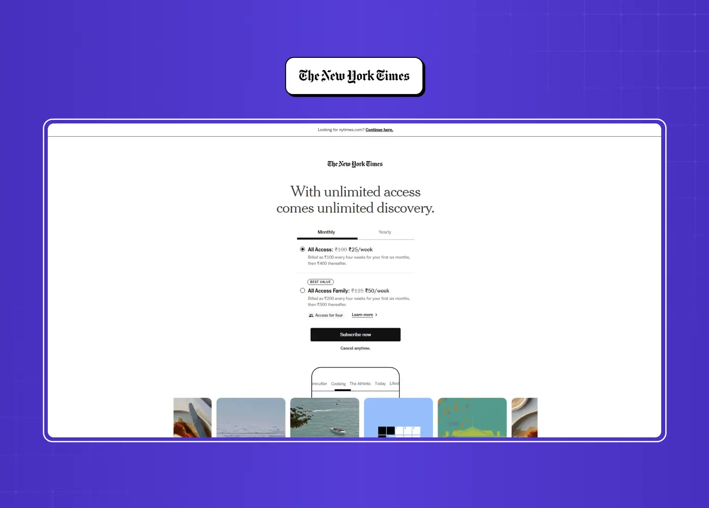
The NYT pioneered the metered paywall back in 2011, and it remains the reference implementation. You get a set number of free articles per month before the subscription prompt appears. What makes it work today isn't the meter itself, it's that the Times now uses machine-learning personalization to set the limit per user, showing the wall at the moment a given reader is most likely to convert rather than at a fixed count.
What it does differently: the free-article limit isn't fixed, it's personalized per reader
Why it converts: the wall appears at a moment of individual readiness, not an arbitrary count
Takeaway: the meter isn't a fixed number, it's a lever. Tune the trigger to the individual, not the average.
2. The Wall Street Journal: the confident hard paywall
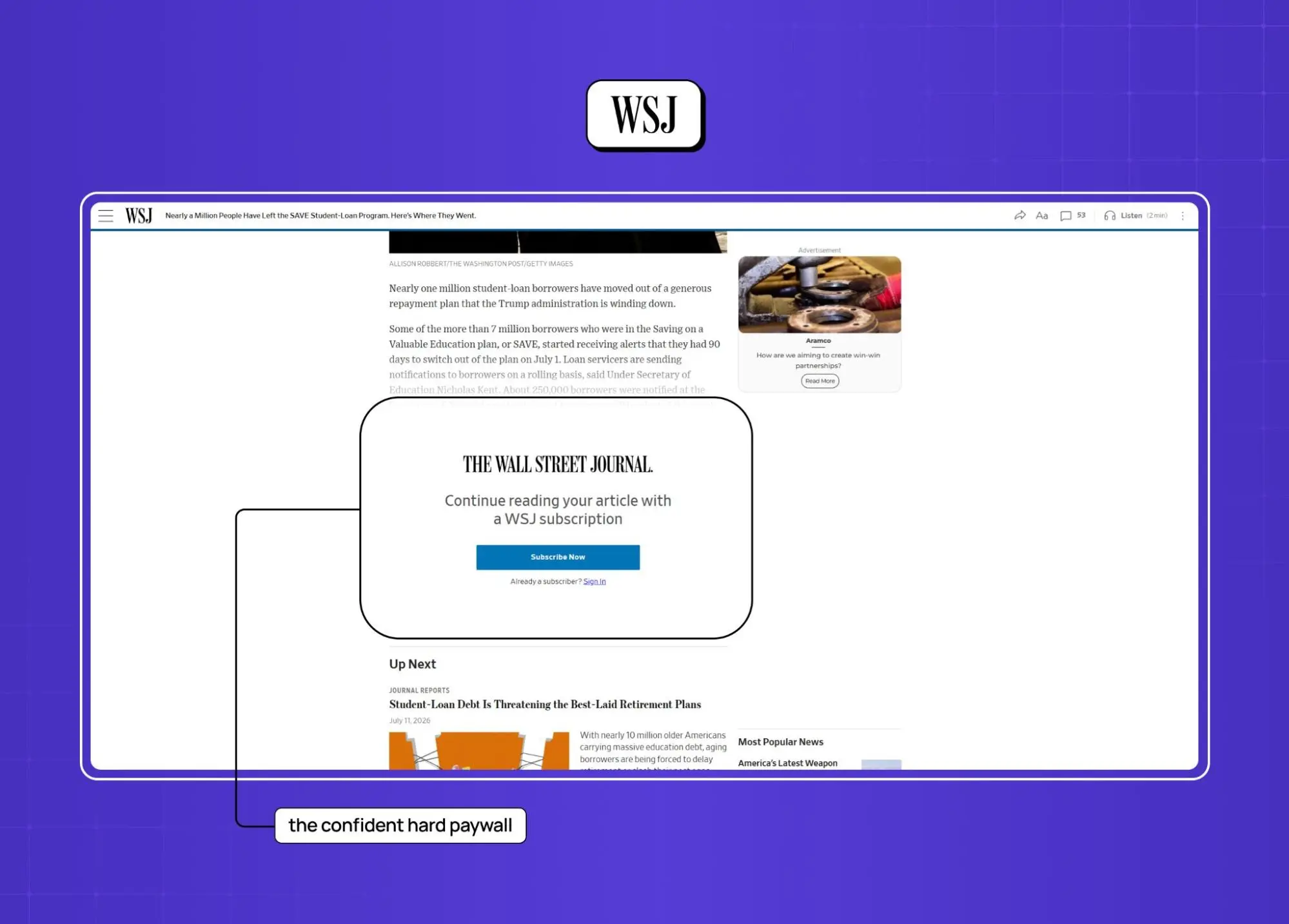
The WSJ runs one of the strictest paywalls online, with little to no free access. This only works because its audience already values the specialized reporting before they arrive: finance professionals who need it.
What it does differently: no meter, no free tier, access starts only after payment
Why it converts: the audience arrives pre-sold on the value, so friction doesn't cost conversions
Watch out for: if users need to experience the product to get it, a hard wall will quietly kill your top of funnel
Takeaway: a hard paywall is a bet that your value is understood in advance.
3. Blinkist: the "honest paywall"
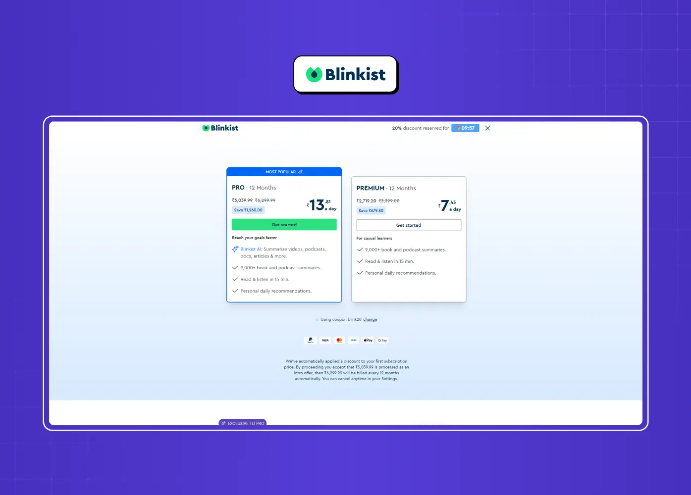
Blinkist popularized the transparent, or "honest," paywall, clearly telling users what they get free versus paid instead of hiding the ball. Free users get one hand-picked summary a day (the "Daily Pick"); choosing your own titles, audio, and the full library sit behind the subscription. The honesty paid off: Blinkist reported a 23% lift in conversion and a 55% drop in complaints.
What it does differently: states the free-versus-paid trade plainly instead of burying it in fine print
Why it converts: transparency builds enough trust to offset the "loss" of hiding features
Takeaway: spelling out the trade honestly converts better than obscuring it.
Consumer subscription app paywalls
4. Spotify: freemium as a growth engine
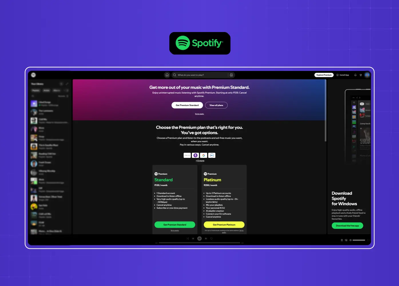
Spotify's free, ad-supported tier is the paywall strategy. It lets hundreds of millions of people build a daily habit, playlists, libraries, listening history, that becomes painful to abandon. The upgrade prompt (no ads, offline, better quality) lands after that dependency is real.
What it does differently: the free tier isn't a trial, it's a permanent, fully-formed product
Why it converts: the paywall sells the habit, not the app itself
Takeaway: freemium works when the free tier creates switching costs.
5. Duolingo: a paywall that feels like the product
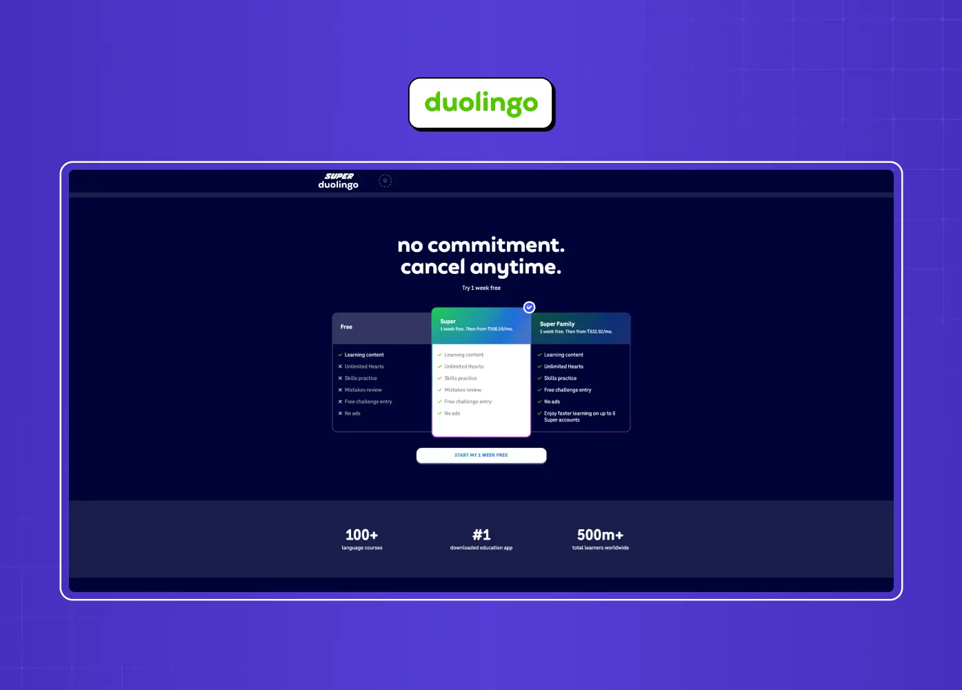
Duolingo's paywall carries the same bright gradients, cheerful tone, and Duo mascot as the rest of the app, so it never feels like a jarring sales screen. It offers a "7-day free trial" with "Cancel anytime" stated plainly, just two plan options with a "Most Popular" tag, and a first-person CTA, "Start my free week." That kind of conversion-focused microcopy does real work.
What it does differently: matches the app's tone instead of switching into "sales mode"
Why it converts: a low-risk, benefit-led CTA and only two choices reduce friction
Takeaway: your paywall is part of your product, not an interruption to it.
6. Calm: personalization through a quiz
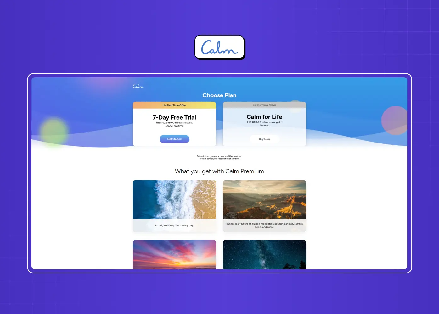
Calm routes new users through a short quiz that ends in a personalized recommendation and a paywall showing a single annual offer with a "Try Free" button, deliberately removing the monthly option as a distraction. Tap a piece of locked content and Calm pulls that content's image into the paywall header and tweaks the copy to match.
What it does differently: removes choice entirely rather than presenting a plan comparison
Why it converts: the offer feels made for that specific user, in that specific moment
Takeaway: fewer choices and contextual relevance beat a generic pricing grid.
7. Headway, Forest & Opal: the free-trial family
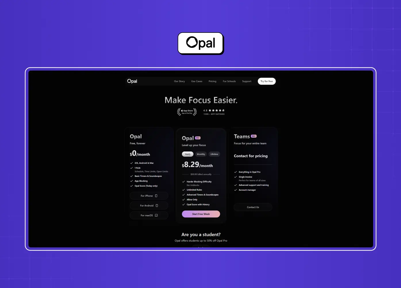
Headway, Forest, and Opal lean on the free trial as their core pattern, each varying it to reduce perceived risk: let people feel the premium experience before paying. The trial reframes the decision from "is this worth money?" to "do I want to keep something I already have?"
What it does differently: shifts the ask from a purchase decision to a low-risk trial decision
Why it converts: loss aversion works in the product's favor once users have the premium experience
Takeaway: a well-timed free trial converts loss aversion into subscriptions, but only if users hit real value inside the trial window.
SaaS in-app & feature-gating paywalls
This is where Groto's clients live, at the intersection of SaaS onboarding and retention, and where the app-store galleries are thinnest, so these examples are worth extra attention.
8. Loom: the usage-gated moment
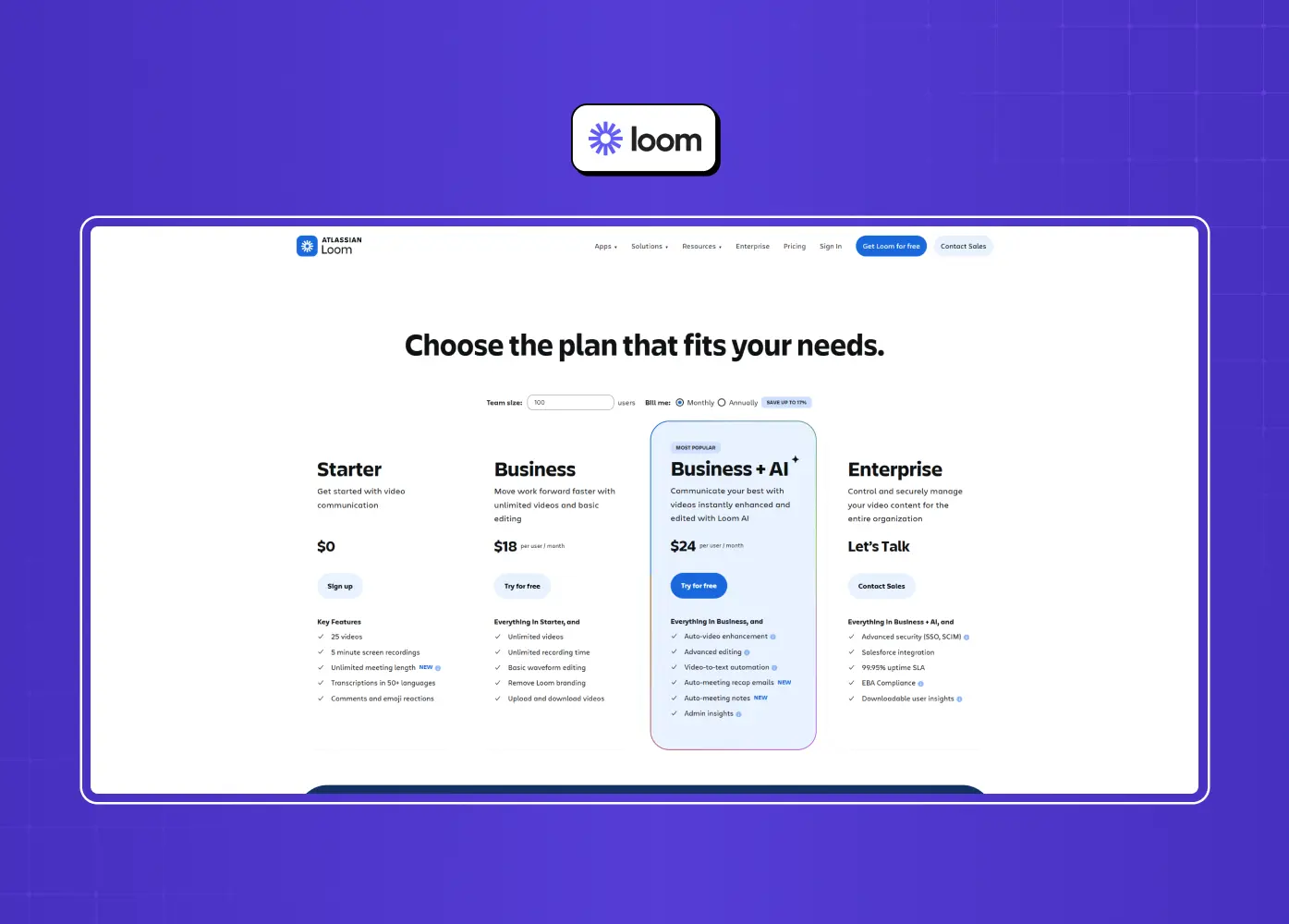
Loom caps free recordings at five minutes and shows exactly where the free plan ends ("25 videos per person"). Most teams start free and upgrade precisely when they hit the limit mid-workflow, a moment of real need, not manufactured urgency.
What it does differently: the limit is tied to actual usage, not an arbitrary time window
Why it converts: the upgrade prompt lands exactly when the user hits a genuine ceiling
Takeaway: usage gates convert best when the limit maps to genuine value.
9. Figma: the paywall timed to momentum
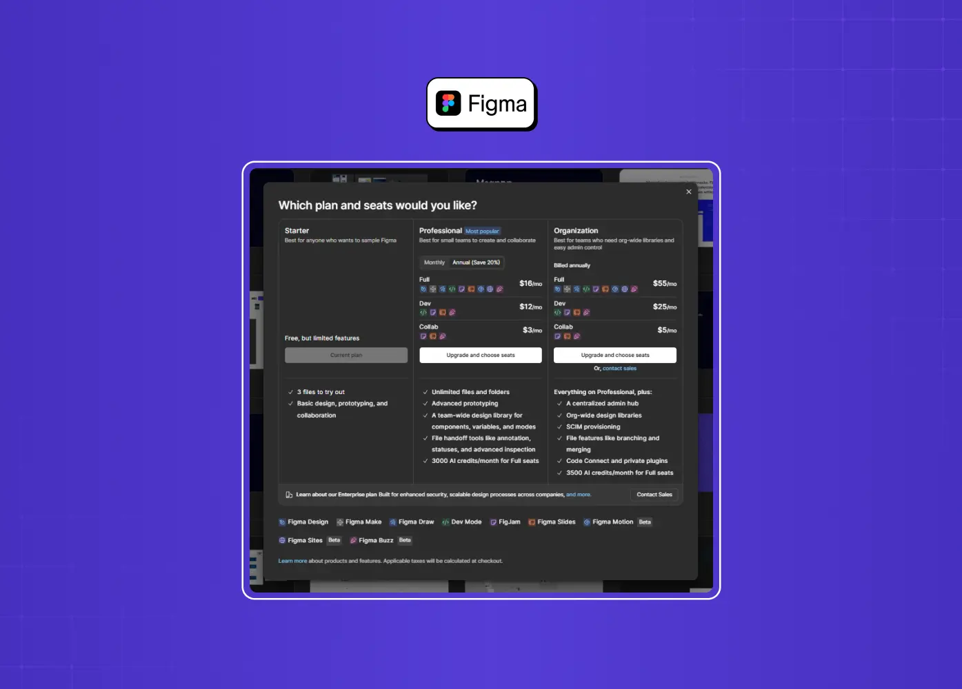
Figma designed its upgrade prompt to appear the moment teams start collaborating, a point of shared momentum, not frustration. Asking for money exactly when the product is delivering its core multiplayer value makes the upgrade feel earned.
What it does differently: times the ask to a peak-value moment instead of a friction point
Why it converts: the request feels earned rather than intrusive
Takeaway: trigger the paywall at peak value, not peak friction.
10. Notion: earn the habit, then gate the team
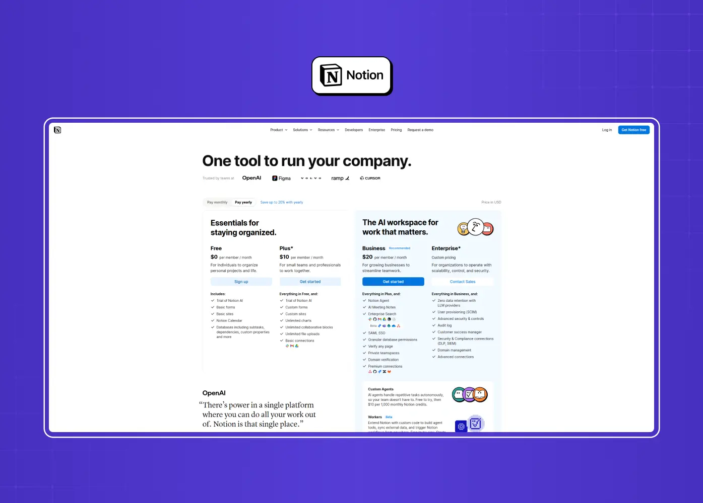
Notion's free tier is genuinely usable, so individuals build workspaces and dependencies before ever hitting a wall. The paywall arrives when teams need collaboration, security controls, or admin tools, where willingness to pay is highest.
What it does differently: gates the organization, not the individual
Why it converts: by the time a team needs it, the habit and the budget both already exist
Takeaway: let individuals fall in love for free, charge the organization when the stakes show up.
11. Zapier: feature gating with gentle urgency
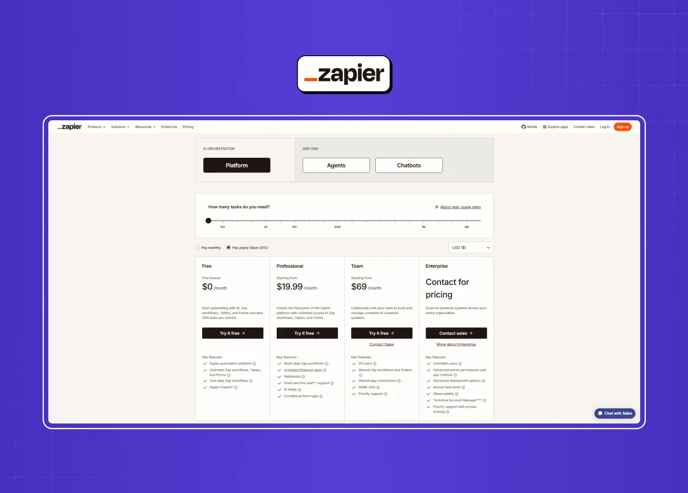
Zapier locks advanced functionality (premium apps, multi-step automations) behind paid tiers and uses subtle nudges like a banner countdown to prompt upgrades without nagging.
What it does differently: gates advanced capability rather than usage volume
Why it converts: light urgency nudges without resorting to pressure tactics
Takeaway: gate the features that signal real willingness to pay, and layer in light, honest urgency rather than dark patterns.
12. Canva: the smart downgrade prompt
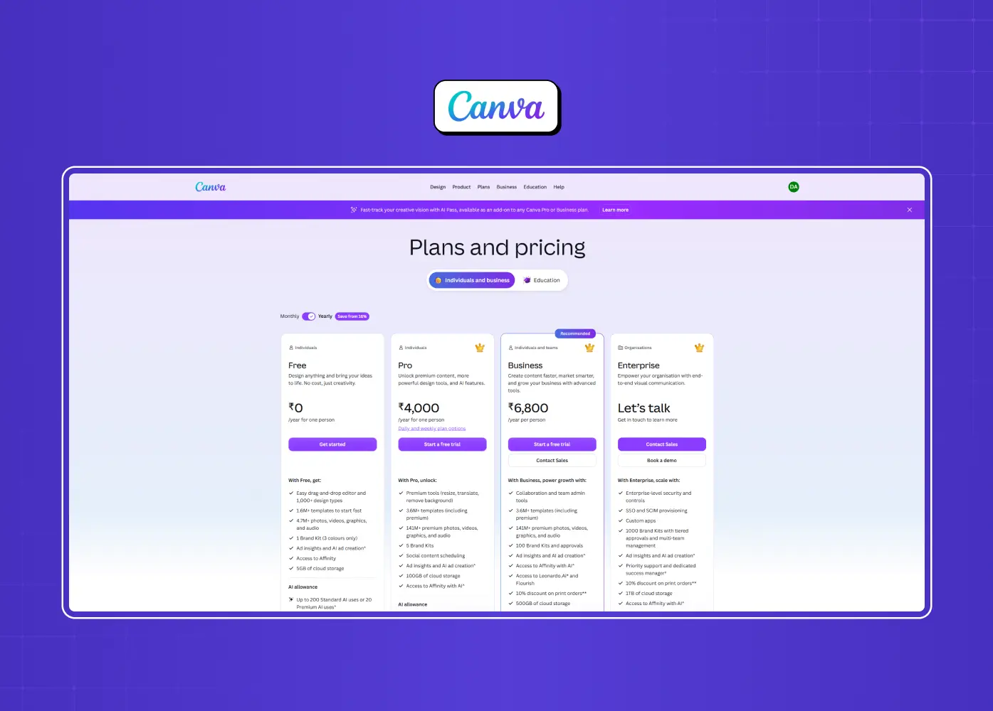
When a Canva trial ends, it doesn't just cut users off, it shows exactly how many times they used specific premium features, then offers a low-commitment path back. It turns the downgrade into a personalized reminder of value already experienced.
What it does differently: treats the end of a trial as its own conversion moment
Why it converts: quantifying lost value is a more honest trigger than a generic "upgrade now" banner
Takeaway: the moment a trial ends is a paywall too.
What the best paywall examples have in common
Look across all twelve and the same principles surface again and again:
Timing beats visuals. A beautifully designed paywall shown at the wrong moment loses to a plain one shown at the right moment. The strongest examples trigger after the user experiences value, hits a natural limit, reaches a milestone, or completes a meaningful action — in other words, after the first value moment. If you fix one thing, fix when your paywall appears.
Clarity and honesty build trust. Blinkist's honest paywall, Duolingo's plain "cancel anytime," and Loom's explicit limits all show that transparency consistently outperforms obscured or manipulative designs, and it reduces support complaints as a bonus.
Fewer choices convert better. Calm's single annual offer and Duolingo's two-plan layout reduce decision paralysis. A wall of tiers at the decision moment is friction disguised as thoroughness.
Context makes the offer relevant. Pulling in the locked content, naming the feature the user just tried, and matching the app's tone all work as micro UX patterns that make a paywall feel like help, not a toll booth..
The free experience does the selling. For Spotify, Notion, and Figma, the paywall barely has to persuade because the free experience already created the desire and the switching cost. The best monetization design starts long before the paywall screen, well inside your SaaS go-to-market strategy.
3 paywall mistakes that quietly kill conversion
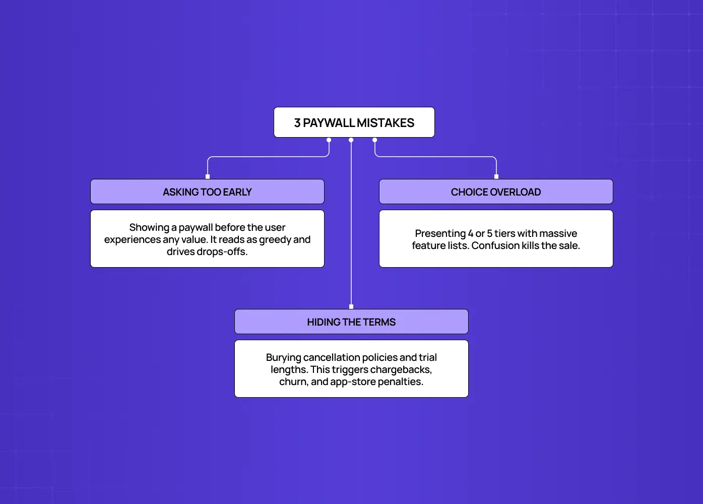
Learning from great examples is half the job. Avoiding the common failures, the UI/UX mistakes that hurt conversions, is the other half. Three mistakes show up again and again in products that struggle to monetize.
1. Asking too early
Showing a paywall before the user has felt any value is the fastest way to lose them
With no reason to trust you yet, the ask reads as greedy
This is the single most common reason freemium and trial products underconvert, and a major driver of SaaS onboarding drop-offs.
The fix is almost always to move the trigger later, to a point where the user has experienced a genuine win
2. Too many choices at the decision moment
A grid of four or five tiers, each with a long feature list, turns a simple yes-or-no into a research project
Confused users don't buy
The strongest examples (Calm, Duolingo) collapse the decision to one clearly recommended option
Save the full pricing matrix for a dedicated pricing or product page design, not the in-context upgrade moment.
3. Hiding the terms
Vague trial lengths, buried cancellation policies, and surprise charges generate chargebacks, app-store complaints, and churn
Blinkist's honest paywall proved the reverse: transparency actually raised conversion while cutting complaints by more than half
Users reward clarity, and app stores increasingly penalize the alternative
If your paywall is underperforming, check these three before you touch the visual design. As with any effort to improve conversion without a redesign, the problem usually isn't how the screen looks. It's when it appears, how many options it presents, and how honestly it states the deal.
How to design a paywall that converts
If you're building or rethinking your own, start here:
Choose the right model. Pick the model that matches how much value users need before they'll trust you: hard walls for pre-understood value, freemium and metered for products that must be experienced first.
Obsess over the trigger. Instrument your product to find the moments where users hit real value or a natural limit, and place the ask there.
Keep the screen honest and simple. One clear recommended plan, plain terms, and a benefit-driven CTA, built from the same elements that drive conversions on any high-performing page.
Treat it as a living experiment. Use A/B testing — often run through feature-flag experiments — to compare headlines, timing, plan count, and CTA copy continuously. Small changes to the most expensive screen in your product compound fast.
The teams that win at subscription revenue don't have prettier paywalls. They have paywalls designed around user psychology and shown at the right moment, and they keep testing them.
Conclusion
A great paywall isn't a wall at all. It's a well-designed door that opens exactly when someone is ready to walk through it. The twelve examples above work because they respect the user's timeline, communicate value honestly, and remove friction at the decision that matters most.
If you're designing a subscription product and want a paywall, and the SaaS signup flow feeding it, engineered to convert, book a discovery call with Groto. We help SaaS and subscription teams design the moments where users decide to pay, backed by research and built to test. Let's make your most expensive screen your best one.