
From Xerox PARC to AI-generated layouts, the graphical user interface has always been the bridge between complex systems and real people. This guide breaks down how GUIs work, what makes them effective, and where interface design is headed next.
Everything you need to know about GUI design, from first principles to modern applications.
TL;DR
A graphical user interface (GUI) is a visual layer that lets users interact with digital products through icons, buttons, windows, and menus instead of typed commands. First introduced at Xerox PARC in the 1970s and commercialized by Apple in 1984, GUIs democratized computing and remain the foundation of every modern digital experience. Good GUI design is not just about aesthetics. It is about reducing cognitive load, creating predictable patterns, and making every interaction feel effortless. This guide covers what makes a GUI work, the core design principles behind it, and how it applies across real products and industries.
What Is a Graphical User Interface?
Before buttons, icons, or anything you could click, there were commands. To open a file, you typed its exact path. To save a document, you memorized a syntax string. Computing existed, but it was not accessible, and it was certainly not intuitive.
A graphical user interface changed all of that and it sits at the center of UI/UX design: a visual system that lets users interact with a digital product through graphical elements rather than text commands. Instead of writing instructions, users click, tap, drag, and scroll. Instead of memorizing syntax, they follow visual cues.
The story of how GUIs came to be is worth knowing, because it explains why the conventions we use today are designed the way they are:
1963: Ivan Sutherland creates Sketchpad, the first graphical computer program, allowing users to draw directly on a screen with a light pen
1968: Douglas Engelbart's "Mother of All Demos" introduces the mouse, hypertext, and real-time collaboration to the world for the first time
1973: Xerox PARC builds the Alto, the first workstation to use a fully GUI-based operating system
1983: Apple releases the Lisa, the first commercial personal computer with a GUI, priced at $9,995
1984: Apple launches the Macintosh, bringing GUI computing to a mainstream consumer audience for the first time
1985: Microsoft releases Windows 1.0, establishing the operating system interface that would eventually reach over a billion users
Each of these milestones did not just advance technology. They advanced the idea that computers could be designed for people, not just engineers.
From Skeuomorphism to Flat Design
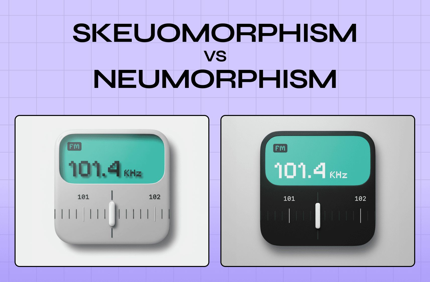
Once GUIs moved into the consumer mainstream, the question shifted from "how do we make interfaces usable" to "how do we make them feel familiar." The answer, for a long time, was skeuomorphism: designing digital elements to look like their real-world counterparts. Apple's iOS 6 is the most referenced benchmark in the skeuomorphism vs neumorphism debate - leather-textured calendars, green felt in Game Center, and bookshelf backgrounds in iBooks. The visual metaphors were deliberate; they helped users who were new to touchscreen computing transfer existing mental models onto unfamiliar interactions.
The shift came sharply with iOS 7 in 2013, when Apple moved to a flat design language: clean typography, minimal shadows, and abstract iconography. Google followed with Material Design, introducing layered surfaces and motion-based feedback as the organizing principles. The move away from skeuomorphism was not purely aesthetic. It was a signal that users had internalized digital conventions well enough that they no longer needed real-world analogies to understand how an interface worked. Flat design assumed a more digitally fluent user, and that assumption proved correct.
What made GUIs revolutionary was not the visual layer itself. It was what that layer represented: abstraction. Complex backend processes were translated into recognizable symbols:
A folder icon stood in for a file directory
A trash can represented deletion
A floppy disk signaled save
Users did not need to understand what was happening under the hood. They only needed to recognize what an element was asking them to do.
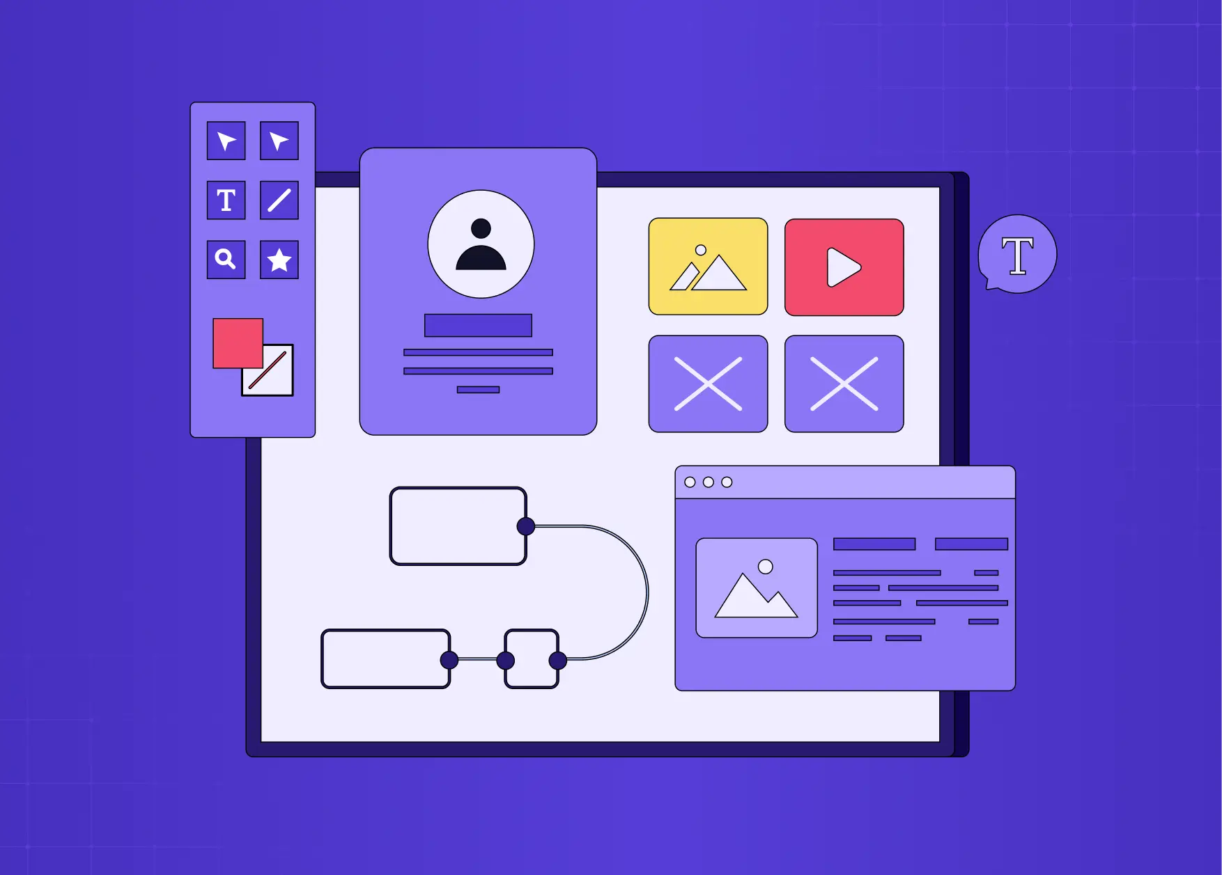
The Core Components of a GUI
Every GUI, regardless of platform, is built from a consistent set of user interface elements. Understanding these components is the foundation of understanding interface design itself.
Windows
Frame applications and control panels to visually separate content on screen
Allow multiple tasks to exist simultaneously without creating visual chaos
Enable multitasking through organized, individual workspaces
Icons
Small, recognizable graphics that represent actions, files, programs, or system states
Borrow from real-world objects (envelope for mail, magnifying glass for search) to reduce interpretation time
The best icons are legible without a label
Menus
Organized lists of options for navigating features and settings
Dropdown, contextual, and navigation bar variations all serve different interaction depths
Hierarchy matters: related actions should be grouped, and frequently used options should surface first
Buttons
Primary action drivers in any interface
Should look clickable, communicate their function clearly, and provide immediate visual feedback
A button that does not look pressable fails before the user ever touches it
Scroll Bars and Sliders
Scroll bars let users move through content that extends beyond the visible area
Sliders handle value adjustments (volume, brightness) through a draggable handle
Both rely on affordance: they must visually communicate that they are meant to be moved
Visual Indicators
Progress bars, loading states, notifications, and dialogue boxes serve as feedback mechanisms
Tell users what the system is doing and whether their last action succeeded
Without them, users feel lost and lose confidence in the product
Additional Interface Elements Worth Knowing
A complete GUI also relies on micro UX patterns — the supporting components that are easy to overlook but critical to usability:
Tabs: Allow users to switch between related views or sections without leaving the current context
Text and input fields: The primary mechanism for user-generated data entry, from search bars to form fields
Tooltips: Small labels that appear on hover or focus, providing contextual information without cluttering the main interface
Breadcrumbs: Navigation wayfinding elements that show users where they are within a hierarchy and how to get back
Dialog boxes: Modal prompts used for confirmations, alerts, and critical decisions that require an explicit user response before the system proceeds
The WIMP Paradigm
WIMP stands for Windows, Icons, Menus, and Pointer. It is the foundational framework that has governed GUI design since Xerox PARC first formalized it in the 1970s, and it remains the structural backbone of virtually every desktop interface today.
The reason WIMP held for five decades is simple: it maps to how people naturally categorize and navigate information. Containers hold things (windows), symbols represent things (icons), lists organize things (menus), and a pointing device selects things (pointer/cursor).
What is worth noting now is where WIMP is being challenged. Gesture-based mobile interfaces, voice commands, and spatial computing environments do not rely on a pointer at all. The post-WIMP era is already underway, and it is reshaping what the next generation of interface design patterns will look like.
How a GUI Actually Works
Most users never think about what happens between clicking a button and seeing a result. But understanding the basic mechanics matters for designers because it explains why certain interactions feel instant while others feel sluggish.
A GUI operates on an event-driven loop:
Input detection: The system registers a user action: a click, tap, keypress, or gesture
Event mapping: The input is matched to a function. Clicking a save button maps to the save command. Dragging a file maps to a move operation
System processing: The mapped function executes in the background: data is written, a file is moved, a request is sent
Visual rendering: The interface updates to reflect the new state: a success message appears, a progress bar completes, a new screen loads
The speed and clarity of that final step, visual rendering, is where most of the perceived quality of a GUI lives. An interface that processes instantly but renders slowly feels broken. An interface that renders smoothly even during heavy processing feels trustworthy. This is why animation, loading states, and transition design are not decorative choices. They are functional ones.
The Limitations of GUI Design
GUIs made computing accessible to everyone, but they come with real trade-offs that any designer or product team should understand.
Resource intensity: GUIs demand significantly more memory and processing power than command-line interfaces. On low-spec hardware or bandwidth-constrained environments, a heavy GUI can create lag that undermines the experience entirely
Slower for expert workflows: For users who perform the same complex tasks repeatedly, navigating menus and clicking through visual hierarchies is often slower than typing a known command. This is why developers, data analysts, and system administrators frequently prefer CLIs for precision work
High development and maintenance cost: A well-designed GUI requires substantial investment in design, front-end development, and ongoing iteration. Every new feature needs a considered visual treatment, which raises the cost of product changes compared to text-based systems
Adaptation difficulty: Users who learn a specific GUI build strong muscle memory around it. When that interface changes significantly, even improvements can feel disorienting and drive short-term drop-off in usage and satisfaction
Why GUI Quality Has Measurable Business Impact
A GUI is not just a digital product design deliverable. It is a business asset and the quality of an interface directly affects the metrics that determine whether a product succeeds.
User adoption: Products with intuitive interfaces get adopted faster because the onboarding curve is shorter. Users who feel competent on day one are significantly more likely to return on day two
Retention and churn: Friction in a GUI compounds over time. A button that is slightly hard to find, a flow that requires one extra step, a loading state with no visual feedback: individually minor, collectively responsible for users quietly switching to a competitor
Conversion: In e-commerce and SaaS trial flows, GUI decisions at the micro level (button placement, form length, progress indicators) have documented impacts on conversion rates. A/B testing consistently shows that visual clarity and reduced decision load move numbers
Brand trust: Users form judgments about product quality within seconds of first interaction. A polished, consistent GUI signals organizational competence. A rough, inconsistent one raises doubt, regardless of what the underlying product actually does
Accessibility as market reach: Meeting WCAG standards is not just an ethical obligation. It expands the addressable audience. An estimated 1.3 billion people globally live with some form of disability, and accessible GUI design ensures that group is not excluded from using your product
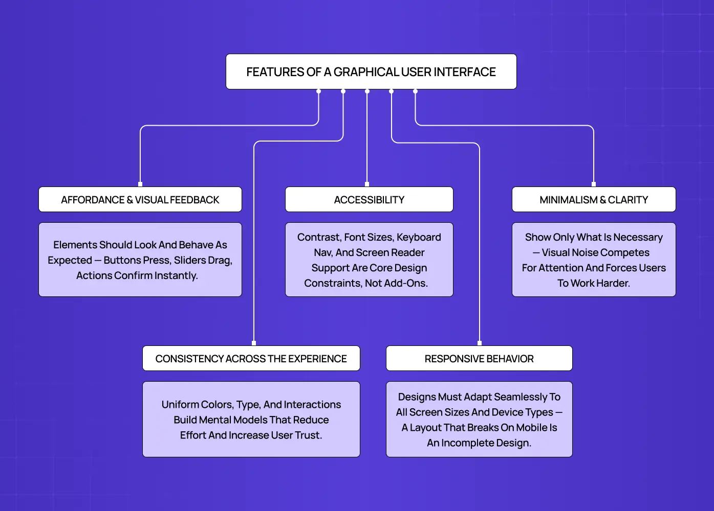
Features of a Graphical User Interface: What Separates Good from Great
Understanding what a GUI contains is one thing. Understanding what makes it effective is another and that effectiveness is grounded in visual design principles that apply across every platform and context.
Affordance and visual feedback
Every element should suggest how it works. A button should look pressable. A slider should look draggable. And when users act, the interface should respond immediately, confirming that something happened.
Consistency across the experience
Users build mental models, and the principles of design that govern GUI consistency are what keep those models intact. If a button style changes halfway through a product, that model breaks and with it, the user's confidence.
Minimalism and clarity
The best interfaces show only what is necessary. Visual noise competes for attention and forces users to work harder to find what they need. We always say: if a design element cannot justify its presence, it should not be there.
Accessibility
Color contrast, legible font sizes, keyboard navigation, and screen reader support are not optional extras. They are part of what makes an interface actually functional for the full range of users who will encounter it. Accessibility-first UX treats these standards as design constraints from the start, not afterthoughts and good GUI design follows that same approach. In practice, this means meeting WCAG 2.1 standards as a baseline: a minimum contrast ratio of 4.5:1 for normal text, touch targets no smaller than 44x44px on mobile, and logical focus order for keyboard navigation. These are not aspirational targets. They are the floor.
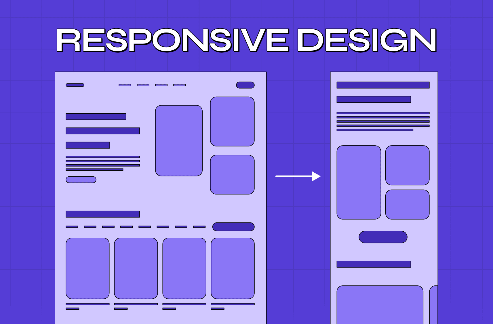
Responsive behavior
Mobile-first design is the foundation of responsive GUIs — building for the smallest screen first ensures the experience scales up gracefully rather than degrading under smaller constraints.
GUI vs CLI: Why the Visual Approach Won
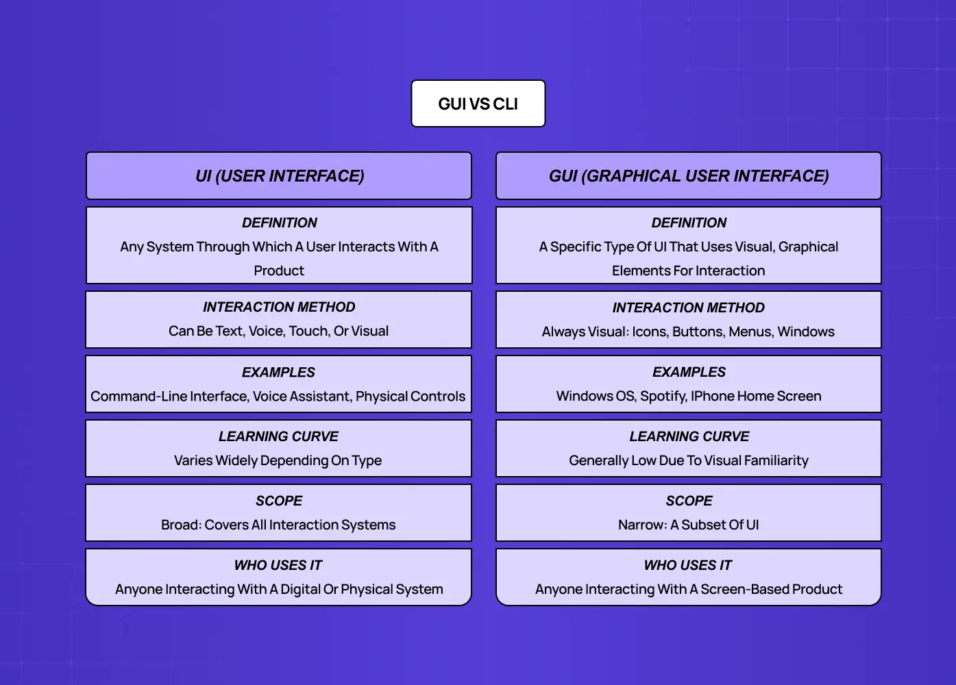
The GUI vs CLI debate sits at the intersection of UI vs UX design and it is worth revisiting from a design standpoint.
Command-line interfaces (CLI):
Require users to input precise text commands with exact syntax
Offer power and speed for those who already know them
Have a steep, unforgiving learning curve
One misplaced character can produce an error or execute the wrong action entirely
Graphical user interfaces:
Replace that model with a visual one
Flatten the learning curve dramatically
Make actions immediately comprehensible: clicking an icon to open a file requires no prior knowledge
Communicate actions through gestures (dragging a file to a folder shows the intent without any instruction)
This is what made personal computing explode in the 1980s and 1990s. The operating system interface became something ordinary people could use, not just engineers. And as mobile computing arrived, the GUI adapted again into touch-based interactions that were even more intuitive than mouse-clicks.
That said, CLIs have not disappeared:
Developers still rely on them for speed, automation, and precision tasks
Power users prefer them for scripting and repetitive workflows
For complex technical environments, the CLI remains faster than navigating nested menus
But for the vast majority of digital products, the GUI is the standard because it is the system that works for everyone, not just experts.
Graphical User Interface Examples Across Industries
GUIs appear across virtually every digital context. Here are a few categories worth looking at from a design perspective.
Operating Systems
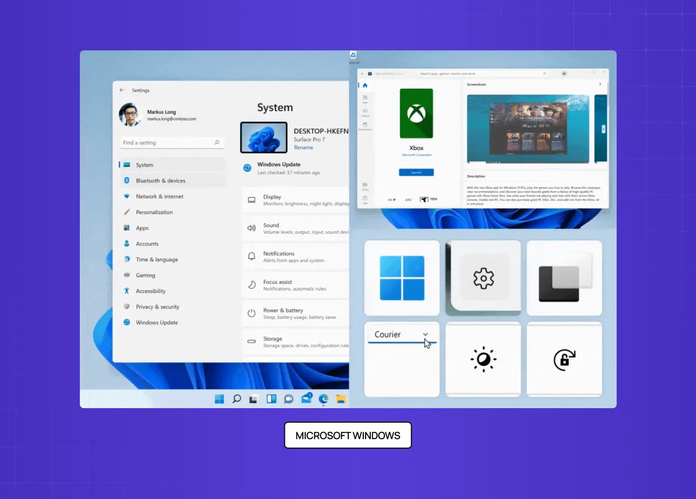
The most foundational graphical user interface examples live at the OS level:
Microsoft Windows introduced its GUI in 1985 and has iterated through 20+ versions, consistently preserving iconic patterns like the Start menu while modernizing the visual language
macOS set the standard for clean, minimal operating system interfaces, with conventions like the Dock and menu bar that designers still reference today
iOS and Android brought GUI design to mobile, introducing gesture-based interaction patterns (swipe, pinch, tap) that redefined what an interface could feel like
Linux (GNOME and KDE): Open-source desktop environments that give technically-oriented users a fully customizable GUI operating system, widely used in development and server management contexts
SaaS Platforms
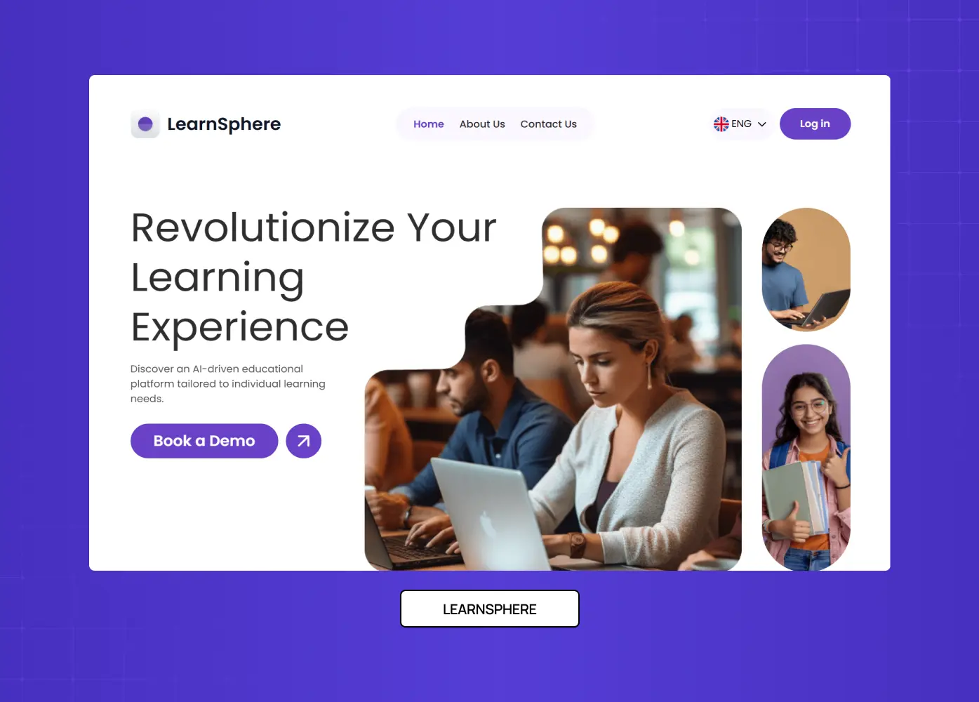
SaaS UX design carries the heaviest GUI design burden of any product category. Users perform complex, repeated tasks with high stakes, and the interface needs to surface the right information without overwhelming the screen.
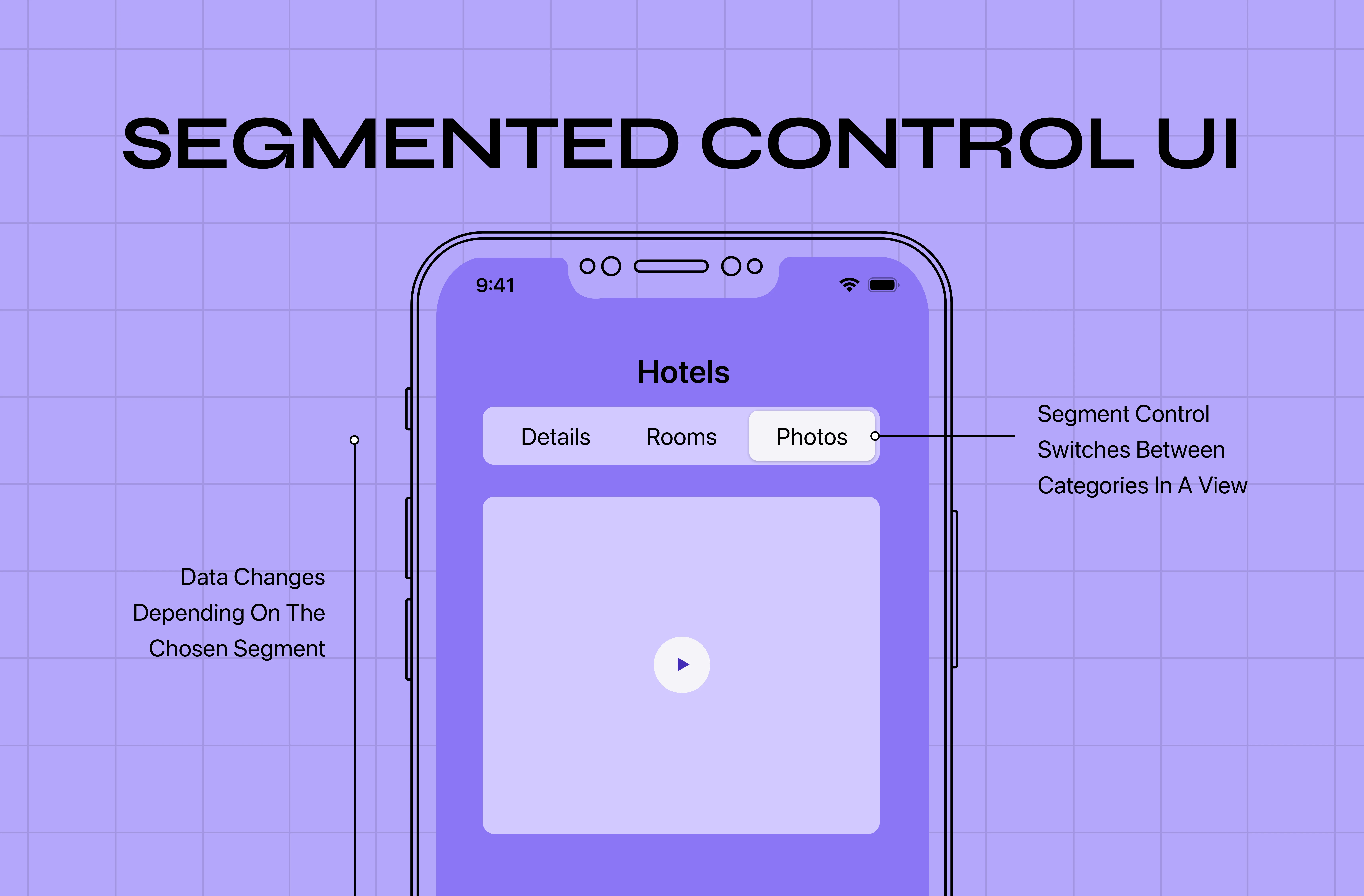
Notion organizes dense, nested content through a clean sidebar, block-based editing, and segmented controls that make a powerful tool feel approachable without hiding its depth.
Salesforce manages enormous data complexity behind a tabbed, role-based interface that routes different users to exactly what they need
LearnSphere, which we redesigned at Groto, required surfacing role-specific information for admins, teachers, and students from the same underlying system without making any of those three experiences feel cluttered or generic
E-Commerce
Conversion is the north star of e-commerce GUI design. Every element is calibrated to reduce friction and guide users toward a purchase:
Shopify storefronts use consistent product grid layouts, persistent cart indicators, and streamlined checkout flows that minimize drop-off at every step
Amazon relies on dense but structured information hierarchy, using visual weight and proximity to guide users from product discovery to purchase
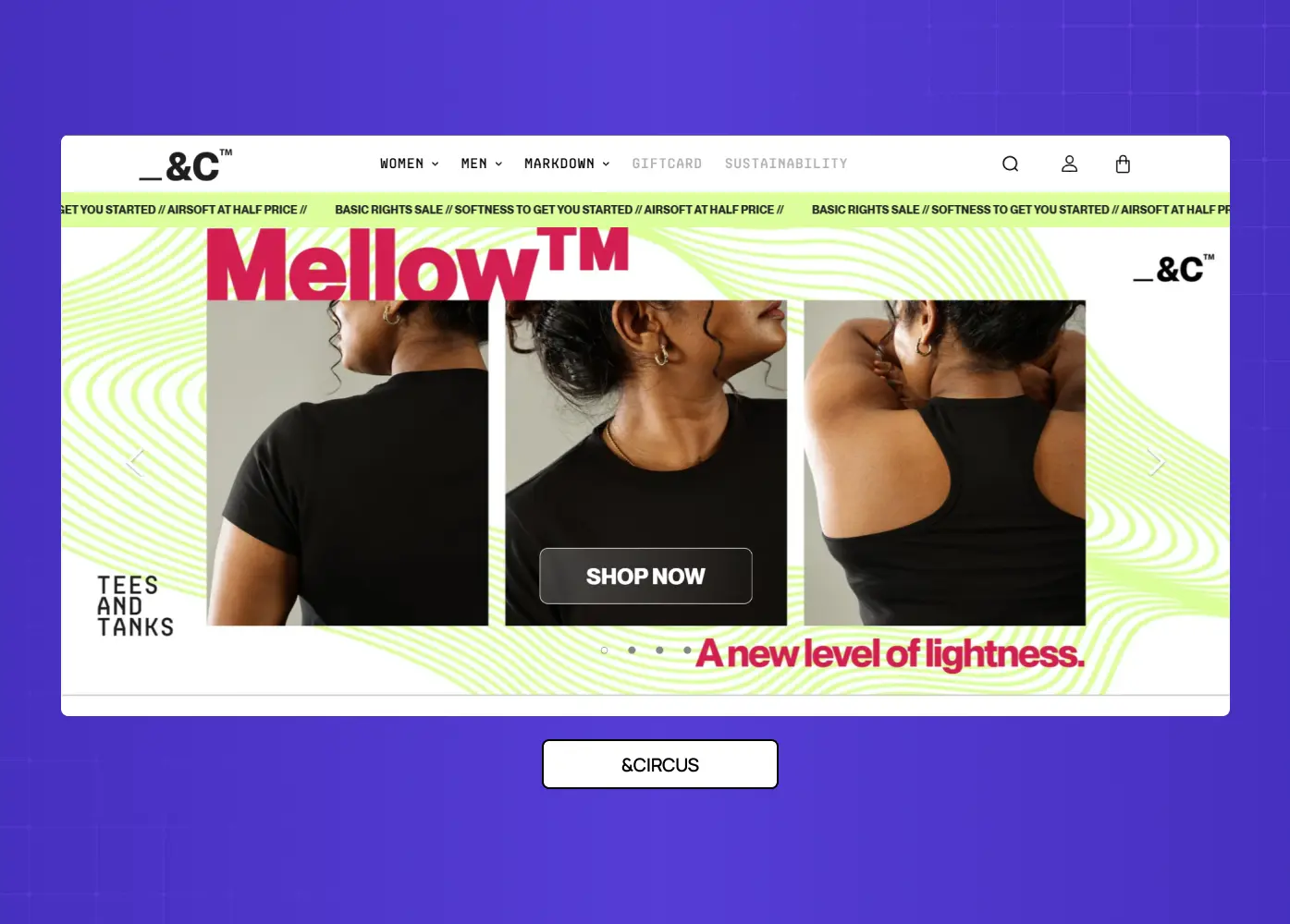
&Circus, a project we handled at Groto, required mobile-first GUI decisions that kept the brand's playful personality intact while making the shopping experience significantly smoother for all users
Health and Wellness Apps
Health platforms deal with dense, personal data. Good GUI design here means progressive disclosure:
Apple Health surfaces daily summaries at the top level and hides granular data behind a deliberate tap, so users are never overwhelmed by the full depth of what is being tracked
Fitbit's app uses color-coded rings and simple progress indicators to communicate complex health metrics at a glance
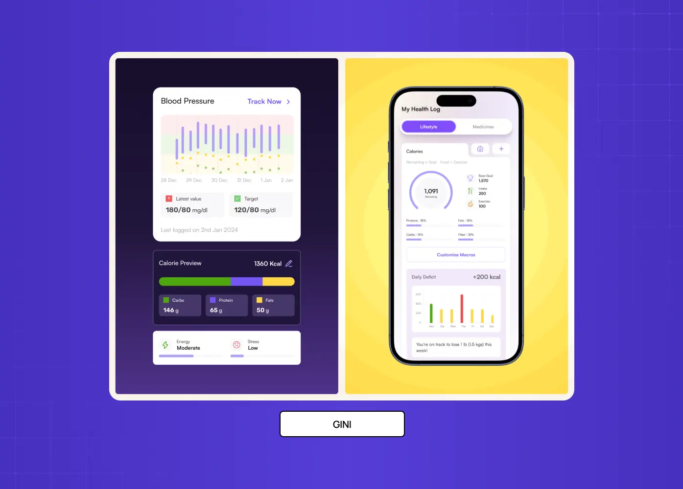
Gini, a health tracking platform we designed at Groto, required bringing together DNA insights, food logging, and activity data into a single interface where no single data type dominated the experience
GUI Design Principles We Apply at Groto
We design GUIs for SaaS products, AI platforms, and consumer apps through our subscription-based model. Across all UX disciplines and product contexts, a few principles hold constant.
Start with the user's mental model
Our design philosophy starts with a single question: what does the user already expect this to work like? Familiar interface design patterns reduce the need for onboarding. When users can transfer knowledge from one product to yours, they feel competent immediately.
Design for scannability, not reading
Users do not read interfaces. They scan them. That means:
Visual hierarchy matters more than copy
Size, weight, contrast, and spacing should guide attention
The eye should land on the most important action first, without the user having to consciously decide where to look
Reduce the number of decisions
Every choice a user has to make is a small tax on their attention. Good GUI design:
Anticipates decisions and makes them on the user's behalf through sensible defaults
Surfaces choices one at a time rather than all at once
Reserves prominence for the actions that matter most in a given context
Test with real behavior, not assumptions
Interface design patterns that feel logical to designers can still confuse users. We build, test, and iterate. The feedback loop between real usage and design revision is where GUIs actually improve.=
How GUIs Are Built: Key Development Frameworks
Design and development are two sides of the same GUI. Choosing the right GUI design tools — Figma, Framer, or Sketch — shapes how effectively designers hand off to developers, who use frameworks to structure, render, and maintain those components in production. For product teams evaluating technical approaches, these are the four frameworks that dominate GUI development today.
React: A JavaScript library maintained by Meta for building component-based web interfaces. Its reusable component model pairs directly with design systems for SaaS, making it the standard choice for web GUIs where consistency across many screens needs to be maintained at scale.
Flutter: Google's cross-platform SDK that compiles to native iOS, Android, and desktop applications from a single codebase. Strong choice for teams that need consistent GUI behavior across platforms without maintaining separate codebases
Qt: A C++ framework for building native desktop applications across macOS, Windows, and Linux. Used in contexts where performance and platform-level fidelity matter more than development speed
Electron: Builds cross-platform desktop applications using HTML, CSS, and JavaScript. Powers products like Figma's desktop app, VS Code, and Slack, making it a practical bridge between web development expertise and desktop GUI delivery
Understanding these frameworks helps designers communicate more precisely with engineering teams and make informed decisions about what is and is not feasible within a given technical stack.
The Future of GUI Design
The graphical user interface as we know it is not standing still. Several forces are actively reshaping what interacting with a product will mean over the next decade.
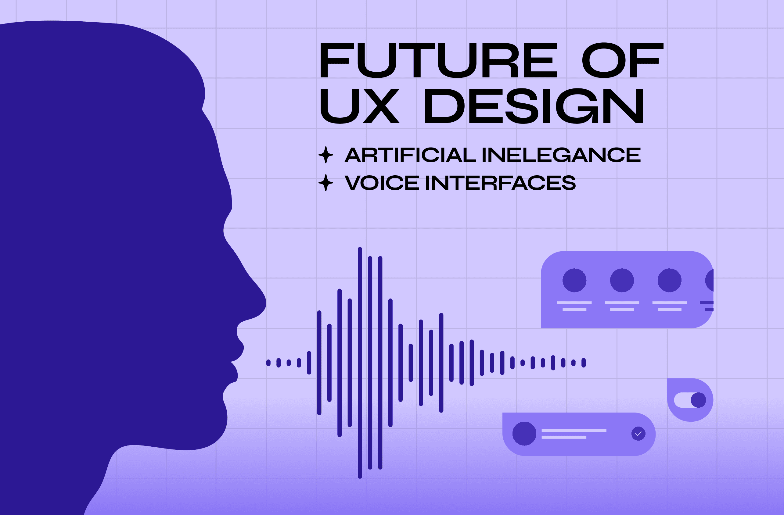
Voice interfaces
Natural language commands, powered by AI, are beginning to supplement or replace traditional GUI elements in specific contexts
Asking a device to perform an action is, in many cases, faster than navigating a menu to find it
Products like Apple's Siri, Google Assistant, and Amazon Alexa have already normalized this interaction model
Spatial computing and AR/VR
Instead of looking at a GUI on a flat screen, users will interact with digital elements overlaid on the physical world
Apple Vision Pro and Meta Quest are early examples of this shift
The design conventions that govern flat, screen-based interfaces will need to be rethought entirely for three-dimensional space
AI-generated interfaces
The AI in UI/UX design shift is already underway - layouts and component arrangements are beginning to be dynamically generated based on user behavior, shifting the designer's role toward systems thinking and constraint-setting rather than pixel-level control.
This does not eliminate the designer's role; it shifts it toward systems thinking and constraint-setting rather than pixel-level control
The challenge becomes designing the rules that the system uses to generate interfaces, not the interfaces themselves
What does not change is the underlying principle: the best interface is the one the user does not have to think about.
Natural User Interfaces (NUI):
NUI is the umbrella term for interfaces that respond to natural human behavior: touch, gesture, voice, gaze, and facial expression combined
Where GUIs require users to learn a visual language (icons, menus, buttons), NUIs are designed to detect and respond to behavior users already exhibit naturally
This makes NUI the most significant post-WIMP direction in interface design, not a replacement for GUIs but an evolution of the interaction model that GUIs established
Devices like Apple Vision Pro, gesture-controlled gaming systems, and voice-first smart home products are all early expressions of NUI principles at consumer scale
Haptic feedback is already an active layer in this model: Apple Watch's Taptic Engine and iPhone's vibration responses provide physical confirmation of digital actions, closing the sensory loop between user input and system response
Conclusion
A well-designed GUI is not just a visual layer. It is the primary way users understand, trust, and keep returning to a product. Here is what to carry forward:
GUIs replaced command-based inputs with visual, intuitive interactions, making computing accessible to everyone
Core components (windows, icons, menus, buttons, sliders, visual indicators) work together to reduce cognitive load
Good GUI design is defined by affordance, consistency, minimalism, accessibility, and responsiveness
The gap between GUI and CLI is a design gap as much as a technical one: one system is built for experts, the other for everyone
Real-world GUIs in operating systems, SaaS, e-commerce, and health platforms show how principles translate into product decisions
The future of GUI design is being shaped by voice, spatial computing, and AI-driven interfaces