

Black anchors. Orange activates. When these two colors share a canvas, the result is a website that commands attention without asking for it. Here is how the most effective brands make this palette work.
Black and orange: bold by design, powerful when done right.
TL;DR: Black and orange is one of the most powerful color pairings in web design: high contrast, emotionally charged, and visually memorable. This blog breaks down what makes this palette work, which brands use it well, the design principles behind it, and how to apply it without overdoing it.
What Is a Black and Orange Website?
Some color combinations fade into the background. Black and orange does the opposite.
Few color combinations are as bold or as instantly recognizable as black and orange.
A black and orange website pairs a dark background with orange accents to create strong visual contrast.
Black provides the foundation, giving the design a sense of sophistication, stability, and focus.
Orange introduces warmth, energy, and urgency, naturally drawing attention to the elements that matter most.
This color combination isn't meant to blend in. It's designed to stand out, making it a popular choice for brands that want to leave a lasting impression.
The exact shades can change the overall mood. A vibrant orange feels energetic and playful, while burnt orange or copper creates a more refined, premium look. Likewise, many designers prefer charcoal or other dark neutrals over pure black, since they add depth and are often easier on the eyes.
When used well, black and orange create a balanced contrast, much like other complementary color pairings, where each color enhances the other. The dark background gives orange room to shine, helping important content and calls to action stand out without overwhelming the design.
The Psychology Behind the Palette
Why do some websites feel premium the moment they load, while others instantly grab your attention? A big part of that comes down to color psychology.
Color isn't just a design choice. It influences how users feel, what they notice first, and whether they trust what they're seeing.
Black is often associated with sophistication, confidence, and focus. In web design, it gives layouts a strong visual foundation while making other elements stand out more clearly. Dark backgrounds also create a sense of depth, helping content feel more immersive and intentional.
Orange brings a completely different energy. It's warm, optimistic, and action-oriented without feeling overly aggressive. Sitting between the intensity of red and the cheerfulness of yellow, orange naturally draws attention, which is why it's often used for buttons, highlights, and calls to action.
When paired together, black and orange create a balance that is both striking and approachable. The contrast helps establish a brand personality that feels bold without becoming intimidating.
Some of the biggest advantages of this color combination include:
Creates strong visual contrast that improves readability.
Naturally draws attention to calls to action and important content.
Gives brands a confident, modern, and memorable identity.
Balances authority with warmth, making products feel both premium and approachable.
Helps guide users through the page by creating clear visual hierarchy.
Works especially well for SaaS products, creative agencies, technology brands, automotive companies, gaming websites, and lifestyle brands.
We've seen this principle in action through our own work. When we redesigned &Circus, India's body-positive underwear brand, the goal was to balance boldness with approachability across the whole brand experience. A high-contrast color palette helped the mobile-first experience feel playful, trustworthy, and distinctive without sacrificing usability.
Why This Palette Matters in Web Design
In a landscape where most websites default to muted neutrals, safe blues, or monochromatic palettes, black and orange earns its place by doing something most palettes cannot: it guides and emotes at the same time. Here is what makes it significant from a purely design perspective:
High visual contrast draws the eye immediately and creates a natural focal hierarchy across the page
Brand differentiation is built in; this palette is uncommon enough that it registers as intentional rather than templated
Emotional balance is the core strength: black grounds the layout with authority and restraint, while orange introduces warmth and forward motion
User focus is engineered, not accidental; orange against black naturally directs attention to CTAs, key metrics, and navigation moments
It signals modernity, particularly for design-forward, tech, and creative industries where bold visual styles are part of the brand promise
It performs across media, carrying over coherently into social graphics, merchandise, motion work, and print without losing its impact
The palette does not just look bold. It functions boldly, which is the distinction worth designing toward.
What Is the Black and Orange Website Hub?
The phrase "black and orange website hub" circulates online in a fairly specific context. It refers loosely to a category of dark-themed, high-contrast websites that have developed a visual identity around this palette, particularly in entertainment, gaming, and tech. There are also communities and aggregators that curate design inspiration under this label.
From a pure design standpoint, think of the hub as a shared aesthetic language: dark base, warm accent, bold typography, and intentional spacing. Any site that uses this formula clearly and consistently earns its place in that visual family.
Is This Palette Right for Every Brand?
No. And that is actually part of its appeal.
Black and orange is not a safe choice. It is a deliberate one. It suits brands that have something confident to say and want their visual identity to say it loudly.
Where it works best:
Creative agencies and design studios
SaaS platforms and AI products targeting tech-forward audiences
Gaming and entertainment
Automotive, sports, and lifestyle brands
Startups positioning themselves as bold alternatives in their market
Where it requires more careful handling:
Healthcare and wellness, where warmth needs to feel gentle, not electric
Financial services, where trust is built through restraint
Long-form content and editorial sites, where extended reading on a dark background can cause eye fatigue
Brands whose audience skews significantly older or more conservative
The test is simple: does your brand personality support the energy this palette generates? If the answer is yes, the combination rewards commitment.
10 Inspiring Orange and Black Website Designs
These website design examples span industries and styles. Each one shows a different way to use this palette with intention.
1. Firewatch

Firewatch is a game, but its website is a design study in storytelling through color. Every element is calibrated to pull emotion, not just attention.
The background pulls from deep forest darkness while warm orange tones mimic firelight at dusk
Orange is used only where it matters: calls to action, reviews, and key navigation moments
Scroll transitions are cinematic and immersive, each one reinforcing the palette's emotional logic
The result is a site that functions as an extension of the game world itself, not a separate promotional layer
2. Harley-Davidson
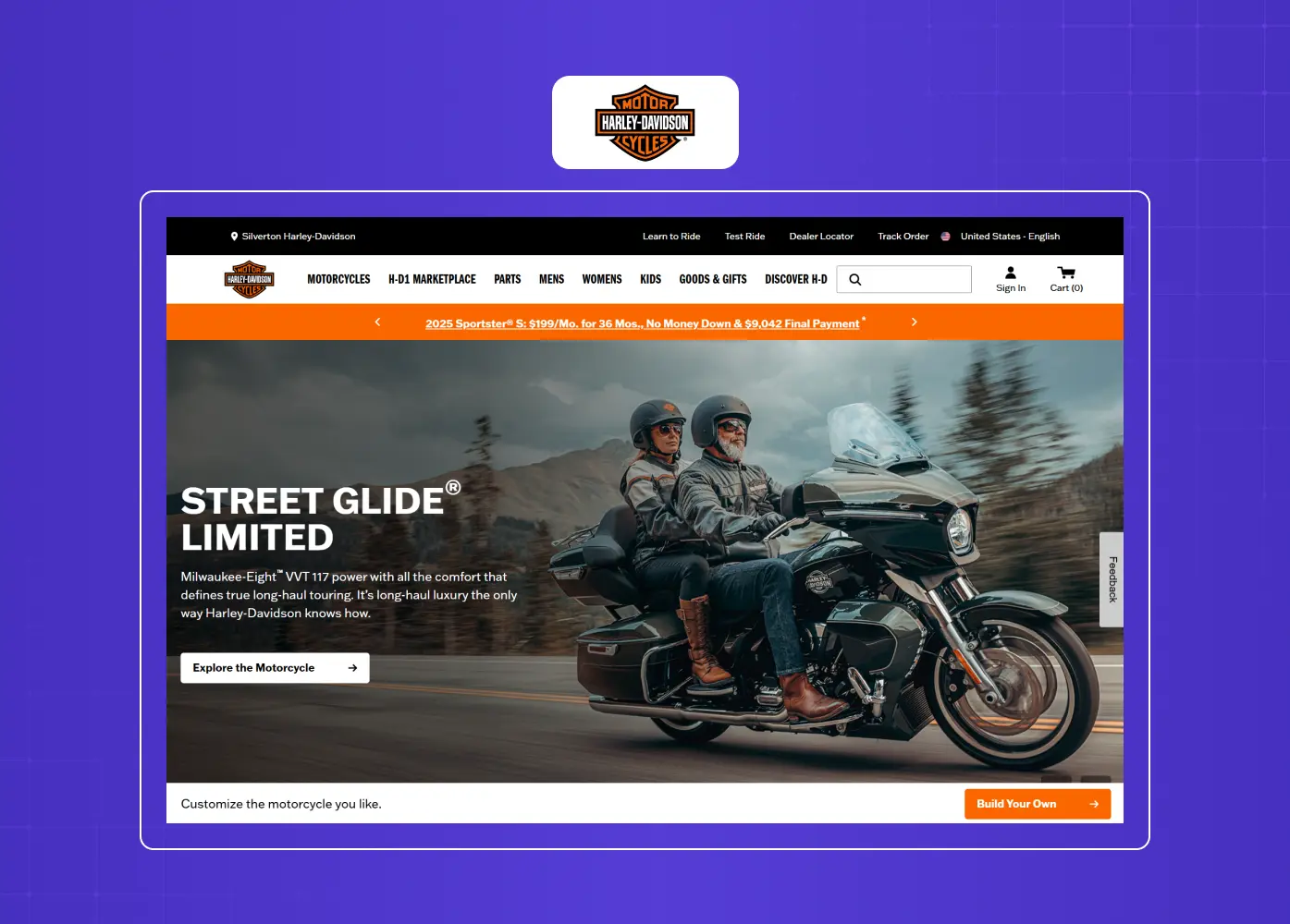
Few brands own a color the way Harley-Davidson owns orange. Their use of this palette is not a design decision; it is an identity statement.
Deep black backgrounds set the visual tone: raw, disciplined, and unapologetically bold
Signature orange creates an immediate visual shorthand for the lifestyle the brand sells
The palette functions as a brand language that users recognize before reading a single word
This is the level of color integration worth aiming for: where the palette and the personality are indistinguishable
3. Swiggy
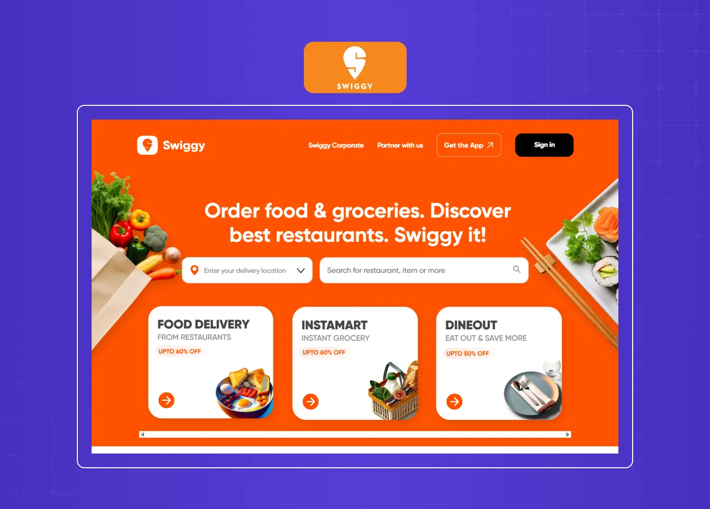
Swiggy's interface is a textbook case of orange driving user behavior. The design is built around the emotional logic of hunger and speed.
Orange functions as the emotional trigger, signaling warmth, food, and fast action
Black and dark tones provide structural grounding without slowing the visual pace
Every micro-interaction reinforces the dual message: we are warm, and we move quickly
The combination creates an experience that feels both appetizing and efficient simultaneously
4. Formula 1
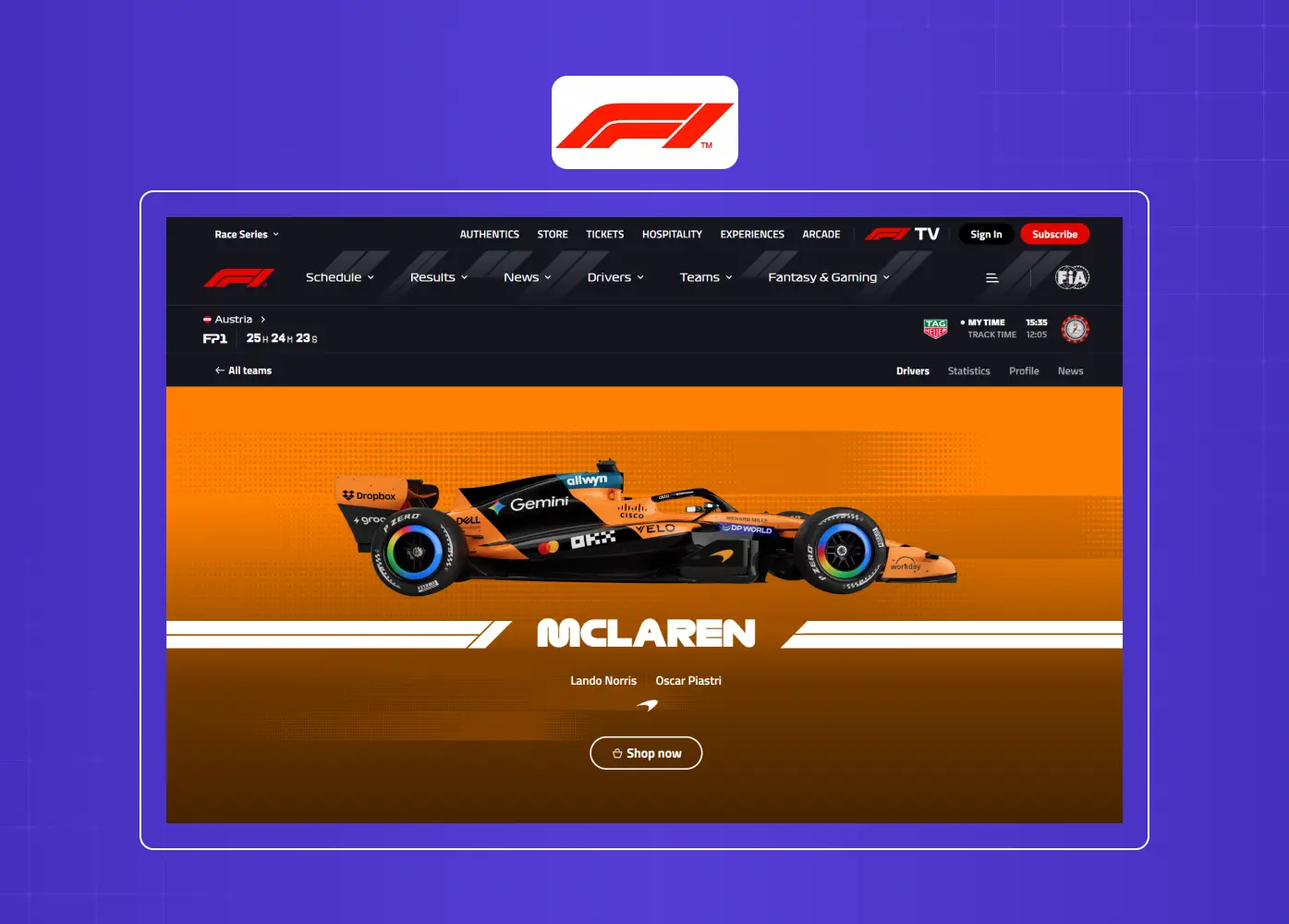
In promotional content and seasonal campaigns, Formula 1 embraces a black and orange identity that maps cleanly onto the sport's personality.
Orange in banners and CTA buttons creates a sense of forward motion and competitive energy
Black handles the precision and seriousness that the sport's engineering culture demands
The palette appears most prominently in race promotions, merchandise sections, and special campaign content
It is a clean example of using color selectively within a wider identity system, rather than applying it everywhere
5. IdeaRocket Animation
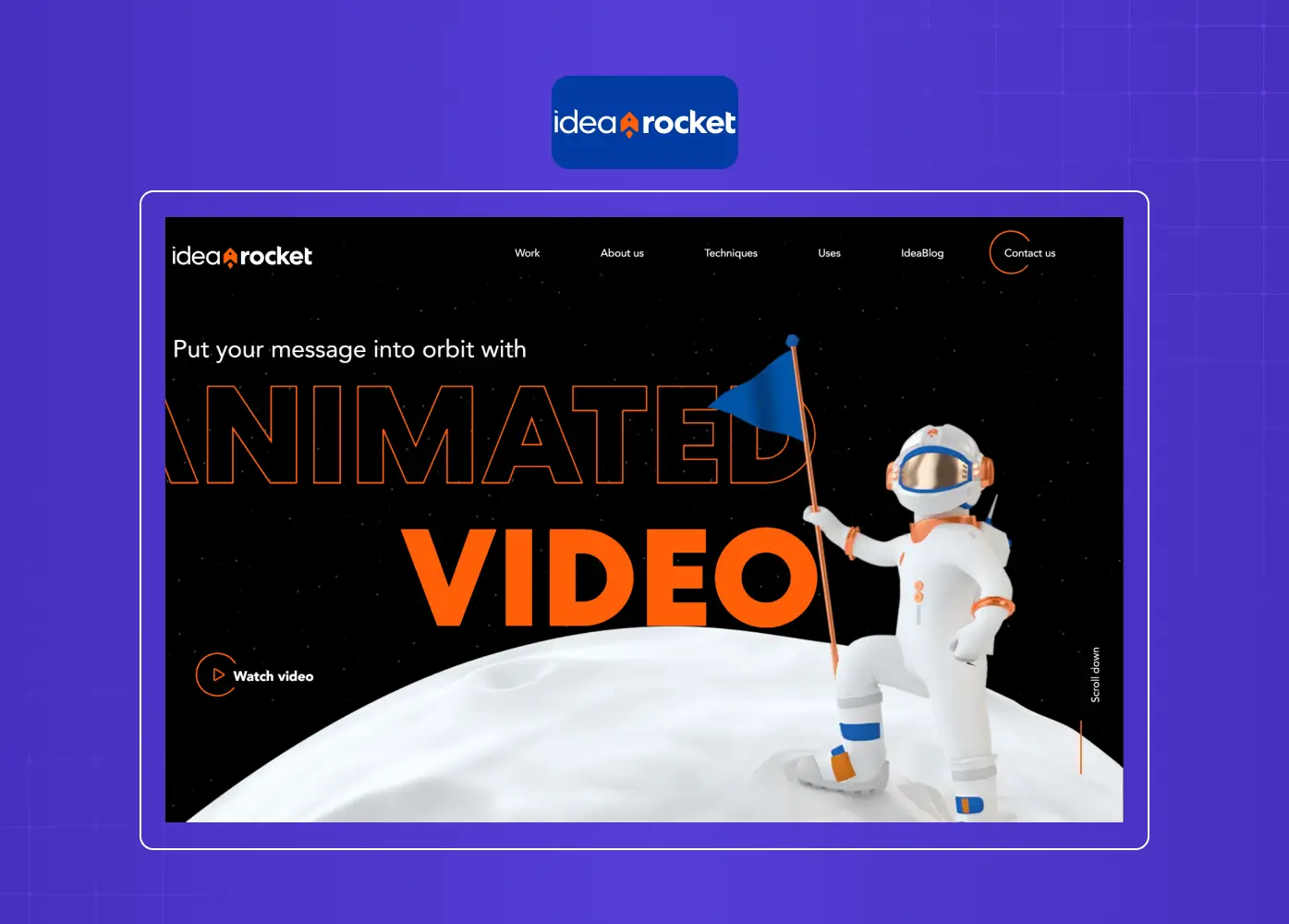
Idea Rocket Animation studio uses a dark navy-black base with high-contrast orange across logos, hover states, and animation previews. The choice is deeply intentional.
The black background makes their motion work appear to glow, amplifying the visual impact of every animation
Orange reinforces the "creative spark" narrative that sits at the center of their brand positioning
Hover states and micro-interactions are calibrated to feel active and alive, not decorative
The palette earns its place by being tied directly to what the studio does, not just how it wants to look
6. Humbleteam
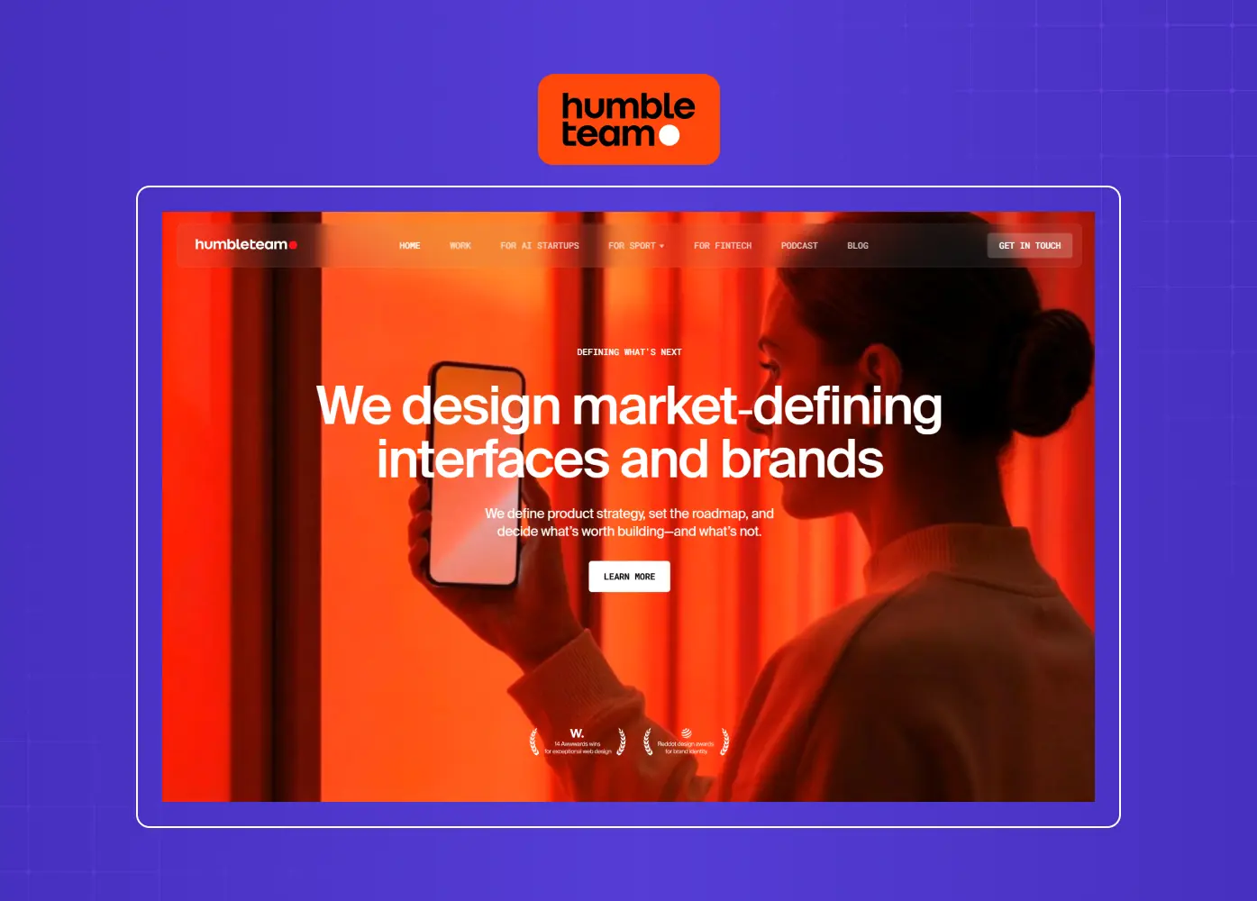
A world-class product design agency, Humbleteam uses black with burnt orange and soft beige to create a palette that feels bold but refined.
Orange appears on hover states and project previews in a restrained way, letting the work speak first
The burnt orange shade reads as grounded and premium rather than playful or aggressive
Generous whitespace prevents the high-contrast palette from feeling dense or overwrought
Their homepage is one of the cleaner examples of how to use this combination without letting it dominate the page
7. MicDrop Agency
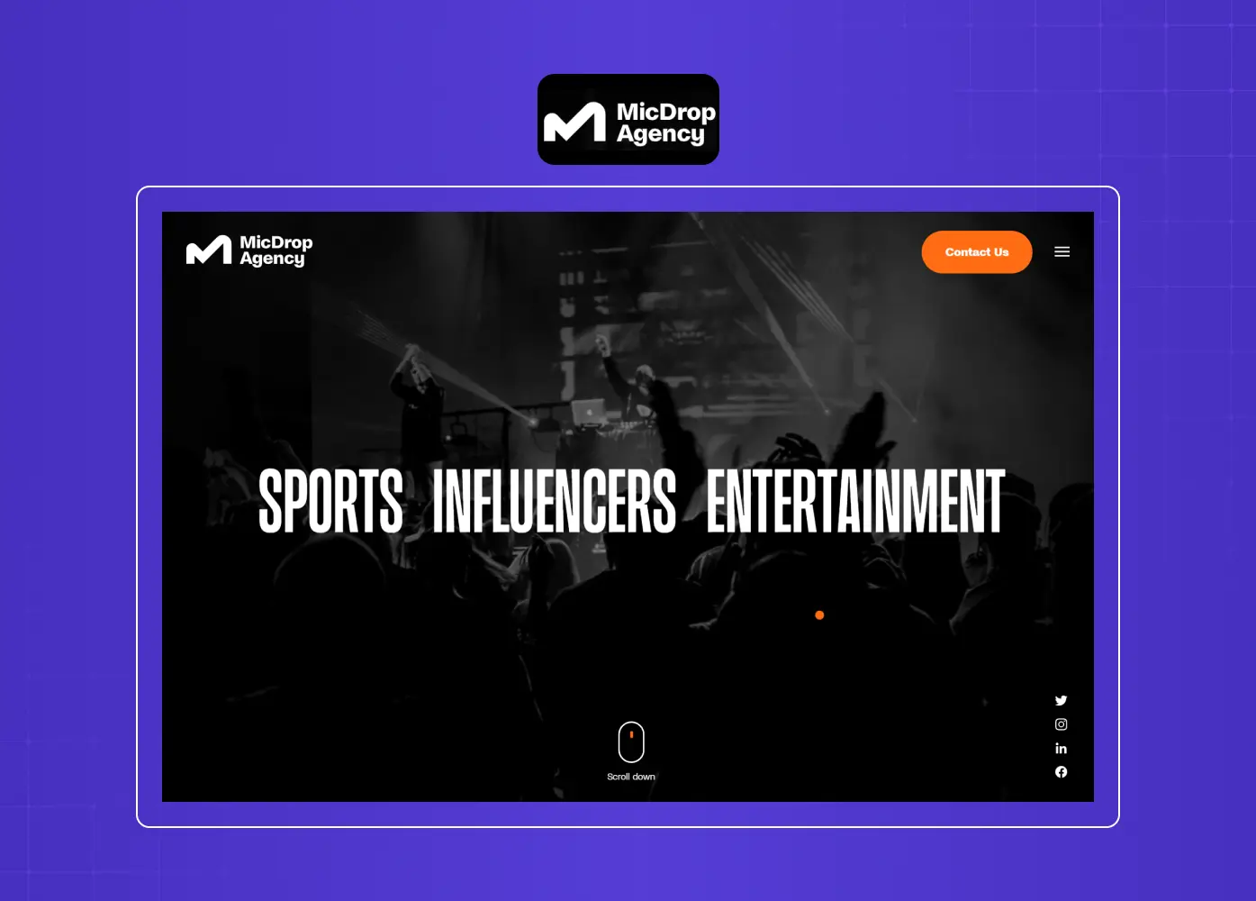
Built around sports and entertainment marketing, MicDrop uses full-screen black visuals with orange text overlays. Everything about the site is calibrated to feel like a hype reel.
Orange is used for bold statements and key messaging, making the brand voice visible in the color itself
Full-screen black hero sections create a dramatic, high-stakes atmosphere before any copy is read
The design does not whisper; it announces. That energy is intentional and aligned with the clients they serve
It is a strong example of a palette that mirrors the industry it operates in, rather than simply looking different
8. Continental Tires
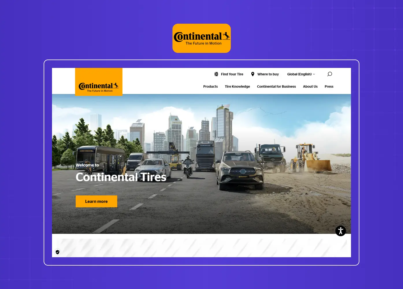
An automotive brand using black and orange is almost expected, but Continental earns its inclusion here because the execution is considered and technically precise.
Orange creates a feeling of motion and mechanical confidence without leaning into aggression
Black handles the structural weight and communicates reliability across global platforms
The palette appears consistently across digital campaigns, product pages, and brand communications
The site feels like the product it sells: controlled, fast, and built to last
9. TekRevol
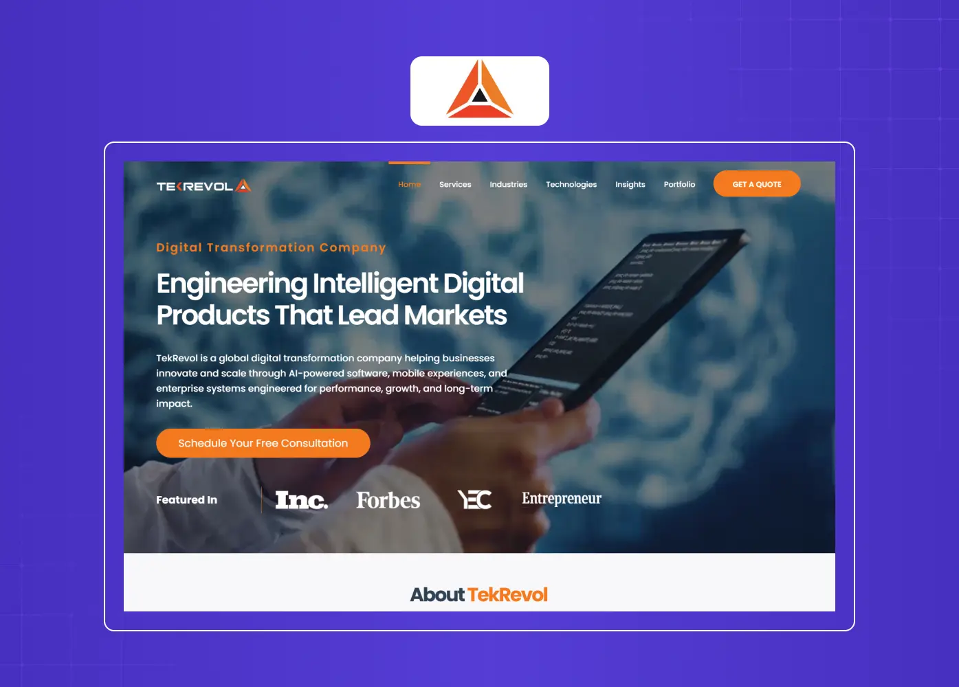
TekRevol, a tech company, uses bold orange gradients against black hero sections, with strong typography and interactive elements that signal forward momentum.
Orange gradients in hero sections communicate growth and energy immediately on arrival
Strong typography paired with the dark base keeps the layout legible and structured
Interactive elements and scroll behaviors are consistent with the palette's urgency
The site is a good reference for SaaS and product-based firms wanting energy and confidence from a single palette
10. Normand PLLC
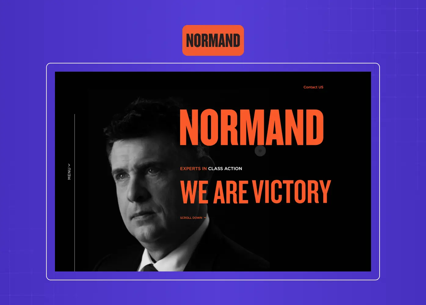
Normand PLLC, a law firm using black and orange is an unexpected choice, and that is exactly why it works. The dark theme feels premium and authoritative while orange accents challenge the category default.
Black communicates the gravity and seriousness that legal clients expect from a firm
Orange accents soften the rigidity that usually defines legal websites, making the firm feel approachable
The combination breaks the blue-gray category stereotype without sacrificing credibility
It is proof that this palette can work in conservative sectors when shade selection and restraint are handled carefully
Design Principles for Getting This Right
Knowing the palette is not enough. Applying the core design principles is where the real work happens.
Use orange as a director, not a decorator
Reserve orange for elements that need user attention like CTAs, key headlines, navigation highlights, and hover states, the same logic behind the strongest landing page designs.
Avoid applying it to everything simultaneously, or it loses the ability to guide the eye
One strong orange focal point per screen section is usually enough
When orange appears everywhere, it stops being an accent and becomes noise
Shade selection matters more than you think
Bright tangerine (
#FF6600range) reads as playful and fast-paced, suited to entertainment and consumer brandsBurnt or amber orange (
#CC4B00to#E86A0Arange) reads as grounded and premium, better for agencies and B2BTest your chosen shade against the specific dark tone you are using, since perceived warmth shifts depending on the background
A small shift in shade can change the entire emotional register of the palette
Give the layout room to breathe
High-contrast palettes intensify visual density, which means generous spacing is not optional
Section breaks, negative space, and clean typography grids prevent the design from feeling aggressive
When in doubt, add more whitespace than feels comfortable
Crowded layouts with bold color contrasts create visual fatigue faster than muted palettes do
Scroll transitions and hover animations are amplified on dark backgrounds, which means motion should be deliberate and minimal; one smooth transition per interaction is usually enough
Avoid stacking multiple animated elements in the same viewport; on a black canvas, simultaneous motion creates visual noise rather than energy
Typography needs careful handling
Orange text works for headlines and short labels; avoid it for body copy
White text on black is the most readable combination for longer paragraphs
Limit type sizes and weights so the palette carries the personality rather than the letterforms
Mixing multiple font weights with strong color contrasts can make a layout feel chaotic rather than bold
Accessibility is not secondary
Bright orange (
#FF6600) on black clears WCAG AA requirements with a contrast ratio around 6.7:1However, white text on orange typically falls below the 4.5:1 minimum for body text, which is a common mistake
Use contrast checkers before finalizing any color-text pairing
Test across devices and screen brightness levels since dark palettes behave differently on OLED and outdoor screens
On mobile, compressed viewport widths can make high-contrast layouts feel visually aggressive; test orange accent sizing and spacing specifically at 375px and 390px breakpoints, not just on desktop
How We Think About Color at Groto
Color strategy at Groto is not about picking what looks exciting in isolation. It is about finding the visual language that carries a brand's specific intent into every screen state, every interaction, every scroll.
When we worked on Camb.ai, the challenge was designing a platform used by global content creators across 140-plus languages. The UX needed to feel energetic enough to match the product's speed while remaining structured enough to handle complex workflows. High-contrast thinking, not necessarily black and orange but the same underlying product design principles of contrast, focus, and intentional color weight, was central to how we approached that work.
The same principles apply when any brand considers a bold palette like this one. Color should do work. It should guide, signal, and establish tone without the user ever consciously noticing it doing so.
If you are exploring a color direction like black and orange for your brand or product, that conversation starts with intent: what do you want users to feel, and where do you want them to go next?
Conclusion
Black and orange is a high-commitment palette that rewards clarity and intentionality
The pairing works because it balances two opposing emotional registers: authority and energy
It is not appropriate for every brand, and choosing it should be a strategic decision, not a stylistic one
Real-world examples across gaming, tech, legal, and consumer brands show the range of execution possible
The design mechanics, shade selection, spacing, type handling, and accessibility, determine whether the palette elevates or overwhelms
When executed with focus, a black and orange website creates a visual identity that is difficult to forget


