

Most AI dashboard designs fail for the same reason: the team designed a standard data dashboard and added an AI layer on top. The result shows AI outputs the same way it shows static KPIs — with no indication of certainty, no explanation of reasoning, no path to recovery when the AI is wrong, and no design language for when the user should trust the AI and when they shouldn't.
An AI dashboard is not a data dashboard with an AI feature. The design requirements are completely different.

Most conversations about AI dashboard design focus on tools: which platform to use, how to connect your data, what prompts to type. That is useful, but it skips the harder question. Even a well-generated AI dashboard can fail its users if the design layer has not accounted for what makes AI outputs fundamentally different from standard data. This piece covers the design principles that determine whether an AI dashboard builds user trust over time or quietly erodes it. It extends the foundation laid in our guide to designing SaaS dashboards users actually understand — these principles begin where that post ends. If you are evaluating tools or building a dashboard from scratch, they apply regardless of which platform you use.
TL;DR
Standard data dashboards show facts. AI dashboards show inferences, and that difference changes everything about how they should be designed.
Most AI dashboard failures are not model problems. They are design problems: outputs presented without confidence indicators, reasoning, or failure-state handling.
The six principles that separate trusted AI dashboards from trust-eroding ones are Confidence Visibility, Decision Transparency, Appropriate Reliance Design, Failure State Dignity, Data Provenance, and Override Accessibility.
These are not visual guidelines. They are structural requirements for any product where AI informs user decisions.
What Is AI Dashboard Design?
AI dashboard design is the practice of designing interfaces where AI — predictive models, recommendation engines, anomaly detectors, classification systems — generates some or all of the information users act on. It is a specialized application within the broader field of what AI UX design is and how it shapes modern products — one with distinct requirements that general AI UX principles alone do not cover.
It is not the same as standard dashboard design. The information type is different, the failure modes are different, and the design requirements that follow from both are different — a distinction explored in depth in our analysis of what actually works in AI UX versus traditional UX for SaaS products, where the behavioral differences between users of each surface consistently at the metric level.
Standard Dashboard vs. AI Dashboard
Aspects | Standard Dashboard | AI Dashboard |
Information type | Facts the system knows with certainty | Inferences the model has generated |
Example | Monthly revenue: $1.2M | Churn risk score: 78% |
Certainty | Deterministic | Probabilistic |
Failure mode | Data pipeline error | Wrong inference, silent or visible |
Design job | Organize and clarify | Organize, clarify, AND communicate uncertainty |
Why the Distinction Matters for Design
A standard dashboard has one design job: present known information clearly. An AI dashboard has several additional jobs that standard design systems are not built to handle — each requiring the 13 principles of design to be applied to a problem set those principles were not originally written to address:
Communicate how certain the AI is about each output
Surface what data and reasoning produced the output
Guide users toward the right level of trust, not maximum trust
Handle AI-specific failures with information, not blank states
Show users where the AI's data came from and when it was last refreshed
Give users a frictionless path to apply their own judgment instead
Nielsen Norman Group's research on AI reliance documents that users given no uncertainty information about AI outputs either over-rely or under-rely. Both outcomes destroy the value of the AI feature. The design solution is calibration — and it is the central challenge at the heart of what agentic experience design is: where the system has agency, the interface must mediate between user confidence and system capability.
Why Most AI Dashboards Fail Users
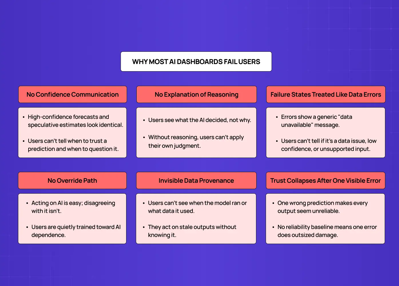
The failures below are not model failures. They are design failures. They show up across products regardless of how sophisticated the underlying AI is.
No Confidence Communication
AI outputs are displayed at the same visual weight as deterministic data. A high-confidence forecast and a speculative estimate look identical. Users have no basis for knowing when to trust a prediction and when to question it.
No Explanation of Reasoning
Users see what the AI decided but not why. A churn risk score with no attribution is a black-box number users can only accept or dismiss. Without visibility into what data drove the output, users cannot apply their own judgment alongside the AI.
Failure States Treated Like Data Errors
When an AI output is unavailable or unreliable, most dashboards show a generic "data unavailable" state. Users have no way to understand whether the model hit a data quality issue, fell below its confidence threshold, or encountered an input type it was not trained on.
No Override Path
Dashboards make it easy to act on AI recommendations but difficult to formally disagree. Users who want to apply their own judgment have no accessible route to do so, and the product quietly trains them toward AI dependence.
Invisible Data Provenance
Users cannot see when the model last ran, what data it used, or whether there are quality issues in the inputs. This creates silent failure: users act on AI outputs based on stale or incomplete data without realizing it.
Trust Collapses After One Visible Error
When all AI outputs carry identical visual certainty, a single wrong prediction suggests every output might be wrong at the same rate. Nothing in the interface has established a reliability baseline, so one error does disproportionate damage. It is one of the most consistent patterns across the AI-driven UX practices every business needs to address in 2026 — trust fragility after a single visible error is among the most common reasons AI features are disabled rather than improved.
Each of these failure modes has a corresponding design solution. The six principles below define what those solutions look like in practice.
The Groto AI Dashboard Design Stack: 6 Principles for Building User Trust
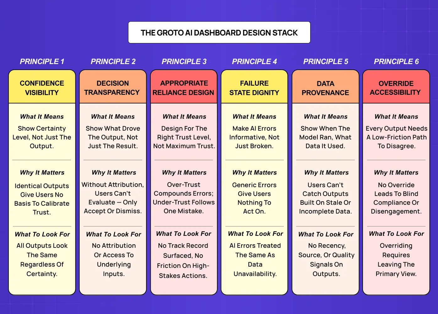
These principles are structural requirements, not visual guidelines. A design system for SaaS products built for deterministic data visualization has no token for AI confidence states, no component for explainability UI, and no documented pattern for AI failure states. The six principles below define what needs to be built, and why.
The six principles at a glance:
Principle 1: Confidence Visibility
Principle 2: Decision Transparency
Principle 3: Appropriate Reliance Design
Principle 4: Failure State Dignity
Principle 5: Data Provenance
Principle 6: Override Accessibility
Principle 1: Confidence Visibility
Show how certain the AI is, not just what it says.
What It Means
Every AI output carries a confidence level by definition. The model produced that output with some degree of certainty, and that certainty varies across outputs, time, and data quality conditions. Confidence visibility means surfacing that certainty as a first-class interface element, present in the primary display of any AI output, not buried in a tooltip or an admin panel. The underlying rules are those of any well-designed information surface — the digital product design principles of hierarchy, emphasis, and progressive disclosure — applied here to the specific challenge of communicating probabilistic certainty.
Why It Matters
When a high-confidence prediction and a low-confidence estimate look identical, users have no basis for calibrating their reliance. They either treat all outputs as equally reliable, or they learn through experience that some outputs are wrong and begin discounting all of them. Neither outcome is what the product intends.
In Practice
Add confidence bands around forecast lines instead of displaying single-point estimates
Use color or opacity gradations — grounded in visual design principles of contrast and opacity — to distinguish high-confidence from low-confidence outputs
Display explicit confidence percentages adjacent to AI outputs where relevant
Apply linguistic qualifiers such as "high confidence," "uncertain," or "insufficient data" on recommendation cards
Visually recede low-confidence outputs relative to high-confidence ones so the hierarchy is immediate
From the Field
Google Maps (travel time estimates) Google Maps surfaces confidence implicitly through ranges rather than single-point estimates. When traffic data is uncertain, it shows "35-55 min" instead of "42 min." That range is a confidence signal baked into the primary display, not a tooltip. Users calibrate their planning accordingly without needing to understand the model behind it. This is exactly what confidence visibility looks like in a consumer-facing AI interface.
What to Look For
If all AI outputs carry identical visual treatment regardless of model certainty, confidence visibility has not been designed. Ask engineering whether confidence scores exist in the underlying model output. If they do and the interface does not surface them, the design is actively hiding information users need.
Principle 2: Decision Transparency
Make AI reasoning visible and auditable.
What It Means
Decision transparency means surfacing the primary inputs and logic behind an AI output in a way users can inspect, even if they cannot fully audit the model. The minimum viable implementation answers one question: what data did the AI use to generate this output?
Why It Matters
A churn risk score that surfaces "based on login frequency, feature adoption rate, and support ticket volume over the past 30 days" gives a user something to evaluate. They can assess whether those inputs are reliable, whether they have context the model lacks, and whether the output makes sense. A score with no attribution is a black-box number users can only accept or dismiss. Research on explainable AI interfaces consistently shows that "Why this recommendation?" access beside AI outputs increases user trust scores and reduces support tickets.
In Practice
Surface the primary data signals that contributed to each AI output
Indicate which factors carried the highest weight in the model's decision
Flag when the AI is operating on data it has not seen frequently
Make the explanation accessible from the output itself, not from a separate documentation page
Use progressive disclosure: a one-line summary with an expandable detail view for users who want more — one of the micro UX design patterns that improve user experience instantly and the most practical way to surface AI reasoning without overloading the primary view
From the Field
When we redesigned Barista, a PR-first AI platform, PR teams needed to understand why the AI flagged a particular angle or recommended a specific content approach for a client. Without visible reasoning, account managers were either following AI suggestions blindly or ignoring them entirely. Making the primary contributing signals visible in the workflow was the design change that made AI recommendations usable rather than decorative.
What to Look For
If AI outputs appear with no attribution and no access to underlying inputs, decision transparency has not been addressed. The starting point is a consistently accessible, lightweight explanation of primary data sources and factors behind each AI output.
Principle 3: Appropriate Reliance Design
Build for the right level of trust, not maximum trust.
What It Means
The goal of AI dashboard design is not to maximize user trust in the AI. It is to align user confidence with actual AI capability. That means designing for both over-trust prevention and under-trust correction simultaneously.
Why It Matters
Over-reliance is the more common failure. A dashboard that presents AI outputs confidently with no uncertainty information trains users to act on recommendations without applying their own judgment. This works when the AI is right and creates compounding errors when it is wrong in cases where domain knowledge would have caught the mistake — a risk financial AI design specialists treat as a baseline design requirement, since over-reliance on a wrong model output in a financial context carries direct monetary consequences. Under-reliance follows visible AI errors: one wrong recommendation causes users to discount subsequent correct ones, sometimes permanently.
In Practice
For over-reliance prevention:
Require explicit confirmation before high-stakes AI-driven actions execute
Surface confidence indicators before the user acts on a recommendation, not after
Show the key inputs behind an AI decision at the moment the user is about to act on it
For under-reliance correction:
Surface how often the AI has been correct in the user's specific context
Display AI track record on similar historical cases
Show the cost of ignoring a correct recommendation over time
From the Field
When we designed the AI-powered hiring platform for Pathways, appropriate reliance was a central design concern. Hiring decisions carry real consequences for candidates and organizations alike. The solution was confirmation patterns that surfaced key inputs behind an AI assessment at the moment a recruiter was about to act, creating proportional friction on high-stakes actions without making the tool feel adversarial.
What to Look For
If the product has no mechanism for surfacing AI track record, no confirmation friction for high-stakes AI actions, and no design response to a state where a user has been ignoring AI outputs for a sustained period, appropriate reliance design has not been addressed.
Principle 4: Failure State Dignity
Design AI errors as information, not as breakdowns.
What It Means
Standard dashboard errors are operational: a pipeline failed, a metric is unavailable, a connection timed out. AI dashboard errors are categorically different: the model produced a wrong output, or produced one with insufficient data to be reliable, or encountered an input distribution it was not trained on. AI-specific failure modes require AI-specific design responses.
Why It Matters
The most common design failure is treating AI errors like data errors: displaying a generic "data unavailable" state or showing nothing. A blank cell or generic error leaves users without the information they need to decide whether to wait, investigate, or proceed without the AI's input. A dashboard that surfaces "forecast unavailable — model confidence below threshold for current data volume" gives the user something to work with. Blank gives them nothing and damages trust disproportionately.
In Practice
Distinguish between data-quality failures, model-confidence failures, and out-of-distribution inputs in error copy
Always indicate what the user should do next: wait for more data, consult an alternative source, or proceed with manual estimation
Distinguish between a temporary failure (the model will recover when data conditions improve) and a fundamental limitation (the model cannot reliably handle this input type)
Avoid using the same visual component for AI errors and standard data unavailability states
Write error copy from the user's next action, not from the system's technical state
From the Field
When we worked on LearnSphere's AI-powered edtech platform, failure state design was non-trivial because the product serves three distinct roles: admins, teachers, and students. An AI recommendation failing for a student requires a different error state than the same failure for a teacher. Designing role-aware failure states starts with clearly documented UX persona examples — the role definitions that make "what does this user type need from a failure message?" a design question rather than an assumption. Different detail levels and next-action prompts per role were the difference between an error that confused users and one that gave them a path forward.
What to Look For
If AI error states use the same visual and copy treatment as standard data unavailability, failure state dignity has not been designed. AI failures require a distinct design language that communicates cause, context, and next action.
Principle 5: Data Provenance
Surface where the AI's inputs came from.
What It Means
AI models are only as reliable as the data they were trained on and the inputs they receive at inference. Data provenance means making the data sources, recency, and quality of AI inputs accessible from the AI output itself, at the moment the user is deciding whether to act on it. Not buried in documentation. Not in an admin settings panel.
Why It Matters
Users who understand the data behind an AI output can identify cases where inputs are stale, incomplete, or unrepresentative of the current situation, and adjust their reliance accordingly. This is especially consequential in high-stakes applications — banking app design, for instance, where a data recency gap in an AI risk model carries direct financial and compliance implications beyond a missed user action. Users who cannot see data provenance have no mechanism to catch those cases. Its absence only becomes visible after a user discovers that an AI recommendation was based on a data gap they would have caught if they had known about it.
In Practice
Every AI output should carry three provenance indicators, accessible without leaving the primary view:
Data recency: when was the last model inference and what period does it cover
Primary sources: which signals informed this output
Quality warnings: missing sources, degraded coverage, or reduced input quality that may affect reliability
From the Field
When we built Gini's health tracking platform, which combines DNA insights with AI-powered food logging and personalized recommendations, data provenance was a core design requirement. Users needed to know whether a dietary recommendation was based on their most recent logged data or on older baseline inputs. An AI recommendation that surfaces "based on your last 14 days of activity" is one users can contextualize. One that offers no provenance signal is one users eventually stop trusting.
What to Look For
If AI outputs have no accessible indication of when they were generated, what data they are based on, and whether data quality issues exist in the model's inputs, data provenance has not been addressed.
Principle 6: Override Accessibility
Every AI output needs a clear, unburied path to disagree.
What It Means
An AI dashboard that makes AI outputs easy to act on but difficult to override has, by design, pushed users toward AI dependence. Override accessibility means every AI output in a decision-making context has an accessible, low-friction path for the user to apply their own judgment instead. It must be in the primary UI, labeled in terms of the user's action, and require no more steps than accepting the AI recommendation.
Why It Matters
Users who cannot easily express disagreement with an AI output will either follow it against their judgment (over-reliance) or stop engaging with the AI entirely (disengagement). Both outcomes remove the AI feature's value. There is a secondary benefit too: every override is a training signal, a case where the user's judgment diverged from the model's output. Dashboards that make overrides frictionless generate the feedback data that improves the model over time. Dashboards that bury overrides lose that signal and the user's trust simultaneously.
In Practice
An AI-recommended workflow has an "I'll decide this manually" option at the same visual level as "Accept recommendation"
A risk classification has an "Override to [category]" affordance accessible from the primary view, not from a settings panel three levels deep
A forecast has an "Adjust this forecast" entry point in the primary view, not in an admin interface
Override actions are labeled in terms of the user's choice, not in terms of the model's failure
Overrides are logged and surfaced back to the model team as training signal data
From the Field
Gmail Smart Reply / Smart Compose Gmail's AI suggestion layer is built entirely around frictionless override. Suggested replies appear as light, dismissible chips. Smart Compose completions appear as greyed-out ghost text that disappears the moment you type your own word. The AI is present but never in the way. Disagreeing with the AI requires zero additional steps beyond simply continuing to type. This is the gold standard for override accessibility in a high-frequency, low-stakes AI context — and the clearest consumer-facing illustration of how AI copilot design works at a patterns level: present, useful, and never in the way of the user's own judgment.
What to Look For
If overriding an AI output requires navigating away from the primary view, submitting a support request, or any action that feels like a workaround, override accessibility has not been designed.
Where These Principles Apply in Practice
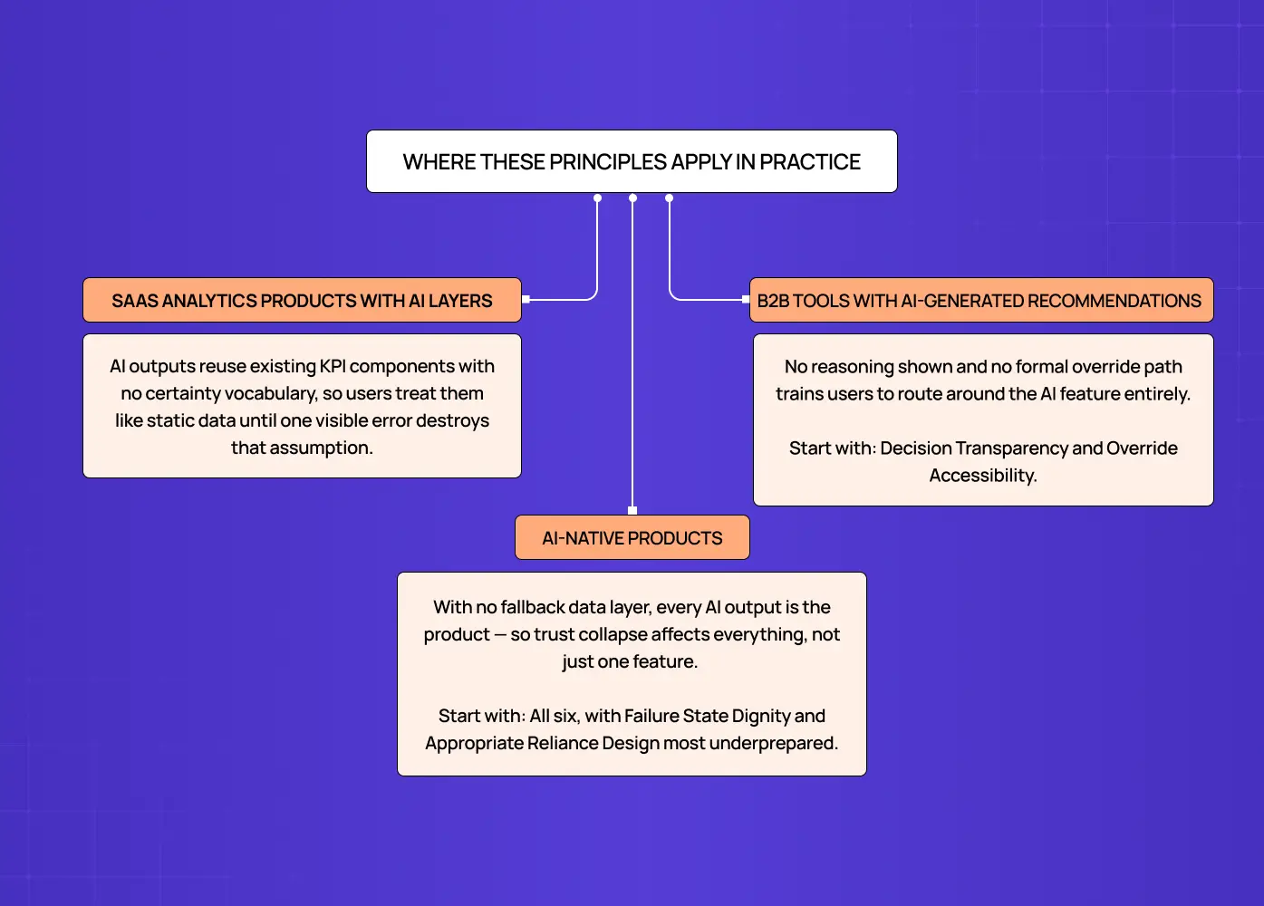
The six principles map directly to specific product contexts. The failure modes differ by product type, and so does the starting priority.
SaaS Analytics Products with AI Layers
These products most commonly fail on Confidence Visibility and Data Provenance. The AI model was added after the data product was already built — which is the sequencing problem documented in our guide to best practices for integrating AI into SaaS UX, where planning the design system extension before the AI feature ships prevents precisely these gaps.
The compounding result:
The design system has no vocabulary for expressing model certainty
Existing KPI components get reused for AI outputs without modification
Users interact with AI outputs exactly as they would with static data, until the first visible error destroys that assumption
Data freshness indicators exist for the data pipeline but not for the model inference layer
Starting priority: Confidence Visibility and Data Provenance.
B2B Tools with AI-Generated Recommendations
Hiring platforms, CRM intelligence tools, and content platforms most commonly fail on Decision Transparency and Override Accessibility. Users in professional contexts are accountable for their decisions, which means:
They need to understand why the AI recommended something before they can act on it professionally
They need a formal path to disagree that does not feel like using the product incorrectly
Burying the override path trains them to route around the AI feature entirely
Starting priority: Decision Transparency and Override Accessibility.
AI-Native Products
Products where AI is the primary interface rather than a feature layer need all six principles from the start:
There is no prior deterministic data layer users can fall back on
Every AI output is the product, not a supplement to it
Trust collapse affects the entire product, not just one feature
The design system must be built from the beginning with AI-specific components
Starting priority: All six, with Failure State Dignity and Appropriate Reliance Design as the most commonly underprepared.
What Most AI Dashboard Designs Get Wrong
The reason these six principles are absent from most AI dashboards is not disagreement with them in principle. It is a sequencing problem.
AI features are typically designed by teams that were originally building a data product. Intelligence was added later, but the design system was never updated to accommodate the new requirements. The result:
Standard data display components get reused for AI outputs they were never designed to handle
The design system has no token for confidence states, no component for explainability UI, no pattern for AI-specific failure states. Closing those gaps means building explicitly from the agentic UI patterns that define trust-first interface behaviour — the design vocabulary AI products cannot scale without.
The product looks like the data product it started as and fails users in all the ways a data product is never asked to fail
At Groto, we build the AI design system layer as a prerequisite to shipping AI features, not as a follow-up. That process begins with high-fidelity wireframes for each AI output type — they are how AI-specific states (confidence bands, reasoning panels, failure states) get pressure-tested before development begins. The Groto AI Dashboard Design Stack is the evaluation lens we apply to every AI product audit. If any one of the six principles is absent from the primary interface, the AI feature is operating below its potential and eroding user trust in direct proportion to how often the model is right but users cannot tell, and how often it is wrong but users have no path to recover from it.
Conclusion
A standard data dashboard and an AI dashboard are not the same design problem. The six principles that separate AI dashboards that build user trust from those that quietly erode it:
Confidence Visibility — surface model certainty as a first-class interface element, not a tooltip
Decision Transparency — make the primary inputs and reasoning behind AI outputs accessible at the point of use
Appropriate Reliance Design — calibrate user confidence to actual AI capability, preventing both over-trust and under-trust
Failure State Dignity — treat AI errors as informative events with cause, context, and a next action
Data Provenance — surface data recency, sources, and quality warnings alongside every AI output
Override Accessibility — make human judgment an equal-weight option at the same level as AI recommendation acceptance
If your product's AI features are generating outputs users ignore, outputs users follow without questioning, or loss of confidence across the product after a single visible error, the design system is not equipped for the product it is serving. For teams making the business case for this investment, our breakdown of how to calculate the ROI of UX design translates those failure modes into quantifiable costs.
Groto works with SaaS and AI-native companies to build the design infrastructure AI features need to perform. If your product has AI outputs and a dashboard that was not built to support them, talk to our team.


