

From cave walls to SaaS dashboards, line art has shaped visual communication for over 70,000 years. This guide covers everything you need: types, techniques, tools, and real-world applications.
Everything designers need to know about line art design: types, styles, techniques, and real-world applications.
TL;DR
Line art design uses intentional lines, typically restrained in fill and shading, to create visual compositions across branding, UI, illustration, and more. It relies on line weight, type, direction, and technique to communicate form and emotion. This guide covers every major style, technique, and real-world application a designer needs to know, from foundational contour work to minimalist logo design and digital product illustration.
"A drawing is simply a line going for a walk," Paul Klee once said. It is a deceptively simple idea. But anyone who has tried to build a brand identity, design a product icon, or craft a marketing illustration from nothing but strokes knows that line work is anything but simple to do well.
At its core, line art design is the practice of using intentional, distinct lines to construct visual meaning without relying on fills, gradients, or heavy rendering. It is one of the oldest visual languages in human history and, in 2026, one of the most commercially relevant.
From minimalist SaaS dashboards to luxury packaging to editorial headers, lines are doing enormous work across the design landscape. This guide breaks down what that work actually involves.
What Is Line Art Design?
Line art design refers to visual compositions created primarily through distinct, controlled lines, where the strokes themselves carry the structural, emotional, and communicative weight of the piece. Understanding the broader visual design principles that underpin composition, contrast, and hierarchy is useful context for why line work operates the way it does.
Unlike illustration styles that rely on color blocking or photorealistic shading, line work isolates form. You are left with contour, weight, direction, and density. Those four variables are all you have, and all you need.
What makes this approach particularly durable in commercial graphic design practice is its versatility. A well-constructed line illustration scales from a favicon to a billboard without losing fidelity. It reproduces cleanly in single-color print. It works on dark backgrounds and light ones. No wonder it remains a go-to visual language for everything from brand identity systems to SaaS onboarding screens.
A Brief History of Line Art
Line art is not a modern invention. The earliest known examples date back over 73,000 years, to ochre-etched geometric patterns found in South African caves. From there, the lineage runs through ancient Egyptian hieroglyphic illustration, Greek vase painting, and into the European Renaissance.
Leonardo da Vinci brought anatomical precision to line work, using hatching to build volume in his drawings without a single fill. Picasso distilled subjects to their defining contours in his Cubist period, demonstrating that a figure could be fully communicated in a handful of strokes. Matisse's Blue Nudes showed how a line's direction and weight could carry emotion on its own. Edgar Degas repeated lines around his ballerina figures to imply motion. Van Gogh turned hatching into a signature style, using directional strokes as expression rather than technique.
In the twentieth century, Keith Haring brought bold outline-based line work into commercial and public contexts, connecting the tradition directly to contemporary branding. The line between fine art and commercial design has been blurring ever since.
The 6 Core Types of Lines in Design
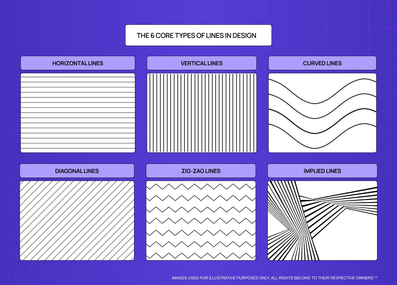
Before any discussion of style or technique, it helps to understand what the six foundational line types communicate visually. Each carries distinct psychological weight.
Horizontal Lines
Signal rest, calm, and groundedness
Evoke stillness and landscape; common in wellness, nature, and lifestyle branding
Create a sense of stability and ease in compositions
Vertical Lines
Communicate power, strength, and aspiration
Common in financial, architectural, and institutional design contexts
Pull the eye upward and convey presence and authority
Curved Lines
Suggest movement, softness, and organic energy
Dominant in fashion illustration, Art Nouveau-influenced work, and flowing logo design
Add rhythm and warmth to compositions that might otherwise feel cold
Diagonal Lines
Generate visual tension and directional energy
Used to direct the eye, imply motion, or create dynamic brand marks
Common in sports, fintech, and high-energy editorial contexts
Zig-zag Lines
Communicate youthful energy, action, and unrest
Used in contexts that need to convey excitement or disruption
Frequently appear in youth branding, activewear, and high-energy campaign graphics
Implied Lines
Not drawn explicitly; formed by the alignment of elements or the viewer's eye completing a path
One of the more advanced concepts in line work
Used extensively in layout composition, gestalt-informed illustration, and spatial design
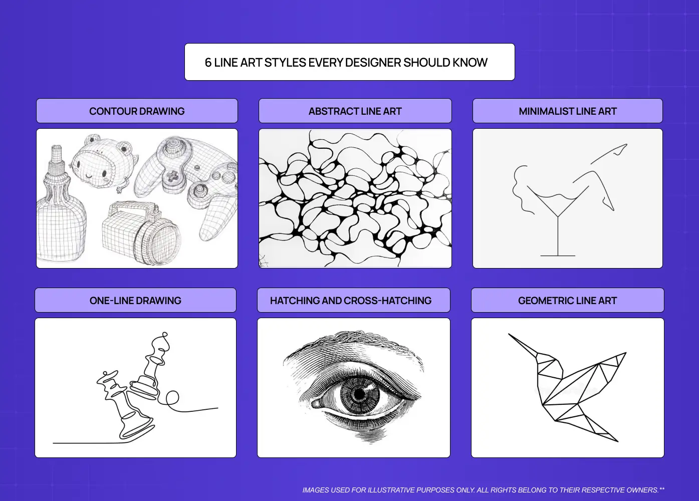
6 Line Art Styles Every Designer Should Know
Before choosing a style, it helps to understand what actually distinguishes one line art approach from another. Four dimensions do most of the work: line weight (uniform monoline versus variable calligraphic weight), line quality (clean and stable versus textured or dry-brush), continuity (unbroken strokes versus hatched, dashed, or broken marks), and detail density (spare minimalism versus high-texture rendering). Every style listed below is essentially a different configuration of these variables. Knowing that makes style selection a deliberate design decision rather than a gut feeling - and committing to a consistent visual mode is one of the earliest expressions of a coherent design philosophy. The same logic applies when distinguishing line-based minimalism from depth-driven styles like skeuomorphism and neumorphism, which sit on the opposite end of the rendering spectrum.
1. Contour Drawing
Traces the outer and inner edges of a subject without any tonal fill. It is the purest form of line art and often serves as the foundation of more complex illustration work.
Contour drawing is the default mode for icon design, product sketches, and UI illustration because it reads clearly at any size and reproduces in any color.
2. Abstract Line Art
Non-representational compositions built from lines, shapes, and geometric patterns rather than recognizable subjects. The goal is emotional resonance over literal representation.
Abstract line work appears frequently in brand identity backgrounds, editorial headers, and packaging design. It gives visual texture without competing with the primary message.
3. Minimalist Line Art
Single-stroke or extremely spare illustrations that reduce a subject to its most essential form. Think the Nike swoosh logic applied to illustration.
This style demands the most discipline. Every line has to justify its presence. When it lands, it is incredibly powerful, particularly in luxury branding and premium product design.
4. One-Line Drawing (Continuous Line)
The entire image is constructed from a single, unbroken stroke. The line never lifts from the surface. The result is a sense of fluidity, continuity, and artistic confidence.
One-line portraits and figures have become enormously popular in contemporary branding. They communicate creativity and sophistication without visual clutter.
5. Hatching and Cross-Hatching
Parallel lines (hatching) or intersecting sets of lines (cross-hatching) are used to create the illusion of shadow, depth, and texture without solid fills.
This style lives in editorial illustration, detailed technical drawing, and any context where you want a handcrafted, high-craft aesthetic. It is also increasingly popular in premium packaging design.
6. Geometric Line Art
Compositions built from precise geometric forms, grids, and mathematically derived shapes. Lines are the connective tissue of polygons, tessellations, and structural patterns.
Geometric line work is a staple in tech branding, SaaS branding, and data visualization design because it reads as analytical and organized. Isometric illustration, where objects are rendered in a three-dimensional grid projection, is one of the most prominent expressions of this style in contemporary SaaS and product design.
Key Techniques That Separate Good Line Art from Great Line Art
Knowing the styles is the starting point. Executing them well comes down to a handful of technical decisions that most designers make instinctively once they understand the principles.
Line Weight Variation
Using varied stroke widths within a single composition is one of the most effective ways to create depth without shading. Thick lines anchor foreground elements; thin lines recede. The contrast creates the illusion of three-dimensionality.
A flat, uniform stroke weight across an entire illustration is one of the most common signs of underdeveloped line work.
Negative Space as a Design Element
In line art, what you leave empty is as important as what you draw. Strong compositions use negative space deliberately, giving the eye room to move and preventing visual overload.
We think of negative space not as absence but as active structure. It is a line art design idea that transforms the white of the canvas into part of the composition. Applying the Rule of Thirds to negative space placement, or using the proportional logic of the Golden Ratio to determine where a focal point sits within the frame, brings structural authority to compositions that might otherwise feel arbitrarily arranged. These are applications of the broader principles of design - contrast, emphasis, and balance — that govern how every element in a line composition relates to every other.
Stroke Direction and Flow
The direction in which lines travel through a composition creates implied movement and guides the viewer's attention. Lines that flow toward the focal point pull the eye there. Lines that radiate outward create energy. Lines that cut against the grain create tension — tension that only reads as intentional when it sits within a broader sense of compositional equilibrium, where the overall arrangement still feels resolved despite the directional pull.
Proportion and Simplification
One of the most demanding skills in this practice is deciding what to leave out. Great line drawing reduces a complex subject to its defining characteristics and discards the rest. Over-rendered line work loses the clarity that makes the style powerful.
Stippling
Stippling builds tonal value and texture through dots rather than strokes. By varying the density and size of individual dots, a designer or illustrator can create the full range of shadow, highlight, and surface texture without a single line. It is closely related to hatching in purpose but produces a visually softer, more grainy quality. Stippling is common in editorial illustration, scientific and botanical drawing, and premium packaging where a hand-crafted, high-detail aesthetic is the goal.
Line Art and Color
Classical line art relies on a monochromatic color scheme by tradition. In contemporary commercial design, however, line work and color are used together far more often than they are kept apart.
Selective colorization - adding a single accent color to an otherwise black-and-white line composition is one of the most effective techniques in modern editorial and brand illustration. It directs attention, adds warmth, and gives line-based graphics a contemporary finish without losing the clarity that makes the style useful.
Watercolor washes behind line drawings are common in food, lifestyle, and wellness branding, where the softness of the color background contrasts productively with the precision of the line work above it. Color blocking, pairing bold filled areas with black outlines, is a dominant trend in social media graphics and packaging design. Each of these approaches reflects different color palette choices that interact with line work in distinct ways - warm palettes against black line versus cool washes beneath neutral strokes produce very different emotional registers.
The principle across all these approaches is the same: line establishes structure and form; color adds emphasis and emotion. The two work best when each is doing a distinct job.
Where Line Art Design Actually Lives in the Real World
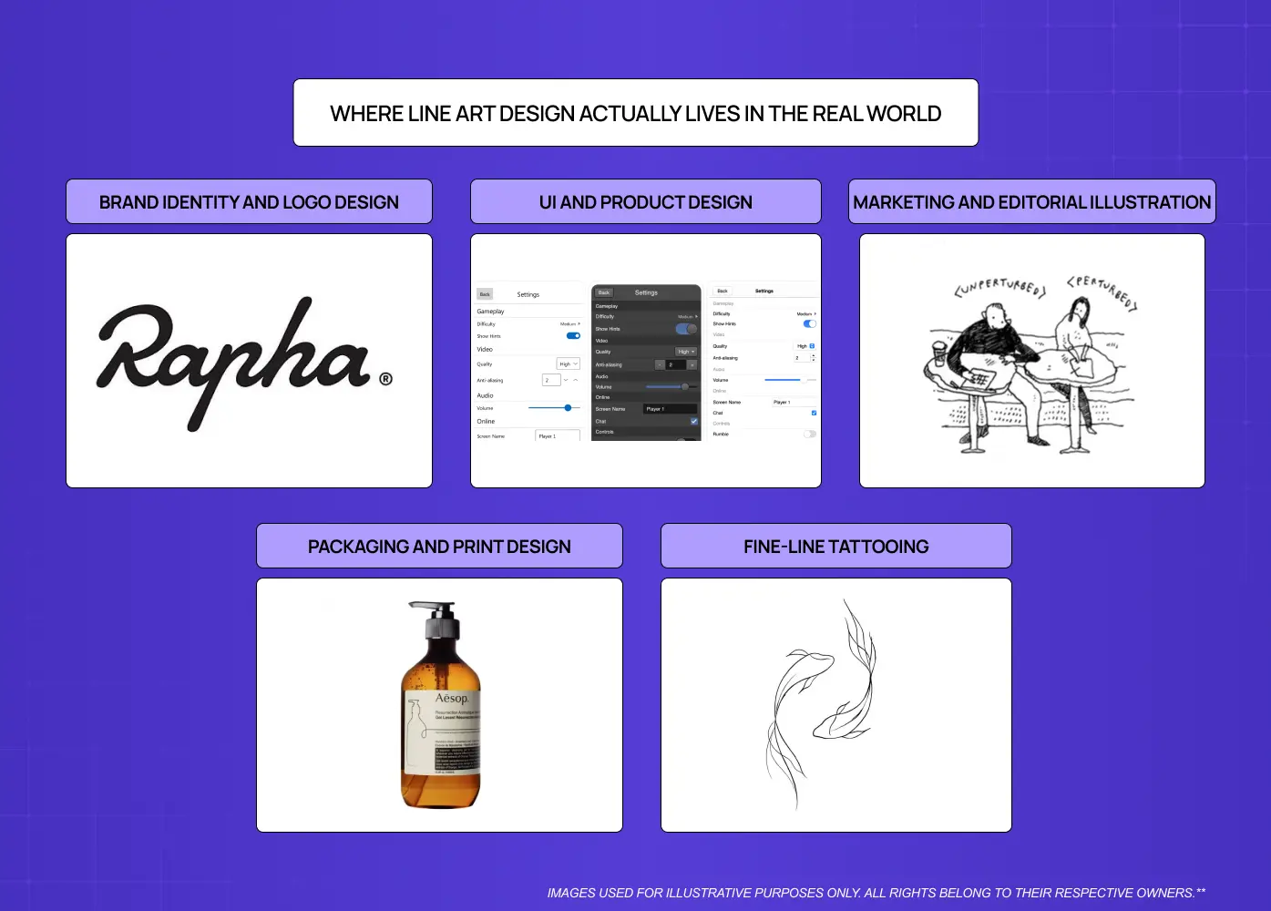
This is where the theory connects to practice. Line art is not a niche or nostalgic style. It is embedded in contemporary commercial design across multiple verticals.
Brand Identity and Logo Design
Minimalist line art logos are a dominant trend in premium and lifestyle branding. Single-stroke animal marks, architectural line logos, and contour-based wordmarks communicate craft, restraint, and confidence and line art style adoption is one of the most visible shifts that happens during a company rebranding, as brands move away from complex emblems toward marks that hold up at small sizes and across digital contexts.
When we work on brand identity systems, line-based illustration is often the visual language we reach for in supporting graphics, because it stays flexible across backgrounds, sizes, and contexts without ever competing with the primary logo.
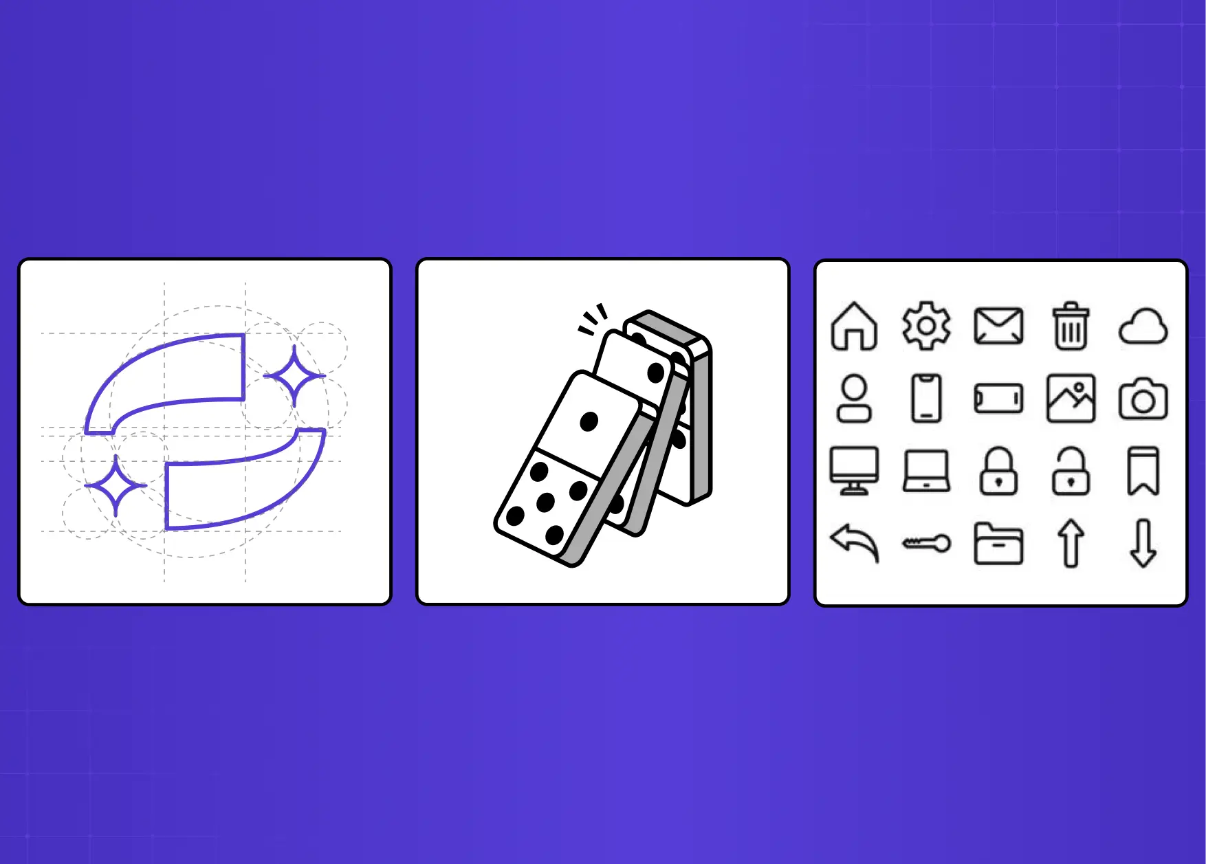
UI and Product Design
Icons are line art. System illustrations in onboarding flows, empty states, and modals are line art and within digital product design, these elements carry a disproportionate share of the personality and clarity burden at moments when words alone fall short. Subtle background textures in SaaS dashboards often use geometric line patterns to add depth without visual noise - a pattern that has accelerated alongside broader UI/UX trends toward flat, low-distraction interfaces.
In our work on products like Barista and Pathways, the illustration systems we built relied heavily on clean line work precisely because it reads well across both light and dark UI themes and stays legible at small sizes without degrading. Structuring these illustration assets inside design systems for SaaS is what makes them reusable and maintainable at scale rather than one-off deliverables.
Marketing and Editorial Illustration
Line art is particularly effective for small and mid-size brands that need a cohesive visual identity system without the production overhead of photography. A set of three thematic line illustrations covering the product, the maker, and the context of use can carry an entire brand across banners, packaging, business cards, and social media with complete consistency.
Line drawings are also frequently used as editorial headers, blog illustrations, and social media graphics because they are fast to produce in sets, maintain stylistic consistency, and communicate with a warmth and personality that stock photography rarely achieves. Browsing website design examples that use line illustration effectively is one of the fastest ways to calibrate what the style can achieve across different brand voices.
Packaging and Print Design
Hatching, cross-hatching, and detailed botanical line illustration have made a significant comeback in premium packaging. The hand-crafted visual quality suggests artisanship and authenticity, which is enormously valuable in food, beauty, and lifestyle product categories.
Fine-Line Tattooing
Fine-line tattooing has emerged as one of the most visible current expressions of line art at a commercial scale. The style, characterized by thin, precise strokes, minimal shading, and high detail density, has driven significant demand for illustrators who can produce clean line work at small scales. For designers, it represents a direct translation of contour and stippling technique into a wearable medium. Many contemporary illustrators now work across both screen-based and tattoo contexts, and the aesthetic influence runs in both directions.
Tools for Line Art Design
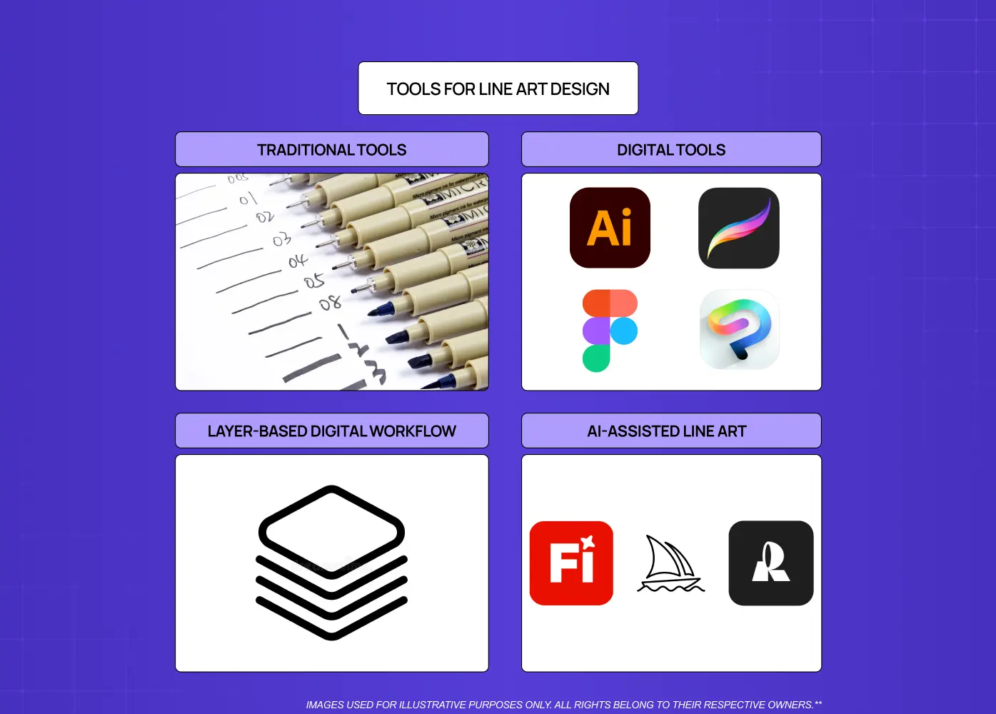
The medium shapes the output. The right tool depends on whether you are working in traditional media, digital, or somewhere between.
Traditional Tools
Fine liners and technical pens: Consistent line quality, permanent ink, ideal for detailed illustration work
Brush pens: Variable line weight depending on pressure; excellent for expressive, calligraphic strokes
Graphite pencils (H grades): Light, precise lines for planning and underdrawing; 2H and 4H are the go-to for initial sketching
Digital Tools
Adobe Illustrator: The industry standard for vector-based line art. Bezier paths give precise control over every stroke; output scales infinitely
Procreate: The preferred tool for hand-drawn digital line work; pressure-sensitive brush engine closely mimics traditional media
Figma: Increasingly used for icon and UI illustration work; excellent for geometric and systematic line art
Clip Studio Paint: Strong for detailed inking and manga-adjacent line styles; popular with illustrators producing editorial work
Layer-Based Digital Workflow
Regardless of which software you use, layer organization is the foundational workflow principle in digital line art. Separate your sketch layer, your structural line layer, your detail layer, and any color or fill layers from each other from the start. This non-destructive approach means you can refine or remove any element without affecting the rest of the composition. In Procreate, this typically means three to five layers minimum for even a simple illustration. In Illustrator, working with grouped and labeled objects on separate layers achieves the same result. Getting this structure right before you begin saves significant time during revisions.
AI-Assisted Line Art
AI tools have entered the line art workflow in ways that are genuinely useful for designers. Adobe Firefly, Midjourney, and Recraft.ai can generate line-style references quickly, which is valuable for ideation and art direction. They work best as starting points: generating a rough compositional direction that a skilled designer then refines, redraws, or builds from. Where AI-generated line art consistently falls short is in line quality at the stroke level. Weight variation, intentional continuity, and the precision of contour work in a well-crafted illustration still require human judgment and execution. The tools are useful; they are not a replacement for the underlying skill.
Common Mistakes in Line Art Design
Knowing what not to do is as important as knowing what to do.
Uniform stroke weight throughout
Kills depth and makes the composition feel flat and unresolved
Fix: Establish a stroke weight hierarchy, thick anchors, medium structure lines, thin details
Over-rendering
Adding too many lines destroys the economy of means that makes line art powerful
Fix: Ask what each line is doing. If it is not defining form, creating texture, or directing the eye, remove it
Ignoring negative space
Filling every corner of the composition removes breathing room and creates visual noise
Fix: Treat empty areas as deliberately designed elements, not as unfinished space
Inconsistent line quality
Shaky, interrupted, or inconsistently weighted strokes undermine professional finish
Fix: Build confidence through practice, use smoothing tools in digital applications, and establish clear style rules before beginning a project
Conclusion
Line art design is one of the most scalable, versatile, and commercially durable visual languages available to designers
The tradition stretches from 73,000-year-old cave markings through da Vinci, Picasso, Matisse, and Haring to contemporary SaaS illustration
The six foundational line types (horizontal, vertical, curved, diagonal, zig-zag, implied) each communicate distinct visual and emotional qualities
Style selection (contour, abstract, minimalist, continuous, hatching, geometric) should be driven by context and communication goal, not aesthetic preference alone
Line weight variation, negative space discipline, stroke direction, and stippling are the key technical variables that determine quality
Selective colorization and watercolor wash techniques extend line art into contemporary commercial contexts without sacrificing its core clarity
Digital workflow discipline, particularly layer organization, is as important as drawing skill in modern line art production
AI tools are useful for ideation and reference generation but do not replicate skilled line execution


