Toggle switches look simple, but small missteps in labeling, contrast, or placement quietly erode user trust. This guide breaks down nine rules for toggle UX, covering checkboxes versus toggles, accessibility, and the mistakes worth avoiding.
Nine practical rules for toggle switch design that keep interfaces clear and trustworthy.

TL;DR
A toggle switch works best for binary, instant, reversible actions like dark mode or notifications.
It should never be paired with a Save button, and never used for destructive or high-stakes actions.
Labels should be short and describe the "on" state, not phrased as a question.
Use high contrast, not color alone, to signal state, and size the tap target for touch.
When a change needs confirmation or isn't instant, reach for a checkbox instead of a toggle.
Get any of this wrong and a two-second interaction turns into a support ticket, a mis-click, or a user who quietly stops trusting your settings page.
Toggle UX is the practice of designing toggle switches so their state, label, and behavior are instantly understandable at a glance. It sits at the intersection of visual design, how the switch looks, and interaction design, what happens when it's flipped. Done well, a user never has to think about a toggle. Done poorly, it becomes a small daily source of doubt: did that save, which way is on, why didn't anything happen. For a product team, that doubt has a price tag. It shows up as abandoned settings pages, avoidable support tickets, and users who lose a little faith in the product every time a control behaves unpredictably. This guide breaks toggle UX into nine concrete rules you can apply immediately, so every toggle in your product earns the trust it's asking for.
The toggle switch looks like the simplest control in your graphical user interface, a little sliding pill that flips on and off. That simplicity is exactly why it's so often misused. Designers reach for toggles because they look modern, then wire them to a Save button, label them with a vague question, or use them for an action that can't be undone. The result is a control that looks effortless but leaves users unsure whether anything actually happened, and for a paid product, that uncertainty is a conversion and retention risk, not just a design nitpick.
Good design is a small set of rules applied consistently. Get them right and toggles become one of the most intuitive controls you can offer; get them wrong and they quietly generate confusion, mis-clicks, and support tickets. Below are nine rules for toggle switch design, covering when to use one, how to label it, accessibility, the toggle-versus-checkbox question, and the mistakes to avoid, so your toggles feel as effortless as they look and your product feels as trustworthy as it should.
First, the anatomy of a toggle switch
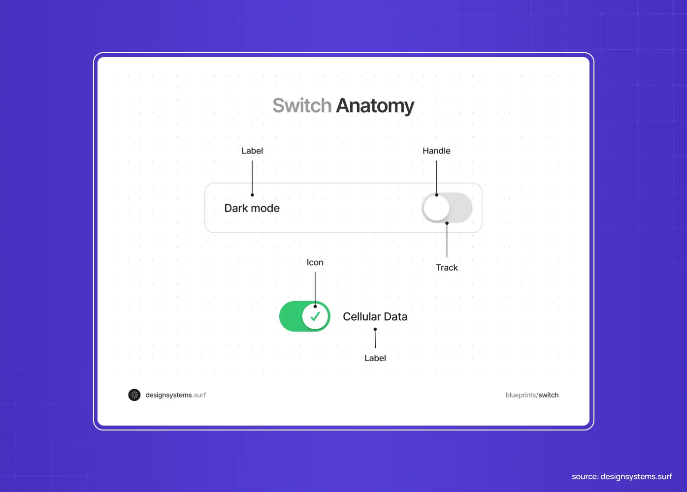
Before the rules, a quick shared vocabulary. A toggle switch has three parts that carry all its meaning.
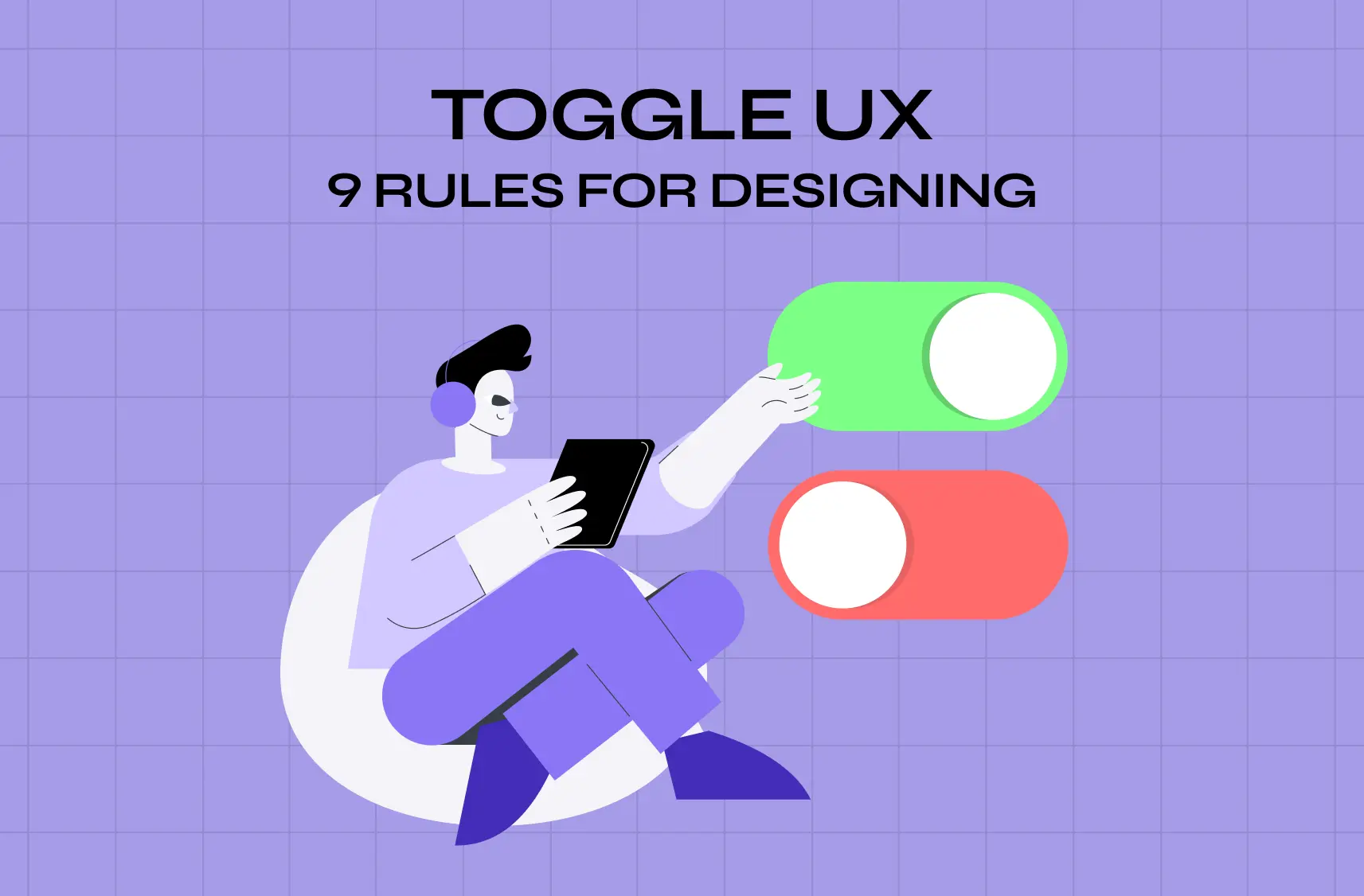
The track: the pill-shaped background whose color signals the state, filled and colored for on, muted for off.
The handle (or thumb): the circular control that slides from one side to the other, giving the switch its physical, light-switch feel.
The label: sits beside the switch, telling the user what the toggle controls.
Good toggle UX is really just these three elements working in agreement with core visual design principles: the label says what it does, the track's color says whether it's active, and the handle's position confirms it. When any one of them is unclear, a vague label, a low-contrast track, an ambiguous handle position, the whole control gets harder to read. Keep all three aligned, applying Gestalt principles so the track, handle, and label read as one control, and the rest of the rules fall into place.
1. Use a toggle only for instant, reversible on/off actions
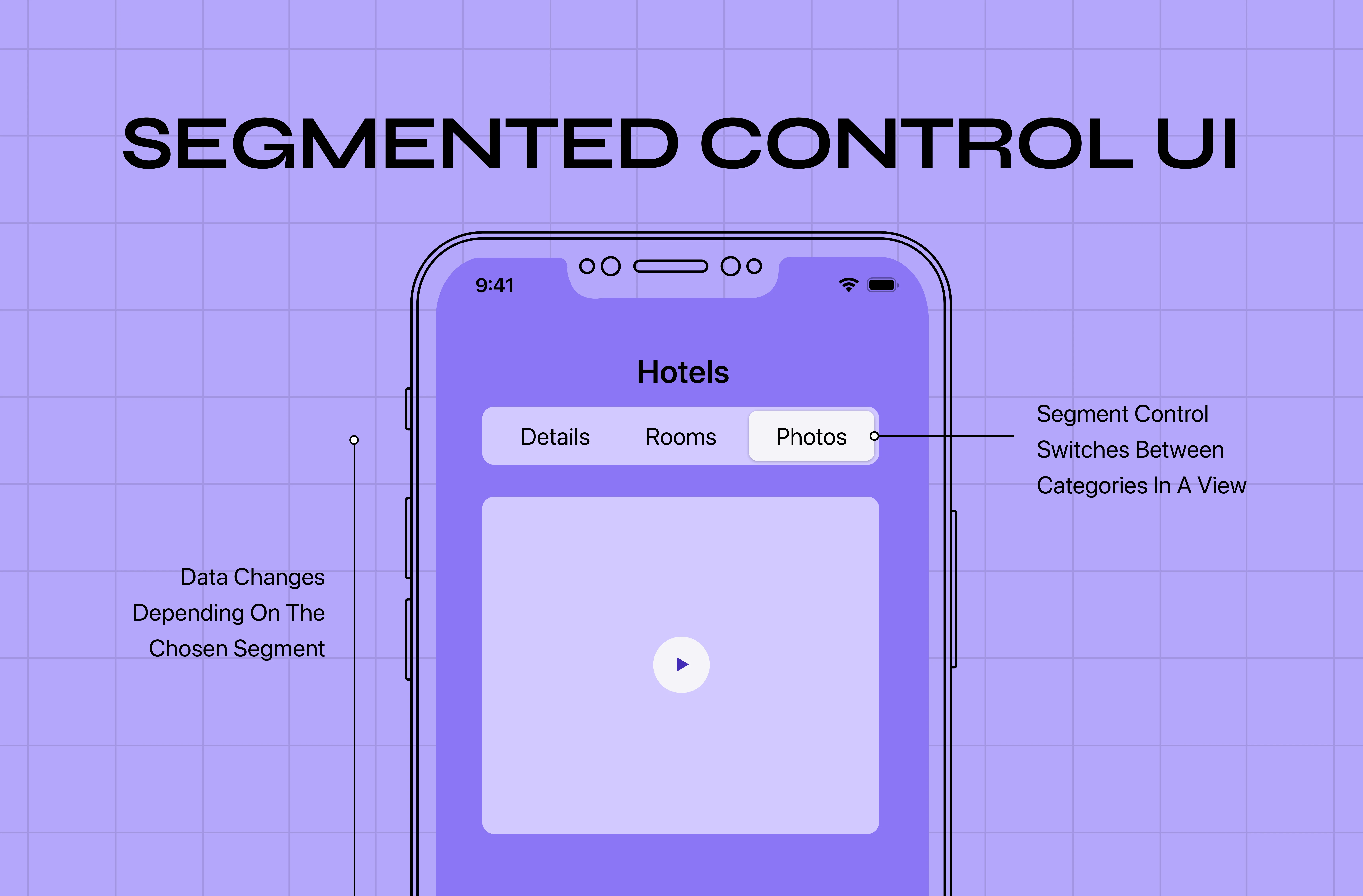
The first rule governs everything else: a toggle switch is for choosing between two opposing states that take effect immediately and can be easily reversed. Turning dark mode on, enabling notifications, showing or hiding a panel, these are textbook toggle jobs — distinct from the feature-flag rollouts teams use behind the scenes to expose a new feature to a subset of users. If the choice isn't binary, or the change shouldn't happen instantly, a toggle is the wrong control, and a segmented control or checkbox usually fits better. Before you place one, ask: "Is this a simple on/off that should happen the moment the user flips it?" If the answer isn't a clean yes, reach for something else.
Use a toggle when:
The choice is strictly binary (on/off, show/hide)
The change takes effect the instant it's flipped
The action is easily reversible with no follow-up steps
2. Make the effect immediate, never pair a toggle with "Save"
Users expect a toggle to do something the instant they flip it. That expectation is the whole point of the control, so honor it: a toggle should take effect immediately and never require the user to click Save or Submit to apply the change. The moment a toggle's outcome is deferred behind a button, you've broken the mental model, and users can't tell whether their choice already took effect or is waiting on something else. If a change genuinely needs a confirmation step, that's a signal you shouldn't be using a toggle at all (see rule 8).
Red flags a toggle needs a rethink:
A Save or Submit button sits next to it
Users repeatedly flip it back and forth right after saving
Support tickets mention "I toggled it but nothing changed"
3. Know when to use a toggle vs. a checkbox
This is the single most useful distinction in toggle design, so here it is cleanly:
Aspect | Toggle switch | Checkbox |
Effect | Instant. Applies the moment it’s flipped | Deferred. Applies after a Submit button |
Best for | ON/off settings (dark mode, notifications) | Selecting options that feed one action |
Mental model | A light switch | A form to fill, then submit |
Needs a submit button? | No | Usually yes |
The chief difference is whether there's an instant cause-and-effect between the control and what it controls. If flipping it should do something right away, use a toggle. If the user is selecting options that only matter once they hit "Apply," "Submit," or "Export," use checkboxes.
Quick decision rule:
Instant effect, no confirmation needed: use a toggle
Needs Submit, Apply, or Export: use a checkbox
4. Write labels that are short, direct, and describe the "on" state
A toggle's label is microcopy that should tell the user exactly what turning it on will do. Keep labels short and frontload the keywords, because users read only as much as they think they need, "Email notifications," not "Do you want to receive email notifications from us?" Never phrase the label as a question, and never leave it neutral or ambiguous, because then the user can't tell what state "on" even represents. The label describes the action; the switch shows whether it's active.
Label checklist:
Frontload the key word (what it controls, not a question)
Skip "Do you want to..." phrasing entirely
Test it by saying the label aloud with "on/off" appended, if it doesn't make sense, rewrite it
5. Signal state with high contrast, and don't rely on color alone
Color is the primary way users read a toggle's state, so use clear visual emphasis to make the on and off states unmistakably different, a strong color for on (green is the convention) against a muted gray for off. Low-contrast toggles are a common failure: if "on" and "off" look nearly identical, users genuinely can't tell what's active. But color alone isn't enough for accessibility, since color-blind and low-vision users may not perceive the difference. Reinforce state with a second signifier, the handle's position, and ideally a subtle on/off indicator, so the switch is legible to everyone, not just users with typical color vision.
Beyond color, reinforce state with:
Handle position (left for off, right for on)
A text or icon indicator next to the switch
A minimum 4.5:1 contrast ratio between states
6. Size toggles for touch and respect platform conventions
On touch devices, a toggle needs to be comfortably tappable, aim for a target of at least around 44×44 pixels so users aren't fighting to hit it. Beyond size, respect the conventions users already carry from their devices: on iOS a toggle slides right and turns green when on, while Android and other platforms have their own patterns. Designing toggles that match platform expectations means users don't have to relearn a control they've used thousands of times. Familiarity is usability, don't reinvent the switch.
Sizing and convention checklist:
Minimum 44×44 pixel tap target on mobile
Match iOS and Android platform conventions where relevant
Don't shrink the tappable area just to save visual space
7. Never bury a toggle in a form that needs a submit button
Here's a mistake even experienced teams make: dropping toggles into a long form alongside fields that only take effect when the user hits Submit, a pattern that quietly hurts form completion. Now the interface is sending two contradictory messages, the toggle implies instant change, the form implies deferred change, and users can't tell which applies. The fix is to separate controls that produce instant results from those that require a command button.
If a screen mixes both:
Group instant toggles visually apart from submit-driven fields
Add a small "applies immediately" note near instant controls if the layout can't separate them
Reconsider whether a toggle belongs on that screen at all
8. Don't use toggles for high-stakes or destructive actions
Toggles signal "flip me freely, it's reversible." That signal is dangerous when the underlying action isn't. Deleting an account, canceling a subscription, or permanently changing something important should never hide behind a toggle, because the control invites exactly the casual, instant interaction those actions must avoid. High-stakes decisions deserve a deliberate pattern, a button with a confirmation step, a modal, an explicit "are you sure?" The friction is the feature.
Never toggle:
Deleting an account
Canceling a subscription or downgrading a paid plan
Any permanent, high-stakes, or billing-related change
9. Give clear feedback, and handle delayed states honestly
Most toggles change state instantly, but real products sometimes need a moment to save a setting to a server — and anything that genuinely unfolds in stages belongs in a staged timeline, not a toggle. Don't let the toggle lie about that. If the change is truly instant, the visual flip is feedback enough. If there's a delay, show it, a brief loading indicator on the toggle, and a clear resolution to on or off (or a graceful error if it fails), so users are never left wondering whether their action stuck. The worst toggle is one that appears to flip but silently fails in the background.
Honest feedback checklist:
Instant change: the flip itself is the feedback
Delayed change: show a loading state until it resolves
Failed change: show a graceful error and revert the toggle visually
Toggle UX done right: everyday examples
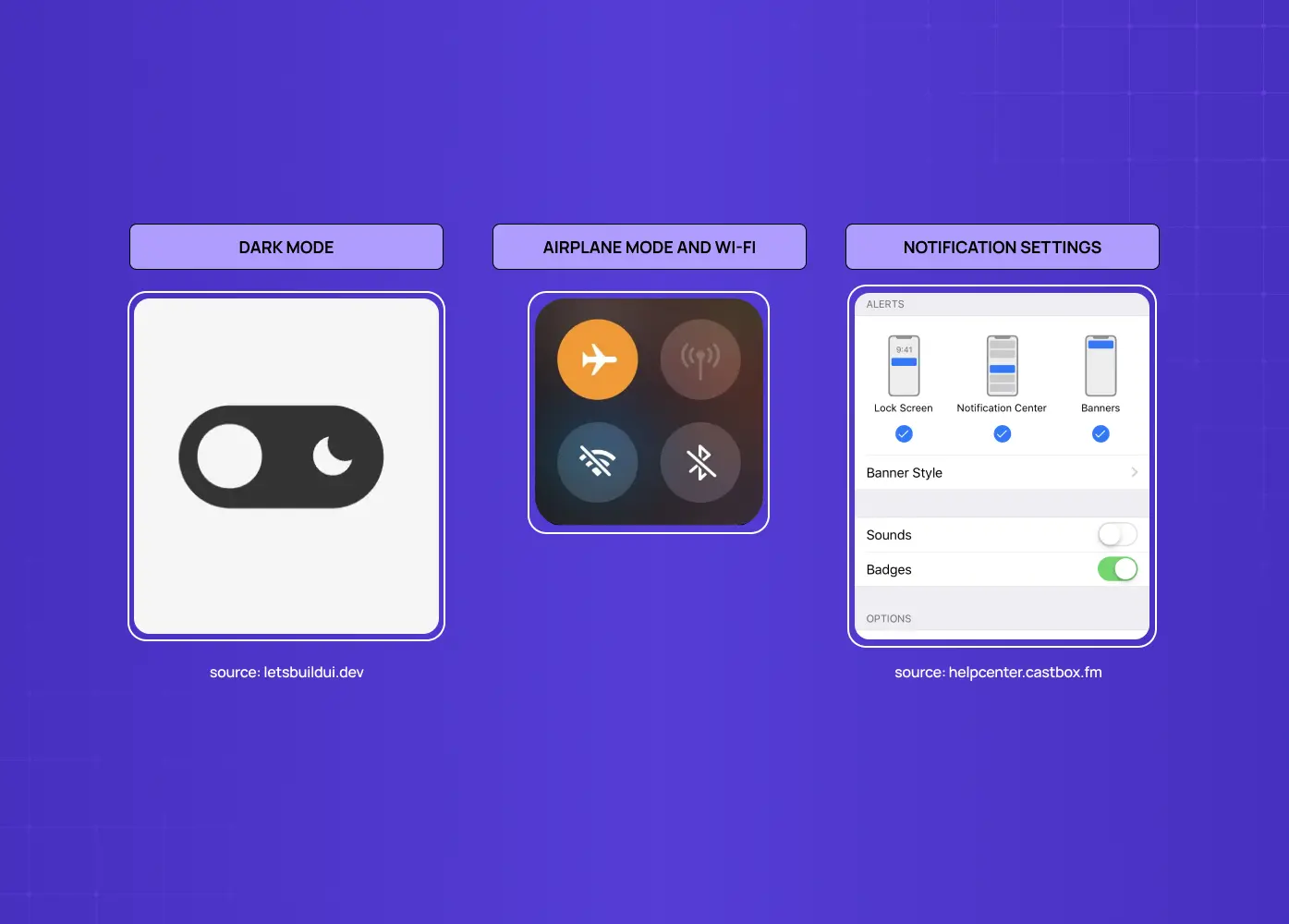
The best way to internalize these rules is to notice them in products you already use.
Dark mode is the canonical good toggle: binary, instant, reversible, and clearly labeled, flip it and the interface changes immediately, no save required.
Notification settings are another strong fit: each notification type gets its own toggle that takes effect the moment you flip it, so users can dial preferences in without hunting for an "apply" button.
Airplane mode and Wi-Fi on a phone follow the same logic: instant system states you turn on and off freely.
Now contrast those with the anti-patterns. A "delete my account" control behind a toggle would be alarming precisely because toggles invite casual flipping, that action correctly lives behind a button and a confirmation. A checkout page choosing shipping options uses checkboxes or radios, not toggles, because the choices only matter once you submit the order. And a settings form that mixes instant toggles with fields that require "Save changes" is the classic confusion trap.
It's the same discipline we apply on every product engagement at Groto. When we simplified PolicyBazaar's insurance shopping flow, the win wasn't a single redesigned screen, it was auditing every control on the page and making sure each one, toggles included, behaved exactly the way users expected it to. That kind of component-level discipline is what turned browsing into completed sign-ups.
Toggle UX mistakes to avoid at a glance
To summarize the traps, which rank among the common UI/UX mistakes that hurt conversions:
Using toggles for actions that need confirmation
Pairing a toggle with a Save button
Writing vague or question-style labels
Relying on low-contrast color to signal state
Ignoring tap-target size or platform conventions
Mixing toggles into submit-driven forms
Using toggles for destructive or high-stakes actions
Nearly every bad toggle in the wild is some combination of these, which means avoiding them is one of the fastest ways to sharpen an interface, and one of the cheapest wins available to a product team that isn't ready for a full redesign.
Why these small details matter
It's tempting to file toggle design under "nitpicking." It isn't. Controls like toggles are the atoms of an interface and among the most-used micro-UX patterns, users touch them constantly, and each tiny moment of doubt ("did that save?", "which way is on?", "why didn't anything happen?") is a small tax on trust. Multiply that across every setting screen and every session, and sloppy control design becomes a measurable drag on activation, retention, and support costs across your SaaS dashboards, not just a feeling of polish.
There's a compounding effect, too. A product that gets the small components right tends to get the big flows right, because the same interaction discipline — clear cause and effect, honest feedback, respect for convention — applies at every scale. Teams that treat a toggle as "just a toggle" often carry that same carelessness into checkout flows and onboarding, where it costs real conversions. Teams that sweat the toggle usually sweat everything else too, and that discipline shows up directly on the bottom line: fewer support tickets, higher settings adoption, and users who trust the product enough to explore deeper into it.
Conclusion
Toggle switches earn their keep when they're used for exactly what they signal: instant, reversible, binary choices, clearly labeled and clearly styled.
Follow these nine rules and your toggles will feel invisible in the best way, users flip them without a second thought, confident about what just happened.
Ignore them, and a control that should be effortless becomes a small, persistent source of doubt, and a measurable cost to your product.
If your team is auditing controls one by one with the right UX design tools, this is exactly the kind of component-level work that compounds across an entire product.
If you want a product design partner who sweats the component-level details that make interfaces feel effortless, toggles included, book a discovery call with Groto. We design the small moments that add up to products people trust. Let's make every control in your product pull its weight.