
Shipping an AI feature is a bet on behavior you haven't observed yet. Feature flag UX AI turns that bet into a controlled experiment: progressive rollout, kill switches, and live control, paired with the design work that makes the experience worth shipping at all.
Feature flag UX AI lets you ship non-deterministic AI features safely, without betting the product.

TL;DR
Feature flag UX for AI means using flags as a control layer for a non-deterministic experience, deciding who sees it, how fast it expands, and how quickly it gets pulled back.
AI features cannot be fully tested before launch. Their behavior only fully shows up once real users interact with them at scale, which is exactly why flags matter more here than for conventional software.
The patterns that matter most are progressive rollout, kill switches, user targeting, A/B testing of model behavior, decoupling prompt from model from retrieval, and guardrail-based auto-rollback.
Feature flags control whether and to whom an AI feature ships. They do not decide whether the feature is any good. That is still a design problem.
Teams that treat flags as a substitute for design end up with a beautifully controlled rollout of a feature nobody wants to use.
Use both together: design the experience with intention, then ship it behind flags so real-world model behavior cannot blindside you.
Feature flag UX AI is quickly becoming a baseline requirement, not an optional add-on, for any team shipping AI-powered products working toward real AI feature adoption. As AI features move from demos into production, the question stops being "does this work" and becomes "how do we control what happens when it does not." That control layer gives PMs, designers, and engineers a shared way to manage a system that behaves differently for every user, every prompt, and every session. Before diving into the mechanics, it helps to understand why this matters more for AI than it ever did for traditional software, and where the responsibility for a good AI experience actually sits.
Here's the problem with shipping an AI feature the normal way: you can't fully know how it behaves until real users hit it at scale. You tested it, it looked great in the demo, and then it meets ten thousand real prompts and starts doing things you never saw in QA: hallucinating on edge cases, dropping conversion in one segment, spiking latency on long inputs. With a conventional feature, "ship it to everyone" is a reasonable bet. With a non-deterministic AI feature, it's a bet on behavior you haven't observed yet. That's exactly the bet feature flags let you stop making.
If you're a PM or CTO shipping AI features, feature flags aren't a DevOps nicety. They're the infrastructure that lets you put a non-deterministic experience in front of real users safely, control it live, and iterate the design against how the model actually behaves. This guide covers what a feature flag is in the AI context, why AI features need them more than conventional ones, how to tell if your design team actually needs this infrastructure yet, the specific patterns that matter, and, because someone always asks, the honest limits: what feature flags can't do, and why they complement good AI UX design rather than replace it.
What a Feature Flag Is, and Why It's a UX Tool for AI
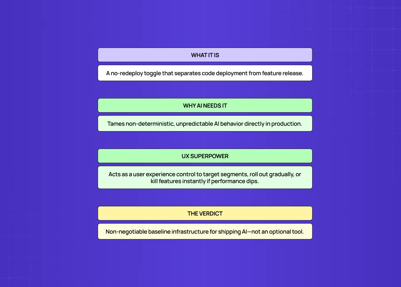
A feature flag is a switch in your code, functionally a toggle exposed at the account, cohort, or admin level, that turns a feature on or off, or targets it to specific users, without a redeploy. For AI products, that switch is what lets you control a non-deterministic experience in production, so it functions as much as a UX instrument as an engineering one. In its simplest form, a flag wraps a feature so you can enable it, disable it, or show it to a chosen slice of users by changing a setting, not by shipping new code. That decoupling of deploy from release is the core idea.
For conventional software, that's mostly an engineering convenience. For AI, it's something bigger, because the thing you're controlling is the experience itself, an experience you can't fully specify in advance. A flag lets you decide:
Who sees the AI feature first, and who sees it last
How it behaves for different segments or plans
Whether it stays on, based on how it's actually performing
How fast you dial exposure up, or shut it down entirely
That's a UX-level set of controls, not just an engineering toggle. Feature flags are, in effect, the floor for shipping AI features, not the ceiling, but the baseline infrastructure you build on. Treating them as optional for an AI deployment is the wrong frame.
Why AI Features Need Feature Flags More Than Conventional Features
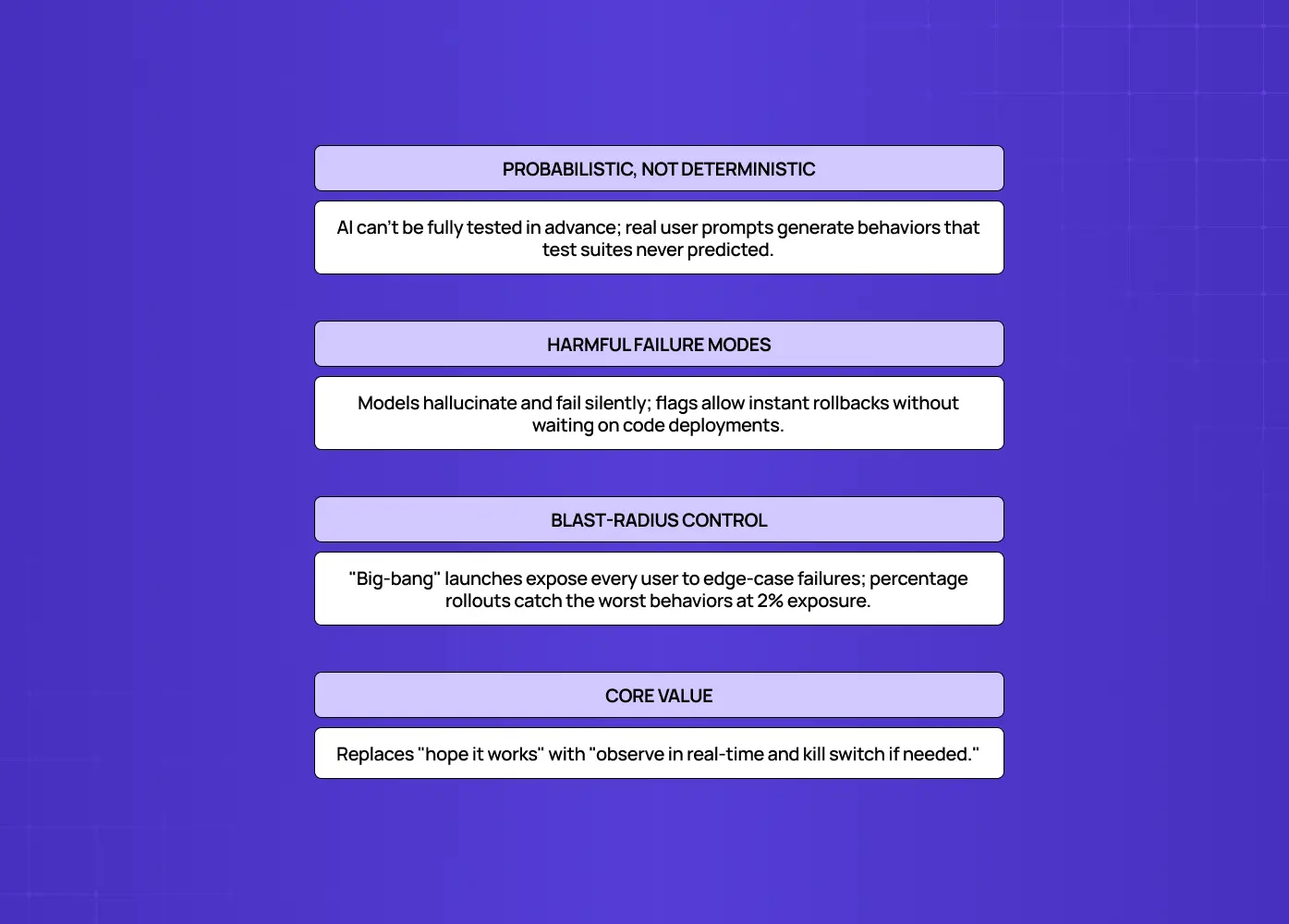
AI features need flags more than conventional features because their behavior is probabilistic. You can't QA every output in advance, outputs can be wrong or harmful, and the only reliable way to learn how the feature behaves is to expose it gradually while watching real results. Three properties of AI make this non-negotiable:
You can't fully test it before you ship it. A deterministic feature does the same thing every time, so testing a representative set of cases tells you how it'll behave in production. An AI feature's output varies with the input, and real users send inputs your test set never imagined. A percentage rollout is often the only way to find out how an LLM-powered feature behaves at scale, because the behavior genuinely doesn't exist until real traffic produces it.
It can fail in ways that hurt users. AI features can hallucinate, produce unsafe or off-brand output, or degrade quietly. When a feature can be confidently wrong, you need the ability to pull it back fast, faster than a code deploy allows. A flag gives you that.
The failure mode of a big-bang launch is worse. Traditional rollouts assume that exposing more users just surfaces more of the same bugs. For a probabilistic system, that assumption breaks: more users means more kinds of behavior, some of which you've never seen. Ship to everyone at once and you discover the model's worst behavior at maximum blast radius. Ship behind a flag and you discover it at 2% of users, with a switch in your hand.
For AI, flags convert "hope it works" into "watch it work, and stop it if it doesn't."
How to Know If Your Design Team Actually Needs Feature Flags

Not every AI feature needs the full weight of a flag-driven rollout on day one, but most teams underestimate how quickly they get there. A few signals tend to show up before it becomes obvious:
The feature's output changes based on things you don't fully control. Prompt tweaks, model updates, or retrieval changes shift behavior without a code change, so your team has no way to freeze what users see.
You've already had a "we didn't see that coming" moment. A demo went one way, and production traffic surfaced something the test set never hit. That's usually the first real signal.
Design and engineering are guessing about real behavior instead of observing it. If your design team is iterating on confidence states, error messages, or correction flows based on assumptions rather than what the model actually does with real inputs, they're designing blind.
A single bad output would be visible to a customer, a regulator, or a segment you can't afford to lose — the kind of exposure AI Act high-risk rules exist to govern. The higher the stakes of a wrong answer, the earlier you need a kill switch, not after the first incident.
You're about to A/B test the AI's behavior itself, not just a UI layout, but the prompt, the model, or the interaction pattern. That kind of test needs infrastructure a static feature never required.
If two or more of these are true, your team doesn't need to debate whether to invest in feature flag UX. It needs to start building it before the next release, not after the next incident.
The Feature Flag Patterns That Matter for AI UX
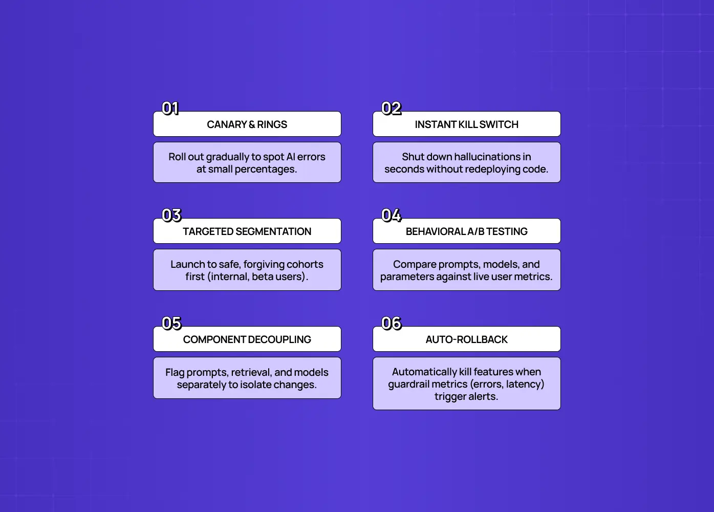
The patterns that make flags powerful for AI are progressive rollout, kill switches, user targeting, A/B testing of model behavior, decoupling the parts of your AI system, and guardrail-based auto-rollback. Together they let you ship, observe, control, and iterate a non-deterministic experience safely.
Progressive rollout (canary and rings). Instead of releasing to everyone, expose the AI feature to a small percentage first (a canary), then expand through defined audience tiers (rings), increasing exposure gradually while monitoring for regressions at each gate. Because AI behavior only fully appears at scale, this staged exposure is how you learn safely.
The kill switch. Wire the feature so you can enable, evaluate, and disable it in real time without a redeploy. This matters enormously for AI: if the only way to turn off a feature that's hallucinating is to ship code, your recovery time is minutes at best. A flag-based kill switch brings that down to seconds.
User targeting and segmentation. Flags let you decide who gets the AI experience: internal users first, then beta opt-ins, then specific plans, regions, or cohorts. For AI UX this is a design tool, letting you give the new behavior to users most likely to benefit, or most forgiving, and expand deliberately, so brand-new users going through AI onboarding UX rarely land inside a half-rolled-out flag.
A/B testing model and experience behavior. Because a flag can serve different versions to different users, the same infrastructure behind most A/B testing for SaaS companies, you can experiment with the AI itself, a different prompt, model, temperature, or interaction pattern, and measure which produces better outcomes: task success, satisfaction, conversion, not just which looks better in review.
Decoupling prompt, model, retrieval, and tools. A GenAI feature, including one that renders a fully generative UI, is really several moving parts: the prompt, the retrieval layer, the model, and any tools the system calls. Put each behind its own flag and you can change one without redeploying the others, isolating cause and effect so you know exactly which change shifted behavior.
Guardrail metrics and auto-rollback. Tie the rollout to guardrail metrics, the same UX metrics for SaaS that matter everywhere else in your product, and let it automatically disable itself when they cross a threshold, while retaining a manual override. Instrument alerts at three levels: informational (a slight uptick in latency or token usage), warning (hallucination rate or satisfaction dipping), and critical (conversion dropping or the model failing outright).
None of this is theoretical. In 2024, a single faulty software update, shipped without staged rollout or a fast kill switch, took down roughly 8.5 million Windows machines in one day, grounding airlines, hospitals, and banks for hours. It wasn't an AI feature, but the failure mode is the same one this section exists to prevent: a change went to everyone at once, with no way to pull it back quickly when it went wrong. Staged exposure and an obvious kill switch are what stand between "we caught it at 2% of users" and "we caught it everywhere, all at once."
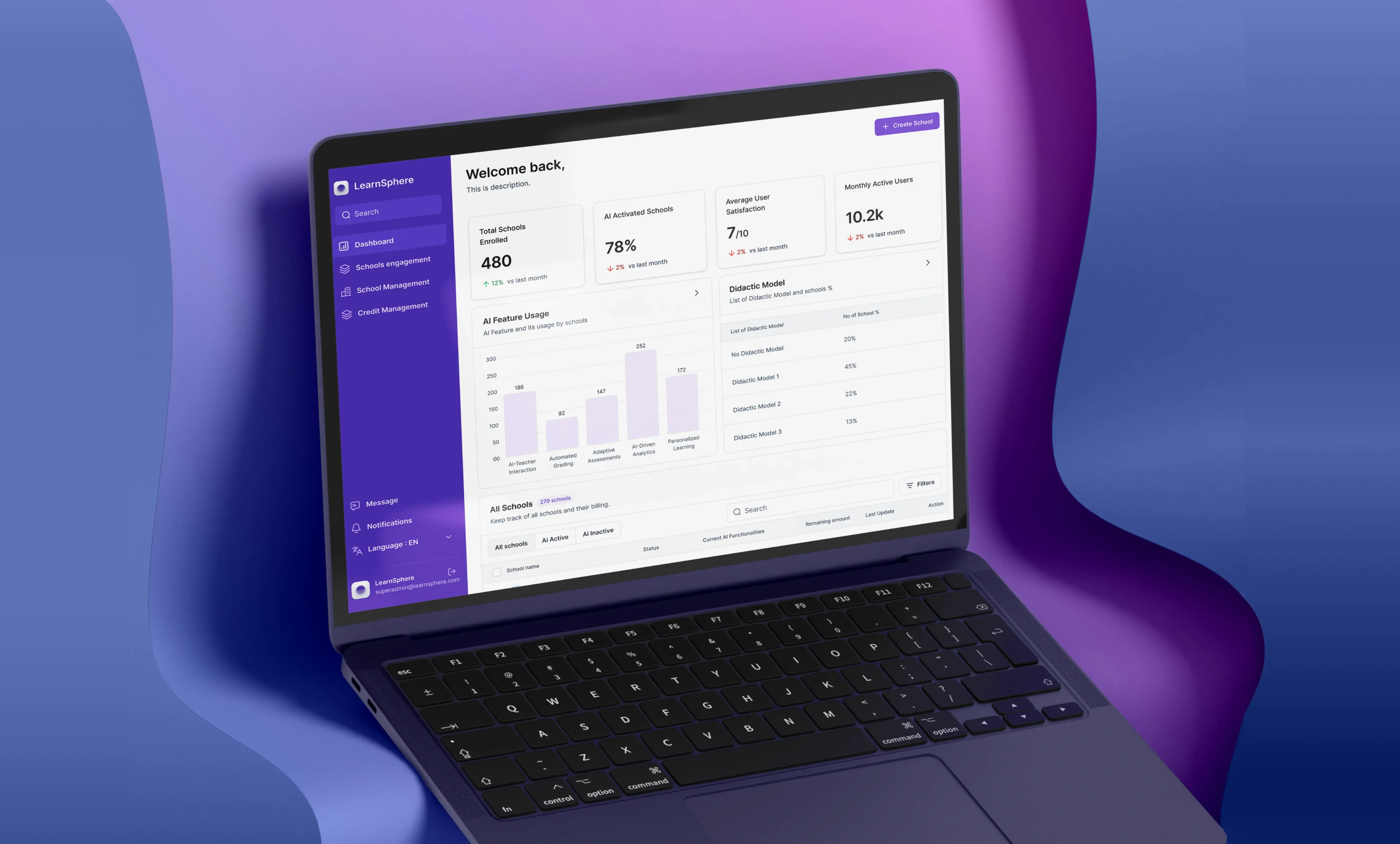
When teams get this right, the infrastructure disappears into the background and what users notice is simply that the product feels dependable. Groto's work with Barista, a PR-first AI platform, is a good example of what the design side of this looks like in practice: the Content Editor shows each prompt alongside the AI-generated output, with tools to revise, re-prompt, or save multiple drafts, and a role-based system that gives Super Admins, Admins, and Members exactly the access and visibility each role needs, the same kind of AI dashboard design problem that admin-facing flag controls present.That kind of interface, where users can see, question, and correct what the AI produced, is what a flag-controlled rollout is protecting on its way out to real users. If your team is building something similar, our AI-first UX Design practice focuses on exactly this kind of copilot-grade interface work.
Feature Flags vs. Designer Input: What You Really Need

It's tempting to treat feature flags and design work as competing investments, especially when a team is trying to ship fast, when really flag ownership sits squarely at the intersection of product management and UX design. They're not actually in competition, but they do different jobs, and confusing the two is where teams get into trouble.
Feature flags answer operational questions: Who sees this? How fast does it expand? What happens if it fails? Can we turn it off in seconds?
Design answers experience questions: Does the user understand what the AI is doing? Do they trust the output? Can they correct it easily when it's wrong? Does uncertainty get communicated instead of hidden?
A team with strong flag infrastructure and weak design ships a well-controlled rollout of a confusing feature. A team with strong design and no flag infrastructure ships a great experience that they can't safely control once it's live. Neither is a complete answer on its own.
The practical decision most teams face isn't "flags or design," it's sequencing: which one do you invest in first for a given feature? As a rough guide:
Invest in flag infrastructure first when the AI feature is high-risk (financial, medical, or legal outputs) or when you're shipping to a large existing user base with no room for a visible failure.
Invest in design input first when the core problem is that early users don't understand or trust the feature, since no amount of staged rollout fixes an interface that confuses people.
Invest in both simultaneously when you're building a net-new AI product from scratch, which is the most common real-world case, where getting MVP UX scope right upfront tends to save the most rework later.
The honest answer is that mature AI teams eventually need both, and the sequencing question just determines which gap hurts you first.
Can Feature Flags Replace Good UX Design?
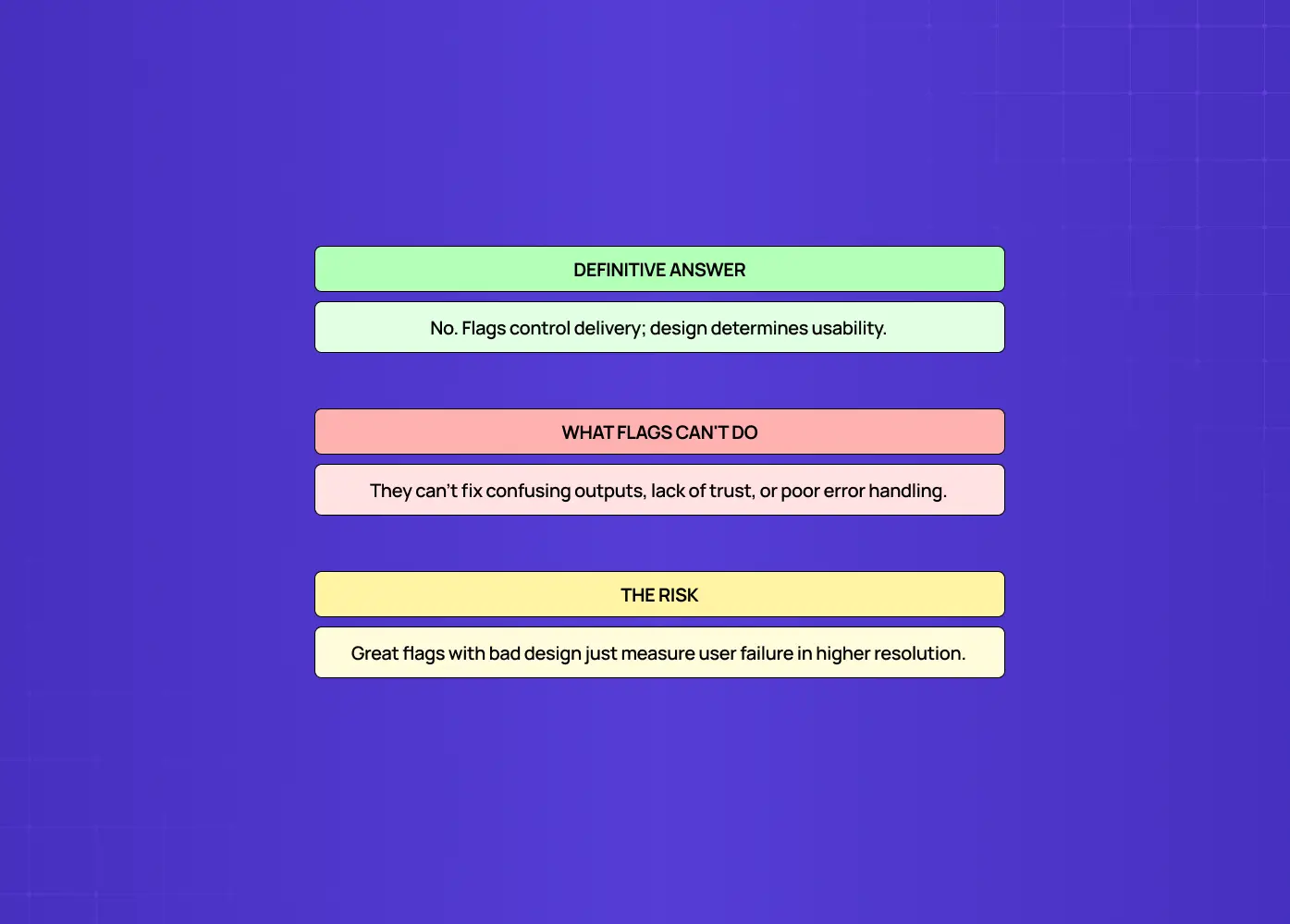
No. Feature flags let you ship, control, and test an AI experience safely, but they don't design that experience. A flag can roll out a confusing, untrustworthy AI feature just as smoothly as a great one, so flags are a complement to good AI UX design, not a substitute for it. This is the question behind the skeptical framing "do flags replace designer input," and the answer is a clear no, for a simple reason: flags control whether and to whom a feature ships, not whether it's any good.
Everything that makes an AI feature actually usable is still a design problem that exists before any flag is involved:
How the feature communicates uncertainty when the model isn't sure
How it streams output so waiting feels responsive instead of stalled
How users correct it when it's wrong, quickly and without friction
How errors and edge cases are handled and explained, which is where handling AI edge cases becomes real design work no flag performs
Whether people understand and trust what the system is doing
None of that is created by a rollout mechanism. A feature flag will happily deliver a beautifully instrumented rollout of an experience that confuses everyone who sees it. It will even help you discover that the experience confuses people, via your guardrail metrics, but it won't tell you how to fix it, and it certainly won't fix it for you.
The right mental model is a division of labor:
Design decides what the AI experience should be: the confidence states, the correction flows, the trust-building details that determine whether users adopt the feature.
Feature flags decide how you ship and control that experience: who sees it, how fast it expands, and how quickly you can pull it back.
They're powerful precisely because they let good design meet real model behavior safely and iterate against it. But they operate on a designed experience, they don't produce one. Teams that treat flags as a substitute for design ship well-controlled rollouts of features nobody wants to use, and the tidy metrics just document the disappointment in higher resolution.
How to Use Feature Flags Well for AI UX
Use flags to make AI releases observable and reversible, and pair every bit of that infrastructure with the design work that makes the experience worth shipping in the first place. A practical approach looks like this:
Put every AI feature behind a flag by default, planned in from the start of how you develop an AI-powered SaaS product rather than bolted on later. For a probabilistic feature, the ability to disable without a redeploy is a baseline safety requirement, not a special case.
Start each rollout small and gated: canary to internal users, then a friendly cohort, then widening rings, confirming the experience holds at each step.
Instrument the metrics that actually reflect the experience, not just latency and error rate, but hallucination and quality signals, task success, and user trust indicators, wired to alerts across all three severity levels.
Keep the kill switch tested and obvious, so pulling a misbehaving feature is a calm two-click action, not a scramble, the kind of micro UX design pattern that makes infrastructure feel intentional rather than half-shipped.
Decouple prompt, model, retrieval, and tools behind separate flags so you can isolate exactly what changed when behavior shifts.
Treat the flag system as the delivery vehicle for well-designed AI UX. The rollout controls the risk; the design controls whether the feature is any good.
The teams that ship AI well do both: they design the experience carefully and release it behind flags so real-world behavior can't blindside them.
Common Mistakes With Feature Flags and AI
Most feature-flag mistakes with AI come from treating flags as either unnecessary or sufficient. The frequent ones:
Shipping AI features with no flag at all, so the only way to stop a hallucinating feature is a redeploy measured in minutes.
Using flags purely as an engineering toggle, ignoring their power to target, experiment, and iterate the experience.
Monitoring only technical metrics (latency, errors) while missing the quality and trust signals that reveal whether the AI is actually working.
Never testing the kill switch, so it fails exactly when you need it most.
Leaving flags in forever, accumulating flag debt that makes the codebase a maze and slows down every future change.
Assuming that because the rollout is controlled, the experience is good, shipping a well-flagged feature that no one was actually helped by — something testing real user behavior catches long before the metrics do.
Avoid these and flags become what they should be: the safety layer that lets good AI design reach users without risking the whole product.
Conclusion
Shipping a non-deterministic feature the way you'd ship a deterministic one is a bet on behavior you haven't seen yet. Feature flag UX for AI is how you stop making that bet:
Release AI features progressively instead of all at once
Target exactly who sees them, and expand deliberately
Experiment with how the model behaves, not just how the UI looks
Decouple the moving parts so you always know what caused a shift
Pull a bad experience back in seconds instead of minutes, when something goes wrong
For AI products, that isn't optional infrastructure, it's the floor, and how disciplined a team is about it says a lot about AX maturity. But flags control how you ship an experience, not whether it's good. The confidence states, correction flows, and trust-building details that decide whether users actually adopt your AI feature are design work that has to happen regardless, and flags are what let that design meet real model behavior safely and improve against it.
If you're building AI features and want them designed to be trusted and usable, and shipped behind the kind of progressive, reversible rollout that keeps a non-deterministic experience from blindsiding you, book a discovery call with Groto. We design AI product experiences and help teams ship them safely against real model behavior. Let's make your next AI feature a controlled launch, not a gamble.