
Visual Identity vs Brand Identity: What's the Difference (and Why It Matters)

10 min read

10 min read

Brand Design

Visual Identity vs Brand Identity: What's the Difference (and Why It Matters)

Visual identity and brand identity aren't the same thing. This guide breaks down the real difference, how they connect, and which to build first.

Visual Identity vs Brand Identity: What's the Difference (and Why It Matters)

10 min read

10 min read

Brand Design

Visual Identity vs Brand Identity: What's the Difference (and Why It Matters)

Visual identity and brand identity aren't the same thing. This guide breaks down the real difference, how they connect, and which to build first.

Most founders think their logo is their brand. It's not. Visual identity is how a brand looks, brand identity is who a brand is, and understanding the difference changes the order you build things in.

Confusing your logo with your brand? Here's the real difference, explained clearly.

Illustration of a designer surrounded by creative tools, representing digital design, creativity, and workflow.

TL;DR

  • Visual identity vs brand identity comes down to this: brand identity is who a brand is, visual identity is how that brand looks.

  • Visual identity (logo, colors, typography, imagery) is one part of the larger brand identity (purpose, values, personality, voice).

  • Get the order wrong, starting with visuals before strategy, and you end up with good-looking design that says nothing.

  • This guide covers the definitions, the components of each, how they connect, where "branding" and "brand" fit in, and how to build both in the right sequence.

Visual identity vs brand identity is one of the most misunderstood pairings in branding, and the confusion is costly. Treat them as the same thing and you'll either overspend on a logo while your positioning stays undefined, or write beautiful brand guidelines that never take visible shape. Understanding where one ends and the other begins is the first step to building a brand that actually connects with people, not just one that looks nice in a deck.

Ask ten founders what their "brand" is and most will point at a logo. It's an understandable mistake, the logo is the most visible part, but it's a bit like describing a person entirely by their outfit. The logo, the colors, the fonts: those are the visual identity. The values, the personality, the promise behind them: that's the brand identity. Confusing the two is how companies end up with beautiful branding that says nothing, or a strong strategy that no one can recognize.

Understanding visual identity vs brand identity isn't just semantics, it changes the order you build things in and whether your brand actually connects. This guide gives you the clear, one-line difference up front, then defines each term, breaks down their components, shows exactly how they relate, and clarifies where the fuzzier words "branding" and "brand" fit. By the end, you'll never mix them up again, and you'll know which one to invest in first.

The short answer

Here's the distinction in a sentence: brand identity is who a brand is, visual identity is how that brand looks. Brand identity is the comprehensive foundation: purpose, values, personality, voice. Visual identity is the aesthetic layer that expresses it: logo, colors, typography. Crucially, visual identity is part of brand identity, not a separate thing beside it. One is the essence, the other is one of the ways that essence becomes visible.

Aspect

Brand identity

Visual identity

What it is

Who the brand is (its essence)

How the brand looks

Scope

The whole blueprint

A subset of brand identity

Includes

Values, mission, voice, positioning, personality, and visual identity

Logo, color, type, imagery, graphics

Appeals to

Emotion and meaning

The eyes, recognition

Analogy

A person's character

A person's appearance

Now let's unpack each.

What is brand identity?
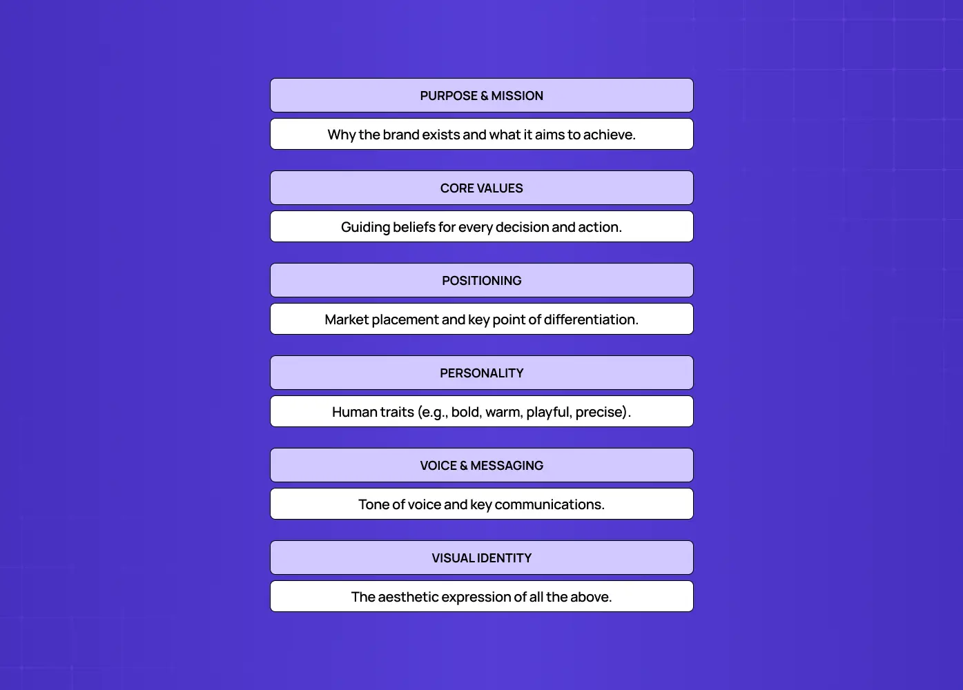
Diagram outlining the key components of brand strategy, including purpose, values, positioning, personality, messaging, and visual identity.

Brand identity is the comprehensive blueprint that defines a brand's purpose, mission, values, positioning, and personality: the essence of who the brand is and what it stands for. It's the internal foundation that shapes how a company thinks, speaks, and behaves, and it's what creates genuine emotional connection with an audience. If visual identity is what you see, brand identity is what you feel and believe about a company.

Brand identity is holistic. It encompasses everything that makes the brand what it is, including its visual identity but reaching well beyond it. Its core components include:

  • Purpose and mission: why the brand exists and what it's trying to do.

  • Core values: the beliefs that guide its decisions and behavior, often formalized into a design philosophy once they reach the product.

  • Positioning: where it sits in the market and how it's different from competitors.

  • Personality: the human traits the brand embodies (bold, warm, precise, playful).

  • Brand voice and messaging: how it speaks, its tone, and the key things it says.

  • Visual identity: the aesthetic expression of all of the above (more on this next).

Notice that visual identity sits inside this list. That's the key relationship, and we'll come back to it.

What is visual identity?
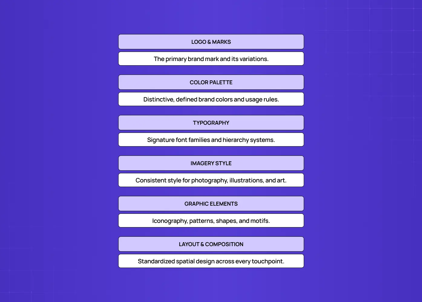
Diagram summarizing the core elements of brand identity, including logo, color palette, typography, imagery, graphic elements, and layout.

Visual identity is the subset of brand identity focused on aesthetics: the collection of visual elements that define how a brand looks and make it instantly recognizable. It's the tangible, seeable translation of the brand's essence into design, and it draws directly on graphic design fundamentals to make that translation work. When people say a brand "looks" a certain way, they're describing its visual identity.

Its components are the design assets a brand uses consistently across every touchpoint:

  • Logo: the primary mark and its variations.

  • Color palette: the defined brand colors and how they're used, usually built from one of the standard types of color palettes.

  • Typography: the fonts and type system, where typography in graphic design does most of the tonal work.

  • Imagery and photography style: the look and treatment of photos and illustrations.

  • Iconography and graphic elements: icons, patterns, shapes, and other recurring visual motifs.

  • Layout and composition: how elements are arranged for a consistent feel.

Together these create a cohesive, recognizable style, though holding them together takes real fluency in visual design principles, not just a folder of assets. But on their own, without the brand identity behind them, they're just decoration. A gorgeous logo for a company with no clear values or voice is a pretty shell.

The UX/UI checklist top SaaS teams actually use

15 essential checks covering onboarding, conversions, and retention. Spot quick wins and fix friction before it costs you signups.

No Spam. Free Lifetime

The UX/UI checklist top SaaS teams actually use

15 essential checks covering onboarding, conversions, and retention. Spot quick wins and fix friction before it costs you signups.

No Spam. Free Lifetime

The key differences at a glance

The cleanest way to hold the distinction:

  • What it describes: brand identity describes who a brand is on the inside, visual identity expresses who it is on the outside.

  • What it's made of: brand identity is the strategy and substance, visual identity is the design and surface.

  • How it connects: brand identity connects through meaning, story, and emotion, visual identity connects through sight and recognition.

  • How big it is: brand identity is the whole, visual identity is one important part of it.

Get this straight and most branding confusion evaporates. You stop treating a logo as "the brand" and start seeing it as one expression of something much larger. It's the same nested relationship as user experience vs customer experience, where the narrower term lives inside the broader one rather than beside it.

Examples that make the distinction click

Definitions only go so far. A few familiar brands make the split between visual identity and brand identity easy to see:

  • Nike: the visual identity is the swoosh mark, bold capitalized type, and high-energy action photography. The brand identity behind it is athletic empowerment, the belief that anyone with a body is an athlete, expressed through the "Just Do It" ethos long before it shows up in any ad.

  • Airbnb: the visual identity is the Bélo symbol, a warm coral palette, and friendly, human photography. The brand identity is belonging, the idea that you can feel at home anywhere in the world, which is why the visuals lean personal and community-driven rather than corporate.

  • Patagonia: the visual identity is an earthy, understated color palette and rugged outdoor photography. The brand identity is environmental activism and durability over disposability, values that show up in the product itself, not just the marketing.

In each case, the visuals didn't come first. They were built to express a strategy that already existed. That order is the whole point of understanding visual identity vs brand identity, and it holds just as firmly in software, where SaaS branding has to carry a product story long before a single screen gets styled.

How they work together

The two aren't rivals, they're layers of the same thing, and they only work in concert. Brand identity shapes the story, visual identity enhances how that story is seen and felt. The strategy gives the visuals meaning, the visuals make the strategy visible and memorable. A brand identity without a visual identity has nothing recognizable to attach itself to, no way for people to spot it in the wild. A visual identity without a brand identity looks nice but rings hollow, because there's no substance beneath the style.

Think of it as nested: visual identity lives inside brand identity, which is why the two must be aligned. Your colors should reflect your personality, your typography should match your voice, your imagery should embody your values. Two common failure modes show what happens when that alignment breaks:

  • Polished visuals over a muddled strategy: the design looks professional, but nobody can explain what the company stands for or why it's different.

  • Clear values with generic design: the strategy is sharp, but the visuals look like every other company in the category, so the positioning never actually lands.

When the outside genuinely expresses the inside, a brand feels coherent and trustworthy. When they're disconnected, people sense the mismatch even if they can't name it.

Where "branding" and "brand" fit in

Two more terms get tangled into this, so let's place them cleanly. Your brand is the perception that lives in your audience's minds, everything they think and feel about you, which you influence but never fully control. Branding is the ongoing process and set of actions you take to shape that perception over time. Here's the full hierarchy in one place:

  • Brand identity is what you deliberately define.

  • Visual identity is the aesthetic part of that definition.

  • Branding is the work of expressing it consistently everywhere.

  • Brand is the impression all of that leaves behind.

Four related terms, one clear hierarchy, and knowing the difference makes conversations about your brand far less muddled.

Why the distinction actually matters
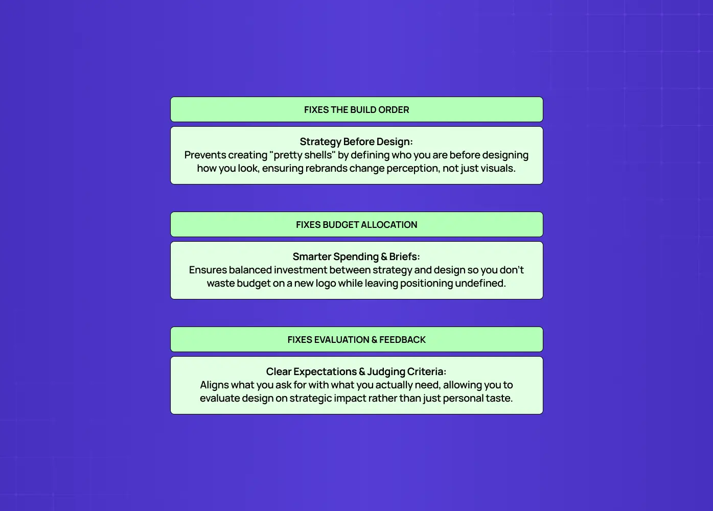
Infographic highlighting how brand strategy improves design decisions, budget allocation, and evaluation through clear business direction.

This isn't a vocabulary quiz, the difference has real, practical consequences:

  • It fixes the build order. The most common and costly mistake in branding is starting with the visuals: jumping straight to logo and color choices before defining what the brand stands for. That produces good-looking design with no strategic foundation, which is why so many rebrands look fresh but change nothing about how a company is perceived, and why it pays to be precise about what rebranding means before you commission one. Once you understand that visual identity is the expression of brand identity, the correct order becomes obvious: define who you are first, then design how you look.

  • It fixes where your budget goes. Teams that grasp the difference invest in strategy and visuals in the right proportion. Knowing the split also tells you when to bring in a graphic design agency and exactly what to hand them. They don't spend the entire budget on a logo while leaving positioning and voice undefined, and they don't write beautiful brand guidelines that never get expressed in a coherent visual system.

  • It fixes how you brief and evaluate design work. If you ask a designer for "a new brand" when you mean "a new logo," you'll get a mismatch of expectations. If you evaluate visual identity purely on whether it's pretty, rather than whether it accurately expresses your brand identity, you'll approve work that looks good but communicates the wrong thing.

Getting the two terms straight makes you a better client, a clearer thinker, and far more likely to end up with a brand that's both attractive and meaningful.

A quick example: the two identities side by side
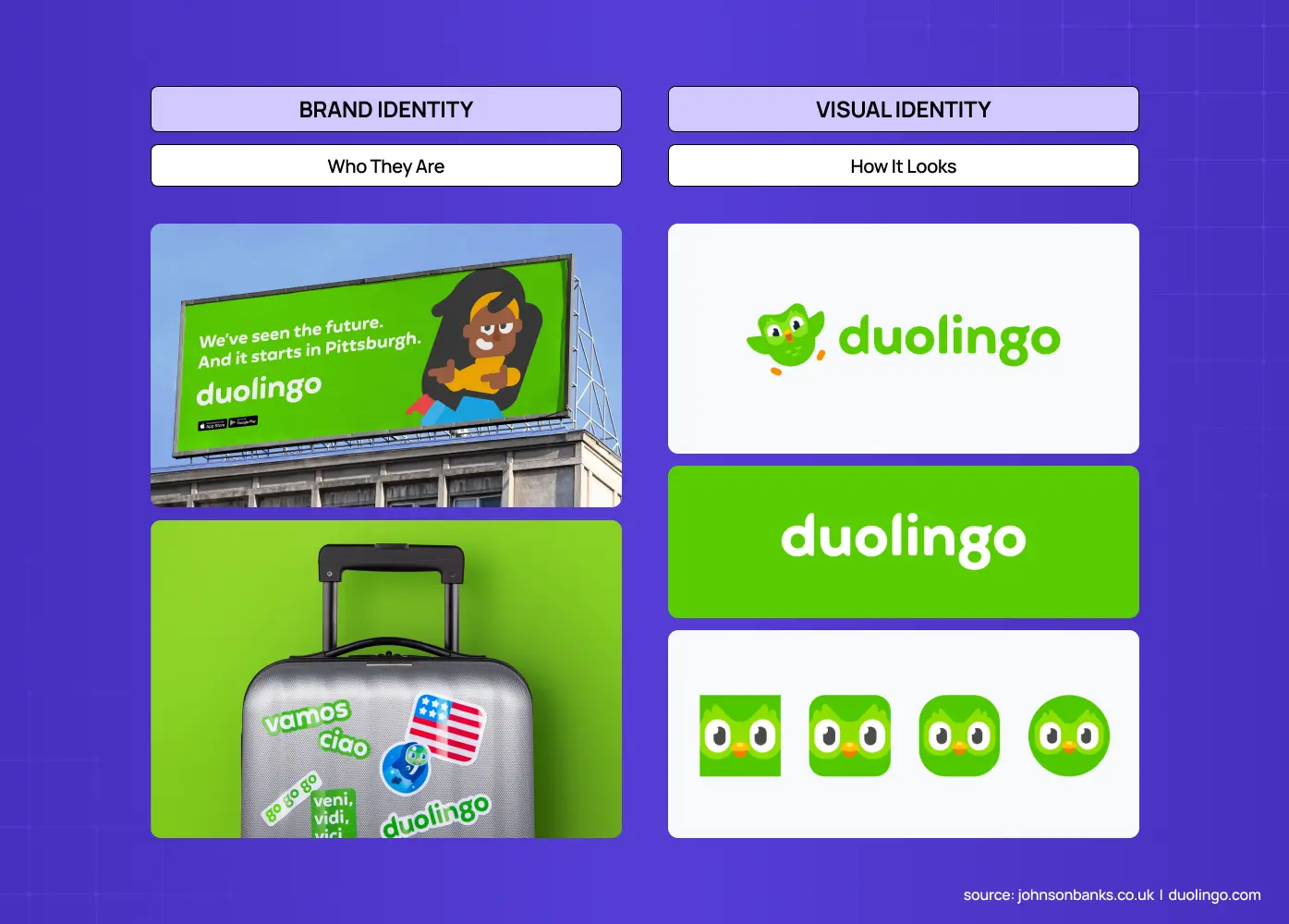
Comparison of Duolingo's brand identity and visual identity using real-world branding, logo, typography, and app icon examples.

Take Duolingo. Its brand identity is the substance: a purpose (make language learning free and accessible to everyone), core values (consistency, playfulness, showing up daily beats cramming), a positioning (the fun, low-pressure alternative to expensive classes or dry textbook apps), a personality (cheeky, a little chaotic, relentlessly encouraging), and a voice (informal, self-aware, not afraid to be silly, including its famous streak-reminder notifications). None of that is something you can see, it's who the company is.

Its visual identity is how all of that becomes visible:

  • A bright, saturated green as the dominant brand color, impossible to miss and instantly recognizable.

  • Duo, the owl mascot, drawn in a rounded, expressive style that reads as friendly rather than corporate.

  • A bold, chunky typeface that feels approachable and slightly playful rather than formal.

  • Illustration-heavy app screens and marketing, favoring cartoonish characters over polished stock photography.

Every one of those choices is a deliberate expression of the brand identity, and each leans on established principles of design to land it. Swap in a muted navy palette, a serif typeface, and stock photos of people in blazers, and the visuals would contradict the brand, still "a visual identity," but the wrong one, because it no longer expresses who the company is. That's the test of good design work: not "is it attractive?" but "does it look like who we say we are?"

Common myths and mistakes

A few misconceptions cause most of the confusion:

  • "Our logo is our brand." A logo is a single element of the visual identity, which is itself a subset of the brand identity. Treating it as the whole is how companies underinvest in strategy, and why briefing logo design companies without a defined identity usually disappoints.

  • "A rebrand means new visuals." True rebrands often involve revisiting the brand identity, the positioning and values, not just refreshing the logo. It's why serious company rebranding starts with strategy work rather than a logo sketch, and why a purely cosmetic rebrand rarely changes how a company is actually perceived.

  • "Visual identity is the fun part, so start there." Starting with visuals before strategy is the classic error that produces pretty but hollow design.

  • "Consistency is just about using the right colors." Real consistency means the visuals, the voice, and the behavior all express the same brand identity. That behavioral layer is the territory of brand experience design, and a company can be visually consistent yet still feel incoherent if its actions contradict its stated values.

Avoiding these traps mostly comes down to remembering the hierarchy: substance first, expression second.

How to build them in the right order

If you're creating or refreshing a brand, sequence matters:

  1. Start with brand identity. Clarify your purpose, values, positioning, personality, and voice. This is strategy work, the phase the strongest branding agencies lead before any design begins, and it should be settled before anyone opens a design tool, because every visual decision downstream depends on it.

  2. Move to visual identity. Once you know who the brand is, design the logo, color palette, typography, and imagery to express that strategy, testing each choice against the question "does this look like who we say we are?" A distribution rule like the 60-30-10 rule keeps the palette balanced once the colors are settled.

  3. Codify both in brand guidelines so everyone applies them consistently. For digital products, those guidelines usually graduate into a design system. That consistency is the branding work that, over time, builds the brand in people's minds.

Strategy first, expression second, consistency always.

Conclusion

  • Visual identity and brand identity are often used interchangeably, but they're different layers of the same thing.

  • Brand identity is who you are, visual identity is how you look, and the second lives inside the first.

  • Get the relationship right and everything downstream gets easier: clearer briefs, better design decisions, and a brand that's recognizable and meaningful.

  • Get it wrong and you risk a beautiful surface with nothing behind it.

  • We walked this exact path during our rebrand story, starting with fundamental brand positioning before touching a single visual asset.

  • If you want a partner to build a brand and visual identity that genuinely fit each other, strategy and design in alignment, book a discovery call with Groto. We help teams define who they are and design how they look so the two reinforce each other. Let's build a brand that's more than skin deep.

Most founders think their logo is their brand. It's not. Visual identity is how a brand looks, brand identity is who a brand is, and understanding the difference changes the order you build things in.

Confusing your logo with your brand? Here's the real difference, explained clearly.

Illustration of a designer surrounded by creative tools, representing digital design, creativity, and workflow.

TL;DR

  • Visual identity vs brand identity comes down to this: brand identity is who a brand is, visual identity is how that brand looks.

  • Visual identity (logo, colors, typography, imagery) is one part of the larger brand identity (purpose, values, personality, voice).

  • Get the order wrong, starting with visuals before strategy, and you end up with good-looking design that says nothing.

  • This guide covers the definitions, the components of each, how they connect, where "branding" and "brand" fit in, and how to build both in the right sequence.

Visual identity vs brand identity is one of the most misunderstood pairings in branding, and the confusion is costly. Treat them as the same thing and you'll either overspend on a logo while your positioning stays undefined, or write beautiful brand guidelines that never take visible shape. Understanding where one ends and the other begins is the first step to building a brand that actually connects with people, not just one that looks nice in a deck.

Ask ten founders what their "brand" is and most will point at a logo. It's an understandable mistake, the logo is the most visible part, but it's a bit like describing a person entirely by their outfit. The logo, the colors, the fonts: those are the visual identity. The values, the personality, the promise behind them: that's the brand identity. Confusing the two is how companies end up with beautiful branding that says nothing, or a strong strategy that no one can recognize.

Understanding visual identity vs brand identity isn't just semantics, it changes the order you build things in and whether your brand actually connects. This guide gives you the clear, one-line difference up front, then defines each term, breaks down their components, shows exactly how they relate, and clarifies where the fuzzier words "branding" and "brand" fit. By the end, you'll never mix them up again, and you'll know which one to invest in first.

The short answer

Here's the distinction in a sentence: brand identity is who a brand is, visual identity is how that brand looks. Brand identity is the comprehensive foundation: purpose, values, personality, voice. Visual identity is the aesthetic layer that expresses it: logo, colors, typography. Crucially, visual identity is part of brand identity, not a separate thing beside it. One is the essence, the other is one of the ways that essence becomes visible.

Aspect

Brand identity

Visual identity

What it is

Who the brand is (its essence)

How the brand looks

Scope

The whole blueprint

A subset of brand identity

Includes

Values, mission, voice, positioning, personality, and visual identity

Logo, color, type, imagery, graphics

Appeals to

Emotion and meaning

The eyes, recognition

Analogy

A person's character

A person's appearance

Now let's unpack each.

What is brand identity?

Diagram outlining the key components of brand strategy, including purpose, values, positioning, personality, messaging, and visual identity.

Brand identity is the comprehensive blueprint that defines a brand's purpose, mission, values, positioning, and personality: the essence of who the brand is and what it stands for. It's the internal foundation that shapes how a company thinks, speaks, and behaves, and it's what creates genuine emotional connection with an audience. If visual identity is what you see, brand identity is what you feel and believe about a company.

Brand identity is holistic. It encompasses everything that makes the brand what it is, including its visual identity but reaching well beyond it. Its core components include:

  • Purpose and mission: why the brand exists and what it's trying to do.

  • Core values: the beliefs that guide its decisions and behavior, often formalized into a design philosophy once they reach the product.

  • Positioning: where it sits in the market and how it's different from competitors.

  • Personality: the human traits the brand embodies (bold, warm, precise, playful).

  • Brand voice and messaging: how it speaks, its tone, and the key things it says.

  • Visual identity: the aesthetic expression of all of the above (more on this next).

Notice that visual identity sits inside this list. That's the key relationship, and we'll come back to it.

What is visual identity?

Diagram summarizing the core elements of brand identity, including logo, color palette, typography, imagery, graphic elements, and layout.

Visual identity is the subset of brand identity focused on aesthetics: the collection of visual elements that define how a brand looks and make it instantly recognizable. It's the tangible, seeable translation of the brand's essence into design, and it draws directly on graphic design fundamentals to make that translation work. When people say a brand "looks" a certain way, they're describing its visual identity.

Its components are the design assets a brand uses consistently across every touchpoint:

  • Logo: the primary mark and its variations.

  • Color palette: the defined brand colors and how they're used, usually built from one of the standard types of color palettes.

  • Typography: the fonts and type system, where typography in graphic design does most of the tonal work.

  • Imagery and photography style: the look and treatment of photos and illustrations.

  • Iconography and graphic elements: icons, patterns, shapes, and other recurring visual motifs.

  • Layout and composition: how elements are arranged for a consistent feel.

Together these create a cohesive, recognizable style, though holding them together takes real fluency in visual design principles, not just a folder of assets. But on their own, without the brand identity behind them, they're just decoration. A gorgeous logo for a company with no clear values or voice is a pretty shell.

The UX/UI checklist top SaaS teams actually use

15 essential checks covering onboarding, conversions, and retention. Spot quick wins and fix friction before it costs you signups.

No Spam. Free Lifetime

The key differences at a glance

The cleanest way to hold the distinction:

  • What it describes: brand identity describes who a brand is on the inside, visual identity expresses who it is on the outside.

  • What it's made of: brand identity is the strategy and substance, visual identity is the design and surface.

  • How it connects: brand identity connects through meaning, story, and emotion, visual identity connects through sight and recognition.

  • How big it is: brand identity is the whole, visual identity is one important part of it.

Get this straight and most branding confusion evaporates. You stop treating a logo as "the brand" and start seeing it as one expression of something much larger. It's the same nested relationship as user experience vs customer experience, where the narrower term lives inside the broader one rather than beside it.

Examples that make the distinction click

Definitions only go so far. A few familiar brands make the split between visual identity and brand identity easy to see:

  • Nike: the visual identity is the swoosh mark, bold capitalized type, and high-energy action photography. The brand identity behind it is athletic empowerment, the belief that anyone with a body is an athlete, expressed through the "Just Do It" ethos long before it shows up in any ad.

  • Airbnb: the visual identity is the Bélo symbol, a warm coral palette, and friendly, human photography. The brand identity is belonging, the idea that you can feel at home anywhere in the world, which is why the visuals lean personal and community-driven rather than corporate.

  • Patagonia: the visual identity is an earthy, understated color palette and rugged outdoor photography. The brand identity is environmental activism and durability over disposability, values that show up in the product itself, not just the marketing.

In each case, the visuals didn't come first. They were built to express a strategy that already existed. That order is the whole point of understanding visual identity vs brand identity, and it holds just as firmly in software, where SaaS branding has to carry a product story long before a single screen gets styled.

How they work together

The two aren't rivals, they're layers of the same thing, and they only work in concert. Brand identity shapes the story, visual identity enhances how that story is seen and felt. The strategy gives the visuals meaning, the visuals make the strategy visible and memorable. A brand identity without a visual identity has nothing recognizable to attach itself to, no way for people to spot it in the wild. A visual identity without a brand identity looks nice but rings hollow, because there's no substance beneath the style.

Think of it as nested: visual identity lives inside brand identity, which is why the two must be aligned. Your colors should reflect your personality, your typography should match your voice, your imagery should embody your values. Two common failure modes show what happens when that alignment breaks:

  • Polished visuals over a muddled strategy: the design looks professional, but nobody can explain what the company stands for or why it's different.

  • Clear values with generic design: the strategy is sharp, but the visuals look like every other company in the category, so the positioning never actually lands.

When the outside genuinely expresses the inside, a brand feels coherent and trustworthy. When they're disconnected, people sense the mismatch even if they can't name it.

Where "branding" and "brand" fit in

Two more terms get tangled into this, so let's place them cleanly. Your brand is the perception that lives in your audience's minds, everything they think and feel about you, which you influence but never fully control. Branding is the ongoing process and set of actions you take to shape that perception over time. Here's the full hierarchy in one place:

  • Brand identity is what you deliberately define.

  • Visual identity is the aesthetic part of that definition.

  • Branding is the work of expressing it consistently everywhere.

  • Brand is the impression all of that leaves behind.

Four related terms, one clear hierarchy, and knowing the difference makes conversations about your brand far less muddled.

Why the distinction actually matters

Infographic highlighting how brand strategy improves design decisions, budget allocation, and evaluation through clear business direction.

This isn't a vocabulary quiz, the difference has real, practical consequences:

  • It fixes the build order. The most common and costly mistake in branding is starting with the visuals: jumping straight to logo and color choices before defining what the brand stands for. That produces good-looking design with no strategic foundation, which is why so many rebrands look fresh but change nothing about how a company is perceived, and why it pays to be precise about what rebranding means before you commission one. Once you understand that visual identity is the expression of brand identity, the correct order becomes obvious: define who you are first, then design how you look.

  • It fixes where your budget goes. Teams that grasp the difference invest in strategy and visuals in the right proportion. Knowing the split also tells you when to bring in a graphic design agency and exactly what to hand them. They don't spend the entire budget on a logo while leaving positioning and voice undefined, and they don't write beautiful brand guidelines that never get expressed in a coherent visual system.

  • It fixes how you brief and evaluate design work. If you ask a designer for "a new brand" when you mean "a new logo," you'll get a mismatch of expectations. If you evaluate visual identity purely on whether it's pretty, rather than whether it accurately expresses your brand identity, you'll approve work that looks good but communicates the wrong thing.

Getting the two terms straight makes you a better client, a clearer thinker, and far more likely to end up with a brand that's both attractive and meaningful.

A quick example: the two identities side by side

Comparison of Duolingo's brand identity and visual identity using real-world branding, logo, typography, and app icon examples.

Take Duolingo. Its brand identity is the substance: a purpose (make language learning free and accessible to everyone), core values (consistency, playfulness, showing up daily beats cramming), a positioning (the fun, low-pressure alternative to expensive classes or dry textbook apps), a personality (cheeky, a little chaotic, relentlessly encouraging), and a voice (informal, self-aware, not afraid to be silly, including its famous streak-reminder notifications). None of that is something you can see, it's who the company is.

Its visual identity is how all of that becomes visible:

  • A bright, saturated green as the dominant brand color, impossible to miss and instantly recognizable.

  • Duo, the owl mascot, drawn in a rounded, expressive style that reads as friendly rather than corporate.

  • A bold, chunky typeface that feels approachable and slightly playful rather than formal.

  • Illustration-heavy app screens and marketing, favoring cartoonish characters over polished stock photography.

Every one of those choices is a deliberate expression of the brand identity, and each leans on established principles of design to land it. Swap in a muted navy palette, a serif typeface, and stock photos of people in blazers, and the visuals would contradict the brand, still "a visual identity," but the wrong one, because it no longer expresses who the company is. That's the test of good design work: not "is it attractive?" but "does it look like who we say we are?"

Common myths and mistakes

A few misconceptions cause most of the confusion:

  • "Our logo is our brand." A logo is a single element of the visual identity, which is itself a subset of the brand identity. Treating it as the whole is how companies underinvest in strategy, and why briefing logo design companies without a defined identity usually disappoints.

  • "A rebrand means new visuals." True rebrands often involve revisiting the brand identity, the positioning and values, not just refreshing the logo. It's why serious company rebranding starts with strategy work rather than a logo sketch, and why a purely cosmetic rebrand rarely changes how a company is actually perceived.

  • "Visual identity is the fun part, so start there." Starting with visuals before strategy is the classic error that produces pretty but hollow design.

  • "Consistency is just about using the right colors." Real consistency means the visuals, the voice, and the behavior all express the same brand identity. That behavioral layer is the territory of brand experience design, and a company can be visually consistent yet still feel incoherent if its actions contradict its stated values.

Avoiding these traps mostly comes down to remembering the hierarchy: substance first, expression second.

How to build them in the right order

If you're creating or refreshing a brand, sequence matters:

  1. Start with brand identity. Clarify your purpose, values, positioning, personality, and voice. This is strategy work, the phase the strongest branding agencies lead before any design begins, and it should be settled before anyone opens a design tool, because every visual decision downstream depends on it.

  2. Move to visual identity. Once you know who the brand is, design the logo, color palette, typography, and imagery to express that strategy, testing each choice against the question "does this look like who we say we are?" A distribution rule like the 60-30-10 rule keeps the palette balanced once the colors are settled.

  3. Codify both in brand guidelines so everyone applies them consistently. For digital products, those guidelines usually graduate into a design system. That consistency is the branding work that, over time, builds the brand in people's minds.

Strategy first, expression second, consistency always.

Conclusion

  • Visual identity and brand identity are often used interchangeably, but they're different layers of the same thing.

  • Brand identity is who you are, visual identity is how you look, and the second lives inside the first.

  • Get the relationship right and everything downstream gets easier: clearer briefs, better design decisions, and a brand that's recognizable and meaningful.

  • Get it wrong and you risk a beautiful surface with nothing behind it.

  • We walked this exact path during our rebrand story, starting with fundamental brand positioning before touching a single visual asset.

  • If you want a partner to build a brand and visual identity that genuinely fit each other, strategy and design in alignment, book a discovery call with Groto. We help teams define who they are and design how they look so the two reinforce each other. Let's build a brand that's more than skin deep.

Have a project in mind?

Let’s talk through your idea and see what makes sense.

Harpreet Singh

Founder at Groto

Have a project in mind?

Let’s talk through your idea and see what makes sense.

Harpreet Singh

Founder at Groto

FAQ

Everything you were going to ask (and a few things you didn’t know to)

What is another word for visual identity?

Visual identity is sometimes called visual branding, design identity, or visual brand language. All three refer to the same thing: the collection of design elements, logo, color, typography, and imagery, that make a brand recognizable at a glance.

What are the 3 C's of brand positioning?

The 3 C's are Company, Customer, and Competitor. Positioning work starts by looking at what your company can genuinely deliver, what your customers actually want and value, and where competitors are falling short. The overlap between those three areas is where a defensible market position lives.

Is visual identity just a logo?

No. A logo is one element of a visual identity, alongside color palette, typography, imagery style, iconography, and layout conventions. A strong visual identity uses all of these together and consistently, a logo on its own is just a mark, not a full system.

How do you develop a visual identity?

Start by auditing what already exists and researching how competitors present themselves visually. From there, define a color palette and typography system that reflect your brand's personality, choose an imagery style, and test everything across real touchpoints, website, packaging, social, before locking it into guidelines.

How do you find your brand identity?

Start with a few honest questions: why does your business exist beyond making money, who are you actually trying to help, what principles guide your decisions, and what makes you different from the alternatives your customers could choose instead. The answers shape your positioning, personality, and voice, the substance a visual identity is later built to express.

What is Zara's brand identity?

Zara is positioned around fast, trend-driven, accessible fashion, getting runway-inspired styles into stores quickly and affordably. That positioning shows up visually in a minimalist, largely black-and-white aesthetic and clean, understated typography that lets the clothing itself stay the focus rather than heavy branding.

What is another word for visual identity?

Visual identity is sometimes called visual branding, design identity, or visual brand language. All three refer to the same thing: the collection of design elements, logo, color, typography, and imagery, that make a brand recognizable at a glance.

What are the 3 C's of brand positioning?

The 3 C's are Company, Customer, and Competitor. Positioning work starts by looking at what your company can genuinely deliver, what your customers actually want and value, and where competitors are falling short. The overlap between those three areas is where a defensible market position lives.

Is visual identity just a logo?

No. A logo is one element of a visual identity, alongside color palette, typography, imagery style, iconography, and layout conventions. A strong visual identity uses all of these together and consistently, a logo on its own is just a mark, not a full system.

How do you develop a visual identity?

Start by auditing what already exists and researching how competitors present themselves visually. From there, define a color palette and typography system that reflect your brand's personality, choose an imagery style, and test everything across real touchpoints, website, packaging, social, before locking it into guidelines.

How do you find your brand identity?

Start with a few honest questions: why does your business exist beyond making money, who are you actually trying to help, what principles guide your decisions, and what makes you different from the alternatives your customers could choose instead. The answers shape your positioning, personality, and voice, the substance a visual identity is later built to express.

What is Zara's brand identity?

Zara is positioned around fast, trend-driven, accessible fashion, getting runway-inspired styles into stores quickly and affordably. That positioning shows up visually in a minimalist, largely black-and-white aesthetic and clean, understated typography that lets the clothing itself stay the focus rather than heavy branding.

More Articles

Extreme close-up black and white photograph of a human eye

Let’s bring your vision to life

Tell us what's on your mind? We'll hit you back in 24 hours. No fluff, no delays - just a solid vision to bring your idea to life.

Profile portrait of a man in a white shirt against a light background

Harpreet Singh

Founder and Creative Director

Get in Touch

Extreme close-up black and white photograph of a human eye

Let’s bring your vision to life

Tell us what's on your mind? We'll hit you back in 24 hours. No fluff, no delays - just a solid vision to bring your idea to life.

Profile portrait of a man in a white shirt against a light background

Harpreet Singh

Founder and Creative Director

Get in Touch

Extreme close-up black and white photograph of a human eye

Let’s bring your vision to life

Tell us what's on your mind? We'll hit you back in 24 hours. No fluff, no delays - just a solid vision to bring your idea to life.

Profile portrait of a man in a white shirt against a light background

Harpreet Singh

Founder and Creative Director

Get in Touch