Most design inconsistencies are not a taste problem. They are a structure problem. Atomic design gives product teams a clear, five-stage framework for building UI that stays consistent as products scale, features multiply, and complexity compounds.
A component-first framework for building interfaces that hold together over time.

TL;DR
Atomic design is a five-stage methodology for building scalable design systems, from the smallest UI elements all the way up to complete pages. Introduced by Brad Frost, it gives product teams a structured, component-first way of working that makes interfaces stay consistent as products grow, teams expand, and complexity compounds.
There is a specific kind of design problem that sneaks up on teams. It does not arrive all at once. A button style gets quietly adjusted on one screen. A card component picks up a slightly different shadow mid-sprint. A heading hierarchy that made sense three months ago now has four inconsistent variations scattered across the product.
None of it feels catastrophic individually. Until you look at the product as a whole and realize it does not hold together anymore.
That is not a creativity failure. It is a structure failure.
A well-built design system addresses this at the root. And atomic design is one of the most coherent methodologies for building one.It gives teams a shared vocabulary, a logical hierarchy grounded in the core principles of design, and a component-first way of working that keeps interfaces coherent even as the product scales.
What Is Atomic Design?
Atomic design is a methodology for building user interfaces in a structured, modular, and scalable way. It was introduced by designer and web consultant Brad Frost and later documented in his atomic design book, which is freely available at atomicdesign.bradfrost.com.
The core idea is this: instead of designing screens from the top down, you build interfaces from the bottom up. You start with the smallest functional units and compose them into increasingly complex structures, each stage building deliberately on the one before it.
The framework organizes this process into five stages:
Atoms — the smallest indivisible UI elements, like buttons, labels, and icons
Molecules — purposeful combinations of atoms, like a search bar or a form field
Organisms — larger interface sections composed of multiple molecules
Templates — structural page layouts that define how organisms are arranged
Pages — templates filled with real content and tested against real conditions
Each stage has a clear role. Nothing is arbitrary. The hierarchy reflects how interfaces are actually constructed and, more importantly, how they should be maintained when things need to change.
The naming is not accidental. Brad Frost borrowed the metaphor directly from chemistry because it captures something true about interfaces: everything is built from a small set of irreducible parts that combine into progressively more complex structures. In chemistry, an atom is the smallest unit of matter that retains meaning. Breaking it down further gives you subatomic particles, which are no longer recognizable as the original substance. The same principle holds in UI. A button broken down into its fill color and a text string is no longer a button. It is just properties. The metaphor earns its place because it reflects a real structural property of interfaces, not just a catchy name.
What makes this approach particularly relevant today is that modern development frameworks already work this way at the code level. Frameworks like React and Vue are built around components. Atomic design gives designers the same mental model, which is a large part of why it has become so central to how design and engineering teams collaborate on complex products.
Why Building With Structure Changes Everything
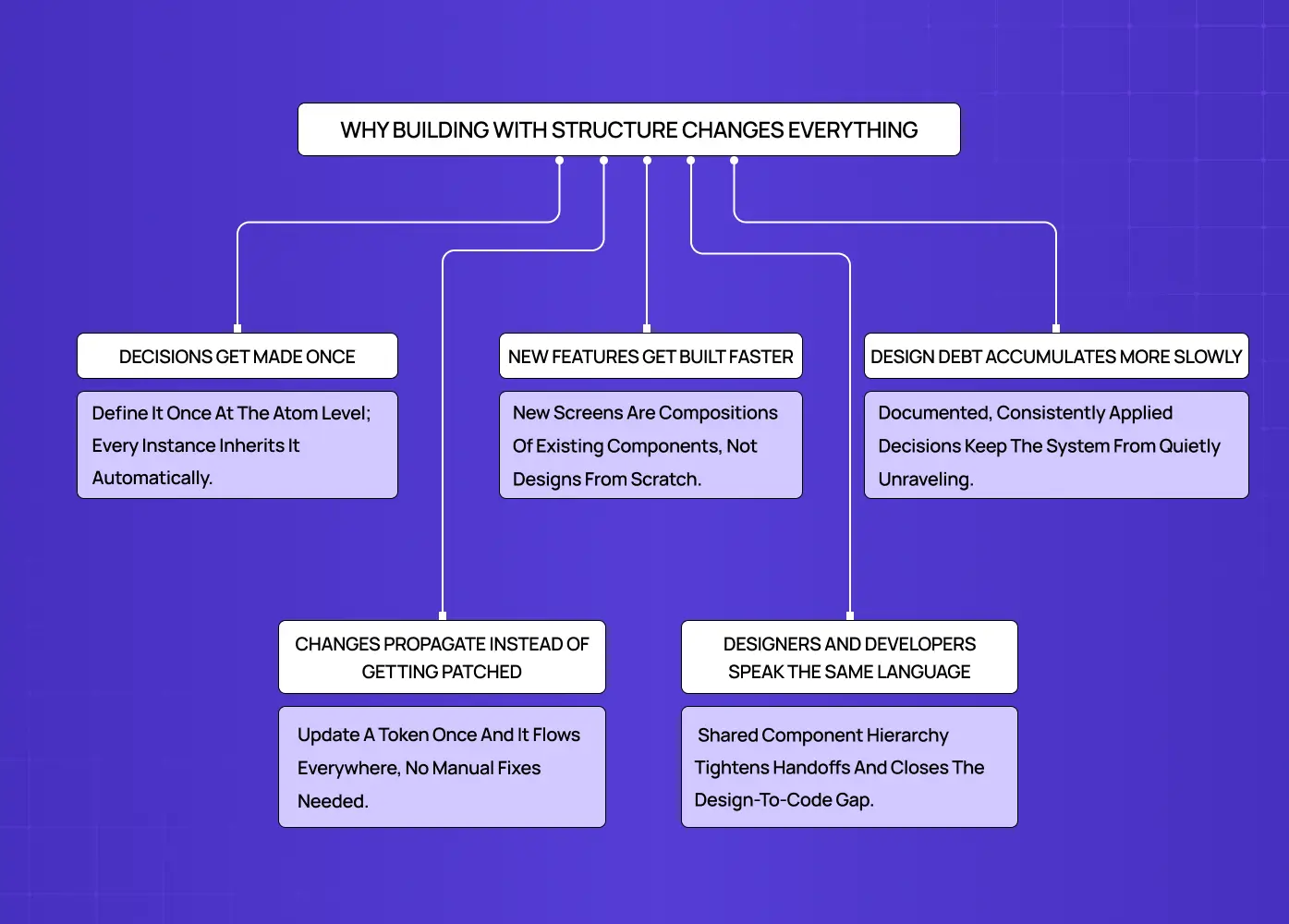
Most UI inconsistencies do not come from bad taste. They come from an absence of shared decisions made early enough.
When a team designs screen by screen rather than component by component, every new surface becomes a fresh opportunity to make slightly different choices. Over time, those choices compound. The product starts to feel inconsistent in ways that are hard to pinpoint and even harder to fix after the fact.
Here is what product design principles actually change in practice:
Decisions get made once. When you define a button at the atom level, every button in the product inherits that decision. You are not re-evaluating it on every screen.
Changes propagate instead of getting patched. Update a color at the design token level and it flows through every component that references it, rather than requiring manual correction across dozens of files.
Designers and developers speak the same language. When both sides work from the same component hierarchy, handoffs become cleaner and the gap between the design file and the codebase narrows.
New features get built faster. Adding a new screen becomes an exercise in composing existing components rather than designing from scratch.
Design debt accumulates more slowly. Because foundational decisions are documented and consistently applied, the system does not quietly unravel between sprints.
For SaaS products especially, where the interface is the product, building proper design systems for SaaS products separates teams that ship consistently from teams that are perpetually catching up on their own technical and design debt.
The Five Stages, Explained
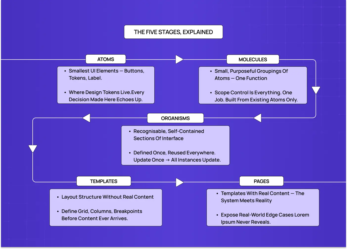
Atoms
Atoms are the foundation. They are the smallest elements in a UI that cannot be meaningfully broken down further: a button, an input field, a text label, a checkbox, an icon, a divider.
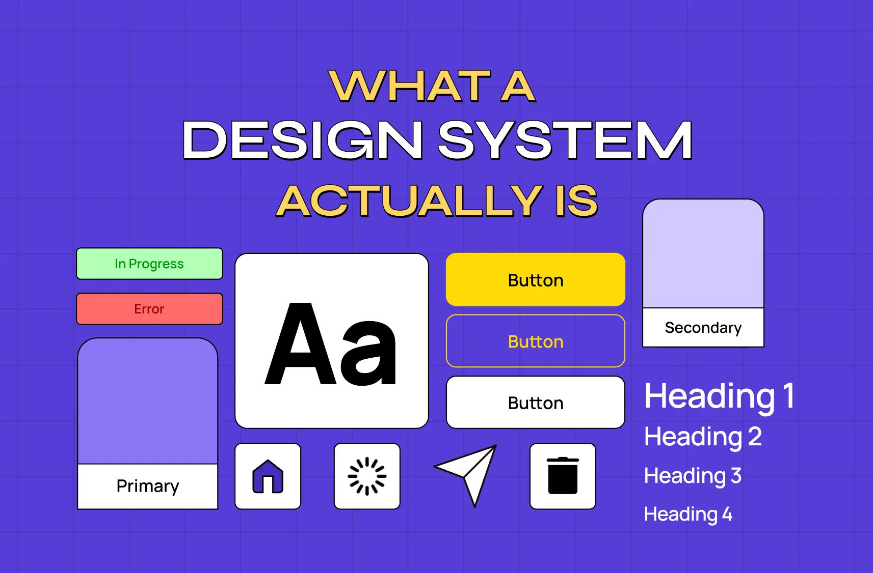
On their own, atoms do not represent a workflow or a feature. What they represent is a committed decision. The typography, color values you tokenize, the spacing units you standardize here are the visual design principles that echo through every component built above them.
This is also where design tokens live. A token is a named visual decision, something like color.action.primary, that every interactive element across the product references. Defining these rules ensures your atomic design style and overall brand experience stay consistent at every level without having to manually police it across hundreds of components.
Design tokens are also moving toward a shared cross-platform standard. The W3C Design Tokens Community Group has been formalizing a common format that allows the same token to feed Figma, web, iOS, and Android simultaneously. This is exactly what makes the cross-platform propagation you see in systems like Airbnb's DLS possible at scale.
What lives at the atom level:
Interactive elements: buttons, checkboxes, toggles, radio buttons, input fields
Display elements: labels, icons, tags, badges, dividers
Foundational values: typography styles, spacing units, color tokens, shadow definitions
States: default, hover, active, disabled, and error
One underappreciated consequence of defining components at the atom level is what it does for accessibility. When focus states, minimum touch targets, color contrast ratios, and semantic HTML are built into an atom correctly, every molecule, organism, and page that uses that atom inherits those properties automatically. This is the opposite of retrofitting accessibility screen by screen. A button atom with a properly defined focus-visible state, sufficient color contrast, and correct ARIA role does not need to be re-audited every time it appears in a new context. It is already correct by construction. This is one of the strongest arguments for investing in atomic design principles early, because accessibility debt, like visual inconsistency, compounds when it is left to the surface level.
Molecules
A molecule is a small, purposeful grouping of atoms. A search bar is a molecule: an input field, a button, and an icon combined into a single functional unit. A form field with a label, an input, and an inline error message is a molecule. Individually those atoms are inert. Together they form a complete, reusable interaction pattern.
The discipline molecules require is scope control. A molecule should do one thing clearly. The moment a molecule starts accommodating three different use cases, it stops being reusable and becomes a liability.
What makes a well-formed molecule:
A singular, clearly defined function
Built entirely from atoms already defined in the system
Consistent behavior regardless of where it appears in the product
No internal style choices that deviate from the atom layer beneath it
Organisms
Organisms are where the interface starts to feel recognizable. A site header with a logo, navigation links, and a search bar is an organism. A dashboard panel combining multiple data cards is an organism. A comment thread, a product listing grid, a multi-step onboarding flow are all organisms.
What makes organisms particularly valuable from a systems perspective is leverage. An organism defined once can appear across multiple pages while remaining a single maintained component. Update it in one place and every instance reflects the change immediately.
What characterizes organisms:
Composed of multiple molecules and sometimes standalone atoms
Self-contained enough to be placed into a layout independently
The components most commonly reused across different pages and contexts
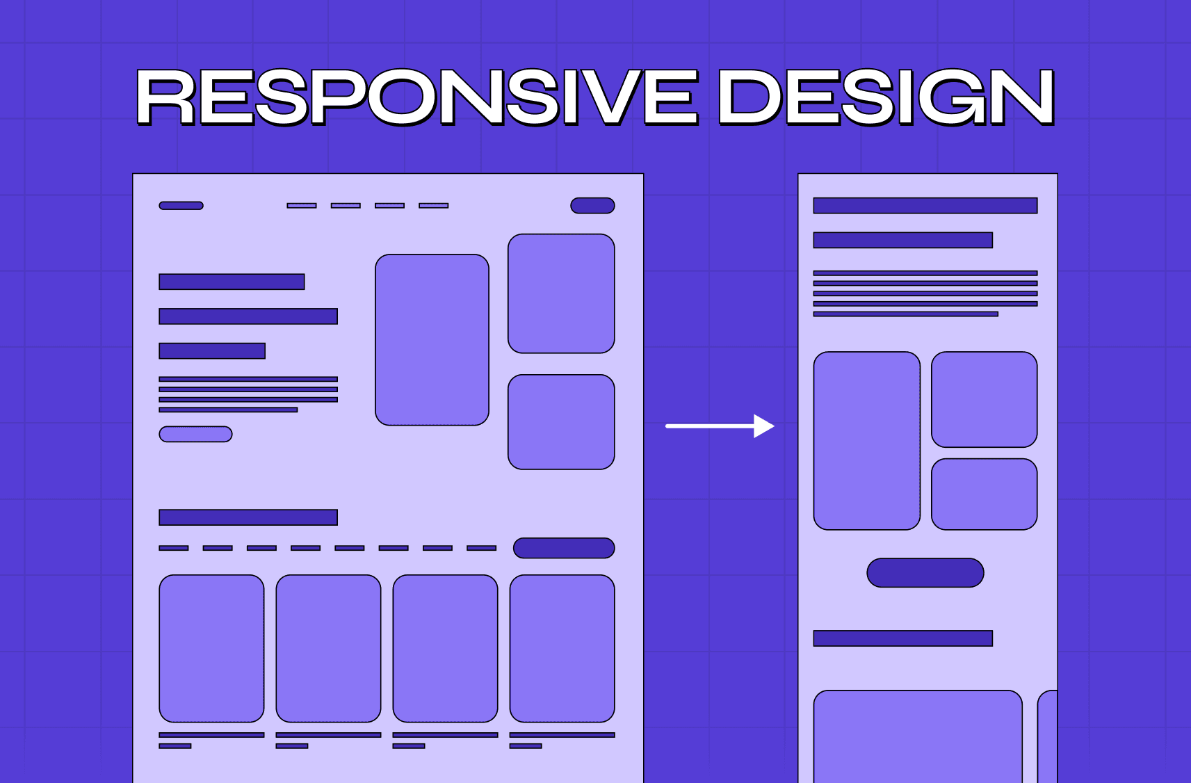
The stage where responsive behavior needs to be explicitly designed and documented
Templates
Templates define layout structure without filling it with real content. They are the spatial contract for a page type: where organisms sit, how they stack, what the column behavior is, how spacing scales at different breakpoints.
A dashboard template, a settings page template, and an onboarding flow each have their own layout logic. Templates make those decisions explicit before content arrives, which means teams stop reinventing the grid for every new screen they scope.
What templates establish:
Grid structure, column layout, and content hierarchy
Placement and stacking order of organisms within the page
Responsive behavior and layout shifts across breakpoints
A shared structural reference for both designers and developers
Pages
Pages are instances of templates filled with real content. This is where the system meets reality, and where its gaps become visible.
Real copy is never the same length as placeholder text. Real images have unexpected dimensions. Real data surfaces edge cases that lorem ipsum never reveals. Pages are not just the final deliverable. They are the diagnostic stage of the system.
When a page looks broken, the answer is almost never to fix that individual page. It is to trace the problem back to the template, organism, or atom that failed to handle the real-world condition, and resolve it there.
What pages test and reveal:
How the system handles content variation, long strings, missing data, and empty states
Whether template structures hold up under different data conditions
Which atoms or molecules need additional states to be complete
How the full experience reads when all the pieces come together
How This Plays Out in Real Projects
What we saw with LearnSphere
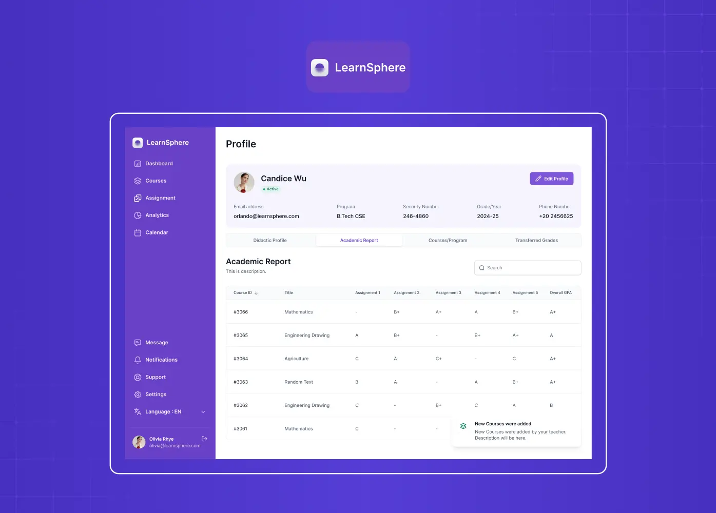
When we worked on LearnSphere, an AI-powered edtech platform serving students, teachers, admins, and superadmins across multiple institutions, the challenge was not just visual. The platform already had a functioning product, but it lacked consistency across roles. Each user type had different workflows, different information hierarchies, and different levels of interaction complexity.
Designing screen by screen would have resulted in a fragmented experience where every role felt like a different product.
Our approach was to build from the component level up. We started by establishing the foundational layer: a unified typography system, a consistent color structure, and shared interactive states across all four user types. Molecules like form fields, status indicators, and notification patterns were scoped tightly and reused across all roles.
The result was a platform where adding a new feature or a new role-specific view did not require starting from scratch. The system absorbed complexity rather than breaking under it. Consistency across roles was structural, not enforced manually.
How Airbnb applies the same thinking
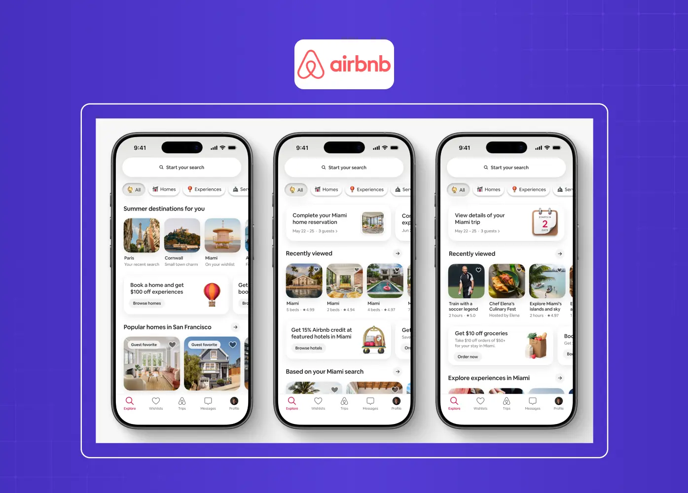
Airbnb's design system, known as the Design Language System (DLS), is one of the most cited examples of atomic design principles applied at product scale. Airbnb maintains a shared library of base components, from foundational tokens for color, typography, and spacing, all the way up to complex organisms like listing cards, booking panels, and navigation structures.
What makes the DLS notable is that it spans both web and native mobile platforms. The same component logic and the same design decisions at the token level propagate across iOS, Android, and web simultaneously. When Airbnb updates a color role or a type scale, it flows through the entire product without requiring platform-by-platform corrections.
This is the payoff of a mature atomic design system: the ability to make one decision that applies everywhere.
How IBM Carbon does it at enterprise scale
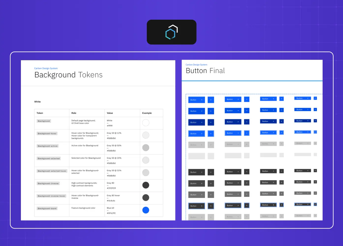
IBM's Carbon Design System is another strong reference point, particularly for enterprise and SaaS UX design. Carbon defines its atom layer through a set of design tokens that cover color, spacing, motion, and typography. Those tokens feed into a comprehensive UI component library of buttons, inputs, data tables, and notifications.
What Carbon illustrates well is governance. Every component in the system has documented usage guidelines, accessibility requirements, and variant specifications. Teams across dozens of IBM products can build new features using the same components without creating new inconsistencies. The system scales because the decisions are upstream, not enforced downstream per screen.
Where the Methodology Gets Genuinely Difficult
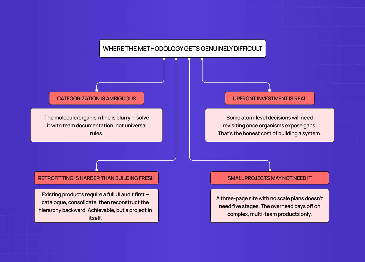
It would be misleading to present this as a frictionless process. There are real challenges worth knowing about before you start.
Categorization is inherently ambiguous. The line between a molecule and an organism is not always obvious. Two experienced designers on the same team will draw it differently. The answer is not a universal rule. It is team-level documentation that defines the convention and applies it consistently.
The upfront investment is real. Defining atoms before you have a complete product picture means some decisions will need revisiting once organisms reveal gaps. This is the honest cost of building a system rather than a series of individual screens.
Retrofitting is significantly harder than building from scratch. Applying this framework to an existing product requires a full UI audit before any system work can begin. That means cataloguing what exists, identifying inconsistencies, consolidating duplicates, and constructing the hierarchy backward from components already live in production. It is achievable, but it is a project in its own right.
Small projects do not always need this level of structure. A three-page marketing site with no planned expansion does not need a five-stage component hierarchy. The methodology earns its overhead on complex, multi-team, multi-screen products. Applying it to something that will not scale adds scaffolding without benefit.
Is Atomic Design Still Relevant in 2026?
It is a fair question. The methodology was introduced over a decade ago, and the design landscape has shifted considerably since then.
The honest answer is that it is more structurally relevant than ever, even if the way teams apply it has evolved.
Here is why it has held up:
Component-based development frameworks like React and Vue are now the standard, not the exception. The way engineers build products today already assumes a modular, composable structure. Atomic design gives designers a mental model that aligns with that reality rather than working against it.
Design tooling has caught up. Figma's component architecture, variables, and design token support are all direct implementations of what the methodology describes. The tools have grown toward the framework.
Design systems are now an expectation at serious product companies, not a nice-to-have. The atomic design book gave teams a shared vocabulary for something they were already trying to build.
Where the conversation has genuinely shifted is around AI-generated UI. Tools that produce full screens from a text prompt work top-down, which sits in tension with the bottom-up composition atomic design describes. But this does not make the methodology obsolete. If anything, it makes the underlying system more important. AI-generated output still needs to be reconciled back into a consistent component structure. The system is what gives generated UI somewhere to land. Without it, AI-assisted design produces fast output that creates slow cleanup.
The framework is not a manual drawing process. It is a structural logic. And that logic does not expire.
How Modern Tooling Maps to the Framework
One reason this approach has remained relevant well beyond its introduction is that the tools designers use every day have evolved to reflect its logic directly.
Figma's component system, with base components, variants, component properties, and layout grids in Figma, maps almost directly onto the atom-to-organism hierarchy. Design tokens in Figma, and in tools like Tokens Studio, are a direct implementation of the foundational layer described in the atomic design book: named visual decisions that feed into every component above them.
For teams working in component-based development frameworks, the alignment goes further still:
An atom in your Figma file should correspond to a base component in the codebase
A molecule in your design system should have a matching composed component in the front-end
The UI component library your developers build from and the component library in your design tool should, ideally, be two sides of the same structure
When that alignment is maintained, handoffs get cleaner, design debt accumulates more slowly, and updates are propagated rather than patched across dozens of files.
Conclusion
Atomic design is a component-first framework that gives product teams a structured, traceable way to build and maintain consistent interfaces at scale.
The five stages create a clear hierarchy where every design decision has a source and every change has a clear propagation path rather than requiring manual correction across screens.
Real-world applications, from LearnSphere's multi-role edtech platform to Airbnb's cross-platform DLS and IBM's enterprise Carbon system, show how the same principles apply whether you are building for ten screens or ten thousand.
The methodology requires genuine upfront investment, clear team conventions around categorization, and a commitment to treating the component system as the single source of truth.
Modern tooling, including Figma's component architecture and native design token support, has evolved directly in line with how atomic design organizes UI decisions.
Its real value does not show up on day one. It shows up six months later, when the product doubles in scope and the system holds without requiring a rebuild.