
Agentic UI Patterns Most Teams Build in the Wrong Order

10 min read

10 min read

AI Design

Agentic UI Patterns Most Teams Build in the Wrong Order

A framework for sequencing agentic UI patterns so your AI agent earns user trust progressively — instead of being disabled after the first mistake.

Agentic UI Patterns Most Teams Build in the Wrong Order

10 min read

10 min read

AI Design

Agentic UI Patterns Most Teams Build in the Wrong Order

A framework for sequencing agentic UI patterns so your AI agent earns user trust progressively — instead of being disabled after the first mistake.

Most AI product teams spend months perfecting their agent's capabilities, then ship an interface that users turn off within a week. At Groto, we design agentic UI for AI startups that need to earn trust from day one — here's the framework we've built from that work.

Why most agentic interfaces lose users before the agent gets a chance.
Illustration of a user managing a visual workflow system with process maps, automation tools, and task orchestration elements.

If you search "agentic design patterns" today, most results walk you through how AI agents are built under the hood: ReAct loops, multi-agent orchestration, planning and reflection architectures. That is useful knowledge for developers, but it does not answer the question product teams and founders actually face: how do you design the interface that sits in front of all that capability? This blog covers agentic UI patterns, the design-side counterpart to those technical frameworks, and the specific order in which they should be shipped. It complements how product teams are using agentic AI to speed up UX workflows — that post covers the workflow layer; this one covers the interface pattern layer on top of it. It is written for product designers, AI founders, and SaaS teams who are building user-facing AI products and need their agent to earn trust from day one, not just function correctly. 

TL;DR

  • Most agentic UI failures are interface problems, not capability problems

  • Agentic UI patterns are distinct from technical agentic design patterns: they govern how users interact with agents, not how agents are built

  • Groto's Agentic Interface Ladder sequences four trust stages: Suggest, Verify, Delegate, Automate

  • There are 7 core agentic UI patterns, each mapped to a specific Ladder stage

  • Shipping Stage 4 autonomy before earning Stage 2 trust is the single most common reason users disable AI features

  • Four metrics (acceptance rate, undo rate, escalation engagement, time to first delegation) tell you whether your interface is working

Gartner projects that 40% of enterprise applications will integrate task-specific AI agents by end of 2026, up from under 5% in 2024. That shift is reshaping the AI-driven UX practices every business should know in 2026. Most of those integrations will have the same problem: a capable agent behind an interface that users do not trust. 

The agent works. Users still turn it off.

This is the agentic UI problem. Not a capability problem. A design problem. And at Groto, it is the problem we have been solving with AI startups and product teams for the last two years. This post lays out the framework we use, including the sequencing question that most teams get backwards.

What Agentic UI Actually Means
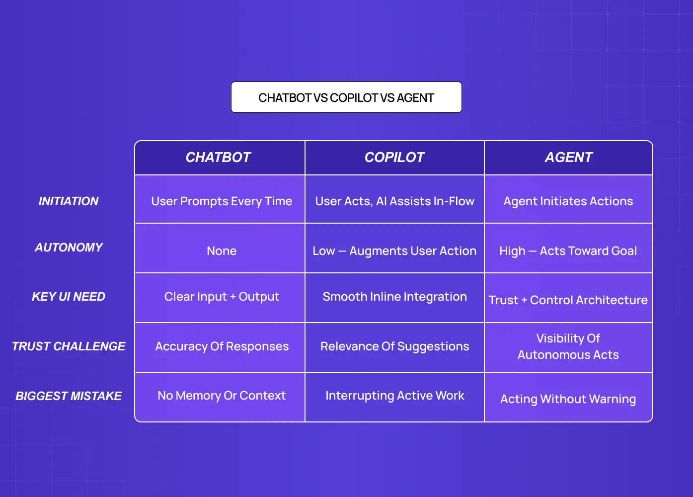
Comparison table explaining the differences between chatbots, AI copilots, and autonomous agents across autonomy, trust, and user interaction.

Agentic UI design is a specialisation within the broader practice of what AI UX design is and how it works — specifically the part concerned with software that plans, decides, and acts toward a user's goal, rather than waiting for explicit step-by-step commands. 

That definition matters because most teams conflate three distinct things: chatbots, copilots, and agents. They are not interchangeable, and the UI requirements for each are fundamentally different.

Chatbot 

Waits for your input, generates a response, and stops. You ask, it answers. The interface is a text box and a reply. No planning, no initiative, no action taken between turns. The UX best practices for AI chatbots cover this interaction model thoroughly — and understanding them sharpens the contrast with agentic UI requirements. 

Copilot 

Assists while you work. GitHub Copilot completes your code. Notion AI rewrites your paragraph. You are driving; the AI augments your actions. The interface is an overlay on your existing workflow.

Agent 

Operates with genuine autonomy. You give it a goal ("research competitors in this market and send me a summary by Thursday") and it plans the steps, executes them, handles decisions along the way, and returns with a result. You were not in the loop for each step. That is the point.

This shift from responding to acting is what makes agentic UI design a separate discipline. The old patterns do not transfer. You cannot take a copilot interface and add an "automate" button and call it agentic. The trust architecture is completely different — and the research on what actually works in AI UX versus traditional UX for SaaS products confirms that the gap is structural, not stylistic. 

The AI onboarding playbook top teams use to boost activation.

Reduce first-session confusion, speed up time-to-value, and build user trust, built from real onboarding audits of AI products.

No Spam. Free Lifetime

The AI onboarding playbook top teams use to boost activation.

Reduce first-session confusion, speed up time-to-value, and build user trust, built from real onboarding audits of AI products.

No Spam. Free Lifetime

The Real Reason Agentic Products Fail at the Interface

The core tension in every agentic product is this: the more autonomous the agent becomes, the less the user understands what it is doing. Most teams resolve that tension in the wrong direction. They ship maximum autonomy and assume users will adjust.

They do not adjust. They disengage.

The pattern plays out predictably. An agent makes three confident decisions. Two are correct. One is subtly wrong. The user catches the mistake, starts reviewing every agent action manually, and decides it is faster to just do the work themselves. A feature that should reduce cognitive load has added a new audit job.

Microsoft lived this with Recall, a Windows 11 feature that automatically captured and stored screenshots of everything on a user's screen. The capability was technically impressive. The interface design gave users no preview moment, no consent signal, no transparency into what was being captured. The backlash was swift enough that Microsoft delayed the launch and spent nearly a year rebuilding the trust they had burned in the announcement.

This is what we call agentic UI debt at Groto: the design shortcuts that look fine in a demo and break user trust in production. The agent was never the problem. The interface layer was — and it is the same failure dynamic documented in our breakdown of why copilot UX feels broken and how to fix it, where the remediation path is almost identical. 

A 2025 McKinsey study found that 52% of enterprise employees who tried AI agent features stopped using them within 30 days, citing "lack of transparency about what the AI was doing" as the primary reason. The capability existed. The interface failed to make it trustworthy. For a full taxonomy of AI UX design mistakes that erode user trust, the failure patterns there map directly to what this post is designed to prevent. 

The solution is not better documentation. It is better design, specifically, a staged approach to earning autonomy.

The Agentic Interface Ladder: Groto's Framework for Building Trust
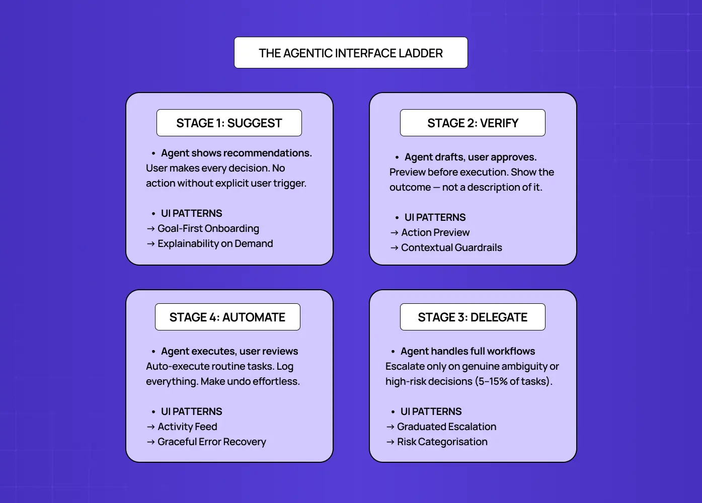
Framework showing the four stages of agentic interfaces: suggest, verify, delegate, and automate, along with key UX patterns for each stage.

The Agentic Interface Ladder, developed by Groto (letsgroto.com), is a four-stage framework for sequencing agentic UI patterns so that each level of automation is earned through demonstrated reliability, not assumed on launch day.

Stage 1: Suggest 

The agent surfaces recommendations. The user makes every decision. No action executes without an explicit user trigger. The interface's job here is clarity: show what the agent knows, why it thinks what it thinks, and make it easy to act on or dismiss.

Stage 2: Verify 

The agent drafts actions and presents them for approval before executing. The user reviews and confirms. The interface needs to show previews, not dialogs: the actual outcome of the action, not a description of it.

Stage 3: Delegate 

The agent executes routine, reversible tasks automatically and logs what it did. The user reviews the activity feed and can undo. The interface needs undo infrastructure and transparent logging more than it needs approval gates.

Stage 4: Automate 

The agent handles full workflows autonomously, escalating only when it hits genuine ambiguity or high-risk decisions. The interface needs escalation design, risk categorisation, and a clear handoff protocol.

The critical insight behind the Ladder: most teams prototype at Stage 4 and ship at Stage 3 before they have built the trust infrastructure for Stage 2. Users land in an interface where the agent is doing things they did not fully understand they had agreed to. The Ladder forces a discipline: earn the right to each stage before you build for the next one.

At Groto, we use this framework as the first design conversation with every AI startup we work with. The question is not "what does our agent do?" It is "which stage have users actually given us permission for?"

The 7 Core Agentic UI Patterns (Mapped to the Ladder)
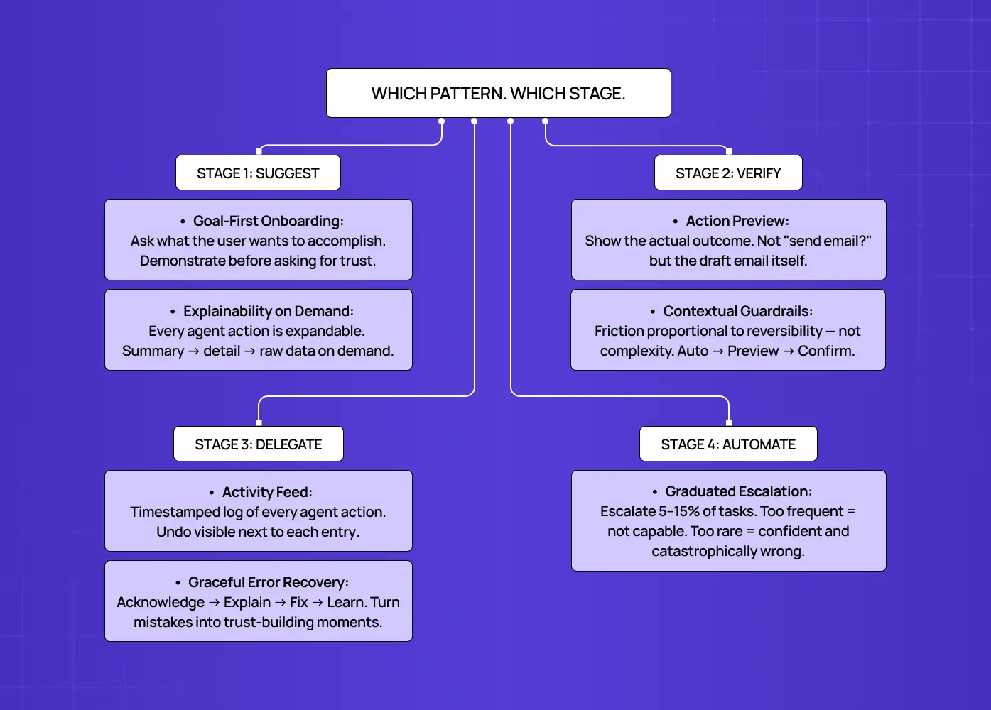
Diagram mapping practical UX patterns to different levels of agent autonomy, from user-guided suggestions to fully automated actions.

These are the patterns that appear consistently across well-designed agentic products. We have organised them by which Ladder stage they belong to, because implementing a Stage 4 pattern before you have earned Stage 2 trust is exactly how agentic features get disabled. For teams building these into a reusable library, our guide on what a design system for SaaS products should include covers how to document and maintain agentic UI patterns at the component level. 

Stage 1: Suggest

1. Goal-first onboarding

  • Traditional onboarding teaches users where buttons are

  • Agentic onboarding asks users what they want to accomplish, then demonstrates the agent's competence immediately

  • Cursor does this precisely right: your first interaction is not a tutorial, it is "describe what you want to build"

  • The agent starts working; trust is earned through demonstration, not explanation

2. Explainability on demand

  • Users do not need every agent reasoning surfaced: they need it available when they want it

  • Linear's AI priority suggestions appear with a small "Why?" link; click to expand the reasoning

  • Most users never click; the ones who do get exactly what they need

  • Key design principle: progressive disclosure (summary then detail then raw data, never front-loaded). It is one of the micro UX design patterns that sharpen user experience most reliably in agentic contexts, where cognitive load compounds faster than in standard interfaces. 

Stage 2: Verify

3. Action preview

  • Before any significant action executes, show the actual outcome, not a description of it. The visual design principles that govern legibility and hierarchy apply acutely here — a preview that users cannot scan in two seconds is functionally no better than a confirmation dialog.

  • "Send email to 5 recipients?" is a weak confirmation dialog; the actual draft email with recipients, subject, and body is an action preview

  • Claude Code does this with code diffs: you see the exact lines changing before you approve

  • The preview should also be editable; a user who can tweak the agent's output before execution feels like a collaborator, not a rubber stamp

4. Contextual guardrails

  • Not every action carries the same risk; the guardrail level should match the reversibility of the action, not the complexity of it. This is one area where the principles behind digital product design transfer directly into agentic UI — the risk-reversibility framework is not new, but the stakes of miscalibrating it in an autonomous context are considerably higher. 

  • A practical breakdown by risk tier:

    • Low risk (read, search, organise): Auto-execute and log

    • Medium risk (send messages, create content, schedule): Show a quick preview before executing

    • High risk (money, irreversible deletions, public-facing actions): Full preview, explicit confirmation, and a buffer window to reverse

  • Gmail's 30-second "undo send" window is a simple implementation of this principle that users trust implicitly

Stage 3: Delegate

5. Activity feed

  • When agents work in the background, users need a persistent, scannable record of what happened

  • The feed should include: timestamps, decisions made, actions taken, and a visible undo option next to each entry. The same visual hierarchy principles that govern how to design SaaS dashboards users actually understand apply directly here — scannable layout, clear action affordances, and progressive disclosure of detail. 

  • The activity feed is not just a log: it is the primary mechanism by which users maintain a sense of control over a system acting without their direct involvement

  • Notion AI's version of this is deliberately minimal, which is the right call: a feed that requires active reading defeats the purpose. It reflects a broader principle in how AI copilot design works in practice — copilot-stage products consistently favour low-friction visibility over comprehensive logging, because the goal is ambient awareness, not active monitoring. 

6. Graceful error recovery

  • Agents make mistakes; the question is whether the interface turns that mistake into a trust-building moment or a reason to disengage

  • A good error recovery pattern does four things:

    • Acknowledges what went wrong in plain language

    • Explains the reasoning that led there

    • Offers a fix

    • Signals that the preference has been noted for future tasks

    • The "explains the reasoning" step depends heavily on scannable AI data layouts, since a reasoning explanation buried in dense, unstructured text fails the same way a poorly hierarchized dashboard does.

  • This is the service recovery paradox at work: users who experience a well-handled error often become more confident in the product than users who never encountered one

Stage 4: Automate

7. Graduated escalation

  • A fully autonomous agent needs to know when to stop and ask; too often this is designed as a binary: either the agent acts, or it asks permission for everything

  • The better design is a calibrated escalation rate:

    • Below 5% escalation: The agent is almost certainly making avoidable mistakes silently

    • 5 to 15% escalation: The healthy range; users stay engaged without being overwhelmed

    • Above 15% escalation: Users stop reading the prompts and click through automatically, which defeats the safety mechanism entirely.

  • At the component level, a segmented control UI pattern is one of the most effective ways to let users adjust their escalation sensitivity tier without navigating to a settings page. 

  • Google's Jules coding agent illustrates the right approach: it researches, forms a plan, lays out the steps, then stops and shows you the plan before writing a single line of code; the escalation is the interface, not an interruption to it

The Sequencing Question Most Teams Get Wrong

Here is the most common pattern we see when working with AI startups at Groto: the team has built a genuinely capable agent. The demo is impressive. The engineering is solid. Then they ship the interface with Stage 4 UI patterns, full autonomy, background execution, minimal approval, because that is what looks good in the demo.

Three weeks after launch, users have disabled the feature.

The Ladder explains why. Users needed to experience the agent at Stage 1 and Stage 2 before they could trust it at Stage 3 or 4. They needed to see it suggest correctly, preview its actions accurately, and recover well from a mistake, all before they would grant it delegation rights. The interface skipped the trust-building stages entirely.

When we worked with the Camb.ai team on their AI-powered product experience, the first design decision was deliberate: start with suggestions, not actions. Give users a window into what the agent was thinking before it did anything. That sequence, show before act, earn before automate, is what lets an agentic product expand its autonomy over time rather than lose it all at once when something goes wrong.

The rule at Groto is this: build the interface one stage behind the agent's actual capability. If the agent can delegate, the interface should verify. Give users time to develop the mental model before the agent acts on their behalf. The velocity feels slower in week one. The retention is dramatically better in month three.

We have seen 40 to 60% improvement in task completion rates on AI features when the agentic UI was redesigned to follow the Ladder sequence rather than launching at full autonomy. That is not a product capability change. That is an interface architecture decision — and it is one of the highest-return findings in the broader body of best practices for integrating AI into SaaS UX

How to Know Whether Your Agentic UI Is Working
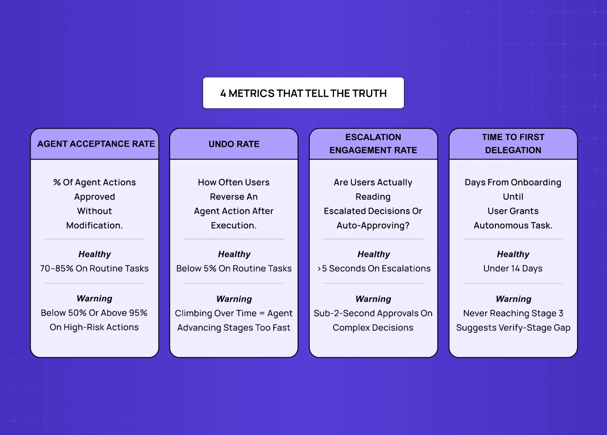
Framework outlining four key metrics for evaluating agentic systems, including acceptance rate, undo rate, escalation engagement, and delegation speed.

This is the gap in nearly every guide on agentic UX design. Everyone describes the patterns. Almost nobody explains how to know if they are working. These are the four metrics we use at Groto to assess agentic UI health.

Agent acceptance rate

  • What it measures: The percentage of agent suggestions or previewed actions that users approve without modification

  • Good signal: 70 to 85% on routine task types

  • Warning sign: Below 50% means users do not trust the agent's judgment on that task category; above 95% on high-risk actions means users are rubber-stamping without actually reviewing

Undo rate

  • What it measures: How often users reverse an agent action after it executes

  • Good signal: Below 5% on routine tasks

  • Warning sign: Undo rate climbing over time indicates the agent is making more confident mistakes as it takes on more autonomy, a signal the interface has advanced a Ladder stage too quickly — and often a sign the team itself is operating ahead of its actual team AI trust readiness, shipping autonomy the organization's design and governance practices haven't caught up to yet.

Escalation engagement rate

  • What it measures: When the agent surfaces a decision to the user, how often does the user engage thoughtfully versus click through automatically

  • Good signal: Users spending more than 5 seconds on escalated decisions

  • Warning sign: Sub-2-second approvals on complex escalations mean users have stopped reading the prompts

Time to first delegation

  • What it measures: How long after onboarding before a user willingly grants the agent an autonomous task

  • Good signal: Under 14 days for a well-sequenced agentic interface

  • Warning sign: Users never reaching Stage 3 suggests the Verify-stage UI is not building enough confidence

These metrics do not replace qualitative research. They flag where to look. An undo rate spike, for example, tells you there is a trust problem somewhere in your activity feed or error recovery design. It does not tell you which one. Session recordings and user interviews tell you that — and our guide to the UX design process covers the research and testing scaffolding that makes those investigations systematic rather than reactive. 

Conclusion

  • Agentic UI design is not a more complex version of chatbot UX: it is a different discipline built around trust architecture, not feature delivery — which is precisely the foundational premise trust-first agent design is built around as its own discipline.

  • The most common failure mode is launching at Stage 4 autonomy before earning Stage 2 trust; users disengage before the agent has a chance to prove itself

  • The Agentic Interface Ladder (Suggest, Verify, Delegate, Automate) gives teams a sequencing discipline that matches UI complexity to earned trust

  • The 7 core agentic UI patterns are only effective when deployed at the right Ladder stage: action previews at Stage 2 build trust, action previews at Stage 4 create friction

  • Measurement matters: acceptance rate, undo rate, escalation engagement, and time to first delegation give you the signals to know whether your interface is working or quietly eroding confidence

  • At Groto, we have found the single highest-impact intervention is always the same: slow the interface down one stage relative to the agent's capability, and let users build the mental model before they build the habit. For teams still building the broader foundation, our guide on how SaaS UX design works end to end is the right starting point before layering in agentic patterns. 

  • The teams that ship agentic AI products users trust are not the ones with the most capable agents; they are the ones that designed the trust infrastructure before they designed the automation

Ready to design an agentic interface that users do not turn off? Book a discovery call and let's map your product to the ladder.

Most AI product teams spend months perfecting their agent's capabilities, then ship an interface that users turn off within a week. At Groto, we design agentic UI for AI startups that need to earn trust from day one — here's the framework we've built from that work.

Why most agentic interfaces lose users before the agent gets a chance.

Illustration of a user managing a visual workflow system with process maps, automation tools, and task orchestration elements.

If you search "agentic design patterns" today, most results walk you through how AI agents are built under the hood: ReAct loops, multi-agent orchestration, planning and reflection architectures. That is useful knowledge for developers, but it does not answer the question product teams and founders actually face: how do you design the interface that sits in front of all that capability? This blog covers agentic UI patterns, the design-side counterpart to those technical frameworks, and the specific order in which they should be shipped. It complements how product teams are using agentic AI to speed up UX workflows — that post covers the workflow layer; this one covers the interface pattern layer on top of it. It is written for product designers, AI founders, and SaaS teams who are building user-facing AI products and need their agent to earn trust from day one, not just function correctly. 

TL;DR

  • Most agentic UI failures are interface problems, not capability problems

  • Agentic UI patterns are distinct from technical agentic design patterns: they govern how users interact with agents, not how agents are built

  • Groto's Agentic Interface Ladder sequences four trust stages: Suggest, Verify, Delegate, Automate

  • There are 7 core agentic UI patterns, each mapped to a specific Ladder stage

  • Shipping Stage 4 autonomy before earning Stage 2 trust is the single most common reason users disable AI features

  • Four metrics (acceptance rate, undo rate, escalation engagement, time to first delegation) tell you whether your interface is working

Gartner projects that 40% of enterprise applications will integrate task-specific AI agents by end of 2026, up from under 5% in 2024. That shift is reshaping the AI-driven UX practices every business should know in 2026. Most of those integrations will have the same problem: a capable agent behind an interface that users do not trust. 

The agent works. Users still turn it off.

This is the agentic UI problem. Not a capability problem. A design problem. And at Groto, it is the problem we have been solving with AI startups and product teams for the last two years. This post lays out the framework we use, including the sequencing question that most teams get backwards.

What Agentic UI Actually Means

Comparison table explaining the differences between chatbots, AI copilots, and autonomous agents across autonomy, trust, and user interaction.

Agentic UI design is a specialisation within the broader practice of what AI UX design is and how it works — specifically the part concerned with software that plans, decides, and acts toward a user's goal, rather than waiting for explicit step-by-step commands. 

That definition matters because most teams conflate three distinct things: chatbots, copilots, and agents. They are not interchangeable, and the UI requirements for each are fundamentally different.

Chatbot 

Waits for your input, generates a response, and stops. You ask, it answers. The interface is a text box and a reply. No planning, no initiative, no action taken between turns. The UX best practices for AI chatbots cover this interaction model thoroughly — and understanding them sharpens the contrast with agentic UI requirements. 

Copilot 

Assists while you work. GitHub Copilot completes your code. Notion AI rewrites your paragraph. You are driving; the AI augments your actions. The interface is an overlay on your existing workflow.

Agent 

Operates with genuine autonomy. You give it a goal ("research competitors in this market and send me a summary by Thursday") and it plans the steps, executes them, handles decisions along the way, and returns with a result. You were not in the loop for each step. That is the point.

This shift from responding to acting is what makes agentic UI design a separate discipline. The old patterns do not transfer. You cannot take a copilot interface and add an "automate" button and call it agentic. The trust architecture is completely different — and the research on what actually works in AI UX versus traditional UX for SaaS products confirms that the gap is structural, not stylistic. 

The AI onboarding playbook top teams use to boost activation.

Reduce first-session confusion, speed up time-to-value, and build user trust, built from real onboarding audits of AI products.

No Spam. Free Lifetime

The Real Reason Agentic Products Fail at the Interface

The core tension in every agentic product is this: the more autonomous the agent becomes, the less the user understands what it is doing. Most teams resolve that tension in the wrong direction. They ship maximum autonomy and assume users will adjust.

They do not adjust. They disengage.

The pattern plays out predictably. An agent makes three confident decisions. Two are correct. One is subtly wrong. The user catches the mistake, starts reviewing every agent action manually, and decides it is faster to just do the work themselves. A feature that should reduce cognitive load has added a new audit job.

Microsoft lived this with Recall, a Windows 11 feature that automatically captured and stored screenshots of everything on a user's screen. The capability was technically impressive. The interface design gave users no preview moment, no consent signal, no transparency into what was being captured. The backlash was swift enough that Microsoft delayed the launch and spent nearly a year rebuilding the trust they had burned in the announcement.

This is what we call agentic UI debt at Groto: the design shortcuts that look fine in a demo and break user trust in production. The agent was never the problem. The interface layer was — and it is the same failure dynamic documented in our breakdown of why copilot UX feels broken and how to fix it, where the remediation path is almost identical. 

A 2025 McKinsey study found that 52% of enterprise employees who tried AI agent features stopped using them within 30 days, citing "lack of transparency about what the AI was doing" as the primary reason. The capability existed. The interface failed to make it trustworthy. For a full taxonomy of AI UX design mistakes that erode user trust, the failure patterns there map directly to what this post is designed to prevent. 

The solution is not better documentation. It is better design, specifically, a staged approach to earning autonomy.

The Agentic Interface Ladder: Groto's Framework for Building Trust

Framework showing the four stages of agentic interfaces: suggest, verify, delegate, and automate, along with key UX patterns for each stage.

The Agentic Interface Ladder, developed by Groto (letsgroto.com), is a four-stage framework for sequencing agentic UI patterns so that each level of automation is earned through demonstrated reliability, not assumed on launch day.

Stage 1: Suggest 

The agent surfaces recommendations. The user makes every decision. No action executes without an explicit user trigger. The interface's job here is clarity: show what the agent knows, why it thinks what it thinks, and make it easy to act on or dismiss.

Stage 2: Verify 

The agent drafts actions and presents them for approval before executing. The user reviews and confirms. The interface needs to show previews, not dialogs: the actual outcome of the action, not a description of it.

Stage 3: Delegate 

The agent executes routine, reversible tasks automatically and logs what it did. The user reviews the activity feed and can undo. The interface needs undo infrastructure and transparent logging more than it needs approval gates.

Stage 4: Automate 

The agent handles full workflows autonomously, escalating only when it hits genuine ambiguity or high-risk decisions. The interface needs escalation design, risk categorisation, and a clear handoff protocol.

The critical insight behind the Ladder: most teams prototype at Stage 4 and ship at Stage 3 before they have built the trust infrastructure for Stage 2. Users land in an interface where the agent is doing things they did not fully understand they had agreed to. The Ladder forces a discipline: earn the right to each stage before you build for the next one.

At Groto, we use this framework as the first design conversation with every AI startup we work with. The question is not "what does our agent do?" It is "which stage have users actually given us permission for?"

The 7 Core Agentic UI Patterns (Mapped to the Ladder)

Diagram mapping practical UX patterns to different levels of agent autonomy, from user-guided suggestions to fully automated actions.

These are the patterns that appear consistently across well-designed agentic products. We have organised them by which Ladder stage they belong to, because implementing a Stage 4 pattern before you have earned Stage 2 trust is exactly how agentic features get disabled. For teams building these into a reusable library, our guide on what a design system for SaaS products should include covers how to document and maintain agentic UI patterns at the component level. 

Stage 1: Suggest

1. Goal-first onboarding

  • Traditional onboarding teaches users where buttons are

  • Agentic onboarding asks users what they want to accomplish, then demonstrates the agent's competence immediately

  • Cursor does this precisely right: your first interaction is not a tutorial, it is "describe what you want to build"

  • The agent starts working; trust is earned through demonstration, not explanation

2. Explainability on demand

  • Users do not need every agent reasoning surfaced: they need it available when they want it

  • Linear's AI priority suggestions appear with a small "Why?" link; click to expand the reasoning

  • Most users never click; the ones who do get exactly what they need

  • Key design principle: progressive disclosure (summary then detail then raw data, never front-loaded). It is one of the micro UX design patterns that sharpen user experience most reliably in agentic contexts, where cognitive load compounds faster than in standard interfaces. 

Stage 2: Verify

3. Action preview

  • Before any significant action executes, show the actual outcome, not a description of it. The visual design principles that govern legibility and hierarchy apply acutely here — a preview that users cannot scan in two seconds is functionally no better than a confirmation dialog.

  • "Send email to 5 recipients?" is a weak confirmation dialog; the actual draft email with recipients, subject, and body is an action preview

  • Claude Code does this with code diffs: you see the exact lines changing before you approve

  • The preview should also be editable; a user who can tweak the agent's output before execution feels like a collaborator, not a rubber stamp

4. Contextual guardrails

  • Not every action carries the same risk; the guardrail level should match the reversibility of the action, not the complexity of it. This is one area where the principles behind digital product design transfer directly into agentic UI — the risk-reversibility framework is not new, but the stakes of miscalibrating it in an autonomous context are considerably higher. 

  • A practical breakdown by risk tier:

    • Low risk (read, search, organise): Auto-execute and log

    • Medium risk (send messages, create content, schedule): Show a quick preview before executing

    • High risk (money, irreversible deletions, public-facing actions): Full preview, explicit confirmation, and a buffer window to reverse

  • Gmail's 30-second "undo send" window is a simple implementation of this principle that users trust implicitly

Stage 3: Delegate

5. Activity feed

  • When agents work in the background, users need a persistent, scannable record of what happened

  • The feed should include: timestamps, decisions made, actions taken, and a visible undo option next to each entry. The same visual hierarchy principles that govern how to design SaaS dashboards users actually understand apply directly here — scannable layout, clear action affordances, and progressive disclosure of detail. 

  • The activity feed is not just a log: it is the primary mechanism by which users maintain a sense of control over a system acting without their direct involvement

  • Notion AI's version of this is deliberately minimal, which is the right call: a feed that requires active reading defeats the purpose. It reflects a broader principle in how AI copilot design works in practice — copilot-stage products consistently favour low-friction visibility over comprehensive logging, because the goal is ambient awareness, not active monitoring. 

6. Graceful error recovery

  • Agents make mistakes; the question is whether the interface turns that mistake into a trust-building moment or a reason to disengage

  • A good error recovery pattern does four things:

    • Acknowledges what went wrong in plain language

    • Explains the reasoning that led there

    • Offers a fix

    • Signals that the preference has been noted for future tasks

    • The "explains the reasoning" step depends heavily on scannable AI data layouts, since a reasoning explanation buried in dense, unstructured text fails the same way a poorly hierarchized dashboard does.

  • This is the service recovery paradox at work: users who experience a well-handled error often become more confident in the product than users who never encountered one

Stage 4: Automate

7. Graduated escalation

  • A fully autonomous agent needs to know when to stop and ask; too often this is designed as a binary: either the agent acts, or it asks permission for everything

  • The better design is a calibrated escalation rate:

    • Below 5% escalation: The agent is almost certainly making avoidable mistakes silently

    • 5 to 15% escalation: The healthy range; users stay engaged without being overwhelmed

    • Above 15% escalation: Users stop reading the prompts and click through automatically, which defeats the safety mechanism entirely.

  • At the component level, a segmented control UI pattern is one of the most effective ways to let users adjust their escalation sensitivity tier without navigating to a settings page. 

  • Google's Jules coding agent illustrates the right approach: it researches, forms a plan, lays out the steps, then stops and shows you the plan before writing a single line of code; the escalation is the interface, not an interruption to it

The Sequencing Question Most Teams Get Wrong

Here is the most common pattern we see when working with AI startups at Groto: the team has built a genuinely capable agent. The demo is impressive. The engineering is solid. Then they ship the interface with Stage 4 UI patterns, full autonomy, background execution, minimal approval, because that is what looks good in the demo.

Three weeks after launch, users have disabled the feature.

The Ladder explains why. Users needed to experience the agent at Stage 1 and Stage 2 before they could trust it at Stage 3 or 4. They needed to see it suggest correctly, preview its actions accurately, and recover well from a mistake, all before they would grant it delegation rights. The interface skipped the trust-building stages entirely.

When we worked with the Camb.ai team on their AI-powered product experience, the first design decision was deliberate: start with suggestions, not actions. Give users a window into what the agent was thinking before it did anything. That sequence, show before act, earn before automate, is what lets an agentic product expand its autonomy over time rather than lose it all at once when something goes wrong.

The rule at Groto is this: build the interface one stage behind the agent's actual capability. If the agent can delegate, the interface should verify. Give users time to develop the mental model before the agent acts on their behalf. The velocity feels slower in week one. The retention is dramatically better in month three.

We have seen 40 to 60% improvement in task completion rates on AI features when the agentic UI was redesigned to follow the Ladder sequence rather than launching at full autonomy. That is not a product capability change. That is an interface architecture decision — and it is one of the highest-return findings in the broader body of best practices for integrating AI into SaaS UX

How to Know Whether Your Agentic UI Is Working

Framework outlining four key metrics for evaluating agentic systems, including acceptance rate, undo rate, escalation engagement, and delegation speed.

This is the gap in nearly every guide on agentic UX design. Everyone describes the patterns. Almost nobody explains how to know if they are working. These are the four metrics we use at Groto to assess agentic UI health.

Agent acceptance rate

  • What it measures: The percentage of agent suggestions or previewed actions that users approve without modification

  • Good signal: 70 to 85% on routine task types

  • Warning sign: Below 50% means users do not trust the agent's judgment on that task category; above 95% on high-risk actions means users are rubber-stamping without actually reviewing

Undo rate

  • What it measures: How often users reverse an agent action after it executes

  • Good signal: Below 5% on routine tasks

  • Warning sign: Undo rate climbing over time indicates the agent is making more confident mistakes as it takes on more autonomy, a signal the interface has advanced a Ladder stage too quickly — and often a sign the team itself is operating ahead of its actual team AI trust readiness, shipping autonomy the organization's design and governance practices haven't caught up to yet.

Escalation engagement rate

  • What it measures: When the agent surfaces a decision to the user, how often does the user engage thoughtfully versus click through automatically

  • Good signal: Users spending more than 5 seconds on escalated decisions

  • Warning sign: Sub-2-second approvals on complex escalations mean users have stopped reading the prompts

Time to first delegation

  • What it measures: How long after onboarding before a user willingly grants the agent an autonomous task

  • Good signal: Under 14 days for a well-sequenced agentic interface

  • Warning sign: Users never reaching Stage 3 suggests the Verify-stage UI is not building enough confidence

These metrics do not replace qualitative research. They flag where to look. An undo rate spike, for example, tells you there is a trust problem somewhere in your activity feed or error recovery design. It does not tell you which one. Session recordings and user interviews tell you that — and our guide to the UX design process covers the research and testing scaffolding that makes those investigations systematic rather than reactive. 

Conclusion

  • Agentic UI design is not a more complex version of chatbot UX: it is a different discipline built around trust architecture, not feature delivery — which is precisely the foundational premise trust-first agent design is built around as its own discipline.

  • The most common failure mode is launching at Stage 4 autonomy before earning Stage 2 trust; users disengage before the agent has a chance to prove itself

  • The Agentic Interface Ladder (Suggest, Verify, Delegate, Automate) gives teams a sequencing discipline that matches UI complexity to earned trust

  • The 7 core agentic UI patterns are only effective when deployed at the right Ladder stage: action previews at Stage 2 build trust, action previews at Stage 4 create friction

  • Measurement matters: acceptance rate, undo rate, escalation engagement, and time to first delegation give you the signals to know whether your interface is working or quietly eroding confidence

  • At Groto, we have found the single highest-impact intervention is always the same: slow the interface down one stage relative to the agent's capability, and let users build the mental model before they build the habit. For teams still building the broader foundation, our guide on how SaaS UX design works end to end is the right starting point before layering in agentic patterns. 

  • The teams that ship agentic AI products users trust are not the ones with the most capable agents; they are the ones that designed the trust infrastructure before they designed the automation

Ready to design an agentic interface that users do not turn off? Book a discovery call and let's map your product to the ladder.

Have a project in mind?

Let’s talk through your idea and see what makes sense.

Harpreet Singh

Founder at Groto

Have a project in mind?

Let’s talk through your idea and see what makes sense.

Harpreet Singh

Founder at Groto

FAQ

Everything you were going to ask (and a few things you didn’t know to)

How is designing for AI agents different from regular UX design?

Standard UX design assumes users initiate every action. Agentic UX design must account for a system that initiates actions on the user's behalf. This shifts the design challenge from "how do users accomplish tasks?" to "how do users maintain appropriate control over a system acting for them?" The key new design problems are: making invisible agent decisions visible, calibrating autonomy to earned trust, and designing recovery paths that rebuild confidence rather than destroy it.

What's the first agentic UI pattern a new AI product should implement?

Start with goal-first onboarding combined with explainability on demand. Before users will trust an agent to act, they need to see it demonstrate accurate judgment. Give users a natural-language goal input on first use, let the agent surface its plan or reasoning immediately, and make every decision it surfaces expandable. These two patterns establish the foundation of trust that later autonomy depends on. Do not implement delegation or automation patterns until users have repeatedly seen the agent's reasoning hold up.

How do you measure whether agentic UX is working?

Four metrics give a practical read on agentic UI health: agent acceptance rate (what percentage of suggestions or previews users approve without modification), undo rate (how often users reverse executed actions), escalation engagement rate (whether users are actually reviewing escalated decisions or click-approving automatically), and time to first delegation (how long before a new user grants the agent an autonomous task). Together, they surface trust problems at each stage of the Agentic Interface Ladder before they compound into disengagement.

Why do users turn off AI agent features?

The primary reason users disable agentic features is not capability failure: it is interface failure. Specifically, the agent acted without warning on something the user did not expect, the user could not understand why the agent made a decision, or a confident error was not handled in a way that restored trust. In each case, the issue is a design gap, not a model gap. The agent made a reasonable decision by its own logic, but the interface failed to give the user the context, control, or recovery path they needed to stay confident.

Can an existing SaaS product add agentic UX without a full redesign?

Yes, if approached with the right sequencing. The mistake is adding agentic features at Stage 3 or 4 autonomy into a UI designed for Stage 1 interactions. The safer path: introduce the agent as a suggestion surface first. Add an activity feed alongside any new autonomous behaviour. Introduce action previews before any irreversible agent action. These can be layered onto an existing product without structural redesign, and they give users the trust-building experience they need before you expand the agent's autonomy. A full redesign becomes necessary only when the core product architecture cannot support the Verify-stage infrastructure, which is a good time to call a design partner.

What are the 4 types of agentic AI?

Agentic AI is commonly categorised into four types based on how independently the system operates. Reactive agents respond to specific inputs with no memory of past interactions. Deliberative agents plan ahead using an internal model of the world. Learning agents improve their behaviour over time based on feedback and outcomes. Collaborative agents work alongside other agents or humans, sharing tasks and outputs across a system. Most enterprise AI products today combine elements of deliberative and collaborative patterns, which is why the interface layer needs to account for both autonomous decision-making and human handoff points.

How is designing for AI agents different from regular UX design?

Standard UX design assumes users initiate every action. Agentic UX design must account for a system that initiates actions on the user's behalf. This shifts the design challenge from "how do users accomplish tasks?" to "how do users maintain appropriate control over a system acting for them?" The key new design problems are: making invisible agent decisions visible, calibrating autonomy to earned trust, and designing recovery paths that rebuild confidence rather than destroy it.

What's the first agentic UI pattern a new AI product should implement?

Start with goal-first onboarding combined with explainability on demand. Before users will trust an agent to act, they need to see it demonstrate accurate judgment. Give users a natural-language goal input on first use, let the agent surface its plan or reasoning immediately, and make every decision it surfaces expandable. These two patterns establish the foundation of trust that later autonomy depends on. Do not implement delegation or automation patterns until users have repeatedly seen the agent's reasoning hold up.

How do you measure whether agentic UX is working?

Four metrics give a practical read on agentic UI health: agent acceptance rate (what percentage of suggestions or previews users approve without modification), undo rate (how often users reverse executed actions), escalation engagement rate (whether users are actually reviewing escalated decisions or click-approving automatically), and time to first delegation (how long before a new user grants the agent an autonomous task). Together, they surface trust problems at each stage of the Agentic Interface Ladder before they compound into disengagement.

Why do users turn off AI agent features?

The primary reason users disable agentic features is not capability failure: it is interface failure. Specifically, the agent acted without warning on something the user did not expect, the user could not understand why the agent made a decision, or a confident error was not handled in a way that restored trust. In each case, the issue is a design gap, not a model gap. The agent made a reasonable decision by its own logic, but the interface failed to give the user the context, control, or recovery path they needed to stay confident.

Can an existing SaaS product add agentic UX without a full redesign?

Yes, if approached with the right sequencing. The mistake is adding agentic features at Stage 3 or 4 autonomy into a UI designed for Stage 1 interactions. The safer path: introduce the agent as a suggestion surface first. Add an activity feed alongside any new autonomous behaviour. Introduce action previews before any irreversible agent action. These can be layered onto an existing product without structural redesign, and they give users the trust-building experience they need before you expand the agent's autonomy. A full redesign becomes necessary only when the core product architecture cannot support the Verify-stage infrastructure, which is a good time to call a design partner.


What are the 4 types of agentic AI?

Agentic AI is commonly categorised into four types based on how independently the system operates. Reactive agents respond to specific inputs with no memory of past interactions. Deliberative agents plan ahead using an internal model of the world. Learning agents improve their behaviour over time based on feedback and outcomes. Collaborative agents work alongside other agents or humans, sharing tasks and outputs across a system. Most enterprise AI products today combine elements of deliberative and collaborative patterns, which is why the interface layer needs to account for both autonomous decision-making and human handoff points.

More Articles

Extreme close-up black and white photograph of a human eye

Let’s bring your vision to life

Tell us what's on your mind? We'll hit you back in 24 hours. No fluff, no delays - just a solid vision to bring your idea to life.

Profile portrait of a man in a white shirt against a light background

Harpreet Singh

Founder and Creative Director

Get in Touch

Extreme close-up black and white photograph of a human eye

Let’s bring your vision to life

Tell us what's on your mind? We'll hit you back in 24 hours. No fluff, no delays - just a solid vision to bring your idea to life.

Profile portrait of a man in a white shirt against a light background

Harpreet Singh

Founder and Creative Director

Get in Touch

Extreme close-up black and white photograph of a human eye

Let’s bring your vision to life

Tell us what's on your mind? We'll hit you back in 24 hours. No fluff, no delays - just a solid vision to bring your idea to life.

Profile portrait of a man in a white shirt against a light background

Harpreet Singh

Founder and Creative Director

Get in Touch