
UX Persona Examples: What They Are, How They Work, and What Good Ones Look Like

A practical guide to UX persona examples — what they include, how they're built, and how they drive better design decisions across SaaS, edtech, and e-commerce.

UX Persona Examples: What They Are, How They Work, and What Good Ones Look Like

A practical guide to UX persona examples — what they include, how they're built, and how they drive better design decisions across SaaS, edtech, and e-commerce.

Most teams think they understand their users — until they try to build a persona. This guide breaks down what UX persona examples actually look like across product categories, and how to build ones that drive real design decisions.

Real UX persona examples that show what good user research looks like in practice.
Illustration of a UX designer standing beside a large user persona dashboard with charts, profile details, and interface components in a purple monochrome style.

TL;DR

  • A UX persona is a research-backed, fictional character that represents a real user group.

  • Strong personas include a name, photo, demographics, goals, pain points, behavioral patterns, and a quote.

  • There are four types: primary, secondary, customer, and served personas.

  • Limit personas to 2–4 per project to keep design decisions focused and purposeful.

  • Persona quality depends entirely on the quality of your user research — assumptions make weak personas.

What Is a UX Persona?

Before getting into ux persona examples, it helps to understand what actually makes one. A UX persona is a fictional but research-grounded character that represents a distinct segment of your target users — not a demographic bucket, and not a rough sketch of "our ideal customer." It's a specific, believable person, complete with:

  • A name and a face

  • A job and a daily context

  • A set of real frustrations

  • A clear reason to care about your product

The distinction matters because design decisions made for "users in general" are rarely good decisions for anyone in particular. A persona forces specificity — and it protects against two failure modes that quietly derail most design processes:

  • Self-referential design — When designers subconsciously build products based on their own behaviors and preferences rather than their users'. Without a persona anchoring decisions, the team becomes the default user.

  • The elastic user — When different stakeholders hold different, shifting ideas of who the user is. Without a written, agreed-upon persona, "the user" stretches to justify whatever decision is already on the table.

A persona replaces both with something concrete enough to argue about in a product meeting — and concrete enough to actually design for.

Research from Maze's Future of User Research Report reinforces this: teams with a democratized research culture are 2x more likely to report that user insights influence strategic decisions — and personas are the primary vehicle for making those insights accessible across the team. 

At Groto, personas are one of the first artifacts we reach for at the start of a UX engagement. Whether we're redesigning a SaaS platform or rethinking a mobile app flow, mapping out who we're designing for is non-negotiable.

The UX/UI checklist top SaaS teams actually use

15 essential checks covering onboarding, conversions, and retention. Spot quick wins and fix friction before it costs you signups.

No Spam. Free Lifetime

The UX/UI checklist top SaaS teams actually use

15 essential checks covering onboarding, conversions, and retention. Spot quick wins and fix friction before it costs you signups.

No Spam. Free Lifetime

Personas vs. Market Segments: Not the Same Thing

This is a distinction worth making explicitly — especially when working with stakeholders from marketing or growth backgrounds.

  • Market segments are built on quantitative data: demographics, geography, purchase behavior, channel attribution. They help teams find and acquire customers.

  • UX personas are qualitative. They personify that data — giving it a name, a face, a context, and a set of needs. They help teams build experiences those customers will actually use. The distinction between the customer and the user matters here too — user experience and customer experience are not the same thing, and conflating the two is one of the most common reasons persona segmentation goes wrong before it even starts. 

A market segment might read: "Males, 25–35, urban, mid-income, frequent app users." A persona built from the same data reads: "Marcus, 34, operations manager in Austin, needs the dashboard to surface exceptions in under 10 seconds." Both are valid tools. They answer different questions — and should never be used interchangeably.

UX Persona vs. Buyer Persona vs. User Story vs. JTBD

Adjacent frameworks often get conflated. Here's how they differ:

Framework

Focus Question

Primary Audience

Best Used For

UX Persona

How does the user interact with our interface?

Product Designers & Engineers

Designing features, workflows, visual hierarchy, usability

Buyer Persona

What triggers this person to purchase?

Marketing & Sales Teams

Ad targeting, messaging, pricing tiers, acquisition

User Story

What specific action does the user need to take?

Agile Development Teams

Scoping dev sprints and engineering backlogs

Jobs-to-Be-Done

What progress is the user trying to achieve?

Product Strategy & Leadership

Core value proposition and long-term innovation

Each has its place. A UX persona and a buyer persona can describe the same human being — but they're asking fundamentally different questions and should never be merged into one document. The methodology that governs which framework to reach for first is worth understanding; UX design methodologies explained covers how design thinking, jobs-to-be-done, and other approaches structure the sequence in which each tool is applied. 

What Goes Into a UX Persona?
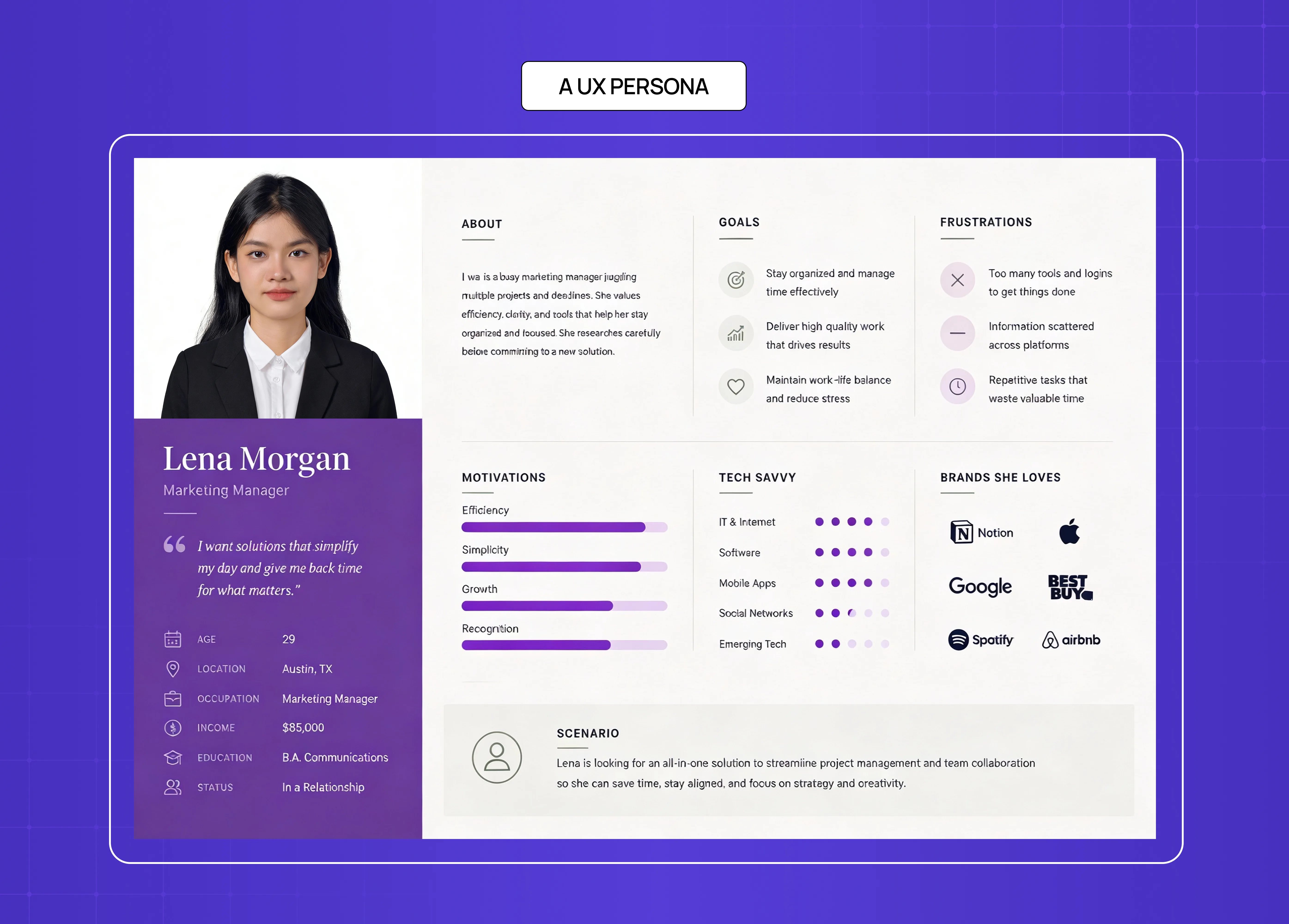
Detailed UX persona card for “Lena Morgan,” a marketing manager, showing goals, frustrations, motivations, tech-savviness, favorite brands, and personal background in a clean dashboard layout.

There is no single correct format, but high-quality personas consistently share the same core components.

Name and Photo

  • Not decorative — they trigger empathy

  • A photo, even a stock image, makes the persona feel human enough to factor into a design decision under pressure

  • A name turns "the user" into a person the team can reference consistently

Demographics

  • Age, location, occupation, income level, education, household context

  • Keep only what's relevant to the product:

    • A banking app cares about income and financial literacy

    • A fitness app cares about lifestyle and device habits

    • A logistics tool cares about job role and daily workflow

Goals and Motivations

Goals operate on three levels:

  • Life goals — what they want to be or become

  • End goals — what they want to accomplish with your product

  • Experience goals — what they want to feel while using it

Pain Points and Frustrations

  • Where does the current experience break down for them?

  • What makes them switch, abandon, or complain?

  • This is often the most design-actionable section in a persona — it maps directly to what needs fixing

Behavioral Patterns

  • How often do they interact with technology, and on which devices?

  • Do they skip onboarding or rely on detailed instructions?

  • Do they use keyboard shortcuts, or navigate by exploration?

  • Behaviors shape interface decisions more than demographics do

A Representative Quote

  • One line that captures their attitude — the persona speaking, not the researcher summarizing

  • Done well, it makes the character feel real and keeps the team anchored to who they're designing for

Persona Format: Low-Fidelity vs. High-Fidelity

The format of a persona should match your stage in the design process. There are three tiers:

  • Lean grid / proto-persona — Sticky-note style, assumption-based, built before research is complete. Good for rapid team alignment and early ideation.

  • Canvas-style — Emphasizes visual elements like mood boards. Captures influences, trends, pains, and gains. Good for empathy-building workshops.

  • Profile-style — The polished, shareable format most teams recognize. Clearly labeled sections, concise copy, stakeholder-ready. Used at the high-fidelity stage when research is in.

The rule: the earlier the stage, the lower the fidelity. Don't invest in a polished profile persona before you've done the research to back it up.

The Four Types of UX Personas
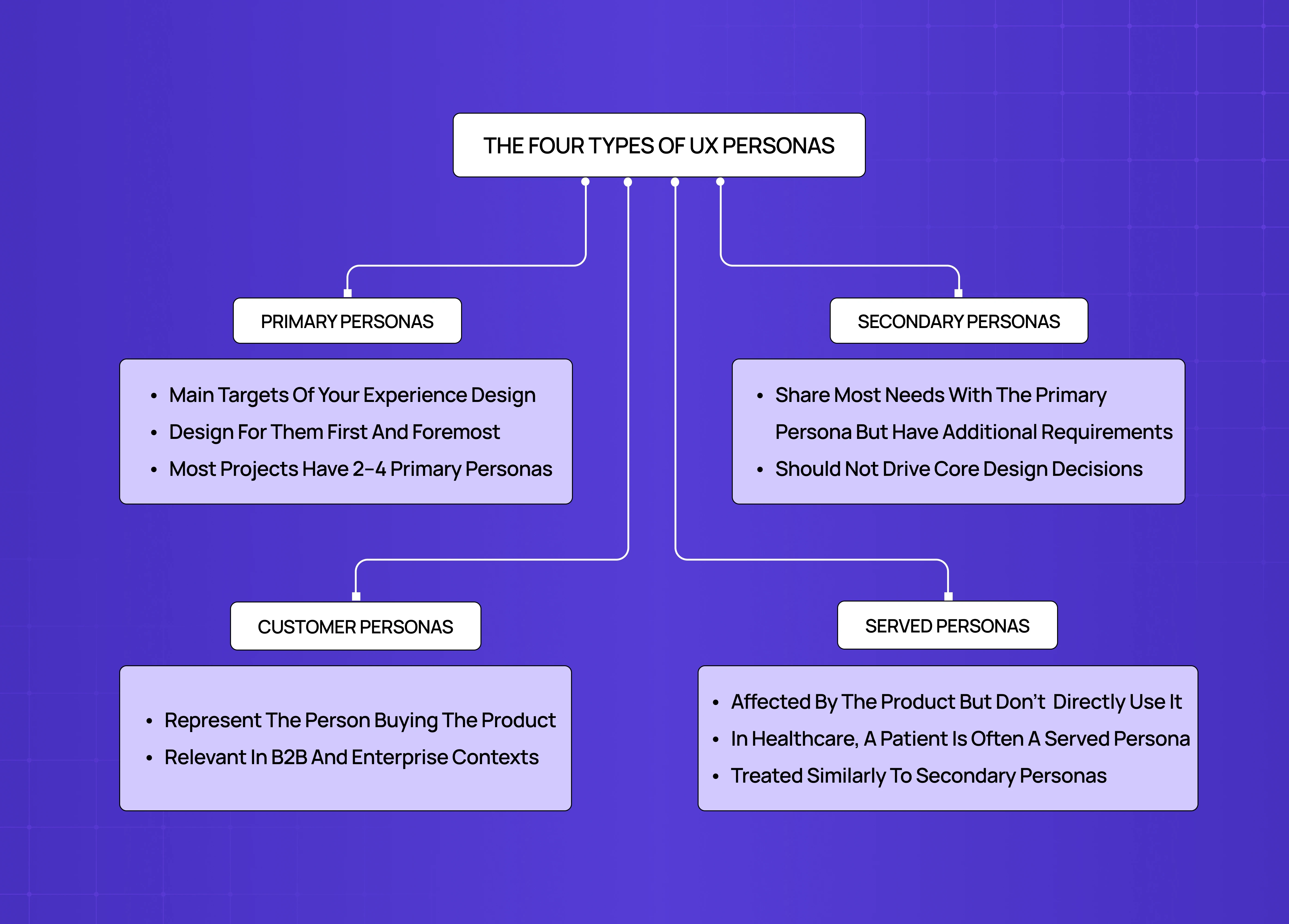
Diagram explaining the four types of UX personas: primary personas, secondary personas, customer personas, and served personas, connected through a flowchart structure.

Not all personas carry the same weight in a project.

Primary Personas

  • The main targets of your experience design

  • Design for them first and foremost

  • Most projects have 2–4 primary personas, each representing a distinct behavioral segment

Secondary Personas

  • Share most needs with the primary persona but have additional requirements

  • Inform edge cases and extended functionality

  • Should not drive core design decisions

Customer Personas

  • Represent the person buying or commissioning the product — often different from the one using it

  • Relevant in B2B and enterprise contexts where procurement and day-to-day usage are separate roles

Served Personas

  • Affected by the product but don't directly use it

  • In healthcare, a patient is often a served persona — they experience the outcome of a tool they never touch

  • Treated similarly to secondary personas; useful for understanding downstream impact

Understanding which type of persona you're building changes what goes into it and how much it should influence your design decisions.

Proto-Personas vs. Qualitative Personas: Which Do You Need?

This is one of the most practical distinctions in persona work — and one most teams skip past too quickly.

Proto-Personas

  • Built from the team's collective assumptions and prior experience

  • Contain unvalidated hypotheses about user behavior and goals

  • Best used early in the process to align the team and identify research gaps

  • Flexible, fast, and easy to revise as new information comes in

Qualitative Personas

  • Derived from direct user observation — interviews, surveys, behavioral data

  • Contain verbatims, ethnographic details, and pattern-validated insights

  • Best used to drive final design decisions and stakeholder communication

  • Higher investment, but the only type that should anchor a shipped product

Aspecs

Proto-Persona

Qualitative Persona

Source

Team assumptions

Direct user observation

Detail level

Basic narrative

Verbatims + ethnographic depth

Best for

Rapid alignment, ideation

Detailed analysis, implementation

82% of companies with well-defined, research-backed personas report improved value propositions — a figure that drops sharply when personas are built on assumptions alone. 

In practice, most projects start with proto-personas and graduate them into qualitative ones as research matures. The format changes; the underlying structure stays the same. The depth of observation required to build a qualitative persona is typically what a dedicated UX researcher owns — and what a UX researcher does across a project explains how persona creation fits into their broader deliverable set. 

What a Weak Persona vs. a Strong Persona Actually Looks Like

Most teams don't realise their personas are underperforming until a design decision goes wrong. Here's the contrast that makes the difference visible.

Weak Persona — Assumption-Based

Name: Generic User 

Age: 25–40 

Occupation: Professional 

Goal: Wants to use the product efficiently 

Pain point: Finds the product confusing sometimes

Why it fails:

  • Demographics without behavioral context — "25–40 professional" describes half the population

  • Goals that are circular — "wants to use the product efficiently" applies to every user of every product

  • Pain points that are too vague to act on — "confusing sometimes" gives designers nothing to work with

  • Built from team assumptions, not user observation

  • No quote, no behavioral pattern, no device context

Strong Persona — Research-Grounded

Name: Marcus, 34 

Occupation: Senior Operations Manager, logistics firm, Austin, TX 

Goal: Surface exceptions on the dashboard in under 10 seconds without navigating more than two levels deep 

Pain point: Admin permissions are buried three levels into settings, causing him to lose 15–20 minutes per week on tasks that should take one click

Why it works:

  • Behavioral specificity — "two levels deep" and "15–20 minutes per week" are designable constraints

  • Goals are scoped to the product — not life goals, not vague aspirations

  • Pain points map directly to interface decisions

  • Grounded in interview observation, not assumption

  • Gives the team something concrete to argue about — and design for

The test: can a designer read your persona and make a specific interface decision from it? If not, the persona needs more research.

UX Persona Examples Across Contexts

The most useful way to understand personas is to see them working across different product categories. Here are five examples built around real-world use cases.

Example 1: SaaS — The Power Admin
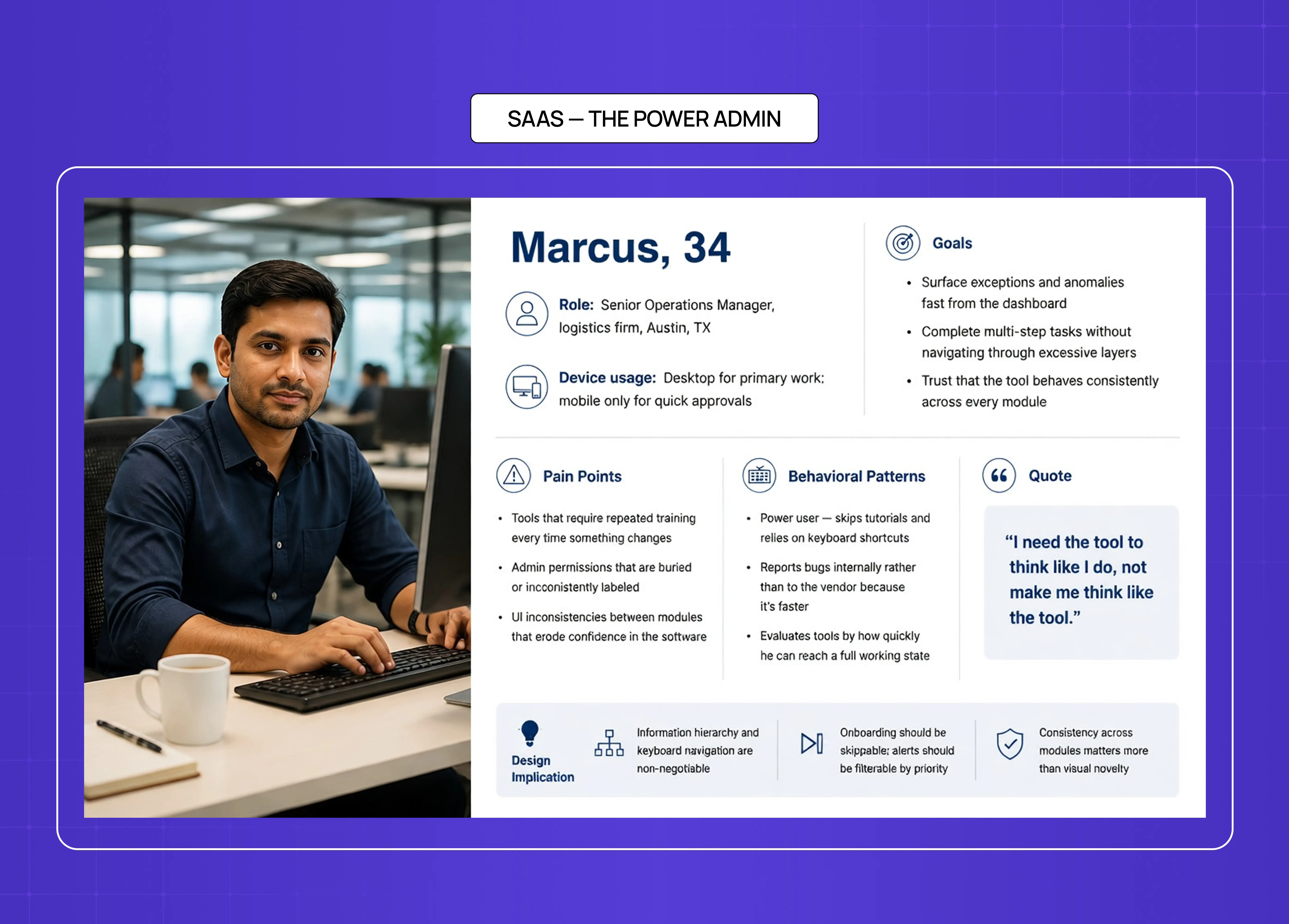
SaaS UX persona example featuring “Marcus, 34,” a senior operations manager, highlighting goals, pain points, behavioral patterns, and design implications for enterprise software.

Who They Are

  • Name: Marcus, 34

  • Role: Senior Operations Manager at a mid-sized logistics firm in Austin, TX

  • Device usage: Desktop for primary work; mobile only for quick approvals

  • Information sources: LinkedIn, industry newsletters, internal Slack channels, peer recommendations

Goals

  • Surface exceptions and anomalies fast from the dashboard

  • Complete multi-step tasks without navigating through excessive layers

  • Trust that the tool behaves consistently across every module

Pain Points

  • Tools that require repeated training every time something changes

  • Admin permissions that are buried or inconsistently labeled

  • UI inconsistencies between modules that erode confidence in the software

Behavioral Patterns

  • Power user — skips tutorials and relies on keyboard shortcuts

  • Reports bugs internally rather than to the vendor because it's faster

  • Evaluates tools by how quickly he can reach a full working state

Quote

"I need the tool to think like I do, not make me think like the tool."

Design Implication

  • Information hierarchy and keyboard navigation are non-negotiable

  • Onboarding should be skippable; alerts should be filterable by priority

  • Consistency across modules matters more than visual novelty

This persona type shaped almost every workflow decision on the Camb.ai redesign — the technically confident, time-pressured professional who needs navigation depth, shortcut accessibility, and clear system feedback. See the Camb.ai case study here.

For readers who want the wider context on how the Power Admin persona maps to established SaaS product patterns, the complete guide to SaaS UX design covers the design decisions this persona type consistently drives. 

Example 2: EdTech — The Reluctant Learner
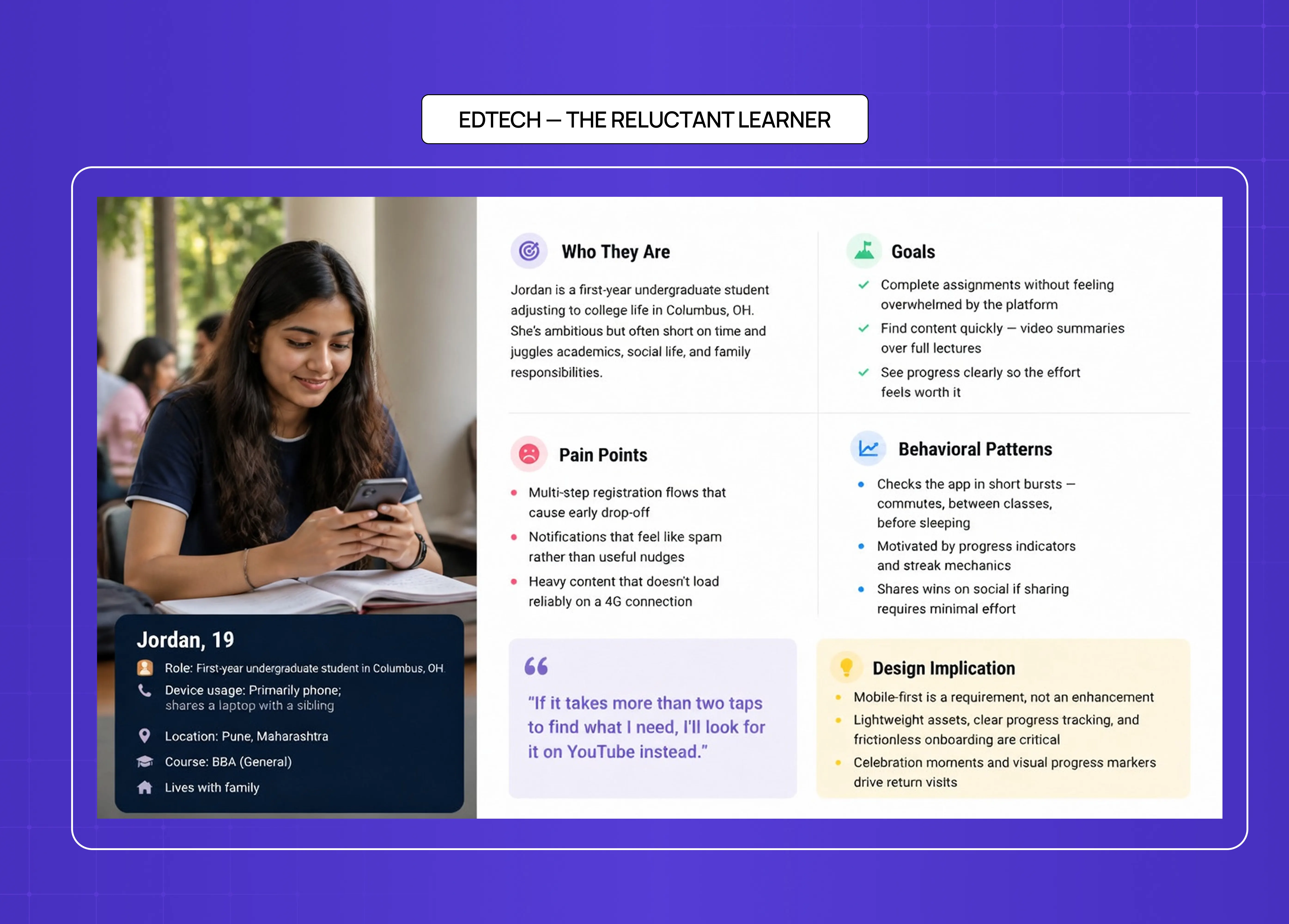
EdTech UX persona example featuring “Jordan, 19,” a college student, with sections covering goals, pain points, behavior patterns, and product design implications for learning platforms.

Who They Are

  • Name: Jordan, 19

  • Role: First-year undergraduate student in Columbus, OH 

  • Device usage: Primarily phone; shares a laptop with a sibling

  • Information sources: YouTube, Instagram, WhatsApp groups, college notice boards

Goals

  • Complete assignments without feeling overwhelmed by the platform

  • Find content quickly — video summaries over full lectures

  • See progress clearly so the effort feels worth it

Pain Points

  • Multi-step registration flows that cause early drop-off

  • Notifications that feel like spam rather than useful nudges

  • Heavy content that doesn't load reliably on a 4G connection

Behavioral Patterns

  • Checks the app in short bursts — commutes, between classes, before sleeping

  • Motivated by progress indicators and streak mechanics

  • Shares wins on social if sharing requires minimal effort

Quote

"If it takes more than two taps to find what I need, I'll look for it on YouTube instead."

Design Implication

  • Mobile-first is a requirement, not an enhancement

  • Lightweight assets, clear progress tracking, and frictionless onboarding are critical

  • Celebration moments and visual progress markers drive return visits

This matches the challenge behind the LearnSphere redesign — building an edtech platform that worked equally well for students like Jordan, their teachers, and platform admins, all from a single unified system. See the LearnSphere case study here.

Example 3: E-commerce — The Considered Buyer
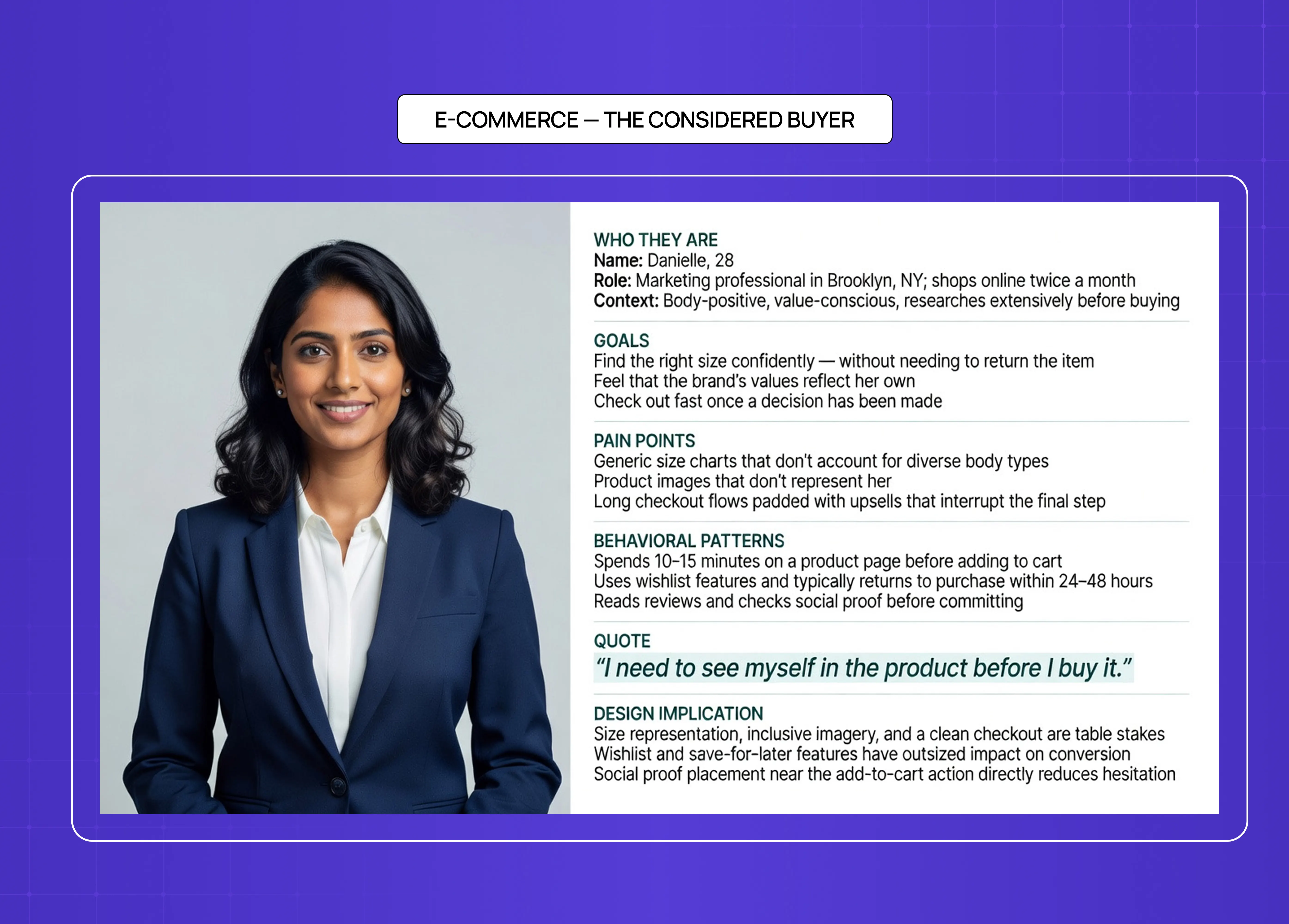
E-commerce UX persona example featuring “Danielle, 28,” a considered online buyer, showing shopping behaviors, frustrations, goals, and design recommendations for online retail experiences.

Who They Are

  • Name: Danielle, 28

  • Role: Marketing professional in Brooklyn, NY; shops online twice a month

  • Context: Body-positive, value-conscious, researches extensively before buying

  • Information sources: Instagram, brand blogs, Google reviews, Reddit threads on fashion/lifestyle

Goals

  • Find the right size confidently — without needing to return the item

  • Feel that the brand's values reflect her own

  • Check out fast once a decision has been made

Pain Points

  • Generic size charts that don't account for diverse body types

  • Product images that don't represent her

  • Long checkout flows padded with upsells that interrupt the final step

Behavioral Patterns

  • Spends 10–15 minutes on a product page before adding to cart

  • Uses wishlist features and typically returns to purchase within 24–48 hours

  • Reads reviews and checks social proof before committing

Quote

"I need to see myself in the product before I buy it."

Design Implication

  • Size representation, inclusive imagery, and a clean checkout are table stakes

  • Wishlist and save-for-later features have outsized impact on conversion

  • Social proof placement near the add-to-cart action directly reduces hesitation

This persona type informed our redesign of &Circus — India's body-positive underwear brand. Mobile-first layout, playful UI, and a checkout experience built around reducing friction for considered buyers like Danielle. See the &Circus case study here.

Example 4: FinTech / Insurance — The Cautious First-Timer
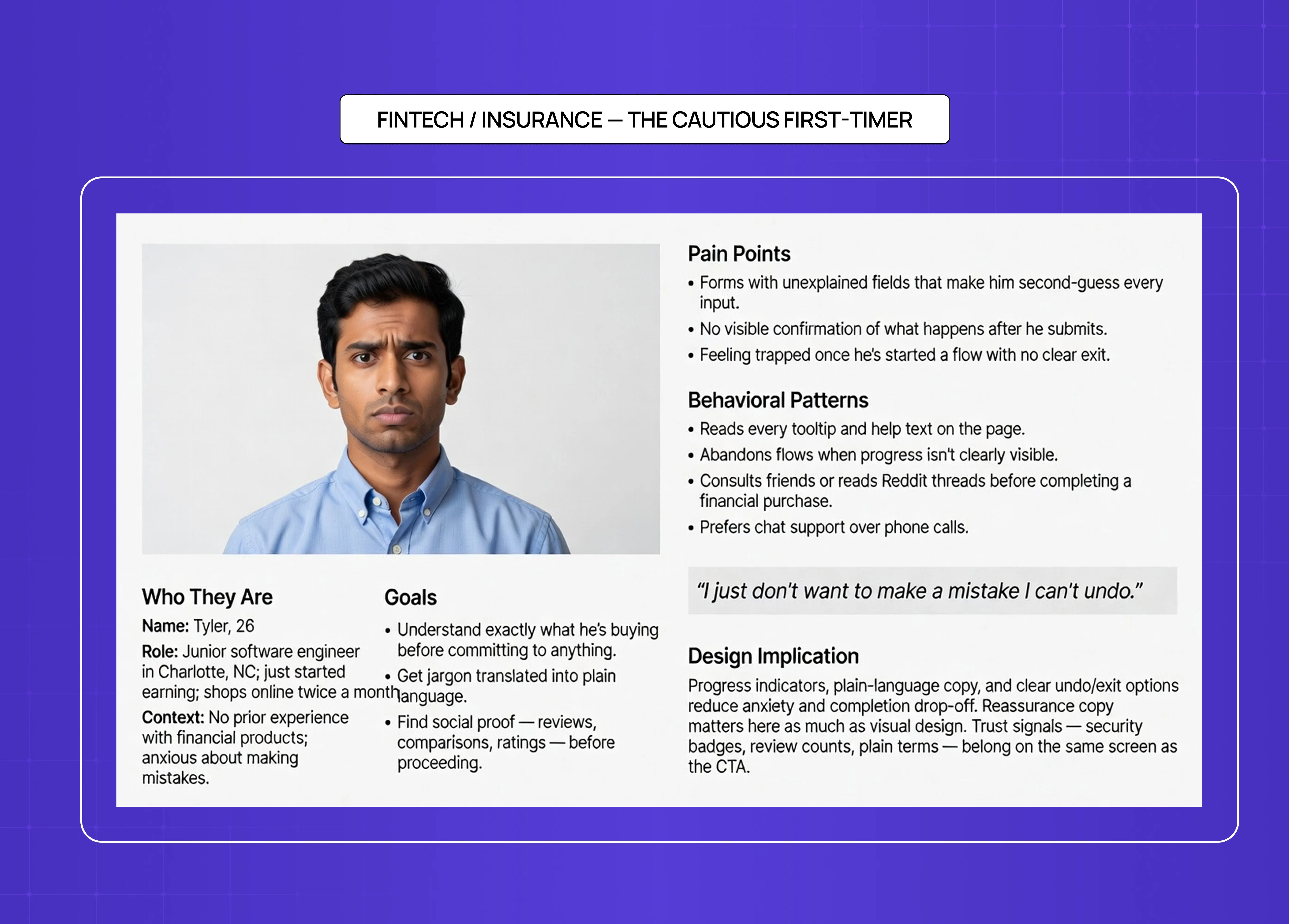
FinTech and insurance UX persona example featuring a cautious first-time user with concerns about trust, complex forms, and financial mistakes, alongside recommended UX considerations.

Who They Are

  • Name: Tyler, 26

  • Role: Junior software engineer in Charlotte, NC; just started earning

  • Context: No prior experience with financial products; anxious about making mistakes

  • Information sources: Reddit (r/personalfinance), YouTube explainers, friends and colleagues, Google search

Goals

  • Understand exactly what he's buying before committing to anything

  • Get jargon translated into plain language

  • Find social proof — reviews, comparisons, ratings — before proceeding

Pain Points

  • Forms with unexplained fields that make him second-guess every input

  • No visible confirmation of what happens after he submits

  • Feeling trapped once he's started a flow with no clear exit

Behavioral Patterns

  • Reads every tooltip and help text on the page

  • Abandons flows when progress isn't clearly visible

  • Consults friends or reads Reddit threads before completing a financial purchase

  • Prefers chat support over phone calls

Quote

"I just don't want to make a mistake I can't undo."

Design Implication

  • Progress indicators, plain-language copy, and clear undo/exit options reduce anxiety and completion drop-off

  • Reassurance copy matters here as much as visual design

  • Trust signals — security badges, review counts, plain terms — belong on the same screen as the CTA

This thinking underpins our work on PolicyBazaar — redesigning the insurance shopping flow so that first-time buyers like Tyler could move through it with confidence rather than confusion. See the PolicyBazaar case study here.

Example 5: B2B Enterprise — The Buying Committee
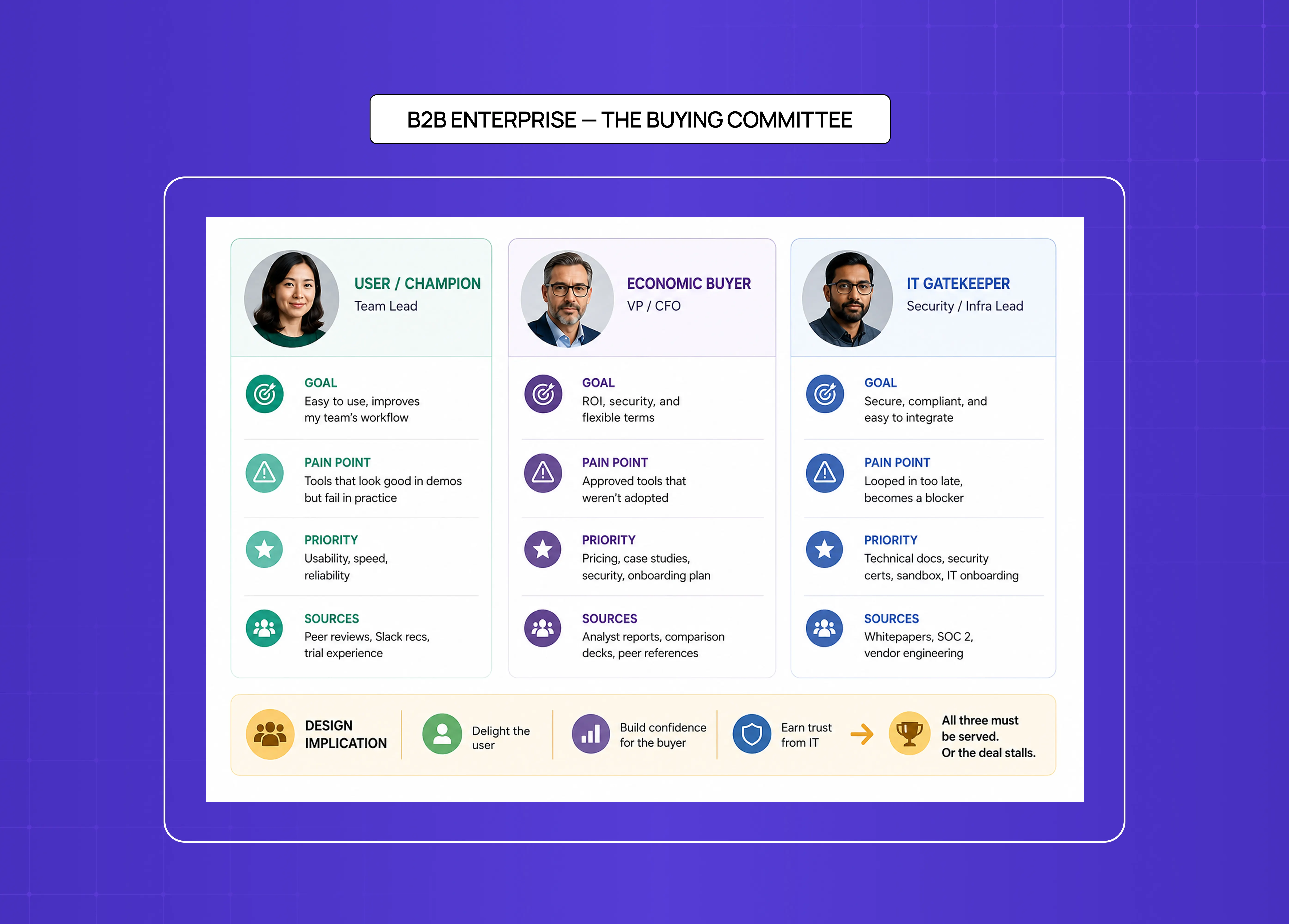
 B2B enterprise buying committee persona board showing different stakeholder roles including user champion, economic buyer, and IT gatekeeper, with their goals, pain points, and priorities.

In B2B and enterprise contexts, there is rarely a single user persona driving a product decision. The purchase, the implementation, and the daily use are handled by different people with different — sometimes conflicting — goals. Designing only for the end user means ignoring the people who actually control adoption.

A typical enterprise buying committee involves three distinct personas:

The User / Champion

  • Who: The person who will use the product daily — a team lead, analyst, or operations manager

  • Goal: Wants a tool that reduces friction in their workflow and is easy to onboard their team onto

  • Pain point: Has been burned by software that looked good in a demo but fell apart in practice

  • Design priority: Usability, speed, reliability, and a low learning curve

  • Information sources: Peer reviews on G2 or Capterra, internal Slack recommendations, trial experience

The Economic Buyer

  • Who: The budget holder — a VP, CFO, or department head who signs off on procurement

  • Goal: Wants ROI justification, security compliance, and contract flexibility

  • Pain point: Has approved tools before that the team never actually adopted

  • Design priority: Clear pricing, case studies, enterprise security documentation, and a credible onboarding plan

  • Information sources: Analyst reports, vendor comparison decks, references from peers at similar companies

The IT Gatekeeper

  • Who: The security or infrastructure lead responsible for approving integrations

  • Goal: Needs the tool to meet data residency, SSO, and API requirements before it can be deployed

  • Pain point: Gets looped in too late — after commercial terms are agreed — and becomes a blocker rather than a partner

  • Design priority: Technical documentation, security certifications, sandbox access, and a smooth IT onboarding path

  • Information sources: Security whitepapers, SOC 2 reports, direct conversations with the vendor's solutions engineering team

The design implication: In enterprise UX, you are never designing for one persona. The champion needs a frictionless daily experience. The economic buyer needs a confident procurement story. The IT gatekeeper needs airtight technical documentation. All three must be served — or the product stalls before it ships.

The Anti-Persona: Defining Who You Are Not Designing For

Knowing your user is only half the equation. Knowing who you are explicitly not designing for is equally important — and most teams skip this entirely.

An anti-persona is a documented character who represents a user type your product is not built to serve. It is not a dismissal of those users — it's a deliberate design constraint that keeps the product focused and prevents scope creep driven by edge cases.

Why Anti-Personas Matter

  • They give the team permission to say no to feature requests that serve fringe users at the cost of core users

  • They prevent the product from being stretched to accommodate use cases it was never built for

  • They make prioritisation conversations faster — "this is an anti-persona problem" is a complete answer in a design review

Anti-Persona Example: Marcus's Counterpart

Core persona: Marcus — the power admin who logs in daily, uses keyboard shortcuts, and needs deep dashboard control.

Anti-persona: A one-time visitor who accesses the platform once a year to download an automated annual compliance report. They have no interest in learning the interface, no need for real-time data, and no tolerance for onboarding.

The design implication: Optimising the dashboard navigation, shortcut layer, and data density for Marcus is the right call — even if it makes the experience harder for the one-time visitor. The anti-persona makes that trade-off explicit and defensible, rather than leaving it as an unspoken assumption.

Document your anti-persona the same way you document your primary persona. Name them, give them context, and reference them whenever a feature debate threatens to pull the product away from its core user.

How to Create a UX Persona
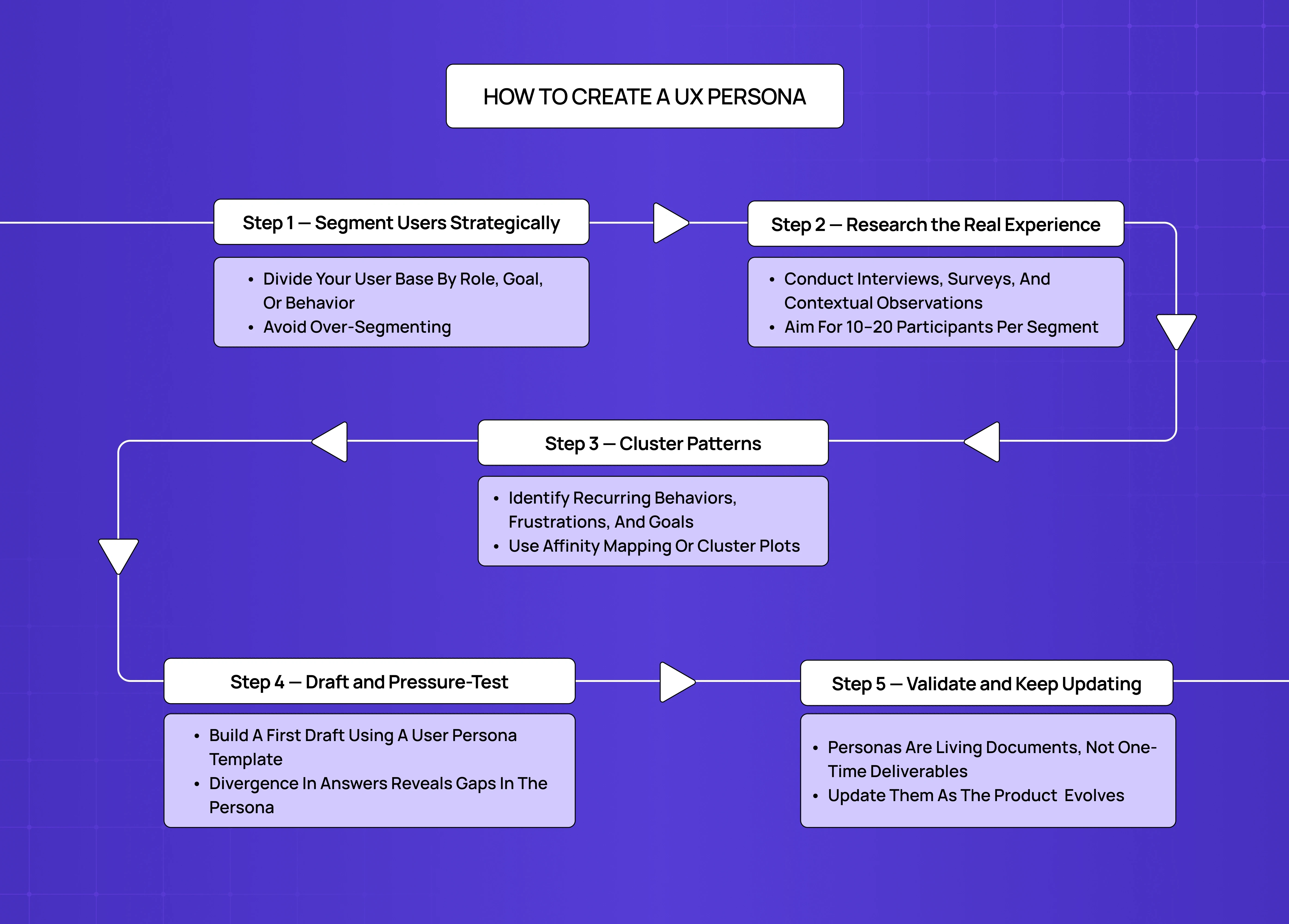
Step-by-step UX persona creation process diagram showing user segmentation, research, pattern clustering, persona drafting, and validation stages connected in a workflow.

Building personas is a team exercise, not a solo deliverable — and one that fits into a defined stage of the broader UX design process. Here's the five-step process we follow: 

Step 1 — Segment Users Strategically

  • Divide your user base by role, goal, or behavior — not demographics alone

  • Behavioral segmentation produces personas that drive better design decisions

  • Avoid over-segmenting: if two personas would make the same choices, merge them

Step 2 — Research the Real Experience

  • Conduct interviews, surveys, and contextual observations — the quality of the persona is entirely a function of the quality of research behind it. Aim for 10–20 participants per segment before identifying patterns. 

  • For a structured overview of the methods and tools that generate persona-quality data, the UX research cheat sheet is a useful companion to this step. 

5 Interview Questions to Start With

Good persona research starts with questions that surface behavior, not opinion. These five are a reliable starting point:

  • "Walk me through the last time you tried to solve [problem] — what did you do first?" Reveals real behavior over idealized workflows.

  • "What takes up the biggest chunk of your time on an average workday?" Establishes broader context and uncovers hidden pain points.

  • "Which tools do you keep open on your screen all day, and why?" Identifies ecosystem dependencies and integration needs.

  • "What's the most frustrating part of your current setup?" Surfaces direct feature and interface opportunities.

  • "How do you know you've done a good job at the end of the day?" Identifies core motivations and the metrics users actually care about.

Step 3 — Cluster Patterns

  • Identify recurring behaviors, frustrations, and goals across your research set

  • Where patterns converge, a persona begins to take shape

  • Use affinity mapping or cluster plots to visualize groupings

Step 4 — Draft and Pressure-Test

  • Build a first draft using a user persona template

  • Ask team members to answer interview questions on the persona's behalf

  • Divergence in answers reveals gaps in the persona — revisit the research

Step 5 — Validate and Keep Updating

  • Personas are living documents, not one-time deliverables

  • Update them as the product evolves and new data comes in

  • A persona built at discovery and never touched again is a liability, not an asset

  • Bring the persona back to 2–3 real users periodically — ask them if it still sounds like them

  • Watch for drift signals: rising support tickets in one area, unexpected drop-off patterns, or onboarding feedback that contradicts the persona's stated behavior

  • Set a refresh trigger — a product pivot, a significant feature release, or a new user segment entering the funnel are all valid reasons to revisit

Keeping Personas Alive in Team Culture

Writing a persona is the easy part. Getting a team to actually use it is harder. A few mechanics that work:

  • Introduce them at the start of every project — Even if the team has seen them before. Personas fade fast. Re-introduce them the way you'd introduce a team member.

  • Run exit interviews using the persona — Ask team members to answer questions on the persona's behalf. Where answers diverge, the persona needs work.

  • Put them somewhere visible — Printed in the design workspace, pinned in Notion, posted in the Slack channel. Out of sight means out of mind.

  • Reference them in design critiques — "Does this decision work for Jordan?" is a more useful critique prompt than "I'm not sure about this."

  • Treat them as version-controlled documents — Date them. Update them when research changes. Archive old versions rather than deleting them.

Tools for Building UX Personas

The right tool depends on your team's workflow and where the persona needs to live. Here are the six we see used most consistently:

  • Figma — Best for product design teams. Build persona canvases directly inside your design system, share them with engineers, and keep them version-controlled alongside your actual design files.

  • UXPressia — Best for dedicated UX researchers. Purpose-built for persona creation and customer journey mapping, with structured templates and export options for stakeholder presentations.

  • Xtensio — Best for teams that need polished, shareable persona documents quickly. Modular, template-driven, and easy to update without design skills.

  • Miro / Mural — Best for cross-functional workshops. Use them to cluster raw research data, run affinity mapping exercises, and collaboratively draft proto-personas in real time.

  • HubSpot Make My Persona — Best for beginners or marketing-adjacent teams. A guided wizard that produces a basic demographic persona quickly — useful as a starting point, not a final deliverable.

  • Notion — Best for centralised documentation. Keeps persona profiles living alongside PRDs, research notes, and sprint backlogs so the team encounters them in normal workflow rather than hunting for them.

Using AI to Accelerate Persona Research

AI won't replace user research — but it can significantly compress the time between raw data and usable persona drafts. Here's where it adds real value:

  • Clustering interview transcripts — Tools like Dovetail, Maze, and ChatGPT can scan large volumes of interview transcripts and surface recurring themes, pain point clusters, and behavioral patterns that would take a researcher days to identify manually.

  • Generating proto-persona drafts — Feed a set of research themes into ChatGPT and ask it to draft a proto-persona structure. Use the output as a starting framework, not a finished artifact.

  • Identifying gaps in existing personas — Paste a persona into an AI tool and ask: "What behavioral context is missing here?" It won't know your users, but it will flag structural gaps.

  • Synthesising survey data — Large quantitative datasets can be fed into AI tools to identify segments and outliers that warrant deeper qualitative investigation.

The critical caveat: AI output is only as good as the primary research fed into it. A persona generated entirely from AI prompts — with no real user data behind it — is a sophisticated assumption, not a research artifact. Use AI to accelerate synthesis, never to replace observation.

How Personas Stay Useful Beyond Discovery

Most teams build personas during research and shelve them after. That's a missed opportunity. Here's where personas continue to add value across the full design lifecycle:

  • Expert reviews — Use the persona as a lens: how would Marcus navigate this flow? Where would Jordan drop off? This gives heuristic evaluations a user-specific frame of reference. The same principle applies when running a UX audit — personas define the benchmark against which you evaluate whether the product actually serves its intended users, not just whether it follows generic usability heuristics. 

  • Usability study recruitment — Persona traits (device usage, technical comfort, behavioral patterns) translate directly into screener criteria for test participants.

  • Analytics segmentation — Map persona types to behavioral analytics segments. This helps evaluate how each user group actually moves through the product post-launch.

  • Proving design ROI — According to Userlytics' State of UX 2025, 77% of companies use UX research to inform marketing decisions, and customer personas are the most common output of that research. A documented persona gives stakeholders a tangible artifact to point to when justifying design investment. 

  • Journey mapping — Personas are the starting point for journey maps. Without a defined persona, a journey map has no subject — it becomes a generic process diagram rather than a user-specific experience map. If you're unclear on the difference between a user journey and a user flow, that distinction matters here — both artifacts require a grounded persona to anchor them, and the two are often confused in exactly the ways that produce generic diagrams. 

  • Onboarding new team members — Introducing personas to new designers, PMs, or developers is the fastest way to build shared understanding of who the product is for.

  • Stakeholder communication — When presenting design decisions, referencing a persona grounds the rationale in user needs rather than personal preference. At the strategy level, personas become the evidence base for how UX strategy translates design insight into business direction — which is where the investment case for persona research ultimately gets made. 

Common Mistakes When Creating Personas

Only 3% of organisations reach the highest stage of research maturity, according to Maze — meaning most teams are building on thinner research foundations than they realise. The mistakes below are a direct consequence of that gap. 
What designers most often get wrong:
  • Building on assumptions instead of research — The most common and most damaging error. A persona that reflects the team's biases will quietly steer every design decision in the wrong direction.

  • Creating too many personas — More than four becomes unmanageable. If you have six "primary" personas, you need to rethink your segmentation.

  • Adding irrelevant detail — A persona for a logistics tool doesn't need a favorite movie. Every detail should affect a design decision. If it doesn't, cut it.

  • Treating personas as static — User behavior changes. Product scope changes. Personas should reflect that.

  • Making personas too similar — If two personas would make the same decisions in every design scenario, merge them into one.

Conclusion

  • A well-built UX persona is a direct output of user research, not creative writing.

  • Every component — demographics, goals, behaviors, pain points — must earn its place by informing a design decision.

  • The sweet spot for most projects is 2–4 primary personas, segmented by behavior rather than demographics.

  • Personas should be introduced early, revisited often, and updated as the product and its users evolve.

  • The best personas don't just describe users — they make design trade-offs easier to make, faster to align on, and harder to rationalize away.

Once personas are validated, they feed directly into the next phase — journey mapping, wireframing, and usability testing. User flows in UX design are a particularly direct application — building the paths through your product around a defined persona's goals rather than a generic user path. A persona without a downstream design artifact is just a document. The goal is always to use them.

Most teams think they understand their users — until they try to build a persona. This guide breaks down what UX persona examples actually look like across product categories, and how to build ones that drive real design decisions.

Real UX persona examples that show what good user research looks like in practice.

Illustration of a UX designer standing beside a large user persona dashboard with charts, profile details, and interface components in a purple monochrome style.

TL;DR

  • A UX persona is a research-backed, fictional character that represents a real user group.

  • Strong personas include a name, photo, demographics, goals, pain points, behavioral patterns, and a quote.

  • There are four types: primary, secondary, customer, and served personas.

  • Limit personas to 2–4 per project to keep design decisions focused and purposeful.

  • Persona quality depends entirely on the quality of your user research — assumptions make weak personas.

What Is a UX Persona?

Before getting into ux persona examples, it helps to understand what actually makes one. A UX persona is a fictional but research-grounded character that represents a distinct segment of your target users — not a demographic bucket, and not a rough sketch of "our ideal customer." It's a specific, believable person, complete with:

  • A name and a face

  • A job and a daily context

  • A set of real frustrations

  • A clear reason to care about your product

The distinction matters because design decisions made for "users in general" are rarely good decisions for anyone in particular. A persona forces specificity — and it protects against two failure modes that quietly derail most design processes:

  • Self-referential design — When designers subconsciously build products based on their own behaviors and preferences rather than their users'. Without a persona anchoring decisions, the team becomes the default user.

  • The elastic user — When different stakeholders hold different, shifting ideas of who the user is. Without a written, agreed-upon persona, "the user" stretches to justify whatever decision is already on the table.

A persona replaces both with something concrete enough to argue about in a product meeting — and concrete enough to actually design for.

Research from Maze's Future of User Research Report reinforces this: teams with a democratized research culture are 2x more likely to report that user insights influence strategic decisions — and personas are the primary vehicle for making those insights accessible across the team. 

At Groto, personas are one of the first artifacts we reach for at the start of a UX engagement. Whether we're redesigning a SaaS platform or rethinking a mobile app flow, mapping out who we're designing for is non-negotiable.

The UX/UI checklist top SaaS teams actually use

15 essential checks covering onboarding, conversions, and retention. Spot quick wins and fix friction before it costs you signups.

No Spam. Free Lifetime

Personas vs. Market Segments: Not the Same Thing

This is a distinction worth making explicitly — especially when working with stakeholders from marketing or growth backgrounds.

  • Market segments are built on quantitative data: demographics, geography, purchase behavior, channel attribution. They help teams find and acquire customers.

  • UX personas are qualitative. They personify that data — giving it a name, a face, a context, and a set of needs. They help teams build experiences those customers will actually use. The distinction between the customer and the user matters here too — user experience and customer experience are not the same thing, and conflating the two is one of the most common reasons persona segmentation goes wrong before it even starts. 

A market segment might read: "Males, 25–35, urban, mid-income, frequent app users." A persona built from the same data reads: "Marcus, 34, operations manager in Austin, needs the dashboard to surface exceptions in under 10 seconds." Both are valid tools. They answer different questions — and should never be used interchangeably.

UX Persona vs. Buyer Persona vs. User Story vs. JTBD

Adjacent frameworks often get conflated. Here's how they differ:

Framework

Focus Question

Primary Audience

Best Used For

UX Persona

How does the user interact with our interface?

Product Designers & Engineers

Designing features, workflows, visual hierarchy, usability

Buyer Persona

What triggers this person to purchase?

Marketing & Sales Teams

Ad targeting, messaging, pricing tiers, acquisition

User Story

What specific action does the user need to take?

Agile Development Teams

Scoping dev sprints and engineering backlogs

Jobs-to-Be-Done

What progress is the user trying to achieve?

Product Strategy & Leadership

Core value proposition and long-term innovation

Each has its place. A UX persona and a buyer persona can describe the same human being — but they're asking fundamentally different questions and should never be merged into one document. The methodology that governs which framework to reach for first is worth understanding; UX design methodologies explained covers how design thinking, jobs-to-be-done, and other approaches structure the sequence in which each tool is applied. 

What Goes Into a UX Persona?

Detailed UX persona card for “Lena Morgan,” a marketing manager, showing goals, frustrations, motivations, tech-savviness, favorite brands, and personal background in a clean dashboard layout.

There is no single correct format, but high-quality personas consistently share the same core components.

Name and Photo

  • Not decorative — they trigger empathy

  • A photo, even a stock image, makes the persona feel human enough to factor into a design decision under pressure

  • A name turns "the user" into a person the team can reference consistently

Demographics

  • Age, location, occupation, income level, education, household context

  • Keep only what's relevant to the product:

    • A banking app cares about income and financial literacy

    • A fitness app cares about lifestyle and device habits

    • A logistics tool cares about job role and daily workflow

Goals and Motivations

Goals operate on three levels:

  • Life goals — what they want to be or become

  • End goals — what they want to accomplish with your product

  • Experience goals — what they want to feel while using it

Pain Points and Frustrations

  • Where does the current experience break down for them?

  • What makes them switch, abandon, or complain?

  • This is often the most design-actionable section in a persona — it maps directly to what needs fixing

Behavioral Patterns

  • How often do they interact with technology, and on which devices?

  • Do they skip onboarding or rely on detailed instructions?

  • Do they use keyboard shortcuts, or navigate by exploration?

  • Behaviors shape interface decisions more than demographics do

A Representative Quote

  • One line that captures their attitude — the persona speaking, not the researcher summarizing

  • Done well, it makes the character feel real and keeps the team anchored to who they're designing for

Persona Format: Low-Fidelity vs. High-Fidelity

The format of a persona should match your stage in the design process. There are three tiers:

  • Lean grid / proto-persona — Sticky-note style, assumption-based, built before research is complete. Good for rapid team alignment and early ideation.

  • Canvas-style — Emphasizes visual elements like mood boards. Captures influences, trends, pains, and gains. Good for empathy-building workshops.

  • Profile-style — The polished, shareable format most teams recognize. Clearly labeled sections, concise copy, stakeholder-ready. Used at the high-fidelity stage when research is in.

The rule: the earlier the stage, the lower the fidelity. Don't invest in a polished profile persona before you've done the research to back it up.

The Four Types of UX Personas

Diagram explaining the four types of UX personas: primary personas, secondary personas, customer personas, and served personas, connected through a flowchart structure.

Not all personas carry the same weight in a project.

Primary Personas

  • The main targets of your experience design

  • Design for them first and foremost

  • Most projects have 2–4 primary personas, each representing a distinct behavioral segment

Secondary Personas

  • Share most needs with the primary persona but have additional requirements

  • Inform edge cases and extended functionality

  • Should not drive core design decisions

Customer Personas

  • Represent the person buying or commissioning the product — often different from the one using it

  • Relevant in B2B and enterprise contexts where procurement and day-to-day usage are separate roles

Served Personas

  • Affected by the product but don't directly use it

  • In healthcare, a patient is often a served persona — they experience the outcome of a tool they never touch

  • Treated similarly to secondary personas; useful for understanding downstream impact

Understanding which type of persona you're building changes what goes into it and how much it should influence your design decisions.

Proto-Personas vs. Qualitative Personas: Which Do You Need?

This is one of the most practical distinctions in persona work — and one most teams skip past too quickly.

Proto-Personas

  • Built from the team's collective assumptions and prior experience

  • Contain unvalidated hypotheses about user behavior and goals

  • Best used early in the process to align the team and identify research gaps

  • Flexible, fast, and easy to revise as new information comes in

Qualitative Personas

  • Derived from direct user observation — interviews, surveys, behavioral data

  • Contain verbatims, ethnographic details, and pattern-validated insights

  • Best used to drive final design decisions and stakeholder communication

  • Higher investment, but the only type that should anchor a shipped product

Aspecs

Proto-Persona

Qualitative Persona

Source

Team assumptions

Direct user observation

Detail level

Basic narrative

Verbatims + ethnographic depth

Best for

Rapid alignment, ideation

Detailed analysis, implementation

82% of companies with well-defined, research-backed personas report improved value propositions — a figure that drops sharply when personas are built on assumptions alone. 

In practice, most projects start with proto-personas and graduate them into qualitative ones as research matures. The format changes; the underlying structure stays the same. The depth of observation required to build a qualitative persona is typically what a dedicated UX researcher owns — and what a UX researcher does across a project explains how persona creation fits into their broader deliverable set. 

What a Weak Persona vs. a Strong Persona Actually Looks Like

Most teams don't realise their personas are underperforming until a design decision goes wrong. Here's the contrast that makes the difference visible.

Weak Persona — Assumption-Based

Name: Generic User 

Age: 25–40 

Occupation: Professional 

Goal: Wants to use the product efficiently 

Pain point: Finds the product confusing sometimes

Why it fails:

  • Demographics without behavioral context — "25–40 professional" describes half the population

  • Goals that are circular — "wants to use the product efficiently" applies to every user of every product

  • Pain points that are too vague to act on — "confusing sometimes" gives designers nothing to work with

  • Built from team assumptions, not user observation

  • No quote, no behavioral pattern, no device context

Strong Persona — Research-Grounded

Name: Marcus, 34 

Occupation: Senior Operations Manager, logistics firm, Austin, TX 

Goal: Surface exceptions on the dashboard in under 10 seconds without navigating more than two levels deep 

Pain point: Admin permissions are buried three levels into settings, causing him to lose 15–20 minutes per week on tasks that should take one click

Why it works:

  • Behavioral specificity — "two levels deep" and "15–20 minutes per week" are designable constraints

  • Goals are scoped to the product — not life goals, not vague aspirations

  • Pain points map directly to interface decisions

  • Grounded in interview observation, not assumption

  • Gives the team something concrete to argue about — and design for

The test: can a designer read your persona and make a specific interface decision from it? If not, the persona needs more research.

UX Persona Examples Across Contexts

The most useful way to understand personas is to see them working across different product categories. Here are five examples built around real-world use cases.

Example 1: SaaS — The Power Admin

SaaS UX persona example featuring “Marcus, 34,” a senior operations manager, highlighting goals, pain points, behavioral patterns, and design implications for enterprise software.

Who They Are

  • Name: Marcus, 34

  • Role: Senior Operations Manager at a mid-sized logistics firm in Austin, TX

  • Device usage: Desktop for primary work; mobile only for quick approvals

  • Information sources: LinkedIn, industry newsletters, internal Slack channels, peer recommendations

Goals

  • Surface exceptions and anomalies fast from the dashboard

  • Complete multi-step tasks without navigating through excessive layers

  • Trust that the tool behaves consistently across every module

Pain Points

  • Tools that require repeated training every time something changes

  • Admin permissions that are buried or inconsistently labeled

  • UI inconsistencies between modules that erode confidence in the software

Behavioral Patterns

  • Power user — skips tutorials and relies on keyboard shortcuts

  • Reports bugs internally rather than to the vendor because it's faster

  • Evaluates tools by how quickly he can reach a full working state

Quote

"I need the tool to think like I do, not make me think like the tool."

Design Implication

  • Information hierarchy and keyboard navigation are non-negotiable

  • Onboarding should be skippable; alerts should be filterable by priority

  • Consistency across modules matters more than visual novelty

This persona type shaped almost every workflow decision on the Camb.ai redesign — the technically confident, time-pressured professional who needs navigation depth, shortcut accessibility, and clear system feedback. See the Camb.ai case study here.

For readers who want the wider context on how the Power Admin persona maps to established SaaS product patterns, the complete guide to SaaS UX design covers the design decisions this persona type consistently drives. 

Example 2: EdTech — The Reluctant Learner

EdTech UX persona example featuring “Jordan, 19,” a college student, with sections covering goals, pain points, behavior patterns, and product design implications for learning platforms.

Who They Are

  • Name: Jordan, 19

  • Role: First-year undergraduate student in Columbus, OH 

  • Device usage: Primarily phone; shares a laptop with a sibling

  • Information sources: YouTube, Instagram, WhatsApp groups, college notice boards

Goals

  • Complete assignments without feeling overwhelmed by the platform

  • Find content quickly — video summaries over full lectures

  • See progress clearly so the effort feels worth it

Pain Points

  • Multi-step registration flows that cause early drop-off

  • Notifications that feel like spam rather than useful nudges

  • Heavy content that doesn't load reliably on a 4G connection

Behavioral Patterns

  • Checks the app in short bursts — commutes, between classes, before sleeping

  • Motivated by progress indicators and streak mechanics

  • Shares wins on social if sharing requires minimal effort

Quote

"If it takes more than two taps to find what I need, I'll look for it on YouTube instead."

Design Implication

  • Mobile-first is a requirement, not an enhancement

  • Lightweight assets, clear progress tracking, and frictionless onboarding are critical

  • Celebration moments and visual progress markers drive return visits

This matches the challenge behind the LearnSphere redesign — building an edtech platform that worked equally well for students like Jordan, their teachers, and platform admins, all from a single unified system. See the LearnSphere case study here.

Example 3: E-commerce — The Considered Buyer

E-commerce UX persona example featuring “Danielle, 28,” a considered online buyer, showing shopping behaviors, frustrations, goals, and design recommendations for online retail experiences.

Who They Are

  • Name: Danielle, 28

  • Role: Marketing professional in Brooklyn, NY; shops online twice a month

  • Context: Body-positive, value-conscious, researches extensively before buying

  • Information sources: Instagram, brand blogs, Google reviews, Reddit threads on fashion/lifestyle

Goals

  • Find the right size confidently — without needing to return the item

  • Feel that the brand's values reflect her own

  • Check out fast once a decision has been made

Pain Points

  • Generic size charts that don't account for diverse body types

  • Product images that don't represent her

  • Long checkout flows padded with upsells that interrupt the final step

Behavioral Patterns

  • Spends 10–15 minutes on a product page before adding to cart

  • Uses wishlist features and typically returns to purchase within 24–48 hours

  • Reads reviews and checks social proof before committing

Quote

"I need to see myself in the product before I buy it."

Design Implication

  • Size representation, inclusive imagery, and a clean checkout are table stakes

  • Wishlist and save-for-later features have outsized impact on conversion

  • Social proof placement near the add-to-cart action directly reduces hesitation

This persona type informed our redesign of &Circus — India's body-positive underwear brand. Mobile-first layout, playful UI, and a checkout experience built around reducing friction for considered buyers like Danielle. See the &Circus case study here.

Example 4: FinTech / Insurance — The Cautious First-Timer

FinTech and insurance UX persona example featuring a cautious first-time user with concerns about trust, complex forms, and financial mistakes, alongside recommended UX considerations.

Who They Are

  • Name: Tyler, 26

  • Role: Junior software engineer in Charlotte, NC; just started earning

  • Context: No prior experience with financial products; anxious about making mistakes

  • Information sources: Reddit (r/personalfinance), YouTube explainers, friends and colleagues, Google search

Goals

  • Understand exactly what he's buying before committing to anything

  • Get jargon translated into plain language

  • Find social proof — reviews, comparisons, ratings — before proceeding

Pain Points

  • Forms with unexplained fields that make him second-guess every input

  • No visible confirmation of what happens after he submits

  • Feeling trapped once he's started a flow with no clear exit

Behavioral Patterns

  • Reads every tooltip and help text on the page

  • Abandons flows when progress isn't clearly visible

  • Consults friends or reads Reddit threads before completing a financial purchase

  • Prefers chat support over phone calls

Quote

"I just don't want to make a mistake I can't undo."

Design Implication

  • Progress indicators, plain-language copy, and clear undo/exit options reduce anxiety and completion drop-off

  • Reassurance copy matters here as much as visual design

  • Trust signals — security badges, review counts, plain terms — belong on the same screen as the CTA

This thinking underpins our work on PolicyBazaar — redesigning the insurance shopping flow so that first-time buyers like Tyler could move through it with confidence rather than confusion. See the PolicyBazaar case study here.

Example 5: B2B Enterprise — The Buying Committee

 B2B enterprise buying committee persona board showing different stakeholder roles including user champion, economic buyer, and IT gatekeeper, with their goals, pain points, and priorities.

In B2B and enterprise contexts, there is rarely a single user persona driving a product decision. The purchase, the implementation, and the daily use are handled by different people with different — sometimes conflicting — goals. Designing only for the end user means ignoring the people who actually control adoption.

A typical enterprise buying committee involves three distinct personas:

The User / Champion

  • Who: The person who will use the product daily — a team lead, analyst, or operations manager

  • Goal: Wants a tool that reduces friction in their workflow and is easy to onboard their team onto

  • Pain point: Has been burned by software that looked good in a demo but fell apart in practice

  • Design priority: Usability, speed, reliability, and a low learning curve

  • Information sources: Peer reviews on G2 or Capterra, internal Slack recommendations, trial experience

The Economic Buyer

  • Who: The budget holder — a VP, CFO, or department head who signs off on procurement

  • Goal: Wants ROI justification, security compliance, and contract flexibility

  • Pain point: Has approved tools before that the team never actually adopted

  • Design priority: Clear pricing, case studies, enterprise security documentation, and a credible onboarding plan

  • Information sources: Analyst reports, vendor comparison decks, references from peers at similar companies

The IT Gatekeeper

  • Who: The security or infrastructure lead responsible for approving integrations

  • Goal: Needs the tool to meet data residency, SSO, and API requirements before it can be deployed

  • Pain point: Gets looped in too late — after commercial terms are agreed — and becomes a blocker rather than a partner

  • Design priority: Technical documentation, security certifications, sandbox access, and a smooth IT onboarding path

  • Information sources: Security whitepapers, SOC 2 reports, direct conversations with the vendor's solutions engineering team

The design implication: In enterprise UX, you are never designing for one persona. The champion needs a frictionless daily experience. The economic buyer needs a confident procurement story. The IT gatekeeper needs airtight technical documentation. All three must be served — or the product stalls before it ships.

The Anti-Persona: Defining Who You Are Not Designing For

Knowing your user is only half the equation. Knowing who you are explicitly not designing for is equally important — and most teams skip this entirely.

An anti-persona is a documented character who represents a user type your product is not built to serve. It is not a dismissal of those users — it's a deliberate design constraint that keeps the product focused and prevents scope creep driven by edge cases.

Why Anti-Personas Matter

  • They give the team permission to say no to feature requests that serve fringe users at the cost of core users

  • They prevent the product from being stretched to accommodate use cases it was never built for

  • They make prioritisation conversations faster — "this is an anti-persona problem" is a complete answer in a design review

Anti-Persona Example: Marcus's Counterpart

Core persona: Marcus — the power admin who logs in daily, uses keyboard shortcuts, and needs deep dashboard control.

Anti-persona: A one-time visitor who accesses the platform once a year to download an automated annual compliance report. They have no interest in learning the interface, no need for real-time data, and no tolerance for onboarding.

The design implication: Optimising the dashboard navigation, shortcut layer, and data density for Marcus is the right call — even if it makes the experience harder for the one-time visitor. The anti-persona makes that trade-off explicit and defensible, rather than leaving it as an unspoken assumption.

Document your anti-persona the same way you document your primary persona. Name them, give them context, and reference them whenever a feature debate threatens to pull the product away from its core user.

How to Create a UX Persona

Step-by-step UX persona creation process diagram showing user segmentation, research, pattern clustering, persona drafting, and validation stages connected in a workflow.

Building personas is a team exercise, not a solo deliverable — and one that fits into a defined stage of the broader UX design process. Here's the five-step process we follow: 

Step 1 — Segment Users Strategically

  • Divide your user base by role, goal, or behavior — not demographics alone

  • Behavioral segmentation produces personas that drive better design decisions

  • Avoid over-segmenting: if two personas would make the same choices, merge them

Step 2 — Research the Real Experience

  • Conduct interviews, surveys, and contextual observations — the quality of the persona is entirely a function of the quality of research behind it. Aim for 10–20 participants per segment before identifying patterns. 

  • For a structured overview of the methods and tools that generate persona-quality data, the UX research cheat sheet is a useful companion to this step. 

5 Interview Questions to Start With

Good persona research starts with questions that surface behavior, not opinion. These five are a reliable starting point:

  • "Walk me through the last time you tried to solve [problem] — what did you do first?" Reveals real behavior over idealized workflows.

  • "What takes up the biggest chunk of your time on an average workday?" Establishes broader context and uncovers hidden pain points.

  • "Which tools do you keep open on your screen all day, and why?" Identifies ecosystem dependencies and integration needs.

  • "What's the most frustrating part of your current setup?" Surfaces direct feature and interface opportunities.

  • "How do you know you've done a good job at the end of the day?" Identifies core motivations and the metrics users actually care about.

Step 3 — Cluster Patterns

  • Identify recurring behaviors, frustrations, and goals across your research set

  • Where patterns converge, a persona begins to take shape

  • Use affinity mapping or cluster plots to visualize groupings

Step 4 — Draft and Pressure-Test

  • Build a first draft using a user persona template

  • Ask team members to answer interview questions on the persona's behalf

  • Divergence in answers reveals gaps in the persona — revisit the research

Step 5 — Validate and Keep Updating

  • Personas are living documents, not one-time deliverables

  • Update them as the product evolves and new data comes in

  • A persona built at discovery and never touched again is a liability, not an asset

  • Bring the persona back to 2–3 real users periodically — ask them if it still sounds like them

  • Watch for drift signals: rising support tickets in one area, unexpected drop-off patterns, or onboarding feedback that contradicts the persona's stated behavior

  • Set a refresh trigger — a product pivot, a significant feature release, or a new user segment entering the funnel are all valid reasons to revisit

Keeping Personas Alive in Team Culture

Writing a persona is the easy part. Getting a team to actually use it is harder. A few mechanics that work:

  • Introduce them at the start of every project — Even if the team has seen them before. Personas fade fast. Re-introduce them the way you'd introduce a team member.

  • Run exit interviews using the persona — Ask team members to answer questions on the persona's behalf. Where answers diverge, the persona needs work.

  • Put them somewhere visible — Printed in the design workspace, pinned in Notion, posted in the Slack channel. Out of sight means out of mind.

  • Reference them in design critiques — "Does this decision work for Jordan?" is a more useful critique prompt than "I'm not sure about this."

  • Treat them as version-controlled documents — Date them. Update them when research changes. Archive old versions rather than deleting them.

Tools for Building UX Personas

The right tool depends on your team's workflow and where the persona needs to live. Here are the six we see used most consistently:

  • Figma — Best for product design teams. Build persona canvases directly inside your design system, share them with engineers, and keep them version-controlled alongside your actual design files.

  • UXPressia — Best for dedicated UX researchers. Purpose-built for persona creation and customer journey mapping, with structured templates and export options for stakeholder presentations.

  • Xtensio — Best for teams that need polished, shareable persona documents quickly. Modular, template-driven, and easy to update without design skills.

  • Miro / Mural — Best for cross-functional workshops. Use them to cluster raw research data, run affinity mapping exercises, and collaboratively draft proto-personas in real time.

  • HubSpot Make My Persona — Best for beginners or marketing-adjacent teams. A guided wizard that produces a basic demographic persona quickly — useful as a starting point, not a final deliverable.

  • Notion — Best for centralised documentation. Keeps persona profiles living alongside PRDs, research notes, and sprint backlogs so the team encounters them in normal workflow rather than hunting for them.

Using AI to Accelerate Persona Research

AI won't replace user research — but it can significantly compress the time between raw data and usable persona drafts. Here's where it adds real value:

  • Clustering interview transcripts — Tools like Dovetail, Maze, and ChatGPT can scan large volumes of interview transcripts and surface recurring themes, pain point clusters, and behavioral patterns that would take a researcher days to identify manually.

  • Generating proto-persona drafts — Feed a set of research themes into ChatGPT and ask it to draft a proto-persona structure. Use the output as a starting framework, not a finished artifact.

  • Identifying gaps in existing personas — Paste a persona into an AI tool and ask: "What behavioral context is missing here?" It won't know your users, but it will flag structural gaps.

  • Synthesising survey data — Large quantitative datasets can be fed into AI tools to identify segments and outliers that warrant deeper qualitative investigation.

The critical caveat: AI output is only as good as the primary research fed into it. A persona generated entirely from AI prompts — with no real user data behind it — is a sophisticated assumption, not a research artifact. Use AI to accelerate synthesis, never to replace observation.

How Personas Stay Useful Beyond Discovery

Most teams build personas during research and shelve them after. That's a missed opportunity. Here's where personas continue to add value across the full design lifecycle:

  • Expert reviews — Use the persona as a lens: how would Marcus navigate this flow? Where would Jordan drop off? This gives heuristic evaluations a user-specific frame of reference. The same principle applies when running a UX audit — personas define the benchmark against which you evaluate whether the product actually serves its intended users, not just whether it follows generic usability heuristics. 

  • Usability study recruitment — Persona traits (device usage, technical comfort, behavioral patterns) translate directly into screener criteria for test participants.

  • Analytics segmentation — Map persona types to behavioral analytics segments. This helps evaluate how each user group actually moves through the product post-launch.

  • Proving design ROI — According to Userlytics' State of UX 2025, 77% of companies use UX research to inform marketing decisions, and customer personas are the most common output of that research. A documented persona gives stakeholders a tangible artifact to point to when justifying design investment. 

  • Journey mapping — Personas are the starting point for journey maps. Without a defined persona, a journey map has no subject — it becomes a generic process diagram rather than a user-specific experience map. If you're unclear on the difference between a user journey and a user flow, that distinction matters here — both artifacts require a grounded persona to anchor them, and the two are often confused in exactly the ways that produce generic diagrams. 

  • Onboarding new team members — Introducing personas to new designers, PMs, or developers is the fastest way to build shared understanding of who the product is for.

  • Stakeholder communication — When presenting design decisions, referencing a persona grounds the rationale in user needs rather than personal preference. At the strategy level, personas become the evidence base for how UX strategy translates design insight into business direction — which is where the investment case for persona research ultimately gets made. 

Common Mistakes When Creating Personas

Only 3% of organisations reach the highest stage of research maturity, according to Maze — meaning most teams are building on thinner research foundations than they realise. The mistakes below are a direct consequence of that gap. 
What designers most often get wrong:
  • Building on assumptions instead of research — The most common and most damaging error. A persona that reflects the team's biases will quietly steer every design decision in the wrong direction.

  • Creating too many personas — More than four becomes unmanageable. If you have six "primary" personas, you need to rethink your segmentation.

  • Adding irrelevant detail — A persona for a logistics tool doesn't need a favorite movie. Every detail should affect a design decision. If it doesn't, cut it.

  • Treating personas as static — User behavior changes. Product scope changes. Personas should reflect that.

  • Making personas too similar — If two personas would make the same decisions in every design scenario, merge them into one.

Conclusion

  • A well-built UX persona is a direct output of user research, not creative writing.

  • Every component — demographics, goals, behaviors, pain points — must earn its place by informing a design decision.

  • The sweet spot for most projects is 2–4 primary personas, segmented by behavior rather than demographics.

  • Personas should be introduced early, revisited often, and updated as the product and its users evolve.

  • The best personas don't just describe users — they make design trade-offs easier to make, faster to align on, and harder to rationalize away.

Once personas are validated, they feed directly into the next phase — journey mapping, wireframing, and usability testing. User flows in UX design are a particularly direct application — building the paths through your product around a defined persona's goals rather than a generic user path. A persona without a downstream design artifact is just a document. The goal is always to use them.

Have a project in mind?

Let’s talk through your idea and see what makes sense.

Harpreet Singh

Founder at Groto

Have a project in mind?

Let’s talk through your idea and see what makes sense.

Harpreet Singh

Founder at Groto

FAQ

Everything you were going to ask (and a few things you didn’t know to)

When should you not use personas?

Personas are less useful when the user base is extremely homogeneous, when the product is highly technical with a narrow expert audience, or when time constraints make proper research impossible. In those cases, a lightweight proto-persona or a direct usability testing approach may serve the team better than investing in a full persona build.

What are some examples of personas?

Personas vary significantly by industry and product type. A SaaS product might have a power admin who needs deep dashboard control and keyboard shortcuts. An edtech platform might design for a mobile-first student who accesses content in short bursts. A fintech app might center on a first-time earner who needs plain-language guidance and visible progress indicators. The best examples are always grounded in real user research — not invented demographics.

How to use ChatGPT to create personas?

ChatGPT can accelerate persona work at the synthesis stage — not replace the research stage. Feed it clustered interview themes and ask it to draft a proto-persona structure, identify behavioral patterns across transcripts, or flag gaps in an existing persona. The output is only as reliable as the research you put in. A persona generated entirely from AI prompts with no user data behind it is a well-formatted assumption, not a design artifact.

How do personas differ across B2C and B2B products?

In B2C, personas typically represent individual end users making independent decisions. In B2B, a single product must serve multiple personas simultaneously — the daily user, the budget holder, and the technical gatekeeper often have conflicting priorities. B2B persona work is inherently more complex because a design decision that satisfies one persona can create friction for another.

How many personas should you create?

For most projects, 2–4 primary personas is the right range. Fewer than two risks oversimplifying a diverse user base. More than four makes it impossible to make coherent design decisions without constantly trading off between too many competing needs. If your list keeps growing, the fix is tighter behavioral segmentation, not more personas.

How do you use a user persona template in tools like Figma?

A good user persona template in Figma includes clearly labeled sections for each core component — photo, bio, quote, goals, pain points, behaviors — laid out clearly enough to present to stakeholders. Templates should be editable and version-controlled so they stay current as research evolves.

When should you not use personas?

Personas are less useful when the user base is extremely homogeneous, when the product is highly technical with a narrow expert audience, or when time constraints make proper research impossible. In those cases, a lightweight proto-persona or a direct usability testing approach may serve the team better than investing in a full persona build.

What are some examples of personas?

Personas vary significantly by industry and product type. A SaaS product might have a power admin who needs deep dashboard control and keyboard shortcuts. An edtech platform might design for a mobile-first student who accesses content in short bursts. A fintech app might center on a first-time earner who needs plain-language guidance and visible progress indicators. The best examples are always grounded in real user research — not invented demographics.

How to use ChatGPT to create personas?

ChatGPT can accelerate persona work at the synthesis stage — not replace the research stage. Feed it clustered interview themes and ask it to draft a proto-persona structure, identify behavioral patterns across transcripts, or flag gaps in an existing persona. The output is only as reliable as the research you put in. A persona generated entirely from AI prompts with no user data behind it is a well-formatted assumption, not a design artifact.

How do personas differ across B2C and B2B products?

In B2C, personas typically represent individual end users making independent decisions. In B2B, a single product must serve multiple personas simultaneously — the daily user, the budget holder, and the technical gatekeeper often have conflicting priorities. B2B persona work is inherently more complex because a design decision that satisfies one persona can create friction for another.

How many personas should you create?

For most projects, 2–4 primary personas is the right range. Fewer than two risks oversimplifying a diverse user base. More than four makes it impossible to make coherent design decisions without constantly trading off between too many competing needs. If your list keeps growing, the fix is tighter behavioral segmentation, not more personas.

How do you use a user persona template in tools like Figma?

A good user persona template in Figma includes clearly labeled sections for each core component — photo, bio, quote, goals, pain points, behaviors — laid out clearly enough to present to stakeholders. Templates should be editable and version-controlled so they stay current as research evolves.

More Articles

Extreme close-up black and white photograph of a human eye

Let’s bring your vision to life

Tell us what's on your mind? We'll hit you back in 24 hours. No fluff, no delays - just a solid vision to bring your idea to life.

Profile portrait of a man in a white shirt against a light background

Harpreet Singh

Founder and Creative Director

Get in Touch

Extreme close-up black and white photograph of a human eye

Let’s bring your vision to life

Tell us what's on your mind? We'll hit you back in 24 hours. No fluff, no delays - just a solid vision to bring your idea to life.

Profile portrait of a man in a white shirt against a light background

Harpreet Singh

Founder and Creative Director

Get in Touch

Extreme close-up black and white photograph of a human eye

Let’s bring your vision to life

Tell us what's on your mind? We'll hit you back in 24 hours. No fluff, no delays - just a solid vision to bring your idea to life.

Profile portrait of a man in a white shirt against a light background

Harpreet Singh

Founder and Creative Director

Get in Touch