Most SaaS teams either conflate a design system with a style guide and under-build, or try to replicate Material Design at a 15-person startup and waste six months on infrastructure nobody uses. The question is never just what a design system is — it's what yours should be, and whether you need it yet.
A design system is not a style guide. Most SaaS teams are building the wrong thing.

This guide covers what a design system actually is, how it differs from a style guide or component library, what its four layers look like in a real product, and the four signals that tell you when your SaaS product has outgrown ad-hoc design. If you're evaluating whether to build one — or trying to understand what you'd actually be building — this is the right starting point.
TL;DR
A design system ≠ a style guide or a component library. It contains both, plus design tokens and governing principles.
It has four layers: Design Tokens → Component Library → Pattern Library → Principles & Guidelines.
Four signals tell you when you need one: Component Debt, Velocity Loss, Onboarding Tax, and Brand Drift.
Two or more signals present simultaneously = the system will pay for itself within the first product cycle.
Right-size to your stage. A 15-person startup needs a different system than a 150-person platform.
Most product teams reach for a design system at the wrong time. They either build one too early — investing months in a component library nobody consistently uses because the product isn't stable enough to systematise — or too late, after years of component debt, inconsistency, and a codebase where the same button exists in fourteen slightly different variations.
The conversation usually starts with the wrong question: "What is a design system?" The more useful question is: at what point does our product need one, and what specifically should it include?
Getting that answer right is the difference between a design system that accelerates your team and one that becomes an abandoned maintenance burden six months after launch.
At Groto, we build design systems across multiple product stages — from early-stage startups finding product-market fit to growth-stage SaaS platforms shipping features across four simultaneous squads. What we've learned is that the decision to build a design system matters more than the decision of what to build. Most teams get the ‘what’ right. Most teams get the ‘when’ wrong.
What a Design System Is — and What It Isn't
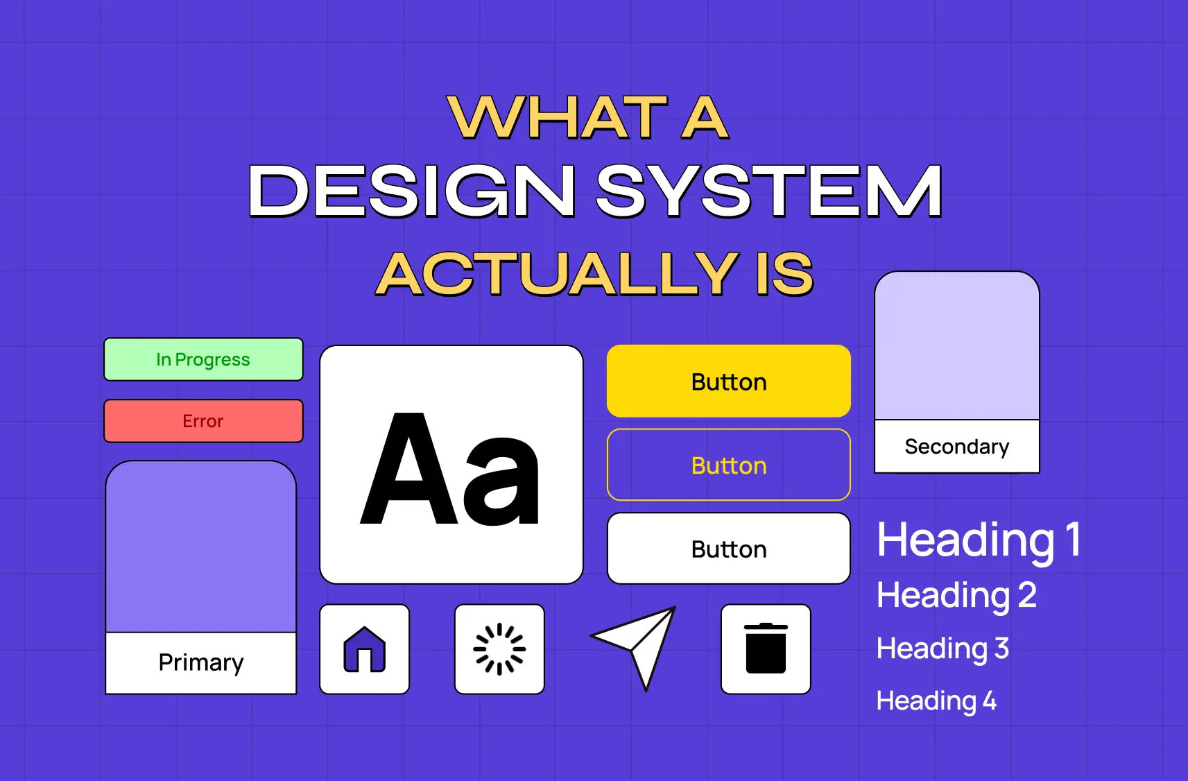
A design system is a documented collection of reusable design components, design tokens, interaction patterns, and the governing principles behind them — maintained as a single source of truth for an entire product or product family.
That definition matters because it distinguishes a design system from three things commonly conflated with it:
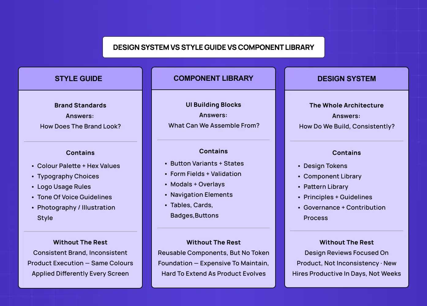
Style guide — Documents brand visual standards: colour palette, typography, logo usage rules, tone of voice. It defines how your SaaS brand identity presents visually, not how the product is built. A subset of a design system, not a synonym. Teams that treat a style guide as a design system typically have consistent brand presentation but inconsistent product execution — the same brand colours and fonts applied differently across every screen.
Component library — A collection of reusable UI elements: buttons, form fields, modals, navigation patterns, data tables, cards. Also a subset of a design system. It includes the UI elements but not the token foundation, usage documentation, or governing principles that make those elements coherent over time.
Pattern library — Documents recurring multi-component UI compositions: empty state patterns, error recovery flows, onboarding sequences, data visualisation formats. The third subset — and the one most teams never build because they stop at components.
A design system contains all three: tokens at the atomic layer, components built on those tokens, patterns built from those components, and the documented decisions that make the whole system coherent over time.
The reason this distinction matters in practice: teams that mistake a style guide for a design system under-invest in the component and documentation layers — a confusion that often stems from treating design systems as an isolated tool rather than as part of SaaS UX fundamentals. Teams that mistake a component library for a design system over-invest in building components before they've established the token foundation — producing a library that's hard to maintain and harder to extend when the product evolves.
A Brief Note on Where Design Systems Came From
The concept formalised gradually. Brad Frost's atomic design methodology (2013) gave teams a shared vocabulary — atoms, molecules, organisms — for thinking about UI components systematically. Google's Material Design (2014) was the first widely adopted self-proclaimed "design language." IBM Carbon, Atlassian, Shopify Polaris, and Apple's Human Interface Guidelines followed, each maturing the field's understanding of what a production-grade system looks like. Today, design systems are standard infrastructure for any team building digital products at scale.
Real-World Design System Examples
The most widely studied public design systems are:
Google Material Design 3 — Token-based theming architecture, dynamic colour system, and adaptive layouts across Android and web. The most widely adopted open-source system.
Atlassian Design System — Powers Jira, Confluence, and Trello under one design language. Semantic tokens (
color.text.brandrather thanblue-700) and a strong governance model make it a benchmark for multi-product consistency.IBM Carbon — Best-in-class data visualisation guidelines and accessibility standards that define what inclusive UX design looks like when it's encoded into a component library rather than left to individual implementation. Supports React, Angular, Vue, and web components. A reference point for enterprise SaaS.
Shopify Polaris — Unusually complete content guidelines alongside visual and code standards. Demonstrates that a design system's value extends to how the product communicates, not just how it looks.
Apple Human Interface Guidelines — Platform-specific design thinking across iOS, macOS, watchOS, and visionOS. The definitive reference for designing within the Apple ecosystem.
These are useful reference points, not blueprints. Each was built by hundreds of people over years for audiences in the tens of millions. A 20-person product team needs SaaS design infrastructure sized for where it actually is, not where these companies eventually got to.
The 4 Layers of a Production Design System
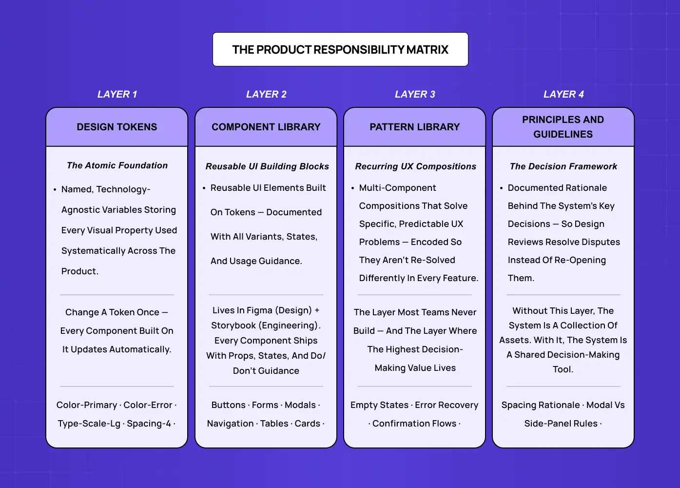
A mature production design system for a SaaS product has four distinct layers, each dependent on the one below it.
Layer 1 — Design Tokens
Design tokens are the atomic layer: named values for every visual property used systematically across the product.
Colour (semantic tokens:
color-primary,color-error,color-surface— not just hex values)Typography scale (typeface, weights, sizes, line heights), grounded in the craft of typography
Spacing system (a consistent increment scale for margins, padding, and layout gaps)
Elevation, border radius, motion timing
Change a token and every component built on it updates automatically across the whole product. Tokens are the foundation that makes the entire system maintainable.
Layer 2 — Component Library
The component library is the set of reusable UI building blocks assembled from your token layer.
Core elements: buttons (all variants and states), form fields (text, select, date picker, checkbox, radio), modals, navigation elements
Supporting elements: tables, cards, badges, alerts, tooltips
Each component carries documented props, variants, states (default, hover, focus, active, disabled, error, loading), and usage guidance that draws from established micro interaction patterns for consistent, predictable behaviour.
For most SaaS products, this layer lives in Figma for design — though the design tool choice affects how well the component library syncs with the token architecture — and in a component framework (React, Vue) with Storybook documentation for engineering.
Layer 3 — Pattern Library
Patterns are recurring multi-component compositions that solve specific, predictable UX problems.
Empty state pattern: what to show when a list is empty and how to prompt first action
Error recovery pattern: how to display, explain, and help users resolve errors
Data visualisation pattern: which chart types to use in which contexts
Confirmation pattern: how to handle irreversible actions
Patterns encode decisions that would otherwise be re-solved from scratch — differently — in every new feature.
Layer 4 — Principles and Guidelines
The layer most teams skip. Principles are the documented rationale behind the system's key decisions — codifying visual design rules into written form so they survive beyond the designers who made them.
Why the spacing scale uses 4px base increments
When to use a modal versus a side panel
How to write microcopy for error states
What accessible design practice requires of every component
Without this layer, the system is a collection of assets without a decision-making framework — and every design review returns to first-principles debates that the system was supposed to resolve.
The Design System Tipping Point: 4 Signals Your SaaS Product Needs One
The question of when to build a design system is more important than what to build. A design system built too early is a premature abstraction — infrastructure investment that precedes the product clarity needed to make it durable. A design system built too late is a tax: a growing backlog of inconsistencies that slows every new feature and makes every design review more expensive than the last.
The Design System Tipping Point, developed by Groto (letsgroto.com), identifies four signals that indicate a product has outgrown ad-hoc design decisions and will recover its investment in a design system faster than the cost of building one.
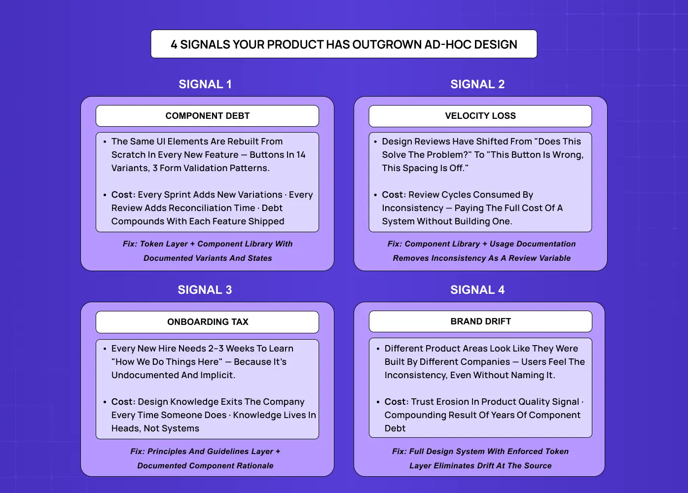
Signal 1 — Component Debt
Your team is rebuilding the same UI elements from scratch in every new feature.
Buttons exist in fourteen slightly different forms across the product
Forms have three different validation patterns
The main navigation looks different from the settings panel
Component debt compounds with every sprint: each new feature adds new variations, and each variation must be reconciled in every future design review. When component debt is visible across a design review session, the cost of the system is already being paid — without any of the benefits.
Signal 2 — Velocity Loss
Design reviews have shifted from "does this solve the user problem?" to inconsistency correction.
Button shade is wrong
Spacing is 2px off
This doesn't match the existing modal pattern
Inconsistency detection is consuming review capacity that should be directed at product quality. When your design review is doing the job a design system would automate, you are paying the full cost of the system — in every review cycle, indefinitely — without building it.
Signal 3 — Onboarding Tax
Every new designer or developer joining the team needs two to three weeks to learn "how we do things here" — not because the product is technically complex, but because design decisions are undocumented and implicit.
Design knowledge lives in individual team members' mental models, not documented systems
It exits the company every time someone does
Each new hire relearns the same unwritten conventions from scratch
The onboarding tax is a knowledge retention problem as much as a speed problem.
Signal 4 — Brand Drift
Different areas of your product look like they were built by different companies — the visible breakdown of a unified visual language that a design system exists to protect.
The marketing site, the main application, the settings area, and the mobile app each have a subtly different visual language
Users notice this inconsistency even when they can't articulate it
It erodes trust in the product quality signal your design is supposed to communicate — which is why a well-maintained product brand experience depends on design system consistency, not just marketing guidelines.
Brand drift is the compounding result of component debt over time.
The tipping point threshold: when two or more of these signals are present simultaneously, a design system will repay its build cost within the first product cycle after deployment. When all four are present, the investment is overdue.
According to research published by Nielsen Norman Group, design teams that implement formal design systems report an average 34% reduction in time spent on design reviews — the direct result of reducing velocity loss and component debt simultaneously. At Groto, our clients typically see the velocity improvement within six to eight weeks of the first components going live in production.
What a Design System for a SaaS Startup Actually Looks Like
One reason design systems get built incorrectly — or prematurely — is the implicit reference model. Most examples teams encounter are Google's Material Design, Apple's Human Interface Guidelines, or Atlassian's Design System: systems built by hundreds of people over years, each rooted in a distinct product design thinking that took decades and enormous scale to develop.
A design system for a 20-person SaaS startup doesn't need to look like Material Design. It needs to be the right size for the team building it and the product it serves.
For an early-stage SaaS product, a right-sized design system typically includes:
A token file covering colour, typography, and spacing
15 to 20 core components covering the elements that appear most frequently across the product — enough to make high-fidelity wireframing consistent without the overhead of a full-scale library
Documented states for each component
A one-page design principles document capturing the three or four decisions most likely to be re-debated without written rationale
This delivers 80% of the benefit of a full system at roughly 20% of the build cost.
For a growth-stage SaaS product — 50 to 200 team members, multiple squads shipping features simultaneously — the system expands to cover the full four layers:
A comprehensive token architecture
A component library that addresses edge cases and complex compositions
A pattern library for recurring UX problems
A governance structure defining who owns the system, how contributions are proposed and reviewed, and how versioning is managed across design and engineering
The mistake is building a growth-stage system for an early-stage product, or assuming a startup-stage system will scale to a growth-stage product without intentional evolution. Both mismatches waste investment — one by over-building infrastructure the team can't yet use, the other by using a system that breaks down precisely when the team most needs it to scale.
The Four Most Common Design System Failure Modes
The design system conversation tends to focus on building the right system. Equally important is avoiding the failure modes that make well-built systems useless within twelve months.
Adoption failure The system is built but the team doesn't use it consistently.
Cause: Components lack clear usage guidance; using the system adds friction to the design workflow; new patterns aren't yet covered in the library
Fix: Invest as much in documentation and onboarding as in the components themselves — the system is only as useful as it is discoverable and understood. This mirrors broader SaaS design practices: tools that add friction get abandoned, regardless of how well they're built.
Maintenance abandonment The system falls behind the product.
Cause: No clear owner or defined contribution process; version mismatches accumulate between Figma and code; teams stop trusting it as a source of truth
Fix: Assign explicit ownership before launch and treat the system as a product, not a project
Token drift The component library loses synchronisation with the token layer.
Cause: Visual properties are changed directly in components rather than at the token level — a designer updates a button colour by editing the hex value on the component rather than updating
color-primaryFix: Enforce one rule: visual properties change at the token level only, never inside components
Scope creep The system attempts to solve every design decision instead of the recurring ones.
Cause: Every one-off component gets added to the library, making it unwieldy to navigate and expensive to maintain
Fix: Apply a clear scope policy — the system covers components that appear in three or more distinct product contexts. One-off components live in the feature, not the system
Does Your SaaS Product Need a Design System Right Now?
The signal isn't team size — it's the cost of not having one. Small teams can reach the tipping point faster than large ones if they're shipping features at high velocity or if design inconsistency is generating visible friction in user research or support.
A product that is probably not yet at the tipping point typically looks like this:
Fewer than ten distinct features shipped
Visual language still being discovered through iteration
Fewer than two active designers on the founding team
Investing here is likely premature — the system will need to be rebuilt when the product finds its stable form, and the rebuilding cost often exceeds the benefit it delivered in the interim.
A product that is at or past the tipping point typically shows:
Features shipping across multiple product areas simultaneously
More than one designer contributing to the visual language
Component debt visibly consuming review cycles
Every sprint without a system adds to a reconciliation cost that only compounds — the point at which bringing in a design-systems practitioner pays for itself fastest.
The fastest way to assess your position: run the four tipping point signals as a quick audit.
Count the number of button variants currently in your product
Time how much of your last three design reviews was spent on inconsistency rather than product decisions
Ask your last two hires how long it took them to feel confident working in the product's design language
The answers locate you precisely relative to the tipping point.
Three Ways to Approach a Design System
Once you've decided a design system is the right investment, there's a second decision: whether to adopt an existing one, adapt one, or build from scratch. The right choice depends on budget, timeline, and how differentiated your product's visual language needs to be.
Adopt — Use an open-source system (Material Design, Ant Design, shadcn/ui) as-is. Lowest cost and fastest to implement. Works well for internal tools or early-stage products where brand differentiation isn't yet a priority. The trade-off: your product inherits conventions built for other audiences.
Adapt — Start with an existing system and customise it with your brand's tokens, patterns, and guidelines. A middle path that balances speed with brand control. As customisations accumulate, the maintenance overhead approaches that of building your own.
Build — Create a custom system on your own token foundation. A custom system works best when it's built from a design philosophy the team has already articulated — without that foundation, token decisions are arbitrary. Higher upfront investment, but produces a system precisely calibrated to your product and team. The right choice for most SaaS products past the early stage, where brand and product differentiation matter.
Most SaaS products that have found product-market fit are better served by a right-sized custom system than by adapting a public one — the adaptation cost typically exceeds the build cost once the product has its own established visual language.
What Groto Does with Design Systems
At Groto, we approach design systems as product infrastructure investment, not a design team deliverable — a distinction central to how the agency design process differs from internal team execution. A design system that a design team builds without engineering involvement becomes a Figma asset library. A design system that is built for the right team size, with the right governance from the start, becomes a velocity multiplier — the kind of foundation that makes the next twelve months of product development measurably faster.
Our design system work for SaaS products starts with the Tipping Point assessment: which of the four signals are present, and what does a right-sized system need to include to address them efficiently. From there, our engagements typically cover:
Tipping Point audit — Identifying which of the four signals are active and scoping the intervention accordingly
Token architecture — Building the semantic token layer for colour, typography, spacing, and motion that the entire system depends on
Core component library — Designing and documenting the 15 to 40 components that cover the highest-frequency UI patterns in the product
Pattern library — Encoding recurring multi-component UX compositions (empty states, error recovery, onboarding flows) that reduce re-solving the same problems across features
Governance structure — Defining ownership, contribution process, versioning, and the review criteria that keep the system trustworthy over time
Engineering handoff — Ensuring the system lives in code (React, Vue, or equivalent) with Storybook documentation, not just in Figma
For some clients, the right intervention is a focused token layer and core component library. For others, it's a pattern library and governance structure layered on top of a component library that already exists but has drifted.
We build the system to scale with the product. A design system designed for a 15-person team that can evolve to serve a 100-person team without being rebuilt is a better investment than one optimised for today that becomes a bottleneck at the next inflection point. The highest-ROI design system work we do is the kind our clients stop noticing — not because it's invisible, but because it's working exactly as designed.
We've delivered design systems for SaaS products in fintech, health tech, B2B productivity, and AI-native platforms. Our clients — including teams that have raised $8M+ and platforms serving 140+ five-star reviewed products — consistently cite the design system as the single highest-leverage infrastructure decision in their design process. If your product is approaching the tipping point, book a discovery call and we'll run the assessment together.
Key Takeaways
A design system is a documented collection of design tokens, reusable UI components, interaction patterns, and governing principles — maintained as a single source of truth. It is not a style guide, a component library, or a pattern library in isolation. It contains all three.
The four layers of a production design system are: Design Tokens (atomic named visual properties), Component Library (reusable UI elements built on tokens), Pattern Library (recurring multi-component UX compositions), and Principles and Guidelines (the rationale governing design decisions the system doesn't directly answer).
The Design System Tipping Point identifies four signals that indicate a product needs one: Component Debt, Velocity Loss, Onboarding Tax, and Brand Drift. Two or more signals present simultaneously = the system recovers its build cost within the first product cycle.
Right-sizing matters. An early-stage SaaS product needs a different system than a growth-stage one. Building at the wrong scale in either direction creates waste and compounds technical debt.
The four most common failure modes are adoption failure, maintenance abandonment, token drift, and scope creep — each preventable with the right governance decisions made before build, not after.