

UX optimization is not a feature request or a redesign cycle. It is the discipline of making design decisions based on how users actually behave, not how we assume they will.
Design-first strategies for optimizing experiences that convert and retain.

TL;DR
UX optimization is an ongoing design discipline, not a one-time fix. It combines user research, behavioral signals, and iterative design changes to reduce friction and improve outcomes.
The most impactful wins come from targeted, specific design improvements rather than full redesigns.
A strong UX optimization framework starts with identifying where users drop off, diagnosing the design cause, and shipping the smallest fix that addresses it.
The right UX optimization tools help you observe real behavior, validate design decisions, and track improvement over time.
Conversion rate, task completion, and retention are the three business metrics most directly tied to design quality.
What Is UX Optimization?
UX optimization is the ongoing practice of improving how people experience a digital product by identifying friction in the design, addressing the cause, and measuring whether the change actually helped. It is not about aesthetic polish or periodic redesigns. It is about building a feedback loop between how users behave and how design responds.
The distinction matters. Redesigns start from assumptions. Optimization starts from evidence. When we work with product teams on improving their interfaces, the first question we always ask is not "what should we change?" but "what are users doing right now that we did not design for?"
Why Design Is at the Center of UX Optimization
Most optimization guides treat UX as a measurement problem. Fix the metric, ship the change, report the result. But the design layer is where friction actually lives, and that is where most of the leverage is.
The numbers reflect this. According to Forrester research, every $1 invested in UX brings an average return of $100 - but calculating the true ROI of UX design requires tracking the right methods and metrics across your entire product. A McKinsey study tracking 300 companies over five years found that design-led organizations saw 32% higher revenue growth and 56% higher shareholder returns than their peers.
The most common UX mistakes that hurt conversions sit at the design layer: poor visual hierarchy causes users to overlook primary CTAs, and inconsistent interaction patterns increase cognitive load. Onboarding flows that frontload form fields before delivering value kill activation rates. Navigation systems built around internal logic rather than user mental models create confusion that no analytics tool can fully diagnose on its own.
Design decisions determine whether an experience is intuitive or effortful. Optimization determines whether those design decisions are working. The two are inseparable in practice, which is why the most effective UX optimization is always design-led.
The UX Optimization Framework We Use
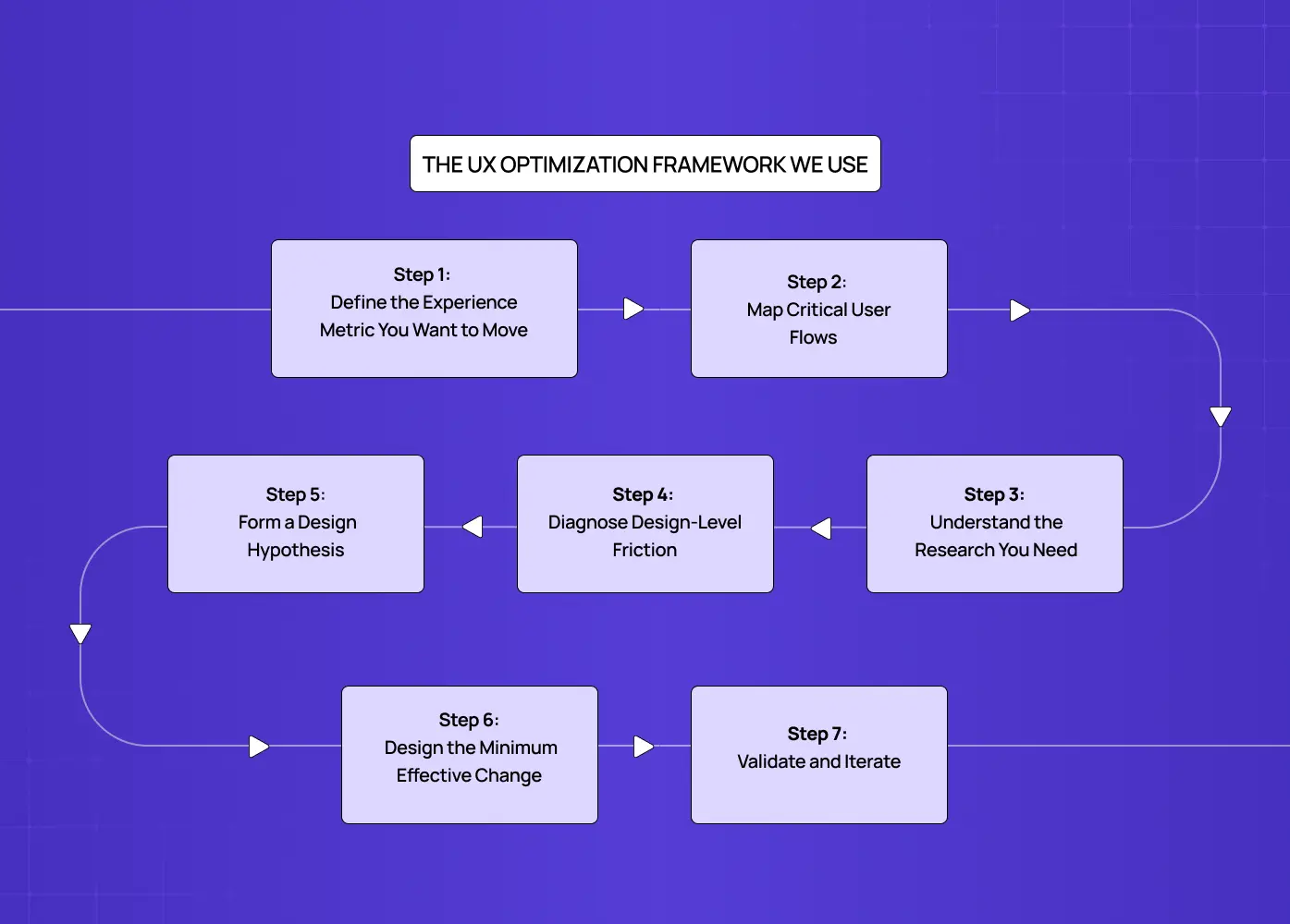
Rather than treating optimization as a series of isolated fixes, we embed it inside the broader UX design process as a structured loop. Here is how we break it down:
Step 1: Define the Experience Metric You Want to Move
A clear UX strategy sets the target before any design work begins — one specific metric per cycle: activation rate, checkout completion, day-7 retention, or feature adoption. One metric per cycle prevents conflicting design decisions and makes results attributable.
Step 2: Map Critical User Flows
We trace the exact sequence of interactions a user takes to reach that metric. Every screen, every transition, every decision point is mapped. This gives us a complete picture of where the experience might be breaking down, rather than guessing from aggregate data.
Step 3: Understand the Research You Need
Not all UX research serves the same purpose. Generative research, which includes user interviews, card sorting, tree testing, and observational sessions, happens before a solution is designed. Its job is to surface what the problem actually is. Evaluative research, which includes prototype testing, A/B testing, and post-launch usability sessions, happens after a solution exists. Its job is to validate whether it works. Running evaluative research before diagnosing the problem leads to testing the wrong thing entirely.
Competitive UX analysis sits outside both categories but belongs here as a useful first input. Reviewing how competing products handle the same critical flows tells you what expectations users may already have when they arrive. If three competitors use a persistent progress indicator in checkout and your product does not, that absence is worth flagging before any user sessions begin. Competitive analysis does not replace user research. It sharpens the questions you bring into it.
Step 4: Diagnose Design-Level Friction
A thorough UX audit is the entry point here. We use a combination of session recordings, heatmaps, and usability testing to surface bad UX design examples in the live product: CTAs that blend into the background, error messages that explain nothing, modals that interrupt critical flows, and navigation labels that do not match user expectations.
Before running any user sessions, we often start with a heuristic evaluation - reviewing the interface against Nielsen's 10 usability heuristics to surface obvious design failures fast. This is a structured expert audit that covers principles like visibility of system status, error prevention, and consistency. It does not replace user research, but it surfaces obvious design failures in under a day and helps us focus usability testing on the friction that matters, rather than spending sessions rediscovering issues a trained eye would catch in minutes.
What we are looking for are repeatable patterns. One user getting confused is noise. Five users making the same wrong turn at the same screen is a design problem worth solving.
Once friction points are mapped, the next question is which one to fix first. We use lightweight scoring frameworks to make that call without subjectivity. ICE (Impact, Confidence, Ease) works well for early-stage teams that need quick triage. RICE (Reach, Impact, Confidence, Effort) adds more rigour and is better suited to product teams managing multiple competing fixes. For teams tracking experience quality at a system level, Google's HEART framework (Happiness, Engagement, Adoption, Retention, Task Success) maps UX signals directly to product health metrics. The goal is not to run every framework simultaneously. It is to have a consistent scoring method so the highest-leverage fix gets prioritized over the most visible one.
Step 5: Form a Design Hypothesis
Every fix we propose is framed as a hypothesis: "If we change X because users are doing Y, we expect Z to improve." This is not bureaucratic formality. It forces honest thinking about causation and helps the team stay aligned on what success looks like before a single pixel moves.
Step 6: Design the Minimum Effective Change
We design the smallest change that plausibly addresses the friction. A sticky CTA button instead of a full form redesign. A revised empty state with a single instructional line instead of a new onboarding sequence. Small changes ship faster, are easier to measure, and carry less regression risk.
Step 7: Validate and Iterate
UX testing with real users validates the change against the baseline metric. Results — including failures, are documented, and the loop restarts.
Core Design Areas That Drive UX Optimization Wins
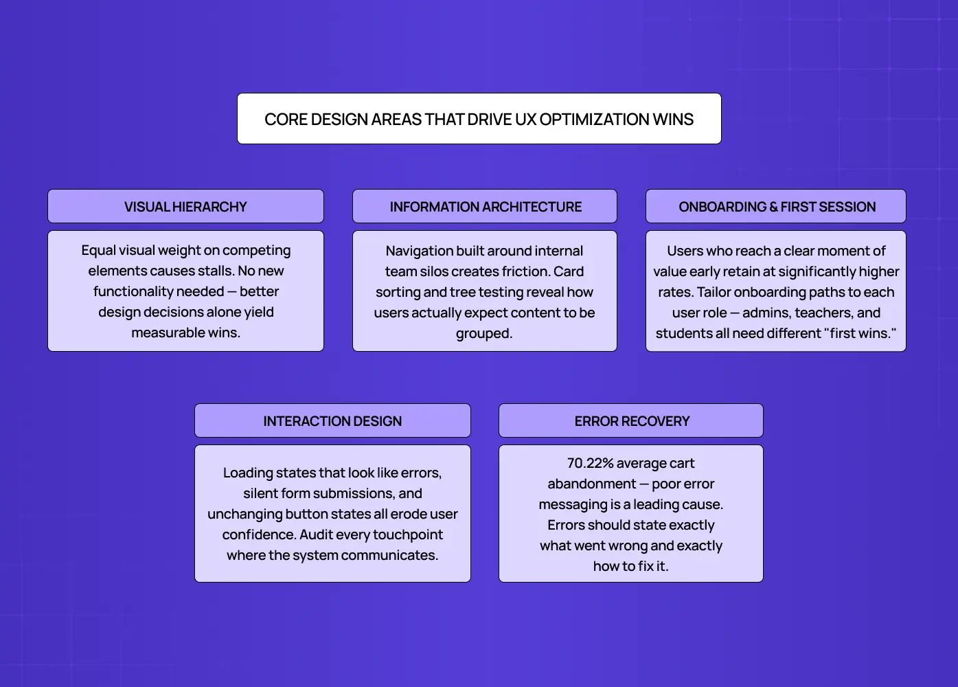
These are the specific design domains where we find the highest-impact optimization opportunities across the products we work on.
Visual Hierarchy and Attention
Users do not read interfaces. They scan them. Visual hierarchy determines what they notice first, second, and what they miss entirely. When a primary action is styled like a secondary one, or when competing elements have equal visual weight, users stall. Optimizing visual hierarchy often yields the quickest measurable improvements because it requires no new functionality, just better design decisions.
Performance is also a UX signal. Load time directly affects how users perceive design quality before a single layout decision is even rendered. Google's Core Web Vitals, specifically Largest Contentful Paint, Interaction to Next Paint, and Cumulative Layout Shift, are the three metrics that most directly connect technical performance to user experience. A page that loads slowly or shifts layout mid-scroll undermines every visual design decision on it. We treat Core Web Vitals as a baseline check in any optimization cycle, not an afterthought.
Signs your visual hierarchy needs attention:
Users scroll past the primary CTA without clicking
Rage clicks on non-interactive elements
Heatmaps show attention clustering in the wrong areas
Form drop-offs before the submit step
Information Architecture
How content is organized determines whether users can find what they came for. A well-designed information architecture maps to user mental models, not to internal product logic or team silos. We use card sorting and tree testing early in the optimization process to understand how users expect information to be grouped before we restructure navigation or content hierarchies.
For a product like PolicyBazaar, where we worked on improving the insurance shopping experience, a core part of the optimization was restructuring how policy options were presented. The product complexity had led to a navigation system that reflected the insurer's logic, not the user's. Reorganizing that structure around user decision stages, rather than product categories, was what reduced drop-offs and made the experience navigable.
Onboarding and First-Session Design
The first session is the highest-stakes design surface in any digital product, and onboarding drop-offs are one of the most expensive conversion leaks a product can have. Users who reach a moment of value early retain at significantly higher rates, and every field, step, or screen that appears before that moment is a tax on activation.
When we redesigned LearnSphere's edtech platform, we restructured the onboarding flow around user roles. Admins, teachers, and students all had different definitions of "first value." Giving each role a tailored path to their first meaningful action, rather than a single generic onboarding sequence, directly improved engagement across all three groups.
This is personalization at the onboarding level: adapting the experience to what a specific user segment actually needs rather than routing everyone through a single generic flow. The same principle applies beyond onboarding. SaaS dashboard UX follows this principle - role-based views, cohort-specific empty states, and behavior-triggered tooltips reduce friction without requiring a full product overhaul. In SaaS UX design, personalization does not need to be algorithmic to be effective. It needs to be intentional.
Interaction Design and Feedback States
Users rely on immediate feedback to understand whether their actions worked. Micro UX patterns - loading states, button state changes, form confirmations - are not minor details. When they fail, they become trust failures. Optimizing interaction design means auditing every touchpoint where the system communicates with the user and ensuring it communicates clearly.
Interaction patterns worth auditing in any optimization cycle:
Button active and disabled states
Form validation logic (inline vs. on submit)
Empty states with instructional copy and a clear next action
Error messages with specific recovery guidance
Loading and transition states that signal system status
Microcopy and Error Recovery
A focused UX writing guide covers every microcopy surface in an interface - button labels, tooltips, empty states, inline validation, and error messages. It is one of the most underinvested resources in product design and one of the highest-leverage ones in optimization. A button that says "Submit" tells users nothing. One that says "Get your free audit" sets an expectation and reduces hesitation. Microcopy optimization requires no new features, no design system changes, and no development sprint. It is a copy decision with a measurable UX outcome.
Error messages are one of the most common places this breaks down. Most teams write them once, ship them, and never revisit them. According to Baymard Institute, the average cart abandonment rate across ecommerce sits at 70.22%, with poor error messaging and unclear form validation among the leading design causes.
The design principle is simple: an error message is not a notification. It is a recovery instruction. It should tell the user exactly what went wrong and exactly how to fix it. "Invalid input" is not an error message. "Please enter a 10-digit phone number" is.
Trust signals follow the same logic. Reviews, security badges, client logos, and usage numbers are not just marketing decisions. They are placement decisions. A five-star rating buried in the footer does nothing. The same signal placed adjacent to a sign-up form or next to a pricing CTA addresses hesitation at the exact moment it occurs. Optimizing social proof means asking where trust anxiety is highest in a given flow, and placing the right signal there rather than where it looks best on the page.
Mobile UX Optimization: A Distinct Surface
Mobile is not a smaller version of desktop. It is a different context entirely, and most products have a measurable conversion gap between the two. Mobile users convert at roughly 30 to 40% lower rates than desktop users, and the majority of that gap is a design problem, not a traffic quality problem.
Mobile-specific friction points worth auditing:
Touch target sizing: interactive elements smaller than 44x44px are a consistent source of mis-taps and frustration
Virtual keyboard behavior: form fields placed near the bottom of the screen get obscured when the keyboard opens, one of the most common and most overlooked mobile UX failures
Scroll-triggered CTAs: buttons that require scrolling to reach on mobile but sit above the fold on desktop create an invisible conversion gap
Device range in testing: testing exclusively on flagship iPhones skews results; mid-range Android devices surface performance and layout issues that premium hardware masks entirely
The optimization process for mobile follows the same framework as desktop, but the observation tools and the failure modes are different. Session recordings on mobile surface different friction than desktop. Heatmaps behave differently with touch input than with cursor movement. Treating mobile as an afterthought in an optimization cycle means missing the surface where most drop-off actually happens.
UX Optimization Tools Worth Having in Your Stack
Good tools make the observation phase faster and the decision phase more honest. Here is what a design-focused optimization stack typically looks like:
For behavioral observation:
Session recording tools (Hotjar, FullStory, Microsoft Clarity) to watch real user sessions and identify interaction patterns that analytics alone will not surface
Heatmap tools to understand where attention goes, what users click, and how far they scroll
For design validation:
Prototype testing tools (Figma, Maze, Lyssna) to validate design hypotheses before development investment
Usability testing platforms to observe task completion under controlled or unmoderated conditions
Tree testing and card sorting tools (Optimal Workshop, Lyssna) to validate information architecture decisions with real user expectations
For measurement:
Funnel analytics (Mixpanel, Amplitude) to identify exactly where users exit a flow and quantify the drop-off
A/B testing for SaaS (Optimizely, VWO, GrowthBook) to run controlled experiments on design changes at scale
Accessibility auditing tools (axe DevTools, WAVE) to surface design gaps that affect usability for all users
The key is not having all of these. It is having the right combination for where you are in the optimization cycle, and using them in sequence rather than in parallel.
How to Measure UX Optimization Results
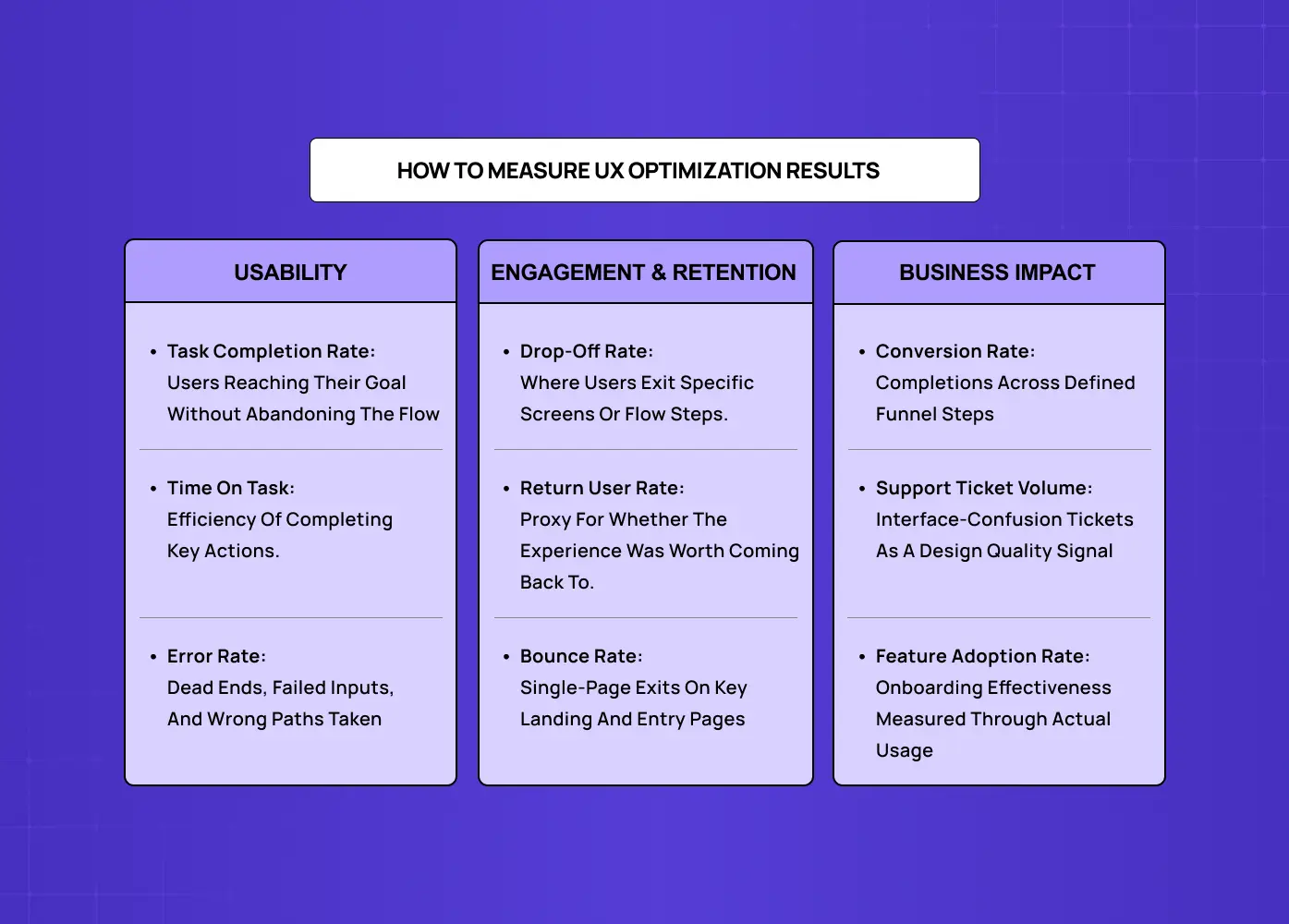
Measuring the outcome of design changes requires tracking the right signals. These are the KPIs most directly tied to design quality:
Usability metrics:
Task completion rate: whether users can achieve their goals without abandoning the flow
Time on task: how efficiently users complete key actions
Error rates: how frequently users encounter dead ends, failed inputs, or incorrect paths
For teams that want to benchmark against industry standards rather than just their own baseline, three standardised scales are worth knowing. The System Usability Scale (SUS) is a 10-question test scored from 0 to 100, with an industry average of 68 and anything above 80 considered excellent. The Customer Effort Score (CES) measures how much work a user has to do to complete a task and is one of the strongest predictors of churn. The Customer Satisfaction Score (CSAT) captures satisfaction at specific touchpoints. These sit alongside behavioral metrics, not as replacements, but as a standardised layer that lets you benchmark against products outside your own category.
Engagement and retention signals:
Drop-off rates at specific screens or flow steps
Return user rates as an indicator of whether the experience delivered value
Bounce rates on key landing and entry pages
Business impact metrics:
Website conversion rate across defined funnel steps
Support ticket volume related to interface confusion
Feature adoption rate as a proxy for onboarding effectiveness
Tracking these consistently over time, segmented by device type, user cohort, and traffic source, gives the design team a clear picture of whether changes are working and where the next highest-priority problem is.
Common UX Optimization Mistakes We See
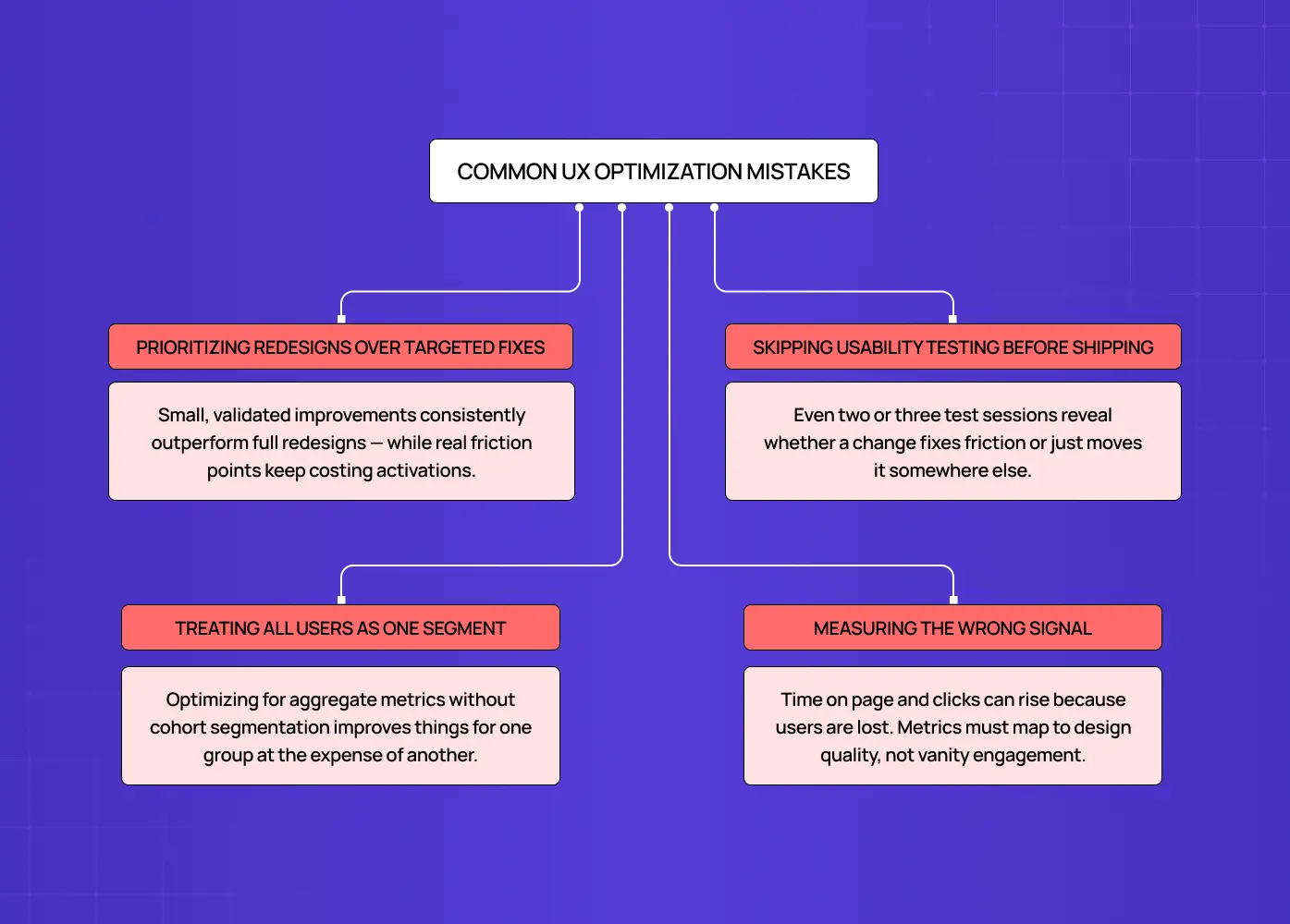
Even experienced design teams fall into the same traps. These are the most common ones:
Prioritizing redesigns over targeted fixes
A full redesign feels like progress, but it is possible to improve conversion without redesigning - small, validated design changes consistently outperform a full rebuild on the same surface. We have seen products spend two quarters on a new design system while specific friction points that were costing activations went unaddressed.
Skipping usability testing before shipping changes
Designing a solution to a problem you have not directly observed with users is an expensive guess. Even two or three usability test sessions can reveal whether a proposed change actually addresses the friction, or simply moves it elsewhere.
Treating all users as one segment
A design decision that works for experienced users may completely confuse new ones. Optimizing for aggregate metrics without segmenting by user cohort leads to improvements for one group at the expense of another.
Measuring the wrong signal
Time on page can increase because the interface is harder to use, not because it is more engaging. Clicks can rise because users are lost. Picking metrics that map directly to design quality, rather than vanity engagement numbers, is what separates optimization from theater.
Conclusion
UX optimization is a design discipline. It requires observation, structured problem framing, targeted design changes, and honest measurement.
The highest-leverage work is almost always at the level of specific interactions: a broken error message, a CTA that disappears on small screens, an onboarding flow that front-loads effort before delivering value.
A repeatable UX optimization framework turns one-off design wins into a compounding improvement system.
The right UX optimization tools do not replace design judgment. They inform it.
The goal is not a "better-looking" product. It is a product where users consistently achieve what they came to do.
Stop guessing. Start optimizing.
Most product friction is invisible until you know where to look. We help SaaS and AI product teams identify exactly what is breaking, and fix it with design that is tested, not assumed.
Let's talk about your product →


