Login Page Design: 20 Examples, Anatomy, and What Actually Works

Login Page Design: 20 Examples, Anatomy, and What Actually Works

A practical, design-first look at login page design: 15+ real examples, the layout patterns behind them, best practices, and mistakes to avoid.

Login Page Design: 20 Examples, Anatomy, and What Actually Works

Login Page Design: 20 Examples, Anatomy, and What Actually Works

A practical, design-first look at login page design: 15+ real examples, the layout patterns behind them, best practices, and mistakes to avoid.

Your login page design is doing more work than you think. It's the first real product experience a user has. Here are the layouts, patterns, and details that separate a forgettable login screen from one that builds trust.

Fifteen login page examples, the patterns behind them, and what actually works.

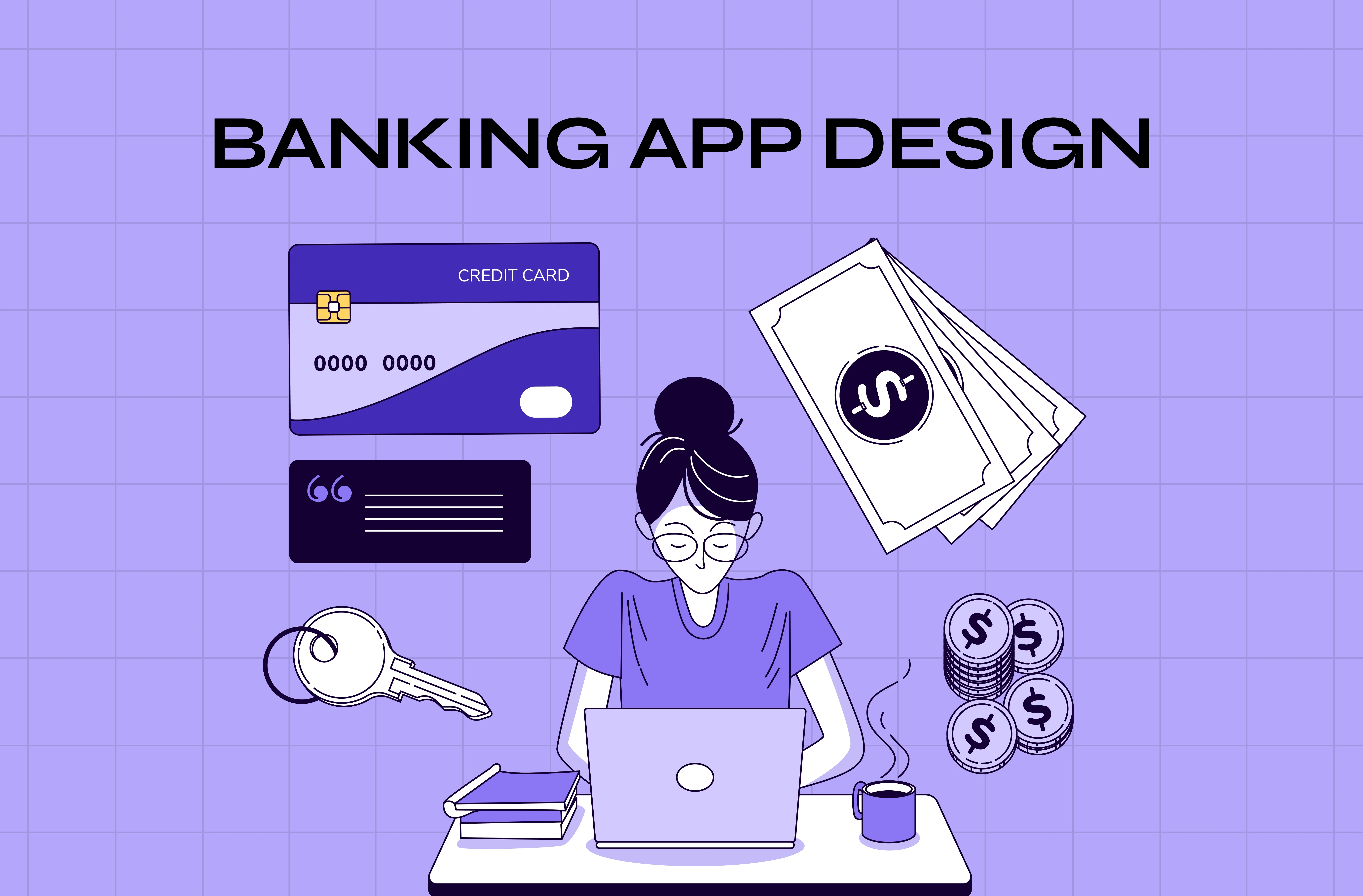
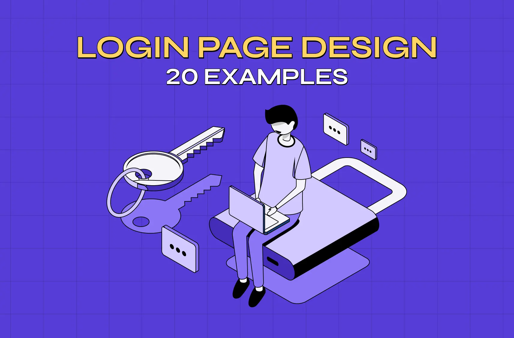
Illustration of a user signing into a digital product with a laptop, password key, and chat icons representing secure login and authentication.

A good login page design gets users in fast, without making them think. Baymard Institute's research puts a real number on why this matters: password reset issues alone drive an average 18.75% checkout abandonment rate for returning users, and up to 19% when password rules are overly strict. Below, I've broken down 20 real login screens, the anatomy behind them, accessibility and mobile requirements, and the practices worth borrowing for your own product.

At Groto, we design login flows as part of almost every SaaS product we touch, and one thing has stayed consistent: users don't visit a login screen to admire it. They visit it to get past it. That doesn't mean it should be an afterthought. It's the first real interaction someone has with your product, and it sets the tone for everything after.

This isn't another generic roundup. We're breaking down what's actually happening in each of these screens, from a design standpoint, the same way we do with product page design examples, so you can apply the same thinking to your own product.

What Is a Login Page?

A login page is the screen that stands between a returning user and their account. It asks for some form of credential, usually an email or username paired with a password, and confirms that the person on the other end is who they say they are.

It's easy to think of this as purely a security checkpoint, but it's also a design surface. The fields you ask for, the order you ask them in, the feedback you give when something goes wrong, and the alternative paths you offer (social login, magic links, SSO, passkeys) all shape whether that checkpoint feels like a formality or a frustration. A login screen and a sign-up page design often share a similar visual language, but they serve different jobs: one authenticates, the other onboards.

Why This Screen Deserves More Attention Than It Gets

It's easy to treat this as a checkbox screen: two fields, a button, done. But a few things are riding on it.

  • First impressions form here, much like homepage design principles shape a first visit. Before a user sees your dashboard, your features, or your value, they see this screen. It's the first signal of how polished the rest of the product will be.

  • Friction here means lost users, and it's measurable. Baymard's research found an 18.75% average abandonment rate tied specifically to password-reset email issues among returning users. That's not a vague usability concern, it's a direct hit to website conversion.

  • It's a trust signal. Clear password guidance, visible security cues, and predictable behavior tell users their data is in safe hands before they've even logged in.

  • It shapes retention, not just acquisition. Returning users hit this screen every single time. A clunky one adds friction to a relationship you're trying to build.

Common Login Layout Patterns You'll Run Into

Before looking at individual products, it helps to know the handful of layouts almost everything is built on, and how they differ from an entry screen like a splash page:

  • Single-column, centered form. Just the fields, centered on the page. No distractions. Common for tools where users already know what they're signing into.

  • Split-screen. Form on one side, brand imagery or value proposition on the other, borrowing from the best landing page design examples. Popular with SaaS products that want to reinforce why someone's logging in.

  • Modal overlay. The login form appears over the product itself, so users can explore before committing. Common on consumer platforms.

  • Stepped or progressive. Email first, password second, sometimes with SSO detection in between. Reduces visual load and works well for enterprise tools.

  • Magic link or OTP. A code or link replaces the password entirely, sent to email or phone. Removes password friction but adds a small wait.

  • Passkeys (WebAuthn). Biometric or device-based authentication (Face ID, Touch ID, a security key) replaces both the password and the wait. This is quickly becoming the standard for high-frequency, high-security products rather than an experimental extra.

Most sign-in page design decisions come down to picking the right one of these for your users, not inventing a new one.

Anatomy of a Login Page

Zooming into the screen itself, most login pages are built from the same handful of components. How you design each one, following basic visual design principles, matters as much as the overall layout.

Identifier field

This is the email, username, or phone number field. Default to email where possible since it's easier for users to recall than a custom username, and it doubles as a recovery channel. If your user base has established usernames (gaming platforms, forums), a flexible single field that accepts either avoids forcing people to remember which one they registered with.

Password field

Pair it with a visibility toggle so users can confirm what they've typed instead of guessing, one of the micro UX patterns that pays for itself immediately.Show password requirements before submission, not after a rejected attempt. Current guidance from NIST favors length over complex character rules (a long, memorable phrase over "must include one symbol and one number"), and interfaces are increasingly following that lead.

Primary CTA

One clearly dominant button. If "Log in" and secondary actions like "Forgot password" carry the same visual weight, users hesitate over which one to use.

Alternative authentication methods

Social login, SSO, magic links, or passkeys. Keep this to one or two options beyond the standard field, and visually separate them from the primary path with a divider or clear grouping rather than stacking everything with equal weight.

Trust and security footer

This is where SOC 2 or ISO badges, links to a security or trust page, and terms and privacy links typically live. It matters more for B2B products, where a buyer is evaluating whether to trust you with company data, than for consumer apps. A generic padlock icon or the word "secure" on its own does little, specific, verifiable credentials do more.

Help and recovery links

"Forgot password," account recovery, and support contact should be visible without hunting, but styled as secondary so they don't compete with the primary action.

20 Login Page Examples Worth Studying

1. Notion
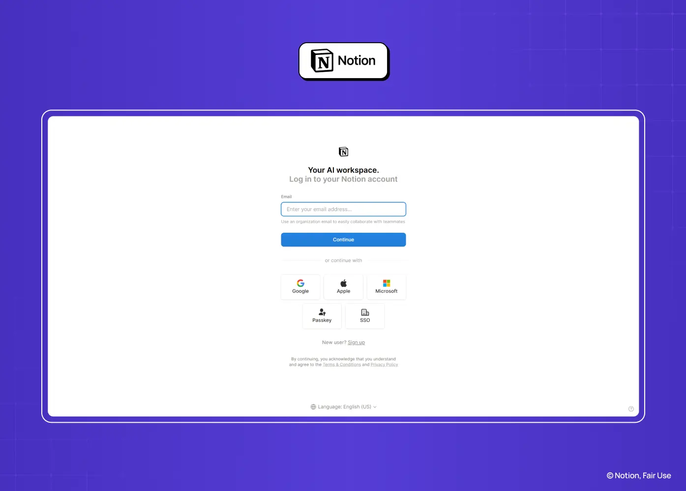
Notion login page featuring email entry, social sign-in options, and SSO authentication in a clean, minimalist interface.

Segment: SaaS Notion uses a centered card layout with generous white space and sharp typographic hierarchy. Multiple authentication methods (Google, Apple, email) are listed upfront rather than hidden behind a "more options" link, which keeps the choice visible without cluttering the card. 

Why it works: The visual hierarchy directs attention to the primary action first, while still surfacing flexibility for users who prefer a different method. Monochrome styling keeps it consistent with the product's minimalist identity.

2. Slack
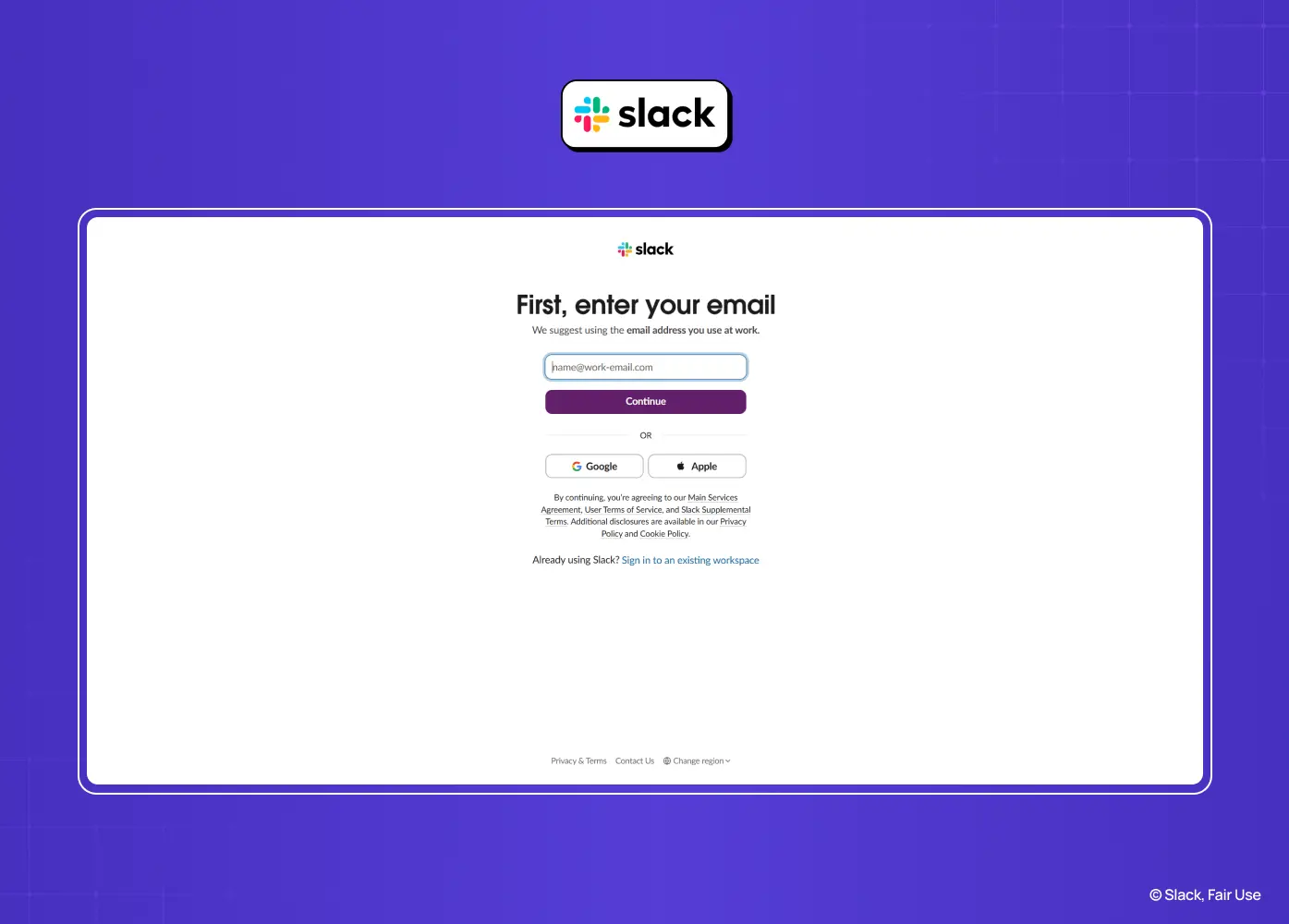
Slack sign-in page prompting users to enter their work email with Google and Apple login options for a streamlined authentication flow.

Segment: SaaS Slack's mobile flow starts with just an email field. Once submitted, a verification link is sent, and users are redirected straight into their workspace once confirmed. There's no password field anywhere in the process. 

Why it works: Removing the password entirely removes the single biggest point of friction (and support tickets) in most login flows. It also sidesteps weak password risk without adding extra steps.

3. Duolingo
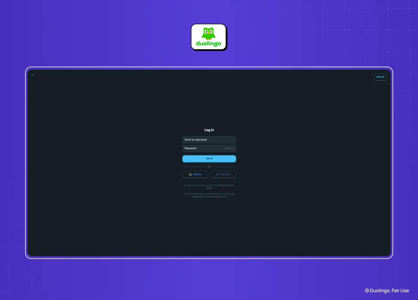
Duolingo login page with email and password fields, social login options, and a distraction-free dark interface.

Segment: Consumer The login modal is vertically centered and stripped to essentials. Primary and secondary actions are visually distinguished by color and weight, so users always know which button moves them forward. 

Why it works: A lightweight modal keeps attention on the task without pulling users out of the app experience entirely. The clear hierarchy between standard and social sign-in avoids decision fatigue.

4. Airbnb
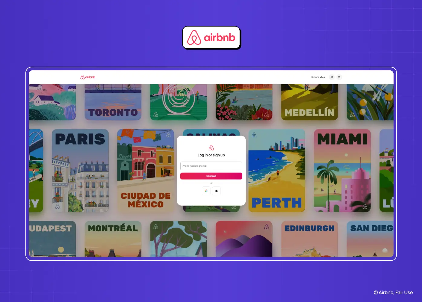
Airbnb sign-in modal over a colorful destination gallery, offering email and social login options for quick account access.

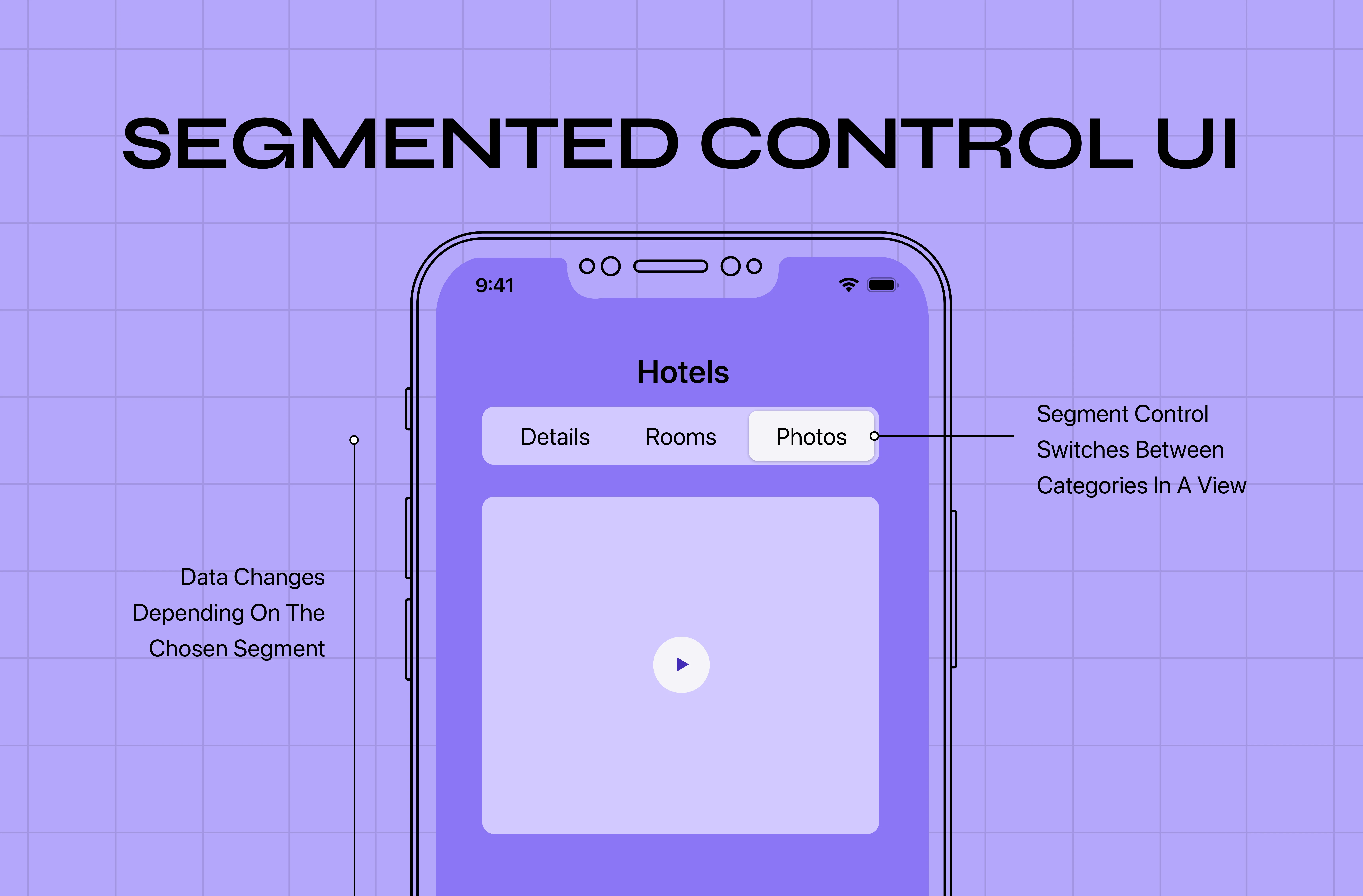
Segment: Consumer Airbnb combines sign-in and sign-up into a single modal, a job often handled by a segmented control, asking for a phone number before offering alternative methods. The structure is vertically stacked with a bold, unmissable primary CTA. 

Why it works: A phone-first approach matches how a large share of its global user base actually verifies identity, and folding two flows into one modal removes an unnecessary extra step.

5. Netflix
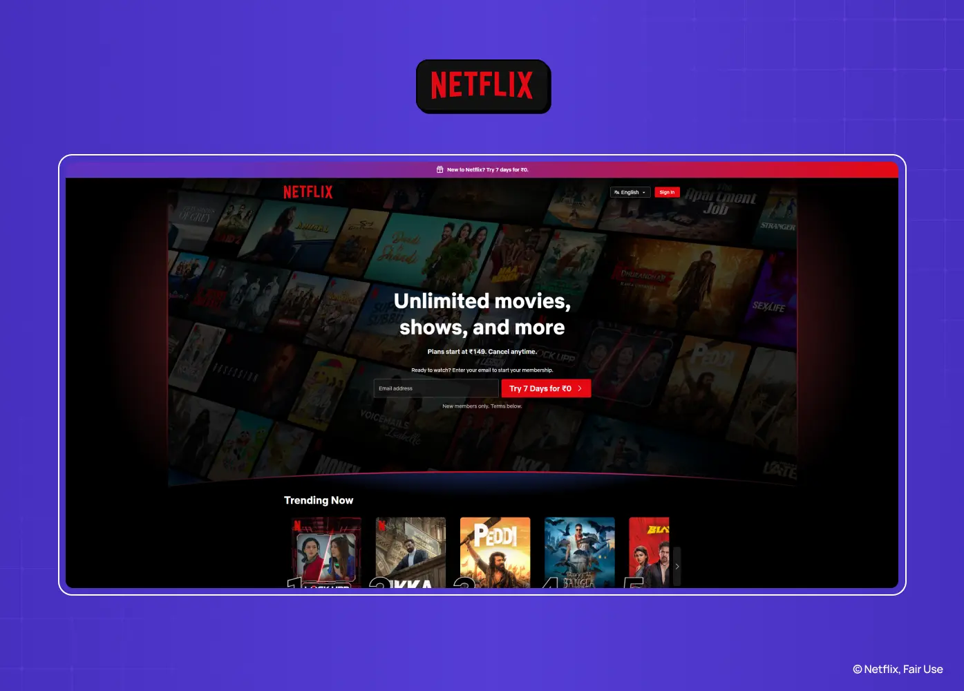
Netflix homepage combining account sign-in with a prominent free trial call-to-action and streaming content previews.

Segment: Consumer / Entertainment The dark-themed login supports email or phone number entry, with a one-time code alternative for anyone who's forgotten their password. Once signed in, users land on a lightweight profile picker. 

Why it works: The OTP option quietly reduces password-related drop-off, and the profile picker that follows keeps the momentum going right after login instead of dumping users into a blank state.

6. Spotify
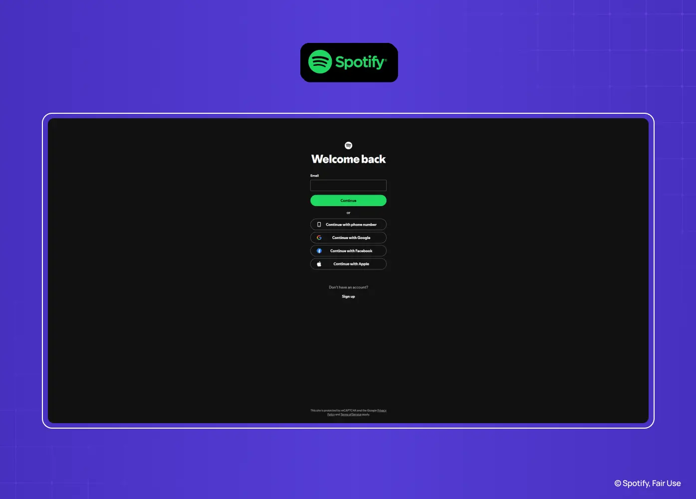
Spotify login screen featuring email entry, social authentication options, and a dark-themed interface centered on quick access.

Segment: Consumer / Entertainment Spotify's dark UI offers several fast paths in: Google, Facebook, Apple, or phone number, all stacked with equal visual weight. A "Remember me" toggle and a clearly placed "Forgot password?" link round it out. 

Why it works: No single login method is pushed as mandatory, which respects the fact that different users arrive with different habits and accounts already set up.

7. Canva
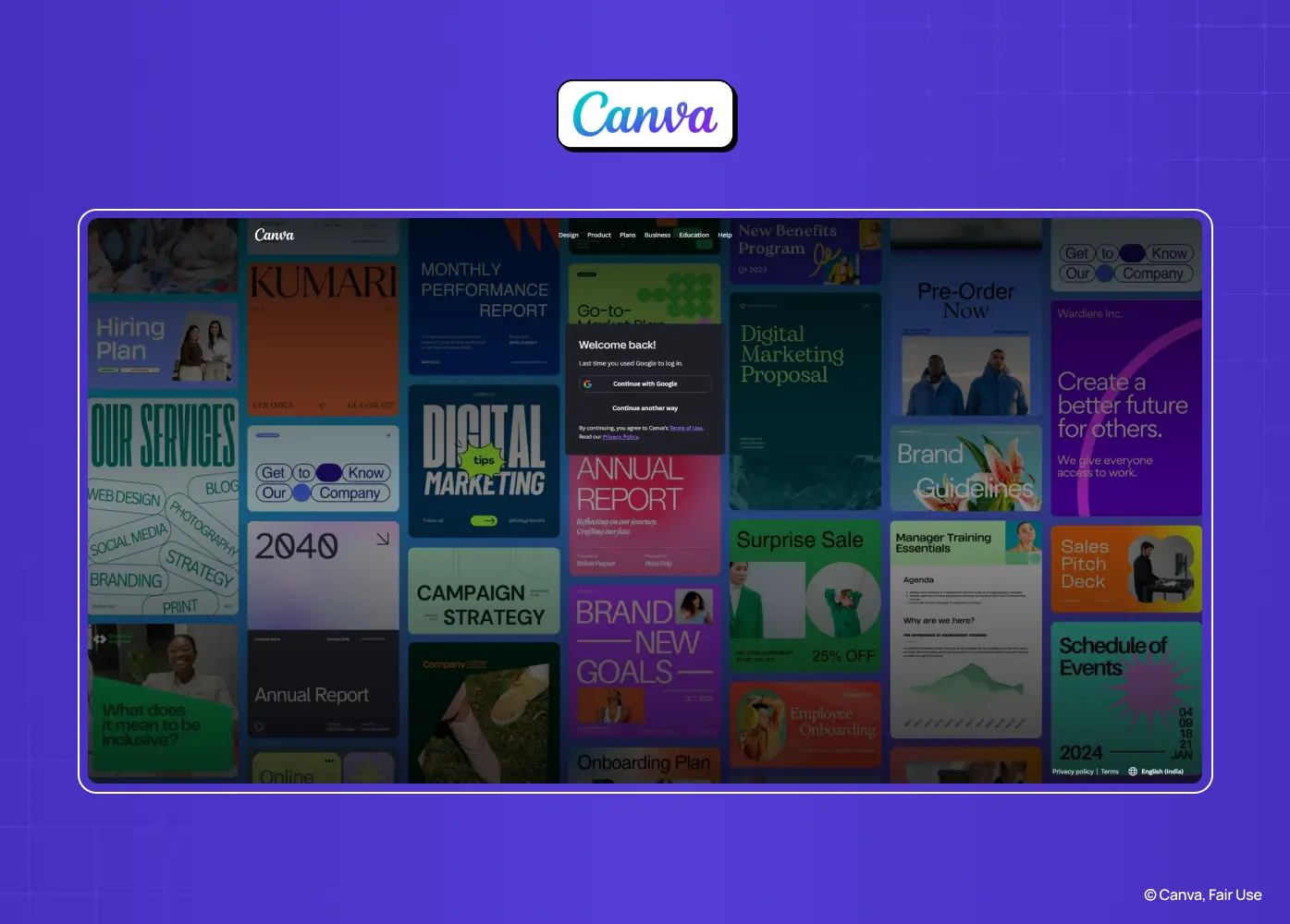
Canva login modal displayed over design templates, providing multiple authentication methods while keeping creative work visible.

Segment: SaaS / Creative The modal splits the screen visually: form on one side, lifestyle photography on the other. Users can choose standard password entry or a passwordless, code-based alternative. 

Why it works: The visual split keeps brand storytelling present without slowing down the actual task, and the optional passwordless path lowers friction for people who log in often.

8. Discord
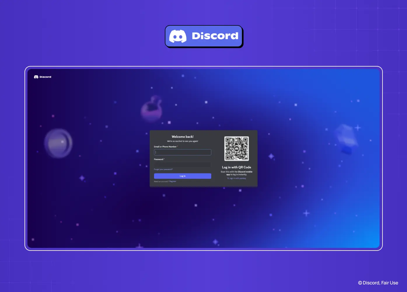
Discord login page featuring email and password fields alongside QR code authentication for fast device sign-in.

Segment: Consumer / Community Alongside the standard form, Discord offers a QR code scan for near-instant login from a paired mobile device, plus a passkey option built directly into the flow rather than buried in settings. 

Why it works: The QR path speaks directly to a mobile-first, always-connected user base, while the passkey option puts modern authentication front and center instead of treating it as an edge case.

9. Headspace
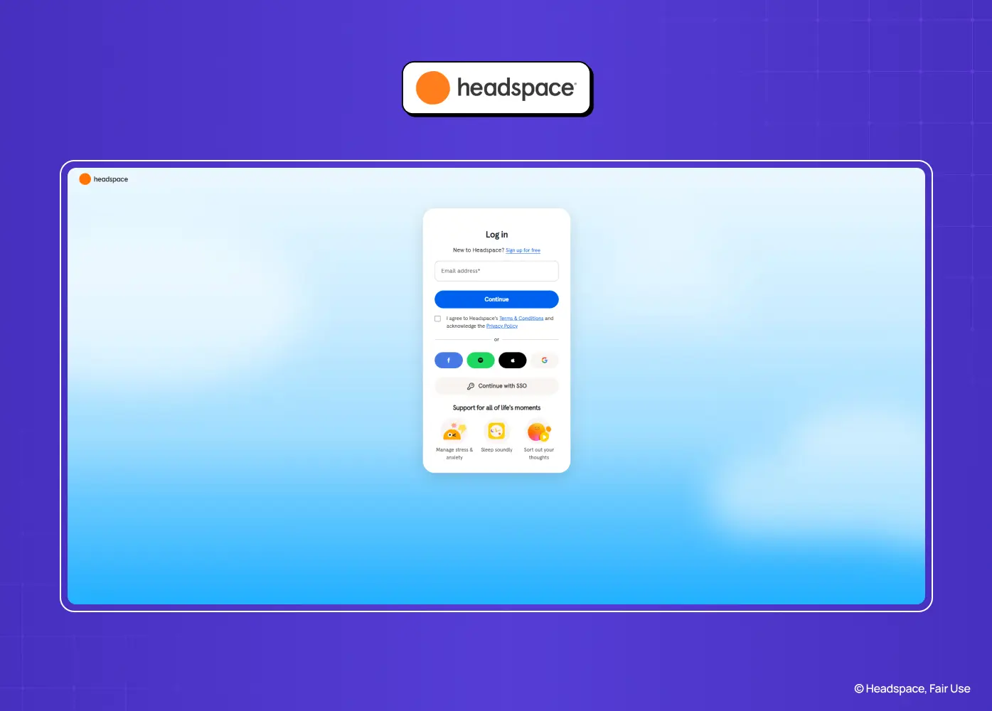
Headspace login page with email authentication, social sign-in options, and a calm, mobile-first interface.

Segment: Consumer A split-screen layout pairs a friendly message with a rounded, softly shadowed login card. Copy throughout is empathetic rather than clinical, and social login icons are used instead of full-width buttons to keep visual noise down. 

Why it works: The interface itself reflects the product's purpose. A calm, uncluttered login screen builds the same sense of ease the app is trying to sell before a user even opens it.

10. Dropbox
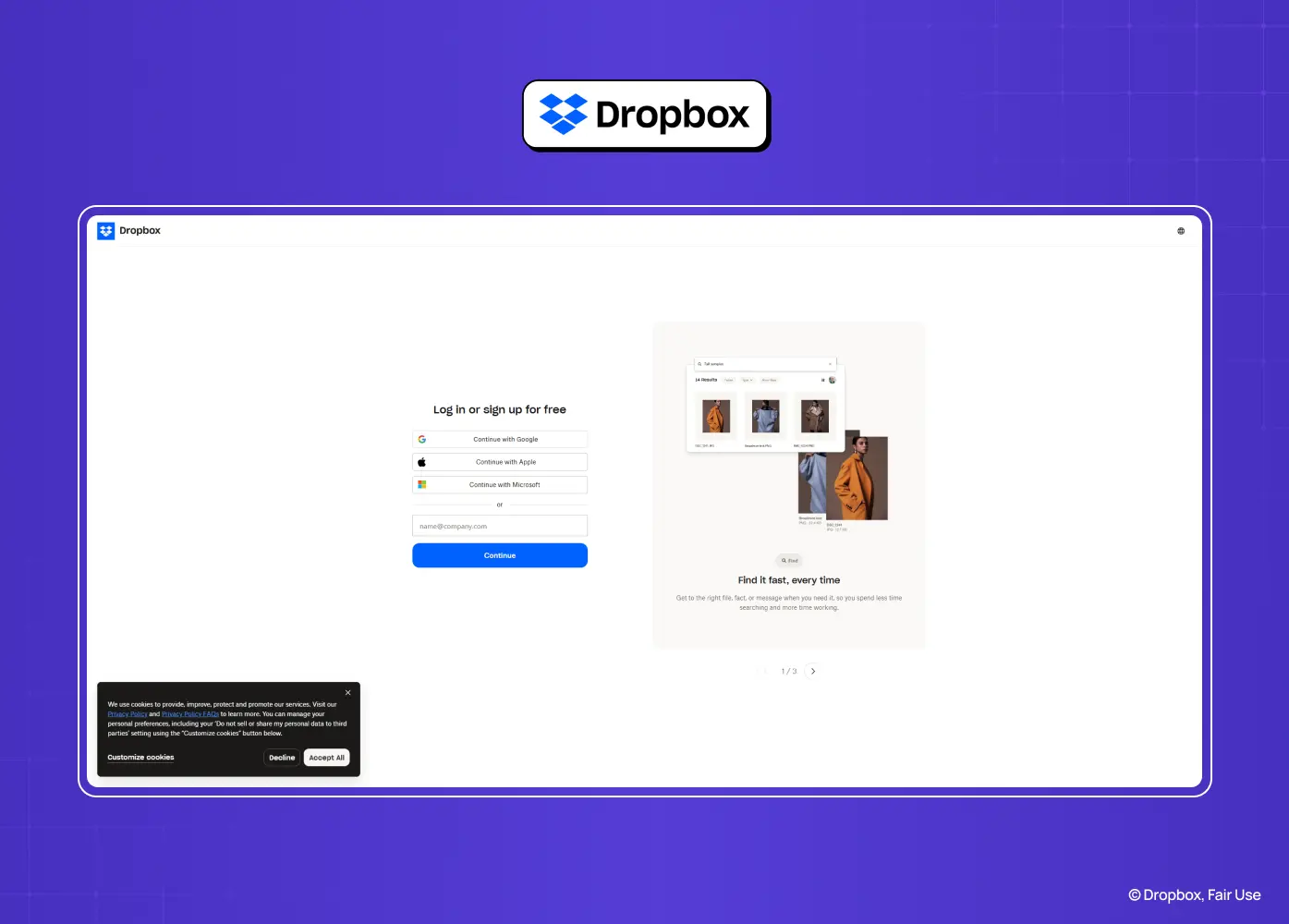
Dropbox sign-in page combining social login, email authentication, and a product preview to reinforce value before login.

Segment: SaaS The layout is a minimal single column, but it quietly detects whether an email belongs to a business account and adjusts to show SSO options automatically. 

Why it works: Personal and enterprise users get two very different needs met through one flow, without forcing either group to hunt for the right path manually.

11. Trello (Atlassian)
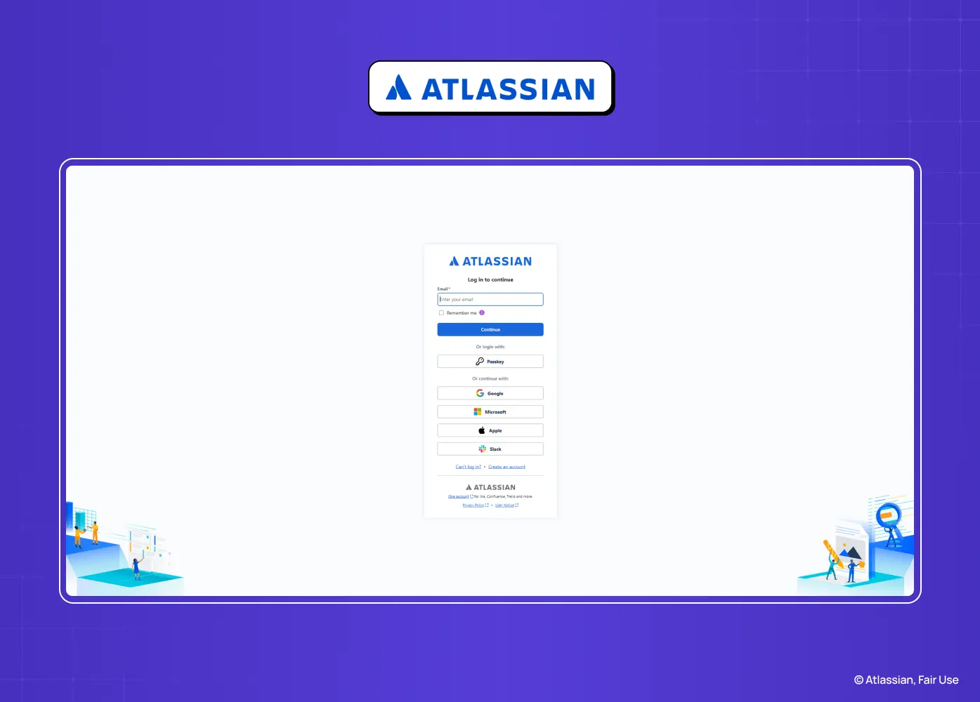
Atlassian login page supporting email, Google, Microsoft, Apple, and SSO authentication in a clean enterprise-focused layout.

Segment: SaaS / Enterprise Trello uses a stepped flow: email first, then password on a second screen, with account switching built directly into that second step for anyone managing multiple workspaces. 

Why it works: Splitting the flow reduces how much a user has to process at once, and surfacing account switching early prevents a common source of confusion for people juggling several teams.

12. Zoom
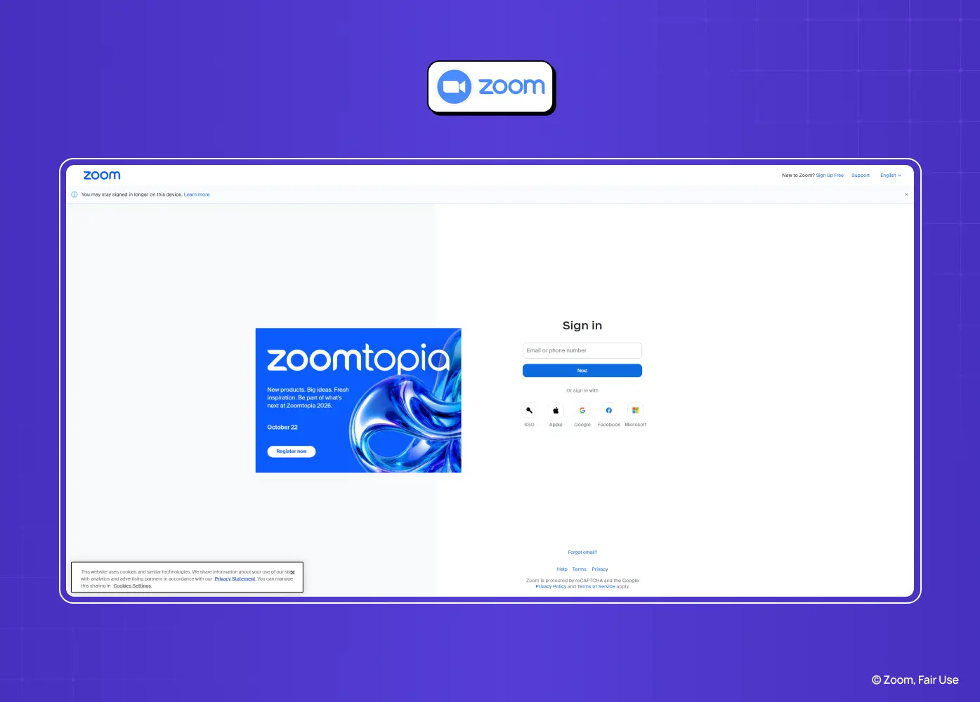
Zoom sign-in page featuring email login, social authentication, and promotional content alongside the authentication form.

Segment: SaaS A split layout pairs the sign-in form with a promotional banner highlighting upcoming features or events. The form itself includes a password visibility toggle and immediate inline error feedback. 

Why it works: The promotional space uses otherwise idle screen real estate without competing with the core task, and the visibility toggle plus inline validation cut down on repeated failed attempts.

13. Figma
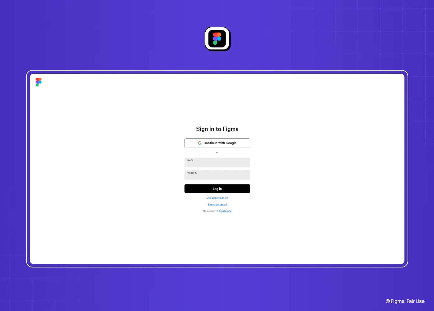
Figma login page with Google sign-in, email and password fields, and a simple, developer-friendly authentication experience.

Segment: SaaS / Creative Figma weighs Google login and SSO equally with the email field, rather than visually prioritizing one over the others. The layout stays centered and clean regardless of which path a user takes. 

Why it works: Figma's user base spans solo designers and large enterprise teams, so no method is treated as the "default," which avoids alienating either group.

14. Webflow
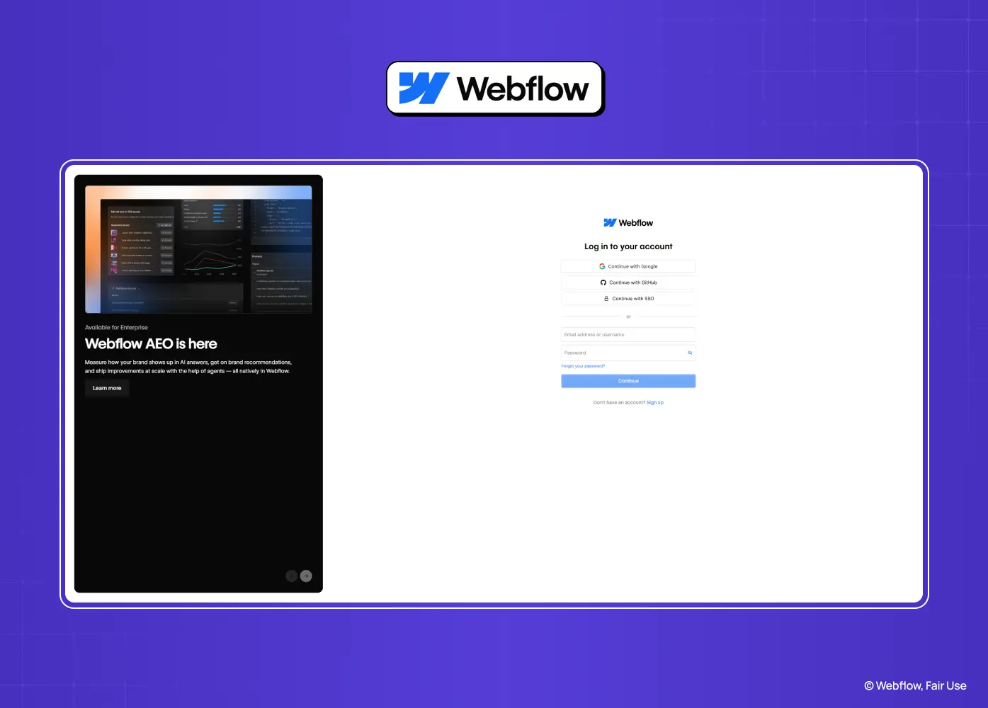
Webflow login page paired with a product showcase, offering email, Google, GitHub, and SSO authentication options.

Segment: SaaS Password requirements are shown proactively, before a user submits the form, rather than appearing only after a failed attempt. The rest of the layout stays a clean single column. 

Why it works: Preventing an error is almost always better than reacting to one. Showing the rules upfront saves users a round trip and avoids the frustration of a rejected submission.

15. Stripe
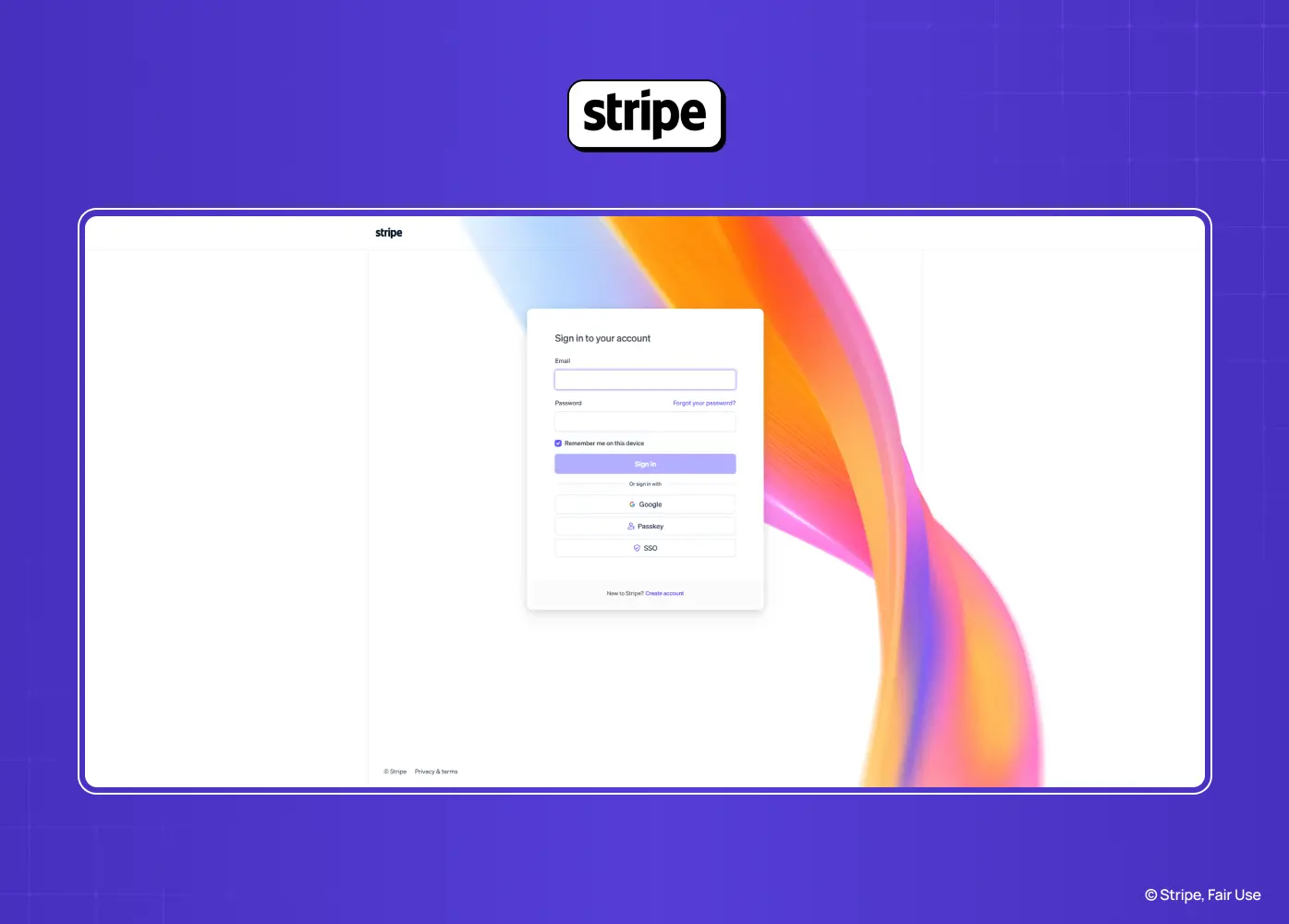
Stripe sign-in page featuring email and password authentication, social login options, and a vibrant branded background.

Segment: SaaS / Enterprise The form is minimal and high-contrast, with security-forward microcopy and a visible two-factor authentication prompt built into the flow rather than tucked away in settings. 

Why it works: Every element reinforces that this is a platform handling sensitive financial data. The visible 2FA step builds confidence rather than feeling like an obstacle.

16. Behance
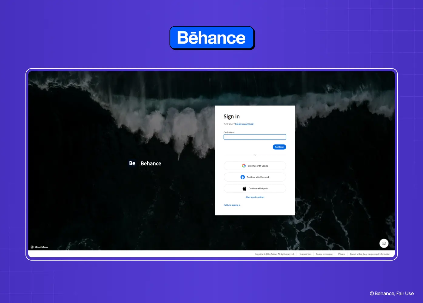
Behance login page over a full-screen creative background with Adobe, Google, Facebook, and Apple sign-in options.

Segment: Creative A centered modal sits over a rotating creative background that showcases community work. Sign-in options are listed cleanly below, without competing with the background imagery. 

Why it works: The background does double duty as both branding and inspiration, while the modal itself stays functional and distraction-free so it doesn't turn into a gallery instead of a login screen.

17. GitHub
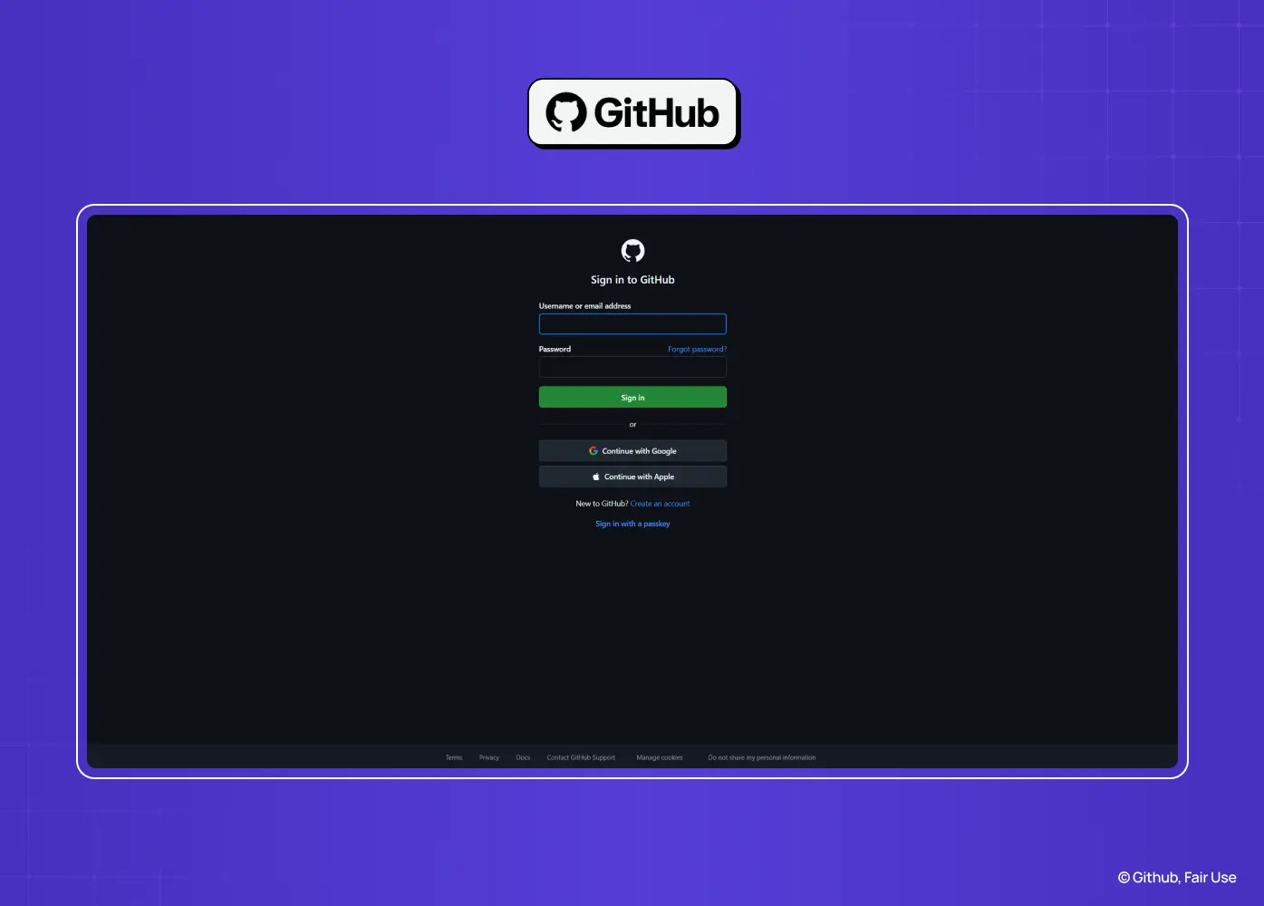
GitHub sign-in page with email, password, and social authentication options presented in the platform's signature dark theme.

Segment: SaaS / Developer GitHub keeps the layout deliberately plain: a centered form, a single primary field order, and a clear link to two-factor recovery methods for anyone locked out. 

Why it works: For a developer audience, a no-frills, fast-loading login page design signals reliability more than any visual flourish would. Function over decoration fits the product and the users.

18. Linear
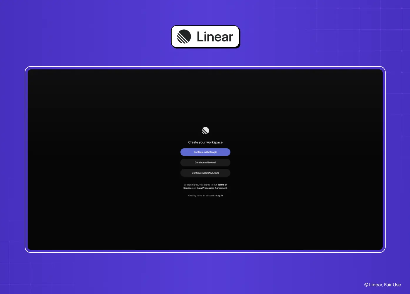
Linear workspace creation page featuring Google, email, and SSO sign-up options in a minimalist dark interface.

Segment: SaaS The login screen uses a dark, minimal interface with a single email field leading into a magic-link flow. There's a subtle animated gradient in the background, understated rather than distracting. 

Why it works: It mirrors the product's own design philosophy: fast, quiet, and focused. The magic-link approach also removes password friction entirely, consistent with Linear's speed-first positioning.

19. Asana
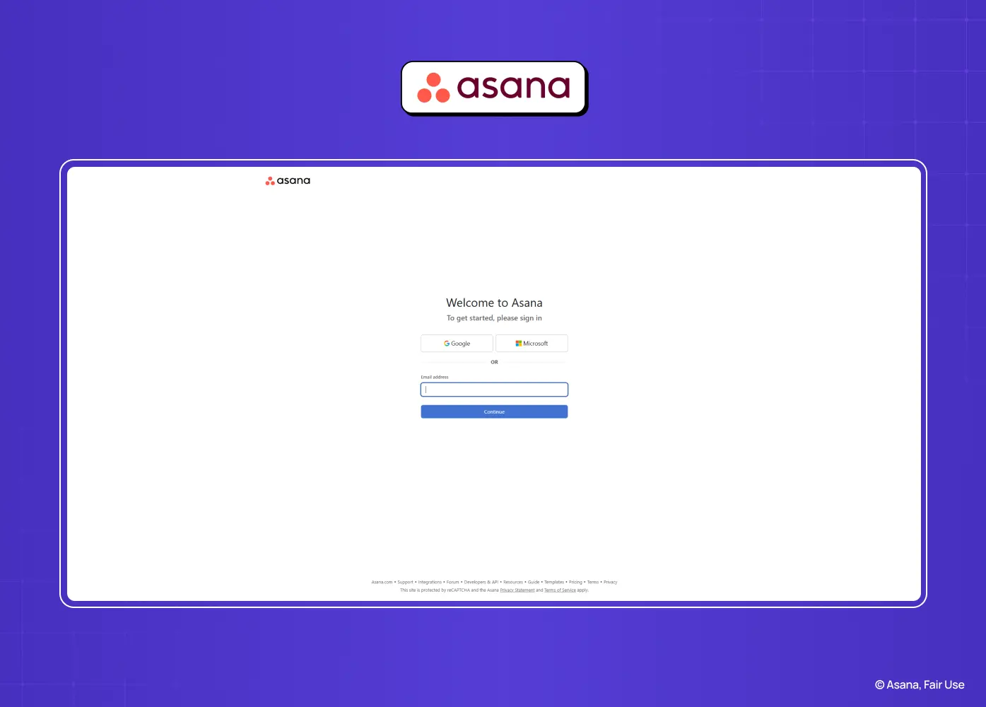
Asana welcome page offering Google, Microsoft, and email sign-in options through a clean, productivity-focused interface.

Segment: SaaS / Enterprise A split-screen layout pairs the form with rotating illustrations that hint at the product's task and project features. SSO detection kicks in automatically for recognized work email domains. 

Why it works: The illustrations soften what could otherwise be a purely transactional screen, and automatic SSO detection saves time for the large share of users logging in through a company account.

20. Instagram
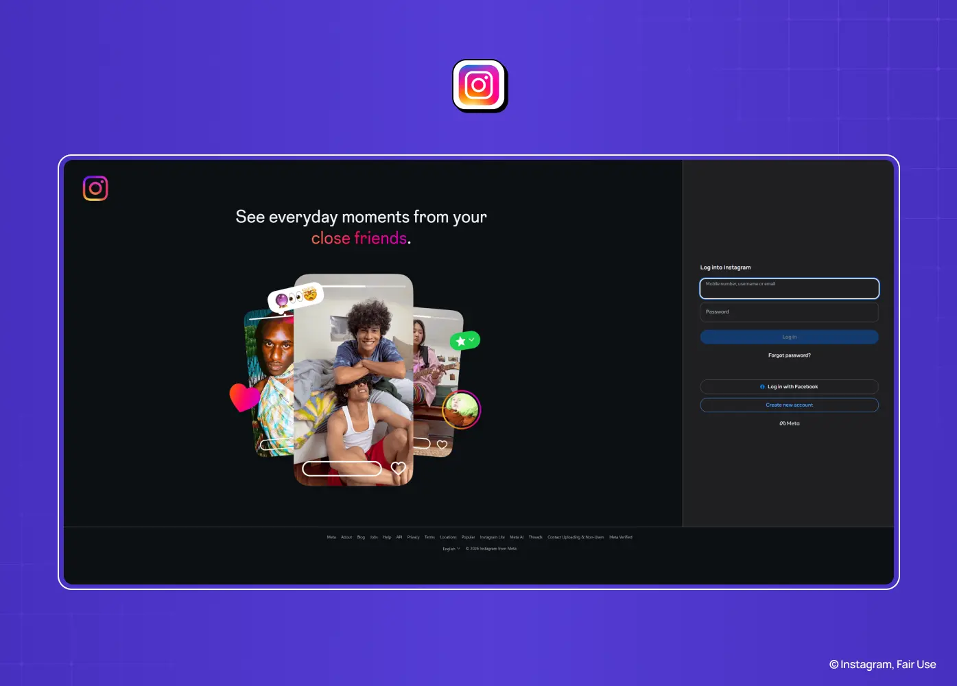
Instagram login page featuring a split-screen layout with a visual preview of the app, email and password fields, and options for Facebook login, password recovery, and account creation.

Segment: Consumer On mobile, the login screen supports username, email, or phone number in a single field, with minimal surrounding UI. Returning users see a personalized "Continue as" option with their profile photo. 

Why it works: Recognizing returning users and shortcutting the flow to a single tap removes nearly all friction for the most common use case, logging back into an account you already have.

Designing for Enterprise SSO

If you're building a SaaS login page for a business audience, single sign-on changes the shape of the flow, and it's worth designing for deliberately rather than bolting on.

Most enterprise flows start with domain detection: a user enters their work email, and the product checks whether that domain is federated to an identity provider like Okta, Azure AD, or Google Workspace. If it is, the flow branches into a stepped pattern rather than showing a password field at all, since the account's credentials live with the IdP, not with you. The user is redirected to their identity provider, authenticates there, and is sent back to your product already signed in.

The design challenge is mostly in the fallback state: what happens when detection fails, when a user's domain isn't yet configured for SSO, or when someone tries to log in with a personal email at a company that requires SSO. Dropbox and Asana both handle this by defaulting quietly back to standard email and password rather than blocking the user with an error, which keeps the flow moving even when the ideal path isn't available.

Error States, Validation, and Lockouts

Errors are inevitable in any login flow. What separates a well-designed one is how specific and timely the feedback is.

  • Validate inline, not just on submit. Flag issues as the user moves between fields (on blur) rather than waiting for a failed submission.

  • Name the field and the fix. "Something went wrong" tells a user nothing. "That email format looks incorrect" tells them exactly what to check, which is microcopy doing real work.

  • Place the message next to the field it refers to, not in a generic banner at the top of the page, so there's no guessing which input caused it.

  • Show password rules before submission, not as a rejection message afterward.

  • Handle lockouts with clarity, not silence. After repeated failed attempts, tell the user their account is temporarily locked and roughly how long that lasts, and surface a password reset option right at that moment instead of making them hunt for it.

  • Be deliberately vague on one specific point: whether an account exists. A message like "no account found with that email" is friendlier, but it also confirms to an attacker which emails are registered. Many products intentionally use a neutral message instead, trading a small amount of user clarity for a real security benefit. It's a genuine trade-off worth making consciously rather than defaulting into it.

Designing Login for Mobile

A login screen that works on desktop can quietly fail on mobile if these mobile-first design details are skipped.

  • Set the right input type. Using an email-specific input type brings up a keyboard with the @ symbol visible, instead of forcing users to switch keyboards mid-entry.

  • Support password manager autofill. Marking the password field correctly lets browsers and system password managers fill it automatically, which removes typing altogether for most returning users.

  • Size tap targets properly. Apple's Human Interface Guidelines and Google's Material Design both recommend touch targets in the 44 to 48 point range at minimum, smaller buttons increase mis-taps and retries.

  • Keep the primary action visible above the keyboard. If the "Log in" button gets pushed off-screen once the keyboard opens, users have to scroll or dismiss the keyboard just to submit, which is an easy fix that gets missed often.

  • Support device-level biometrics where available. Face ID, Touch ID, and Android biometric prompts remove the password step entirely for a huge share of returning mobile sessions.

Accessibility Requirements for Login Screens

A login screen is arguably the highest-stakes accessibility surface in any product, because failing it doesn't just create a worse experience, it locks a user out of the product entirely.

  • Meet contrast minimums. WCAG 2.2 AA calls for at least 4.5:1 contrast for body text and 3:1 for large text and UI components like input borders and icons.

  • Keep focus indicators visible. Don't strip default focus outlines without replacing them with an equally visible custom state. Keyboard users need to see exactly where they are on the page.

  • Use real labels, not placeholder-only fields. Placeholder text disappears the moment a user starts typing and is inconsistently read by screen readers, so it should support a visible label, not replace one.

  • Announce errors properly. Linking an error message to its field programmatically (so assistive technology reads them together) ensures a screen reader user actually hears what went wrong, not just that something did.

  • Make the entire flow keyboard-operable, including the password visibility toggle, which is easy to accidentally build as mouse-only.

  • Avoid pure cognitive-function tests as the only path in. WCAG 2.2 introduced a specific success criterion (3.3.8, Accessible Authentication) that prohibits requiring a user to solve a puzzle or recall something purely from memory as the sole authentication step, unless an alternative is offered. This is directly relevant to some CAPTCHA and security-question patterns still in use today.

The Handoff: What Happens After the Button

Almost every login article, including the ones we researched for this one, stops analyzing the moment someone clicks the login button. That's a mistake, because what happens in the next second matters just as much as everything before it.

A jarring jump from a clean login screen into a cluttered, unstyled dashboard undercuts the good first impression the login flow just built. A few things worth designing deliberately:

  • Use a proper loading state. A skeleton screen that hints at the layout to come feels faster and more intentional than a generic spinner, even when the actual load time is identical.

  • Preserve intent. If a user was trying to reach a specific page before they were prompted to log in, send them there after authenticating instead of defaulting to a generic home screen.

  • Differentiate returning users from long-absent ones. Netflix's profile picker after login is a good example: it keeps momentum going for an already-familiar user rather than treating every login as a first visit.

  • Handle the empty state gracefully. For a genuinely new account with no data yet, the first authenticated screen needs its own design, not just the same dashboard with nothing in it, since this is where onboarding to retention really begins.

How to Measure Login Performance

Good login page design isn't something you finish and walk away from. A few metrics tell you whether it's actually working:

  • Login success rate on the first attempt. A declining number here usually points to a UX issue, not a user problem.

  • Time from page load to authenticated. Track this across the full flow, not just form-fill time, to catch slow redirects or SSO handoffs.

  • Password reset request rate. A rising trend is often the earliest warning sign that something in the flow is failing, well before it shows up in broader churn numbers.

  • Drop-off by step, especially between an identifier field and a password field in stepped flows, which shows exactly where people are giving up, the same way you'd trace onboarding drop-offs.

  • Error rate by field and by auth method, so you can tell whether the friction is coming from the password field specifically or from a particular SSO or social login integration.

Treat these as directional signals to watch over time rather than fixed benchmarks to hit, since acceptable ranges vary a lot by product type and user base.

Localization and RTL Considerations

If your product ships in more than one market, the login screen needs to be designed for that from the start, not patched in later.

  • Support international phone formats with proper country code selection rather than assuming a single format.

  • Mirror the layout for right-to-left languages like Arabic and Hebrew, which affects not just text direction but icon placement and the visual flow of the form itself.

  • Leave room for text expansion. German and Russian labels can run 30% longer than their English equivalents, and a tightly fitted button or field will break under that.

  • Match auth defaults to the market. Airbnb and WhatsApp both lead with phone-first login, which reflects the fact that phone numbers are a more universal identifier than email in many of the regions they operate in.

Login Page Design Best Practices

Pulling the threads above together, a few practices are worth repeating on their own:

  • Ask for only what's necessary. Every extra field is a reason to abandon the flow, which is the same lever behind form conversion rates everywhere else on your site.

  • Offer one or two alternative login methods, not five. Too many options creates decision fatigue instead of removing friction.

  • Make password recovery genuinely easy to find. Bury it and you'll lose people who've simply forgotten a password, not people who've abandoned your product.

  • Keep branding present but quiet. Logo, color, and tone should be recognizable without competing with the form itself.

  • Design for return visits, not just first ones. Remembered emails, saved preferences, and consistent layouts matter more to your most loyal users than to first-timers.

  • Detect context where you can. Auto-recognizing business emails for SSO, or returning users for a shortcut, removes steps without asking the user to do anything extra.

Common Mistakes We Still See

A few patterns worth avoiding, alongside the broader UI/UX mistakes that hurt conversions, that don't fit neatly into the sections above:

  • Overloading the screen with login methods. Five or six options rarely gets used the way designers hope, it just adds clutter.

  • Treating "Remember me" as an all-or-nothing setting. It should extend convenience, not quietly turn into "stay logged in forever" on a shared or public device.

  • No visual hierarchy between primary and secondary actions. If the login button and a secondary link carry equal visual weight, users hesitate over which one to trust, a classic entry in any list of bad UX design examples.

  • Skipping a real trust and security section for B2B products. A generic padlock icon reassures no one; a linked security page and real compliance badges do.

Conclusion

A few things worth carrying forward:

  • Treat this screen as part of the product experience, not a formality before it, and design the moment right after login just as deliberately.

  • Pick a layout pattern that matches how your users actually behave, not the one that looks trendiest.

  • Build in accessibility, mobile handling, and error states from the start rather than patching them in later.

  • Borrow what works from the examples above, but design for your specific users, not a generic template.

  • Keep measuring it. What works for a consumer app rarely works the same way for an enterprise tool.

If you're rethinking your own product's entry point, this is exactly the kind of detail-level work our team at Groto handles daily, from layout decisions down to microcopy, accessibility, and the metrics that tell you if it's working. Happy to take a look at what you've got and tell you honestly what's working and what isn't.

Your login page design is doing more work than you think. It's the first real product experience a user has. Here are the layouts, patterns, and details that separate a forgettable login screen from one that builds trust.

Fifteen login page examples, the patterns behind them, and what actually works.

Illustration of a user signing into a digital product with a laptop, password key, and chat icons representing secure login and authentication.

A good login page design gets users in fast, without making them think. Baymard Institute's research puts a real number on why this matters: password reset issues alone drive an average 18.75% checkout abandonment rate for returning users, and up to 19% when password rules are overly strict. Below, I've broken down 20 real login screens, the anatomy behind them, accessibility and mobile requirements, and the practices worth borrowing for your own product.

At Groto, we design login flows as part of almost every SaaS product we touch, and one thing has stayed consistent: users don't visit a login screen to admire it. They visit it to get past it. That doesn't mean it should be an afterthought. It's the first real interaction someone has with your product, and it sets the tone for everything after.

This isn't another generic roundup. We're breaking down what's actually happening in each of these screens, from a design standpoint, the same way we do with product page design examples, so you can apply the same thinking to your own product.

What Is a Login Page?

A login page is the screen that stands between a returning user and their account. It asks for some form of credential, usually an email or username paired with a password, and confirms that the person on the other end is who they say they are.

It's easy to think of this as purely a security checkpoint, but it's also a design surface. The fields you ask for, the order you ask them in, the feedback you give when something goes wrong, and the alternative paths you offer (social login, magic links, SSO, passkeys) all shape whether that checkpoint feels like a formality or a frustration. A login screen and a sign-up page design often share a similar visual language, but they serve different jobs: one authenticates, the other onboards.

Why This Screen Deserves More Attention Than It Gets

It's easy to treat this as a checkbox screen: two fields, a button, done. But a few things are riding on it.

  • First impressions form here, much like homepage design principles shape a first visit. Before a user sees your dashboard, your features, or your value, they see this screen. It's the first signal of how polished the rest of the product will be.

  • Friction here means lost users, and it's measurable. Baymard's research found an 18.75% average abandonment rate tied specifically to password-reset email issues among returning users. That's not a vague usability concern, it's a direct hit to website conversion.

  • It's a trust signal. Clear password guidance, visible security cues, and predictable behavior tell users their data is in safe hands before they've even logged in.

  • It shapes retention, not just acquisition. Returning users hit this screen every single time. A clunky one adds friction to a relationship you're trying to build.

Common Login Layout Patterns You'll Run Into

Before looking at individual products, it helps to know the handful of layouts almost everything is built on, and how they differ from an entry screen like a splash page:

  • Single-column, centered form. Just the fields, centered on the page. No distractions. Common for tools where users already know what they're signing into.

  • Split-screen. Form on one side, brand imagery or value proposition on the other, borrowing from the best landing page design examples. Popular with SaaS products that want to reinforce why someone's logging in.

  • Modal overlay. The login form appears over the product itself, so users can explore before committing. Common on consumer platforms.

  • Stepped or progressive. Email first, password second, sometimes with SSO detection in between. Reduces visual load and works well for enterprise tools.

  • Magic link or OTP. A code or link replaces the password entirely, sent to email or phone. Removes password friction but adds a small wait.

  • Passkeys (WebAuthn). Biometric or device-based authentication (Face ID, Touch ID, a security key) replaces both the password and the wait. This is quickly becoming the standard for high-frequency, high-security products rather than an experimental extra.

Most sign-in page design decisions come down to picking the right one of these for your users, not inventing a new one.

Anatomy of a Login Page

Zooming into the screen itself, most login pages are built from the same handful of components. How you design each one, following basic visual design principles, matters as much as the overall layout.

Identifier field

This is the email, username, or phone number field. Default to email where possible since it's easier for users to recall than a custom username, and it doubles as a recovery channel. If your user base has established usernames (gaming platforms, forums), a flexible single field that accepts either avoids forcing people to remember which one they registered with.

Password field

Pair it with a visibility toggle so users can confirm what they've typed instead of guessing, one of the micro UX patterns that pays for itself immediately.Show password requirements before submission, not after a rejected attempt. Current guidance from NIST favors length over complex character rules (a long, memorable phrase over "must include one symbol and one number"), and interfaces are increasingly following that lead.

Primary CTA

One clearly dominant button. If "Log in" and secondary actions like "Forgot password" carry the same visual weight, users hesitate over which one to use.

Alternative authentication methods

Social login, SSO, magic links, or passkeys. Keep this to one or two options beyond the standard field, and visually separate them from the primary path with a divider or clear grouping rather than stacking everything with equal weight.

Trust and security footer

This is where SOC 2 or ISO badges, links to a security or trust page, and terms and privacy links typically live. It matters more for B2B products, where a buyer is evaluating whether to trust you with company data, than for consumer apps. A generic padlock icon or the word "secure" on its own does little, specific, verifiable credentials do more.

Help and recovery links

"Forgot password," account recovery, and support contact should be visible without hunting, but styled as secondary so they don't compete with the primary action.

20 Login Page Examples Worth Studying

1. Notion

Notion login page featuring email entry, social sign-in options, and SSO authentication in a clean, minimalist interface.

Segment: SaaS Notion uses a centered card layout with generous white space and sharp typographic hierarchy. Multiple authentication methods (Google, Apple, email) are listed upfront rather than hidden behind a "more options" link, which keeps the choice visible without cluttering the card. 

Why it works: The visual hierarchy directs attention to the primary action first, while still surfacing flexibility for users who prefer a different method. Monochrome styling keeps it consistent with the product's minimalist identity.

2. Slack

Slack sign-in page prompting users to enter their work email with Google and Apple login options for a streamlined authentication flow.

Segment: SaaS Slack's mobile flow starts with just an email field. Once submitted, a verification link is sent, and users are redirected straight into their workspace once confirmed. There's no password field anywhere in the process. 

Why it works: Removing the password entirely removes the single biggest point of friction (and support tickets) in most login flows. It also sidesteps weak password risk without adding extra steps.

3. Duolingo

Duolingo login page with email and password fields, social login options, and a distraction-free dark interface.

Segment: Consumer The login modal is vertically centered and stripped to essentials. Primary and secondary actions are visually distinguished by color and weight, so users always know which button moves them forward. 

Why it works: A lightweight modal keeps attention on the task without pulling users out of the app experience entirely. The clear hierarchy between standard and social sign-in avoids decision fatigue.

4. Airbnb

Airbnb sign-in modal over a colorful destination gallery, offering email and social login options for quick account access.

Segment: Consumer Airbnb combines sign-in and sign-up into a single modal, a job often handled by a segmented control, asking for a phone number before offering alternative methods. The structure is vertically stacked with a bold, unmissable primary CTA. 

Why it works: A phone-first approach matches how a large share of its global user base actually verifies identity, and folding two flows into one modal removes an unnecessary extra step.

5. Netflix

Netflix homepage combining account sign-in with a prominent free trial call-to-action and streaming content previews.

Segment: Consumer / Entertainment The dark-themed login supports email or phone number entry, with a one-time code alternative for anyone who's forgotten their password. Once signed in, users land on a lightweight profile picker. 

Why it works: The OTP option quietly reduces password-related drop-off, and the profile picker that follows keeps the momentum going right after login instead of dumping users into a blank state.

6. Spotify

Spotify login screen featuring email entry, social authentication options, and a dark-themed interface centered on quick access.

Segment: Consumer / Entertainment Spotify's dark UI offers several fast paths in: Google, Facebook, Apple, or phone number, all stacked with equal visual weight. A "Remember me" toggle and a clearly placed "Forgot password?" link round it out. 

Why it works: No single login method is pushed as mandatory, which respects the fact that different users arrive with different habits and accounts already set up.

7. Canva

Canva login modal displayed over design templates, providing multiple authentication methods while keeping creative work visible.

Segment: SaaS / Creative The modal splits the screen visually: form on one side, lifestyle photography on the other. Users can choose standard password entry or a passwordless, code-based alternative. 

Why it works: The visual split keeps brand storytelling present without slowing down the actual task, and the optional passwordless path lowers friction for people who log in often.

8. Discord

Discord login page featuring email and password fields alongside QR code authentication for fast device sign-in.

Segment: Consumer / Community Alongside the standard form, Discord offers a QR code scan for near-instant login from a paired mobile device, plus a passkey option built directly into the flow rather than buried in settings. 

Why it works: The QR path speaks directly to a mobile-first, always-connected user base, while the passkey option puts modern authentication front and center instead of treating it as an edge case.

9. Headspace

Headspace login page with email authentication, social sign-in options, and a calm, mobile-first interface.

Segment: Consumer A split-screen layout pairs a friendly message with a rounded, softly shadowed login card. Copy throughout is empathetic rather than clinical, and social login icons are used instead of full-width buttons to keep visual noise down. 

Why it works: The interface itself reflects the product's purpose. A calm, uncluttered login screen builds the same sense of ease the app is trying to sell before a user even opens it.

10. Dropbox

Dropbox sign-in page combining social login, email authentication, and a product preview to reinforce value before login.

Segment: SaaS The layout is a minimal single column, but it quietly detects whether an email belongs to a business account and adjusts to show SSO options automatically. 

Why it works: Personal and enterprise users get two very different needs met through one flow, without forcing either group to hunt for the right path manually.

11. Trello (Atlassian)

Atlassian login page supporting email, Google, Microsoft, Apple, and SSO authentication in a clean enterprise-focused layout.

Segment: SaaS / Enterprise Trello uses a stepped flow: email first, then password on a second screen, with account switching built directly into that second step for anyone managing multiple workspaces. 

Why it works: Splitting the flow reduces how much a user has to process at once, and surfacing account switching early prevents a common source of confusion for people juggling several teams.

12. Zoom

Zoom sign-in page featuring email login, social authentication, and promotional content alongside the authentication form.

Segment: SaaS A split layout pairs the sign-in form with a promotional banner highlighting upcoming features or events. The form itself includes a password visibility toggle and immediate inline error feedback. 

Why it works: The promotional space uses otherwise idle screen real estate without competing with the core task, and the visibility toggle plus inline validation cut down on repeated failed attempts.

13. Figma

Figma login page with Google sign-in, email and password fields, and a simple, developer-friendly authentication experience.

Segment: SaaS / Creative Figma weighs Google login and SSO equally with the email field, rather than visually prioritizing one over the others. The layout stays centered and clean regardless of which path a user takes. 

Why it works: Figma's user base spans solo designers and large enterprise teams, so no method is treated as the "default," which avoids alienating either group.

14. Webflow

Webflow login page paired with a product showcase, offering email, Google, GitHub, and SSO authentication options.

Segment: SaaS Password requirements are shown proactively, before a user submits the form, rather than appearing only after a failed attempt. The rest of the layout stays a clean single column. 

Why it works: Preventing an error is almost always better than reacting to one. Showing the rules upfront saves users a round trip and avoids the frustration of a rejected submission.

15. Stripe

Stripe sign-in page featuring email and password authentication, social login options, and a vibrant branded background.

Segment: SaaS / Enterprise The form is minimal and high-contrast, with security-forward microcopy and a visible two-factor authentication prompt built into the flow rather than tucked away in settings. 

Why it works: Every element reinforces that this is a platform handling sensitive financial data. The visible 2FA step builds confidence rather than feeling like an obstacle.

16. Behance

Behance login page over a full-screen creative background with Adobe, Google, Facebook, and Apple sign-in options.

Segment: Creative A centered modal sits over a rotating creative background that showcases community work. Sign-in options are listed cleanly below, without competing with the background imagery. 

Why it works: The background does double duty as both branding and inspiration, while the modal itself stays functional and distraction-free so it doesn't turn into a gallery instead of a login screen.

17. GitHub

GitHub sign-in page with email, password, and social authentication options presented in the platform's signature dark theme.

Segment: SaaS / Developer GitHub keeps the layout deliberately plain: a centered form, a single primary field order, and a clear link to two-factor recovery methods for anyone locked out. 

Why it works: For a developer audience, a no-frills, fast-loading login page design signals reliability more than any visual flourish would. Function over decoration fits the product and the users.

18. Linear

Linear workspace creation page featuring Google, email, and SSO sign-up options in a minimalist dark interface.

Segment: SaaS The login screen uses a dark, minimal interface with a single email field leading into a magic-link flow. There's a subtle animated gradient in the background, understated rather than distracting. 

Why it works: It mirrors the product's own design philosophy: fast, quiet, and focused. The magic-link approach also removes password friction entirely, consistent with Linear's speed-first positioning.

19. Asana

Asana welcome page offering Google, Microsoft, and email sign-in options through a clean, productivity-focused interface.

Segment: SaaS / Enterprise A split-screen layout pairs the form with rotating illustrations that hint at the product's task and project features. SSO detection kicks in automatically for recognized work email domains. 

Why it works: The illustrations soften what could otherwise be a purely transactional screen, and automatic SSO detection saves time for the large share of users logging in through a company account.

20. Instagram

Instagram login page featuring a split-screen layout with a visual preview of the app, email and password fields, and options for Facebook login, password recovery, and account creation.

Segment: Consumer On mobile, the login screen supports username, email, or phone number in a single field, with minimal surrounding UI. Returning users see a personalized "Continue as" option with their profile photo. 

Why it works: Recognizing returning users and shortcutting the flow to a single tap removes nearly all friction for the most common use case, logging back into an account you already have.

Designing for Enterprise SSO

If you're building a SaaS login page for a business audience, single sign-on changes the shape of the flow, and it's worth designing for deliberately rather than bolting on.

Most enterprise flows start with domain detection: a user enters their work email, and the product checks whether that domain is federated to an identity provider like Okta, Azure AD, or Google Workspace. If it is, the flow branches into a stepped pattern rather than showing a password field at all, since the account's credentials live with the IdP, not with you. The user is redirected to their identity provider, authenticates there, and is sent back to your product already signed in.

The design challenge is mostly in the fallback state: what happens when detection fails, when a user's domain isn't yet configured for SSO, or when someone tries to log in with a personal email at a company that requires SSO. Dropbox and Asana both handle this by defaulting quietly back to standard email and password rather than blocking the user with an error, which keeps the flow moving even when the ideal path isn't available.

Error States, Validation, and Lockouts

Errors are inevitable in any login flow. What separates a well-designed one is how specific and timely the feedback is.

  • Validate inline, not just on submit. Flag issues as the user moves between fields (on blur) rather than waiting for a failed submission.

  • Name the field and the fix. "Something went wrong" tells a user nothing. "That email format looks incorrect" tells them exactly what to check, which is microcopy doing real work.

  • Place the message next to the field it refers to, not in a generic banner at the top of the page, so there's no guessing which input caused it.

  • Show password rules before submission, not as a rejection message afterward.

  • Handle lockouts with clarity, not silence. After repeated failed attempts, tell the user their account is temporarily locked and roughly how long that lasts, and surface a password reset option right at that moment instead of making them hunt for it.

  • Be deliberately vague on one specific point: whether an account exists. A message like "no account found with that email" is friendlier, but it also confirms to an attacker which emails are registered. Many products intentionally use a neutral message instead, trading a small amount of user clarity for a real security benefit. It's a genuine trade-off worth making consciously rather than defaulting into it.

Designing Login for Mobile

A login screen that works on desktop can quietly fail on mobile if these mobile-first design details are skipped.

  • Set the right input type. Using an email-specific input type brings up a keyboard with the @ symbol visible, instead of forcing users to switch keyboards mid-entry.

  • Support password manager autofill. Marking the password field correctly lets browsers and system password managers fill it automatically, which removes typing altogether for most returning users.

  • Size tap targets properly. Apple's Human Interface Guidelines and Google's Material Design both recommend touch targets in the 44 to 48 point range at minimum, smaller buttons increase mis-taps and retries.

  • Keep the primary action visible above the keyboard. If the "Log in" button gets pushed off-screen once the keyboard opens, users have to scroll or dismiss the keyboard just to submit, which is an easy fix that gets missed often.

  • Support device-level biometrics where available. Face ID, Touch ID, and Android biometric prompts remove the password step entirely for a huge share of returning mobile sessions.

Accessibility Requirements for Login Screens

A login screen is arguably the highest-stakes accessibility surface in any product, because failing it doesn't just create a worse experience, it locks a user out of the product entirely.

  • Meet contrast minimums. WCAG 2.2 AA calls for at least 4.5:1 contrast for body text and 3:1 for large text and UI components like input borders and icons.

  • Keep focus indicators visible. Don't strip default focus outlines without replacing them with an equally visible custom state. Keyboard users need to see exactly where they are on the page.

  • Use real labels, not placeholder-only fields. Placeholder text disappears the moment a user starts typing and is inconsistently read by screen readers, so it should support a visible label, not replace one.

  • Announce errors properly. Linking an error message to its field programmatically (so assistive technology reads them together) ensures a screen reader user actually hears what went wrong, not just that something did.

  • Make the entire flow keyboard-operable, including the password visibility toggle, which is easy to accidentally build as mouse-only.

  • Avoid pure cognitive-function tests as the only path in. WCAG 2.2 introduced a specific success criterion (3.3.8, Accessible Authentication) that prohibits requiring a user to solve a puzzle or recall something purely from memory as the sole authentication step, unless an alternative is offered. This is directly relevant to some CAPTCHA and security-question patterns still in use today.

The Handoff: What Happens After the Button

Almost every login article, including the ones we researched for this one, stops analyzing the moment someone clicks the login button. That's a mistake, because what happens in the next second matters just as much as everything before it.

A jarring jump from a clean login screen into a cluttered, unstyled dashboard undercuts the good first impression the login flow just built. A few things worth designing deliberately:

  • Use a proper loading state. A skeleton screen that hints at the layout to come feels faster and more intentional than a generic spinner, even when the actual load time is identical.

  • Preserve intent. If a user was trying to reach a specific page before they were prompted to log in, send them there after authenticating instead of defaulting to a generic home screen.

  • Differentiate returning users from long-absent ones. Netflix's profile picker after login is a good example: it keeps momentum going for an already-familiar user rather than treating every login as a first visit.

  • Handle the empty state gracefully. For a genuinely new account with no data yet, the first authenticated screen needs its own design, not just the same dashboard with nothing in it, since this is where onboarding to retention really begins.

How to Measure Login Performance

Good login page design isn't something you finish and walk away from. A few metrics tell you whether it's actually working:

  • Login success rate on the first attempt. A declining number here usually points to a UX issue, not a user problem.

  • Time from page load to authenticated. Track this across the full flow, not just form-fill time, to catch slow redirects or SSO handoffs.

  • Password reset request rate. A rising trend is often the earliest warning sign that something in the flow is failing, well before it shows up in broader churn numbers.

  • Drop-off by step, especially between an identifier field and a password field in stepped flows, which shows exactly where people are giving up, the same way you'd trace onboarding drop-offs.

  • Error rate by field and by auth method, so you can tell whether the friction is coming from the password field specifically or from a particular SSO or social login integration.

Treat these as directional signals to watch over time rather than fixed benchmarks to hit, since acceptable ranges vary a lot by product type and user base.

Localization and RTL Considerations

If your product ships in more than one market, the login screen needs to be designed for that from the start, not patched in later.

  • Support international phone formats with proper country code selection rather than assuming a single format.

  • Mirror the layout for right-to-left languages like Arabic and Hebrew, which affects not just text direction but icon placement and the visual flow of the form itself.

  • Leave room for text expansion. German and Russian labels can run 30% longer than their English equivalents, and a tightly fitted button or field will break under that.

  • Match auth defaults to the market. Airbnb and WhatsApp both lead with phone-first login, which reflects the fact that phone numbers are a more universal identifier than email in many of the regions they operate in.

Login Page Design Best Practices

Pulling the threads above together, a few practices are worth repeating on their own:

  • Ask for only what's necessary. Every extra field is a reason to abandon the flow, which is the same lever behind form conversion rates everywhere else on your site.

  • Offer one or two alternative login methods, not five. Too many options creates decision fatigue instead of removing friction.

  • Make password recovery genuinely easy to find. Bury it and you'll lose people who've simply forgotten a password, not people who've abandoned your product.

  • Keep branding present but quiet. Logo, color, and tone should be recognizable without competing with the form itself.

  • Design for return visits, not just first ones. Remembered emails, saved preferences, and consistent layouts matter more to your most loyal users than to first-timers.

  • Detect context where you can. Auto-recognizing business emails for SSO, or returning users for a shortcut, removes steps without asking the user to do anything extra.

Common Mistakes We Still See

A few patterns worth avoiding, alongside the broader UI/UX mistakes that hurt conversions, that don't fit neatly into the sections above:

  • Overloading the screen with login methods. Five or six options rarely gets used the way designers hope, it just adds clutter.

  • Treating "Remember me" as an all-or-nothing setting. It should extend convenience, not quietly turn into "stay logged in forever" on a shared or public device.

  • No visual hierarchy between primary and secondary actions. If the login button and a secondary link carry equal visual weight, users hesitate over which one to trust, a classic entry in any list of bad UX design examples.

  • Skipping a real trust and security section for B2B products. A generic padlock icon reassures no one; a linked security page and real compliance badges do.

Conclusion

A few things worth carrying forward:

  • Treat this screen as part of the product experience, not a formality before it, and design the moment right after login just as deliberately.

  • Pick a layout pattern that matches how your users actually behave, not the one that looks trendiest.

  • Build in accessibility, mobile handling, and error states from the start rather than patching them in later.

  • Borrow what works from the examples above, but design for your specific users, not a generic template.

  • Keep measuring it. What works for a consumer app rarely works the same way for an enterprise tool.

If you're rethinking your own product's entry point, this is exactly the kind of detail-level work our team at Groto handles daily, from layout decisions down to microcopy, accessibility, and the metrics that tell you if it's working. Happy to take a look at what you've got and tell you honestly what's working and what isn't.

Have a project in mind?

Let’s talk through your idea and see what makes sense.

Harpreet Singh

Founder at Groto

Have a project in mind?

Let’s talk through your idea and see what makes sense.

Harpreet Singh

Founder at Groto

FAQ

Everything you were going to ask (and a few things you didn’t know to)

What makes a good login page design?

A good login page is simple and low-friction, offers the authentication methods your audience prefers (passwordless and social for consumers, email/SSO for B2B), has a humane password field with a visibility toggle, gives clear and specific error messages, works well on mobile, and is accessible by default. It should get returning users in as fast as possible while feeling trustworthy.
How can login page design improve conversion?

By removing friction. Cutting unnecessary fields is the biggest lever — one case study saw a 56.3% conversion lift just from removing the confirm-password field, and 27% of users abandon sign-up flows that feel too long. Offering one-tap social or passwordless login and clear error recovery also reduces drop-off.

Should I use passwordless login?

In 2026, yes, wherever possible. Passwordless methods like magic links, one-time codes, and OAuth remove the most common source of login failure — forgotten and mistyped passwords — and showed the highest user retention of any authentication method. Offer a fallback for users who prefer passwords.

What are the most common login page mistakes?

Too much friction (extra fields, confirm-password inputs, multi-step flows), vague error messages, no password-visibility toggle, poor mobile keyboard behavior, missing "remember me," and ignoring accessibility. Most are quick to fix and directly improve conversion.

How do I write good login error messages?

Be specific and solution-oriented. Replace generic alerts like "Something went wrong" with messages that name the problem and the fix, such as "Incorrect password" or "No account found — want to sign up?" Show errors inline next to the relevant field, using calm, plain language — while being mindful not to leak sensitive account information.

What's the best login layout for a SaaS product?

A dual-pane layout works well for SaaS: a minimal login form on one side and the product's value proposition or branding on the other. It keeps entry fast while reinforcing what users are logging into, and it looks credible to any prospects who land on the page.

What makes a good login page design?

A good login page is simple and low-friction, offers the authentication methods your audience prefers (passwordless and social for consumers, email/SSO for B2B), has a humane password field with a visibility toggle, gives clear and specific error messages, works well on mobile, and is accessible by default. It should get returning users in as fast as possible while feeling trustworthy.

How can login page design improve conversion?

By removing friction. Cutting unnecessary fields is the biggest lever — one case study saw a 56.3% conversion lift just from removing the confirm-password field, and 27% of users abandon sign-up flows that feel too long. Offering one-tap social or passwordless login and clear error recovery also reduces drop-off.

Should I use passwordless login?

In 2026, yes, wherever possible. Passwordless methods like magic links, one-time codes, and OAuth remove the most common source of login failure — forgotten and mistyped passwords — and showed the highest user retention of any authentication method. Offer a fallback for users who prefer passwords.

What are the most common login page mistakes?

Too much friction (extra fields, confirm-password inputs, multi-step flows), vague error messages, no password-visibility toggle, poor mobile keyboard behavior, missing "remember me," and ignoring accessibility. Most are quick to fix and directly improve conversion.

How do I write good login error messages?

Be specific and solution-oriented. Replace generic alerts like "Something went wrong" with messages that name the problem and the fix, such as "Incorrect password" or "No account found — want to sign up?" Show errors inline next to the relevant field, using calm, plain language — while being mindful not to leak sensitive account information.

What's the best login layout for a SaaS product?

A dual-pane layout works well for SaaS: a minimal login form on one side and the product's value proposition or branding on the other. It keeps entry fast while reinforcing what users are logging into, and it looks credible to any prospects who land on the page.

More Articles

Extreme close-up black and white photograph of a human eye

Let’s bring your vision to life

Tell us what's on your mind? We'll hit you back in 24 hours. No fluff, no delays - just a solid vision to bring your idea to life.

Profile portrait of a man in a white shirt against a light background

Harpreet Singh

Founder and Creative Director

Get in Touch

Extreme close-up black and white photograph of a human eye

Let’s bring your vision to life

Tell us what's on your mind? We'll hit you back in 24 hours. No fluff, no delays - just a solid vision to bring your idea to life.

Profile portrait of a man in a white shirt against a light background

Harpreet Singh

Founder and Creative Director

Get in Touch

Extreme close-up black and white photograph of a human eye

Let’s bring your vision to life

Tell us what's on your mind? We'll hit you back in 24 hours. No fluff, no delays - just a solid vision to bring your idea to life.

Profile portrait of a man in a white shirt against a light background

Harpreet Singh

Founder and Creative Director

Get in Touch