Snackbar UI: 9 Best Practices for Feedback That Helps Instead of Interrupts

Snackbar UI: 9 Best Practices for Feedback That Helps Instead of Interrupts

A practical guide to snackbar UI: what it is, how it differs from a toast, and nine best practices for timing, placement, actions, and accessibility.

Snackbar UI: 9 Best Practices for Feedback That Helps Instead of Interrupts

Snackbar UI: 9 Best Practices for Feedback That Helps Instead of Interrupts

A practical guide to snackbar UI: what it is, how it differs from a toast, and nine best practices for timing, placement, actions, and accessibility.

Snackbars are one of the smallest yet most consequential feedback patterns in interface design. This guide breaks down what a snackbar is, how it differs from a toast, and nine best practices for timing, placement, actions, and accessibility.

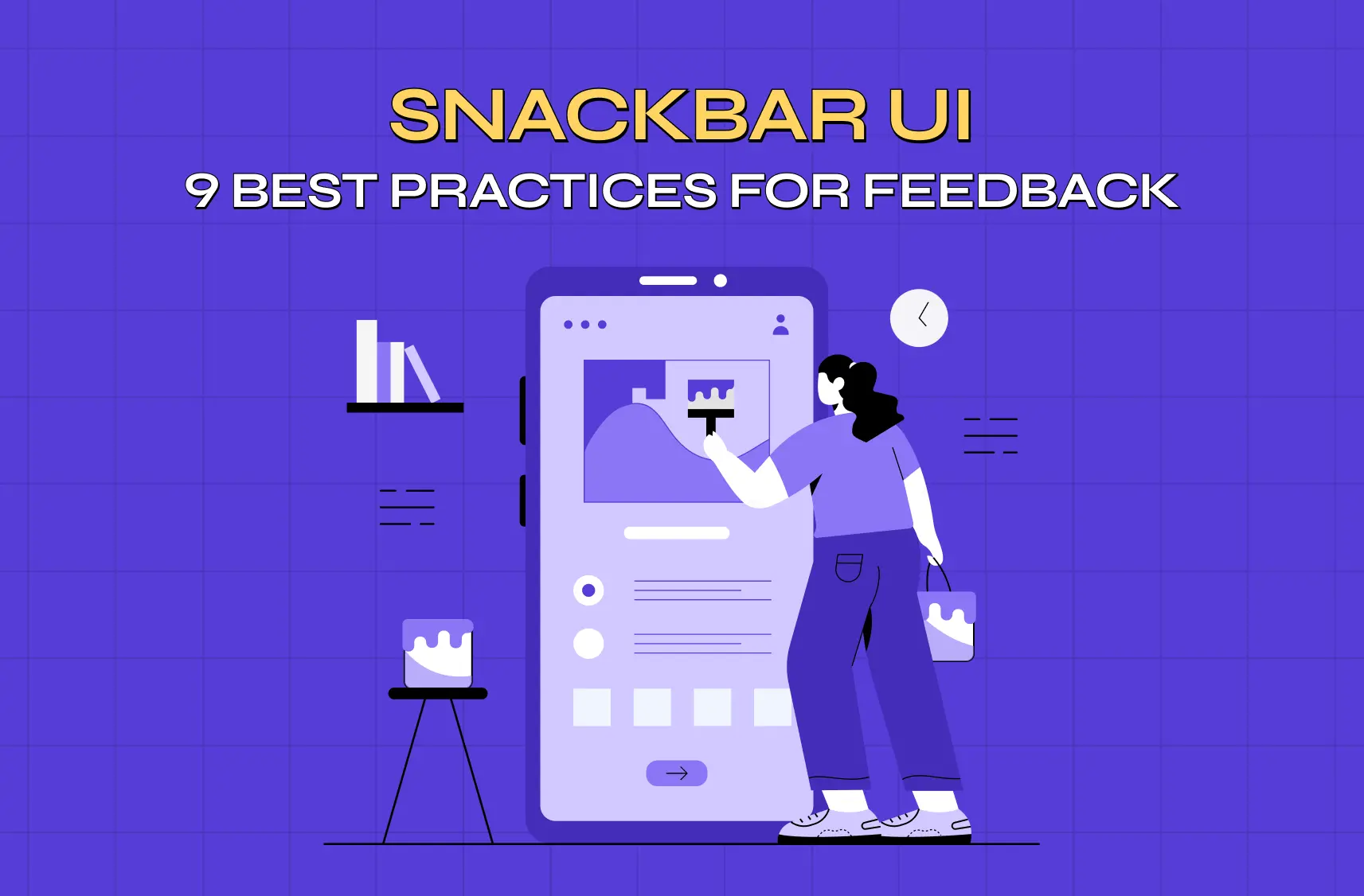
Nine best practices for snackbar UI, from timing and placement to accessibility.

Illustration of a designer editing a mobile app interface on a large smartphone screen, representing UI/UX design and product customization.

TL;DR

  • A snackbar gives brief, non-modal feedback about an action, and can include one optional action like Undo or Retry.

  • It differs from a toast, which is purely informational and offers nothing for the user to do.

  • Getting it right comes down to short messages, sensible timing, showing one at a time, careful placement, and real accessibility support.

  • Use a dialog or banner instead when the message is critical or needs a decision before the user continues.

Snackbar UI is one of the smallest, most frequently used micro-UX feedback patterns, showing up every time an app confirms an action without stopping the user in their tracks. It occupies a narrow, specific lane: present long enough to be noticed and understood, brief enough to never demand real attention. Getting it right takes very few pixels and a surprising amount of judgment, which is exactly what the rest of this guide walks through.

A user archives an email, deletes a file, or sends a message, and for a second, they need to know it worked. The snackbar is the small, unobtrusive bar that tells them, and often gives them a way to undo it. Done well, it's one of the most elegant patterns in interface design: it confirms an action, offers a quick out, and slips away without ever demanding attention. Done poorly, it stacks up, vanishes too fast to read, blocks the button someone was about to tap, or hijacks a moment that should have been a full-blown dialog.

Good snackbar UI is a handful of precise rules about timing, placement, actions, and restraint. Below are nine best practices, plus the crucial difference between a snackbar and a toast, an anatomy breakdown, and the mistakes that make these tiny components surprisingly annoying.Whether you're building feedback for a SaaS dashboard or a mobile product, this is how to make snackbars feel like a quiet, helpful assistant rather than a nagging pop-up.

What is a snackbar (and how is it different from a toast)?
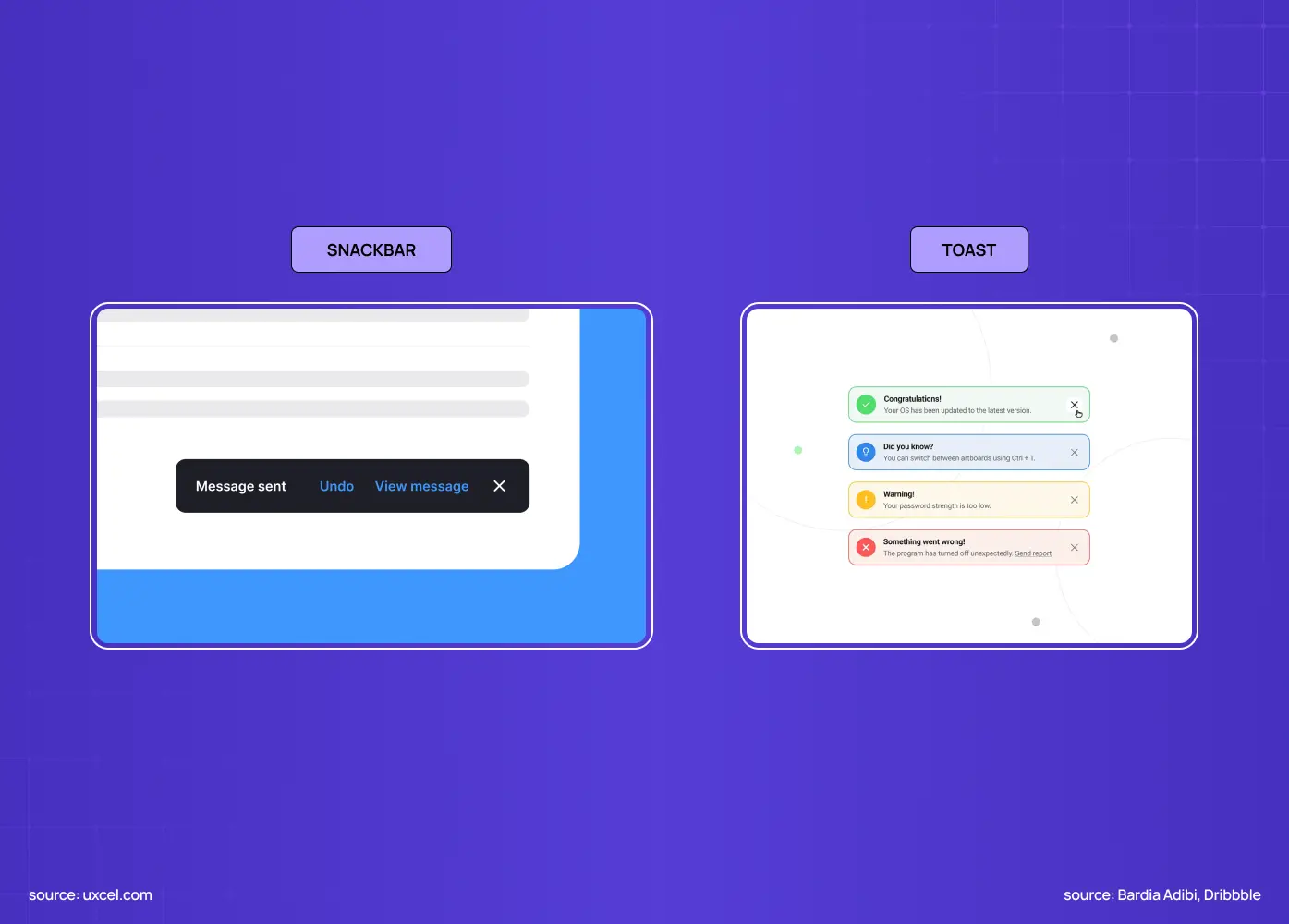
Comparison of snackbar and toast notifications, showing when each feedback pattern is used in modern user interfaces.

A snackbar is a brief, non-modal message in the graphical user interface that appears temporarily to give feedback about an operation. Unlike a toast, it can include a single action such as "Undo" or "Retry." That action is the defining difference. A toast simply informs ("Message sent") and disappears on its own after a few seconds with no way to interact with it. A snackbar informs and optionally lets the user act on that information before it's gone. Both are lightweight and non-blocking; the snackbar just does a little more.

Snackbar Toast Action? Yes, one optional action (Undo, Retry, View) No, informational only Purpose Feedback you might want to act on Simple confirmation or info Dismissal Timeout, swipe, or action Timeout only Example "Email archived, Undo" "Message sent"

Keep this distinction in mind: if there's something useful the user might do about the message, it's a snackbar; if it's pure information, a toast will do.

The anatomy of a snackbar
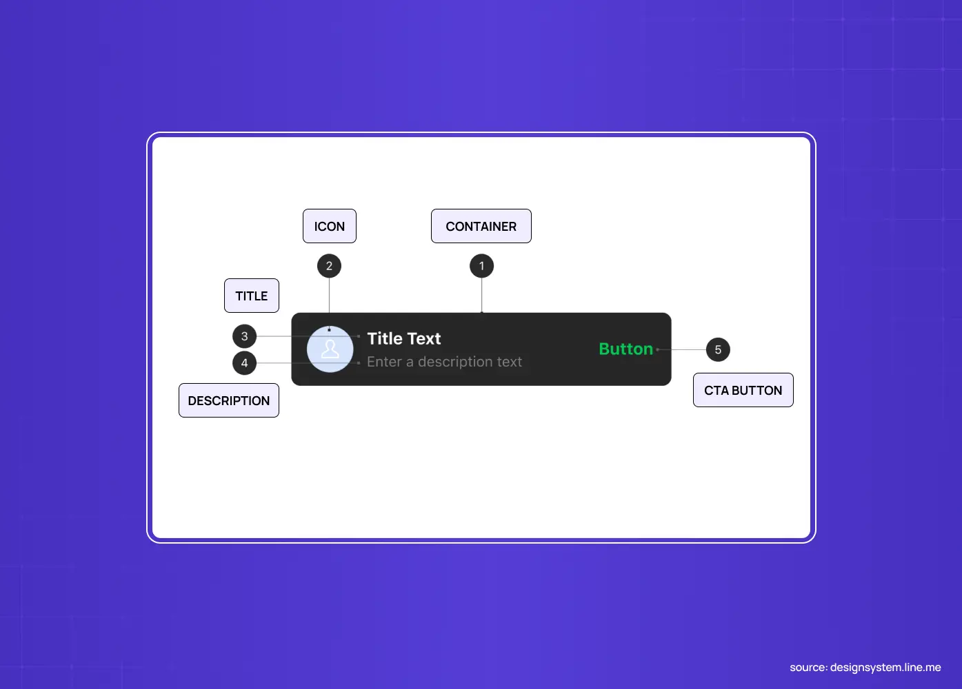
Anatomy diagram of a snackbar component highlighting its container, icon, title, description, and call-to-action button.

A snackbar is simple by design. Its core parts are:

  • A container, usually a dark, rounded bar

  • A short line of message text

  • An optional single action button, visually distinct, often in an accent color

  • Sometimes a small leading icon

It appears briefly, doesn't block the interface, and then dismisses.That minimalism is the point: every part earns its place, and Gestalt principles of proximity make the container, text, and action read as a single unit. With that in mind, here are the rules.

The UX/UI checklist top SaaS teams actually use

15 essential checks covering onboarding, conversions, and retention. Spot quick wins and fix friction before it costs you signups.

No Spam. Free Lifetime

The UX/UI checklist top SaaS teams actually use

15 essential checks covering onboarding, conversions, and retention. Spot quick wins and fix friction before it costs you signups.

No Spam. Free Lifetime

  1. Use snackbars for brief, non-critical feedback

Snackbars are for messages that are important but not critical enough to interrupt the user's flow, such as:

  • Confirming that an action completed

  • Reporting the outcome of a background process

  • Offering a quick follow-up

They are the wrong tool for anything the user must acknowledge or act on before continuing. A failed payment, a destructive confirmation, or a message that needs a decision belongs in a dialog or a persistent banner, not a bar that vanishes in three seconds. Match the weight of the message to the weight of the pattern.

  1. Keep the message short and scannable

A snackbar appears for only a few seconds, so the microcopy has to be readable at a glance.

  • Keep it to a single short line

  • Lead with the outcome, such as "Photo deleted" or "Changes saved"

  • Cut every unnecessary word

If you find yourself writing two sentences, the message is either too complex for a snackbar or should be a different component. Brevity isn't just aesthetic here: it's functional, because a message users can't finish reading before it disappears is worse than no message at all.

  1. Include at most one action, and make it worthwhile

Material Design is strict on this for good reason: a snackbar should contain a single action at most, and that action should never be "Dismiss" or "Cancel," since the timeout already handles dismissal.

  • Reserve the action slot for something genuinely useful, such as Undo, Retry, or View

  • Let that action respond directly to what just happened

  • Avoid a second action or a redundant close button, since either one dilutes the one thing a snackbar is good at

One clear, valuable action keeps the snackbar focused.

  1. Set a duration that matches the message

Too fast and users can't read it; too slow and it lingers annoyingly.

  • A solid rule of thumb is roughly 50 milliseconds per character, tracking reading speed

  • Set a minimum of about three seconds, even for a short message

  • Give action snackbars a bit longer, since users need time to notice the message and decide whether to act

  • For anything truly important with an action, consider letting it persist until dismissed rather than timing out

A snackbar that disappears before the user can hit "Undo" has failed at its one job.

  1. Show only one snackbar at a time

Stacking snackbars is a classic mistake.

  • Only one snackbar should be visible at a time

  • If several events fire in quick succession, queue the messages and show them one after another

  • Never pile new snackbars on top of old ones

A stack of snackbars covers content, overwhelms the user, and defeats the whole point of a quiet, glanceable pattern. One at a time, in order, keeps feedback calm and legible.

  1. Place it where it's visible but not in the way

Placement balances noticeability against obstruction.

  • On mobile, place snackbars near the bottom of the screen, where they're easy to spot without covering primary content

  • Avoid sitting directly on top of a bottom navigation bar or a floating action button

  • On desktop, the bottom-left, bottom-right, or top-right corner works well, keeping the message out of the user's main focus

Wherever it lands, the snackbar should never block the control the user is likely to reach for next.

  1. Never block input, and allow easy dismissal

A snackbar is non-modal by definition: it must not block interaction with the rest of the interface.

  • Users should be able to keep working while it's visible

  • Let it be dismissed easily, by swiping it away on touch or simply letting it time out

  • Never require users to dismiss it before doing anything else

If your "snackbar" traps the user or requires action before they can do anything else, it's really a dialog wearing a snackbar's clothes, and you've picked the wrong pattern. Non-blocking and easily dismissed is the whole contract.

  1. Keep animations subtle and quick

Entrance and exit animation shapes how a snackbar feels.

  • Use a subtle fade, or slide-and-fade, lasting roughly 200 to 400 milliseconds

  • Animate up from the bottom edge on entry

  • Exit by sliding or fading away

  • Avoid a bounce, a big scale, or a long transition, since anything flashier pulls focus toward a component whose entire purpose is to stay in the background

Quiet motion for a quiet component, consistent with core visual design principles.

  1. Make snackbars accessible

Because snackbars appear and vanish quickly, accessibility takes real care.

  • Announce them through an ARIA live region, using role="status" for routine confirmations and role="alert" for more urgent ones

  • If a snackbar contains an action, give users enough time, or a way to pause the timeout, to notice and reach it

  • Make sure the action button is keyboard-focusable

  • Don't rely on color alone to convey meaning

Feedback that only some users can perceive isn't feedback.

Snackbar vs. toast vs. dialog vs. banner: picking the right pattern
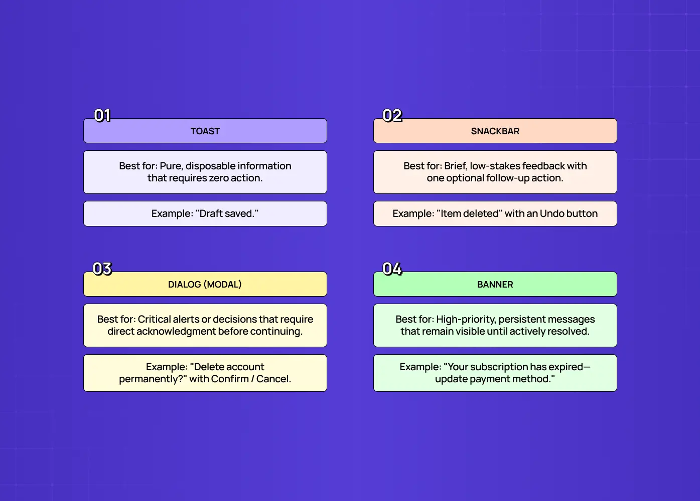
Overview of toast, snackbar, dialog, and banner components with guidance on their ideal use cases in UX design.

Snackbars are one option in a family of feedback patterns, and choosing the right one is half the battle. Here's how they relate:

  • Toast: for pure, disposable information the user never needs to act on, such as "Saved"

  • Snackbar: for brief feedback the user might want to act on, with one optional action, such as a "Deleted" message paired with an "Undo" action

  • Dialog (modal): for messages that are critical or require a decision before continuing, such as "Delete this account permanently?" It deliberately blocks the interface to force acknowledgment

  • Banner: for persistent, higher-priority information that should stay visible until addressed, such as "Your payment method expired," often spanning the top of the screen

The pattern you choose signals how important the message is, so mismatches confuse users. Put a critical error in a snackbar and it vanishes before anyone reads it; put a routine "saved" confirmation in a modal dialog and you've interrupted the user for nothing.

The decision comes down to two questions: does the user need to act on this before continuing, and how bad is it if they miss it? Low stakes and glanceable means toast or snackbar; high stakes or must-acknowledge means banner or dialog. Getting this mapping right is what makes feedback feel proportionate instead of either intrusive or invisible.

Why these small details matter

It's easy to dismiss snackbar design as trivial: it's a little bar that shows up for three seconds. But feedback is one of the core promises an interface makes to its users: when you do something, I'll tell you what happened. Break that promise and users lose confidence fast. A snackbar that disappears before they can read it, or an "Undo" that vanishes before they can reach it, doesn't just fail once: it teaches users they can't trust the system to keep them informed, so they start second-guessing whether their actions worked. That uncertainty is corrosive across an entire product.

The flip side is that well-designed feedback quietly builds trust:

  • An "Undo" snackbar is one of the highest-value patterns in all of UX, letting users act decisively without fear because they know a mistake is instantly reversible

  • That single affordance can replace a whole confirmation dialog, removing friction while increasing safety

  • Getting the timing, the action, and the accessibility right is what separates a product that feels responsive and considerate from one that feels careless, and clear confirmation feedback is part of how good products reduce onboarding drop-off.

For a component this small, that's a remarkable amount of leverage, which is exactly why it's worth designing with care, using the right UX design tools, rather than dropping in a default.

Snackbar UI mistakes to avoid

These recurring failures are easy to spot once you know them, and they sit alongside the other common UI/UX mistakes that quietly hurt a product:

  • Using a snackbar for a critical message that actually needs a dialog

  • Writing messages too long to read before they disappear

  • Cramming in multiple actions or a pointless "Dismiss" button

  • Setting a duration so short users can't act, or so long it lingers

  • Stacking several snackbars at once

  • Placing them over key controls like a bottom nav or FAB

  • Blocking interaction

  • Forgetting screen-reader announcements

Nearly every irritating snackbar is one of these, which makes them a quick, high-value checklist to run before you ship.

Conclusion

The snackbar, like other small UI components, is proof that tiny elements carry real weight. Used correctly, it becomes an almost invisible helper that keeps users informed and in control:

  • Brief, non-critical feedback only

  • A short, scannable message

  • At most one useful action

  • Sensible, readable timing

  • One snackbar visible at a time

  • Unobtrusive placement

  • Genuine accessibility support

Used carelessly, it becomes clutter that interrupts the very flow it's meant to support.

If you want a product design partner who gets the small components exactly right, because that's what makes an interface feel effortless, book a discovery call with Groto. We sweat the details most teams overlook, so your product feels considered at every tap. Let's make even your feedback messages a pleasure to use.

Snackbars are one of the smallest yet most consequential feedback patterns in interface design. This guide breaks down what a snackbar is, how it differs from a toast, and nine best practices for timing, placement, actions, and accessibility.

Nine best practices for snackbar UI, from timing and placement to accessibility.

Illustration of a designer editing a mobile app interface on a large smartphone screen, representing UI/UX design and product customization.

TL;DR

  • A snackbar gives brief, non-modal feedback about an action, and can include one optional action like Undo or Retry.

  • It differs from a toast, which is purely informational and offers nothing for the user to do.

  • Getting it right comes down to short messages, sensible timing, showing one at a time, careful placement, and real accessibility support.

  • Use a dialog or banner instead when the message is critical or needs a decision before the user continues.

Snackbar UI is one of the smallest, most frequently used micro-UX feedback patterns, showing up every time an app confirms an action without stopping the user in their tracks. It occupies a narrow, specific lane: present long enough to be noticed and understood, brief enough to never demand real attention. Getting it right takes very few pixels and a surprising amount of judgment, which is exactly what the rest of this guide walks through.

A user archives an email, deletes a file, or sends a message, and for a second, they need to know it worked. The snackbar is the small, unobtrusive bar that tells them, and often gives them a way to undo it. Done well, it's one of the most elegant patterns in interface design: it confirms an action, offers a quick out, and slips away without ever demanding attention. Done poorly, it stacks up, vanishes too fast to read, blocks the button someone was about to tap, or hijacks a moment that should have been a full-blown dialog.

Good snackbar UI is a handful of precise rules about timing, placement, actions, and restraint. Below are nine best practices, plus the crucial difference between a snackbar and a toast, an anatomy breakdown, and the mistakes that make these tiny components surprisingly annoying.Whether you're building feedback for a SaaS dashboard or a mobile product, this is how to make snackbars feel like a quiet, helpful assistant rather than a nagging pop-up.

What is a snackbar (and how is it different from a toast)?

Comparison of snackbar and toast notifications, showing when each feedback pattern is used in modern user interfaces.

A snackbar is a brief, non-modal message in the graphical user interface that appears temporarily to give feedback about an operation. Unlike a toast, it can include a single action such as "Undo" or "Retry." That action is the defining difference. A toast simply informs ("Message sent") and disappears on its own after a few seconds with no way to interact with it. A snackbar informs and optionally lets the user act on that information before it's gone. Both are lightweight and non-blocking; the snackbar just does a little more.

Snackbar Toast Action? Yes, one optional action (Undo, Retry, View) No, informational only Purpose Feedback you might want to act on Simple confirmation or info Dismissal Timeout, swipe, or action Timeout only Example "Email archived, Undo" "Message sent"

Keep this distinction in mind: if there's something useful the user might do about the message, it's a snackbar; if it's pure information, a toast will do.

The anatomy of a snackbar

Anatomy diagram of a snackbar component highlighting its container, icon, title, description, and call-to-action button.

A snackbar is simple by design. Its core parts are:

  • A container, usually a dark, rounded bar

  • A short line of message text

  • An optional single action button, visually distinct, often in an accent color

  • Sometimes a small leading icon

It appears briefly, doesn't block the interface, and then dismisses.That minimalism is the point: every part earns its place, and Gestalt principles of proximity make the container, text, and action read as a single unit. With that in mind, here are the rules.

The UX/UI checklist top SaaS teams actually use

15 essential checks covering onboarding, conversions, and retention. Spot quick wins and fix friction before it costs you signups.

No Spam. Free Lifetime

  1. Use snackbars for brief, non-critical feedback

Snackbars are for messages that are important but not critical enough to interrupt the user's flow, such as:

  • Confirming that an action completed

  • Reporting the outcome of a background process

  • Offering a quick follow-up

They are the wrong tool for anything the user must acknowledge or act on before continuing. A failed payment, a destructive confirmation, or a message that needs a decision belongs in a dialog or a persistent banner, not a bar that vanishes in three seconds. Match the weight of the message to the weight of the pattern.

  1. Keep the message short and scannable

A snackbar appears for only a few seconds, so the microcopy has to be readable at a glance.

  • Keep it to a single short line

  • Lead with the outcome, such as "Photo deleted" or "Changes saved"

  • Cut every unnecessary word

If you find yourself writing two sentences, the message is either too complex for a snackbar or should be a different component. Brevity isn't just aesthetic here: it's functional, because a message users can't finish reading before it disappears is worse than no message at all.

  1. Include at most one action, and make it worthwhile

Material Design is strict on this for good reason: a snackbar should contain a single action at most, and that action should never be "Dismiss" or "Cancel," since the timeout already handles dismissal.

  • Reserve the action slot for something genuinely useful, such as Undo, Retry, or View

  • Let that action respond directly to what just happened

  • Avoid a second action or a redundant close button, since either one dilutes the one thing a snackbar is good at

One clear, valuable action keeps the snackbar focused.

  1. Set a duration that matches the message

Too fast and users can't read it; too slow and it lingers annoyingly.

  • A solid rule of thumb is roughly 50 milliseconds per character, tracking reading speed

  • Set a minimum of about three seconds, even for a short message

  • Give action snackbars a bit longer, since users need time to notice the message and decide whether to act

  • For anything truly important with an action, consider letting it persist until dismissed rather than timing out

A snackbar that disappears before the user can hit "Undo" has failed at its one job.

  1. Show only one snackbar at a time

Stacking snackbars is a classic mistake.

  • Only one snackbar should be visible at a time

  • If several events fire in quick succession, queue the messages and show them one after another

  • Never pile new snackbars on top of old ones

A stack of snackbars covers content, overwhelms the user, and defeats the whole point of a quiet, glanceable pattern. One at a time, in order, keeps feedback calm and legible.

  1. Place it where it's visible but not in the way

Placement balances noticeability against obstruction.

  • On mobile, place snackbars near the bottom of the screen, where they're easy to spot without covering primary content

  • Avoid sitting directly on top of a bottom navigation bar or a floating action button

  • On desktop, the bottom-left, bottom-right, or top-right corner works well, keeping the message out of the user's main focus

Wherever it lands, the snackbar should never block the control the user is likely to reach for next.

  1. Never block input, and allow easy dismissal

A snackbar is non-modal by definition: it must not block interaction with the rest of the interface.

  • Users should be able to keep working while it's visible

  • Let it be dismissed easily, by swiping it away on touch or simply letting it time out

  • Never require users to dismiss it before doing anything else

If your "snackbar" traps the user or requires action before they can do anything else, it's really a dialog wearing a snackbar's clothes, and you've picked the wrong pattern. Non-blocking and easily dismissed is the whole contract.

  1. Keep animations subtle and quick

Entrance and exit animation shapes how a snackbar feels.

  • Use a subtle fade, or slide-and-fade, lasting roughly 200 to 400 milliseconds

  • Animate up from the bottom edge on entry

  • Exit by sliding or fading away

  • Avoid a bounce, a big scale, or a long transition, since anything flashier pulls focus toward a component whose entire purpose is to stay in the background

Quiet motion for a quiet component, consistent with core visual design principles.

  1. Make snackbars accessible

Because snackbars appear and vanish quickly, accessibility takes real care.

  • Announce them through an ARIA live region, using role="status" for routine confirmations and role="alert" for more urgent ones

  • If a snackbar contains an action, give users enough time, or a way to pause the timeout, to notice and reach it

  • Make sure the action button is keyboard-focusable

  • Don't rely on color alone to convey meaning

Feedback that only some users can perceive isn't feedback.

Snackbar vs. toast vs. dialog vs. banner: picking the right pattern

Overview of toast, snackbar, dialog, and banner components with guidance on their ideal use cases in UX design.

Snackbars are one option in a family of feedback patterns, and choosing the right one is half the battle. Here's how they relate:

  • Toast: for pure, disposable information the user never needs to act on, such as "Saved"

  • Snackbar: for brief feedback the user might want to act on, with one optional action, such as a "Deleted" message paired with an "Undo" action

  • Dialog (modal): for messages that are critical or require a decision before continuing, such as "Delete this account permanently?" It deliberately blocks the interface to force acknowledgment

  • Banner: for persistent, higher-priority information that should stay visible until addressed, such as "Your payment method expired," often spanning the top of the screen

The pattern you choose signals how important the message is, so mismatches confuse users. Put a critical error in a snackbar and it vanishes before anyone reads it; put a routine "saved" confirmation in a modal dialog and you've interrupted the user for nothing.

The decision comes down to two questions: does the user need to act on this before continuing, and how bad is it if they miss it? Low stakes and glanceable means toast or snackbar; high stakes or must-acknowledge means banner or dialog. Getting this mapping right is what makes feedback feel proportionate instead of either intrusive or invisible.

Why these small details matter

It's easy to dismiss snackbar design as trivial: it's a little bar that shows up for three seconds. But feedback is one of the core promises an interface makes to its users: when you do something, I'll tell you what happened. Break that promise and users lose confidence fast. A snackbar that disappears before they can read it, or an "Undo" that vanishes before they can reach it, doesn't just fail once: it teaches users they can't trust the system to keep them informed, so they start second-guessing whether their actions worked. That uncertainty is corrosive across an entire product.

The flip side is that well-designed feedback quietly builds trust:

  • An "Undo" snackbar is one of the highest-value patterns in all of UX, letting users act decisively without fear because they know a mistake is instantly reversible

  • That single affordance can replace a whole confirmation dialog, removing friction while increasing safety

  • Getting the timing, the action, and the accessibility right is what separates a product that feels responsive and considerate from one that feels careless, and clear confirmation feedback is part of how good products reduce onboarding drop-off.

For a component this small, that's a remarkable amount of leverage, which is exactly why it's worth designing with care, using the right UX design tools, rather than dropping in a default.

Snackbar UI mistakes to avoid

These recurring failures are easy to spot once you know them, and they sit alongside the other common UI/UX mistakes that quietly hurt a product:

  • Using a snackbar for a critical message that actually needs a dialog

  • Writing messages too long to read before they disappear

  • Cramming in multiple actions or a pointless "Dismiss" button

  • Setting a duration so short users can't act, or so long it lingers

  • Stacking several snackbars at once

  • Placing them over key controls like a bottom nav or FAB

  • Blocking interaction

  • Forgetting screen-reader announcements

Nearly every irritating snackbar is one of these, which makes them a quick, high-value checklist to run before you ship.

Conclusion

The snackbar, like other small UI components, is proof that tiny elements carry real weight. Used correctly, it becomes an almost invisible helper that keeps users informed and in control:

  • Brief, non-critical feedback only

  • A short, scannable message

  • At most one useful action

  • Sensible, readable timing

  • One snackbar visible at a time

  • Unobtrusive placement

  • Genuine accessibility support

Used carelessly, it becomes clutter that interrupts the very flow it's meant to support.

If you want a product design partner who gets the small components exactly right, because that's what makes an interface feel effortless, book a discovery call with Groto. We sweat the details most teams overlook, so your product feels considered at every tap. Let's make even your feedback messages a pleasure to use.

Have a project in mind?

Let’s talk through your idea and see what makes sense.
Harpreet Singh

Founder at Groto

Have a project in mind?

Let’s talk through your idea and see what makes sense.

Harpreet Singh

Founder at Groto

FAQ

Everything you were going to ask (and a few things you didn’t know to)

How long should a snackbar be displayed?

A good rule of thumb is roughly 50 milliseconds per character, tracking reading speed, with a minimum of about three seconds for short messages. Give snackbars with an action a bit longer so users can notice and respond, and consider making critical action snackbars persist until dismissed.

Where should a snackbar appear?

On mobile, near the bottom of the screen where it's noticeable without covering primary content (but not on top of a bottom nav or floating action button). On desktop, the bottom-left, bottom-right, or top-right corner works well. It should never block the control the user is likely to use next.

What is the difference between alert and snackbar?

An alert, typically shown as a dialog, interrupts the interface and usually requires the user to make a choice or dismiss it before continuing. A snackbar never blocks the interface. It appears briefly alongside whatever the user is doing and disappears on its own, which makes it suited to low-stakes feedback rather than decisions that carry real consequences.

When should you use a snackbar instead of a dialog?

Use a snackbar for brief, non-critical feedback that shouldn't interrupt the user — a confirmation or an optional action like Undo. Use a dialog or persistent banner when the message is critical or requires the user to acknowledge or decide something before continuing, since snackbars auto-dismiss and don't block input.

What is a snackbar on Android?

On Android, a snackbar is a built-in component from Google's Material Design system that surfaces brief messages at the bottom of the screen, often with a single action like Undo. It's designed to feel lightweight and disappears automatically after a short delay unless the user interacts with it.

How do you create a snackbar?

Most design systems and frameworks, including Material Design, Android, Flutter, and popular web component libraries, offer a built-in snackbar component that handles the container, timing, and animation for you. Building one from scratch means defining a non-modal container, a short message, an optional single action, a sensible auto-dismiss duration, and proper ARIA announcements so the pattern stays accessible.

How long should a snackbar be displayed?

A good rule of thumb is roughly 50 milliseconds per character, tracking reading speed, with a minimum of about three seconds for short messages. Give snackbars with an action a bit longer so users can notice and respond, and consider making critical action snackbars persist until dismissed.

Where should a snackbar appear?

On mobile, near the bottom of the screen where it's noticeable without covering primary content (but not on top of a bottom nav or floating action button). On desktop, the bottom-left, bottom-right, or top-right corner works well. It should never block the control the user is likely to use next.

What is the difference between alert and snackbar?

An alert, typically shown as a dialog, interrupts the interface and usually requires the user to make a choice or dismiss it before continuing. A snackbar never blocks the interface. It appears briefly alongside whatever the user is doing and disappears on its own, which makes it suited to low-stakes feedback rather than decisions that carry real consequences.

When should you use a snackbar instead of a dialog?

Use a snackbar for brief, non-critical feedback that shouldn't interrupt the user — a confirmation or an optional action like Undo. Use a dialog or persistent banner when the message is critical or requires the user to acknowledge or decide something before continuing, since snackbars auto-dismiss and don't block input.

What is a snackbar on Android?

On Android, a snackbar is a built-in component from Google's Material Design system that surfaces brief messages at the bottom of the screen, often with a single action like Undo. It's designed to feel lightweight and disappears automatically after a short delay unless the user interacts with it.

How do you create a snackbar?

Most design systems and frameworks, including Material Design, Android, Flutter, and popular web component libraries, offer a built-in snackbar component that handles the container, timing, and animation for you. Building one from scratch means defining a non-modal container, a short message, an optional single action, a sensible auto-dismiss duration, and proper ARIA announcements so the pattern stays accessible.

More Articles

Extreme close-up black and white photograph of a human eye

Let’s bring your vision to life

Tell us what's on your mind? We'll hit you back in 24 hours. No fluff, no delays - just a solid vision to bring your idea to life.

Profile portrait of a man in a white shirt against a light background

Harpreet Singh

Founder and Creative Director

Get in Touch

Extreme close-up black and white photograph of a human eye

Let’s bring your vision to life

Tell us what's on your mind? We'll hit you back in 24 hours. No fluff, no delays - just a solid vision to bring your idea to life.

Profile portrait of a man in a white shirt against a light background

Harpreet Singh

Founder and Creative Director

Get in Touch

Extreme close-up black and white photograph of a human eye

Let’s bring your vision to life

Tell us what's on your mind? We'll hit you back in 24 hours. No fluff, no delays - just a solid vision to bring your idea to life.

Profile portrait of a man in a white shirt against a light background

Harpreet Singh

Founder and Creative Director

Get in Touch