

Your MVP doesn't need to be beautiful. It needs to be clear. This guide shows CTOs, PMs, and founders exactly what UX to prioritise, what to cut, and what to measure — before churn becomes your problem.
Bad UX kills SaaS MVPs faster than a bad idea ever will.

MVP UX Design for SaaS: What to Build, What to Skip, and What Will Kill Your Retention
Most SaaS MVPs don't fail because the product idea was wrong. They fail because no one could figure out how to use it.
Bad UX in an MVP doesn't look like an ugly interface. It looks like a 45% drop-off on the sign-up flow. It looks like users who activate but never come back. It looks like support tickets that say "I don't understand what this does." And it surfaces three to six months after launch, when it's expensive to fix.
This guide is built for CTOs, PMs, and founders at early-stage SaaS companies who are making real tradeoffs right now — limited time, limited budget, no design agency on retainer. We'll tell you exactly what UX your MVP needs, what it doesn't, where the permanent damage happens, and how to measure whether it's working.
No best-practices lists. No agency fluff. Just the specific decisions that matter at your stage.
The Three-Tier UX Spectrum (And Why "Good Enough" Is a Trap)
Most content frames MVP UX as a binary: ship scrappy or ship polished. This is the wrong frame entirely.
The real spectrum has three tiers:
Tier 1 — Scrappy
Fast to build, high churn, hard to diagnose. You're shipping interfaces that only make sense if you're inside the founder's head. Users bounce because they don't understand the value before they've invested enough time to see it.
Tier 2 — Ruthlessly Functional
The correct tier for most MVPs. Every interaction serves one of two goals: helping users reach their "aha moment" faster, or removing everything that stands between them and that moment. Nothing more. This tier is not about polish — it's about removing friction with surgical precision.
Tier 3 — Polished
Expensive, slow to ship, and often counterproductive at early stage. You're investing in trust signals (visual design quality, animation, micro-interactions) before you have enough users to validate that trust signals are your conversion problem.
The trap
Most early-stage teams swing between Tier 1 and Tier 3 depending on who's in the room — the engineer pushing to ship vs. the PM anxious about looking professional. The answer is almost always Tier 2.
The job of MVP UX is not to impress. It is to make one thing obvious: what your product does and how to do it for the first time.
For a product-led growth SaaS Onboarding Is Not a Feature. It's Your Entire MVP.
This is the most common misunderstanding in early SaaS UX — and it's expensive.
Most teams build the product first and design onboarding last, treating it as a nice-to-have wrapper around the core functionality. This is backwards. For a product-led growth SaaS with no sales team, onboarding is the product. It's the only CSM you have.— and fixing SaaS onboarding drop-offs with UX is one of the highest-leverage interventions available before any other feature work begins. It's the only CSM you have.
Here's what "broken onboarding" actually looks like in metrics:
Users activate (create an account) but don't reach their first meaningful action within 7 days
Cohort 1 had 40% week-2 retention; Cohort 2 dropped to 25% with no product changes
Users upgrade trial to paid at a lower rate than your benchmark despite strong feature usage
These are onboarding problems, not product problems. The product may be fine. The path from "signed up" to "got value" is broken — and the design decisions that govern that
path are the core subject of UI/UX design for SaaS products from onboarding to retention.
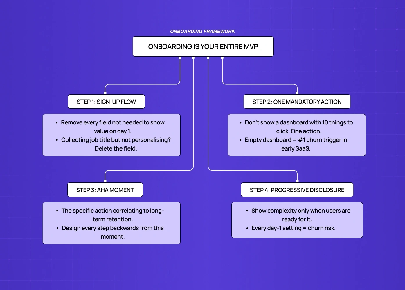
What ruthlessly functional onboarding looks like:
One-goal sign-up flow — remove every field that isn't necessary to show the user value on day one. If you're collecting company size, job title, and use case on sign-up but not personalizing the experience with that data, delete the fields.
A mandatory first action — don't give users a dashboard with ten things to click. Give them one thing that produces a result. This is the "empty state problem" — an empty dashboard is the most common place where users abandon forever.
The aha moment, designed backwards — define what your aha moment is (the specific action that correlates to long-term retention) and design every step of onboarding to get users there in as few clicks as possible.
Progressive disclosure — show complexity only when users are ready for it. A SaaS tool that surfaces every setting and configuration option on day one is a churn machine.
For product-led growth specifically: your onboarding must replace a sales call and a customer success check-in simultaneously. That is a high bar. Most MVPs don't meet it. The ones that do treat onboarding as a design problem, not a copywriting problem.
How Features Inflate Cognitive Load (And Kill Retention)
Every feature you add to an MVP has a hidden UX tax.
This is not an opinion — it's a documented phenomenon in UI research called cognitive load accumulation. Each new element in an interface — button, menu item, setting, configuration option — forces the user's brain to process and decide. At low counts, this is fine. As count grows, users experience decision fatigue, make mistakes, feel overwhelmed, and churn.
For SaaS MVPs specifically, the math is brutal:
5 features shipped well → clear user journey, low support volume, high aha moment rate
8 features shipped → confused users, high support volume, longer time to aha moment, lower retention
This doesn't mean ship less. It means every feature must justify its UX cost — and that judgment call sits precisely at the intersection of product management and UX tradeoffs, where roadmap prioritization and user journey design either reinforce or undermine each other. The question to ask for every roadmap item isn't "is this valuable?" — it's "does adding this make the most important journey faster or slower?"
For how leading teams apply this standard across the full product, SaaS product design best practices covers the principles that govern these tradeoffs at each stage.
The UX cost of each feature:
New primary navigation item: high cost (forces users to relearn the map)
New settings page: medium cost (out of primary flow, but adds cognitive overhead on first encounter)
New in-line action: low-medium cost (depends on where it appears in the journey)
New empty state: high cost (most teams forget to design these at all)
The UX implication of feature prioritization frameworks (MoSCoW, RICE) is almost never discussed in product content. When you score a feature 8/10 on impact and 9/10 on confidence, factor in the UX cost of adding it to the interface. A feature with high value and high UX cost may still be the wrong thing to ship in your MVP.
The UX Decisions That Lock You Into Bad Architecture
Some early UX decisions aren't just inefficient — they create technical and design debt that follows you for years.
These are the ones that matter most:
1. Navigation structure
Your MVP navigation tells users what the product is. If you start with a flat five-item top nav and later need to add sections, you either break users' mental models or do a major redesign. Define your information architecture deliberately in MVP, even if most sections are empty. A good nav scales; a nav built for today breaks tomorrow.
2. Empty states
Most engineering teams treat empty states as a placeholder ("No data yet"). Design-aware teams treat every empty state as a conversion opportunity — the moment where a new user decides whether the product is worth their time. Badly designed empty states are one of the highest-churn triggers in SaaS and one of the most under-resourced design areas in MVPs.
3. Permission models
If your SaaS has any team or multi-user functionality, your permission model UX (who can see what, who can do what) needs to be designed before it's built, not after. Retrofitting permissions into an existing UI is a major redesign project. Most teams learn this the hard way at Series A.
4. Error states
Error messages are often written by engineers at implementation time with zero UX review. Bad error messages ("Something went wrong. Try again.") generate support tickets, destroy trust, and are invisible in your analytics. Good error messages tell users exactly what happened and exactly what to do next. This is a low-effort, high-leverage fix that most MVPs miss — and one of many micro UX design patterns that improve user experience instantly without requiring a full design pass.
5. Data density
How much information do you show on a page? Set a deliberate standard in your MVP — the principles behind designing SaaS dashboards users actually understand show exactly how those standards hold across the most data-dense parts of a product. "We show the 5 most important fields in a list view" is a design decision. If you don't make it deliberately, different engineers will make different calls across the product and you'll end up with an inconsistent, confusing interface that's expensive to audit and fix later.
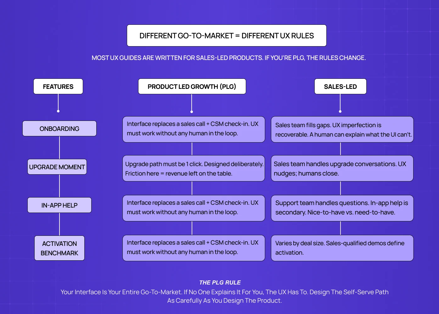
PLG-First UX: Different Rules for Self-Serve SaaS
If your SaaS has no sales team — users discover, try, and convert without talking to a human — your UX has a fundamentally different job than sales-led products. For the full framework behind how SaaS UX should be structured across both models, the complete guide to SaaS UX design
covers the principles that apply at every stage of the product lifecycle.
Most UX content is written for sales-led products, where UX quality affects conversion and retention but a human fills in the gaps. In PLG, the interface is the entire relationship. This changes several things:
Free trial UX vs. freemium UX
Free trial users have a clock in their head. Every interaction should move them toward "I understand why this is worth paying for." Freemium users don't have that urgency — the UX must create it.
In-app upsell design
PLG products must design the upgrade moment deliberately. When does a user hit a limit or a locked feature? Is that moment frustrating or natural? Is the upgrade path one click or three? This is a UX design problem, not a pricing problem.
Help and support in the interface
PLG users can't email a CSM with onboarding questions. In-app help, tooltips, contextual guidance, and empty state copy are doing the work of a customer success team — and for SaaS products with AI-powered features, integrating AI into
SaaS UX introduces additional design considerations around explainability and trust that change how in-product guidance needs to be built. Budget design resources accordingly. Budget design resources accordingly.
The self-serve activation benchmark
For PLG SaaS, a good activation rate (users who reach their first meaningful action within 7 days) is 25–40% depending on product complexity. Below 20% almost always indicates an onboarding UX problem, not a product problem. Most MVP teams don't measure this at all until well after launch. The benchmark also shifts by category: vertical SaaS tools built for a single industry tend to sit at the complex end, where reaching activation takes more deliberate onboarding design.
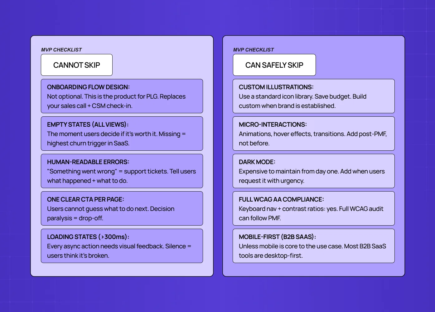
What You Can Safely Skip in Your MVP UX
This is the part most UX guides won't tell you because agencies have an incentive not to.
You can skip:
Custom illustrations and brand-specific iconography (use a standard icon library)
Advanced micro-interactions and animations (save for post-PMF polish)
Fully custom component library (use Radix, Shadcn, or a mature UI kit and build custom only when your interaction needs genuinely differ. Design systems for SaaS products are a post-PMF investment, not an MVP prerequisite.
Dark mode (expensive to maintain, add when users request it)
Extensive accessibility compliance beyond the basics (keyboard navigation and contrast ratios matter from day one; full WCAG AA compliance can come later)
Responsive/mobile design for B2B SaaS tools (unless mobile is core to the use case — and for teams where it is, mobile-first SaaS UX covers what that specialisation actually requires at MVP stage before committing resources to a full responsive build)
You cannot skip:
Onboarding flow design (see above — this is not optional)
Empty states for every major data view
Error messages that are written for humans
Consistent navigation structure
One clear CTA per page (never make users guess what to do next)
A loading state for every async action longer than 300ms
The test for whether to include something: does removing it make the path to aha moment slower or harder? If yes, keep it. If no, cut it.
Tools and Timelines for Small Teams
What a 2–5 person team can realistically execute in 6–8 weeks:
Full onboarding flow design and copy
Core 3–5 screen journey (sign-up → first action → value delivery)
Empty states for all primary views
Basic error handling across the flow
Navigation architecture (can be simple, must be deliberate)
Tools:
Figma (design and prototyping) — no real alternative at this stage
Maze or Useberry for quick usability testing before launch
Hotjar for post-launch session recordings (fastest way to see where users get stuck)
PostHog or Mixpanel for cohort analysis and funnel tracking. For a broader view of what tooling supports each stage of UX work beyond testing and analytics, the best UX design tools breakdown covers the full stack a design-led team needs.
Timeline reality check:
A designer who knows the product can produce a full MVP UX in 4–6 weeks, following the UX design process from discovery through handoff.
A UX agency for early-stage SaaS can turn around discovery + MVP screens in 3–5 weeks with a clear brief — but only if the agency understands PLG constraints and activation-first design priorities, not just visual execution.
A CTO building without a designer will spend 2–3x longer and produce 50–60% of the quality
The ROI of UX design investment at MVP stage typically pays back within the first 3 months of launch through higher activation and lower churn — and the metrics to prove that payback to stakeholders are documented in detail for teams that need to make the case internally.
The Three Metrics That Tell You If Your MVP UX Is Broken
Most early teams track the wrong things. Page views and sign-ups tell you about acquisition, not UX quality — and without a clear SaaS metrics framework in place, it's nearly impossible to separate a UX problem from a product problem. These three metrics isolate UX performance specifically:
1. Time to first meaningful action (T2FMA)
Define the single action that represents a user "getting" your product (sending their first report, completing their first project, connecting their first integration).
Measure how long it takes from sign-up to that action.
Benchmark: under 10 minutes for simple products, under 24 hours for complex ones.
If users are taking longer or not getting there at all, the UX path is broken.
2. Drop-off rate by onboarding step
Funnel analysis of your onboarding flow, step by step. You're looking for any step where more than 20–30% of users exit.
A sudden drop at step 3 of 7 tells you exactly where to focus your UX fix — and if the pattern points to deeper structural issues across the product, how to do a UX audit gives you the methodology to investigate systematically rather than guessing.
3. Support ticket topic analysis
Categorize your first 50 support tickets by the question being asked.
If more than 15–20% are "how do I..." questions, you have an onboarding clarity problem.
If they're "why did this..." questions, you have an error state or feedback problem.
The tickets tell you what your analytics can't.
Ready to Build Your MVP UX Right?
Getting MVP UX right is a 4–6 week investment that pays back in lower churn, faster activation, and cleaner product decisions for the next 18 months.
If you're planning a SaaS MVP or rethinking an existing one, we'd be happy to walk through your specific situation in a 30-minute call.


