Harpreet Singh

Harpreet Singh

Founder and Creative Director

Top 10 Chatbot Design Examples to Inspire Your Next Project

May 19, 2025

Explore real-world chatbot UI examples with practical insights for better chatbot design. See what works, why it matters, and how to improve chatbot experiences.

Groto Cover Image
Harpreet Singh

Harpreet Singh

Founder and Creative Director

Top 10 Chatbot Design Examples to Inspire Your Next Project

May 19, 2025

Explore real-world chatbot UI examples with practical insights for better chatbot design. See what works, why it matters, and how to improve chatbot experiences.

Groto Cover Image

Some chatbot designs do more than just answer questions—they help users get things done, fast. This guide breaks down ten of the best chatbot UI examples, showing the choices that make these bots genuinely useful and easy to use.

See top chatbot UI examples that raise the bar for design and user experience.


Top 10 Chatbot Design Examples to Inspire Your Next Project

What is Chatbot UI?

The visual foundation of every chatbot interaction

A chatbot’s UI (user interface) is the visible surface — the chat bubble you type into, the button you click, the avatar that greets you. In simple terms, it’s what users see and use to communicate with a bot. It includes layout, fonts, color schemes, icons, and interactions. When someone says, “That chatbot was easy to use,” they’re often responding to good chatbot ui design.

But behind every successful chatbot interface design, there’s intention. The UI isn't just decoration. It’s functional clarity. Great chatbot design ensures a user can start, navigate, and complete a conversation without friction. When you layer a conversational engine on top of an unusable interface, the smartest AI feels broken.

Elements of effective chatbot UI

A good chatbot interface design includes:

  • A welcome state with clear intent: "Hi, I can help you find a product or track your order."

  • Quick-reply buttons: Options like “Track my order” or “View offers” that reduce typing effort.

  • Error handling: Phrases like “Sorry, I didn’t get that. Want to try again?” keep the experience human.

  • Micro-interactions: Typing dots, animation cues, and progressive disclosure make the UI feel alive.

If the UI works, users don’t notice it. If it doesn’t, users blame the bot.

What’s the Difference Between Chatbot UI and UX?

UI shows. UX guides. Both matter.

Chatbot UI is what users see. Chatbot UX is what they experience. Think of UI as the visual layer, and UX as the emotional journey. You need both for your chatbot design to resonate. A chatbot might look sleek, but if it asks questions out of order or repeats itself, the experience suffers.

A simple interface with thoughtful prompts, fallback logic, and empathy can outperform a complex UI that tries too hard. When evaluating website chatbot examples, always ask: Did this bot help the user feel confident, supported, and understood?

UX in practice: How flow affects feeling

Let’s say a bot asks, “What can I help with?” followed by eight quick replies. If the user selects one, and the bot jumps straight to a generic answer, the conversation feels abrupt. A better flow might follow up with: “Got it. Do you want to speak to support or see documentation?”

The change is subtle, but in UX terms, it’s everything. It creates a rhythm, a back-and-forth, a feeling of care. That’s what strong chatbot ui design unlocks: not just functionality, but trust.

What Does Great Chatbot Design Look Like?

The difference between useful and forgettable

What separates a successful chatbot design example from a generic one isn’t style. It’s clarity, tone, and timing. Great chatbot design gives users the right nudge at the right time — not all at once.

If the interface offers too many replies too soon, users stall. If it waits too long to act, users leave. If it sounds robotic, users don’t engage. Successful chatbot ui design balances utility with personality.

Characteristics of high-performing chatbot UIs

  • Visual clarity: Clean typography, ample spacing, and consistent design patterns

  • Conversational microcopy: Language that reflects brand tone without losing clarity

  • Personalization: Remembering past user interactions, names, or preferences

  • Fallbacks and recovery: Smart responses when a user goes off-script

  • Progress indicators: Letting users know where they are in a multi-step process

When reviewing website chatbot examples, focus on how they simplify decision-making. The best designs don’t overwhelm — they offer just enough.

1. Erica – Bank of America

Use case: Personal banking assistant

Primary function: Manage finances, track spending, handle transactions

Why it works:

Erica is perhaps the most refined example of a financial chatbot in production. Built into Bank of America’s mobile app, Erica offers a minimalistic chatbot interface design — dark theme, clean lines, and high-contrast buttons create a sense of security. The language is friendly but not informal, striking a tone of helpful professionalism.

Erica doesn’t just answer questions. It anticipates them. For example, if a user checks their balance frequently, Erica will eventually begin showing spending summaries and predictive insights. This is where chatbot UX takes the lead.

Design highlights:

  • Quick reply buttons based on user behavior

  • Visual graphs for spending habits within the chat thread

  • Voice and text input support for accessibility

  • Typing indicators to mirror human conversation pace

Key takeaway: Personalization and predictive interaction elevate utility. Good chatbot design isn’t just reactive — it’s anticipatory.

2. Domino’s Ordering Bot

Use case: Online food ordering

Primary function: Enable pizza ordering and tracking via chat

Why it works:

Domino’s chatbot allows users to place, customize, and track orders from multiple platforms—Facebook Messenger, website widget, mobile app. The chatbot ui design is bright, visual, and unmistakably branded.

The flow starts with a simple greeting and lets returning users reorder their favorite meals in seconds. For new customers, a guided menu flows like a carousel, reducing input effort to taps and selections.

Design highlights:

  • Visual menus with icons for toppings and sizes

  • Progress updates on order preparation and delivery

  • Real-time order tracking with visual indicators

  • Smart default settings based on previous orders

Key takeaway: Speed and visual simplicity reduce cognitive load. Great website chatbot examples should move users from intent to action in as few steps as possible.

3. Redfin Real Estate Assistant

Use case: Real estate discovery and lead capture

Primary function: Help users browse, save, and schedule tours for listings

Why it works:

Real estate often means information overload. Redfin’s chatbot reduces complexity by layering rich listing data into a calm and focused chatbot interface design. The UI shows images, pricing, locations, and availability—all within the chat thread.

The UX is clean and goal-driven. After showing a listing, the bot offers next actions: “Schedule a tour,” “Ask a question,” or “See similar homes.” Each reply tailors the next step. And if a user drops off, the bot follows up later.

Design highlights:

  • Embedded listing previews with swipable galleries

  • Location-based search support via ZIP code or GPS

  • Call-to-action buttons for tour scheduling

  • Integration with calendar tools and agent contact

Key takeaway: Information-heavy products benefit from progressive disclosure. Design your chatbot ui to reveal details only when needed.

4. Sephora’s Ora

Use case: Personal beauty assistant

Primary function: Product discovery, quizzes, tutorials

Why it works:

Ora embodies Sephora’s brand voice—stylish, approachable, and helpful. It’s a highly visual chatbot, using swatches, product images, and video tutorials to guide users through product selection and use.

The flow begins with a quiz to identify skin tone, preferences, or product needs. The UI then suggests products with a “Why we picked this” section. This contextual reasoning builds trust.

Design highlights:

  • Step-by-step quizzes with emoji-based responses

  • Visual recommendations with reviews and star ratings

  • Contextual feedback: “This product suits oily skin types”

  • Product carousels with ‘Add to Bag’ CTAs

Key takeaway:

When decisions are aesthetic or subjective, visuals are critical. Good chatbot design helps users “see” their future with a product.

5. Drift for B2B Lead Capture

Use case: Sales funnel automation

Primary function: Qualify leads, book meetings, answer pre-sales questions

Why it works:

Drift is purpose-built for speed. Its chatbot immediately greets users with intent-based replies: “Talk to Sales,” “See a Demo,” or “Ask a Question.” Behind the scenes, it tags user types, routes conversations, and hands off to reps when needed.

Its minimal chatbot ui design favors text and buttons over clutter. Conversations are short, sharp, and closed-ended — perfect for lead qualification.

Design highlights:

  • Structured conversation flows with branching logic

  • Calendar integration for demo scheduling

  • CRM sync to auto-fill user data and update records

  • Escalation to human agents when needed

Key takeaway:

Conversion-first chatbot interface design strips out distractions. The design goal is always to move the user to the next step.

6. Youper – AI Mental Health Assistant

Use case: Emotional wellness and therapy support

Primary function: Help users manage mood, journal, reflect

Why it works:

Youper offers structured self-help, not just scripted replies. The chatbot opens with a mood check and adapts questions based on emotional state. The chatbot design includes sliders, emojis, and touch-friendly buttons to make emotional input easier.

Visually, it feels calm—muted colors, rounded edges, and minimal motion. The UX allows for pauses, retries, and context switches. It’s designed for real-world emotion, not linear logic.

Design highlights:

  • Mood tracking with emoji-based inputs

  • Journal entries saved and visualized over time

  • Custom coping exercises based on responses

  • Escalation to therapists or crisis resources if flagged

Key takeaway:

Emotionally aware chatbot ui design prioritizes comfort, control, and reflection.

7. Roam’s FAQ Bot – Samantha

Use case: Customer support deflection

Primary function: Automate Level 1 support using internal knowledge base

Why it works:

Roam’s customers often ask the same things. Instead of creating a ticket system, they built Samantha. It’s a conversational interface layered over a structured knowledge base.

The chatbot ui design includes expandable answers, “Did this help?” prompts, and follow-up options. The bot learns from click-throughs and improves accuracy over time.

Design highlights:

  • Searchable FAQ with intelligent matching

  • Expand/collapse UI to avoid overwhelming users

  • Thumbs up/down for feedback scoring

  • Suggested articles for follow-up reading

Key takeaway: Static help docs become dynamic when wrapped in conversation. Don’t just link to knowledge—converse with it.

8. Tidio – Automation Meets Live Support

Use case: Ecommerce sales and support

Primary function: Handle FAQs, convert leads, escalate support

Why it works:

Tidio’s strength is in blending automation with human touch. The chatbot interface design mirrors popular messaging platforms like WhatsApp, which makes adoption instant.

Users can ask about shipping, product availability, or order tracking. If the bot can’t answer, a human picks up seamlessly, with full context.

Design highlights:

  • Real-time chat with AI and human fallback

  • Language detection and auto-translation

  • Integration with Shopify and WooCommerce

  • Offline fallback with email collection

Key takeaway:

The best website chatbot examples aren’t fully automated — they know when to bring a human in.

9. Landbot – Conversational Form Builder

Use case: Interactive forms, surveys, and onboarding

Primary function: Replace static forms with logic-driven conversations

Why it works:

Landbot lets you build bots that feel like a form unfolding in real time. Instead of overwhelming users with a big form, it asks one question at a time — “What’s your name?”, “Where are you located?”, “What do you need help with?”

The chatbot ui design is bright, friendly, and customizable. Use cases range from surveys to lead gen to onboarding.

Design highlights:

  • Drag-and-drop logic editor

  • Button, calendar, and input field support

  • Conditional logic and response-based routing

  • Web embedding with brand customization

Key takeaway:

When you break up forms into conversations, users are more likely to finish them.

10. Voiceflow’s Tico – Demo Scheduler

Use case: Demo booking assistant 

Primary function: Help SaaS users schedule and qualify for demos

Why it works:

Built in Voiceflow, Tico shows what happens when conversation design meets business logic. The bot adapts based on responses — if a user says they’re not ready for a demo, Tico offers resources. If they are, it books instantly.

The chatbot interface design includes date pickers, personalized messages, and fallback logic for missed interactions. It looks simple, but it’s built with complexity in mind.

Design highlights:

  • Integrated scheduling with time zone support

  • Dynamic responses using user profile data

  • Slack and CRM integrations for sales team sync

  • Context-aware re-engagement triggers

Key takeaway: Bots that qualify leads need to adapt. One size doesn’t fit all — even in demos.

Best Practices for Chatbot UI Design

  • Use natural tone and casual prompts. Instead of “How can I assist you?”, say “Need help with something?”

  • Guide users with no more than three quick replies per message. Overchoice causes friction.

  • Highlight what the bot can do up front. Users should know if the bot can book, track, or explain.

  • Handle errors with empathy. Say “Not sure I got that” instead of “Invalid input.”

  • Include typing indicators or micro-loading states to mimic human conversation rhythms.

  • Use visual hierarchy: headers for key responses, muted text for secondary info, buttons that pop.

Design for attention, not just interaction. A focused chatbot interface design can be more powerful than a complex one.

How to Build a Chatbot UI

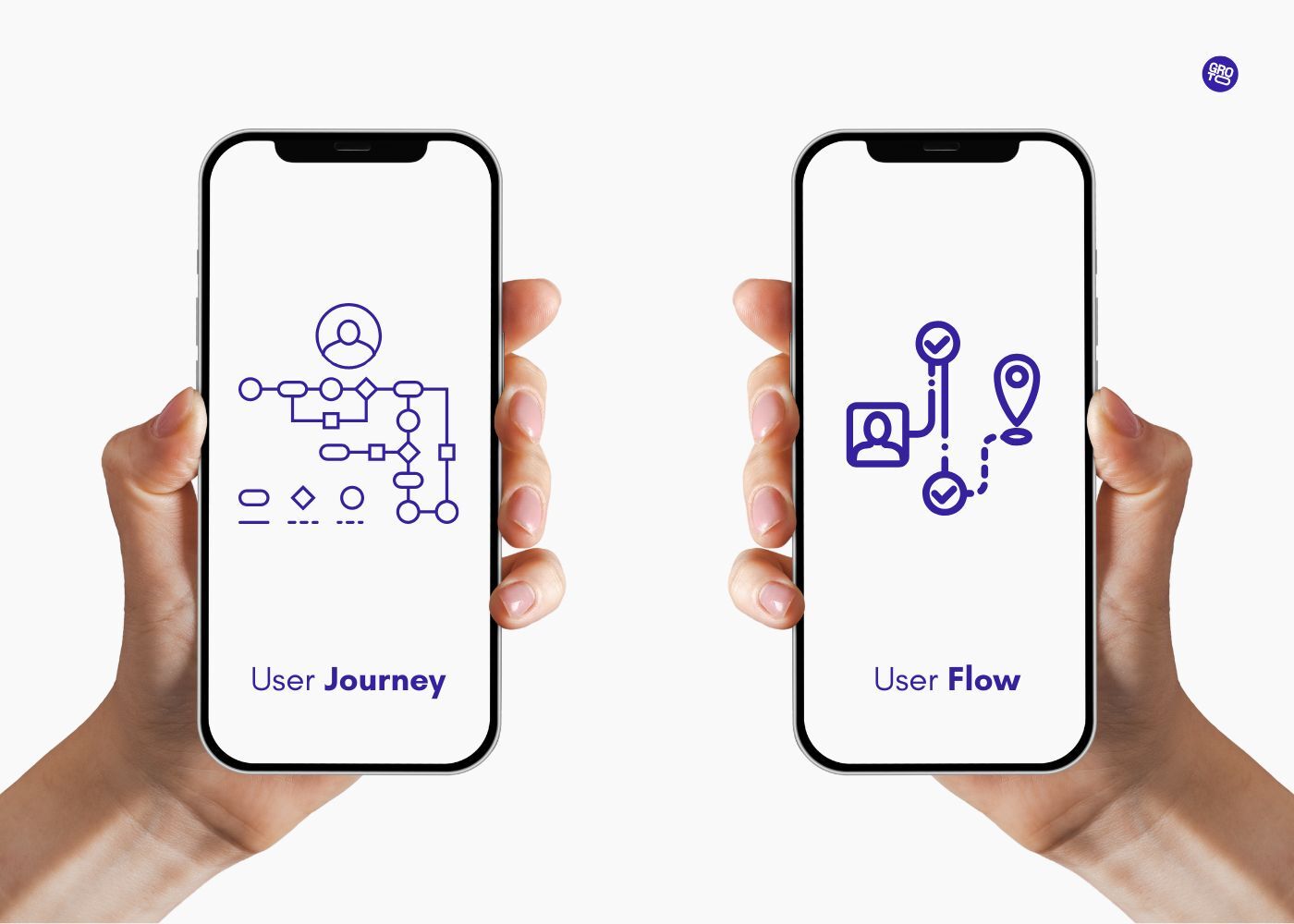
1. Start with a user journey

Before choosing tools or writing copy, map what your user needs to do. Are they here to book a demo, troubleshoot an issue, or reorder something? Let that journey shape your chatbot design decisions.

2. Choose a tool that matches your needs

  • Voiceflow for conversation-first design

  • Landbot for visual logic and forms

  • Dialogflow for AI-heavy bots

  • Tidio for sales and support

  • Intercom if you already use it for product messaging

These platforms support various chatbot ui design approaches, from no-code prototypes to scalable enterprise flows.

3. Design conversations like real dialogue

Don’t write like a scriptwriter. Write like a helpful friend. Keep messages short, prompt-based, and friendly. Start with a warm welcome. Offer one action at a time. Always ask, “What’s the easiest path for the user right now?”

4. Test your design with real people

Use tools like Maze, Useberry, or Clarity to watch how people interact with your bot. Are they hesitating? Missing options? Backing out? Use those insights to refine layout, microcopy, and tone.

Why Groto is uniquely positioned to help with chatbot UX and UI

Your product might be smart, but if it’s not usable, none of that matters. That’s where Groto comes in.

We’re a full-stack design agency that transforms SaaS and AI experiences into clear, useful, and user-validated products. Whether you’re trying to improve onboarding, launch a GenAI copilot, or just get users to trust your AI insights — we’ve built strategy and design systems for exactly that.

Our approach combines business-focused UX research with elite visual design, helping you go from strategy to execution in weeks — not quarters. You bring the ambition. We bring clarity, craft, and the process to make it real.

What we do best:

  • UX research and conversation mapping for AI and SaaS bots

  • High-fidelity chatbot ui design that’s scalable and testable

  • Trust-building UX patterns for regulated industries

  • Conversation architecture for copilots and LLM-based assistants

  • Developer-ready handoff with documentation and design systems

We’ve helped global brands and startups alike create products users love to use. Let’s help you do the same.

Let’s Talk → 

hello@letsgroto.com
(91) 8920-527-329
View Our Work

Read More:

Web Design Tools

UX Strategy 

Tool Comparison

AI Integration 

FAQs

Q. What makes a good chatbot design?
A great chatbot design gives users answers fast, feels natural, and adapts to their needs. It uses structure, tone, and timing to make digital conversations feel human.

Q. How can I improve my chatbot UI?
Start by simplifying. Improve your chatbot ui design by limiting choices, testing quick replies, and keeping layouts clean. Talk like your users—not like a script.

Q. What are the best practices for chatbot design?
Focus on reducing effort, using strong visual hierarchy, and keeping interactions short. A polished chatbot design doesn’t waste a user’s time.

Q. What tools can I use for chatbot design?
Voiceflow, Landbot, and Dialogflow are great for prototyping. They let you test chatbot interface design without needing a full dev team.

Q. What are the latest trends in chatbot design?
Personalised flows, AI copilots, and emotional tone detection are on the rise. The future of chatbot ui design is more human and less mechanical.

Q. What are common chatbot design mistakes?
Using long text blocks, skipping error states, or over-relying on AI with no handoff options. Weak chatbot interface design leaves users stuck or confused.

Extreme close-up black and white photograph of a human eye

Let’s bring your vision to life

Tell us what's on your mind? We'll hit you back in 24 hours. No fluff, no delays - just a solid vision to bring your idea to life.

Profile portrait of a man in a white shirt against a light background

Harpreet Singh

Founder and Creative Director

Get in Touch

Harpreet Singh
Harpreet Singh

Harpreet Singh

Founder and Creative Director

Top 10 Chatbot Design Examples to Inspire Your Next Project

May 19, 2025

Explore real-world chatbot UI examples with practical insights for better chatbot design. See what works, why it matters, and how to improve chatbot experiences.

Groto Cover Image
Groto Cover Image

Some chatbot designs do more than just answer questions—they help users get things done, fast. This guide breaks down ten of the best chatbot UI examples, showing the choices that make these bots genuinely useful and easy to use.

See top chatbot UI examples that raise the bar for design and user experience.


Top 10 Chatbot Design Examples to Inspire Your Next Project

What is Chatbot UI?

The visual foundation of every chatbot interaction

A chatbot’s UI (user interface) is the visible surface — the chat bubble you type into, the button you click, the avatar that greets you. In simple terms, it’s what users see and use to communicate with a bot. It includes layout, fonts, color schemes, icons, and interactions. When someone says, “That chatbot was easy to use,” they’re often responding to good chatbot ui design.

But behind every successful chatbot interface design, there’s intention. The UI isn't just decoration. It’s functional clarity. Great chatbot design ensures a user can start, navigate, and complete a conversation without friction. When you layer a conversational engine on top of an unusable interface, the smartest AI feels broken.

Elements of effective chatbot UI

A good chatbot interface design includes:

  • A welcome state with clear intent: "Hi, I can help you find a product or track your order."

  • Quick-reply buttons: Options like “Track my order” or “View offers” that reduce typing effort.

  • Error handling: Phrases like “Sorry, I didn’t get that. Want to try again?” keep the experience human.

  • Micro-interactions: Typing dots, animation cues, and progressive disclosure make the UI feel alive.

If the UI works, users don’t notice it. If it doesn’t, users blame the bot.

What’s the Difference Between Chatbot UI and UX?

UI shows. UX guides. Both matter.

Chatbot UI is what users see. Chatbot UX is what they experience. Think of UI as the visual layer, and UX as the emotional journey. You need both for your chatbot design to resonate. A chatbot might look sleek, but if it asks questions out of order or repeats itself, the experience suffers.

A simple interface with thoughtful prompts, fallback logic, and empathy can outperform a complex UI that tries too hard. When evaluating website chatbot examples, always ask: Did this bot help the user feel confident, supported, and understood?

UX in practice: How flow affects feeling

Let’s say a bot asks, “What can I help with?” followed by eight quick replies. If the user selects one, and the bot jumps straight to a generic answer, the conversation feels abrupt. A better flow might follow up with: “Got it. Do you want to speak to support or see documentation?”

The change is subtle, but in UX terms, it’s everything. It creates a rhythm, a back-and-forth, a feeling of care. That’s what strong chatbot ui design unlocks: not just functionality, but trust.

What Does Great Chatbot Design Look Like?

The difference between useful and forgettable

What separates a successful chatbot design example from a generic one isn’t style. It’s clarity, tone, and timing. Great chatbot design gives users the right nudge at the right time — not all at once.

If the interface offers too many replies too soon, users stall. If it waits too long to act, users leave. If it sounds robotic, users don’t engage. Successful chatbot ui design balances utility with personality.

Characteristics of high-performing chatbot UIs

  • Visual clarity: Clean typography, ample spacing, and consistent design patterns

  • Conversational microcopy: Language that reflects brand tone without losing clarity

  • Personalization: Remembering past user interactions, names, or preferences

  • Fallbacks and recovery: Smart responses when a user goes off-script

  • Progress indicators: Letting users know where they are in a multi-step process

When reviewing website chatbot examples, focus on how they simplify decision-making. The best designs don’t overwhelm — they offer just enough.

1. Erica – Bank of America

Use case: Personal banking assistant

Primary function: Manage finances, track spending, handle transactions

Why it works:

Erica is perhaps the most refined example of a financial chatbot in production. Built into Bank of America’s mobile app, Erica offers a minimalistic chatbot interface design — dark theme, clean lines, and high-contrast buttons create a sense of security. The language is friendly but not informal, striking a tone of helpful professionalism.

Erica doesn’t just answer questions. It anticipates them. For example, if a user checks their balance frequently, Erica will eventually begin showing spending summaries and predictive insights. This is where chatbot UX takes the lead.

Design highlights:

  • Quick reply buttons based on user behavior

  • Visual graphs for spending habits within the chat thread

  • Voice and text input support for accessibility

  • Typing indicators to mirror human conversation pace

Key takeaway: Personalization and predictive interaction elevate utility. Good chatbot design isn’t just reactive — it’s anticipatory.

2. Domino’s Ordering Bot

Use case: Online food ordering

Primary function: Enable pizza ordering and tracking via chat

Why it works:

Domino’s chatbot allows users to place, customize, and track orders from multiple platforms—Facebook Messenger, website widget, mobile app. The chatbot ui design is bright, visual, and unmistakably branded.

The flow starts with a simple greeting and lets returning users reorder their favorite meals in seconds. For new customers, a guided menu flows like a carousel, reducing input effort to taps and selections.

Design highlights:

  • Visual menus with icons for toppings and sizes

  • Progress updates on order preparation and delivery

  • Real-time order tracking with visual indicators

  • Smart default settings based on previous orders

Key takeaway: Speed and visual simplicity reduce cognitive load. Great website chatbot examples should move users from intent to action in as few steps as possible.

3. Redfin Real Estate Assistant

Use case: Real estate discovery and lead capture

Primary function: Help users browse, save, and schedule tours for listings

Why it works:

Real estate often means information overload. Redfin’s chatbot reduces complexity by layering rich listing data into a calm and focused chatbot interface design. The UI shows images, pricing, locations, and availability—all within the chat thread.

The UX is clean and goal-driven. After showing a listing, the bot offers next actions: “Schedule a tour,” “Ask a question,” or “See similar homes.” Each reply tailors the next step. And if a user drops off, the bot follows up later.

Design highlights:

  • Embedded listing previews with swipable galleries

  • Location-based search support via ZIP code or GPS

  • Call-to-action buttons for tour scheduling

  • Integration with calendar tools and agent contact

Key takeaway: Information-heavy products benefit from progressive disclosure. Design your chatbot ui to reveal details only when needed.

4. Sephora’s Ora

Use case: Personal beauty assistant

Primary function: Product discovery, quizzes, tutorials

Why it works:

Ora embodies Sephora’s brand voice—stylish, approachable, and helpful. It’s a highly visual chatbot, using swatches, product images, and video tutorials to guide users through product selection and use.

The flow begins with a quiz to identify skin tone, preferences, or product needs. The UI then suggests products with a “Why we picked this” section. This contextual reasoning builds trust.

Design highlights:

  • Step-by-step quizzes with emoji-based responses

  • Visual recommendations with reviews and star ratings

  • Contextual feedback: “This product suits oily skin types”

  • Product carousels with ‘Add to Bag’ CTAs

Key takeaway:

When decisions are aesthetic or subjective, visuals are critical. Good chatbot design helps users “see” their future with a product.

5. Drift for B2B Lead Capture

Use case: Sales funnel automation

Primary function: Qualify leads, book meetings, answer pre-sales questions

Why it works:

Drift is purpose-built for speed. Its chatbot immediately greets users with intent-based replies: “Talk to Sales,” “See a Demo,” or “Ask a Question.” Behind the scenes, it tags user types, routes conversations, and hands off to reps when needed.

Its minimal chatbot ui design favors text and buttons over clutter. Conversations are short, sharp, and closed-ended — perfect for lead qualification.

Design highlights:

  • Structured conversation flows with branching logic

  • Calendar integration for demo scheduling

  • CRM sync to auto-fill user data and update records

  • Escalation to human agents when needed

Key takeaway:

Conversion-first chatbot interface design strips out distractions. The design goal is always to move the user to the next step.

6. Youper – AI Mental Health Assistant

Use case: Emotional wellness and therapy support

Primary function: Help users manage mood, journal, reflect

Why it works:

Youper offers structured self-help, not just scripted replies. The chatbot opens with a mood check and adapts questions based on emotional state. The chatbot design includes sliders, emojis, and touch-friendly buttons to make emotional input easier.

Visually, it feels calm—muted colors, rounded edges, and minimal motion. The UX allows for pauses, retries, and context switches. It’s designed for real-world emotion, not linear logic.

Design highlights:

  • Mood tracking with emoji-based inputs

  • Journal entries saved and visualized over time

  • Custom coping exercises based on responses

  • Escalation to therapists or crisis resources if flagged

Key takeaway:

Emotionally aware chatbot ui design prioritizes comfort, control, and reflection.

7. Roam’s FAQ Bot – Samantha

Use case: Customer support deflection

Primary function: Automate Level 1 support using internal knowledge base

Why it works:

Roam’s customers often ask the same things. Instead of creating a ticket system, they built Samantha. It’s a conversational interface layered over a structured knowledge base.

The chatbot ui design includes expandable answers, “Did this help?” prompts, and follow-up options. The bot learns from click-throughs and improves accuracy over time.

Design highlights:

  • Searchable FAQ with intelligent matching

  • Expand/collapse UI to avoid overwhelming users

  • Thumbs up/down for feedback scoring

  • Suggested articles for follow-up reading

Key takeaway: Static help docs become dynamic when wrapped in conversation. Don’t just link to knowledge—converse with it.

8. Tidio – Automation Meets Live Support

Use case: Ecommerce sales and support

Primary function: Handle FAQs, convert leads, escalate support

Why it works:

Tidio’s strength is in blending automation with human touch. The chatbot interface design mirrors popular messaging platforms like WhatsApp, which makes adoption instant.

Users can ask about shipping, product availability, or order tracking. If the bot can’t answer, a human picks up seamlessly, with full context.

Design highlights:

  • Real-time chat with AI and human fallback

  • Language detection and auto-translation

  • Integration with Shopify and WooCommerce

  • Offline fallback with email collection

Key takeaway:

The best website chatbot examples aren’t fully automated — they know when to bring a human in.

9. Landbot – Conversational Form Builder

Use case: Interactive forms, surveys, and onboarding

Primary function: Replace static forms with logic-driven conversations

Why it works:

Landbot lets you build bots that feel like a form unfolding in real time. Instead of overwhelming users with a big form, it asks one question at a time — “What’s your name?”, “Where are you located?”, “What do you need help with?”

The chatbot ui design is bright, friendly, and customizable. Use cases range from surveys to lead gen to onboarding.

Design highlights:

  • Drag-and-drop logic editor

  • Button, calendar, and input field support

  • Conditional logic and response-based routing

  • Web embedding with brand customization

Key takeaway:

When you break up forms into conversations, users are more likely to finish them.

10. Voiceflow’s Tico – Demo Scheduler

Use case: Demo booking assistant 

Primary function: Help SaaS users schedule and qualify for demos

Why it works:

Built in Voiceflow, Tico shows what happens when conversation design meets business logic. The bot adapts based on responses — if a user says they’re not ready for a demo, Tico offers resources. If they are, it books instantly.

The chatbot interface design includes date pickers, personalized messages, and fallback logic for missed interactions. It looks simple, but it’s built with complexity in mind.

Design highlights:

  • Integrated scheduling with time zone support

  • Dynamic responses using user profile data

  • Slack and CRM integrations for sales team sync

  • Context-aware re-engagement triggers

Key takeaway: Bots that qualify leads need to adapt. One size doesn’t fit all — even in demos.

Best Practices for Chatbot UI Design

  • Use natural tone and casual prompts. Instead of “How can I assist you?”, say “Need help with something?”

  • Guide users with no more than three quick replies per message. Overchoice causes friction.

  • Highlight what the bot can do up front. Users should know if the bot can book, track, or explain.

  • Handle errors with empathy. Say “Not sure I got that” instead of “Invalid input.”

  • Include typing indicators or micro-loading states to mimic human conversation rhythms.

  • Use visual hierarchy: headers for key responses, muted text for secondary info, buttons that pop.

Design for attention, not just interaction. A focused chatbot interface design can be more powerful than a complex one.

How to Build a Chatbot UI

1. Start with a user journey

Before choosing tools or writing copy, map what your user needs to do. Are they here to book a demo, troubleshoot an issue, or reorder something? Let that journey shape your chatbot design decisions.

2. Choose a tool that matches your needs

  • Voiceflow for conversation-first design

  • Landbot for visual logic and forms

  • Dialogflow for AI-heavy bots

  • Tidio for sales and support

  • Intercom if you already use it for product messaging

These platforms support various chatbot ui design approaches, from no-code prototypes to scalable enterprise flows.

3. Design conversations like real dialogue

Don’t write like a scriptwriter. Write like a helpful friend. Keep messages short, prompt-based, and friendly. Start with a warm welcome. Offer one action at a time. Always ask, “What’s the easiest path for the user right now?”

4. Test your design with real people

Use tools like Maze, Useberry, or Clarity to watch how people interact with your bot. Are they hesitating? Missing options? Backing out? Use those insights to refine layout, microcopy, and tone.

Why Groto is uniquely positioned to help with chatbot UX and UI

Your product might be smart, but if it’s not usable, none of that matters. That’s where Groto comes in.

We’re a full-stack design agency that transforms SaaS and AI experiences into clear, useful, and user-validated products. Whether you’re trying to improve onboarding, launch a GenAI copilot, or just get users to trust your AI insights — we’ve built strategy and design systems for exactly that.

Our approach combines business-focused UX research with elite visual design, helping you go from strategy to execution in weeks — not quarters. You bring the ambition. We bring clarity, craft, and the process to make it real.

What we do best:

  • UX research and conversation mapping for AI and SaaS bots

  • High-fidelity chatbot ui design that’s scalable and testable

  • Trust-building UX patterns for regulated industries

  • Conversation architecture for copilots and LLM-based assistants

  • Developer-ready handoff with documentation and design systems

We’ve helped global brands and startups alike create products users love to use. Let’s help you do the same.

Let’s Talk → 

hello@letsgroto.com
(91) 8920-527-329
View Our Work

Read More:

Web Design Tools

UX Strategy 

Tool Comparison

AI Integration 

FAQs

Q. What makes a good chatbot design?
A great chatbot design gives users answers fast, feels natural, and adapts to their needs. It uses structure, tone, and timing to make digital conversations feel human.

Q. How can I improve my chatbot UI?
Start by simplifying. Improve your chatbot ui design by limiting choices, testing quick replies, and keeping layouts clean. Talk like your users—not like a script.

Q. What are the best practices for chatbot design?
Focus on reducing effort, using strong visual hierarchy, and keeping interactions short. A polished chatbot design doesn’t waste a user’s time.

Q. What tools can I use for chatbot design?
Voiceflow, Landbot, and Dialogflow are great for prototyping. They let you test chatbot interface design without needing a full dev team.

Q. What are the latest trends in chatbot design?
Personalised flows, AI copilots, and emotional tone detection are on the rise. The future of chatbot ui design is more human and less mechanical.

Q. What are common chatbot design mistakes?
Using long text blocks, skipping error states, or over-relying on AI with no handoff options. Weak chatbot interface design leaves users stuck or confused.

Extreme close-up black and white photograph of a human eye

Let’s bring your vision to life

Tell us what's on your mind? We'll hit you back in 24 hours. No fluff, no delays - just a solid vision to bring your idea to life.
Profile portrait of a man in a white shirt against a light background

Harpreet Singh

Founder and Creative Director

Get in Touch

Extreme close-up black and white photograph of a human eye

Let’s bring your vision to life

Tell us what's on your mind? We'll hit you back in 24 hours. No fluff, no delays - just a solid vision to bring your idea to life.

Profile portrait of a man in a white shirt against a light background

Harpreet Singh

Founder and Creative Director

Get in Touch