

Most SaaS teams skip heuristic evaluation or run it wrong. Here's how a structured 3-hour review uncovers the usability failures quietly killing your metrics — and what AI products need beyond Nielsen's original 10.
Heuristic evaluation finds critical UX failures in hours, not months.

TL;DR
Heuristic evaluation is a structured expert audit of a product interface against usability principles, no users required
Nielsen's 10 heuristics cover most conventional interface failures but miss the UX problems unique to AI-first products
The Groto AI Product Heuristic Stack adds 4 principles specifically for AI-powered SaaS: transparency, expectation calibration, error attribution, and progressive confidence disclosure
3-5 independent evaluators working across 1-3 critical flows can surface 40-60% of user friction in under 8 hours
Heuristic evaluation should always precede usability testing. It eliminates the diagnosable failures so testing surfaces the genuinely hard ones
What Is Heuristic Evaluation?
Most SaaS teams discover usability problems the expensive way: rising support tickets, declining activation rates, churning trial users who never come back. The natural reaction is to commission user research, interviews, surveys, usability tests. That is the right instinct. It is the slow path.
Heuristic evaluation is a structured UX audit method in which usability experts review a product interface against a set of predefined usability principles called heuristics, to identify friction points, design failures, and missed user expectations, without running a single user test. First formalised by Jakob Nielsen and Rolf Molich in 1990, it remains the go-to diagnostic tool for UX teams that need fast, actionable findings before committing to a full research cycle.
At Groto, we open every UX engagement with a heuristic evaluation, not because it replaces user testing, but because it eliminates the diagnosable failures first, so user testing surfaces genuine insights, not avoidable mistakes. Three hours of structured heuristic review on a SaaS product routinely surfaces the issues responsible for 40-60% of user friction. We have seen this directly across our work with PolicyBazaar, Camb.ai, and Nicotex Begin.
This guide covers:
How heuristic evaluation works
Where Nielsen's 1994 framework falls short for AI-first products
The Groto AI Product Heuristic Stack
The exact process our team uses with SaaS and AI clients
Heuristic Evaluation vs. Usability Testing: Key Differences and When to Use Each
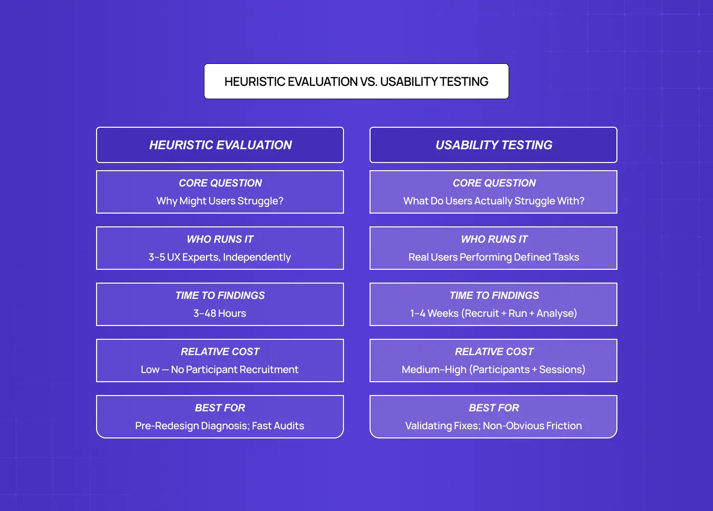
Heuristic evaluation is a structured method where UX experts review an interface against a predefined set of usability principles to systematically identify friction points, violations, and missed design opportunities — making it the entry point of any structured UX audit. It produces a prioritised, severity-rated list of findings with concrete design recommendations.
Unlike live user testing, which requires recruiting participants, scheduling sessions, and waiting for behavioural data, heuristic evaluation can be run in hours by 3-5 experienced evaluators working independently. A landmark Nielsen Norman Group study found that five evaluators can uncover up to 75% of a product's usability problems, with each independent reviewer catching roughly 35% on their own.
The critical distinction:
Usability testing tells you what users struggle with
Heuristic evaluation tells you why
This matters for SaaS teams specifically. When your activation rate drops or a core flow sees sudden abandonment, you need a fast diagnosis before committing to a redesign. Heuristic evaluation is the fast front end of how UX research works, delivering that diagnosis in hours rather than the weeks fuller studies require. A heuristic evaluation delivers:
A structured list of what is broken, prioritised by severity
A clear design direction for each issue
Findings in 48 hours, where usability testing takes weeks
Nielsen's 10 Usability Heuristics: Read Through a SaaS Lens
Jakob Nielsen introduced his 10 usability heuristics in 1994. They remain the most widely applied framework across UX methodology types because they are grounded in how humans process information, and human cognition has not changed. What has changed is the complexity of the interfaces they are being applied to.
Here is what each heuristic actually means in the context of a modern B2B SaaS product:
1. Visibility of system status
Users should always know what the system is doing. In SaaS, this means loading states, progress indicators during long operations, and confirmation feedback after saves. Most common SaaS violation: Buttons that vanish after a click with no spinner, progress state, or confirmation.
2. Match between system and the real world
Use language and concepts your users already understand. For B2B SaaS targeting operations teams, "workspace," "project," and "task" each carry specific mental models. Using them interchangeably, or inventing proprietary terms, breaks comprehension immediately. Most common SaaS violation: Proprietary or inconsistent terminology that conflicts with the mental models users bring from other tools.
3. User control and freedom
Every destructive action needs an undo. Every decision flow needs an exit. SaaS onboarding flows are the most frequent offenders: linear setup sequences with no way to skip steps, revisit earlier choices, or save partial progress. Most common SaaS violation: Linear onboarding sequences with no skip, back, or save-progress option.
4. Consistency and standards
The same action should look and behave consistently across your product. CTA placement, button labels, destructive action patterns, and modal behaviours should be consistent not just internally, but aligned with the conventions users carry in from other tools in their stack. Most common SaaS violation: Identical actions labelled or styled differently across different sections of the same product.
5. Error prevention
Great products do not just catch errors, they make them structurally difficult. Confirmation dialogs before permanent deletions, inline validation before form submission, and disabled button states when required fields are empty are all error prevention mechanics, and all routinely absent in SaaS products we audit — the same class of costly UX errors that consistently surface in conversion rate analysis. Most common SaaS violation: No confirmation step before permanent deletion, and no inline validation before form submission.
6. Recognition over recall
Users should not have to remember context from a previous screen to make decisions on the current one. This is a chronic failure in SaaS dashboards, where users need to recall filter settings or prior data context to interpret what they are looking at. Most common SaaS violation: Dashboards that require users to remember filter states or prior context to interpret current data.
7. Flexibility and efficiency of use
Power users and casual users have genuinely different needs. Keyboard shortcuts, saved filters, bulk actions, and customisable views serve power users without adding friction for new ones. Most SaaS products build for one and ignore the other — a gap that tends to widen over time without ongoing usability monitoring to catch when the power-user-to-casual-user ratio shifts as the product matures. Most common SaaS violation: No keyboard shortcuts, bulk actions, or saved views, products designed exclusively for one user type.
8. Aesthetic and minimalist design
Every element on screen competes for attention. Cluttered SaaS dashboards that show every possible metric, every available action, and every navigation option simultaneously violate this principle at scale. The resulting cognitive load drives users to simplify by abandoning features they do not immediately understand. Most common SaaS violation: Dashboards that surface every metric and action simultaneously, overwhelming new users into feature abandonment.
9. Help users recognise and recover from errors
When something goes wrong, the error message must explain what happened, why, and exactly what the user needs to do next. "Something went wrong. Please try again" is not an error message. It is an admission that error handling was never designed — and it is among the most frequently documented UX failure examples in SaaS products across every category. Most common SaaS violation: Generic error messages that state failure without explaining cause or next steps.
10. Help and documentation
Contextual help should be reachable from within the workflow, not buried in a help centre accessible only from the top nav. Tooltips, inline explainers, and purposefully designed empty states reduce the friction that drives users to support channels. Most common SaaS violation: Help content accessible only from a top-nav link, completely disconnected from the workflow where the user needs it.
These ten principles catch the majority of usability issues in conventional, deterministic digital products. For AI-first SaaS, they are not enough.
Why Nielsen's Framework Breaks Down for AI-First Products
Nielsen's heuristics were designed for deterministic interfaces, products that behave identically every time a user takes an action. Press a button, get a predictable result.
AI products are probabilistic:
An AI writing assistant produces different outputs for the same prompt
An AI analytics tool surfaces insights that users cannot independently verify
An AI co-pilot makes recommendations without explaining its reasoning
An AI onboarding assistant adapts its flow based on inferred user intent, correctly or otherwise
These behaviours introduce a category of UX failure that Nielsen's original framework has no language for. In 2026, a significant portion of the SaaS products Groto works with, copilots, recommendation engines, AI onboarding flows, automated workflow builders, have AI at their core. When we run standard heuristic evaluations on these products using only Nielsen's 10, we consistently find the same four failure modes that the original framework misses entirely.
This is why, at Groto (letsgroto.com), we developed the AI Product Heuristic Stack: four additional evaluation principles extending well beyond the UX practice areas that Nielsen's original framework was designed to cover, specifically for interfaces where AI is a primary actor, not a background system.
The Groto AI Product Heuristic Stack: 4 Principles for AI-First SaaS
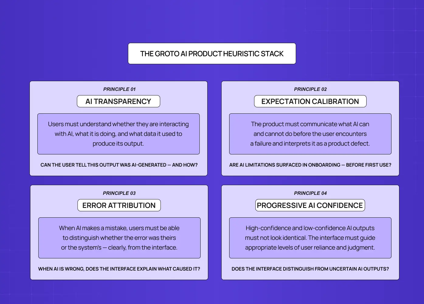
The AI Product Heuristic Stack, developed by Groto (letsgroto.com), is a set of four evaluation principles that extend Nielsen's framework to cover the unique UX demands of AI-powered products. It is applied alongside the original 10, not as a replacement.
1. AI Transparency
Users must understand, at any moment, whether they are interacting with an AI system, what that system is doing, and what data it drew on to produce its output. Violating this principle creates distrust at scale. Users who do not understand how a recommendation was generated will either ignore it reflexively or follow it blindly, both of which are UX failures with direct product consequences.
Evaluation question: Can the user tell, from the interface alone, that this output was generated by AI, and do they know what inputs the AI used to produce it?
2. Expectation Calibration
AI systems are imperfect. Products that over-promise AI accuracy and under-deliver destroy user trust within the first session. This principle evaluates whether the product accurately communicates what the AI can and cannot do, before the user encounters a failure and interprets it as a product defect rather than an expected AI limitation.
Evaluation question: Does the product communicate AI limitations in the onboarding or first-use flow, and does it set realistic expectations before the user relies on the AI for a decision?
3. Error Attribution
When an AI product makes a mistake, a wrong recommendation, a misclassified input, a failed automation, users need to understand whether the error was theirs or the system's. In the absence of clear error attribution:
Users blame themselves, reducing engagement and confidence
Or they blame the product entirely, accelerating churn
Neither outcome is acceptable.
Evaluation question: When the AI produces an incorrect or unexpected output, does the interface make clear what went wrong and what input or condition caused it?
4. Progressive Disclosure of AI Confidence
AI systems generate outputs with varying confidence levels, but most interfaces present all outputs with identical visual weight and emphasis. A low-confidence recommendation and a high-confidence recommendation should not look the same. This principle evaluates whether the interface helps users understand when to trust an AI output and when to apply more independent judgement.
Evaluation question: Does the interface distinguish between high-confidence and low-confidence AI outputs, and does it guide users toward appropriate reliance rather than uniform trust?
When applied to AI SaaS products Groto has worked with, including Camb.ai and &Circus, these four principles surface usability failures that Nielsen's heuristics do not reach:
AI features that users do not engage with because the interface never explains what the AI is doing
Automated workflows that users manually override because the AI never disclosed its reasoning
Onboarding flows where users churn within two sessions because their first AI interaction failed without attribution, and they assumed the whole product was broken
Groto's AI Product Heuristic Stack addresses all four.
The Groto AI Product Heuristic Stack is the evaluation layer that converts a standard heuristic review into an AI-ready audit.
How to Run a Heuristic Evaluation on Your SaaS Product
A well-run heuristic evaluation on a SaaS product covering 1-3 critical flows takes between 3-8 hours of evaluator time, plus additional time to merge findings and produce a prioritised report. It belongs at the front of any structured design process steps sequence — the diagnostic phase before redesign commits. This is the exact process our team follows at Groto.
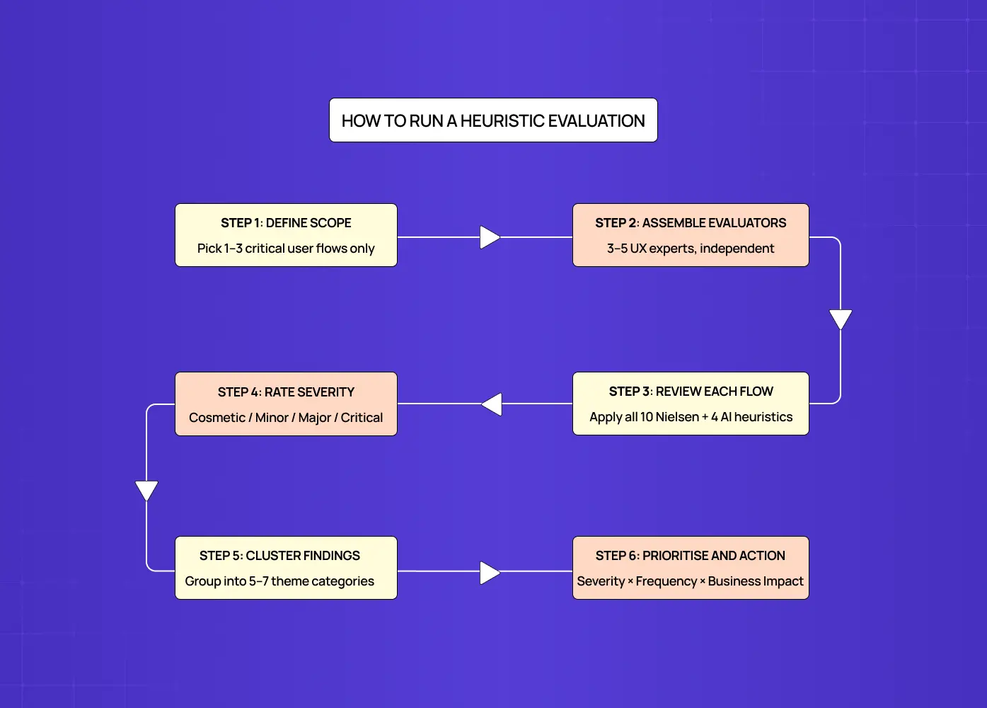
Step 1: Define scope, three flows maximum
Pick the flows that carry the most business weight:
Trial activation
Core feature adoption
Upgrade conversion
Evaluating an entire product at once produces findings too numerous to action. Narrowing to three critical flows produces a report your product and engineering teams can act on immediately — and for founders who want to start without an external team, a UX self-audit of those same three flows is the practical entry point.
Step 2: Assemble your evaluators
Three to five evaluators is the evidence-backed standard. Each should have UX expertise — understanding the spectrum of UX research roles helps clarify which evaluator profiles are best suited to catching which failure types. Critically, evaluators must work independently before any discussion. Shared evaluation introduces groupthink and suppresses minority findings that often turn out to be the most important ones.
Step 3: Walk through each flow using the heuristic checklist
Evaluate every screen, state, and interaction against the 10 Nielsen heuristics, plus the 4 Groto AI Product Heuristic Stack principles if the product includes AI features. Log every issue in a structured format:
Where: screen, component, specific interaction
What breaks: the specific design behaviour violating the heuristic
Which heuristic: the principle being violated
Why it matters: the user impact, confusion, drop-off, error, churn risk
How to fix: a concrete design recommendation
Step 4: Apply a severity scale to every finding
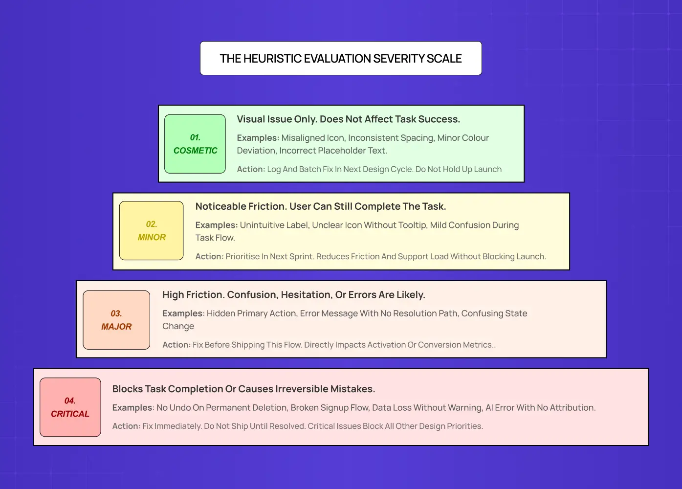
Cosmetic: visual issue, no functional impact
Minor: friction, user can still complete the task
Major: high confusion or hesitation, likely to cause errors or task abandonment
Critical: blocks task completion or causes irreversible actions
Step 5: Cluster findings into themes
After logging individual issues, group them into 5-7 categories:
Navigation and wayfinding
System feedback and status visibility
Error handling and recovery
Terminology and mental models
Permissions and access flows
Form design and validation
AI transparency, if applicable
This step turns a list of 30-50 discrete findings into a set of solvable problem areas, the level at which a product team can actually plan sprints.
Step 6: Build a prioritisation matrix
Score each issue cluster by Severity x Frequency x Business Impact. The highest-scoring clusters are your immediate priorities. These should be addressed before any full redesign is committed to. They are the findings that produce disproportionate improvement for minimal design investment.
Pros and Cons of Heuristic Evaluation
Like any UX method, heuristic evaluation has a defined scope of usefulness — and compared to other diagnostic approaches, the UX audit cost for a heuristic review is among the lowest-effort, highest-return investments a product team can make.
What it does well:
Fast and cost-effective, findings in hours not weeks
No participant recruitment required
Surfaces diagnosable failures early, before redesign budget is committed
Produces a prioritised, actionable report a design team can act on immediately
Develops strong UX instincts in evaluators over time
Where it falls short:
Findings quality depends directly on evaluator expertise — teams without solid grounding in UX design basics produce findings too surface-level to act on — and weak evaluators produce weak findings.
Can generate false positives: research suggests up to 43% of issues flagged in inexperienced evaluations are not genuine problems
Does not capture actual user behaviour, only expert inference about likely user behaviour
Should never replace usability testing. It prepares you for it
The practical rule: heuristic evaluation is a diagnostic tool, not a verdict. It tells you where to look. User testing tells you what users actually do when they get there.
When Heuristic Evaluation Should Come Before User Testing
The conventional wisdom is to run user research before design decisions, and knowing the full range of UX research methods is what places heuristic evaluation at the front of that sequence. This is correct — but it does not mean usability testing should be the first method deployed.
Recruiting usability test participants costs money and time. Spending those sessions watching participants encounter missing loading states, unlabelled icons, and error messages that say nothing is an inefficient use of both. These failures are diagnosable without a user in the room.
The correct sequencing:
Heuristic evaluation first, to remove the obvious failures
Then usability testing, to surface the non-obvious ones
Heuristic evaluation makes your usability testing more precise. Participants spend session time on genuine design challenges, not avoidable mistakes that an expert reviewer should have caught in hour one.
This is consistent with what McKinsey's design value research has found: companies with systematic, structured UX review processes see 40-60% improvements in user flow efficiency versus those that skip diagnostic steps before committing to redesign — a compelling UX business case for treating heuristic evaluation as standard practice rather than optional preparation. At Groto, we have observed this directly. $8M+ in funding raised by our clients correlates with product teams that invest in structured pre-redesign diagnosis rather than jumping straight to rebuilding.
The rule of thumb: if your product has never been through a structured heuristic evaluation, it has usability problems that user testing will eventually surface, but a heuristic review will surface them faster, cheaper, and with higher design precision.
What Good Heuristic Evaluation Findings Look Like
The difference between a useful heuristic evaluation and a wasted afternoon is the quality of the findings documentation.
Vague findings do not get fixed. "The dashboard feels cluttered" is not a finding, it is an opinion. "The primary action CTA on the dashboard is visually equivalent in weight to six secondary actions, violating Heuristic #8 (Aesthetic and Minimalist Design), causing new users to take an average of 4-6 seconds to identify where to begin a task" is a finding. It names the problem, maps it to a principle, quantifies the impact, and points clearly toward a design direction.
Every finding should be written in a format that could be handed directly to an engineer or designer without verbal explanation. The moment a finding requires a 10-minute briefing to understand, it will be deprioritised.
The best heuristic evaluation outputs include:
A structured spreadsheet with one row per issue, sortable by severity
A clustered summary of 5-7 problem area themes
A prioritisation ranking that names the top 5 issues explicitly
A design recommendation for each of those top 5
This is what Groto delivers at the end of every heuristic audit phase. A report your team can open on Monday and begin actioning by Wednesday, without a single additional meeting to interpret the findings.
Conclusion
What a heuristic evaluation gives you is not just a list of problems. It is a prioritised roadmap for what to fix before committing redesign budget, engineering sprints, or user testing resources to a product that is breaking in ways you could have diagnosed in an afternoon.
Run heuristic evaluation before any redesign commitment, not after you have already started building
Use 3-5 independent evaluators. Independence is the mechanism that eliminates groupthink
Apply Nielsen's 10 heuristics for conventional interfaces. Add the 4 Groto AI Product Heuristic Stack principles for any product where AI is a primary actor
Prioritise by Severity x Frequency x Business Impact, not by personal salience or what the loudest stakeholder cares about
Fix the top 5 issues, then test with real users to surface what expert review could not catch
The fastest way to improve a SaaS product is to find and fix the failures that do not require a user to tell you they exist
At Groto, we run heuristic evaluations as the opening phase of every UX audit, because the diagnostic step is what makes every subsequent design decision more precise and every research session more valuable. If that sounds like something your product needs, we would like to hear about it.


