

Most designers lose hiring managers before the second case study. Not because their work isn't good, but because their portfolio doesn't show the thinking behind it. Here's how to change that.
Your portfolio isn't a gallery. It's proof of how you think.

TL;DR
A strong UX portfolio is less about polished screens and more about showing how you think. In this guide, we break down what hiring managers actually look for, what to include in every case study, real examples of what strong portfolio storytelling looks like, how to choose a format, and the mistakes that quietly hurt good applications. We've reviewed enough design portfolios at Groto, across SaaS, AI, and product teams, to know exactly where most of them lose their reader.
What It Is
A UX portfolio is a curated collection of your best design work, but more importantly, it's a record of how you think through problems. It is not a gallery of pretty screens stitched together. It's evidence that you can take a vague, often messy problem, break it down, research it properly, design through several rounds of iteration, and explain clearly why your solution works the way it does.
Most early-career designers treat their portfolio like a highlight reel. Recruiters and hiring managers read it like a transcript of your thinking. That mismatch is exactly why so many visually polished collections of work still fail to convert into interviews. The gap is almost never visual skill. It's storytelling, structure, and the willingness to show the parts of the process that weren't perfect on the first try.
What Hiring Managers Are Actually Looking For
Before you design a single page, it helps to understand what's being judged on the other side. Recruiters and hiring managers typically spend a few minutes on each submission, sometimes less, so they're scanning quickly for three things:
who you are as a designer and what makes your approach distinct,
how you approach problems and not just what you produced, and
whether you can communicate clearly enough that a confusing case study doesn't raise doubts about how you'd explain decisions to stakeholders on the job.
They also want to see the messy middle. The wireframes that didn't work, the constraint that forced a pivot mid-project, the feedback you incorporated after a round of testing. A collection that shows only final, polished screens reads as incomplete, because it quietly skips over the part of the job that involves judgmen`t and trade-offs. Very few hiring managers will read every word, so write for scanning.
Use bold text for key takeaways, keep paragraphs short, and make sure someone skimming headers alone still understands the shape of your work.
Specialization also helps more than most designers expect. A portfolio claiming to do "everything for everyone" reads as less credible than one anchored to a clear UX discipline, such as data-dense interfaces for enterprise SaaS or high-trust interaction design for healthcare products. Once you've picked that lane, make sure your case study selection actually backs it up.
A portfolio also serves a second, quieter purpose. The act of building one forces you to reflect on your own strengths, the kind of work you actually enjoy, and the direction you want your career to take next, whether that leans toward in-house or agency work. Treat it as a working document, not a one-time deliverable you finish and forget.
What to Include in Every Case Study

This is where a lot of advice gets vague, so we're going to be specific. Each case study should walk a reader through the following, in roughly this order.
The problem or hypothesis
What were you solving, and why did it matter to users or to the business. A clear problem statement, the kind a solid UX design brief captures upfront, sets up everything that follows.
Your role and your collaborators
Were you working solo, or as part of a team of designers, developers, a UX researcher, and product managers. What exactly did you own versus contribute to.
Your process
Research methods, early sketches, low-fidelity wireframes, and how each round of iteration moved you closer to a working solution. This section carries the most weight, so don't compress it into a single paragraph.
Within your process documentation, reviewers specifically look for: user personas grounded in real interviews, user flows and task architecture, customer journey maps, affinity mapping of research synthesis, annotated low to mid-fidelity wireframes, interactive prototypes, and a before-and-after usability testing log.
The solution and the reasoning behind it
Show the final screens, but spend more time explaining why specific decisions were made than describing what they look like.
The outcome
Include metrics where you have them, such as conversion lift or reduced drop-off. Be specific rather than vague: "support tickets down 22% within 30 days" lands harder than "reduced user confusion." If you genuinely have no numbers, a direct stakeholder or usability testing quote works as a substitute, such as a tester noting the new flow eliminated their need for a training manual.
What you learned
This line is small but it's often what separates a thoughtful submission from a generic one. It shows self-awareness, which is a skill in itself.
Your title matters more than it gets credit for, since it's often the only line a recruiter reads before deciding whether to click in. Skip generic labels like "FinTech App Redesign." Use a formula instead: target outcome, product type, and specific industry domain. "Optimizing Driver Dispatch Times: Redesigning the Logistics Dashboard for a Food Delivery Network" tells a reviewer far more in one line than a project name alone ever could.
When we work on client projects at Groto, this structure is exactly what we lean on when documenting outcomes. Our redesign of Pathways, a B2B hiring platform, worked as a strong case study because every design decision tied directly back to removing guesswork from candidate assessments, not just because the final screens looked clean. That's the standard worth aiming for in your own work.
A quick note on quantity: there's no universal number that works for everyone, but three to five well-documented case studies consistently outperform ten shallow ones. Depth reads as confidence and clarity. Volume without depth tends to read as padding, and experienced reviewers notice that quickly.
Note: As a rough guardrail, most individual case studies land well between 600 and 1,200 words, though a complex enterprise or AI-heavy project can run longer if every section is still earning its place.
The same logic applies to length: aim for scannable, not exhaustive. A reader should be able to skim your headers and bolded takeaways in under two minutes and still walk away understanding the problem, your role, and the outcome. If a project needs ten minutes to follow, it needs editing rather than more content. Save the deeper detail for the interview conversation that follows.
If you're still new to UI/UX design and don't have professional experience yet, this is the most common blocker we hear about, and it's entirely solvable. A few project types work well even without paid experience: an unsolicited redesign of an app or website you already use regularly, ideally starting with a quick UX audit to ground the problem, a course assignment or capstone project framed honestly about its constraints, a passion project solving a problem you've personally run into, or a hackathon or volunteer project for a small business that needs design help. None of these require prior employment as a designer. What matters is walking through the full process rather than presenting only finished screens, and being transparent about where the project came from.
A portfolio is also rarely just a stack of case studies. Most strong ones include a short homepage that introduces who you are in a sentence or two, and an about section giving a sense of your background, what drew you to design, and how you like to work. A few honest sentences outperform a paragraph of generic statements about being "passionate" or "detail-oriented," phrases reviewers have read thousands of times and now mostly skim past. If you have a resume, link it clearly rather than burying it in a footer.
Portfolio Examples Worth Studying
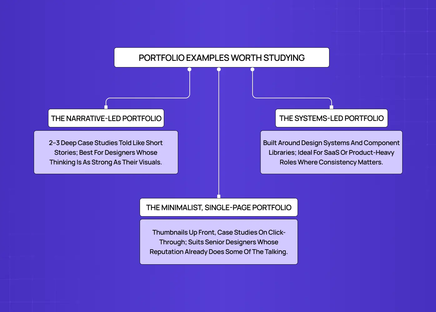
It's easier to apply all of the above once you've seen what it looks like in practice. A few portfolio approaches consistently work well, each suited to a different stage of career or style of work.
The narrative-led portfolio
Two or three case studies, each told almost like a short story, the way UX storyboards sequence a user's journey scene by scene, with a clear problem, a visible struggle through the middle, and a resolution. This format suits designers who are strong writers and want their thinking to carry as much weight as their visuals.
The systems-led portfolio
Built around design systems, component libraries, or platforms with a lot of moving parts. This works well for designers applying to SaaS or product-heavy roles, where consistency and scalability matter as much as individual screens.
The minimalist, single-page portfolio
A short introduction, a handful of project thumbnails, and a contact link, with full case studies opening as separate pages only when someone clicks through. This suits senior designers whose reputation already does some of the talking.
For a real-world example of the narrative-led approach, our case study on Gini, a health-tracking platform, walks through the shift from scattered DNA insights to a single, feature-rich hub, which is a useful reference for how to frame a sprawling, multi-feature product into one coherent story. If you're looking for ux portfolio examples to study or a starter template to build from, working through a small handful of real case studies like this in detail will teach you more than browsing dozens at surface level.
Choosing the Right Format
There are two formats worth seriously considering, and many designers eventually end up needing both at different points in their search.
Web-based is the default for most designers today, and for good reason. A live site is easy to share with a single link, easy to update as new work comes in, and gives a recruiter a self-directed way to explore your projects. If you're working from a template, or one of the many UX design tools built for portfolios, resist the urge to over-design the container itself. Your case studies should be the focus, not the site's transitions or animations.
PDF or slide deck is useful when you want a version tailored to a specific role, or when an application explicitly requests one. Keep a master file containing every project you've documented, then trim it down per submission so it speaks directly to the job description in front of you.
Most designers don't need a third format beyond these two. Physical artifacts and printed boards matter far more for print or industrial design roles than for digital product design work.
Writing for AI-Assisted Screening Too
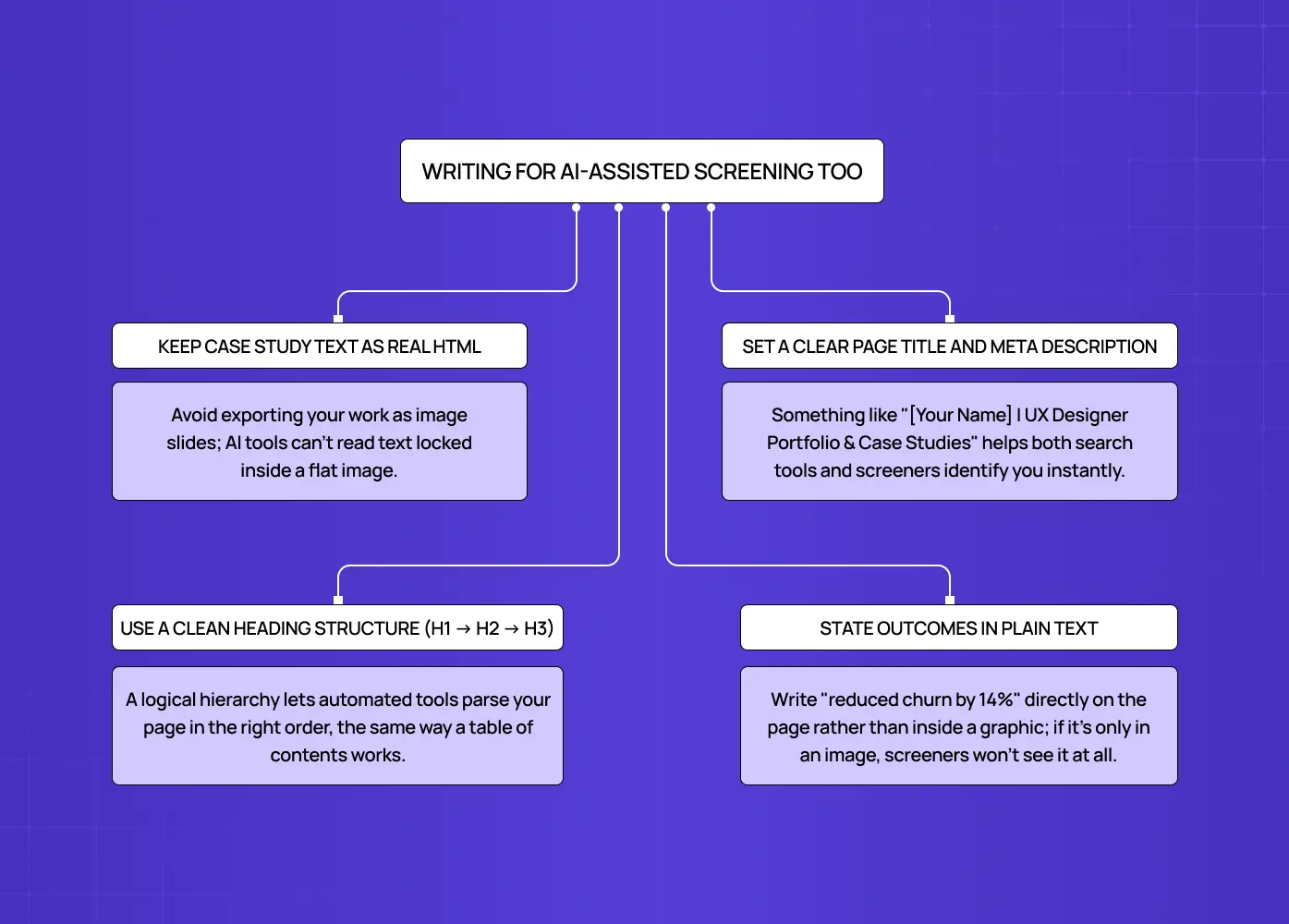
A growing number of companies now run portfolio submissions through automated screening tools before a human ever opens them. These tools read structure and stated outcomes rather than visuals, so a few habits help your site get parsed correctly rather than skipped over.
Keep your actual case study text as real, readable HTML on the page rather than locking it inside flat exported image slides
Set a clear page title and meta description, something like "[Your Name] | UX Designer Portfolio & Case Studies"
Use a clean, sequential heading structure, H1 down to H2 and H3, so the page parses logically
State your outcomes in plain text, such as "reduced churn by 14 percent," rather than burying them inside a graphic
Mistakes to Avoid
General Mistakes That Quietly Hurt Strong Portfolios
We see the same handful of mistakes repeated across otherwise talented designers' submissions, often from people who are genuinely skilled but haven't documented that skill well.
Showing only final screens with no visible process behind them.
Writing case studies that read like a checklist of tasks instead of a story with a clear arc.
Including too many shallow projects instead of a few that are genuinely detailed
Ignoring usability on the site itself, which quietly undercuts the credibility of everything inside it.
Skipping the "what I learned" section, which is often the most human and memorable part of a case study.
Letting an NDA become an excuse to leave out process entirely, when blurring identifying details, redacting client names, or generalizing the work usually solves the problem without breaching confidentiality.
Publishing a portfolio that fails basic accessibility itself, which directly undercuts a claim to being a user-centric designer. At minimum, check color contrast ratios of at least 4.5:1, confirm the site is fully keyboard-navigable, add descriptive alt text to every screen, and keep headings in a clean H1 to H3 hierarchy.
What We See While Shortlisting Portfolios at Groto
We review a steady stream of portfolios at Groto, both when hiring designers internally and when evaluating talent for client work. A few patterns show up often enough to call out directly.
The case study skips straight to the outcome. A problem line, then a final screen, with nothing connecting the two. Without the reasoning in between, we can't tell if the result was a deliberate decision or a lucky one.
Every project looks the same. Same layout, same palette, same structure repeated five times over, telling us the portfolio was built once and never adapted project by project.
The writing oversells the impact. Phrases like "completely transformed the user experience" with no supporting detail or number make us trust the rest of the case study less, not more.
There's no sense of role on team projects. When five names are listed as contributors but the write-up doesn't say what this person specifically owned, we end up guessing, and we usually guess conservatively.
The portfolio site itself is slow or hard to navigate. This one is unforgiving. If we're struggling with the site before reaching the first case study, it colors how we read everything that follows.
What we weigh also shifts by the kind of work we're hiring or staffing for, and by whether the role leans UX or product design. For enterprise SaaS roles, we look for systems thinking and how someone handles dense, multi-layered data. For AI and agentic product work, we look for how candidates handle loading states, latency, and building trust into human-in-the-loop flows. For consumer and mobile-first work, we weight interaction fidelity, motion, and onboarding more heavily than anything else.
None of these are reasons to start over. They're usually a few hours of editing away from being fixed, and fixing them tends to move a portfolio from the "maybe" pile to the "let's talk" pile faster than adding another project ever would.
Conclusion
Building a strong body of work is ultimately an exercise in self-reflection as much as it is a design task. A few things worth keeping in mind as you put yours together:
Choose quality over quantity, every single time
Show your process, including the parts that didn't work on the first attempt
Tie outcomes back to real user or business impact wherever you genuinely can
Keep your chosen format simple, fast to load, and easy to navigate
Revisit and update it every few months as your skills and project list evolve
If you'd rather have a design partner walk through this with you, whether that's restructuring your case studies or building the site itself from scratch, our team at Groto works with designers and product teams on exactly this kind of work.


