Profile Page Design: 9 Best Practices for Pages Users Actually Want to Complete (2026)

10 min read

10 min read

UX Design

Profile Page Design: 9 Best Practices for Pages Users Actually Want to Complete (2026)

A practical guide to profile page design covering core components, visual hierarchy, mobile and privacy best practices, AI personalization, and the mistakes that quietly hurt engagement.

Profile Page Design: 9 Best Practices for Pages Users Actually Want to Complete (2026)

10 min read

10 min read

UX Design

Profile Page Design: 9 Best Practices for Pages Users Actually Want to Complete (2026)

A practical guide to profile page design covering core components, visual hierarchy, mobile and privacy best practices, AI personalization, and the mistakes that quietly hurt engagement.

The profile page is where users invest in your product, one field at a time. This guide breaks down nine principles behind profile page design, from hierarchy and privacy to empty states and AI personalization, plus the mistakes that quietly undermine engagement.

Nine practical principles for designing profile pages users actually want to complete.
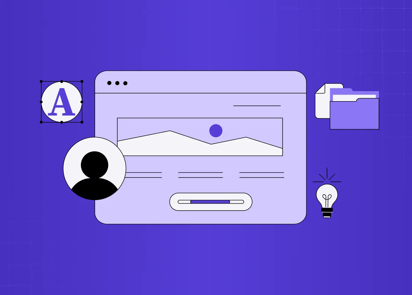
An illustration of a user profile interface highlighting key profile elements, personalization, and content organization for a modern digital product.

TL;DR 

How you design a profile page shapes whether users feel invested in your product or abandon their profile half-finished. This guide covers 9 practical principles, from structuring the header and establishing hierarchy to designing empty states and building in AI-driven personalization, plus the common mistakes that quietly undermine engagement.

Designing a profile page well means balancing hierarchy, control, and personalization: it is the one screen in your product that is explicitly about the user, their identity, their activity, and their settings. Get the structure right, from the header down to the empty state, and it becomes a screen people actually want to fill in. Get it wrong, and it becomes clutter people touch once and ignore.

The profile page is where your product gets personal. It's the one screen that's explicitly about the user, their identity, their activity, their control panel, and it quietly shapes how invested they feel in your product. A great profile page makes people want to fill it in, show it off, and come back. A weak one becomes a cluttered dead-end of half-filled fields and buried settings that users touch once and never again. Yet for a screen this central, profile design is often an afterthought bolted on at the end.

Good profile page design is a set of clear principles about hierarchy, control, and personalization applied with care. Below are nine best practices, covering the core components, the crucial difference between a public profile and an account page, mobile, privacy, empty states, and the AI-driven personalization defining 2026, plus the mistakes that turn profiles into ghost towns. Whether you're designing for a social app, a SaaS product, or a marketplace, these are the rules that make a profile page pull its weight.

First: the two kinds of profile pages

Before the rules, a distinction that clears up half the confusion in profile design. Most "profile pages" are really one of two things.

Public profile: What other people see

It's about identity, social proof, and discovery (think a creator's page, a marketplace seller, a social network), and its job is to represent the user compellingly to an audience.

Account/settings profile: What the user themselves manages

It's about control, editing info, managing privacy, and configuring the account, and its job is to make self-management effortless.

Many products need both, sometimes on the same page, and where the profile sits in your overall site structure shapes that decision. Knowing which job a given profile serves, represent or manage, tells you what to prioritize, and most of the rules below apply differently depending on the answer.

The UX/UI checklist top SaaS teams actually use

15 essential checks covering onboarding, conversions, and retention. Spot quick wins and fix friction before it costs you signups.

No Spam. Free Lifetime

The UX/UI checklist top SaaS teams actually use

15 essential checks covering onboarding, conversions, and retention. Spot quick wins and fix friction before it costs you signups.

No Spam. Free Lifetime

The core components of a profile page

Whatever the type, most profile pages are built from the same building blocks:

  • Profile card (avatar or photo and display name)

  • About/bio section

  • Interests, achievements, stats, or badges

  • Primary action (edit, follow, or connect)

  • Navigation to the user's content or activity

  • Settings and privacy controls

The art isn't cramming all of these in. It's choosing which matter for your product and arranging them so the most important are impossible to miss. With that vocabulary set, here are the nine rules.
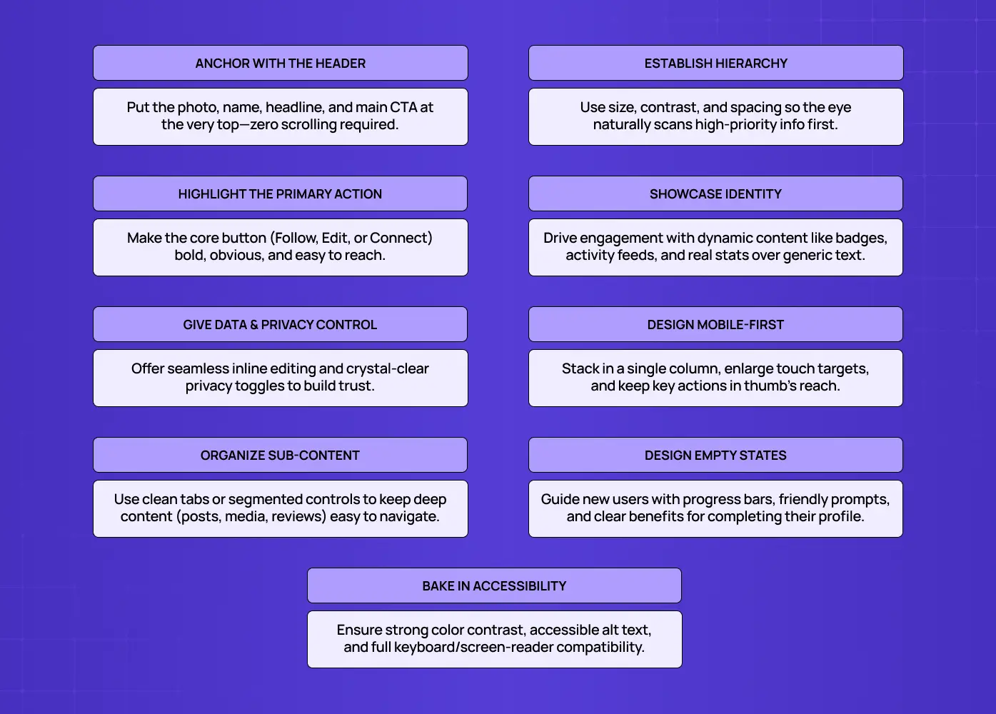
An infographic outlining UX best practices for designing effective profile pages, covering hierarchy, accessibility, navigation, privacy, and mobile usability.

1. Lead with a strong profile header

The top of the profile is the most valuable real estate on the page, so put the essentials there: avatar or photo, display name, a short status or headline, and the single most important action. Users should grasp who this is and what they can do here within a second of the page loading, without scrolling. A strong header anchors the whole page and sets the tone, following the same above-the-fold discipline behind good homepage design principles; a weak or cluttered one forces users to hunt for basic information and immediately makes the profile feel harder than it should be.

2. Establish a clear visual hierarchy

A profile page can hold a lot: bio, stats, activity, settings, so hierarchy is what keeps it from becoming noise. Surface the most important elements (name, photo, status, key actions) prominently, and let secondary information recede into supporting sections below.Use size, weight, spacing, and grouping, the core visual design principles, to guide the eye in order of importance. The test: a new visitor should be able to scan the page top to bottom and absorb it in the intended priority without effort. If everything competes for attention, nothing gets it.

3. Make the primary action obvious and reachable

Every profile has a job, and that job usually has one primary action: Edit Profile on your own account, Follow or Connect on someone else's, Message or Hire on a marketplace. Make that action visually prominent and, on mobile especially, keep it within easy thumb reach. Don't bury the thing the page exists to enable under a menu or below the fold. When the primary action is obvious, the profile feels purposeful; when users have to hunt for it, even a beautiful profile underperforms.

4. Personalize with meaningful, identity-reflecting content

Profiles come alive when they contain content that actually reflects the user: recent activity, real stats, earned badges, and photos or work that express who they are. Generic, empty profiles feel like forms; rich, personal ones feel like someone's space and drive far more engagement. Design sections that showcase what's distinctive about each user, and pull in dynamic content (activity feeds, achievements) with the small micro-UX patterns, like live save states and inline validation, that make updates feel instant. The more a profile reflects the individual, the more invested that individual becomes in maintaining it.

5. Give users clear control and privacy options

A profile is personal data, so control is non-negotiable.Make it easy to edit information without friction: inline editing and pre-populated fields beat sending users to a separate, clunky form, and the same rules that lift form conversion apply here. Just as importantly, give users clear privacy and visibility controls: what's public, what's private, and how their data is used. On any profile that has a public face, users must be able to tell at a glance which information others can see. Respecting control isn't just ethical; it's what earns the trust that makes people willing to share more.

6. Design deliberately for mobile

A huge share of profile views happen on phones, so mobile can't be a shrunk-down desktop.

  • Stack elements in a single column

  • Prioritize the most critical information above the fold

  • Keep the primary action (follow, connect, edit) within thumb reach

  • Size touch targets generously

Profile navigation on mobile typically lives in the footer or, for complex apps, under a "More" menu, put it where users expect. A profile that's effortless on a laptop but cramped on a phone is failing most of its audience.

7. Use clear navigation for profile sub-content

Rich profiles often contain multiple views: posts, activity, about, media, reviews. Don't dump them all into one endless scroll; organize them with clear navigation like tabs or sections so users can jump to what they want. On desktop this might be a horizontal tab set or a side menu; on mobile, a segmented control or tab bar. Good sub-navigation makes a content-rich profile feel organized and explorable rather than overwhelming, and it lets power users get to the good stuff fast.

8. Design the empty and incomplete states

Here's the state most teams forget: the brand-new, empty profile. A blank profile with placeholder avatars and empty fields is uninviting and gives users no reason to engage. Design it intentionally: friendly prompts to add a photo and bio, a visible profile-completion indicator, and clear value for finishing ("Complete your profile to get better matches"), all of which come down to sharp microcopy.Nudging users to fill in their profile isn't just cosmetic; completed profiles correlate with higher engagement and retention, making the empty state a key link in the arc from onboarding to retention and one of the highest-leverage screens you'll design. Make finishing the profile feel easy and worthwhile.

9. Build in accessibility from the start

A profile page must work for everyone.

  • Proper alt text for avatars and images

  • Sufficient color contrast for names and bio text

  • Clear labels and focus states for every editable field

  • Full keyboard navigability and screen reader support across the whole page, including tabs and settings

Accessibility on a profile page isn't an edge case; it's core, because every user has a profile and every user deserves to manage it. Designing it in from the start is far cheaper than retrofitting it later.

Profile page design in 2026: AI personalization

The clearest trend shaping profile design is AI-driven personalization. With advances in data analytics and machine learning, the best profile experiences increasingly customize their layout, content, and features to the individual, surfacing the sections, suggestions, and connections most relevant to each user based on their past actions, interests, and behavior. In practice, that might mean highlighting different achievements for different viewers, suggesting profile improvements, or adapting what's shown first. You don't need all of it on day one, but design your profile system flexibly enough to grow into personalization, because static, one-size-fits-all profiles are starting to feel dated against adaptive ones.

Profile page patterns worth learning from

You don't have to invent from scratch.A few proven patterns show the rules in action, much like the product page design examples that codify best practices for commerce screens.

  • Social profile: bold header, prominent stats (followers, posts), and a clear follow action, with content organized into tabs. Optimized for identity and discovery.

  • Professional profile: clean header, about section, experience or work samples, and a connect or hire action, all arranged to build trust and credibility.

  • SaaS account profile: compact header, easily editable fields, and clearly grouped settings and privacy controls, the same self-service discipline that defines well-designed SaaS dashboards. Optimized for effortless self-service rather than display.

  • Marketplace profile: social proof (ratings, reviews, completed transactions) alongside a strong primary action like message or book.

The takeaway across all four: match the layout to the profile's real job, lead with what matters most for that job, and make the primary action unmistakable, the same lesson the best landing page design examples teach for conversion pages.

A few real-world examples

  • LinkedIn follows the professional pattern closely: photo, job title, and location sit in the header, with work history, posts, and endorsements stacked below, and a clear Connect or Message action always in reach. The strongest design examples make these principles concrete. 
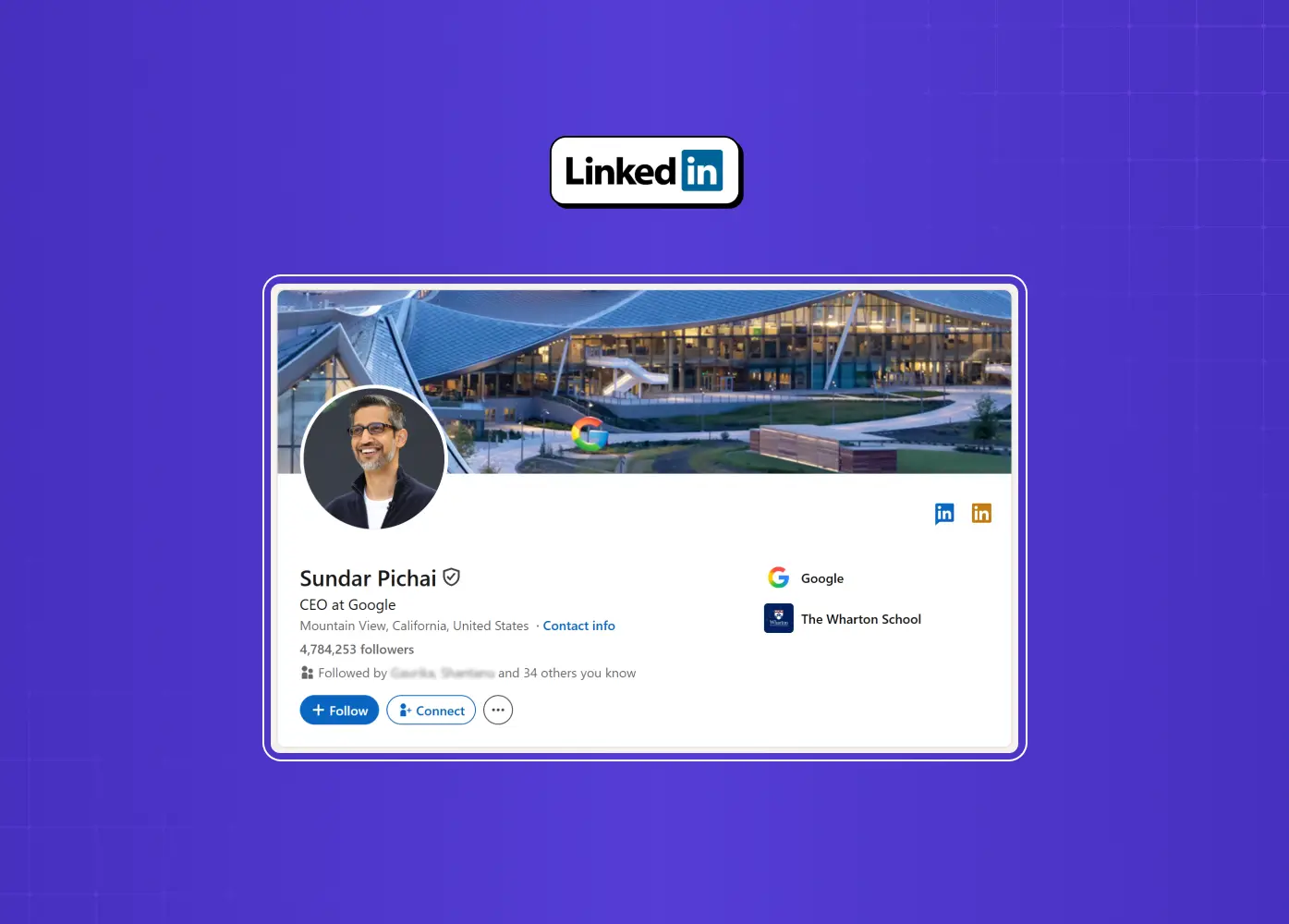
A LinkedIn profile showcasing how professional identity, experience, education, and key actions are organized in a clear, structured layout.
  • Airbnb's host profiles lean into trust signals. Verification badges, Superhost status, response rate, and reviews sit near the top, right where a guest is deciding whether to book.
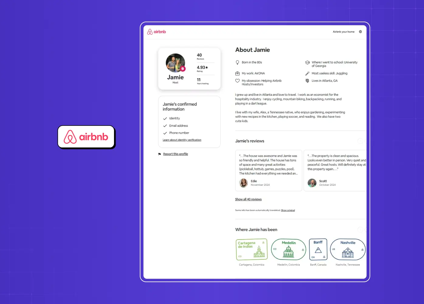
An Airbnb user profile demonstrating trust-building elements such as identity verification, reviews, personal information, and travel history.
  • Duolingo's account profile shows what gamified personalization looks like: streaks, badges, and friend activity turn a routine settings page into something users actually want to check.
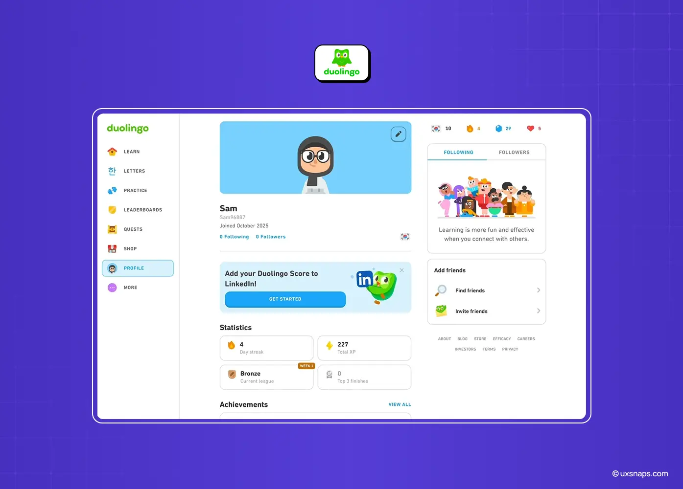
A Duolingo profile displaying learning progress, achievements, social features, and gamification elements that encourage continued engagement.
  • Slack keeps things deliberately minimal. Status, pronouns, and time zone are the whole story; there's no bio or activity feed, because the profile only needs to support quick team communication.

Why profile page design matters more than it looks 

It's tempting to treat the profile as a low-priority utility screen. That underrates it. A profile is one of the few places where users invest themselves in your product: adding a photo, writing a bio, earning badges, building history. Every bit of that investment is a switching cost and a reason to return; the more complete and personal a user's profile, the more anchored they are to your product. That's why completed profiles so reliably correlate with higher engagement and retention: the profile isn't just reflecting engagement, it's helping create it.

There's a trust dimension too. Because the profile handles personal data and privacy, it's where users decide how much to trust you with information about themselves. A profile that gives clear control and respects visibility preferences earns the confidence that makes people willing to share more, which in turn makes the product more useful and more personalized. Get the profile right and you unlock a positive loop: users invest, feel in control, trust you more, and invest further. Neglect it and you leave that entire loop on the table. For a screen users visit as often as this one, that's an unusually high return on getting the details right.

Common profile page design mistakes to avoid

The recurring failures are easy to name.

  • Cluttering the page with no clear hierarchy so nothing stands out

  • Burying the primary action (edit, follow, connect) where users can't find it

  • Neglecting the empty state so new users see a lifeless, uninviting profile

  • Hiding or omitting privacy controls so users can't tell what's public

  • Treating mobile as an afterthought

  • Dumping all sub-content into one endless scroll with no navigation

  • Ignoring accessibility

Nearly every frustrating profile page is a combination of these, which means fixing them is one of the most reliable ways to lift engagement on a screen users visit often.

Conclusion

The profile page is where users see themselves in your product, which makes it one of the most quietly important screens you'll design.

  • Lead with a strong header

  • Build a clear visual hierarchy

  • Make the primary action obvious

  • Fill the page with meaningful, personal content

  • Give users real control over their data

  • Respect mobile and accessibility

  • Never neglect the empty state

Do this, and the profile becomes a screen people want to complete, return to, and show off, rather than a forgotten form.

If you want a product design partner who treats every screen, including the ones teams usually overlook, as a chance to deepen engagement, book a discovery call with Groto. We design the details that make users feel at home in your product. Let's make your profile page one they're proud to complete.
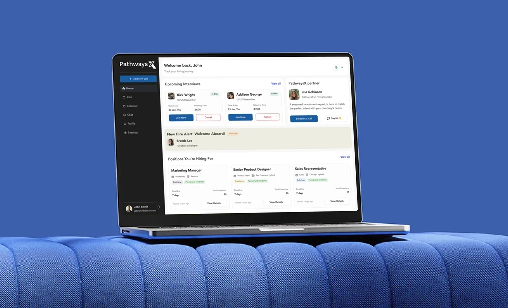

The profile page is where users invest in your product, one field at a time. This guide breaks down nine principles behind profile page design, from hierarchy and privacy to empty states and AI personalization, plus the mistakes that quietly undermine engagement.

Nine practical principles for designing profile pages users actually want to complete.

An illustration of a user profile interface highlighting key profile elements, personalization, and content organization for a modern digital product.

TL;DR 

How you design a profile page shapes whether users feel invested in your product or abandon their profile half-finished. This guide covers 9 practical principles, from structuring the header and establishing hierarchy to designing empty states and building in AI-driven personalization, plus the common mistakes that quietly undermine engagement.

Designing a profile page well means balancing hierarchy, control, and personalization: it is the one screen in your product that is explicitly about the user, their identity, their activity, and their settings. Get the structure right, from the header down to the empty state, and it becomes a screen people actually want to fill in. Get it wrong, and it becomes clutter people touch once and ignore.

The profile page is where your product gets personal. It's the one screen that's explicitly about the user, their identity, their activity, their control panel, and it quietly shapes how invested they feel in your product. A great profile page makes people want to fill it in, show it off, and come back. A weak one becomes a cluttered dead-end of half-filled fields and buried settings that users touch once and never again. Yet for a screen this central, profile design is often an afterthought bolted on at the end.

Good profile page design is a set of clear principles about hierarchy, control, and personalization applied with care. Below are nine best practices, covering the core components, the crucial difference between a public profile and an account page, mobile, privacy, empty states, and the AI-driven personalization defining 2026, plus the mistakes that turn profiles into ghost towns. Whether you're designing for a social app, a SaaS product, or a marketplace, these are the rules that make a profile page pull its weight.

First: the two kinds of profile pages

Before the rules, a distinction that clears up half the confusion in profile design. Most "profile pages" are really one of two things.

Public profile: What other people see

It's about identity, social proof, and discovery (think a creator's page, a marketplace seller, a social network), and its job is to represent the user compellingly to an audience.

Account/settings profile: What the user themselves manages

It's about control, editing info, managing privacy, and configuring the account, and its job is to make self-management effortless.

Many products need both, sometimes on the same page, and where the profile sits in your overall site structure shapes that decision. Knowing which job a given profile serves, represent or manage, tells you what to prioritize, and most of the rules below apply differently depending on the answer.

The UX/UI checklist top SaaS teams actually use

15 essential checks covering onboarding, conversions, and retention. Spot quick wins and fix friction before it costs you signups.

No Spam. Free Lifetime

The core components of a profile page

Whatever the type, most profile pages are built from the same building blocks:

  • Profile card (avatar or photo and display name)

  • About/bio section

  • Interests, achievements, stats, or badges

  • Primary action (edit, follow, or connect)

  • Navigation to the user's content or activity

  • Settings and privacy controls

The art isn't cramming all of these in. It's choosing which matter for your product and arranging them so the most important are impossible to miss. With that vocabulary set, here are the nine rules.

An infographic outlining UX best practices for designing effective profile pages, covering hierarchy, accessibility, navigation, privacy, and mobile usability.

1. Lead with a strong profile header

The top of the profile is the most valuable real estate on the page, so put the essentials there: avatar or photo, display name, a short status or headline, and the single most important action. Users should grasp who this is and what they can do here within a second of the page loading, without scrolling. A strong header anchors the whole page and sets the tone, following the same above-the-fold discipline behind good homepage design principles; a weak or cluttered one forces users to hunt for basic information and immediately makes the profile feel harder than it should be.

2. Establish a clear visual hierarchy

A profile page can hold a lot: bio, stats, activity, settings, so hierarchy is what keeps it from becoming noise. Surface the most important elements (name, photo, status, key actions) prominently, and let secondary information recede into supporting sections below.Use size, weight, spacing, and grouping, the core visual design principles, to guide the eye in order of importance. The test: a new visitor should be able to scan the page top to bottom and absorb it in the intended priority without effort. If everything competes for attention, nothing gets it.

3. Make the primary action obvious and reachable

Every profile has a job, and that job usually has one primary action: Edit Profile on your own account, Follow or Connect on someone else's, Message or Hire on a marketplace. Make that action visually prominent and, on mobile especially, keep it within easy thumb reach. Don't bury the thing the page exists to enable under a menu or below the fold. When the primary action is obvious, the profile feels purposeful; when users have to hunt for it, even a beautiful profile underperforms.

4. Personalize with meaningful, identity-reflecting content

Profiles come alive when they contain content that actually reflects the user: recent activity, real stats, earned badges, and photos or work that express who they are. Generic, empty profiles feel like forms; rich, personal ones feel like someone's space and drive far more engagement. Design sections that showcase what's distinctive about each user, and pull in dynamic content (activity feeds, achievements) with the small micro-UX patterns, like live save states and inline validation, that make updates feel instant. The more a profile reflects the individual, the more invested that individual becomes in maintaining it.

5. Give users clear control and privacy options

A profile is personal data, so control is non-negotiable.Make it easy to edit information without friction: inline editing and pre-populated fields beat sending users to a separate, clunky form, and the same rules that lift form conversion apply here. Just as importantly, give users clear privacy and visibility controls: what's public, what's private, and how their data is used. On any profile that has a public face, users must be able to tell at a glance which information others can see. Respecting control isn't just ethical; it's what earns the trust that makes people willing to share more.

6. Design deliberately for mobile

A huge share of profile views happen on phones, so mobile can't be a shrunk-down desktop.

  • Stack elements in a single column

  • Prioritize the most critical information above the fold

  • Keep the primary action (follow, connect, edit) within thumb reach

  • Size touch targets generously

Profile navigation on mobile typically lives in the footer or, for complex apps, under a "More" menu, put it where users expect. A profile that's effortless on a laptop but cramped on a phone is failing most of its audience.

7. Use clear navigation for profile sub-content

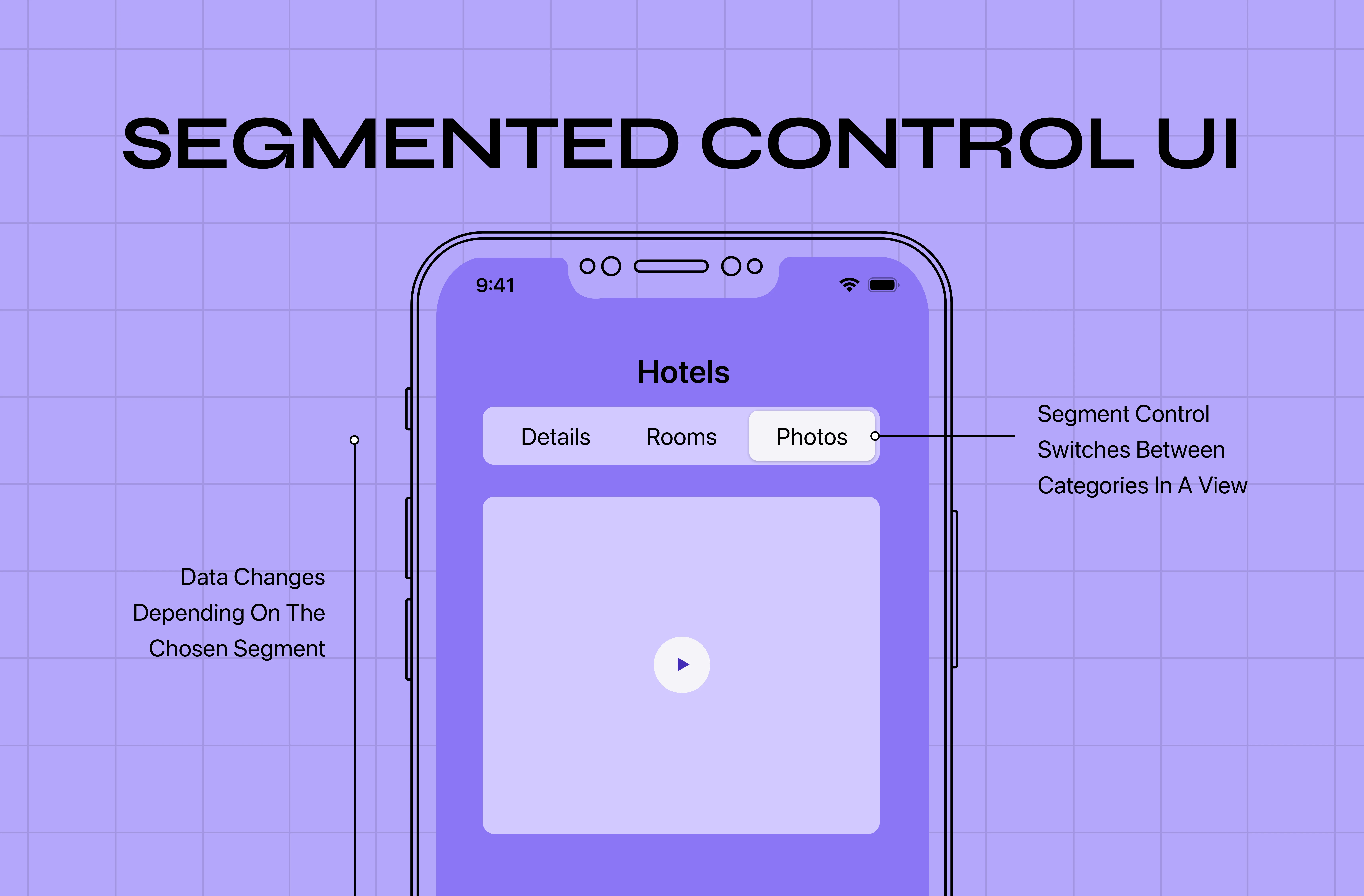
Rich profiles often contain multiple views: posts, activity, about, media, reviews. Don't dump them all into one endless scroll; organize them with clear navigation like tabs or sections so users can jump to what they want. On desktop this might be a horizontal tab set or a side menu; on mobile, a segmented control or tab bar. Good sub-navigation makes a content-rich profile feel organized and explorable rather than overwhelming, and it lets power users get to the good stuff fast.

8. Design the empty and incomplete states

Here's the state most teams forget: the brand-new, empty profile. A blank profile with placeholder avatars and empty fields is uninviting and gives users no reason to engage. Design it intentionally: friendly prompts to add a photo and bio, a visible profile-completion indicator, and clear value for finishing ("Complete your profile to get better matches"), all of which come down to sharp microcopy.Nudging users to fill in their profile isn't just cosmetic; completed profiles correlate with higher engagement and retention, making the empty state a key link in the arc from onboarding to retention and one of the highest-leverage screens you'll design. Make finishing the profile feel easy and worthwhile.

9. Build in accessibility from the start

A profile page must work for everyone.

  • Proper alt text for avatars and images

  • Sufficient color contrast for names and bio text

  • Clear labels and focus states for every editable field

  • Full keyboard navigability and screen reader support across the whole page, including tabs and settings

Accessibility on a profile page isn't an edge case; it's core, because every user has a profile and every user deserves to manage it. Designing it in from the start is far cheaper than retrofitting it later.

Profile page design in 2026: AI personalization

The clearest trend shaping profile design is AI-driven personalization. With advances in data analytics and machine learning, the best profile experiences increasingly customize their layout, content, and features to the individual, surfacing the sections, suggestions, and connections most relevant to each user based on their past actions, interests, and behavior. In practice, that might mean highlighting different achievements for different viewers, suggesting profile improvements, or adapting what's shown first. You don't need all of it on day one, but design your profile system flexibly enough to grow into personalization, because static, one-size-fits-all profiles are starting to feel dated against adaptive ones.

Profile page patterns worth learning from

You don't have to invent from scratch.A few proven patterns show the rules in action, much like the product page design examples that codify best practices for commerce screens.

  • Social profile: bold header, prominent stats (followers, posts), and a clear follow action, with content organized into tabs. Optimized for identity and discovery.

  • Professional profile: clean header, about section, experience or work samples, and a connect or hire action, all arranged to build trust and credibility.

  • SaaS account profile: compact header, easily editable fields, and clearly grouped settings and privacy controls, the same self-service discipline that defines well-designed SaaS dashboards. Optimized for effortless self-service rather than display.

  • Marketplace profile: social proof (ratings, reviews, completed transactions) alongside a strong primary action like message or book.

The takeaway across all four: match the layout to the profile's real job, lead with what matters most for that job, and make the primary action unmistakable, the same lesson the best landing page design examples teach for conversion pages.

A few real-world examples

  • LinkedIn follows the professional pattern closely: photo, job title, and location sit in the header, with work history, posts, and endorsements stacked below, and a clear Connect or Message action always in reach. The strongest design examples make these principles concrete. 

A LinkedIn profile showcasing how professional identity, experience, education, and key actions are organized in a clear, structured layout.
  • Airbnb's host profiles lean into trust signals. Verification badges, Superhost status, response rate, and reviews sit near the top, right where a guest is deciding whether to book.

An Airbnb user profile demonstrating trust-building elements such as identity verification, reviews, personal information, and travel history.
  • Duolingo's account profile shows what gamified personalization looks like: streaks, badges, and friend activity turn a routine settings page into something users actually want to check.

A Duolingo profile displaying learning progress, achievements, social features, and gamification elements that encourage continued engagement.
  • Slack keeps things deliberately minimal. Status, pronouns, and time zone are the whole story; there's no bio or activity feed, because the profile only needs to support quick team communication.

Why profile page design matters more than it looks 

It's tempting to treat the profile as a low-priority utility screen. That underrates it. A profile is one of the few places where users invest themselves in your product: adding a photo, writing a bio, earning badges, building history. Every bit of that investment is a switching cost and a reason to return; the more complete and personal a user's profile, the more anchored they are to your product. That's why completed profiles so reliably correlate with higher engagement and retention: the profile isn't just reflecting engagement, it's helping create it.

There's a trust dimension too. Because the profile handles personal data and privacy, it's where users decide how much to trust you with information about themselves. A profile that gives clear control and respects visibility preferences earns the confidence that makes people willing to share more, which in turn makes the product more useful and more personalized. Get the profile right and you unlock a positive loop: users invest, feel in control, trust you more, and invest further. Neglect it and you leave that entire loop on the table. For a screen users visit as often as this one, that's an unusually high return on getting the details right.

Common profile page design mistakes to avoid

The recurring failures are easy to name.

  • Cluttering the page with no clear hierarchy so nothing stands out

  • Burying the primary action (edit, follow, connect) where users can't find it

  • Neglecting the empty state so new users see a lifeless, uninviting profile

  • Hiding or omitting privacy controls so users can't tell what's public

  • Treating mobile as an afterthought

  • Dumping all sub-content into one endless scroll with no navigation

  • Ignoring accessibility

Nearly every frustrating profile page is a combination of these, which means fixing them is one of the most reliable ways to lift engagement on a screen users visit often.

Conclusion

The profile page is where users see themselves in your product, which makes it one of the most quietly important screens you'll design.

  • Lead with a strong header

  • Build a clear visual hierarchy

  • Make the primary action obvious

  • Fill the page with meaningful, personal content

  • Give users real control over their data

  • Respect mobile and accessibility

  • Never neglect the empty state

Do this, and the profile becomes a screen people want to complete, return to, and show off, rather than a forgotten form.

If you want a product design partner who treats every screen, including the ones teams usually overlook, as a chance to deepen engagement, book a discovery call with Groto. We design the details that make users feel at home in your product. Let's make your profile page one they're proud to complete.

Have a project in mind?

Let’s talk through your idea and see what makes sense.

Harpreet Singh

Founder at Groto

Have a project in mind?

Let’s talk through your idea and see what makes sense.
Harpreet Singh

Founder at Groto

FAQ

Everything you were going to ask (and a few things you didn’t know to)

What should a profile page include?

The core components are a profile card (avatar or photo and display name), an About/bio section, interests or achievements and stats, a primary action (edit, follow, or connect), navigation to the user's content or activity, and settings with privacy controls. Choose the ones that matter for your product and prioritize the most important above the fold.

What's the difference between a public profile and an account page?

A public profile is what other people see: it's about identity, social proof, and discovery, so it prioritizes representing the user compellingly. An account or settings profile is what the user manages themselves: it's about control, so it prioritizes easy editing and privacy management. Many products need both.

How do you design a profile page for mobile?

Stack elements in a single column, put the most critical information above the fold, keep the primary action within thumb reach, and use generously sized touch targets. Profile navigation usually lives in the footer tab bar, or under a "More" menu in complex apps.

Why is the empty profile state important?

A blank profile with placeholder avatars and empty fields is uninviting and gives new users no reason to engage. Designing it well, with friendly prompts, a completion indicator, and clear value for finishing, nudges users to complete their profile, and completed profiles correlate with higher engagement and retention.

How do you handle privacy on a profile page?

Give users clear controls over what information is public versus private and how their data is used, and make it obvious at a glance which details others can see. Treating privacy and visibility as first-class features (not buried settings) builds the trust that makes users comfortable sharing more.

What are common profile page design mistakes?

Cluttering the page with no hierarchy, burying the primary action, neglecting the empty state, hiding privacy controls, treating mobile as an afterthought, dumping all sub-content into one endless scroll without navigation, and ignoring accessibility. Most poor profile pages combine several of these.

What should a profile page include?

The core components are a profile card (avatar or photo and display name), an About/bio section, interests or achievements and stats, a primary action (edit, follow, or connect), navigation to the user's content or activity, and settings with privacy controls. Choose the ones that matter for your product and prioritize the most important above the fold.

What's the difference between a public profile and an account page?

A public profile is what other people see: it's about identity, social proof, and discovery, so it prioritizes representing the user compellingly. An account or settings profile is what the user manages themselves: it's about control, so it prioritizes easy editing and privacy management. Many products need both.

How do you design a profile page for mobile?

Stack elements in a single column, put the most critical information above the fold, keep the primary action within thumb reach, and use generously sized touch targets. Profile navigation usually lives in the footer tab bar, or under a "More" menu in complex apps.

Why is the empty profile state important?

A blank profile with placeholder avatars and empty fields is uninviting and gives new users no reason to engage. Designing it well, with friendly prompts, a completion indicator, and clear value for finishing, nudges users to complete their profile, and completed profiles correlate with higher engagement and retention.

How do you handle privacy on a profile page?

Give users clear controls over what information is public versus private and how their data is used, and make it obvious at a glance which details others can see. Treating privacy and visibility as first-class features (not buried settings) builds the trust that makes users comfortable sharing more.

What are common profile page design mistakes?

Cluttering the page with no hierarchy, burying the primary action, neglecting the empty state, hiding privacy controls, treating mobile as an afterthought, dumping all sub-content into one endless scroll without navigation, and ignoring accessibility. Most poor profile pages combine several of these.

More Articles

Extreme close-up black and white photograph of a human eye

Let’s bring your vision to life

Tell us what's on your mind? We'll hit you back in 24 hours. No fluff, no delays - just a solid vision to bring your idea to life.

Profile portrait of a man in a white shirt against a light background

Harpreet Singh

Founder and Creative Director

Get in Touch

Extreme close-up black and white photograph of a human eye

Let’s bring your vision to life

Tell us what's on your mind? We'll hit you back in 24 hours. No fluff, no delays - just a solid vision to bring your idea to life.

Profile portrait of a man in a white shirt against a light background

Harpreet Singh

Founder and Creative Director

Get in Touch

Extreme close-up black and white photograph of a human eye

Let’s bring your vision to life

Tell us what's on your mind? We'll hit you back in 24 hours. No fluff, no delays - just a solid vision to bring your idea to life.

Profile portrait of a man in a white shirt against a light background

Harpreet Singh

Founder and Creative Director

Get in Touch