Balance is one of the most foundational principles of design. This guide breaks down what it means, how visual weight works, and how to use all five types with purpose and precision.
Balance in design is not about symmetry. It is about control.
TL;DR
Balance in design is the distribution of visual weight across a composition to create stability, flow, and harmony.
The five main types are symmetrical, asymmetrical, radial, mosaic, and discordant balance.
Visual weight is determined by color, size, texture, spacing, and contrast, not just physical placement.
Asymmetrical balance is the most commonly used in modern digital and graphic design.
Breaking balance intentionally (discordant) is a valid design choice when the goal is tension or urgency.
At Groto, we apply balance as a structural decision, not a stylistic one, across every product and interface we design.
What Is the Principle of Design Balance?
Balance is one of the foundational principles of design.. In its simplest definition, it refers to how visual elements are distributed across a composition so that no single element overpowers the rest. The result is a layout that feels intentional, stable, and easy to read.
Think of it less like a scale and more like gravity. When balance is working well in a design, you do not notice it. When it is missing, everything feels slightly off, even if you cannot immediately pinpoint why.
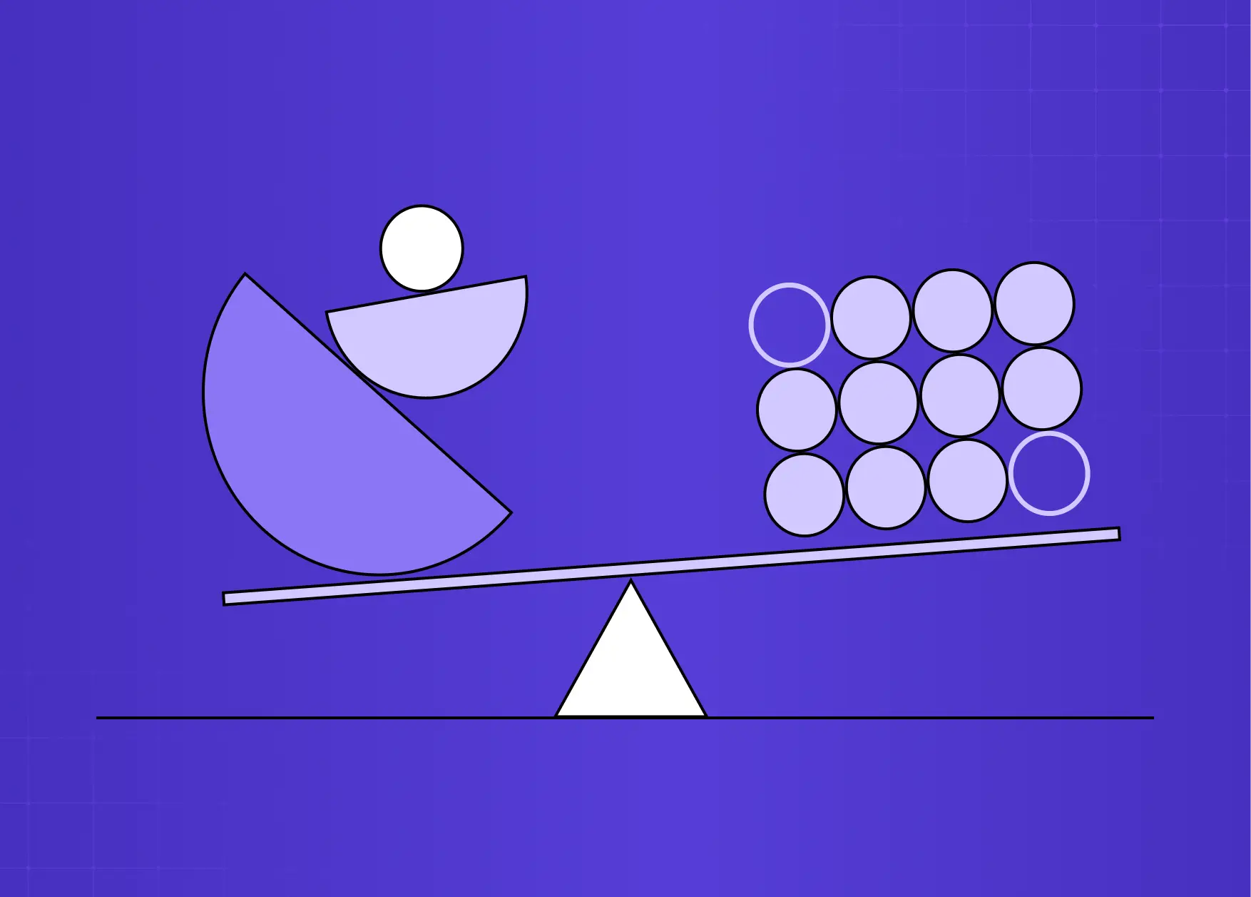
In graphic design, balance is not about making both halves of a layout identical. It is about managing visual weight. A single bold shape can counterbalance several smaller ones. A dark color can offset a large area of white space. A high-contrast element on one side can anchor a quieter composition on the other.
Balance is a core part of our design philosophy at Groto - a structural decision made early in the process, not a finishing touch. Whether we are working within SaaS design systems or mobile app onboarding flows, the visual weight of every element is considered relative to everything around it.
Visual Weight: The Foundation of Balance
Before breaking down the types of balance, it helps to understand what actually determines how heavy an element feels to the viewer.
Visual weight is not the same as physical size. Several factors influence how much "pull" an element exerts in a composition:
Factors That Affect Visual Weight
Size: Larger elements naturally feel heavier and draw attention first.
Color: Dark or saturated colors carry more visual weight than light or muted ones - this is why a monochromatic color scheme can still achieve balance through tonal contrast alone.
Contrast: An element with sharp contrast against its background will feel heavier than one that blends in.
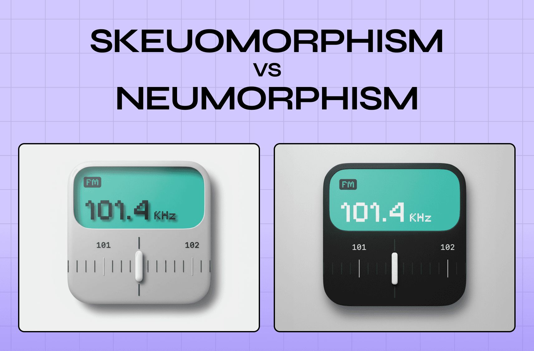
Texture: Detailed or textured areas feel denser and heavier than smooth, open ones - the visual weight gap between skeuomorphism vs neumorphism is a direct result of this principle.
Position: Elements placed toward the edges or bottom of a composition can feel heavier due to implied gravity.
Isolation: A single element surrounded by white space can carry significant visual weight despite being small.
Understanding visual weight - including how your choice of color palettes shifts perceived weight across a composition - is what separates a designer who places elements intuitively from one who places them with purpose. The contrast principle of design ties directly into this: contrast is one of the most powerful tools for creating or disrupting balance in a layout.
The 5 Types of Balance in Graphic Design
All competitor references cover three to five types. Here we cover all five, as each serves a distinct purpose in design practice.
Symmetrical Balance
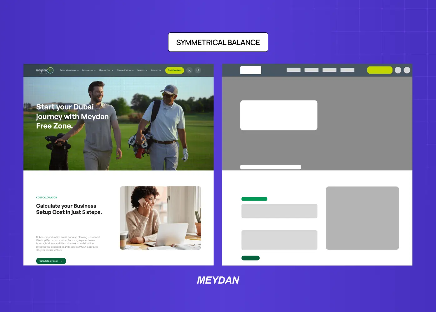
Symmetrical balance, sometimes called formal balance, occurs when elements on both sides of a central axis are mirrored in terms of visual weight. Draw an imaginary line through the center of the layout and both halves feel equally weighted.
This type of balance creates a sense of order, stability, and formality. It works well for institutional branding, financial products, and interfaces where trustworthiness is the primary message. When we redesigned Meydan FZ's website, structural symmetry was used across key landing sections to convey professionalism and reliability for an entrepreneur-facing platform.
Symmetrical balance does carry a risk: when applied rigidly, it can feel static or predictable. Variety in color or scale within a symmetric framework helps maintain visual interest without destabilizing the layout.
Asymmetrical Balance
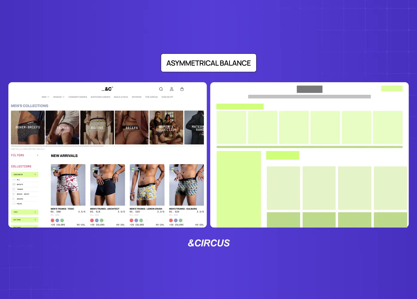
Asymmetrical balance is perhaps the most used type in modern interface and graphic design. Unlike symmetry, it does not mirror elements across an axis. Instead, it achieves equilibrium through contrast: a large element on one side balanced by several smaller ones on the other, or a visually heavy element offset by generous white space.
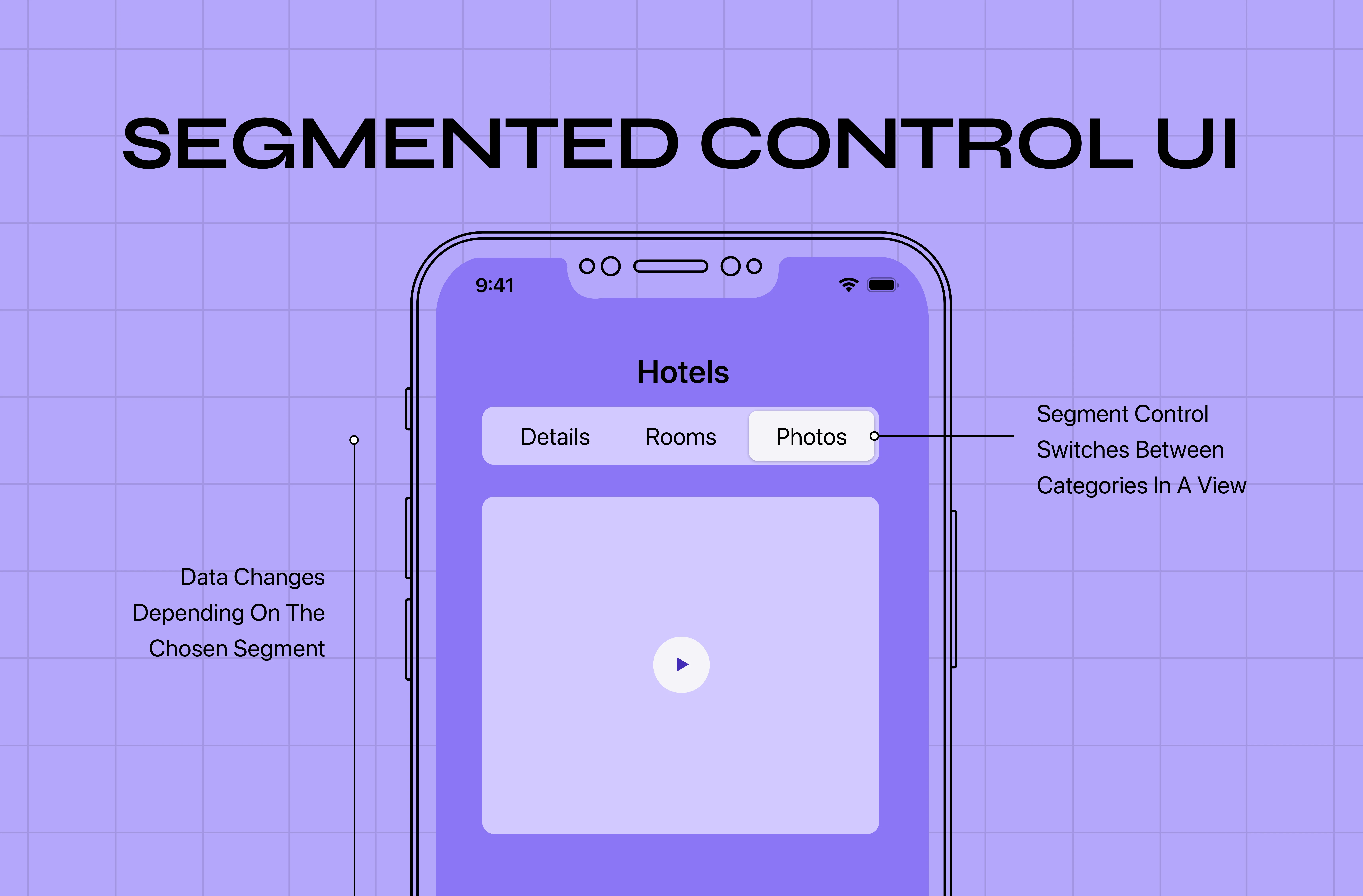
The result is a composition that feels dynamic and contemporary without feeling chaotic. Asymmetrical layouts tend to guide the viewer's eye along a deliberate path, which makes them particularly effective for landing pages, editorial layouts, and product interfaces like segmented controls where minor weight shifts directly affect how choices are perceived.
When we worked on the &Circus mobile-first redesign, asymmetrical balance was central to the visual language. A bold hero image on one axis, lighter typographic elements — with deliberate tracking in typography to control visual weight — on the other, created movement and energy appropriate for a fashion-forward brand without sacrificing clarity.
Radial Balance
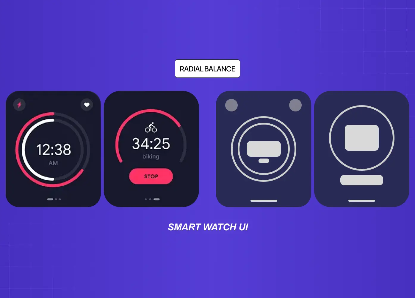
Radial balance distributes elements outward from a central focal point, much like the spokes of a wheel or the petals of a flower. All visual weight radiates from and returns to the center, which naturally draws the viewer's eye to the most important element in the composition.
This type of balance is less common in interface design but appears frequently in logo design, iconography, line art design, data visualization, and illustration. When used in dashboards, radial compositions work well for circular charts or radial navigation patterns that require the user to perceive relationships between elements around a single core concept.
Mosaic Balance
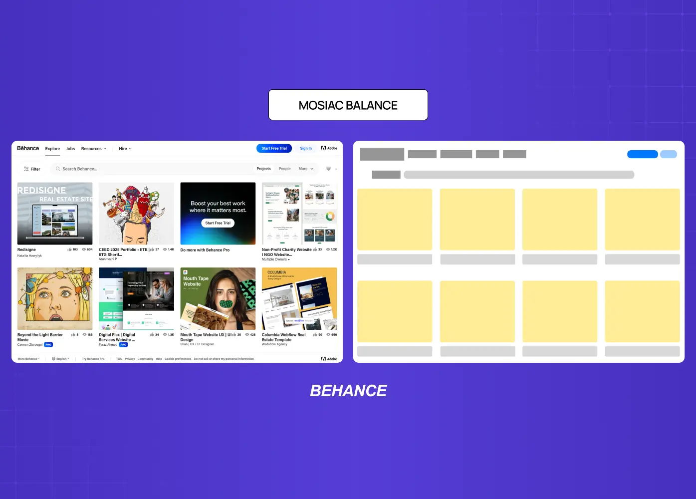
Mosaic balance, also called crystallographic balance, is the visual equivalent of organized noise. Elements appear scattered or chaotic at first glance, but share a uniform quality such as scale, color, or rhythm that creates an underlying order. There is no single focal point.
Think of a grid of thumbnail cards on a product marketplace, or the texture of a pattern-based background. Each element carries roughly equal weight, and the composition reads as a whole rather than directing attention to any one part. This type of balance works well for collection-style interfaces or editorial spreads where variety is the point.
Discordant Balance
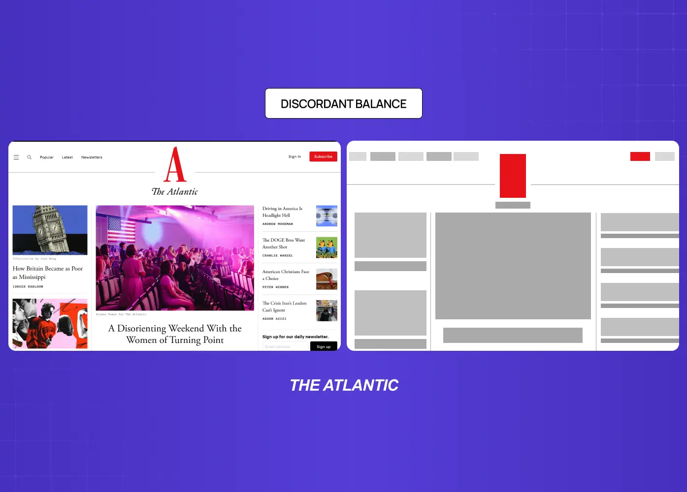
Discordant balance, sometimes called off-balance design, is the intentional absence of equilibrium. Elements are placed in a way that creates deliberate tension, visual discomfort, or urgency. This is not bad design. It is a strategic design choice.
Discordant balance is commonly seen in campaign visuals designed to interrupt attention, error states in product interfaces that need to signal something is wrong, or bold typographic layouts where the asymmetry itself is the message. The key distinction is intent: a discordant composition should feel purposefully uncomfortable, not accidentally unresolved.
How to Apply Balance in Your Designs
Knowing the types is only half the work. Applying balance well requires a process.
Steps to Achieve Balanced Compositions
Start with a focal point. Before placing any element, decide what the viewer should look at first. Every other decision flows from that anchor.
Map out visual weight. Sketch the rough weight distribution of your layout before adding detail. Where is the heaviest element? What offsets it?
Use contrast deliberately. The contrast principle of design is one of your most effective tools - particularly when applied through a split-complementary palette, where opposing hues create natural weight differentials that anchor a composition.
Lean on white space. Negative space is not empty. It carries visual weight and can actively balance heavier elements on the opposing side of a layout.
Work with a grid. Understanding the types of grids available and their structural role is what allows asymmetrical balance to be achieved without the layout collapsing.
Step back and squint. A practical technique: reduce your design to a small thumbnail or squint at it. You will immediately see where weight is concentrated and where the layout is pulling unevenly.
Why Balance Matters Beyond Aesthetics
A balanced composition is not just visually pleasing. It directly influences how information is processed.
When visual weight is distributed well, the viewer's eye moves through a layout in the order the designer intended. This creates a natural visual hierarchy, where the most important information is seen first, secondary content follows, and supporting details fill in without competing for attention.
An unbalanced layout forces the viewer to work harder. The eye bounces between competing elements with no clear entry point, which increases cognitive load and reduces comprehension. In product design, this translates directly to higher drop-off rates, lower task completion, and user frustration.
Balance, like other visual design principles, is closely tied to perceived quality in graphic design. Users consistently rate visually balanced interfaces as more trustworthy and easier to use - a perception that extends directly into brand experience, where balance signals quality at every touchpoint. This is the case in web design, mobile interfaces, marketing materials, and data dashboards alike.
When we redesigned LearnSphere's edtech platform, one of the core digital product design decisions was rebalancing the visual hierarchy across role-based dashboards for admins, teachers, and students. Each user type had different priority actions. Achieving the right balance for each view meant different compositional approaches, but a consistent underlying visual logic.
Conclusion
Balance is one of those principles that operates quietly in a good design and loudly in a bad one. When we get it right, the viewer moves through a layout intuitively. When it is missing, even a well-intentioned design will feel unresolved.
Key takeaways from this guide:
Balance is about visual weight distribution, not identical placement on both sides of a layout.
The five types of balance cover formal to experimental design needs, from symmetry to deliberate discord.
Visual weight is influenced by color, contrast, size, texture, and position.
Asymmetrical balance is the dominant choice in modern digital and graphic design because it creates movement and guides the viewer's eye.
Applying balance is a process: start with a focal point, map weight distribution, use contrast and white space as tools, and test with thumbnails.
Balance is not a finishing touch. It is a structural decision that shapes how information is perceived, processed, and trusted.
At Groto, balance informs every design decision we make across web, mobile, and SaaS products. If your product's visual language needs a sharper sense of structure and visual clarity, see how we work.