

Most businesses obsess over traffic and ignore the page where the sale actually happens. Here's what a high-converting product page really looks like — and the design decisions that make the difference.
Your product page is where browsers become buyers — or don't.

A visitor lands on your product page. They have 8 seconds — maybe less — to decide whether they're buying or bouncing. That's not a UX problem. That's a design problem.
Most businesses pour their budget into driving traffic, then lose the sale on the very page where it should close. The homepage gets the redesign. The landing page gets the A/B tests. And the product page? It gets a stock photo, a paragraph of specs, and a button that says "Add to Cart."
At Groto, we see this pattern constantly. And we know it leaves serious conversion on the table.
This blog breaks down what a high-performing product page actually looks like — through real examples worth learning from, the psychology behind what makes them work, and the design principles that separate pages that convert from pages that just exist.
What Is a Product Page?
A product page — also called a product detail page or PDP — is the dedicated page within a website or online store where a visitor learns about a specific product: its features, benefits, pricing, and options. It is the final point of persuasion in the buying journey.
Unlike a homepage or a landing page, which cast a wider net, a product page has one job: convert intent into action. Every element on it — the image, the headline, the CTA — either moves the visitor toward a purchase or away from it.
Product Page vs. Landing Page: Why the Difference Matters
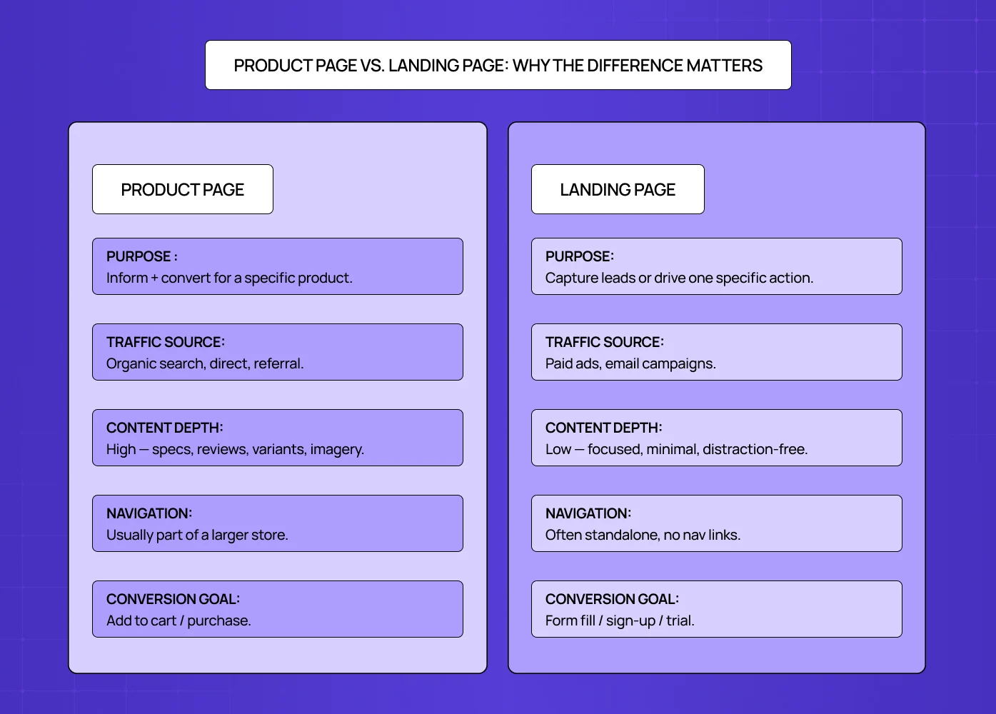
These two are often confused, but they serve very different functions.
Aspects | Product Page | Landing Page |
Purpose | Inform + convert for a specific product | Capture leads or drive one specific action |
Traffic source | Organic search, direct, referral | Paid ads, email campaigns |
Content depth | High — specs, reviews, variants, imagery | Low — focused, minimal, distraction-free |
Navigation | Usually part of a larger store | Often standalone, no nav links |
Conversion Goal | Add to cart / purchase | Form fill / sign-up / trial |
Understanding this distinction — and knowing what a splash page is and where it fits in the funnel alongside both — helps you design the right page for the right intent and avoid over-engineering one at the cost of the other.
What Does a Product Page Actually Need? The Anatomy
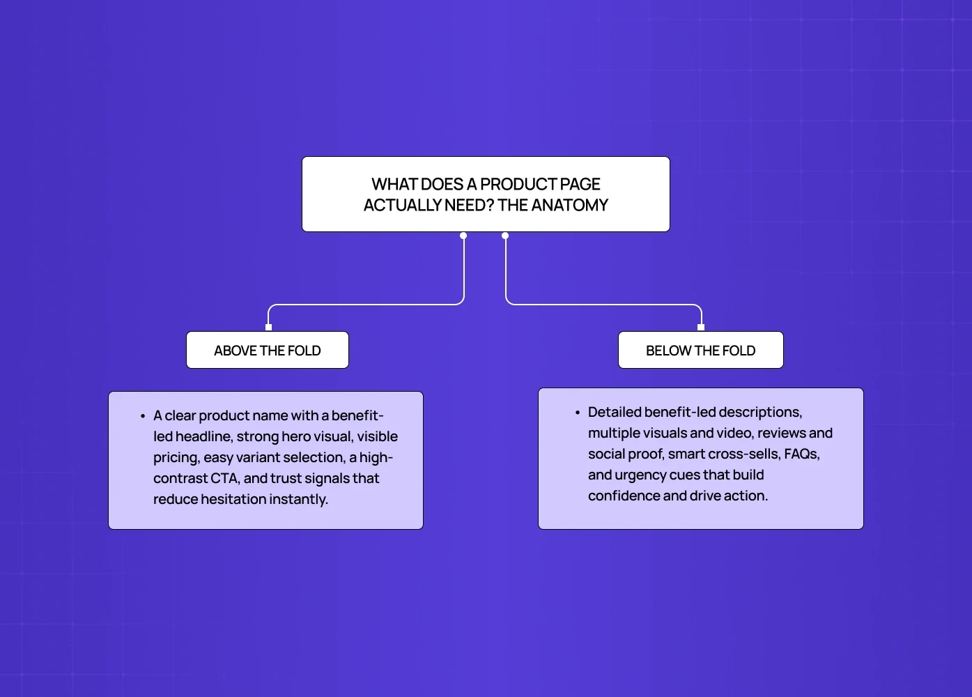
Before getting into examples, it helps to understand what a high-converting product page is made of. This is the checklist we work from at Groto — built from the same foundational thinking as the 27 landing page elements that drive conversions, applied specifically to product detail pages. Every top-performing PDP we have studied consistently follows it.
Above the fold
Product name and a benefit-driven headline
High-quality hero image or visual
Price, clearly displayed
Variant selectors (size, color, quantity)
A prominent, high-contrast CTA button
Key trust signals — shipping time, return policy, payment security
Below the fold
Detailed product description (benefit-led, not spec-heavy)
Multiple product images — angles, lifestyle shots, close-ups
Product video where relevant
Customer reviews and ratings — 11 to 30 reviews produce a 68% higher conversion rate compared to zero, according to Spiegel Research Center
Social proof — UGC, star ratings, press mentions
Cross-sell or complementary product recommendations
FAQ or objection-handling section
Urgency and scarcity signals — stock meters, shipping cutoffs, limited-time offers
On the urgency point specifically: "Only 3 left in stock" or "Order by 3pm to ship today" are not manipulative tactics when they are true. They are information the buyer needs to make a decision — and withholding them is a conversion mistake.
A stat worth noting: a trust seal alone produced a 107% sales increase for Express Watches in a VWO case study. These elements are not decoration — they are infrastructure, and they appear consistently across the best landing page design examples regardless of category, because the psychology behind trust signaling does not change with the product.
The Psychology Behind Why Product Pages Convert
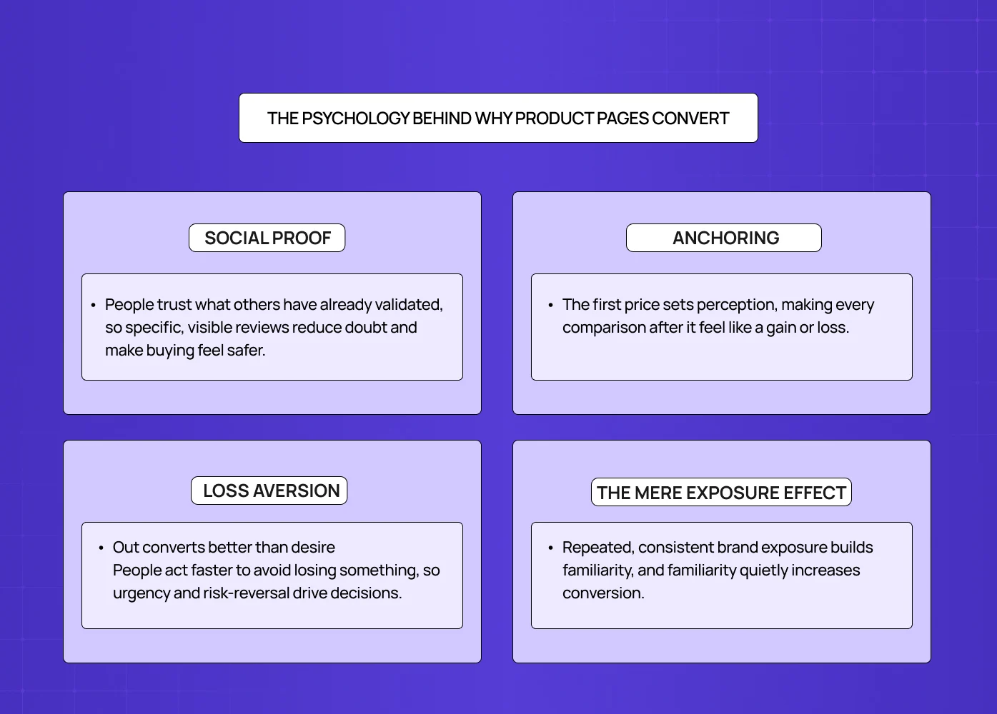
Most articles tell you what to put on a product page. Almost none explain why it works. Understanding the psychology behind conversion decisions is where the real design leverage sits.
Social proof — the crowd as signal
Humans default to what others have already validated. When 98% of shoppers read reviews before buying (Mobiloud, 2024), the implication is clear: a page without reviews is asking visitors to take a leap nobody wants to take alone. Dr. Squatch surfaces specific, detailed reviews prominently — not because it looks good, but because specificity ("reduced my skin dryness within a week") triggers belief in a way that vague praise never does.
Anchoring — the first number wins
The first price a visitor sees becomes the reference point against which everything else is judged. Kit and Ace use this deliberately — showing the original retail price alongside the discounted one in high-contrast color. The original price anchors perception; the discounted price feels like a win. At Groto, we treat price presentation as a design decision, not just a data field.
Loss aversion — fear of missing out converts better than desire
People are statistically more motivated to avoid losing something than to gain something of equal value. Scarcity signals ("Only 2 left"), countdown timers, and limited-time offers work because they reframe the decision — and the micro UX design patterns that make these signals land are what separate urgency that converts from urgency that feels forced. Leesa uses this principle with their 100-night trial — framing it not as a feature but as risk removal. The loss being avoided is the risk of a bad purchase.
The mere exposure effect — familiarity builds trust
Visitors who have seen your brand across multiple touchpoints before landing on the product page convert at higher rates. This is why consistency between homepage design principles, landing page, and product page design is not just an aesthetic preference — it is a conversion strategy. Every time the design language breaks, a small amount of trust breaks with it.
At Groto, we think about psychology before we think about aesthetics. The visual decisions follow the behavioral ones.
10 Product Page Examples Worth Studying (And What They Get Right)
You do not have to start from scratch. These are some of the best-executed product page examples on the web right now — and for broader design inspiration beyond the product page, the best website design examples show what this level of intentionality looks like applied across an entire site. Here are the specific design decisions behind why each one converts.
1. Apple — Benefit-First Hierarchy
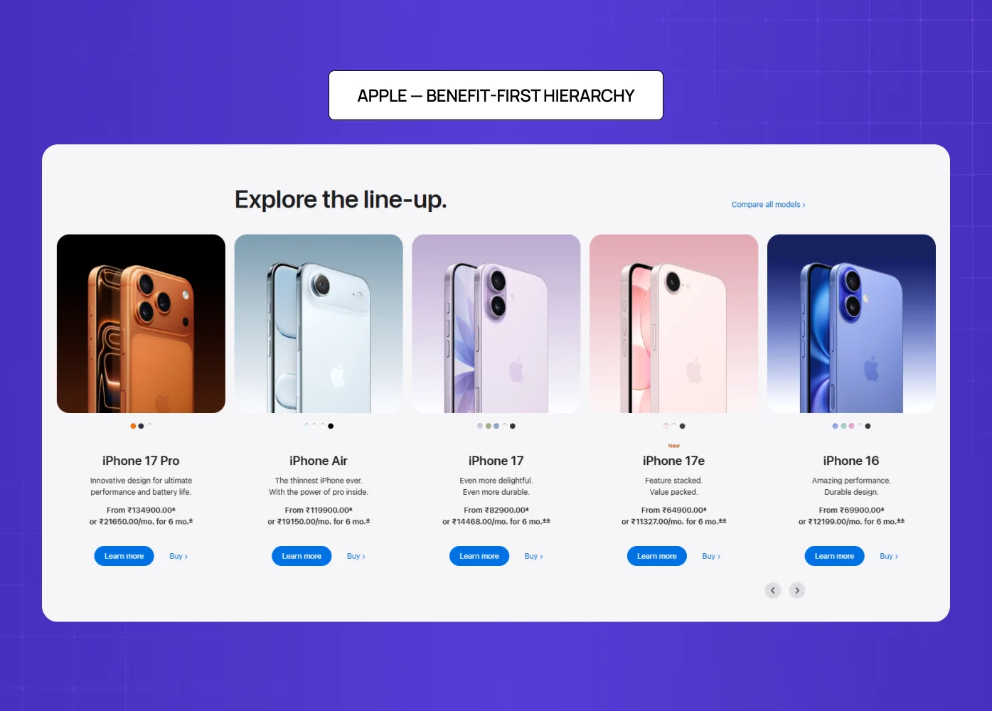
Apple's iPhone product page is the benchmark for clean, conversion-focused design. There are no distractions. Every scroll earns more context, not more clutter.
What it gets right:
Benefit-driven headlines ("The thinnest iPhone ever" is a promise, not a spec)
A CTA visible above the fold on both desktop and mobile
Stunning visuals that do the selling before the copy even begins
Minimal navigation that keeps the visitor focused on one decision
The lesson: visual design principles — hierarchy above all — are what make the eye move cleanly from image to headline to price to CTA without interruption. When that sequence breaks, so does the sale.
2. Bellroy — Staging the Buyer Journey
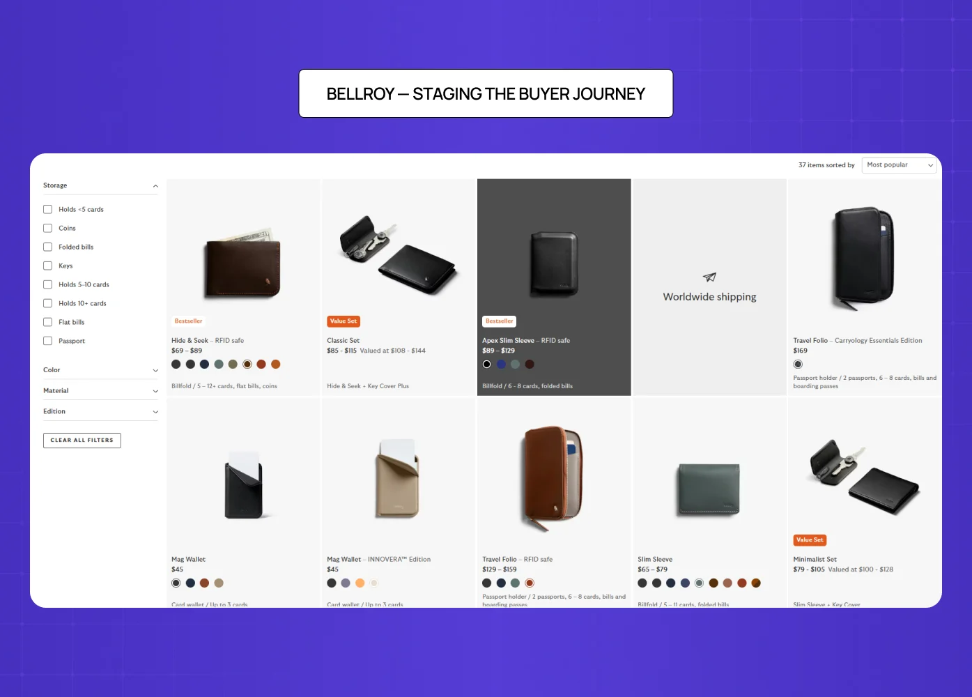
Bellroy sells thinner-than-typical wallets. The design challenge is getting the visitor to understand the value of something they did not know they needed.
Their solution is to divide the page into three clear stages — the problem, the fix, and the product. An interactive slider lets users watch both wallets fill up with cards side by side, visually proving the value proposition rather than stating it — and interactive product experiences shows how leading brands across categories use this same principle of demonstration over explanation to hold attention and drive decisions.
What it gets right:
Storytelling structure that mirrors how buyers actually make decisions
Interactive elements that replace paragraphs of explanation
Copy that speaks to outcomes, not specifications
3. Dr. Squatch — Brand Voice as a Conversion Tool
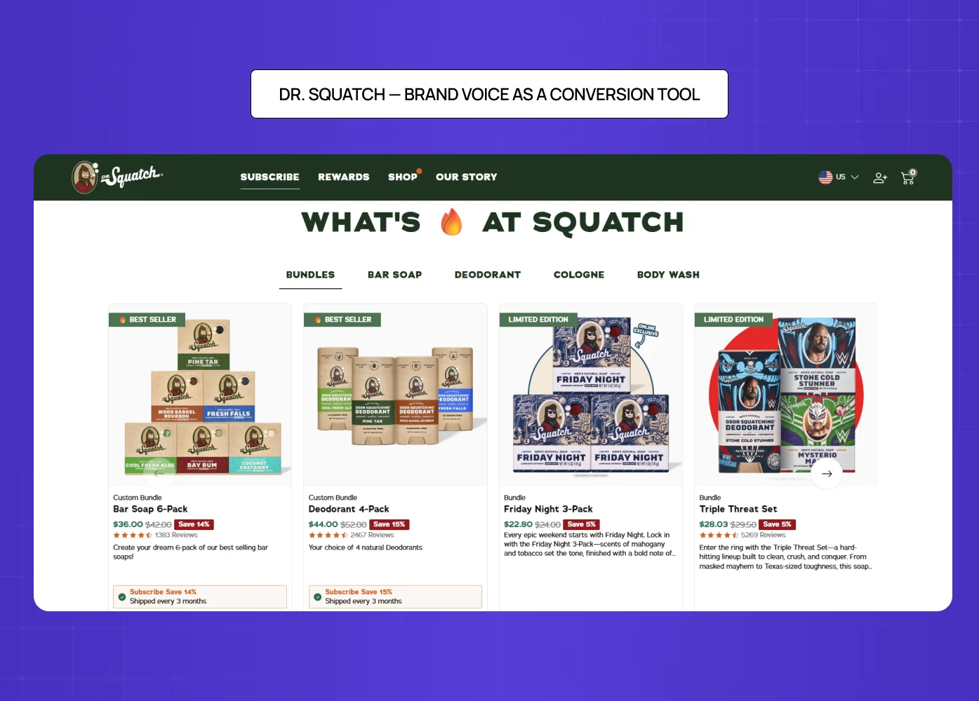
Dr. Squatch's product page works because the brand voice is consistent from the headline all the way to checkout. It uses humor, storytelling, and specific social proof in a way that feels authentic rather than salesy.
What it gets right:
Reviews are surfaced prominently and written with specificity, not vague praise
The tone matches the audience precisely — irreverent, confident, masculine
Product descriptions read like a conversation, not a catalogue entry
4. Figs — Visual Storytelling at Scale
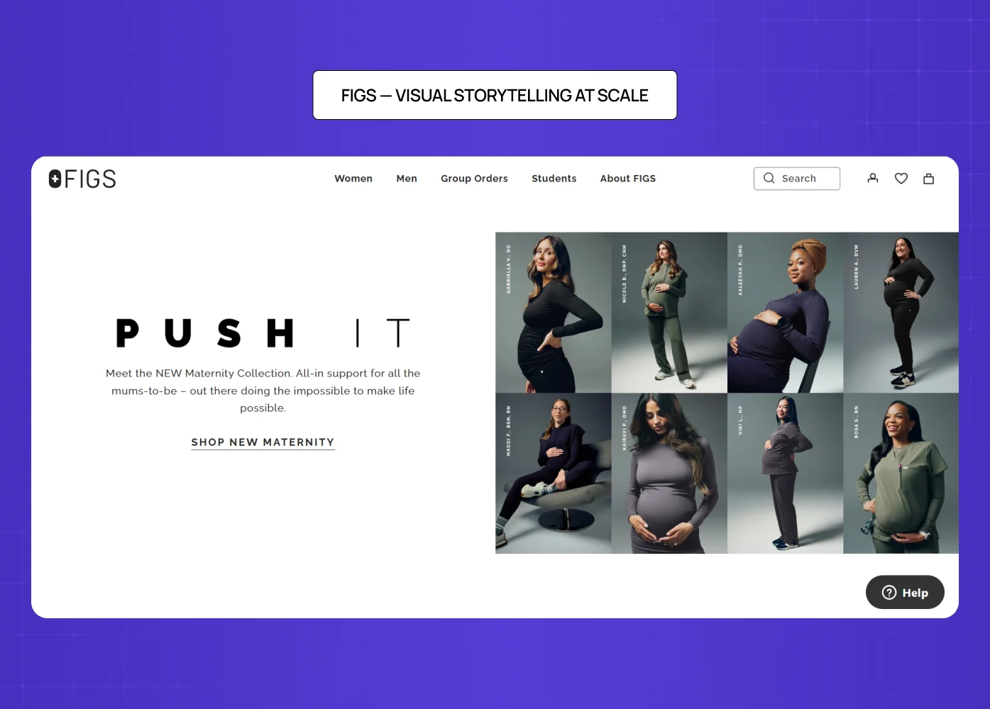
Figs sells medical scrubs to healthcare professionals. Their product page balances high-energy visuals with functional, reassuring copy — because their buyer needs both confidence and comfort.
What it gets right:
Models in dynamic poses alongside a 360-degree animated GIF
An autoplay video that intercuts product footage with real healthcare scenes
Features written in the buyer's own language — medical terminology, proprietary fabric names
Extensive cross-selling that keeps buyers in the ecosystem
According to Stacks & Stacks research via VWO, product videos produce a 144% lift in cart additions. Figs' investment in motion content is not a creative indulgence — it is a conversion decision.
5. Nicotex Begin — Trust Before Action
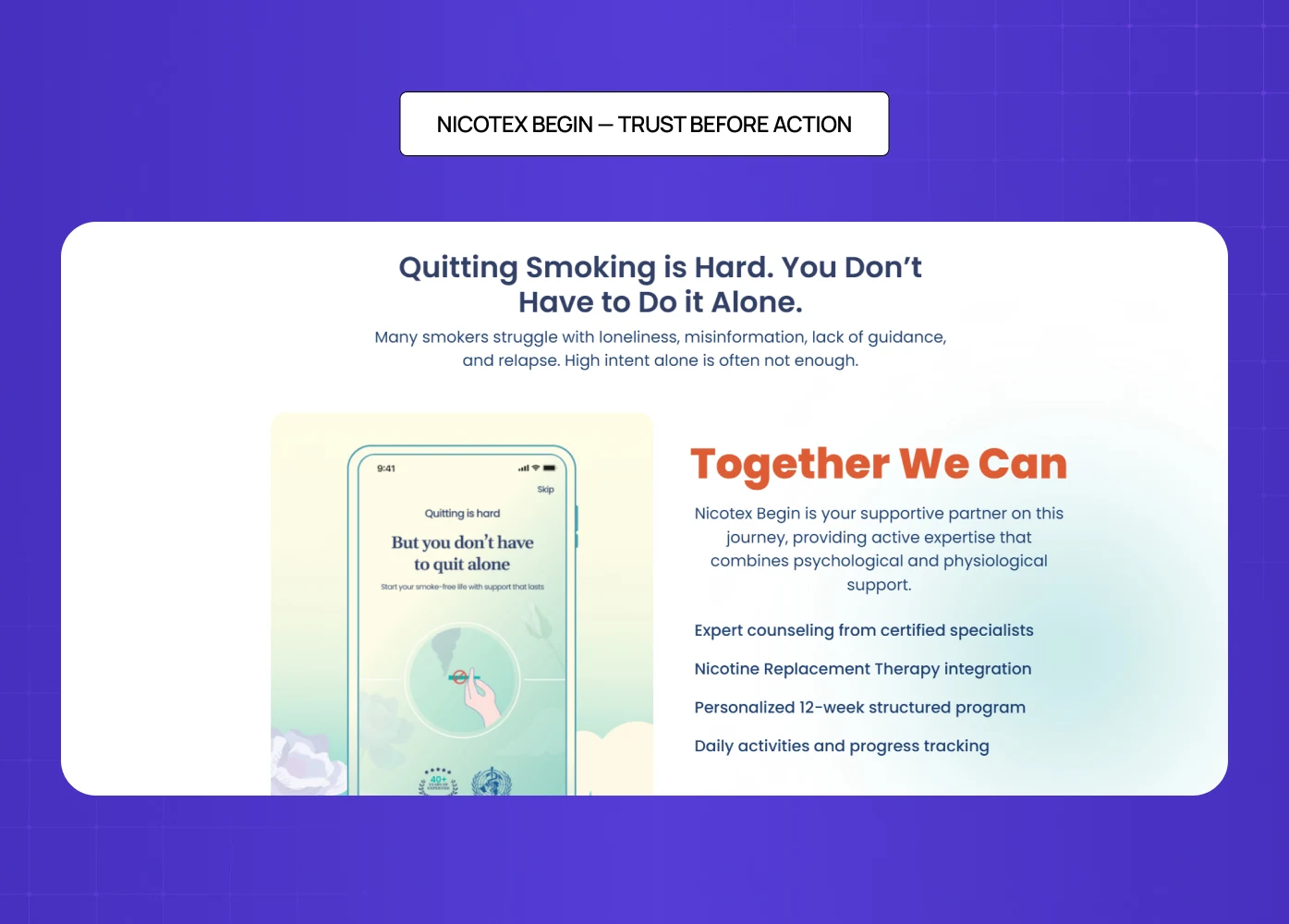
When we designed the product page for Nicotex Begin, a healthcare product operating in a crowded, skeptical market, every element had to earn trust before asking for action.
What we focused on:
Imagery that was clinical but warm — professional without being cold
Copy that addressed hesitation directly, not defensively
A CTA that felt confident without being aggressive
Consistency with the broader brand that visitors had already built comfort with
In a category where doubt is the default, the design job is to systematically remove it. That calibration — knowing what to say, what to show, and in what order — is where conversion is actually won.
6. Love Wellness — Making Repurchase Feel Easy
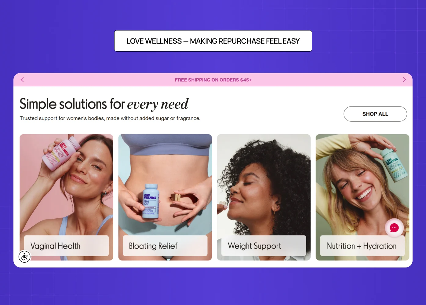
Love Wellness leads with outcome-driven copy and surfaces subscription options clearly alongside one-time purchase pricing. It does not bury the better deal — it makes the value of committing obvious, which is the same principle running through subscription paywall examples in digital products, where the ask only converts when the paid tier reads as the better option rather than the locked one.
What it gets right:
Reviews with specific detail ("reduced bloating within a week") rather than generic praise
Subscription and one-time options presented side by side without confusion
A layout that makes a high-frequency repurchase feel natural and low-friction
7. Kit and Ace — The Power of Subtle Incentives
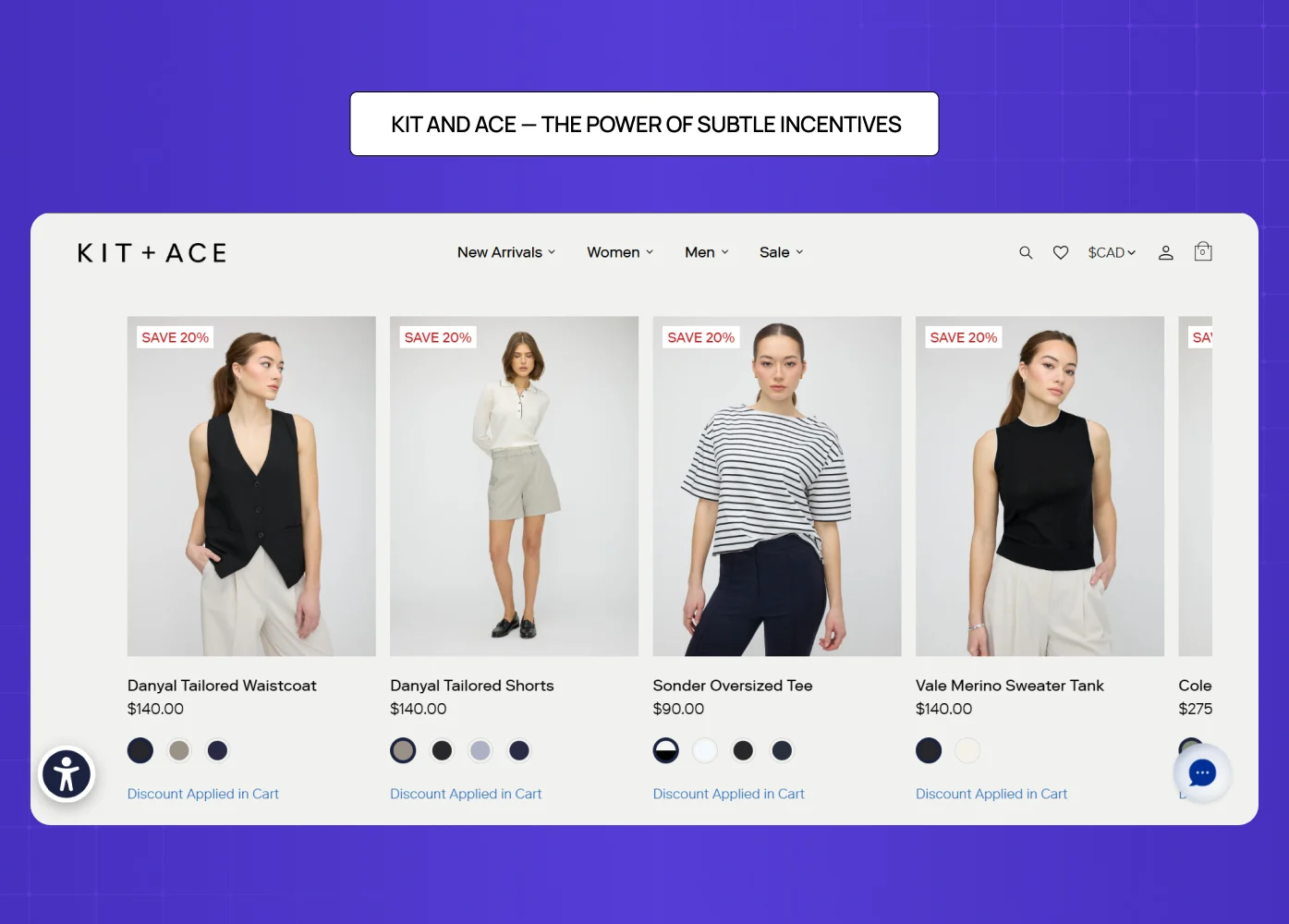
Kit and Ace's product page is deliberately minimal. But it uses a quiet, well-placed incentive to move buyers further down the funnel without feeling pushy.
What it gets right:
A scrolling header reveals a discount — but does not show the amount, encouraging cart additions to reveal it
Discounted pricing shown in high-contrast color against the original price
A popout offering an additional discount for first-time visitors
The page never sacrifices brand prestige to push the promotion
8. Leesa — Handling a High-Consideration Purchase
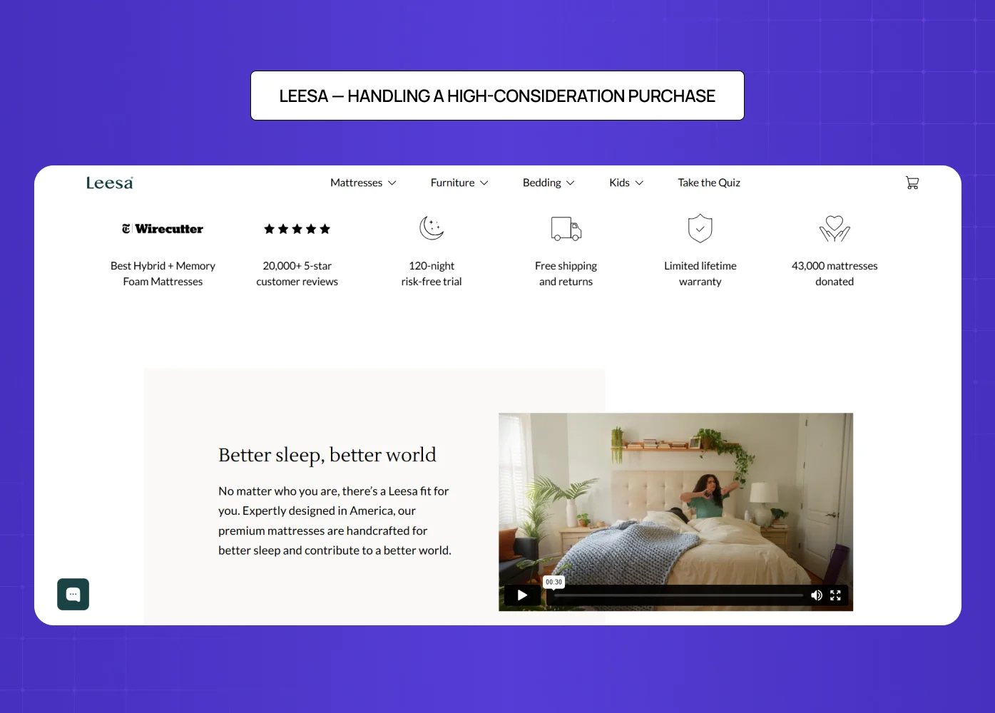
Selling a mattress online is a hard design problem. The buyer cannot try it, the price is high, and the commitment feels significant. Leesa's product page handles all of this directly.
What it gets right:
A 100-night trial offer addressed above the fold — before the visitor even thinks to object
Competitor comparison charts that make the decision feel informed, not pressured
Return policy and payment options surfaced early, not hidden in the footer
Methodical trust-building that earns the purchase rather than demanding it
9. Master & Dynamic — Specs and Story, Both Done Right
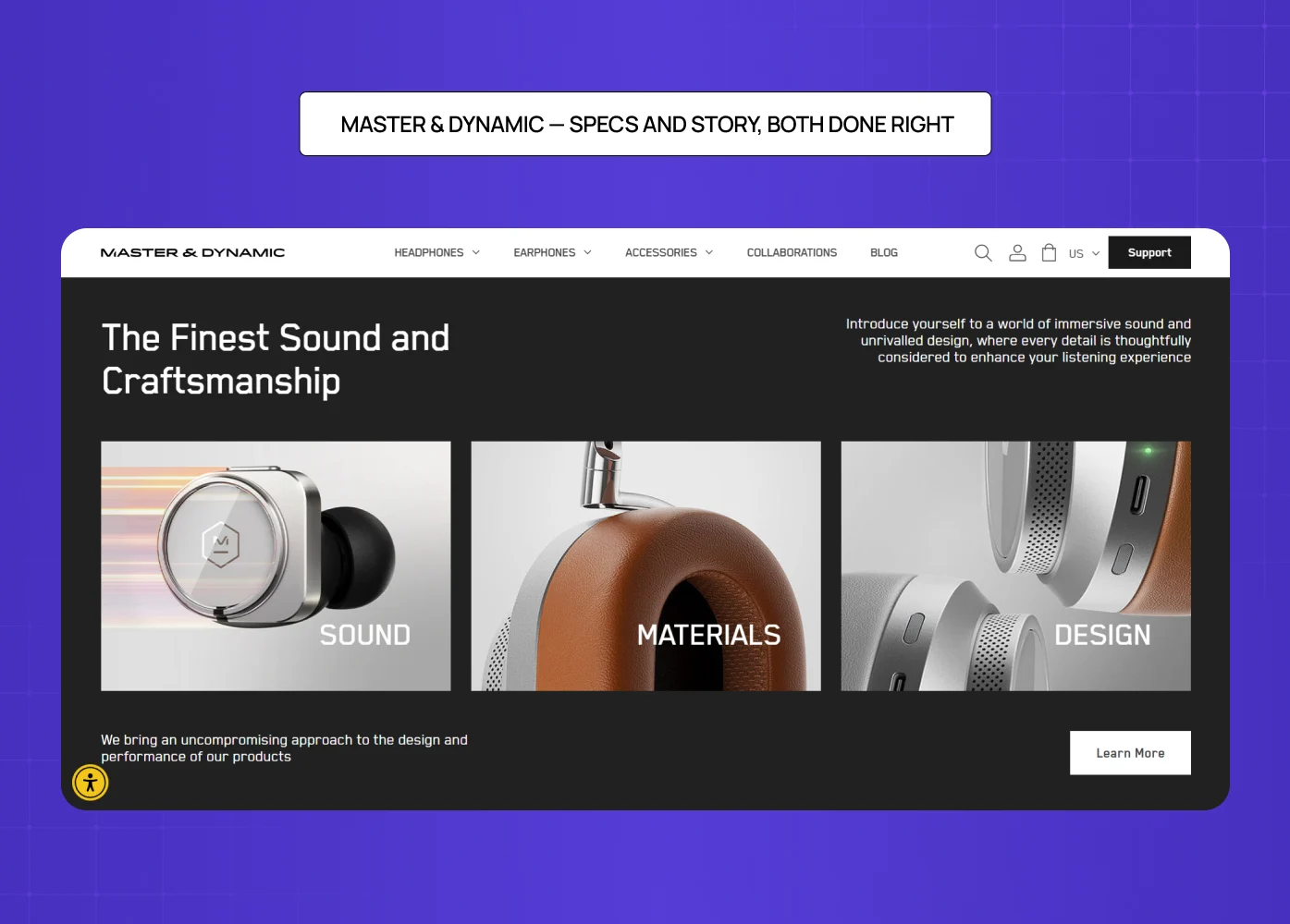
Master & Dynamic sells premium wireless headphones. Their product page serves two kinds of buyers simultaneously — those who need to feel something, and those who need to know everything.
What it gets right:
Descriptions that lead with relatable experiences ("hear your songs in a whole new way")
A clean but comprehensive technical spec list for detail-oriented buyers
A product comparison feature for hesitant buyers evaluating options
Anchor links that let visitors jump directly to Features or Tech Specs without scrolling past content they do not need
10. PolicyBazaar — Simplifying a High-Anxiety Purchase
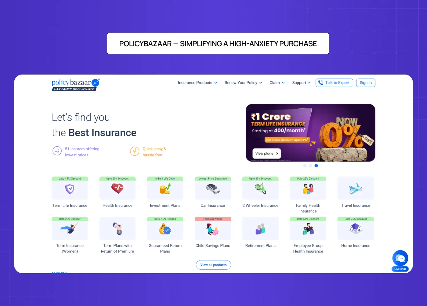
Insurance is one of the most friction-heavy categories in digital commerce — complex products, anxious buyers, and a trust gap that most pages never close. When we designed PolicyBazaar's product page, that friction was the central design problem.
What we focused on:
Breaking down dense policy information into scannable, jargon-free sections
Leading with what the user gains, not what the policy covers in legal terms
Surfacing trust signals — ratings, claim settlement ratios, recognizable credentials — early and prominently
A CTA architecture that guided the visitor toward a decision without overwhelming them with options
When the product is complicated, the page has to make the decision feel simple. That is the design work.
Mobile Product Page Design: Why It Deserves Its Own Conversation
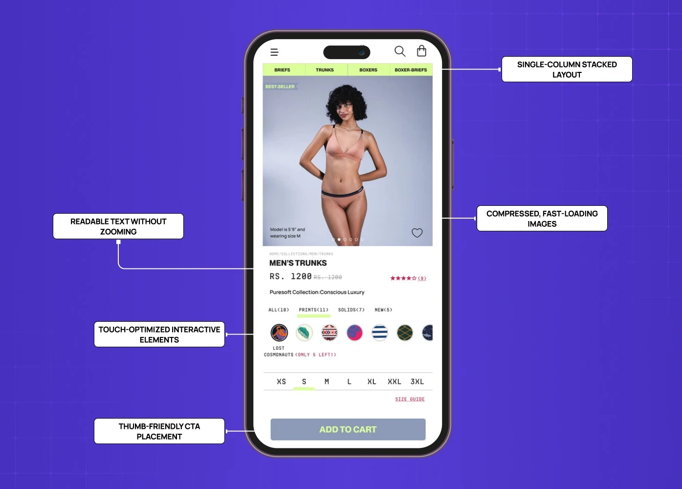
Mobile drives between 57% and 78% of all ecommerce traffic depending on the category (Mobiloud, SellersCommerce). That number alone should make mobile-first responsive design best practices the first conversation in any product page design project — not the last.
And yet, 40% of ecommerce sites still fail basic pinch-to-zoom requirements on mobile (Baymard Institute). That is not a minor oversight. That is a significant portion of your traffic hitting a broken experience at the exact moment they are trying to buy.
What mobile-first product page design actually means:
Single-column stacked layout — content that works vertically, not horizontally
Thumb-friendly CTA placement — the button the buyer needs to tap should never require a stretch or a scroll
Compressed, fast-loading images — pages loading at 2.4 seconds convert at 1.9% versus 0.6% at 5.7 seconds or more (Convert.com)
Touch-optimized interactive elements — size selectors, image carousels, and quantity inputs that work cleanly on touchscreens
Readable text without zooming — minimum 16px body text, adequate line spacing, sufficient contrast
A product page that performs on desktop and breaks on mobile is not a finished product. It is half a product.
What Kills Conversions on a Product Page
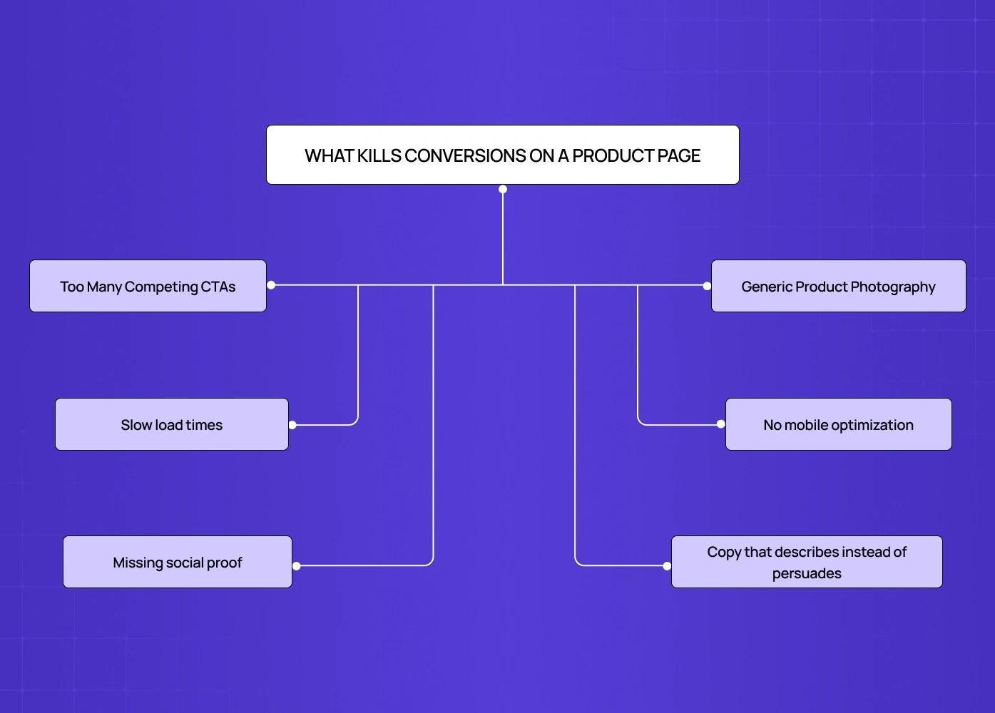
Design mistakes on a product page are not always obvious — many are the same UI/UX mistakes that hurt conversions across the web, just concentrated on the page that matters most. Here are the most common ones we encounter — and why they cost conversions.
Too many competing CTAs. If a visitor does not know what to click, they click nothing.
Generic product photography. 67% of shoppers say image quality is more important than product descriptions (Justuno). Stock-style images undermine the authenticity that converts.
Slow load times. Pages loading at 5.7 seconds or more convert at less than a third the rate of pages loading at 2.4 seconds.
No mobile optimization. A desktop-only design in a mobile-first world is a conversion killer.
Missing social proof. UGC lifts conversion by 161% on average across 200,000 stores (Yotpo). No reviews means no reason to commit.
Copy that describes instead of persuades. Spec lists are not selling. Benefits are.
Conclusion
A product page is where design and conversion meet — and for teams that need to build the business case for investing in it, calculating the ROI of UX and design decisions turns conversion improvements into numbers leadership will fund. Get it right, and a visitor who was browsing becomes a buyer. Get it wrong, and all the traffic in the world will not help.
Every element should earn its place — if it does not move the visitor toward a decision, remove it
Lead with benefit, not feature — the buyer wants to know what changes for them
Visuals are the primary persuasion tool, especially when the buyer cannot touch the product
Psychology drives conversion — social proof, anchoring, loss aversion, and familiarity are design tools
Mobile is the primary screen, not an afterthought — design for it first
Handle objections on the page — return policy, shipping, and trust badges belong above the fold
Test, measure, and iterate — a product page is never truly finished
If your product page is not converting the way it should, the problem is almost always a design one — and the fastest path forward is often not a full overhaul. Understanding how to improve your website conversion rate without redesigning is where many teams find the highest-leverage wins before committing to a rebuild. And that is exactly what we solve.


