
Search is where your most motivated users go, yet it's often under-designed. This guide breaks down nine best practices for search bar placement, sizing, autocomplete, forgiving results, and accessibility, so search becomes a strength instead of a dead end.
Nine best practices for a search bar that actually helps users find things.

TL;DR
Search bar design covers placement, sizing, placeholder text, autocomplete, forgiving results, and accessibility, all working together as one system
Make search obvious, place it in the header, and keep it visually consistent across every page
Size the input for real queries, guide users with helpful placeholder text, and add autocomplete that predicts intent
Design for failure too: forgiving search, a real zero-results state, and a properly designed results page prevent dead ends
Mobile and accessibility are not optional extras, they decide whether search works for everyone
A well-designed search bar is a small UI component that carries an outsized share of the work. It covers everything from where the input sits and how wide it is, to how autocomplete behaves and what happens when a query comes up empty. Get those pieces right and you shorten the distance between a user's question and your answer. Get them wrong, and even a well-built product can feel hard to use.
On any content-heavy site or app, the search bar is where your most motivated users go. Someone who types a query isn't browsing. They know what they want and they're telling you exactly what it is. Get that moment right and you hand them the answer instantly; get it wrong and you turn your highest-intent visitors into bounces. Yet search is one of the most under-designed components on the web, often shrunk into a corner, hidden behind an icon, or left to return brittle, dead-end results.
Good search bar design is a handful of well-understood principles applied with care. Below are nine best practices, covering where to put the bar, how wide to make it, autocomplete, placeholder text, forgiving results, mobile, accessibility, and the modern AI-search expectations of 2026, plus the mistakes that quietly frustrate users. Whether you're designing search for an e-commerce store, a SaaS app, or a content site, these are the rules that turn search from an afterthought into one of your best conversion tools.
The anatomy of a search bar
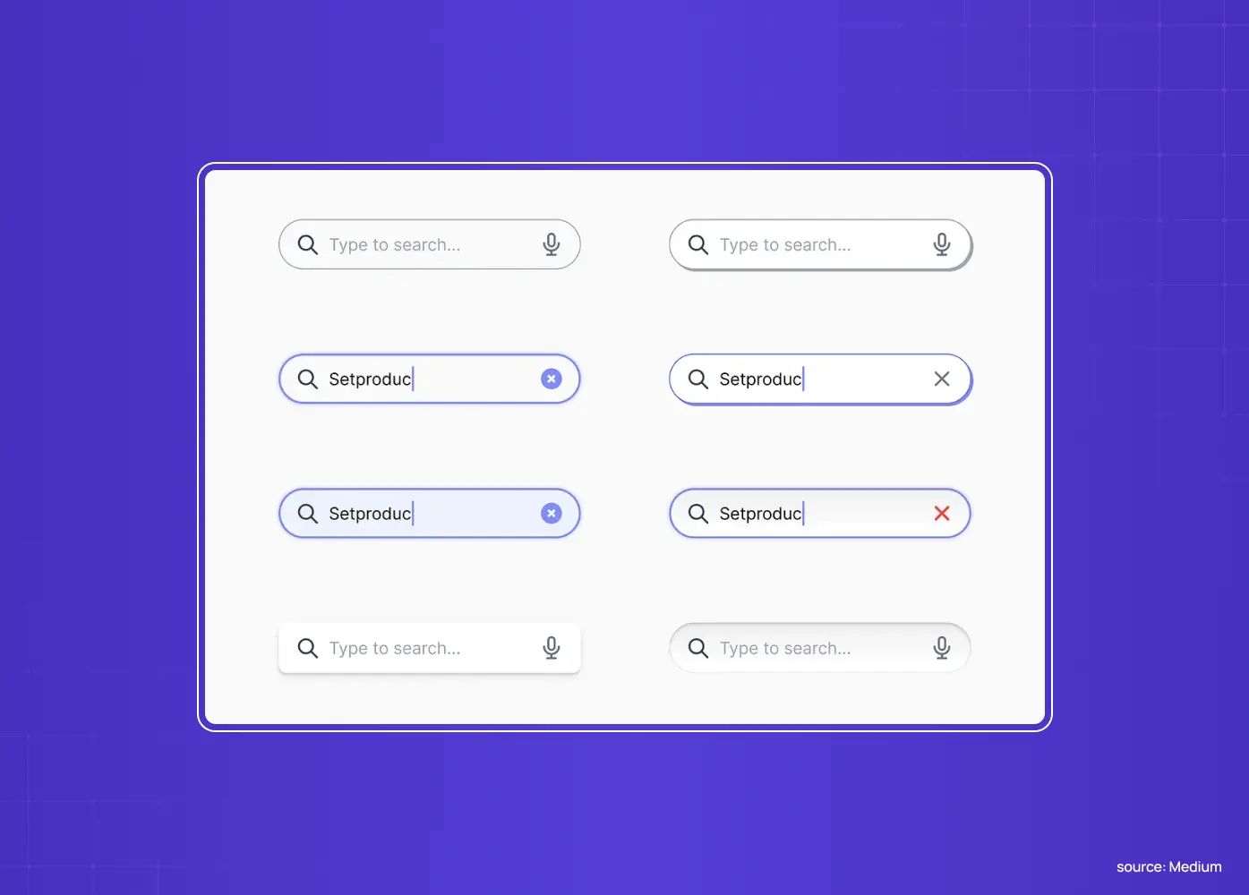
A quick shared vocabulary first. A well-designed search bar has five working parts, each a piece of the graphical user interface, so let's name each one before getting into the rules that govern them.
The magnifier icon
The universally recognized signal for search. It's what tells a user, at a glance and without reading a word, that this is where they type to find something.
The input field
The area a user types into. Its width, its default state, and how clearly it reads as "interactive" all shape whether people notice it and trust it.
Placeholder text
The hint text shown before a user types anything. Done well, it tells people what they can search for and how to phrase it. Done poorly, it's a wasted opportunity, or worse, mistaken for a permanent label.
Submit affordance
How a query actually gets sent, whether that's pressing Enter, clicking the magnifier icon, or tapping an explicit search button. Most search bars need to support more than one of these.
Autocomplete dropdown
The suggestions that appear as a user types, increasingly standard on any search bar handling more than a handful of possible results. It shortens the search user flow between a user's first keystroke and a finished query.
Great search design is these five parts working together so the user never has to wonder where to search, what they can search for, or whether their query registered. Keep that anatomy in mind as we go through the rules.
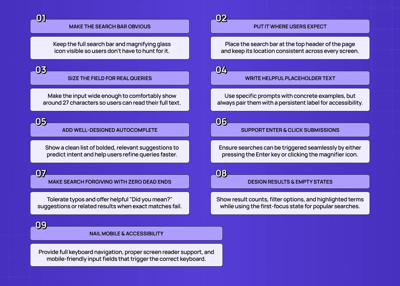
1. Make the search bar obvious, don't hide it behind an icon
The fastest way to kill search usage is to make people hunt for it. Use the universally understood magnifying-glass icon and, on search-reliant sites, keep the full field visible rather than collapsing it into an icon that requires a click to reveal. The more your users depend on search, e-commerce, large content libraries, documentation, the more visible and prominent the bar should be. Hiding search behind an icon adds a step and signals that search is secondary; for many products, that's precisely the wrong message.
Use the standard magnifying-glass icon so search is instantly recognizable
Keep the full field visible on search-reliant sites: e-commerce, large content libraries, documentation
Avoid collapsing search into an icon that requires a click to reveal
Treat visibility as a signal: hidden search quietly tells users the feature is secondary
Example: Amazon keeps a full-width search field permanently visible in its header on every page, treating search as a primary way to navigate its catalog rather than a fallback
2. Put it where users expect, and keep it consistent
Users have been trained by thousands of other sites to look for search in one place: the top of the page, in the header. Meet that expectation rather than fighting it. Just as important, keep the search bar in the same location and the same appearance across every page of your site. When the box jumps position or changes style as users move from the homepage layout to an interior page, users have to re-orient each time. Consistency is what makes search feel effortless and reliable.
Place search at the top of the page, in the header
Keep the same location and appearance across every page
Avoid changing shape or position between the homepage and interior pages
Remember that inconsistency forces users to re-find search each time, which erodes trust
3. Size the field to fit real queries
A cramped search box that shows only a few characters forces users to type blind, unable to see or review what they've entered, which leads to more errors and less confidence. Make the input wide enough to display a typical query in full. A field that comfortably shows around 27 characters covers the large majority of real searches. The width also acts as a visual design signal: a generous field invites longer, more natural queries, while a tiny one implies you only expect single keywords.
Aim for a field that comfortably shows around 27 characters
Avoid cramped inputs that force users to type blind
Treat field width as a signal: a generous field invites fuller, more natural queries
A tiny field implies you only expect single keywords, which limits how users search
4. Write placeholder text that helps
Placeholder text is prime real estate for guidance. Instead of a generic "Search," use it to hint at what users can search for and how, "Search products, brands, or categories" or "Search docs, e.g. 'reset password'." Helpful, specific placeholders set expectations better than empty or generic ones, and the same principles of UX microcopy guide users everywhere else in the interface. One caution: never rely on placeholder text as the field's only label, because it disappears the moment a user starts typing and vanishes entirely for assistive tech in some implementations. Pair it with a proper, persistent label for accessibility.
Hint at what and how users can search, with a concrete example where possible
Avoid generic placeholder copy like "Search," it guides nothing
Never rely on placeholder text as the field's only label
Pair placeholder text with a proper, persistent label for accessibility
Example: Airbnb's search field opens with a specific prompt like "Where to?" instead of a generic label, setting expectations for what to type before a user even taps in
5. Add autocomplete, and design it well
Autocomplete (autosuggest) is one of the highest-impact micro-UX patterns you can add, because it helps users refine and complete their query before they even submit, predicting intent from their input, history, and context. Design it deliberately: keep the number of suggestions manageable, roughly one to ten depending on your site's size, and bold the matched portion of each suggestion so users can scan for the relevant match at a glance. Well-built autocomplete reduces typos, speeds up the path to results, and quietly teaches users what your search can do.
Keep the number of suggestions manageable, roughly one to ten depending on site size
Bold the matched portion of each suggestion so users can scan quickly
Predict intent using the user's input, history, and context
Treat autocomplete as a teaching tool: it quietly shows users what your search can do
Example: many documentation sites, including Stripe's, use instant search that surfaces matched articles as soon as a user starts typing, often built on tools like Algolia DocSearch
6. Support both the Enter key and a clear submit action
Users submit searches in different ways, so support all of them. The Enter key should always trigger the search, and the magnifier icon or an explicit search button should be clickable to submit as well. Never make users guess how to run their query. Small as it sounds, an unclickable icon or a form that ignores Enter is a surprisingly common source of friction that makes an otherwise good search feel broken.
Make sure the Enter key always triggers the search
Make the magnifier icon or an explicit button clickable as an alternate submit path
Never make users guess how to run their query
Test both paths, since an unclickable icon is a common, easy-to-miss source of friction
7. Make search forgiving, no dead ends
Real users misspell words, use synonyms, and type plurals. A search that only matches exact strings will fail them constantly and dump them onto a barren "no results" page, one of the worst experiences in any product. Design forgiving search that tolerates typos, synonyms, and variations, and that always offers a path forward. When there's no perfect match, don't dead-end: suggest corrections ("Did you mean…?"), show related or popular results, and keep the search bar front and center so users can retry. A helpful zero-results state is a design decision, not an error message.
Tolerate typos, synonyms, and plural variations
Offer a "Did you mean…?" correction instead of a dead end
Show related or popular results when there's no exact match
Keep the search bar visible so users can retry immediately
Treat the zero-results state as a design decision, not an error message
Example: Google's search handles misspellings so smoothly that most users never notice a typo was even corrected, which is exactly the point of forgiving search
8. Design the results and empty states, not just the input
The search bar is only half the experience; the results page is the other half. Echo the user's query back to them, show a result count, provide filters and sorting for larger result sets, and highlight the matched terms in results so relevance is obvious. Equally, design the states most teams forget: the empty/first-focus state (show recent or popular searches to give users a running start) and the zero-results state (offer suggestions and alternatives). Search that looks great but returns an unstyled, unhelpful results page has only solved the easy half of the problem.
Echo the user's query back to them on the results page
Show a result count and provide filters or sorting for larger result sets
Highlight matched terms in results so relevance is obvious at a glance
Design the empty/first-focus state with recent or popular searches — a compact, chronological timeline layout of a user's recent queries gives returning users a running start
Design the zero-results state with suggestions and alternatives
9. Nail mobile and accessibility
On small screens, search often collapses to an icon that expands into a full-width field, that's fine, as long as the icon is obvious and the expanded field is easy to use, with the right keyboard triggered on focus.Beyond mobile, make search accessible to everyone through proper accessibility practices: give the input a proper label, ensure clear focus states, support full keyboard navigation, and make sure screen readers announce the field. Accessible search isn't a niche concern, it's core to a component this central.
On mobile, an expanding icon is acceptable as long as it's obvious and easy to use
Trigger the correct on-screen keyboard when the field gains focus
Give the input a proper, persistent label
Support full keyboard navigation, including moving through autocomplete suggestions
Make sure screen readers announce the field itself and its results
Example: Apple's App Store collapses search into a tab icon on mobile that expands into a full-width field with the right keyboard on tap, keeping the pattern obvious despite limited space
Visible search bar vs. search icon: which should you use?
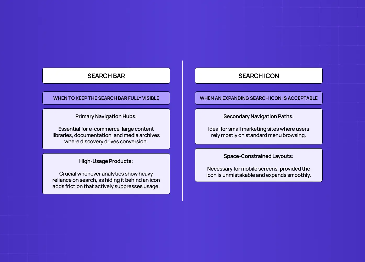
One decision trips up a lot of teams: should search be a full, always-visible bar, or a compact icon that expands on click? The answer depends on how central search is to your product. If users rely on search as a primary way to navigate site structure (large content libraries, documentation, media archives), make the bar visible and prominent, because every extra click suppresses usage. Hiding a heavily used feature behind an icon is friction you can measure in lost conversions.
If search is genuinely secondary, a small marketing site where most people browse the nav, for instance, a search icon that expands into a field is a reasonable space-saving choice. The rule of thumb: the more your users depend on search, the more visible it should be. When in doubt, look at your analytics. High search usage is a strong argument for a persistent, prominent bar; low usage on a content-rich site may actually mean your search is too hidden, not that people don't want it. On mobile, the expanding-icon pattern is often necessary regardless, simply because of space, the key is making the icon unmistakable and the expanded field easy to use.
When to keep search fully visible:
E-commerce catalogs, where search directly drives conversion
Large content libraries, documentation, or media archives
Any product where analytics show high search usage
When an expanding icon is acceptable:
Small marketing sites where most people browse the navigation instead
Mobile layouts where screen space is limited regardless of intent
Products where search usage data shows it's genuinely a secondary path
Search bar design in 2026: the AI shift
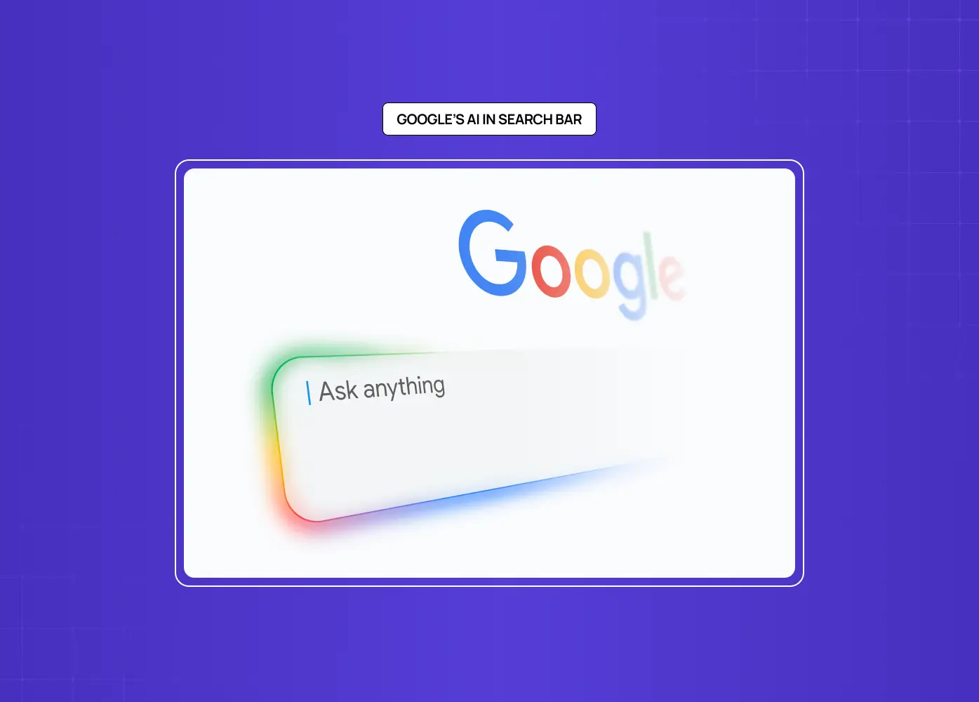
Modern search expectations have moved beyond keyword matching. The best 2026 experiences lean on natural-language understanding (users type or speak full questions and expect real answers), anticipatory and personalized results that use behavior and context to surface what someone likely wants in real time, and emerging visual and voice queries. You don't need all of this on day one, but design your search bar so it can grow into these patterns, a field that already handles conversational queries and personalized suggestions will feel dramatically more capable than a rigid keyword box. The direction of travel is clear: search is becoming a conversation, not a lookup.
Common search bar design mistakes to avoid
The recurring failures are easy to spot, and like most UI mistakes that hurt conversions, nearly every frustrating search experience comes back to the same set of errors:
Hiding search behind an icon on a search-reliant site
Making the field too small to read a query
Using a vague "Search" placeholder that guides nothing
Skipping autocomplete entirely
Building unforgiving, exact-match search that dead-ends on typos
Forgetting to design the zero-results and empty states
Moving the bar around between pages
Ignoring accessibility
Fixing these is one of the most reliable ways to improve how usable and trustworthy your product feels.
The good news is that search is one of the most measurable components you have. Track what people search for, how often searches return zero results, and which queries lead nowhere, and you'll get a precise map of where your search, and often your content or catalog, is falling short. Popular queries reveal what users expect to find; high zero-result queries reveal gaps to fix with synonyms, content, or better matching. Treat your search bar as a living system to monitor and refine, not a component to ship once and forget, and it will keep getting sharper as you learn what your users actually look for.
Why search design deserves real investment
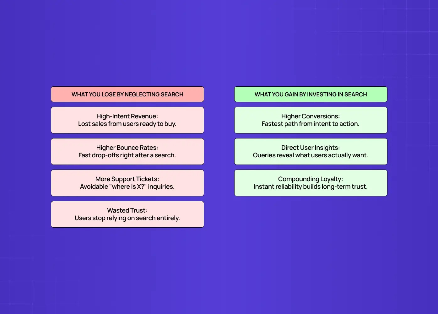
It's worth pausing on why this component earns disproportionate attention. Users who search are your highest-intent visitors, they've moved past browsing and are actively declaring what they want. On e-commerce sites in particular, searchers convert at notably higher rates than non-searchers, because a search is often the last step before a purchase decision. That makes the search experience a direct lever on revenue, not just a usability nicety. When search fails those users, a dead-end results page, a query that returns nothing, a box they couldn't find, you're losing the people most ready to act.
What this costs you when search is neglected:
Lost revenue from high-intent visitors who never complete their purchase or signup
Higher bounce rates right after a search, one of the clearest silent-failure signals
More support tickets and "where do I find X" questions that a working search would resolve on its own
Slower onboarding, since new users lean on search more than returning ones do
There's also a compounding trust effect. A search that understands typos, surfaces the right result first, and never dumps users into a barren page signals a product that's competent and cared-for. A brittle one signals the opposite, and it teaches users to stop trusting search altogether, after which they either leave or fall back on slower navigation, dragging down engagement across the board. Because search sits at the intersection of intent and outcome, small improvements here tend to pay back quickly and repeatedly. It's one of the few components where getting the details right is unambiguously a growth investment, which is exactly why it deserves more design attention than the corner it usually gets.
What a well-invested search bar earns you back:
Repeated trust: once search proves reliable, users default to it instead of avoiding it
Faster paths to conversion or task completion, since search skips several steps of browsing
Better product data, since search queries are a direct, unfiltered signal of what users actually want
A compounding advantage, since small, ongoing refinements keep outperforming a "set once" search bar
Conclusion
Make search obvious and well-placed, in the header, and consistent across every page
Size the input generously so users can see and review their query
Guide with helpful placeholder text and autocomplete that predicts intent
Forgive human error: typos, synonyms, plurals, and zero-result states should never dead-end
Design the results and empty states with the same care as the input itself
Respect mobile constraints and accessibility requirements as core, not optional
Your search bar serves the users who already know what they want, which makes it one of the highest-leverage components you'll design. Do all of the above, and search becomes a quiet engine of engagement and conversion instead of a dead end.
If you want a product design partner who obsesses over the components that decide whether users find what they came for, search included, book a discovery call with Groto. We design the interactions that turn intent into outcomes. Let's make your search bar work as hard as your users do.