
UX Competitor Analysis: A Step-by-Step Guide to Doing It Right

UX Competitor Analysis: A Step-by-Step Guide to Doing It Right

A practical guide to UX competitor analysis, covering what it is, how to run one step by step, what to evaluate, and mistakes to avoid.

UX Competitor Analysis: A Step-by-Step Guide to Doing It Right

UX Competitor Analysis: A Step-by-Step Guide to Doing It Right

A practical guide to UX competitor analysis, covering what it is, how to run one step by step, what to evaluate, and mistakes to avoid.

A UX competitor analysis shows you the real bar your users measure you against. This guide walks through what it is, why it matters, the types of competitors to study, and a clear step-by-step process to follow.

Learn how to run a UX competitor analysis that actually improves your product's design.

Two people discussing analytics dashboards and charts, symbolizing competitor research and product evaluation.

TL;DR 

A UX competitor analysis is a structured look at how competing products handle navigation, onboarding, and usability, so you can see where to match the market and where to beat it. This guide covers:

  • What it is and how it differs from a business competitor analysis

  • Why it's worth doing and which competitors to include

  • A clear 7-step process, from setting goals to acting on findings

  • What to evaluate, which tools help, and the mistakes to avoid

Every product decision gets compared to something, whether your team planned for that or not. A UX competitor analysis is simply the practice of doing that comparison on purpose: looking closely at how rival products handle the experience side of things, so your own design choices are backed by evidence rather than a hunch. It's one of the most practical exercises a product or design team can run, because it tells you exactly what your users already expect and where the room to stand out actually is.

Your product isn't judged in a vacuum. Every user who lands on your app arrives carrying expectations set by every other app they use: the smooth onboarding of one, the effortless checkout of another, the search that always works. If your experience is more confusing than the alternatives, users notice instantly, even if they can't articulate why. That's exactly why a UX competitor analysis is one of the highest-leverage pieces of UX research a product team can do. It shows you the bar your users are actually measuring you against.

Done well, it reveals gaps to exploit, table-stakes you can't skip, and patterns users already understand, so you design with evidence instead of guesswork. This guide walks through what a UX competitor analysis is, why it matters, the types of competitors to include, a clear step-by-step process, exactly what to evaluate, and the mistakes that make the whole exercise useless. Let's turn your competitors into your best research resource.

What is a UX competitor analysis?
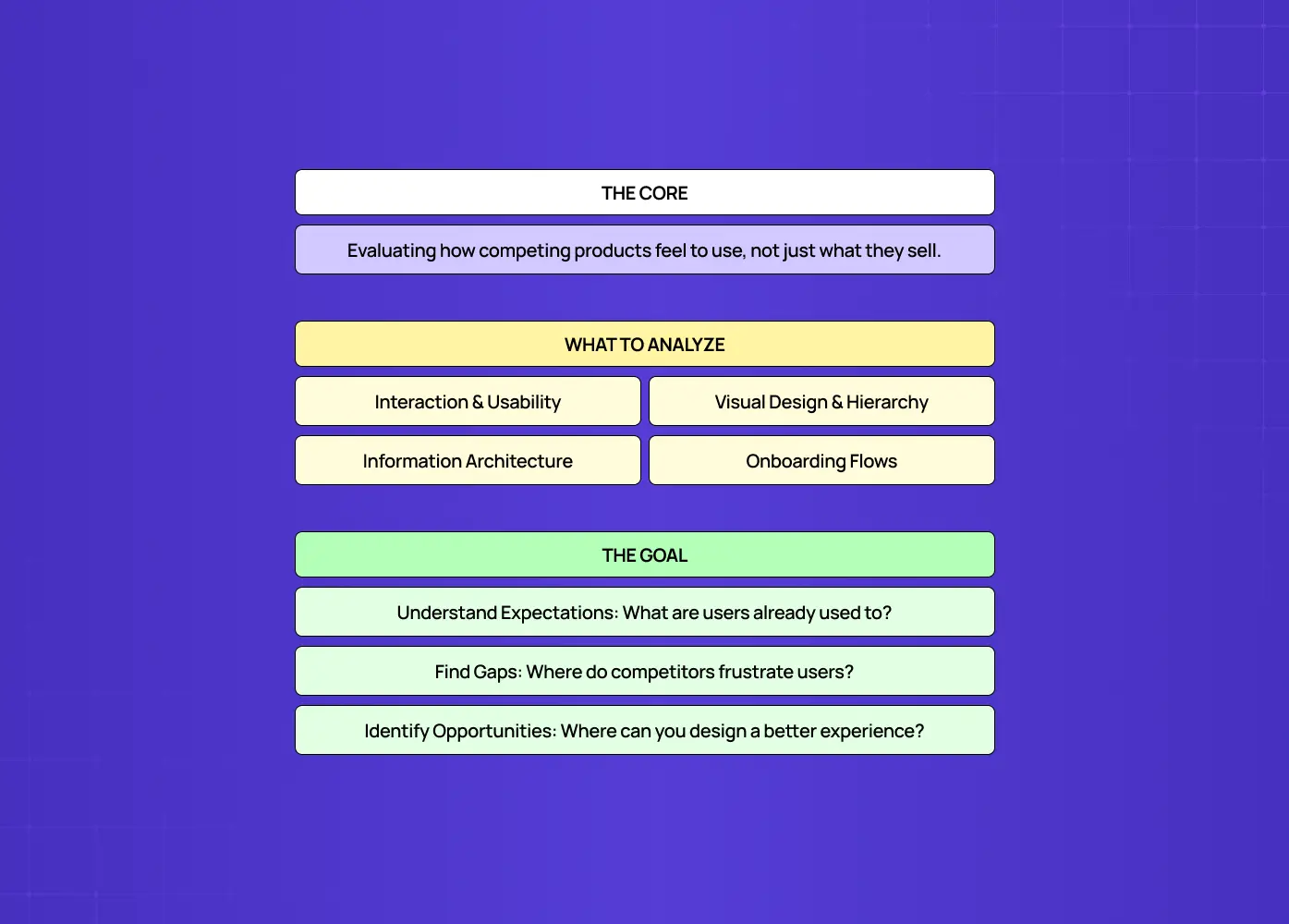
Diagram outlining the purpose, evaluation areas, and goals of analyzing competitor user experiences.

A UX competitor analysis is a structured evaluation of how competing products design their user experience. Specifically, it looks at:

  • Interaction patterns and overall usability

  • Visual design and hierarchy

  • Information architecture

  • Onboarding flows

  • How each product feels to actually use, not just what it offers on paper

Unlike a broad market or business competitive analysis (which looks at pricing, positioning, and features), a UX competitor analysis is specifically about experience: how it feels to actually use each product, where it's smooth, and where it's frustrating.

The goal isn't to copy competitors. It's to understand the landscape your product lives in. What do users already expect because everyone does it a certain way? Where is everyone falling short, leaving an opening? Which flows are needlessly painful across the board? A good analysis answers those questions with evidence you can design from, sitting alongside the other UX design methodologies your team already relies on.

10 UX fixes that can lift your landing page conversions this week

A quick CRO + UX audit checklist that uncovers the hidden leaks killing your signups, built from audits of real SaaS landing pages.

No Spam. Free Lifetime

10 UX fixes that can lift your landing page conversions this week

A quick CRO + UX audit checklist that uncovers the hidden leaks killing your signups, built from audits of real SaaS landing pages.

No Spam. Free Lifetime

How it differs from a business competitor analysis

It's worth drawing a clear line, because the two get conflated.

  • A business (or marketing) competitor analysis looks at the market broadly: pricing models, feature sets, commercial positioning, market share, go-to-market strategies, strengths and weaknesses as a company.

  • A UX competitor analysis zooms in on one specific thing: the experience of using the product.

The two are complementary. You might learn from a market analysis that a rival is winning on price, and from a UX analysis that they're winning because their onboarding is dramatically smoother than yours. But they answer different questions and use different methods. A UX analysis requires actually using the products, walking the flows, and evaluating usability, whereas a market analysis leans on public data, reviews, and financials. If your goal is to improve your product's design, it's the UX lens you need. Feature checklists and pricing tables won't tell you why users find a competitor easier to use. Keep the two distinct, run whichever your question calls for, and use them together when you want the full picture of both what competitors offer and how it feels to use it.

Why UX competitor analysis matters
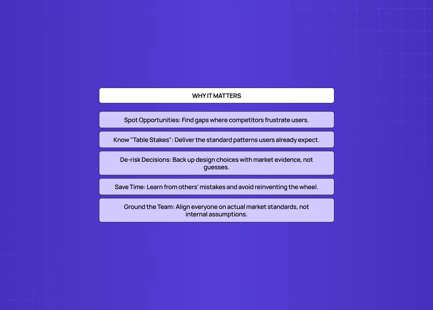
Summary highlighting benefits such as finding opportunities, reducing risk, aligning teams, and learning from competitors.

The payoff is significant:

  • It reveals opportunities. When you see where competitors' experiences frustrate users, you find gaps your product can win on.

  • It identifies table stakes. These are the patterns and features users now expect as standard, which you skip at your peril.

  • It de-risks design decisions. Instead of debating in the abstract, you can point to how the problem is solved, well or badly, across the market.

  • It saves time. You don't have to reinvent solved problems, and you can learn from others' mistakes instead of repeating them.

  • It grounds your team in reality. It aligns everyone on the actual standard your users compare you to, rather than an internal assumption of it.

It's research that pays for itself many times over.

The types of competitors to include

A common mistake is looking only at obvious rivals. A strong analysis considers three types:

  • Direct competitors offer a similar product to the same audience. These are your most obvious benchmarks.

  • Indirect competitors solve the same user problem in a different way (a spreadsheet vs. your project management tool, say). These reveal alternative mental models your users may bring, especially when you already have UX personas documented.

  • Analogous or aspirational competitors: products in other categories with exceptional UX for a pattern you share, like the checkout flow of a top e-commerce brand or the onboarding of a beloved app. A running swipe file of strong website design examples is a good place to source them.

Including all three gives you both a realistic competitive picture and a higher bar to aim for. For depth over breadth, shortlist three to five to analyze closely rather than skimming a dozen.

How to do a UX competitor analysis: step by step
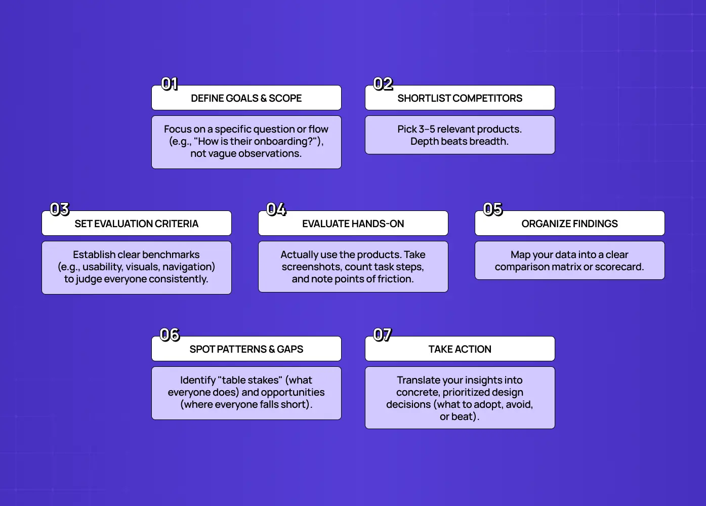
Seven-step workflow covering goal definition, competitor selection, evaluation, organizing insights, and taking action.

Step 1: Define your goals and scope

Start with the question you're trying to answer. Are you improving onboarding? Redesigning a checkout? Benchmarking your paywall design against the market? Entering a new market? A focused goal keeps the analysis actionable. "How do competitors handle first-time setup?" yields far more than a vague "let's see what others do." Define the product area and the specific flows you'll examine.

Step 2: Identify and shortlist competitors

Compile a list across the three types above (direct, indirect, and analogous), then narrow to the three to five most relevant to your goal. Depth beats breadth: a close analysis of five products teaches you more than a shallow glance at fifteen.

Step 3: Set your evaluation criteria and benchmarks

Decide what you'll assess before you start, so every competitor is judged consistently. Establish clear UX benchmarks, the specific dimensions you'll rate for each, such as:

  • Navigation and onboarding

  • Key task flows

  • Visual design and hierarchy

  • Usability and accessibility

Consistent criteria are what make findings comparable instead of anecdotal. If you're unsure which dimensions your question actually calls for, a UX research cheat sheet helps you match methods to the scope you set in step one.

Step 4: Do the hands-on evaluation

Actually use each product, testing the SaaS signup flow as the first thing under evaluation, then walk through the key flows as a real user and document everything, including:

  • Screenshots of each flow

  • Notes on where you hesitated or got confused

  • Step counts (how many steps to complete the core task?)

  • A lightweight heuristic evaluation across the flow, capturing both the good and the bad

This hands-on walkthrough is the core of the analysis, and the method is the same one you'd use to run a UX audit, just pointed at someone else's product. Secondhand impressions aren't enough.

Step 5: Organize your findings

Pull everything into a structured format, typically a matrix or scorecard with competitors as rows (or columns) and your criteria as the other axis, rated consistently, with screenshots as evidence. A clear structure turns a pile of observations into something the whole team can read and compare at a glance.

Step 6: Identify patterns, gaps, and opportunities

Step back and look across the matrix and ask:

  • What does everyone do the same way? (table stakes)

  • Where does everyone fall short? (your opportunity)

  • What does the best performer do that others don't? (the bar to match or beat)

Separate the patterns worth adopting from the gaps worth exploiting. Laying the gaps over an empathy map helps you check that each opportunity represents a frustration a real user actually has, not just a difference you noticed.

Step 7: Turn insights into action

The analysis is worthless if it just sits in a doc. Translate findings into concrete, prioritized design decisions and recommendations: what to adopt because it's expected, what to do differently to stand out, and what to avoid because competitors prove it fails. This final step is what separates research that changes the product from research that gathers dust.

What to evaluate: the UX competitor analysis checklist
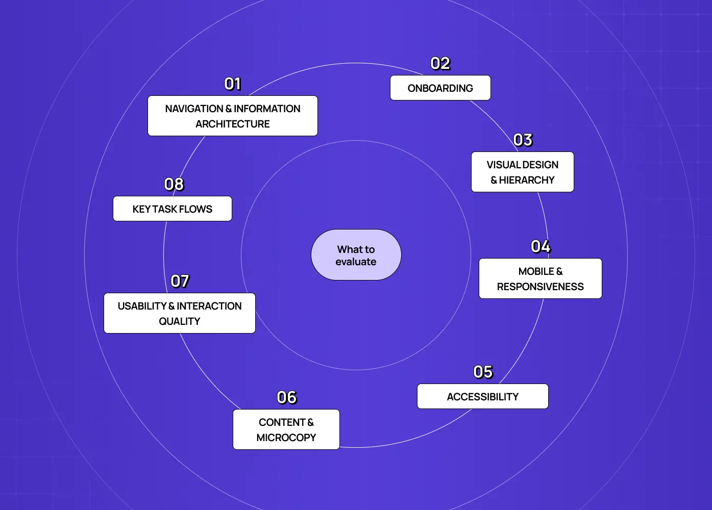
Circular framework listing key UX evaluation areas including navigation, onboarding, accessibility, content, and usability.

When you assess each competitor, cover these dimensions consistently:

  • Navigation & information architecture: how content and features are organized, and how easy it is to find things.

  • Onboarding: how new users get started, and whether it's intuitive and quick.

  • Key task flows: the steps to complete core tasks, counting the number of steps, decision points, and points of confusion, the same signals you'd watch for in UX testing on your own product.

  • Visual design & hierarchy: clarity, consistency, and how well the design guides attention.

  • Usability & interaction quality: how well interactions, feedback, and states work (against usability heuristics).

  • Mobile & responsiveness: how the experience holds up across devices.

  • Accessibility: whether the experience works for users with different needs.

  • Content & microcopy: clarity of labels, error messages, and guidance.

Run the same checklist on yourself first. A quick self-audit on your own site establishes the baseline row in the matrix, and without it you have no idea whether a competitor is genuinely ahead. Rate each dimension consistently across competitors, and you'll have a clear, comparable picture of where each stands, and where the market is weak.

Tools and templates that help

You don't need fancy software, but the right tools speed things up:

  • For documenting and comparing: a simple spreadsheet or a design-tool board (Figma, FigJam) works well as your analysis matrix, with competitors on one axis, criteria on the other, and screenshots embedded as evidence.

  • For capturing flows: screen-recording and screenshot tools let you save exactly how a competitor's onboarding or checkout behaves, so you can review it later and share it with the team.

  • For evaluation: usability heuristics (like Nielsen's ten) give you a ready-made lens to evaluate each product consistently rather than relying on gut feel.

  • For quantitative context: analytics or session tools can add data on your own performance, benchmarking against the UX metrics you already track rather than an impression.

Plenty of UX platforms also offer free competitor-analysis templates that pre-structure the matrix. This is a fine starting point, as long as you adapt the criteria to your specific goal rather than filling in a generic grid. The tool matters far less than the rigor: consistent criteria, hands-on evaluation, and honest synthesis are what produce insight.

How to turn findings into design decisions

The step teams most often fail at is this last one: converting analysis into action, the point where a pile of competitor observations has to turn into a design strategy. A useful way to structure it is to sort every finding into three buckets, then prioritize:

  • Adopt: patterns that are table stakes or clearly superior, which you should match so you don't fall behind expectations.

  • Differentiate: areas where competitors are uniformly weak, which represent your opportunity to stand out by doing it noticeably better.

  • Avoid: approaches that competitors prove create friction, the same bad UX design failure patterns resurfacing across products, which you now know to steer clear of.

  • Prioritize: weigh potential impact on your users and goals against the effort to build it, and feed the high-value ones into your UX optimization backlog or next project brief.

Attach the evidence (the screenshot, the step count, the specific friction you observed) so the recommendation carries weight in reviews. Findings with an owner and a priority get built. Findings in a slide deck get forgotten.

How often should you run one?

A UX competitor analysis isn't a one-and-done. Competitors ship redesigns, new entrants appear, and user expectations keep rising, so a snapshot goes stale. Run a thorough analysis at key moments, and do a lighter refresh periodically to catch meaningful changes:

  • Before a major project

  • When entering a new market

  • When planning a SaaS website redesign or major product update.

  • A quarterly or twice-yearly check on your core competitors' key flows

Treat it as an ongoing habit rather than a single deliverable, and you'll always be designing against the current bar, not last year's. Many mature teams keep a living competitor-analysis board, usually owned by a UX researcher who updates it as they notice changes, so the knowledge compounds instead of being rebuilt from scratch each time.

Common UX competitor analysis mistakes to avoid

Even useful-sounding analyses go wrong in predictable ways:

  • Copying instead of learning. Mimicking a competitor's design without understanding why it works (or whether it actually does) imports their mistakes along with their strengths.

  • Only looking at direct competitors. This misses the indirect and analogous products that often hold the best lessons.

  • Starting with no clear goal. This produces a sprawling survey that informs no decision.

  • Evaluating features instead of experience. Listing what competitors have, rather than how it feels to use, misses the point.

  • Falling prey to confirmation bias. Seeing what confirms your existing plan, rather than what's actually there.

  • Treating it as a one-time exercise. Competitors evolve, so the best teams revisit their analysis periodically.

Avoid these and the analysis stays sharp, honest, and genuinely useful.

Conclusion

A UX competitor analysis turns the products your users already know into a map of what to match, what to beat, and what to avoid. To get real value from it:

  • Define a clear goal before you start

  • Look beyond just direct rivals

  • Evaluate the real experience against consistent criteria

  • Convert what you learn into prioritized design decisions

Do that, and you stop designing on assumptions and start designing against the actual standard your users hold you to.

If you want a UX research agency to run a rigorous UX competitor analysis, and turn it into a product that outperforms the field, book a discovery call with Groto. We ground every recommendation in evidence, including a clear-eyed look at your competition. The same discipline is worth applying when selecting external help; product teams weighing Eleken alternatives run this exact comparison on agencies before they commit. Let's find your opening and design for it.
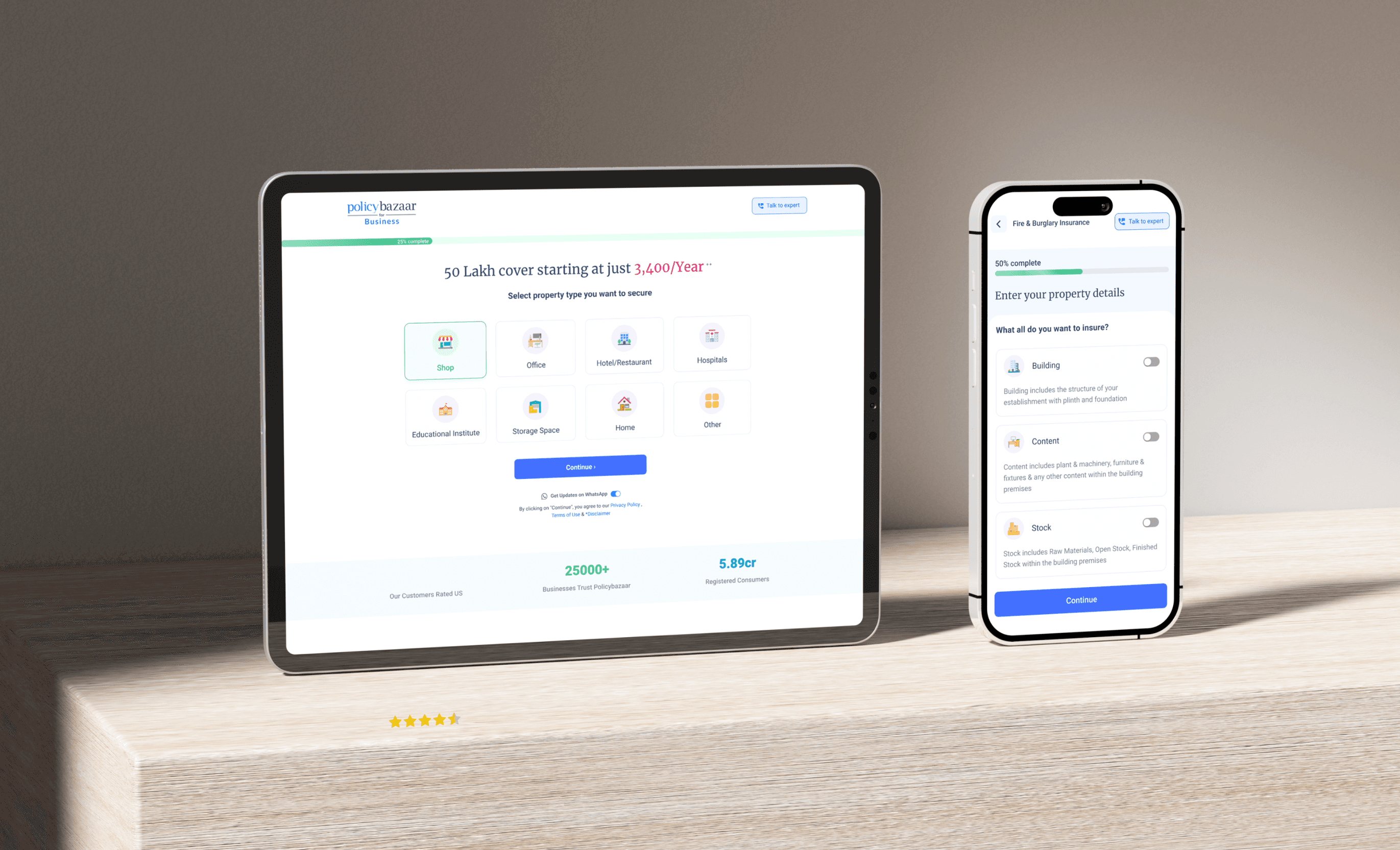

A UX competitor analysis shows you the real bar your users measure you against. This guide walks through what it is, why it matters, the types of competitors to study, and a clear step-by-step process to follow.

Learn how to run a UX competitor analysis that actually improves your product's design.

Two people discussing analytics dashboards and charts, symbolizing competitor research and product evaluation.

TL;DR 

A UX competitor analysis is a structured look at how competing products handle navigation, onboarding, and usability, so you can see where to match the market and where to beat it. This guide covers:

  • What it is and how it differs from a business competitor analysis

  • Why it's worth doing and which competitors to include

  • A clear 7-step process, from setting goals to acting on findings

  • What to evaluate, which tools help, and the mistakes to avoid

Every product decision gets compared to something, whether your team planned for that or not. A UX competitor analysis is simply the practice of doing that comparison on purpose: looking closely at how rival products handle the experience side of things, so your own design choices are backed by evidence rather than a hunch. It's one of the most practical exercises a product or design team can run, because it tells you exactly what your users already expect and where the room to stand out actually is.

Your product isn't judged in a vacuum. Every user who lands on your app arrives carrying expectations set by every other app they use: the smooth onboarding of one, the effortless checkout of another, the search that always works. If your experience is more confusing than the alternatives, users notice instantly, even if they can't articulate why. That's exactly why a UX competitor analysis is one of the highest-leverage pieces of UX research a product team can do. It shows you the bar your users are actually measuring you against.

Done well, it reveals gaps to exploit, table-stakes you can't skip, and patterns users already understand, so you design with evidence instead of guesswork. This guide walks through what a UX competitor analysis is, why it matters, the types of competitors to include, a clear step-by-step process, exactly what to evaluate, and the mistakes that make the whole exercise useless. Let's turn your competitors into your best research resource.

What is a UX competitor analysis?

Diagram outlining the purpose, evaluation areas, and goals of analyzing competitor user experiences.

A UX competitor analysis is a structured evaluation of how competing products design their user experience. Specifically, it looks at:

  • Interaction patterns and overall usability

  • Visual design and hierarchy

  • Information architecture

  • Onboarding flows

  • How each product feels to actually use, not just what it offers on paper

Unlike a broad market or business competitive analysis (which looks at pricing, positioning, and features), a UX competitor analysis is specifically about experience: how it feels to actually use each product, where it's smooth, and where it's frustrating.

The goal isn't to copy competitors. It's to understand the landscape your product lives in. What do users already expect because everyone does it a certain way? Where is everyone falling short, leaving an opening? Which flows are needlessly painful across the board? A good analysis answers those questions with evidence you can design from, sitting alongside the other UX design methodologies your team already relies on.

10 UX fixes that can lift your landing page conversions this week

A quick CRO + UX audit checklist that uncovers the hidden leaks killing your signups, built from audits of real SaaS landing pages.

No Spam. Free Lifetime

How it differs from a business competitor analysis

It's worth drawing a clear line, because the two get conflated.

  • A business (or marketing) competitor analysis looks at the market broadly: pricing models, feature sets, commercial positioning, market share, go-to-market strategies, strengths and weaknesses as a company.

  • A UX competitor analysis zooms in on one specific thing: the experience of using the product.

The two are complementary. You might learn from a market analysis that a rival is winning on price, and from a UX analysis that they're winning because their onboarding is dramatically smoother than yours. But they answer different questions and use different methods. A UX analysis requires actually using the products, walking the flows, and evaluating usability, whereas a market analysis leans on public data, reviews, and financials. If your goal is to improve your product's design, it's the UX lens you need. Feature checklists and pricing tables won't tell you why users find a competitor easier to use. Keep the two distinct, run whichever your question calls for, and use them together when you want the full picture of both what competitors offer and how it feels to use it.

Why UX competitor analysis matters

Summary highlighting benefits such as finding opportunities, reducing risk, aligning teams, and learning from competitors.

The payoff is significant:

  • It reveals opportunities. When you see where competitors' experiences frustrate users, you find gaps your product can win on.

  • It identifies table stakes. These are the patterns and features users now expect as standard, which you skip at your peril.

  • It de-risks design decisions. Instead of debating in the abstract, you can point to how the problem is solved, well or badly, across the market.

  • It saves time. You don't have to reinvent solved problems, and you can learn from others' mistakes instead of repeating them.

  • It grounds your team in reality. It aligns everyone on the actual standard your users compare you to, rather than an internal assumption of it.

It's research that pays for itself many times over.

The types of competitors to include

A common mistake is looking only at obvious rivals. A strong analysis considers three types:

  • Direct competitors offer a similar product to the same audience. These are your most obvious benchmarks.

  • Indirect competitors solve the same user problem in a different way (a spreadsheet vs. your project management tool, say). These reveal alternative mental models your users may bring, especially when you already have UX personas documented.

  • Analogous or aspirational competitors: products in other categories with exceptional UX for a pattern you share, like the checkout flow of a top e-commerce brand or the onboarding of a beloved app. A running swipe file of strong website design examples is a good place to source them.

Including all three gives you both a realistic competitive picture and a higher bar to aim for. For depth over breadth, shortlist three to five to analyze closely rather than skimming a dozen.

How to do a UX competitor analysis: step by step

Seven-step workflow covering goal definition, competitor selection, evaluation, organizing insights, and taking action.

Step 1: Define your goals and scope

Start with the question you're trying to answer. Are you improving onboarding? Redesigning a checkout? Benchmarking your paywall design against the market? Entering a new market? A focused goal keeps the analysis actionable. "How do competitors handle first-time setup?" yields far more than a vague "let's see what others do." Define the product area and the specific flows you'll examine.

Step 2: Identify and shortlist competitors

Compile a list across the three types above (direct, indirect, and analogous), then narrow to the three to five most relevant to your goal. Depth beats breadth: a close analysis of five products teaches you more than a shallow glance at fifteen.

Step 3: Set your evaluation criteria and benchmarks

Decide what you'll assess before you start, so every competitor is judged consistently. Establish clear UX benchmarks, the specific dimensions you'll rate for each, such as:

  • Navigation and onboarding

  • Key task flows

  • Visual design and hierarchy

  • Usability and accessibility

Consistent criteria are what make findings comparable instead of anecdotal. If you're unsure which dimensions your question actually calls for, a UX research cheat sheet helps you match methods to the scope you set in step one.

Step 4: Do the hands-on evaluation

Actually use each product, testing the SaaS signup flow as the first thing under evaluation, then walk through the key flows as a real user and document everything, including:

  • Screenshots of each flow

  • Notes on where you hesitated or got confused

  • Step counts (how many steps to complete the core task?)

  • A lightweight heuristic evaluation across the flow, capturing both the good and the bad

This hands-on walkthrough is the core of the analysis, and the method is the same one you'd use to run a UX audit, just pointed at someone else's product. Secondhand impressions aren't enough.

Step 5: Organize your findings

Pull everything into a structured format, typically a matrix or scorecard with competitors as rows (or columns) and your criteria as the other axis, rated consistently, with screenshots as evidence. A clear structure turns a pile of observations into something the whole team can read and compare at a glance.

Step 6: Identify patterns, gaps, and opportunities

Step back and look across the matrix and ask:

  • What does everyone do the same way? (table stakes)

  • Where does everyone fall short? (your opportunity)

  • What does the best performer do that others don't? (the bar to match or beat)

Separate the patterns worth adopting from the gaps worth exploiting. Laying the gaps over an empathy map helps you check that each opportunity represents a frustration a real user actually has, not just a difference you noticed.

Step 7: Turn insights into action

The analysis is worthless if it just sits in a doc. Translate findings into concrete, prioritized design decisions and recommendations: what to adopt because it's expected, what to do differently to stand out, and what to avoid because competitors prove it fails. This final step is what separates research that changes the product from research that gathers dust.

What to evaluate: the UX competitor analysis checklist

Circular framework listing key UX evaluation areas including navigation, onboarding, accessibility, content, and usability.

When you assess each competitor, cover these dimensions consistently:

  • Navigation & information architecture: how content and features are organized, and how easy it is to find things.

  • Onboarding: how new users get started, and whether it's intuitive and quick.

  • Key task flows: the steps to complete core tasks, counting the number of steps, decision points, and points of confusion, the same signals you'd watch for in UX testing on your own product.

  • Visual design & hierarchy: clarity, consistency, and how well the design guides attention.

  • Usability & interaction quality: how well interactions, feedback, and states work (against usability heuristics).

  • Mobile & responsiveness: how the experience holds up across devices.

  • Accessibility: whether the experience works for users with different needs.

  • Content & microcopy: clarity of labels, error messages, and guidance.

Run the same checklist on yourself first. A quick self-audit on your own site establishes the baseline row in the matrix, and without it you have no idea whether a competitor is genuinely ahead. Rate each dimension consistently across competitors, and you'll have a clear, comparable picture of where each stands, and where the market is weak.

Tools and templates that help

You don't need fancy software, but the right tools speed things up:

  • For documenting and comparing: a simple spreadsheet or a design-tool board (Figma, FigJam) works well as your analysis matrix, with competitors on one axis, criteria on the other, and screenshots embedded as evidence.

  • For capturing flows: screen-recording and screenshot tools let you save exactly how a competitor's onboarding or checkout behaves, so you can review it later and share it with the team.

  • For evaluation: usability heuristics (like Nielsen's ten) give you a ready-made lens to evaluate each product consistently rather than relying on gut feel.

  • For quantitative context: analytics or session tools can add data on your own performance, benchmarking against the UX metrics you already track rather than an impression.

Plenty of UX platforms also offer free competitor-analysis templates that pre-structure the matrix. This is a fine starting point, as long as you adapt the criteria to your specific goal rather than filling in a generic grid. The tool matters far less than the rigor: consistent criteria, hands-on evaluation, and honest synthesis are what produce insight.

How to turn findings into design decisions

The step teams most often fail at is this last one: converting analysis into action, the point where a pile of competitor observations has to turn into a design strategy. A useful way to structure it is to sort every finding into three buckets, then prioritize:

  • Adopt: patterns that are table stakes or clearly superior, which you should match so you don't fall behind expectations.

  • Differentiate: areas where competitors are uniformly weak, which represent your opportunity to stand out by doing it noticeably better.

  • Avoid: approaches that competitors prove create friction, the same bad UX design failure patterns resurfacing across products, which you now know to steer clear of.

  • Prioritize: weigh potential impact on your users and goals against the effort to build it, and feed the high-value ones into your UX optimization backlog or next project brief.

Attach the evidence (the screenshot, the step count, the specific friction you observed) so the recommendation carries weight in reviews. Findings with an owner and a priority get built. Findings in a slide deck get forgotten.

How often should you run one?

A UX competitor analysis isn't a one-and-done. Competitors ship redesigns, new entrants appear, and user expectations keep rising, so a snapshot goes stale. Run a thorough analysis at key moments, and do a lighter refresh periodically to catch meaningful changes:

  • Before a major project

  • When entering a new market

  • When planning a SaaS website redesign or major product update.

  • A quarterly or twice-yearly check on your core competitors' key flows

Treat it as an ongoing habit rather than a single deliverable, and you'll always be designing against the current bar, not last year's. Many mature teams keep a living competitor-analysis board, usually owned by a UX researcher who updates it as they notice changes, so the knowledge compounds instead of being rebuilt from scratch each time.

Common UX competitor analysis mistakes to avoid

Even useful-sounding analyses go wrong in predictable ways:

  • Copying instead of learning. Mimicking a competitor's design without understanding why it works (or whether it actually does) imports their mistakes along with their strengths.

  • Only looking at direct competitors. This misses the indirect and analogous products that often hold the best lessons.

  • Starting with no clear goal. This produces a sprawling survey that informs no decision.

  • Evaluating features instead of experience. Listing what competitors have, rather than how it feels to use, misses the point.

  • Falling prey to confirmation bias. Seeing what confirms your existing plan, rather than what's actually there.

  • Treating it as a one-time exercise. Competitors evolve, so the best teams revisit their analysis periodically.

Avoid these and the analysis stays sharp, honest, and genuinely useful.

Conclusion

A UX competitor analysis turns the products your users already know into a map of what to match, what to beat, and what to avoid. To get real value from it:

  • Define a clear goal before you start

  • Look beyond just direct rivals

  • Evaluate the real experience against consistent criteria

  • Convert what you learn into prioritized design decisions

Do that, and you stop designing on assumptions and start designing against the actual standard your users hold you to.

If you want a UX research agency to run a rigorous UX competitor analysis, and turn it into a product that outperforms the field, book a discovery call with Groto. We ground every recommendation in evidence, including a clear-eyed look at your competition. The same discipline is worth applying when selecting external help; product teams weighing Eleken alternatives run this exact comparison on agencies before they commit. Let's find your opening and design for it.

Have a project in mind?

Let’s talk through your idea and see what makes sense.

Harpreet Singh

Founder at Groto

Have a project in mind?

Let’s talk through your idea and see what makes sense.

Harpreet Singh

Founder at Groto

FAQ

Everything you were going to ask (and a few things you didn’t know to)

What is a UX competitor analysis?

A UX competitor analysis is a structured evaluation of how competing products design their user experience: their navigation, information architecture, onboarding, key task flows, visual design, and usability. Unlike a business competitive analysis, it focuses specifically on how it feels to use each product, to reveal gaps and opportunities for your own design.

What's the difference between direct, indirect, and analogous competitors?

Direct competitors offer a similar product to the same audience. Indirect competitors solve the same user problem in a different way. Analogous (or aspirational) competitors are products in other categories with exceptional UX for a pattern you share. Including all three gives a realistic picture plus a higher bar to aim for.

How many competitors should you analyze?

Three to five is usually ideal. A close, hands-on analysis of a few products yields far more useful insight than a shallow survey of a dozen. Prioritize the competitors most relevant to your specific goal.

What are common UX competitor analysis mistakes?

Copying competitors instead of learning from them, only analyzing direct competitors, starting with no clear goal, evaluating features rather than the actual experience, confirmation bias, and treating it as a one-time exercise instead of revisiting it as competitors evolve.

How to use AI for competitor analysis?

AI tools can speed up parts of the process: summarizing competitor reviews and feedback at scale, spotting recurring complaints across app store or social mentions, and helping organize screenshots and notes into a first-draft matrix. They're useful for surfacing patterns faster, but they don't replace the hands-on walkthrough. The judgment of actually using a product and feeling where it breaks down is still something a person needs to do.

What is an example of a competitor analysis?

A simple example: a project management tool wants to improve its onboarding. The team shortlists four direct competitors and one analogous product known for a smooth first-time setup. They sign up for each, timing and screenshotting every step, then log findings in a shared matrix scored across onboarding clarity, number of steps, and moments of confusion. The pattern that emerges (say, every competitor asks for team size before showing any value) becomes a clear, evidence-backed decision: match that expectation, but shorten the number of steps to get there.

What is a UX competitor analysis?

A UX competitor analysis is a structured evaluation of how competing products design their user experience: their navigation, information architecture, onboarding, key task flows, visual design, and usability. Unlike a business competitive analysis, it focuses specifically on how it feels to use each product, to reveal gaps and opportunities for your own design.

What's the difference between direct, indirect, and analogous competitors?

Direct competitors offer a similar product to the same audience. Indirect competitors solve the same user problem in a different way. Analogous (or aspirational) competitors are products in other categories with exceptional UX for a pattern you share. Including all three gives a realistic picture plus a higher bar to aim for.

How many competitors should you analyze?

Three to five is usually ideal. A close, hands-on analysis of a few products yields far more useful insight than a shallow survey of a dozen. Prioritize the competitors most relevant to your specific goal.

What are common UX competitor analysis mistakes?

Copying competitors instead of learning from them, only analyzing direct competitors, starting with no clear goal, evaluating features rather than the actual experience, confirmation bias, and treating it as a one-time exercise instead of revisiting it as competitors evolve.

How to use AI for competitor analysis?

AI tools can speed up parts of the process: summarizing competitor reviews and feedback at scale, spotting recurring complaints across app store or social mentions, and helping organize screenshots and notes into a first-draft matrix. They're useful for surfacing patterns faster, but they don't replace the hands-on walkthrough. The judgment of actually using a product and feeling where it breaks down is still something a person needs to do.

What is an example of a competitor analysis?

A simple example: a project management tool wants to improve its onboarding. The team shortlists four direct competitors and one analogous product known for a smooth first-time setup. They sign up for each, timing and screenshotting every step, then log findings in a shared matrix scored across onboarding clarity, number of steps, and moments of confusion. The pattern that emerges (say, every competitor asks for team size before showing any value) becomes a clear, evidence-backed decision: match that expectation, but shorten the number of steps to get there.

More Articles

Extreme close-up black and white photograph of a human eye

Let’s bring your vision to life

Tell us what's on your mind? We'll hit you back in 24 hours. No fluff, no delays - just a solid vision to bring your idea to life.

Profile portrait of a man in a white shirt against a light background

Harpreet Singh

Founder and Creative Director

Get in Touch

Extreme close-up black and white photograph of a human eye

Let’s bring your vision to life

Tell us what's on your mind? We'll hit you back in 24 hours. No fluff, no delays - just a solid vision to bring your idea to life.

Profile portrait of a man in a white shirt against a light background

Harpreet Singh

Founder and Creative Director

Get in Touch

Extreme close-up black and white photograph of a human eye

Let’s bring your vision to life

Tell us what's on your mind? We'll hit you back in 24 hours. No fluff, no delays - just a solid vision to bring your idea to life.

Profile portrait of a man in a white shirt against a light background

Harpreet Singh

Founder and Creative Director

Get in Touch