Typography in graphic design goes far deeper than font selection. From typeface classification and kerning to visual hierarchy and font pairing, this guide breaks down the principles, rules, and decisions that separate good design from great design.
Typography rules that shape every great design, explained clearly.

TL;DR
Typography is the art of arranging type to communicate clearly and create visual impact.
Core elements include typeface, font weight, leading, kerning, tracking, and hierarchy.
The main types of typography are serif, sans-serif, script, display, and monospace.
Typography rules cover alignment, contrast, hierarchy, font pairing, spacing, and consistency.
When applied well, typography shapes brand identity, improves readability, and guides user attention.
Every design decision we make at Groto eventually comes back to one thing: how information is arranged on a page or screen. Before color, before layout, before illustrations, there is type. And how that type is handled determines whether a design communicates or just occupies space. Graphic design typography is not a side concern in our work. It is, in many ways, the backbone of it.
This guide covers what typography actually means, the terms you need to understand it properly, the different types of typefaces, the core principles and rules that govern good typographic practice, and why each decision matters in real design work.
What is Typography in Design?
Typography is the art and technique of arranging type to make written language legible, readable, and visually coherent. It involves selecting typefaces, setting point sizes, adjusting spacing, creating hierarchy, and managing the relationship between text and layout. The goal is not beauty for its own sake. It is clarity of communication.
The word comes from the Greek "typos" (impression) and "graphia" (writing). Originally a print craft, Typography today spans every touchpoint across graphic design: websites, mobile apps, brand identity systems, SaaS product interfaces, packaging, and everything in between. In our work on platforms like LearnSphere's edtech product and Gini's health tracking app, the first typographic decisions set the tone for the entire visual system. Get it wrong, and the rest of the design fights against it.
There is an important distinction that comes up early: typeface versus font.
A typeface is the overall design of the letterforms and the family they belong to.
A font is the specific file or style within that typeface, such as a particular weight or width.
Helvetica is a typeface. Helvetica Bold at 14pt is a font.
Understanding this distinction matters because design decisions operate at both levels.
The Core Elements of Typography
Before applying any rules, a designer needs to understand what they are actually manipulating. These are the building blocks of typographic control.
Typeface and Font
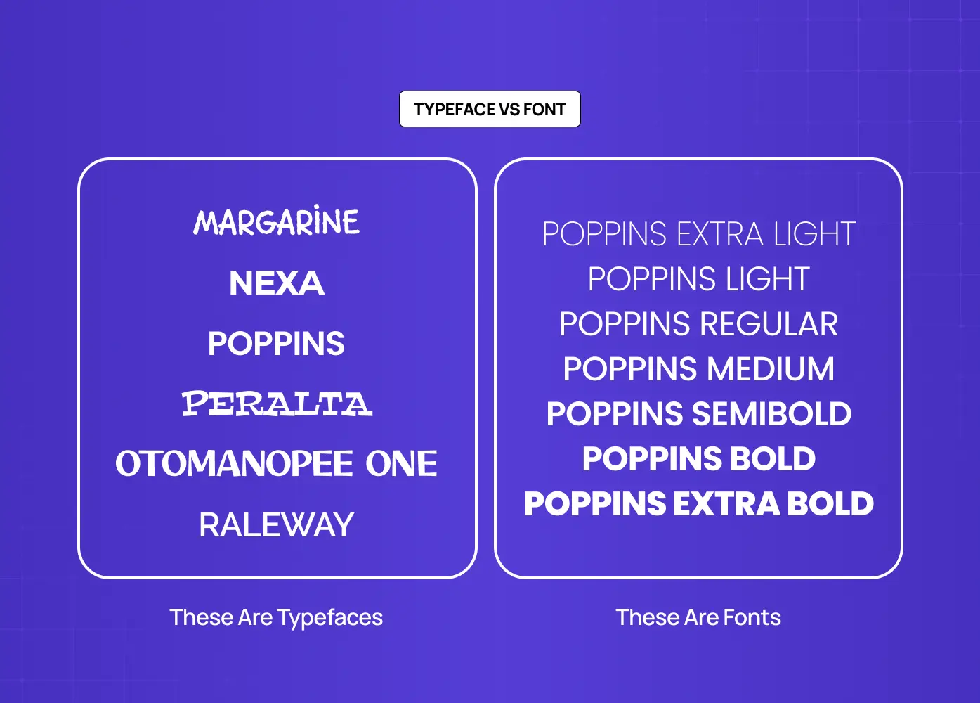
A typeface family can contain dozens of styles: thin, light, regular, medium, semibold, bold, black, condensed, extended, italic, and oblique. Each style carries different visual weight and emotional character. Choosing the right style within a family is as important as choosing the family itself.
Leading, Kerning, and Tracking

Leading (line-height) is the vertical distance between baselines of successive lines of text. Too tight and the text feels suffocating. Too loose and the eye struggles to track from one line to the next. A general starting range is 120-150% of the point size, adjusted based on typeface and context.
Kerning is the adjustment of space between a specific pair of characters. Certain letter combinations, particularly those involving A, V, T, and W, create optical gaps that need to be corrected manually or through a well-kerned font file.
Tracking is the uniform adjustment of spacing across a range of characters or an entire text block. Tight tracking can feel compressed and modern. Loose tracking can create an airy, editorial feel. Uppercase text typically tolerates and benefits from more generous tracking than lowercase.
Hierarchy
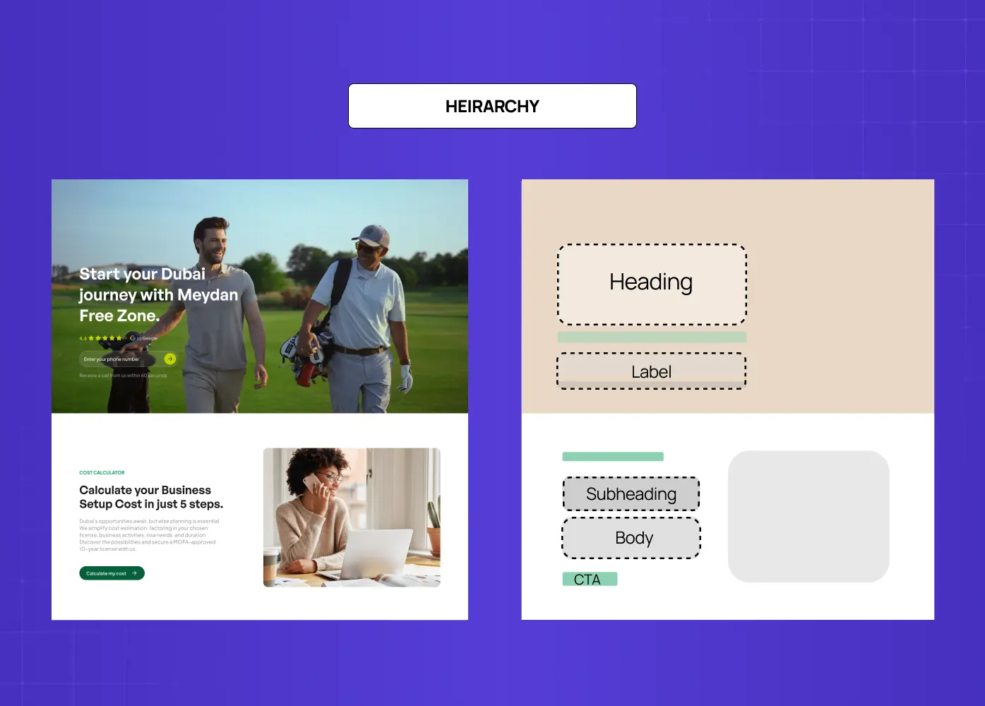
Visual hierarchy is the system that tells a reader where to look first, second, and third. It is established through differences in type size, weight, color, spacing, and placement. A strong hierarchy makes complex information feel approachable. Without it, all text competes equally for attention, and nothing wins.
In our redesign of the Meydan FZ website, establishing a clear typographic hierarchy was one of the early decisions that shaped the entire layout. Headings needed to communicate authority and clarity for business owners navigating a complex regulatory environment. Body text needed to feel approachable, not corporate. The interplay between the two informed every content block on the site.
Types of Typography in Graphic Design
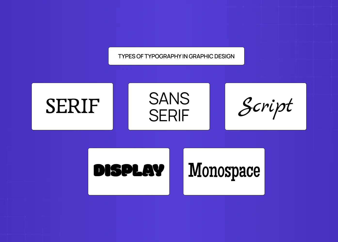
Typefaces fall into distinct categories, each with its own visual character and appropriate contexts.
Serif
Serif typefaces have small strokes (serifs) at the ends of the main letterform strokes. They have a long history rooted in print. Within serif, there are sub-classifications: Humanist/Old Style (warm, calligraphic influence), Transitional (between old and modern), Modern (high contrast, thin serifs), and Slab Serif (heavy serifs, often used in display or advertising). Serifs generally communicate tradition, authority, and trust. They are commonly used in editorial, finance, and luxury brand contexts.
Sans-Serif
Sans-serif typefaces have no finishing strokes. They tend to read as cleaner and more contemporary. Sub-classifications include:
Humanist sans (slight variation, warm),
Transitional sans (uniform, Helvetica being the archetype), and
Geometric sans (built on pure geometric forms).
For SaaS products, interfaces, and tech brands, sans-serif is often the default because it reads well at small sizes on screen.
Script and Cursive
Script typefaces imitate handwriting or calligraphy. They range from formal and elegant to casual and expressive. They work well for brand wordmarks, packaging accents, and invitations, but fail at length in body copy. They are high-personality choices that need to be deployed deliberately.
Display
Display typefaces are designed for large sizes and short bursts of text. They prioritize visual impact over extended readability. Posters, campaign headlines, landing page hero sections, and editorial covers are natural homes for display type.
Monospace
Monospace typefaces allocate equal horizontal space to every character. Originally a typewriter artifact, they are now strongly associated with code, technical interfaces, and developer-facing products. Using a monospace font in a SaaS product's code editor or terminal context is a signal the design understands its audience. Typographic decisions like this are codified inside design systems for SaaS products.
Typography Rules in Graphic Design
Rules in typography exist not to constrain creativity but to protect communication. Here are the ones that matter most in practice.
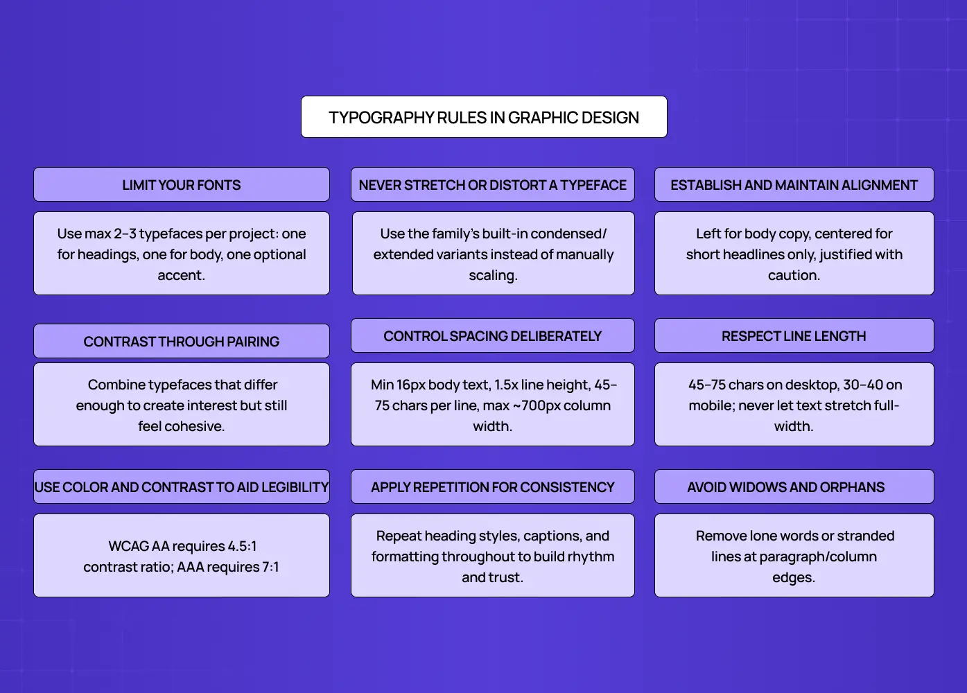
Limit Your Fonts
Using too many typefaces in a single design creates visual noise and undermines cohesion. The widely held principle is to use no more than two or three typefaces per project. One for headings, one for body text, and optionally one for accents or UI labels. This is sometimes called the "3 font rule" in typographic practice.
Never Stretch or Distort a Typeface
Most type families include designed condensed and extended variants built to preserve the stroke weight relationships the type designer intended. Manually squashing or stretching a typeface in a design tool bypasses that entirely. The result distorts the proportions of every letterform and is immediately visible to anyone who understands type. If a design calls for a narrower or wider version of a typeface, use the condensed or extended variant from the same family rather than scaling it manually.
Establish and Maintain Alignment
Alignment controls how text relates to the edges of its container and to other elements on the page. Left-aligned text follows the natural reading direction in most languages and is the default for body copy. Centered alignment is appropriate for short headlines or ceremonial text but breaks down in long paragraphs. Justified alignment creates clean edges but can create uneven word spacing if not carefully managed. The rule is not to pick the most attractive option, but the most appropriate one for how the content will be read.
Contrast Through Pairing
Font pairing works when there is enough contrast between the typefaces to create visual interest but enough harmony that they feel like they belong in the same system.A high-contrast serif heading paired with a neutral sans-serif body text is a time-tested combination. Pairing two typefaces that are too similar creates confusion without differentiation. Pairing ones that are too different creates friction.
Control Spacing Deliberately
White space is not empty space. It is an active typographic tool. Generous margins, sufficient line height, and controlled letter spacing give text room to breathe and help the reader move through content without cognitive friction. In interface design especially, tight spacing is one of the most common sources of readability issues.
A few numbers help here.
For screen reading, 16px is generally the floor for body text. Below that, most readers slow down.
Line height of 150% (1.5x the font size) is the safest default for digital body copy.
For line length, the typographic optimum sits between 45 and 75 characters per line, with 65 characters often cited as the ideal.
A body text column wider than roughly 700px at 16-18px will almost always exceed this and start to feel difficult to track across.
Respect Line Length
Line length is one of the most frequently violated typographic standards, particularly on websites where text is set in full-width containers. The readable optimum is 45 to 75 characters per line for desktop, and 30 to 40 characters for mobile. Below 45, the eye reverses too frequently. Above 75, the eye struggles to find the start of the next line without losing its place. In practice, this means constraining your body text column rather than letting it stretch to fill the available width.
Use Color and Contrast to Aid Legibility
Text must contrast sufficiently with its background to be readable. The Web Content Accessibility Guidelines (WCAG) set a minimum contrast ratio of 4.5:1 for normal body text. Beyond legibility, color in typography carries meaning, heavily influenced by the chosen color palette. A brand using a saturated headline accent in a specific hue is making a personality decision, not just a visual one. This is especially visible in a monochromatic color scheme, where typography carries the full hierarchy load.
Accessibility in typography goes beyond the contrast ratio. The WCAG AAA standard sets a 7:1 contrast threshold for text that needs to meet the highest legibility bar. Ultra-thin font weights, highly stylized display faces, and tight letter-spacing create inherent legibility challenges for users with low vision or dyslexia, even when contrast ratios technically pass. For digital products with broad audiences, choosing typefaces with open apertures, clear counter shapes, and reliable rendering at small sizes is an accessibility decision as much as a brand one.
Apply Repetition for Consistency
Repeating typographic choices, heading styles, list formatting, caption treatment, and pull quote styles, creates rhythm and signals to the reader that the design is deliberate. Consistency also builds trust. When we worked on &Circus's ecommerce redesign, consistent typographic treatment across product pages, campaign banners, and the checkout flow helped tie a bold, body-positive brand identity into a coherent digital experience.
Avoid Widows and Orphans
A widow is a short final line or single word sitting alone at the end of a paragraph. An orphan is a single line from a paragraph stranded at the top of a new column or page. Both interrupt the visual rhythm of a text block and signal that the layout was not reviewed carefully. They are corrected through manual line breaks, minor tracking adjustments, or light copy editing. In long-form editorial and print work especially, eliminating widows and orphans is a mark of typographic attention that separates polished work from rushed work.
Typography Principles That Govern the Craft
Principles operate at a higher level than rules. If you want a full breakdown, see our guide to the 13 principles of design. They describe what typography is trying to achieve, not just how to do it.
Readability vs. Legibility
Legibility refers to how easily individual characters can be distinguished from one another. It is a property of the typeface itself.
Readability refers to how comfortable it is to read a block of text. It is a product of typographic execution: size, spacing, line length, contrast.
A font can be highly legible at 12pt but become unreadable in a 90-character line length with tight leading.
Type as a Design Element
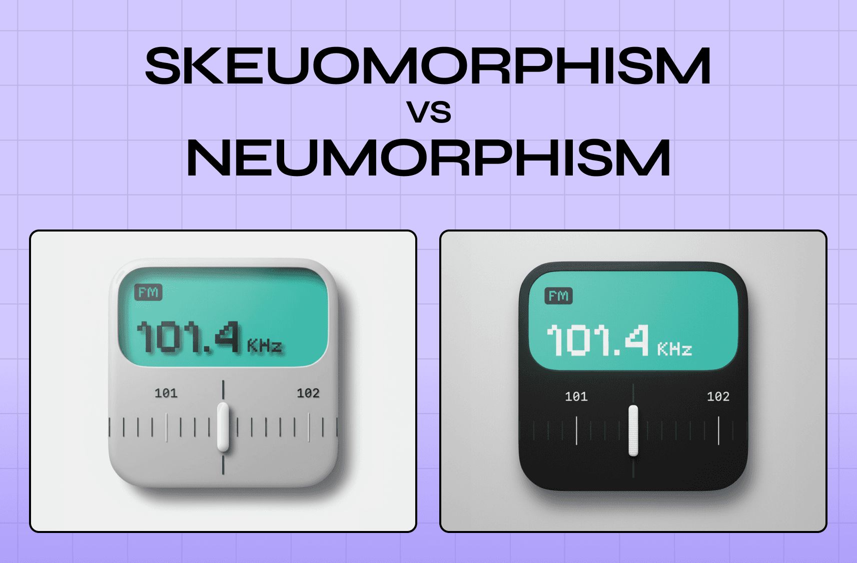
Typography is not just a vehicle for words. It is itself a visual element with personality, and that personality communicates before a single word is read. Geometric sans-serifs project precision, modernity, and technological confidence, which is why they are the default across fintech, mobility, and SaaS products. The contrast is sharp when you look at how type behaves in skeuomorphism vs neumorphism, where surface texture changes the typographic requirements entirely.. Humanist serifs carry warmth, authority, and intellectual credibility, making them the instinctive choice in publishing, legal, and education contexts. Slab serifs read as bold, stable, and industrial, fitting for engineering brands and newspaper mastheads. Script typefaces communicate craft, intimacy, and personality, suited to hospitality, luxury, and artisan brands where the human touch is part of the value. Monospace reads as technically precise and transparent, which is why developer tools and API documentation default to it consistently.
In the Pathways B2B hiring platform we built, the typographic system was designed to communicate precision and trust, because those were the qualities hiring managers needed to feel from the product from the moment they arrived.
Typography and Grid
Typographic decisions cannot be made independently of the grid. The width of a text column, the number of columns, the margins, and the baseline grid all affect how type sits on the page or screen.
A modular grid structures the relationship between type and every other element in the layout, giving the design internal logic.
How Typography Changes Across Contexts
The same typographic principles apply everywhere, but how they are executed changes significantly depending on the medium.
In digital product design, the priorities are screen legibility, responsive scaling, and performance. Body text should sit at 16px minimum. Type must hold up across screen densities, from standard displays to high-resolution retina screens. System fonts, those already installed on the user's device, offer zero load time and reliable rendering. Web fonts loaded via CDN require a loading strategy to avoid a flash of invisible or unstyled text. The practical principle for most products: a well-chosen system font or a single variable font with two to three weights will outperform a heavy multi-file custom font stack on every performance metric that matters, and is far easier to manage within a design system.
In brand identity and logo design, the constraints are different. A typeface chosen for a wordmark must remain legible and distinctive at favicon size and at billboard scale simultaneously. Vector integrity matters. Optical adjustments that work at display size often need refinement at small print sizes. The typeface choice also sets the tonal foundation of the entire brand system, so the decision carries more weight here than in almost any other context.
In editorial and print work, typographic precision increases. Column widths, baseline grids, print-specific leading, and the treatment of widows and orphans all require closer attention than in digital contexts. Print does not reflow. Every decision is fixed at output, which means the craft standard is higher and errors are permanent.
Why Typography Matters in Real Design Work
Good graphic design typography does several things simultaneously. It communicates content, shapes perception, establishes hierarchy, reinforces brand identity, and guides user behavior. When typography breaks down, it is usually because one of these functions was sacrificed for another.
A product with beautiful heading type but unreadable body text will frustrate users. A brand with a distinctive display font but no typographic system will feel inconsistent across touchpoints. A landing page where every text element competes at the same visual weight will fail to direct a visitor toward a conversion action.
Typography is also one of the first places where a brand's values become visible, shaping the overall brand experience. A fintech product using a sharp, modern sans-serif is communicating something different from one using a warm humanist serif, even before the copy is read. These are not decorative choices. They are strategic ones.
According to Nielsen Norman Group research, users read only around 20-28% of the text on a web page. That makes every typographic decision about hierarchy and emphasis doubly important. If the eye does not land on the right text at the right moment, the message is lost regardless of how well it was written.
Conclusion
Typography is the system through which visual language is organized and meaning is communicated through type.
The core elements, typeface, font, leading, kerning, tracking, and hierarchy, are the levers every designer works with.
Types of typography range from serif and sans-serif to script, display, and monospace, each with distinct personalities and appropriate contexts.
Typography rules in graphic design, limiting fonts, controlling spacing, establishing alignment, building contrast through pairing, and maintaining consistency, protect legibility and coherence.
Typography principles remind us that type is both a communication tool and a design element with visual mass, texture, and personality.
In every project we take on at Groto, from SaaS platforms to ecommerce to healthcare apps, typography is one of the earliest and most consequential design decisions we make.